
DISCLOSURE: This site contains some affiliate links to products. I may receive a commission for purchases made through these links (at no cost to you). As an Amazon Associate I earn from qualifying purchases. Thank you!
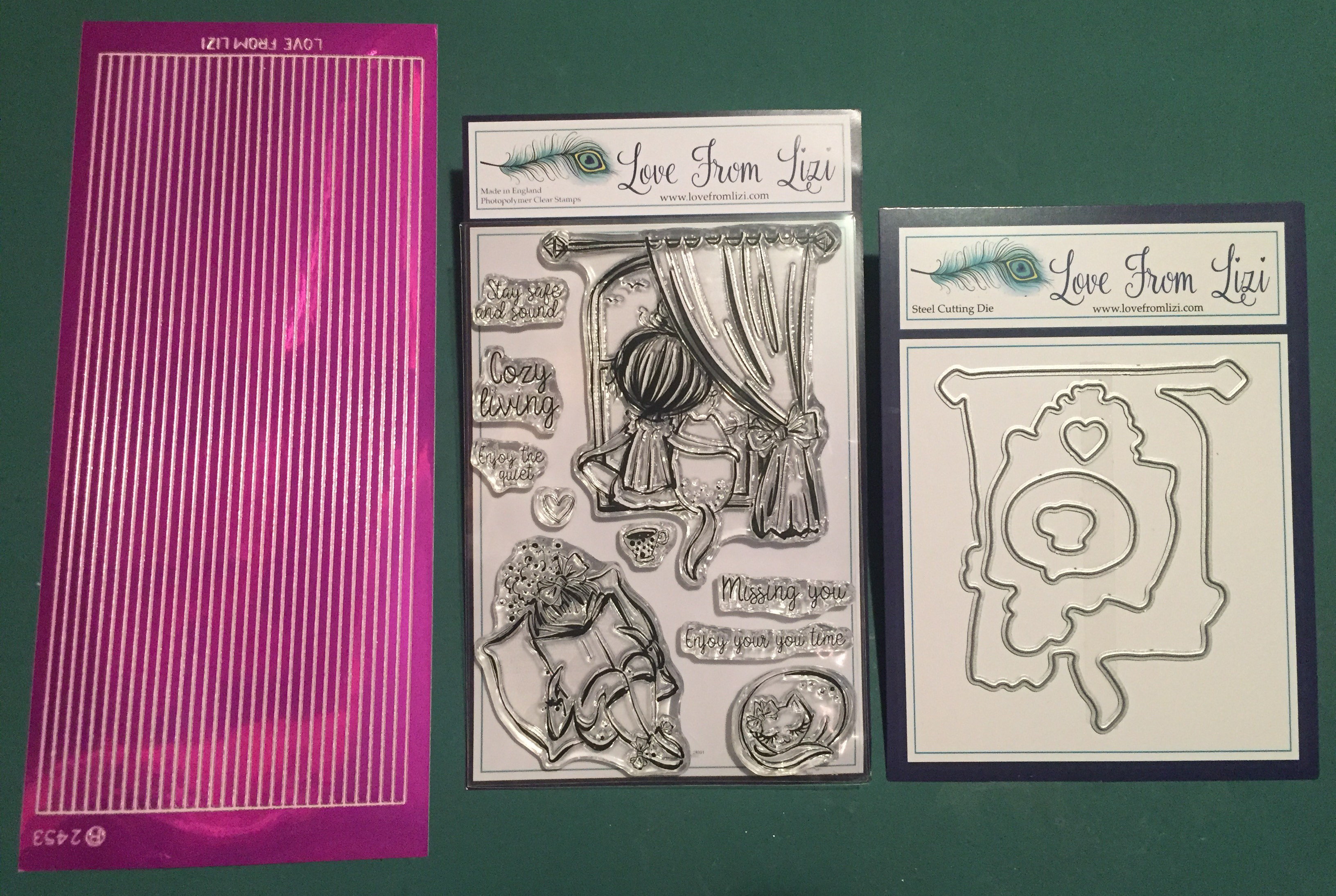
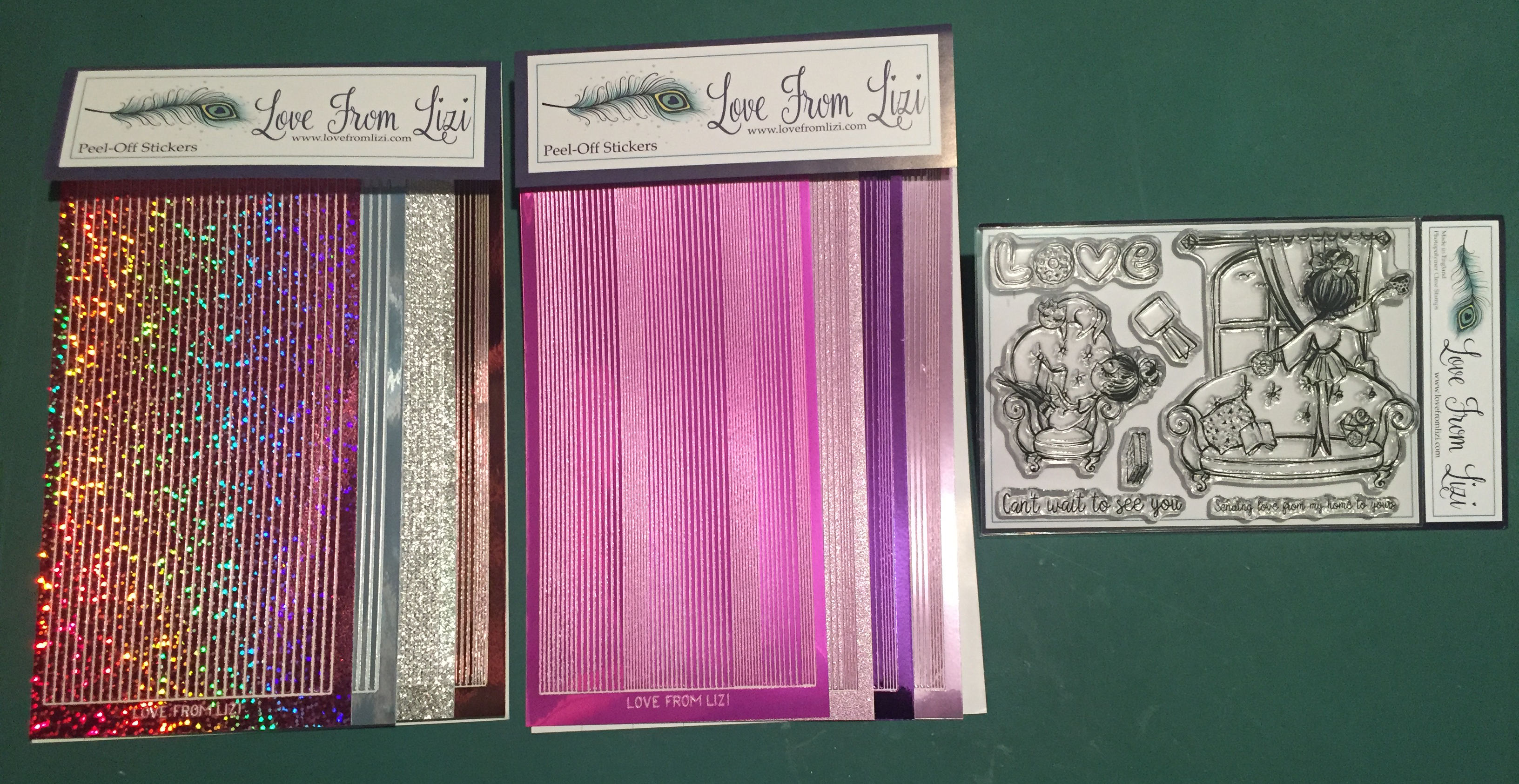
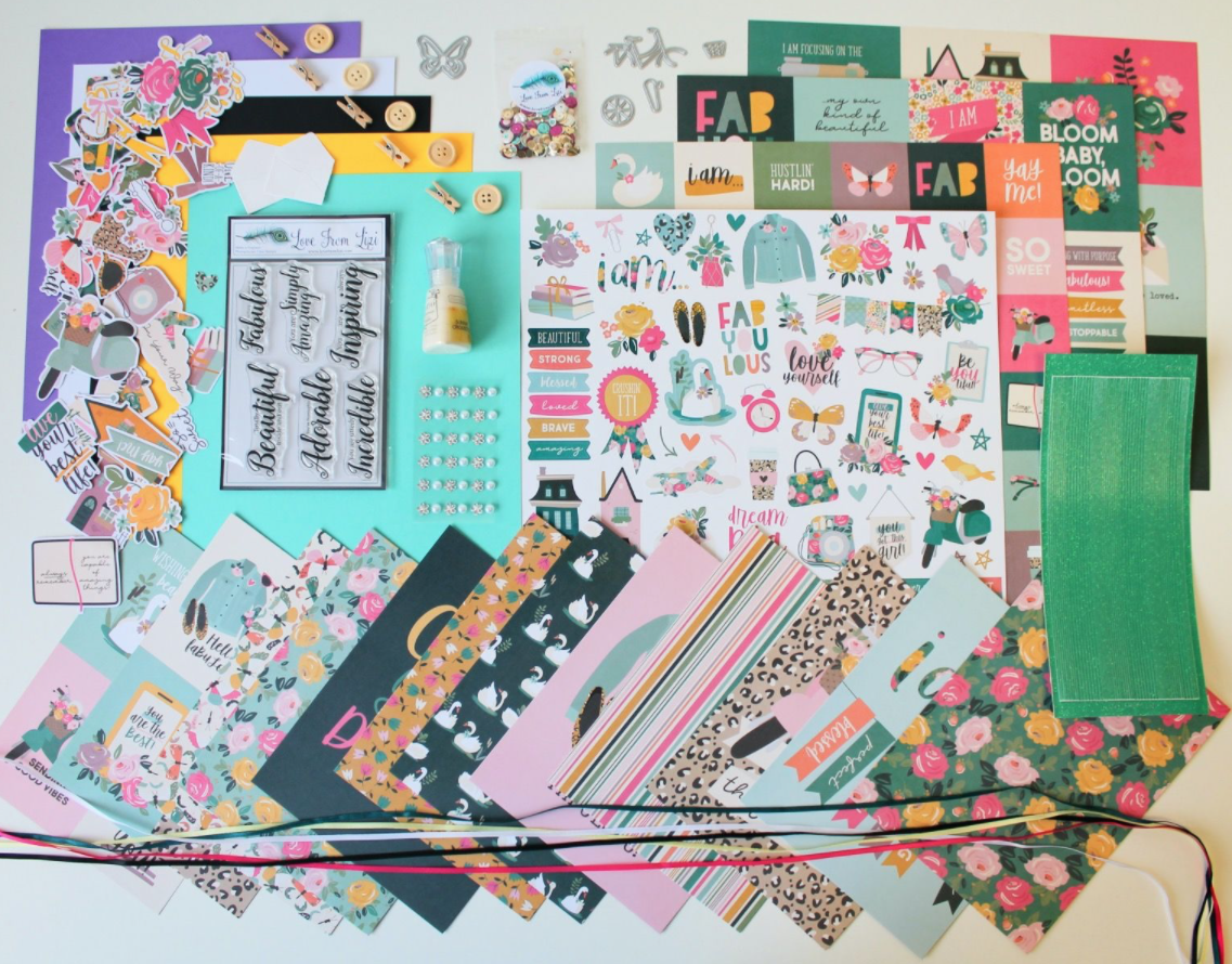
Hello Folks! Scott here with my 10 Cards 1 Kit post featuring the Love From Lizi June 2020 “Safe and Sound” Card Kit. This kit brings back the beloved Eyelash Girls and all the items included are EXCLUSIVE to Love From Lizi – you can’t get these goodies anywhere else!
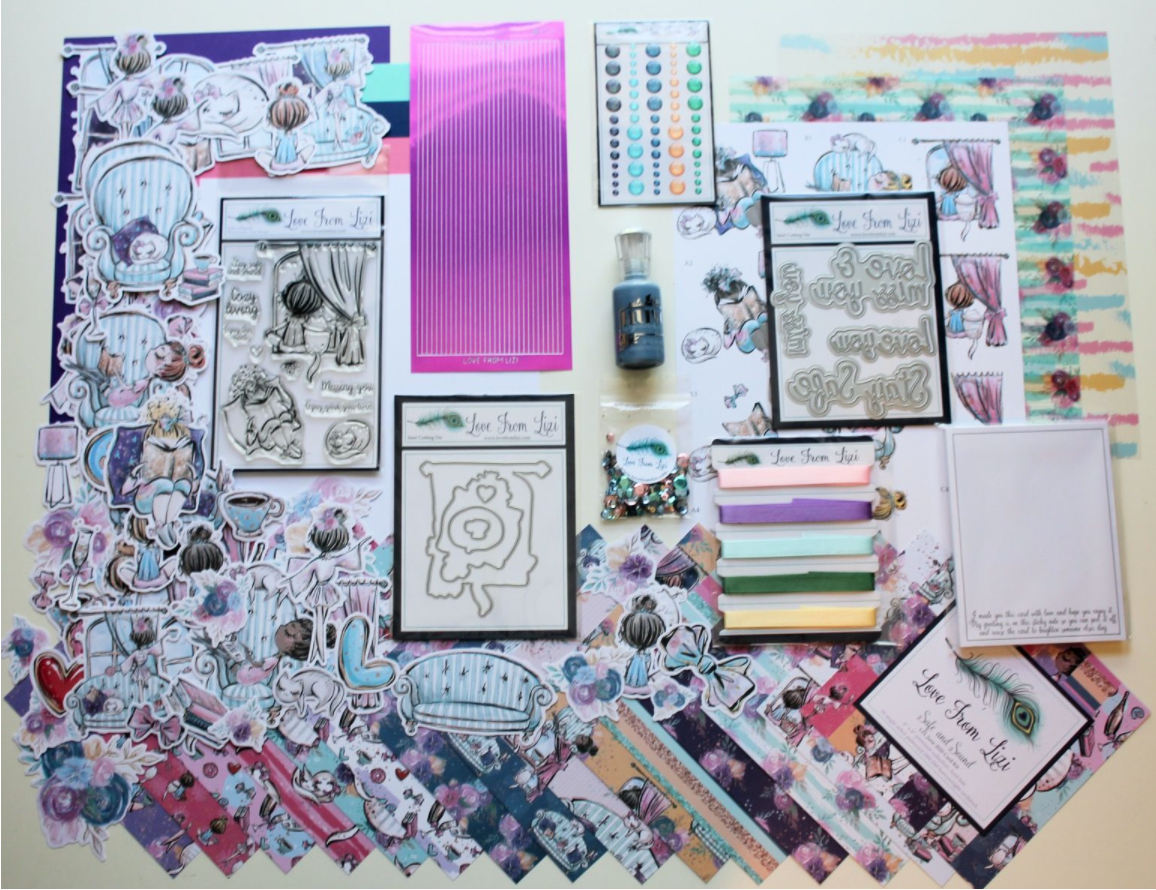
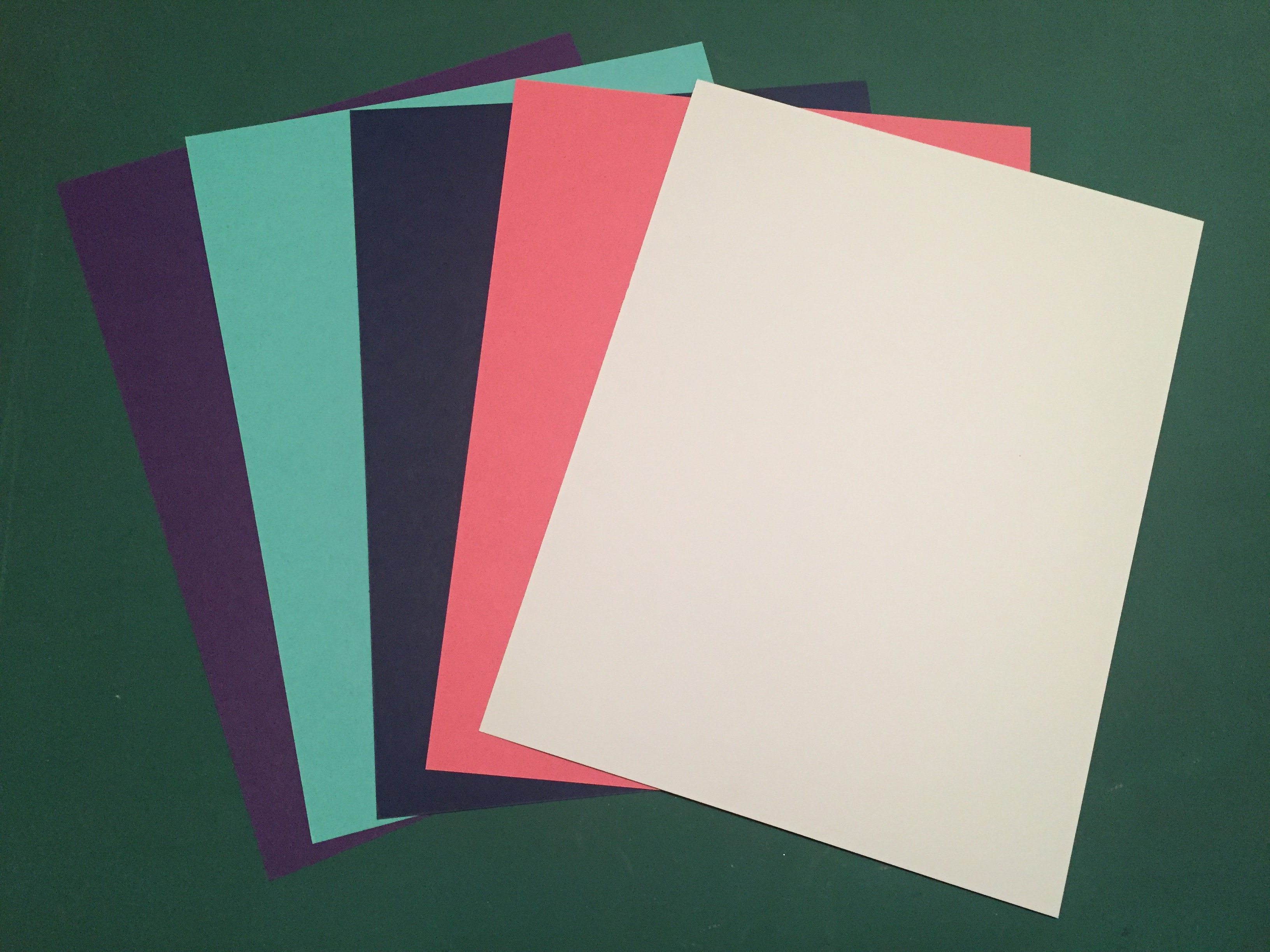
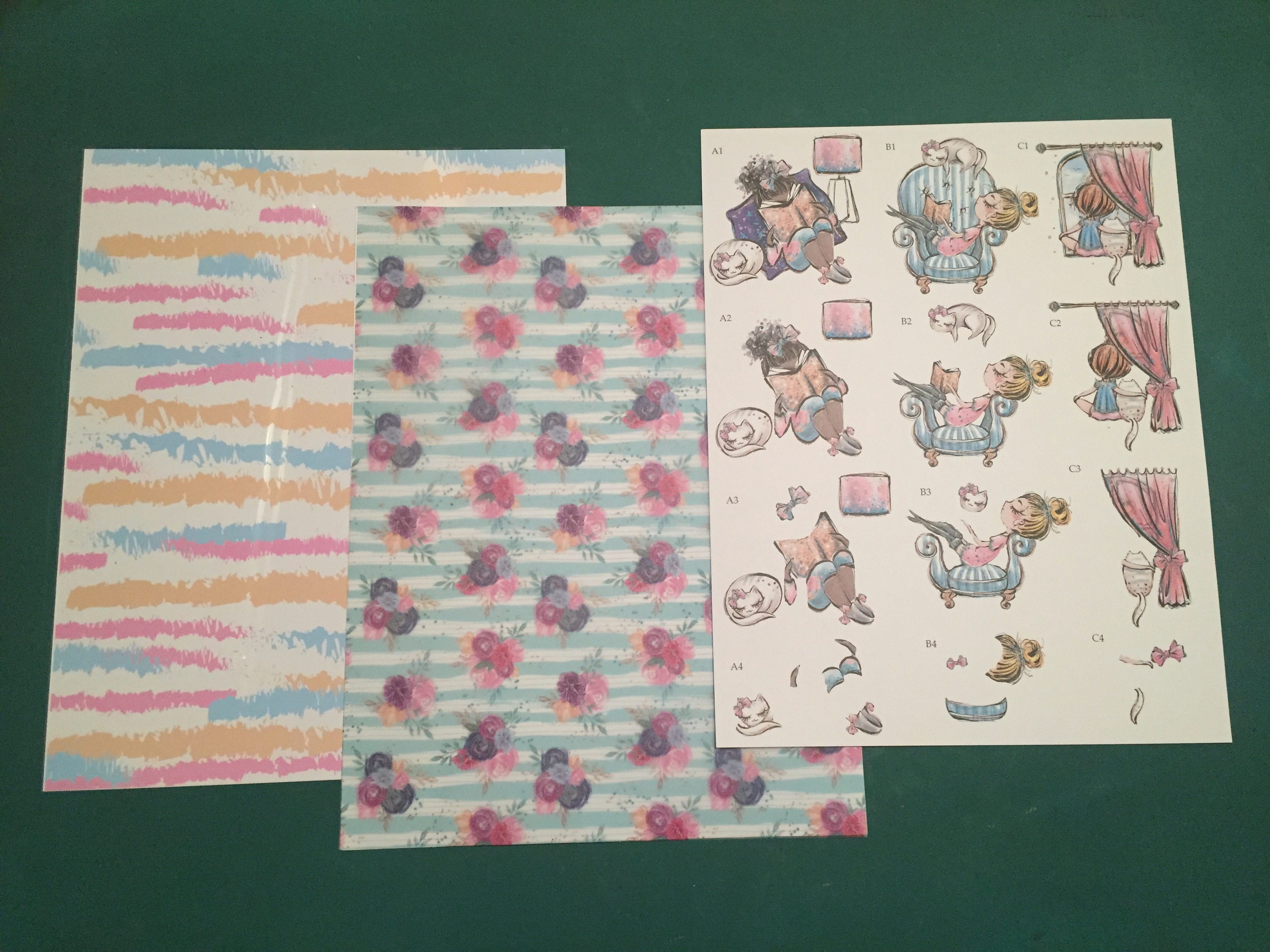
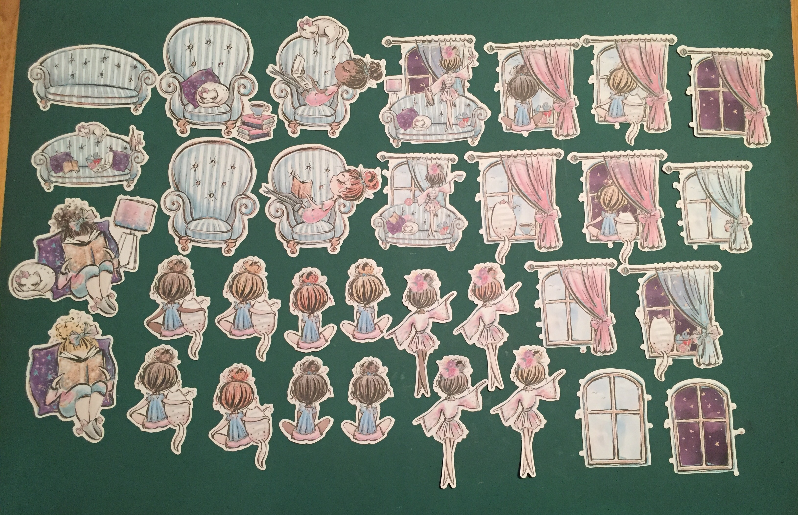
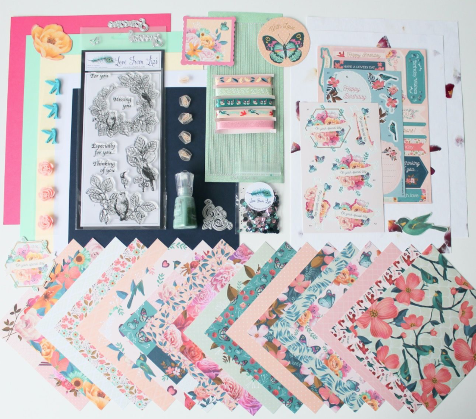
As usual, I do take the 5 sheets of colored card stock in the kit and make my ten A2 card bases (4.25″ x 5.5″) from those. I have always enjoyed Lizi’s decoupage sheets, and this kit featured 3 different decoupage scenes on one large sheet of card stock. Usually, this European version of decoupage (you use foam squares to layer everything together) has the individual pieces already die-cut, but due to pandemic restrictions and time constraints, this set is NOT die-cut.  That means you have to break out your fussy cutting scissors or craft knifes and cut out all the pieces yourself. I know this will deter some folks,
 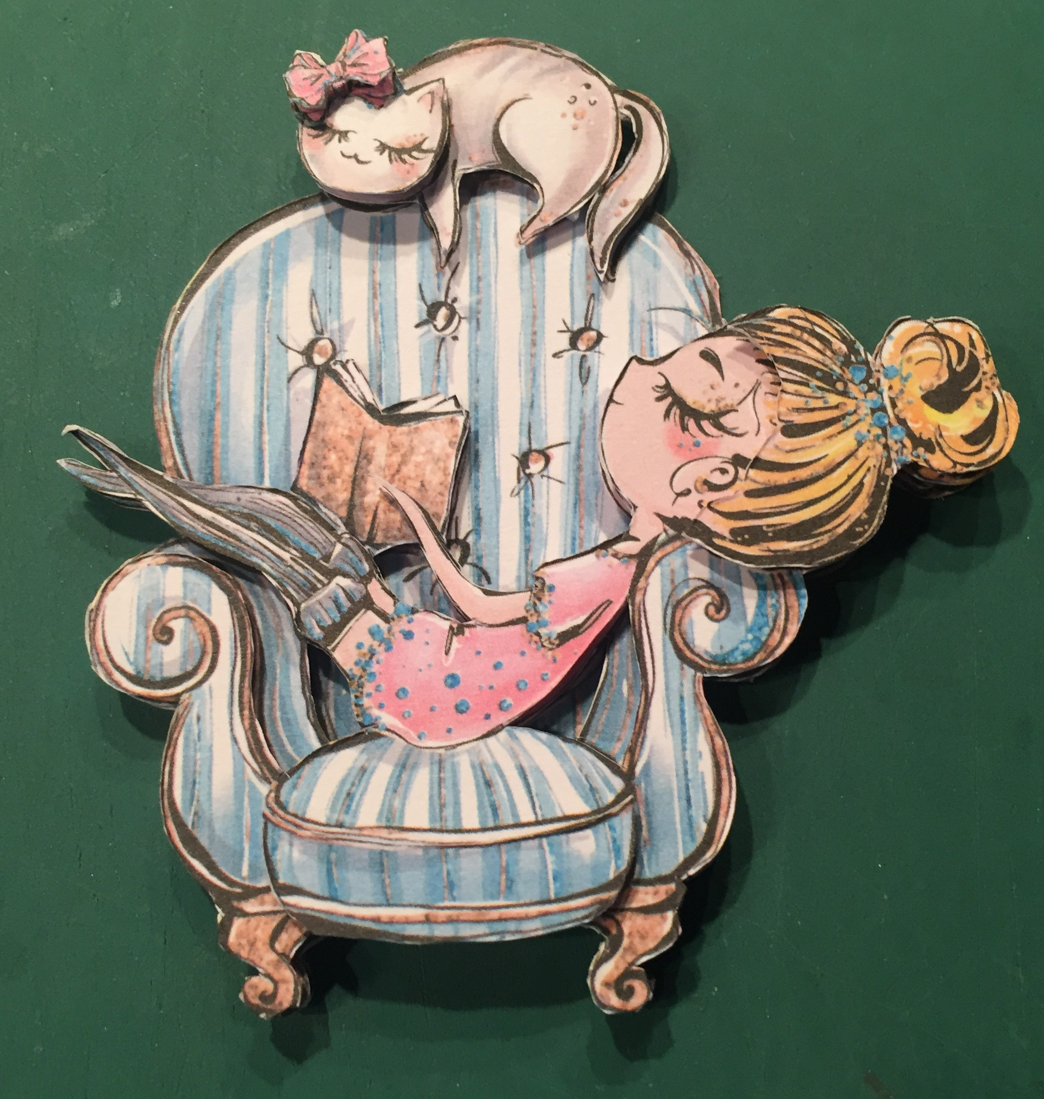 but I love using my craft knife, and, sometimes, machine die-cutting isn’t all that perfect. So, I actually enjoy making sure that all the cut out pieces are precisely trimmed when assembling. I LOVE all the dimension that these four layers create!
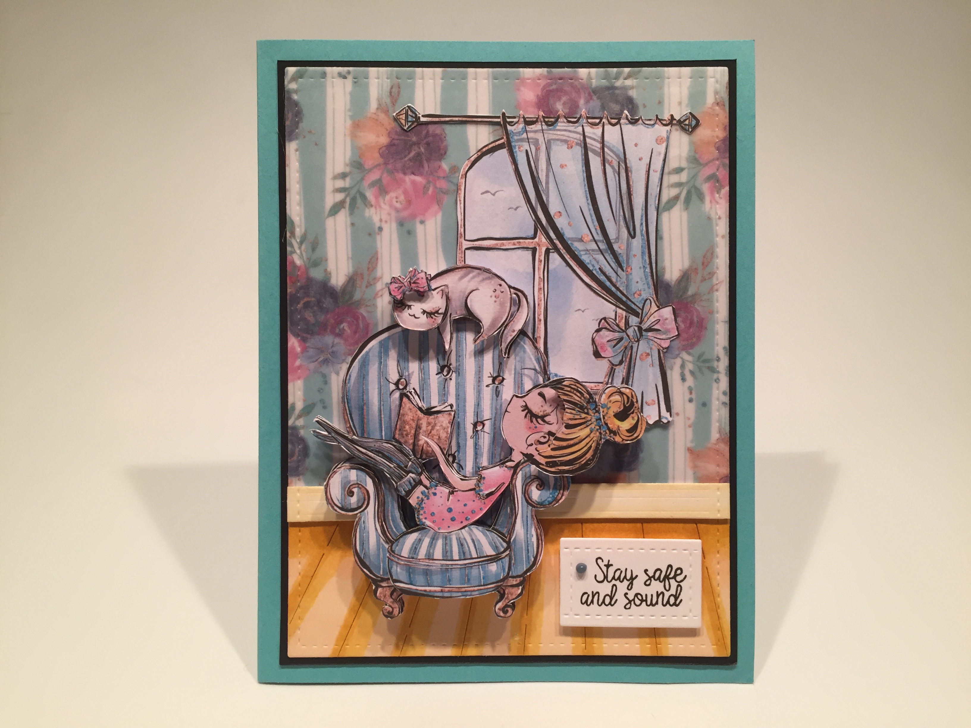
My first card features that terrific decoupage piece in a little interior scene. I cut a 4.25″ x 5.5″ piece of the printed vellum from the kit, and ran it through my Zyron Sticker maker and glued it to a matching piece of white card stock. The printing on that vellum really stands out on a white background, and I wanted to tone it down a little bit, so I glued another piece of plain vellum from my stash over the top. I die-cut the floor and baseboard from white card stock with my new Penny Black Wood Floors die and colored them with my Spectrum Noir alcohol markers. I temporarily attached those pieces on my background, and die-cut that with a Lawn Fawn Stitched Rectangle die. Then I permanently glued the floor down, added three strips of scrap white card stock behind the baseboard, and glued that in place too. I mounted the whole background to a thin black mat and used my ATG gun to glue the background to the Teal Blue card base – Lizi called this Jade Green in her unboxing (as did I) but it sure seems to me to be much more blue than green!.
I fussy cut the white border away from this window ephemera piece and glued that flat to my background, and mounted the decoupage chair to the front with some foam tape. I stamped the sentiment on a scrap of white card stock using VersaFine Onyx Black ink, and did some partial die-cutting with a LFSRD to cut it to size. Lastly, I mounted the sentiment piece to the card front with more foam tape, and added a dot of the Double Denim Nuvo drops. This was probably the easiest decoupage scene to cut out, and I adore the 3D effect it creates. I love this peaceful, socially isolating, greeting card.
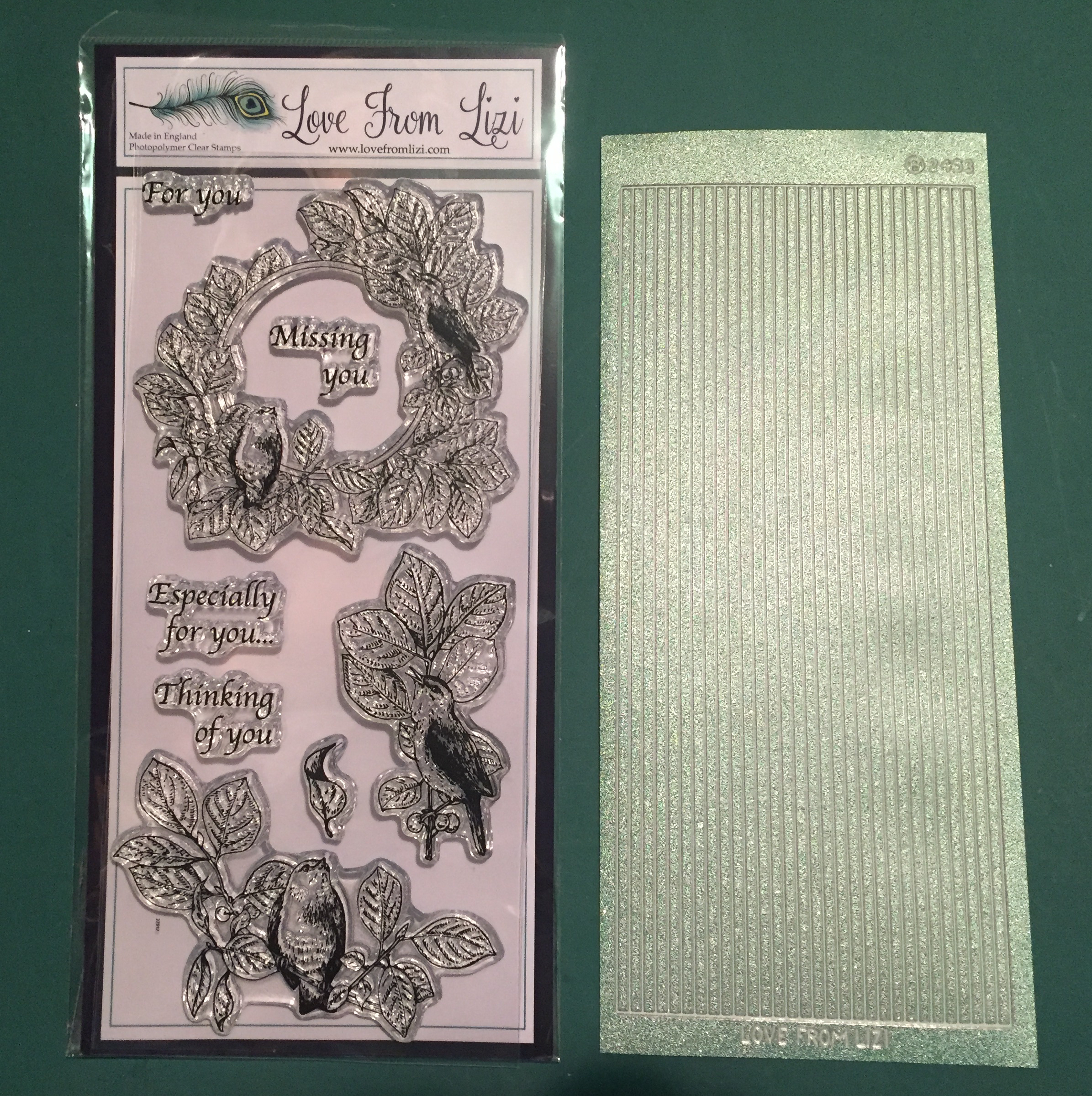
Let’s move on to the the “Safe and Sound” stamp set!
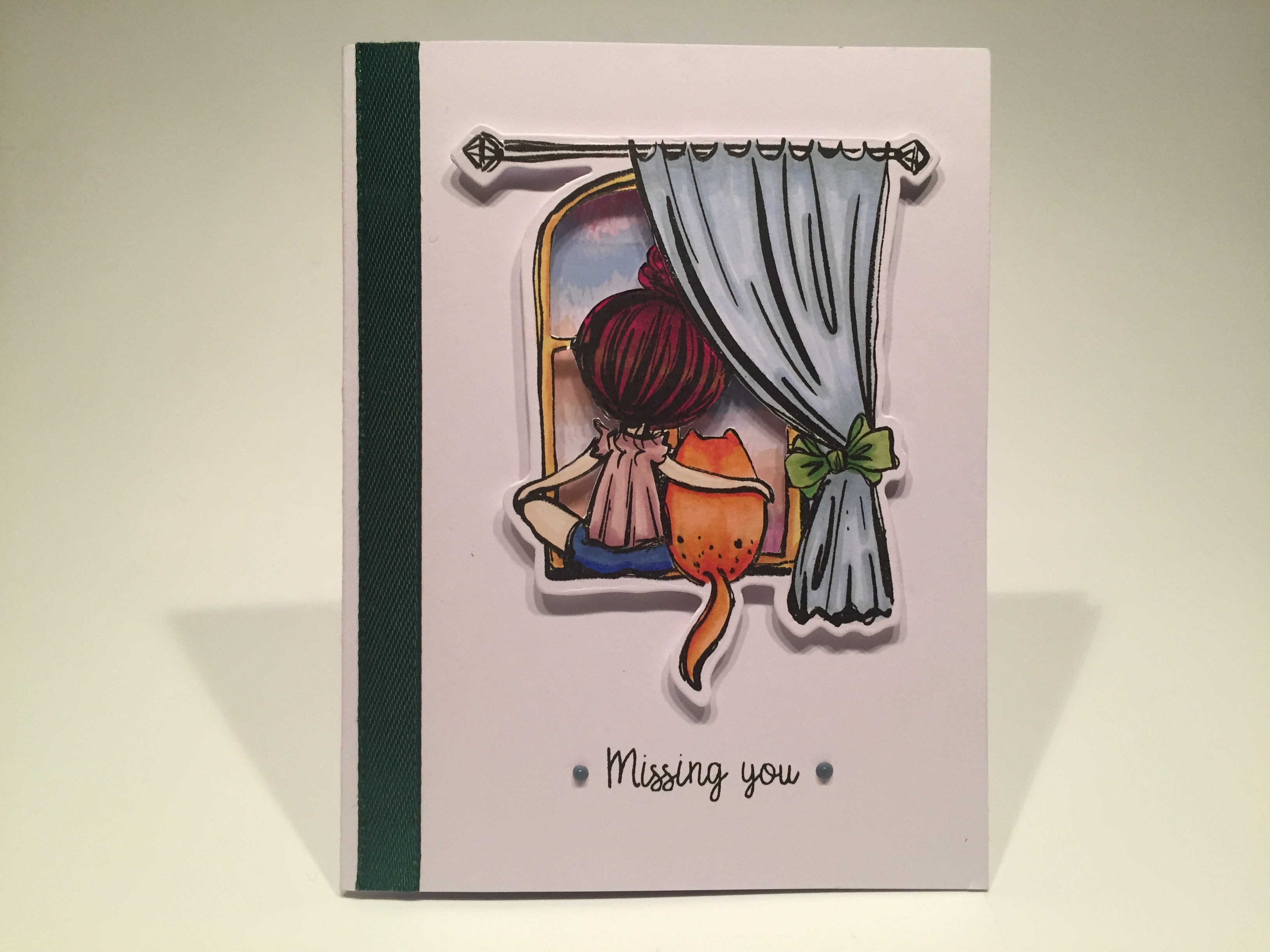
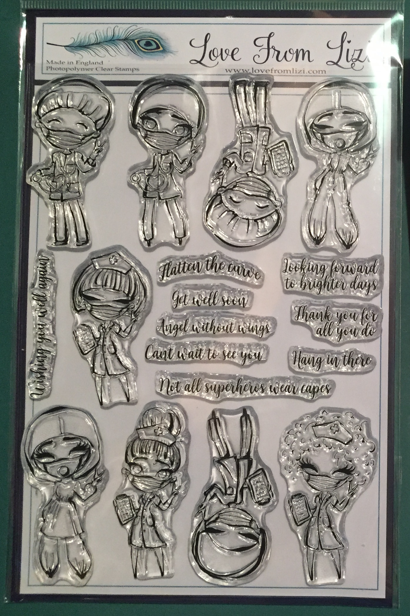
I think this simple card speaks volumes! I stamped this on Lizi’s Super Smooth White alcohol marker-friendly card stock using VersaFine Onyx Black ink, colored it with my Spectrum Noir alcohol markers, and cut it out with the included matching die. I wasn’t very pleased with how I colored the sky through the window (probably because I made the curtain blue too…!) so I fussy cut the window panes away from the stamp, and glued a piece of the printed acetate from our kit behind the window openings. That printed pattern on the acetate sheet provides a nice variety of colors in the sky, and also adds a reflection to the ‘glass’ portions of the window!
I ran a piece of our green ribbon through my Zyron Sticker maker and glued it along the left side of a white card base. I stamped the sentiment directly on the card front with the same ink, and added a couple more Nuvo Drops to either side of that. I added the stamped and colored window scene using foam tape, and that created some interesting shadows behind the window. Love this card very much… maybe it’s just that orange cat…!!
I did stamp both of the large image stamps at the same time… this is the second one…
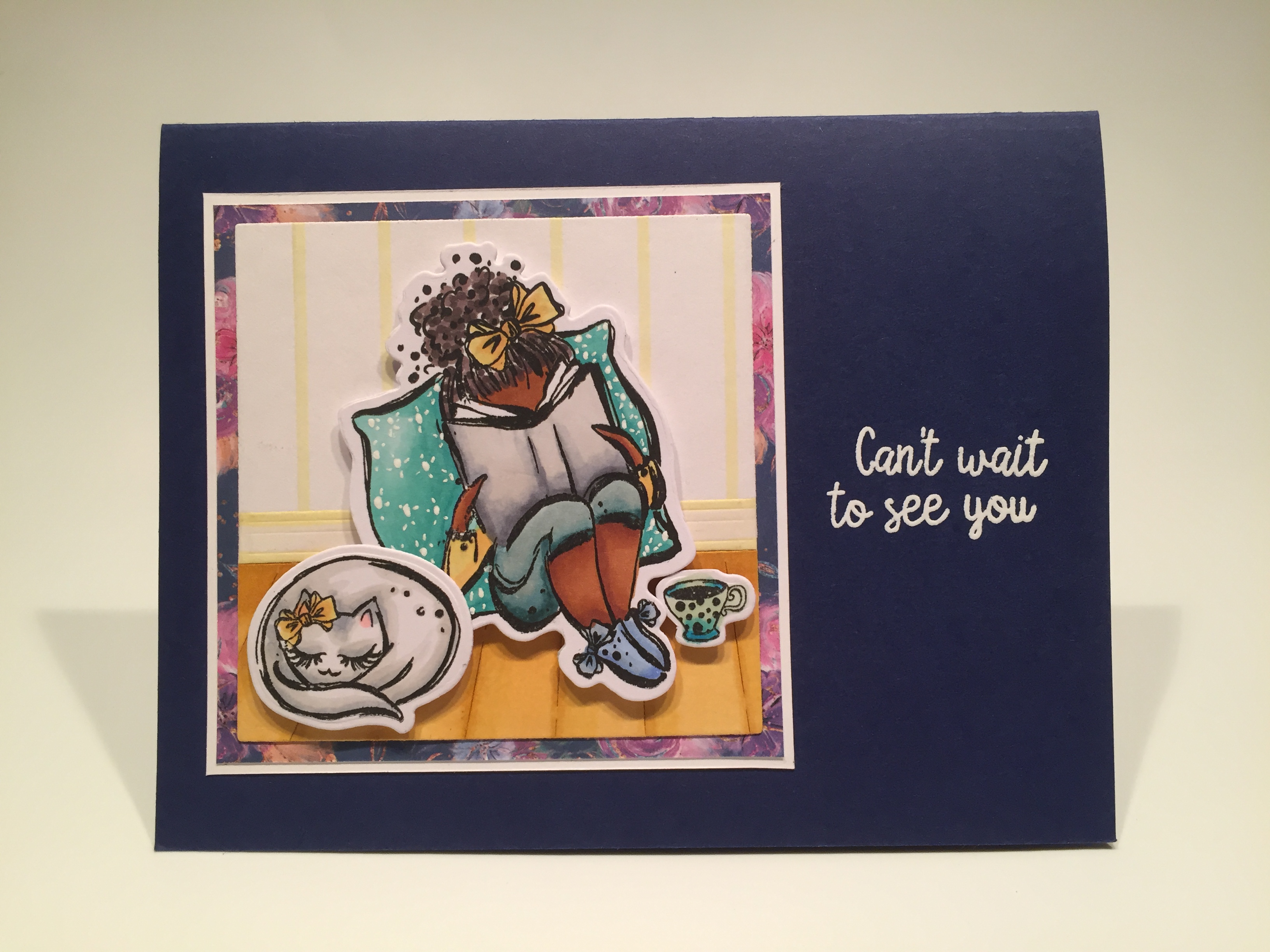
The images were stamped, colored and die-cut just like the last card, and I did add a dotty/starry pattern to the pillow with a white gel pen. I used the Penny Black Wood Floors die again to make the floor and baseboard. I die-cut a scrap of white card stock with a 3″ Darice Nesting Squares die, drew in some “wallpaper stripes” on that with my alcohol markers, attached the floor and baseboard and trimmed them down to size.
I matted that piece on a 3.25″ square of pattern paper from our kit, and mounted both to a thin white mat (3.3/8″ square). This sentiment is from the “Can’t wait to see you” add-on stamp set – currently sold-out, but Lizi is expecting a new batch to arrive in time for your July boxes! I did a little stamp surgery on the sentiment and split it into two pieces, then stamped that on the Navy Blue card base using VersaMark ink, and embossed that with White embossing powder. I attached my background square using my ATG adhesive, and added the die-cut stamps using foam tape. I particularly like the matching bows on our Eyelash Girl and her cat!
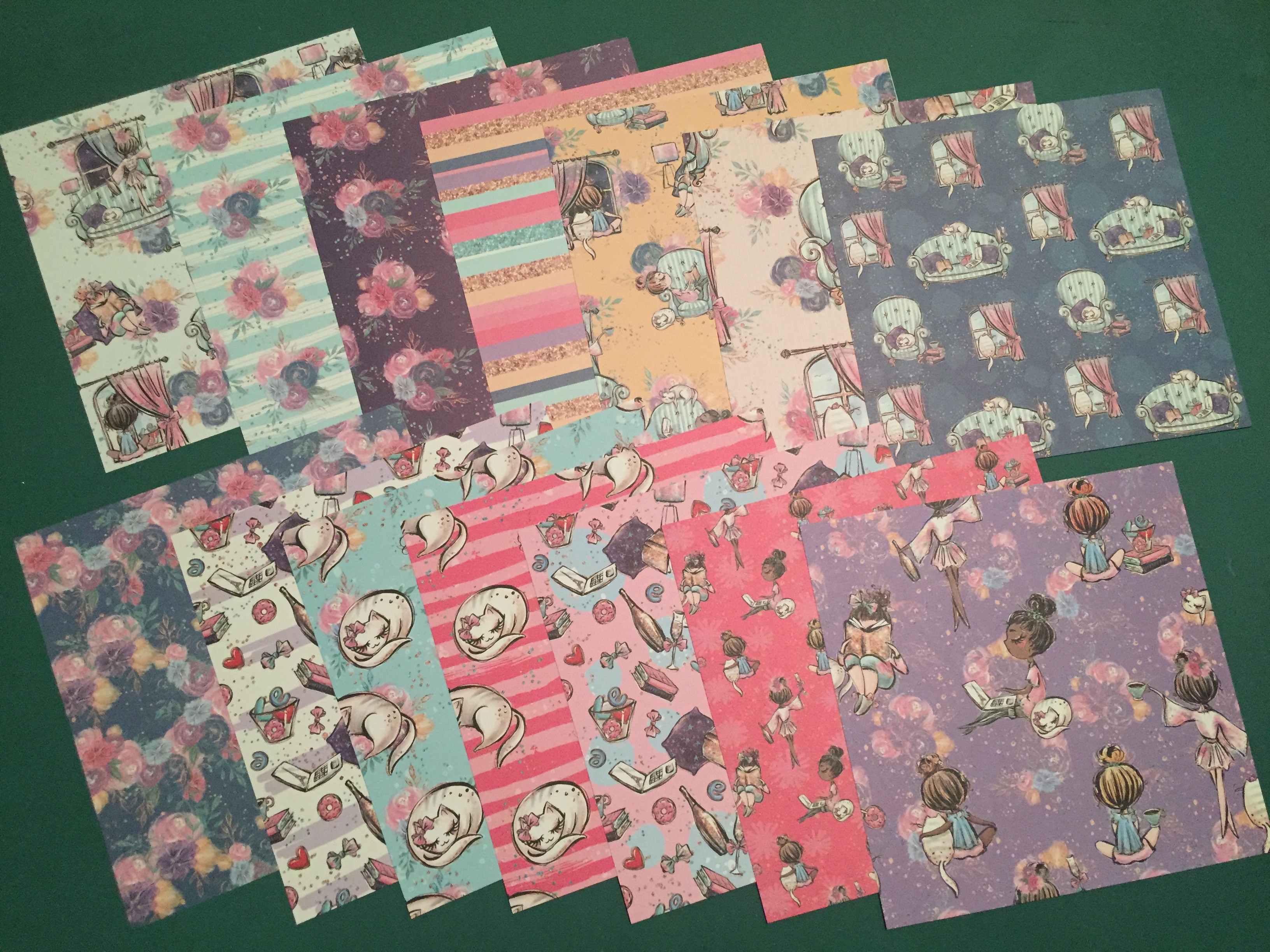
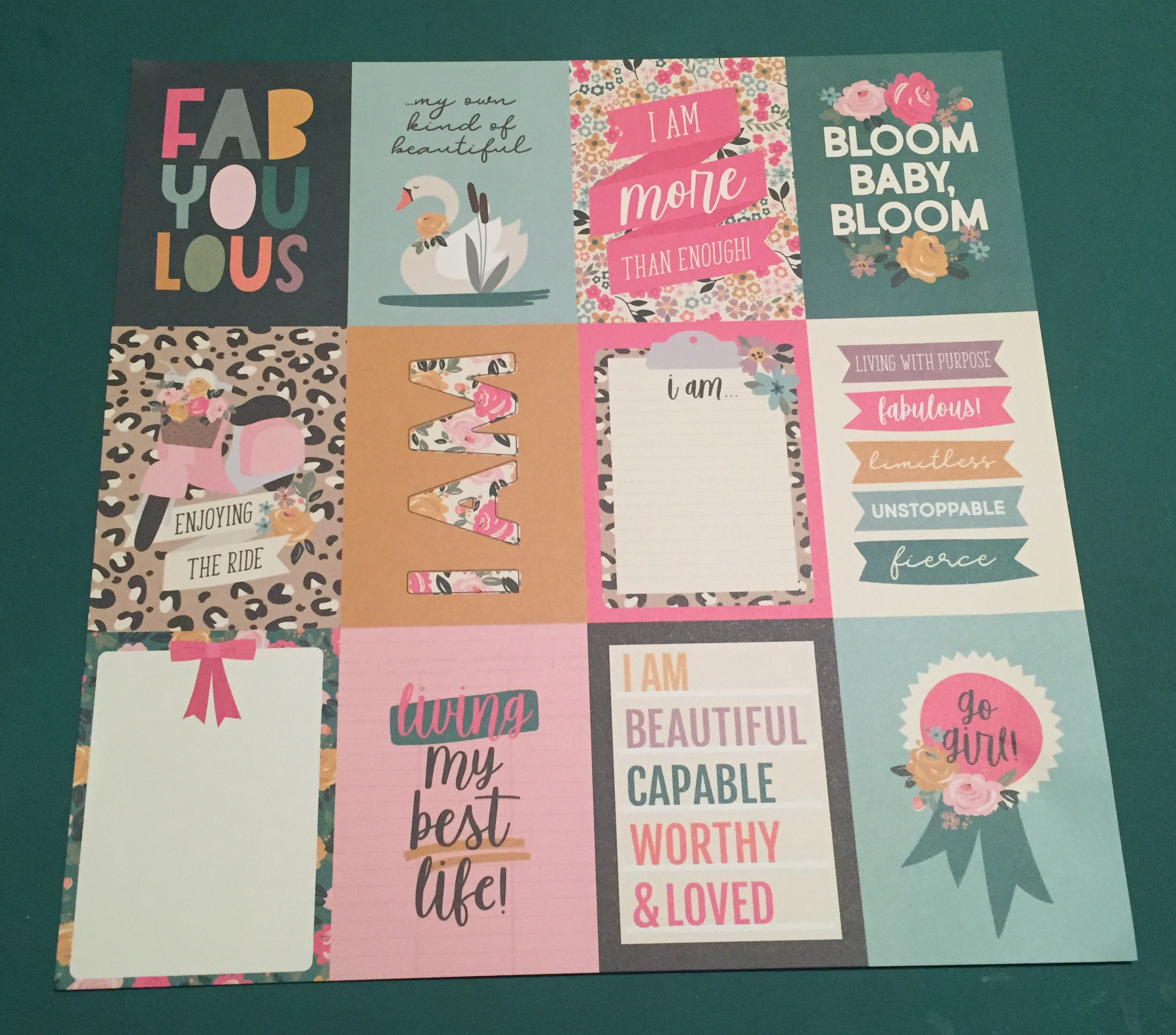
I was having a hard time envisioning how to use these pattern papers in this kit… most had very specific and large images that almost told a story all by themselves. I found them to be a little busy behind the stamped images or ephemera pieces, so I thought of another way to use them that would minimize the pattern while retaining the great colors!
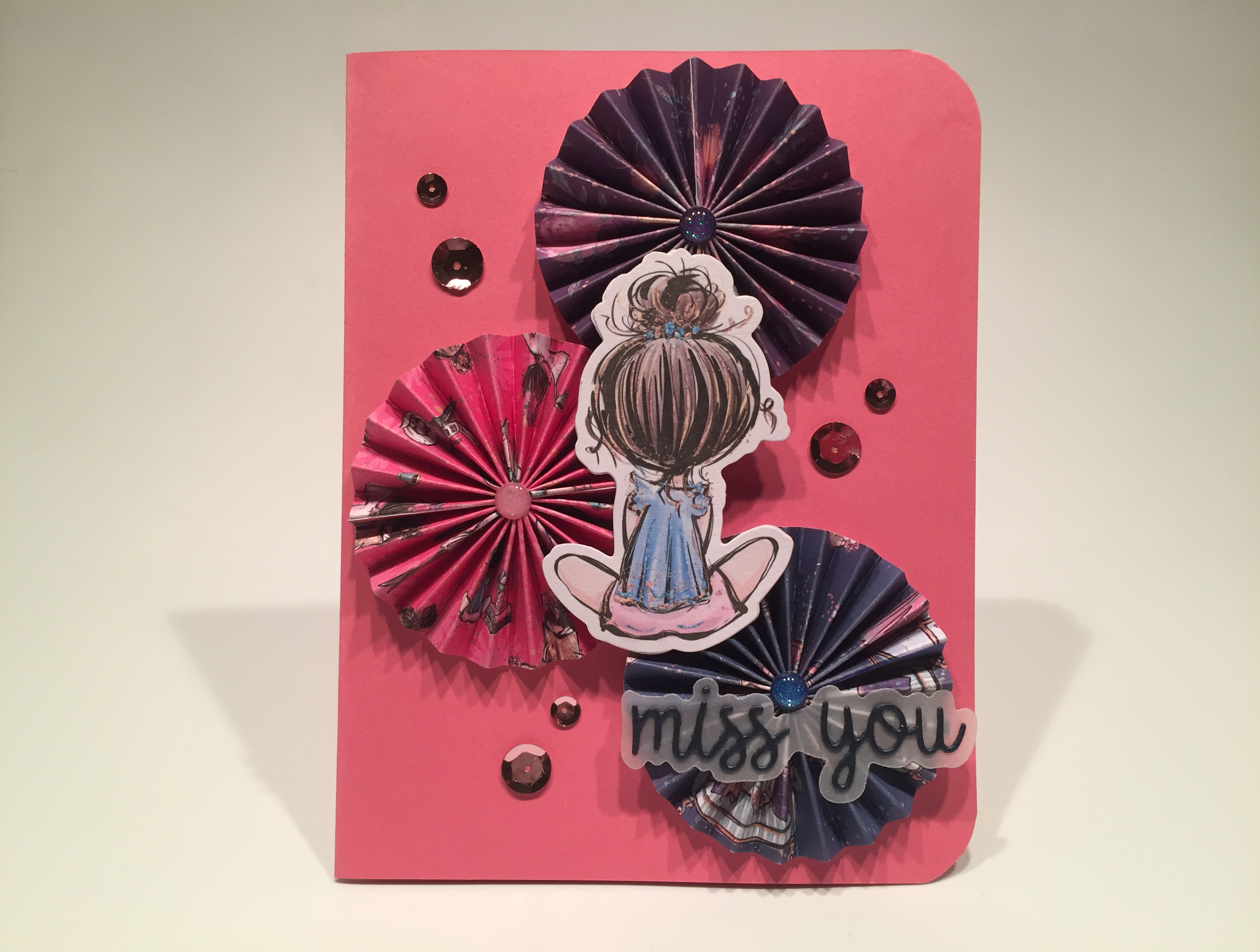
I made some rosettes! I’ve never made rosettes before! I LOVE this! Each rosette is made with two 1″ strips of pattern paper scored at every 1/4″. I did find that folding these rosettes was easier when I reversed my score lines front to back. So, instead of just scoring straight across at every quarter inch, on one strip I scored the front side at every 1/4″ and 3/4″, and then flipped the strip over and scored the back at every 1/2″ and full inch. I did the opposite (front every 1/2″ and full inch, and the back every 1/4″ and 3/4″) on the second strip so the ends would match up and I wouldn’t have to trim off any ‘excess’ folds. Fold both strips in an accordion fashion and squeeze tight to reinforce the creases. I glued the ends together with Scor-Tape, flattened the rosettes out, and attached them to a scrap circle of card stock using more Scor-tape to hold the rosettes flat. There is a fairly detailed How-To on my accompanying YouTube video if you’d like to see how I made these gorgeous rosettes! I know there are a number of “Rosette Dies” out there, but it was extremely gratifying to make these from scratch!
I glued the rosettes directly to the Pink card base, and added the glitter enamel dots to their centers. We don’t have pink enamel dots in this kit but we did get some in the September 2019 kit! This sentiment is one of our die-cuts included in this kit and I die-cut the words from the Dark Blue Pearlescent card stock (from the Safe and Sound Pearlescent Card Stock bundle add-on) and cut the shadow from some plain vellum. I glued those together and then down to the bottom rosette. I glued two of the sitting Eyelash Girl ephemera pieces together for a little extra rigidity and glued those on top of the rosettes. I added some pink sequins from our sequin mix to the card front and rounded the right corners with my Corner Chompers. I LOVE those rosettes and I think they help make this a particularly stunning card! Even in pink!
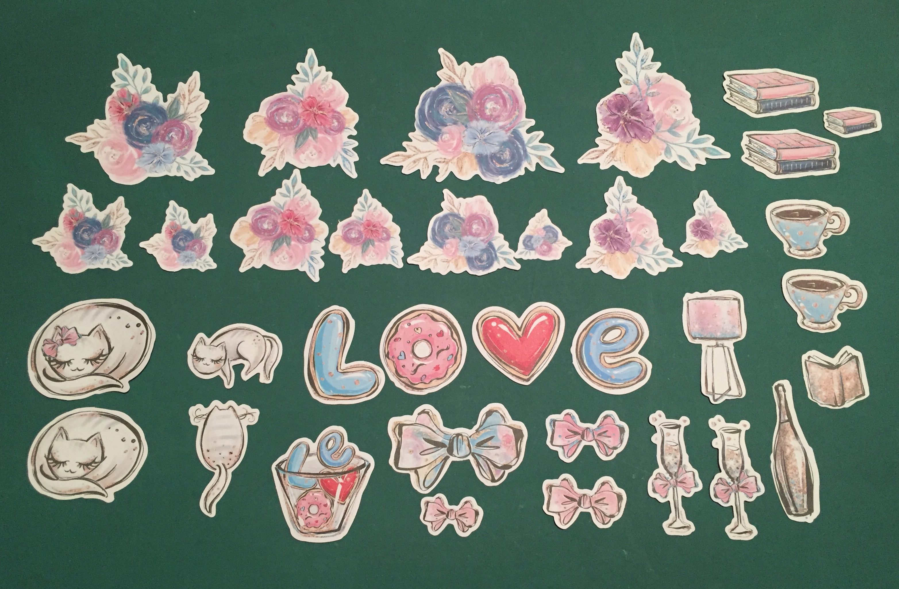
There are SO MANY ephemera pieces in this kit, and some are quite large, so I thought I’d continue playing with those pieces and see if I can make a dent in their numbers!
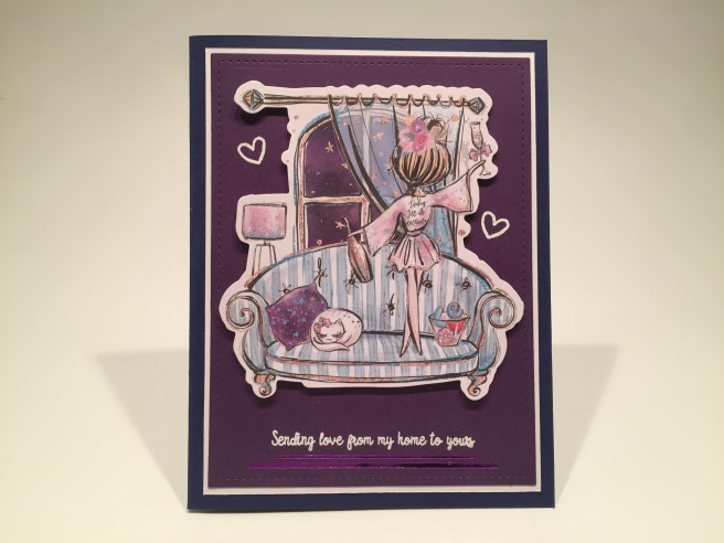
I found some purple card stock in my stash that matched the purple sky in this window almost perfectly! I die cut that with a LFSRD, and matted that on a thin white mat and then down to the other Navy Blue card base. I stamped the sentiment (again from the “Can’t wait to see you” stamp set) and the hearts (from the kit stamp set) on the background using VersaMark ink and embossed them all in white. I added the ephemera piece with foam tape and added some Purple Mirror Pin-Stripe peel offs (from the Safe and Sound Pin Stripe peel off pack) under the sentiment for a touch of shine.
There is a stamp of this scene in the “Can’t wait to see you” stamp set, but it is SO detailed that I shrunk from having to color that stamp and went to this ephemera piece instead! I like this one because our Eyelash Girl is drinking champagne as opposed to the stamp Girl who is having tea and cookies…! Seems much more appropriate to be having a toast with some alcohol! I also like the robe on this Girl which says “Today I’ll do nothing.” Very appropriate and I really like all the matching purples!
Talking about cookies…
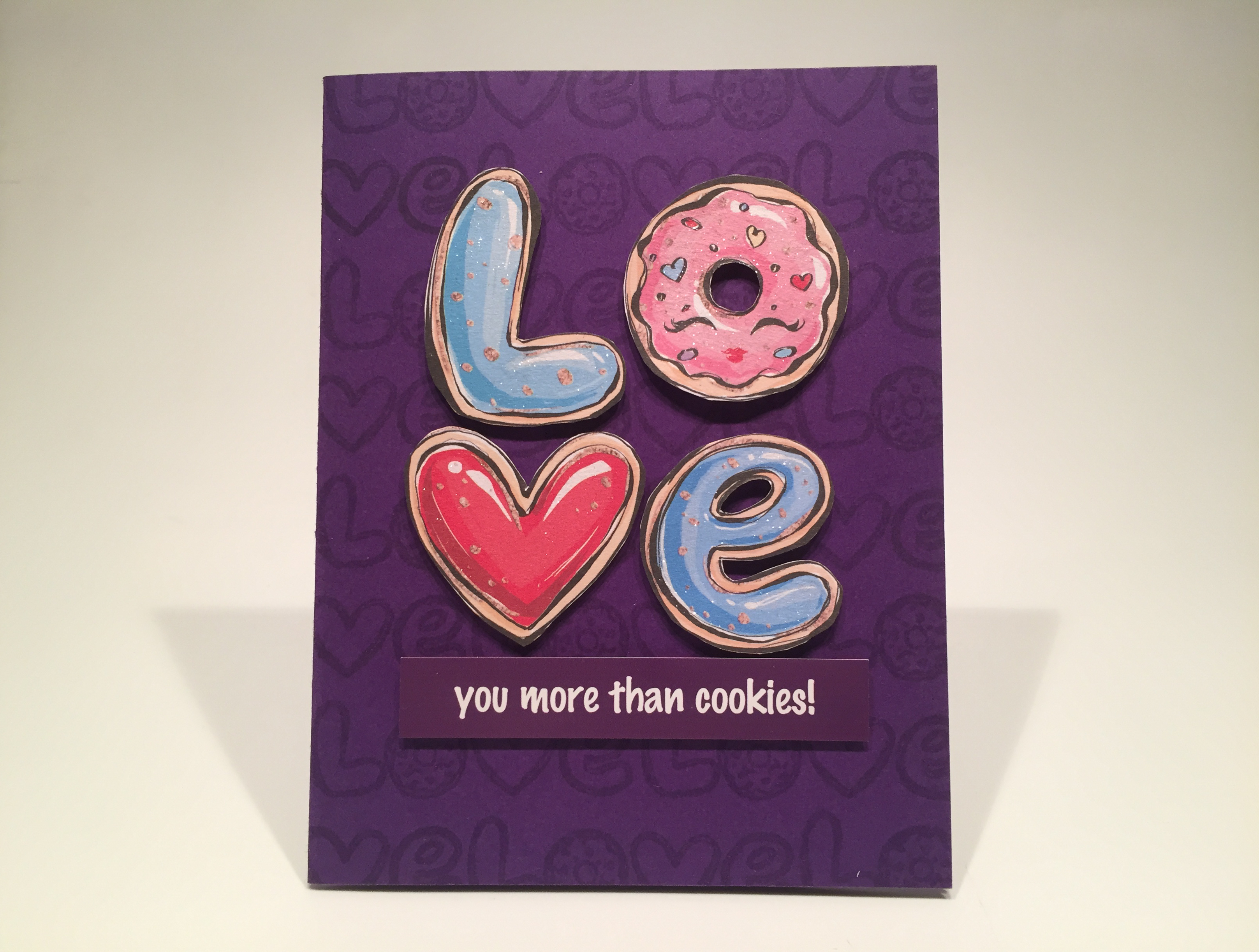
Ain’t it the truth! A fun Valentine for any cookie addict! I stamped the cookie LOVE stamp from the add-on stamp set all over the front of a Deep Purple card base using VersaMark ink for a subtle yet recognizable pattern behind our cookie ephemera! I fussy cut the white borders from the cookie ephemera pieces and added them to the card front with foam tape. I printed this sentiment using my Silhouette Software and the Marker Felt font. I printed that on a piece of photo paper for some added shine, trimmed it down to size and mounted that to the card front with some foam tape. I finished this card by adding some glitter to the frosting on all the cookies using a Spectrum Noir Sparkle Pen. It took me a little while to figure out that the circle cookie actually has eyelashes and lips… so I adjusted its position once I realized that! Cute! A sweet Valentine that has nothing to do with social distancing, quarantines, or isolation. Kind of a relief – I was getting a little depressed there…!
Since we can’t see her face, I thought the Eyelash Girl reclining on a pillow and reading a book could easily be a younger person.
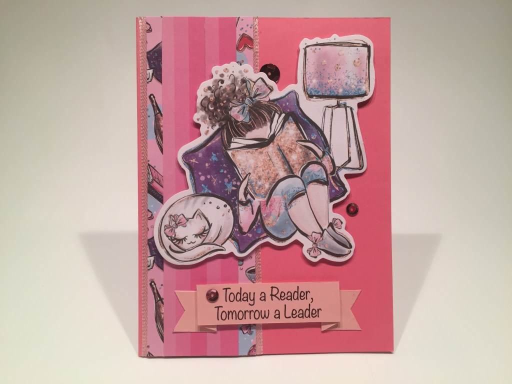
For this background, I took the wide pink stripes from the striped pattern paper and glued them together on top of a 1 3/4″ wide strip of the pink accoutrements pattern paper. I ran two pieces of the pink ribbon through my Zyron sticker maker and glued those down to the left side of the Pink card front so the outside edges were 2″ apart, and glued the pink pattern paper strips on top of the ribbons.
I mounted this big ephemera piece using foam tape and turned to my Silhouette Software to print this encouraging sentiment. I printed this on a scrap of pink card stock (YES… I have SOME pink card stock in my stash!) using the Noteworthy font, and cut it down to a foldable banner shape. I mounted the banner with foam tape behind the center and glued the ends down to the card base. A few sequins from our sequin mix and some sparkle pen on the two bows adds a respectable amount of glitter and shine. A perfect gift card to accompany the gift of a book for your favorite young bibliophile!
Using my own sentiments with these cards certainly cheered me up… let’s do more!
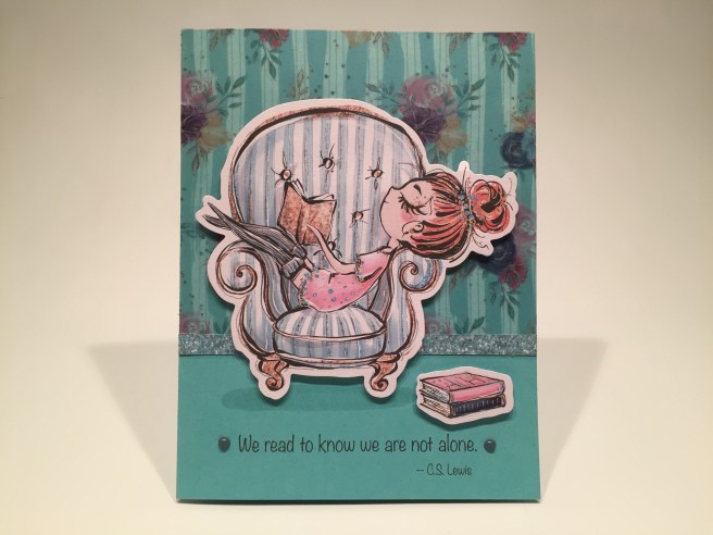
This is a great quote from C.S Lewis that promotes reading, but also speaks a little bit to our current circumstances. Kind of a middle ground here! Using my piggy-back printing method, I printed this sentiment directly on my other Teal Blue card base using the Noteworthy font again. I cut a piece of our printed vellum to 3.75″ x 4.25″, ran it through my Zyron sticker maker and glued it to the top of the card front. I trimmed out a strip of the faux blue glitter from the striped pattern paper and glued it to the bottom of the vellum as a baseboard. I mounted both ephemera pieces with some foam tape and added a touch of a shadow under both with a light grey alcohol marker. A couple of Nuvo drops to highlight the sentiment and we have another terrific card for any avid reader!
We have that one ephemera cat that is lounging on the back of an armchair or sofa…
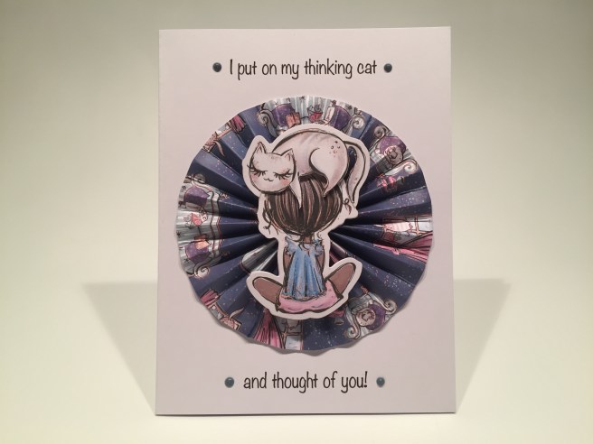
I put on MY thinking cat and thought of a little pun! LOL! I printed this sentiment piggy-back style on a White card base using the Noteworthy font once more. This makes me giggle! This card features a big rosette using the dark blue pattern paper. This rosette is assembled the same as the smaller ones, but the two strips of pattern paper are 1.75″ wide. There is a lot of tension on the outside ends of this piece, so I added a little liquid glue to the seams to help hold the edges together.
I fussy cut the white border away from the bottom of the cat ephemera piece and positioned her on top of the Eyelash Girl’s head so the white border would continue around the outside of both pieces. Some strategically placed foam tape and glue attached the “thinking cat” to her head. I glued the rosette to the card front and the thinking cat girl on top of the rosette. A few Nuvo drops highlight the sentiment, and HOORAY! We have a pun!!! I had to dig pretty deep for this great groaner of a pun, but I like it a lot! I’m sure cat fanciers would get a big kick out of this card!
I shared this little stamped scene on Facebook and Instagram, for a little sneak peek…
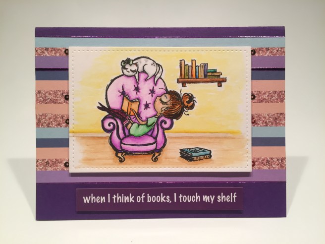
This one makes me laugh out loud! The easy chair and books are from the “Can’t wait to see you” add-on stamp set stamped with Onyx black ink on Bristol Smooth card stock and colored with my Zig Clean Color Real Brush Markers. I sketched in the little bookshelf using Pigma Micron pens and tried to stay true to the spirit of the original stamp illustrations. I think it looks like it belongs! Once the whole scene was colored. I die-cut it with a 4″ x 2.75″ LFSRD.
I took more of the striped pattern paper (denuded of the pink) and glued them together for the background – that came out just under 3.25″ (x 5.5″). I glued the pattern paper to my last Deep Purple card base, added Purple Mirror peel offs to the top and bottom edges, and camouflaged the skinny pink stripe towards the top of the pattern paper with a wider peel off.
I printed this sentiment just like the cookie card sentiment and mounted that and my stamped scene to the card front using foam tape. I LOVE this card! Not only did it give me a much needed laugh, but I also really like this scene! I think the books on the floor and the bookshelf in the back really adds depth and dimension!
That’s my 10 Cards form the Love From Lizi June 2020 Safe and Sound Card Kit!
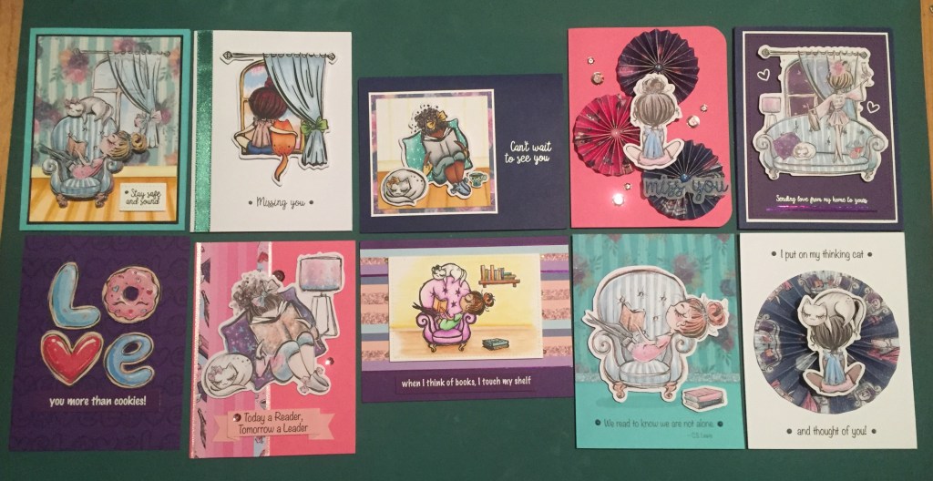
What started out a little bit depressing, became much more fun as I worked my way through these 10 cards! I might have dropped into a depression coma if all of my cards were about staying safe and how much I miss you!! This is a nice assortment including some encouragement cards, a valentine and thinking of you cards and some cards for the bibliophile in all of us! Let me know which card(s) are your favorites!
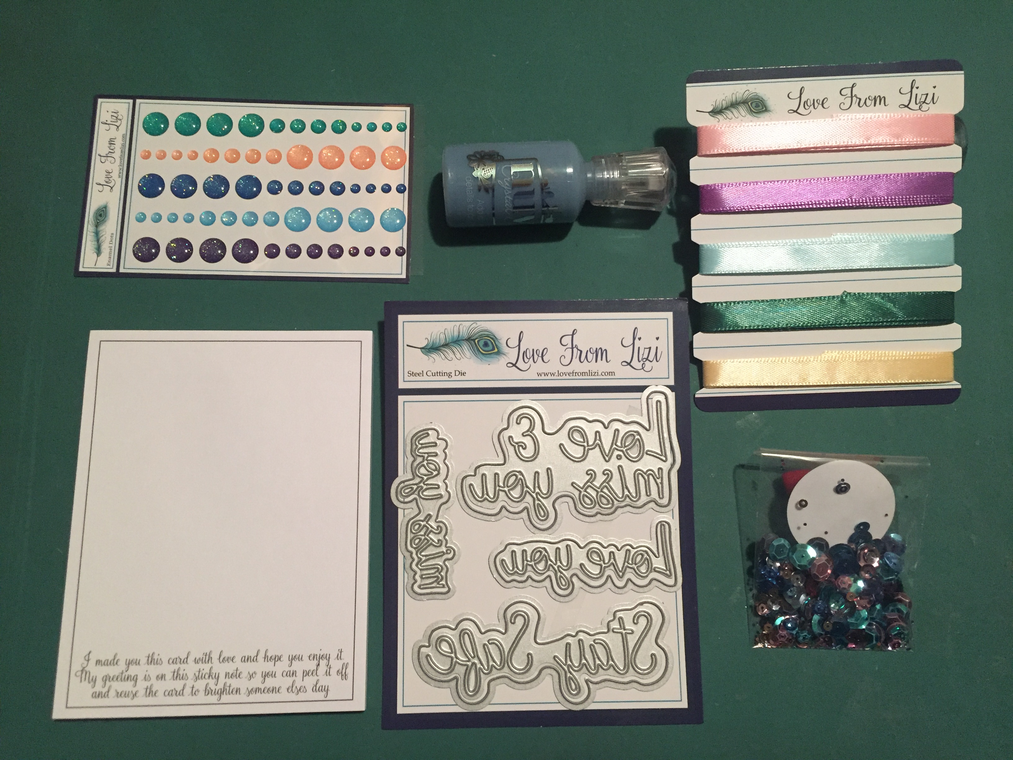
Naturally, I have gobs of supplies left over! I did manage to use all of the image stamps in our Safe and Sound Stamp set but not all of the sentiments. I used some of the vellum and acetate, I used six different pattern papers, a good amount of ephemera (tons more left over) and a little bit of everything in our embellishment bag! I also managed to use some of the stamps in the add-on set, and some peel offs from the add-on peel of pack. I think the only thing in this kit I didn’t use was the Fuchsia Pink Straight peel offs!
This kit has sold out already – most of Lizi’s kits do! The “Can’t wait to see you” add-on stamp set has been re-ordered and should be available again in time for inclusion with Lizi’s July kit. If you want this stamp set for yourself, I might suggest you sign up to be notified when it comes back in stock! If you don’t want to miss out on any of these over-stuffed card kits, I would highly recommend becoming a subscriber! If you do go shopping with Lizi, please use my links! It is always dearly appreciated, and helps support this site! Thank you! Love From Lizi: https://shrsl.com/1yyuw Can’t wait to see you Stamp Set: https://shrsl.com/2b0iq US and Canada Subscriptions: https://shrsl.com/23usr United Kingdom Subscriptions: https://shrsl.com/2b1ev European Union Subscriptions: https://shrsl.com/2b1es The Rest of the World Subscriptions: https://shrsl.com/2b1ey
Thank you so much for sharing your time with me here! I appreciate your support and love being able to share some ideas with you! Remember to Like me, List me, Pin me, Post me, Share me with all of your friends, please keep yourselves and your loved ones Safe and Sound, and as always, Happy Crafting!!
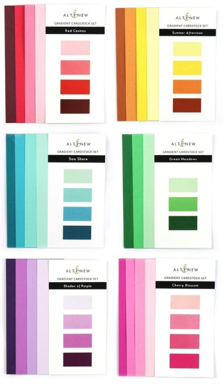 Altenew came out with six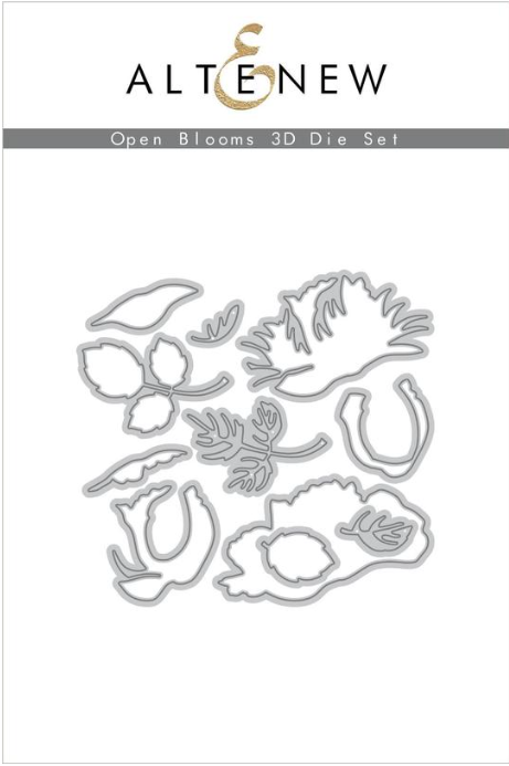
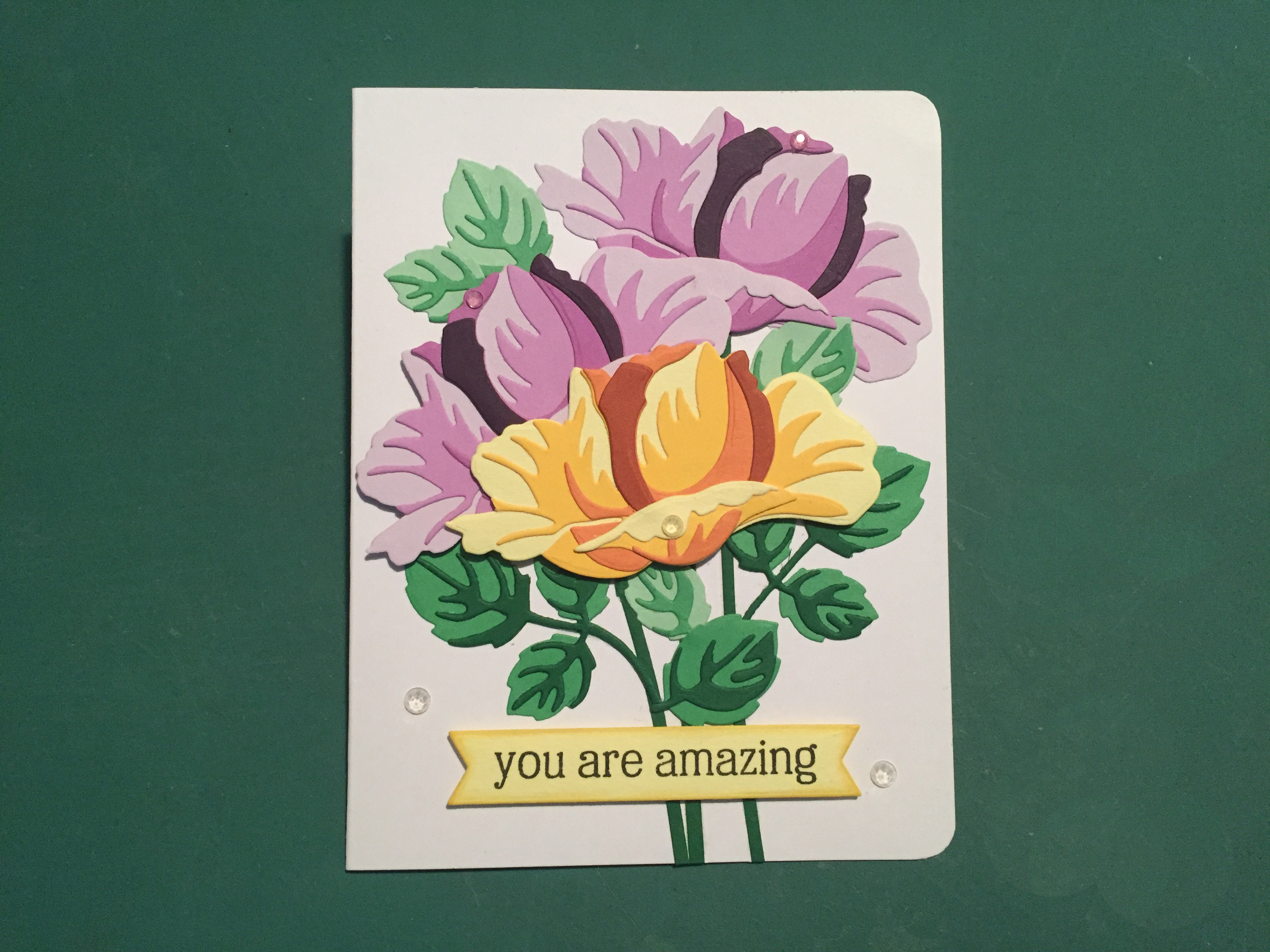 The sentiment is from the Altenew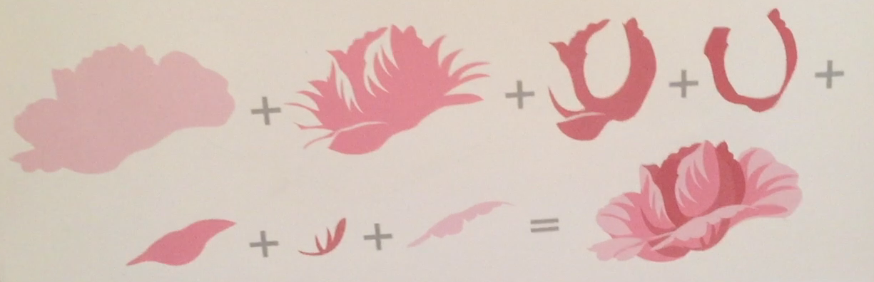
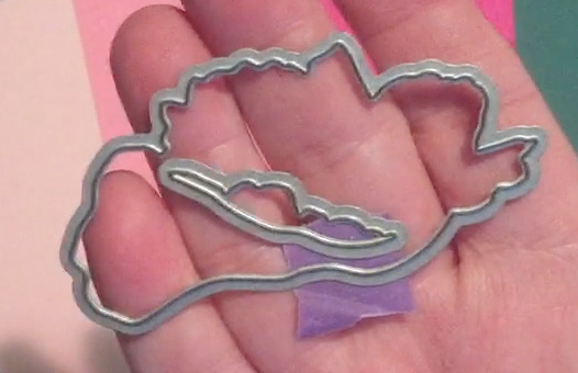 and have the resulting hole covered by the second layer of card stock.
 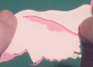 Sure enough, that worked beautifully, and that little trick will help me conserve on cardstock!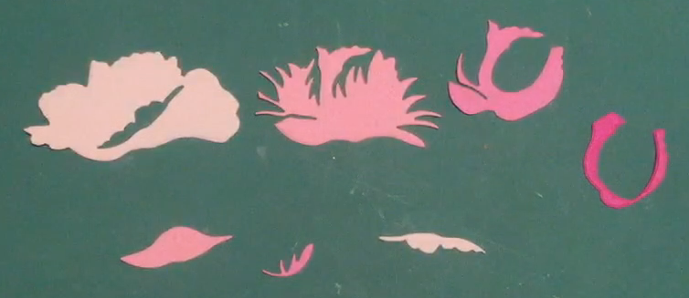
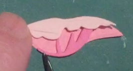
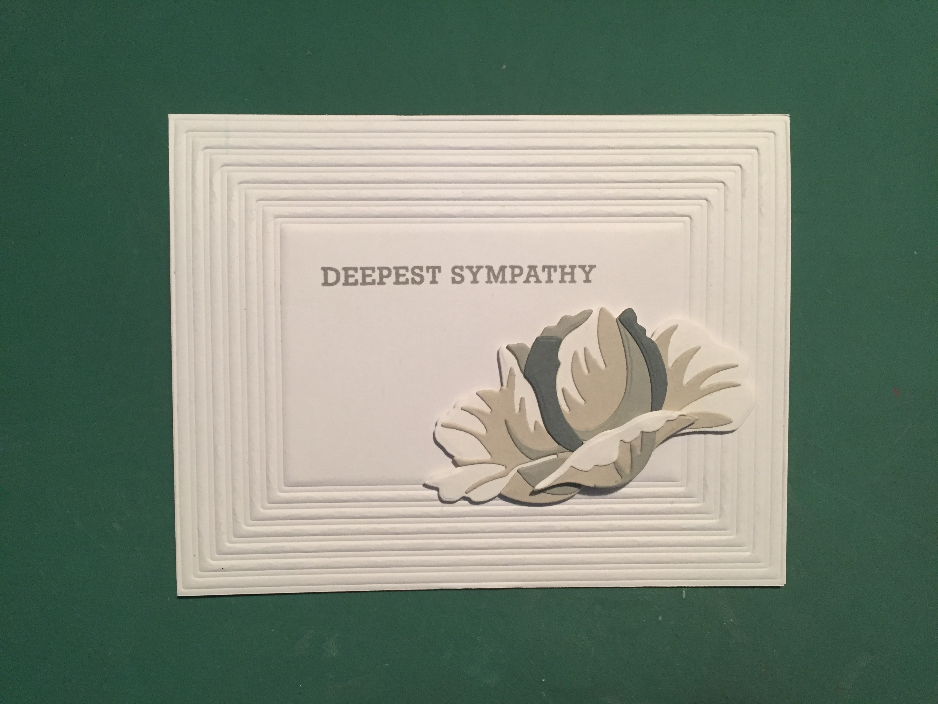
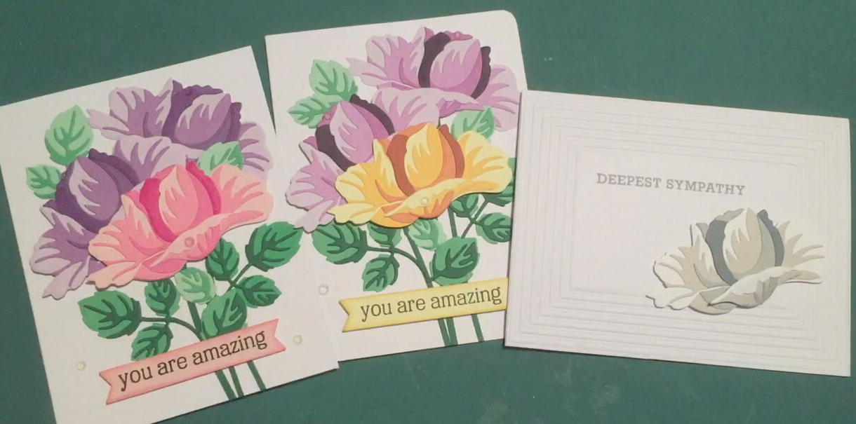
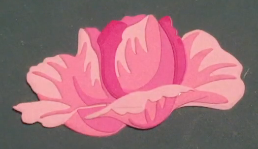 Here’s my completed bloom all glued together. The position of the front petal is also a little ambiguous, but I just had to refer to the illustration for proper placement. I think these blooms are kind of amazing! If your are not in the mood to color, then these Altenew 3D dies can certainly provide some beautifully colored blooms without ever picking up a paintbrush, a marker, an ink pad, or any other medium you might have in your stash!
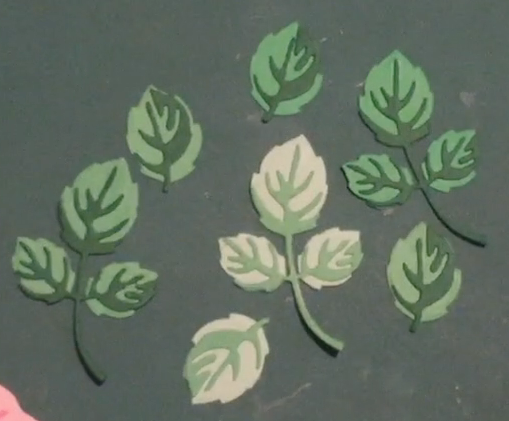 I did some with the medium and darkest Green Meadows card stock and some with the medium and lightest colors as well. For the top right leaves I used some plain green card stock from my stash instead of the medium green from the Green Meadows set. You can see a slight difference, but that works very well and is extremely close color-wise! That should be enough leaves!
 I did come across this pack of Recollections card stock from Michael’s – Purple Passion. That would work terrifically – in fact, it actually gave me an extra color I didn’t need! I went ahead and made two more blooms using this card stock.
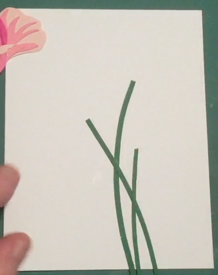 That should provide an “anchor” for my blooms and keep them from feeling unmoored! These strips are a little less than 1/8″ wide, and they certainly don’t have to be all exactly the same. I glued the stems to my card front and (since they are so thin) was able to get a nice curve to the stems as I attached them.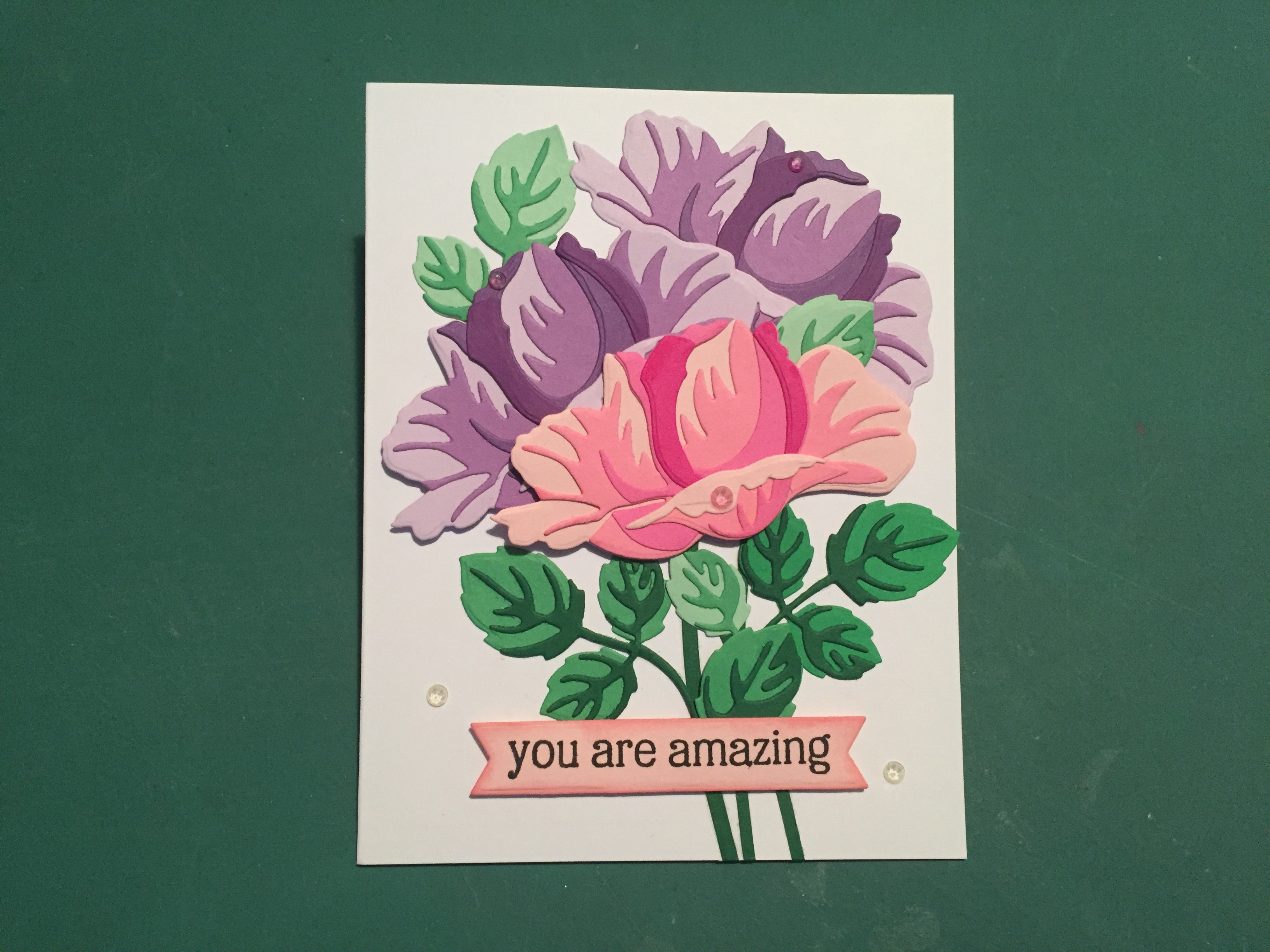
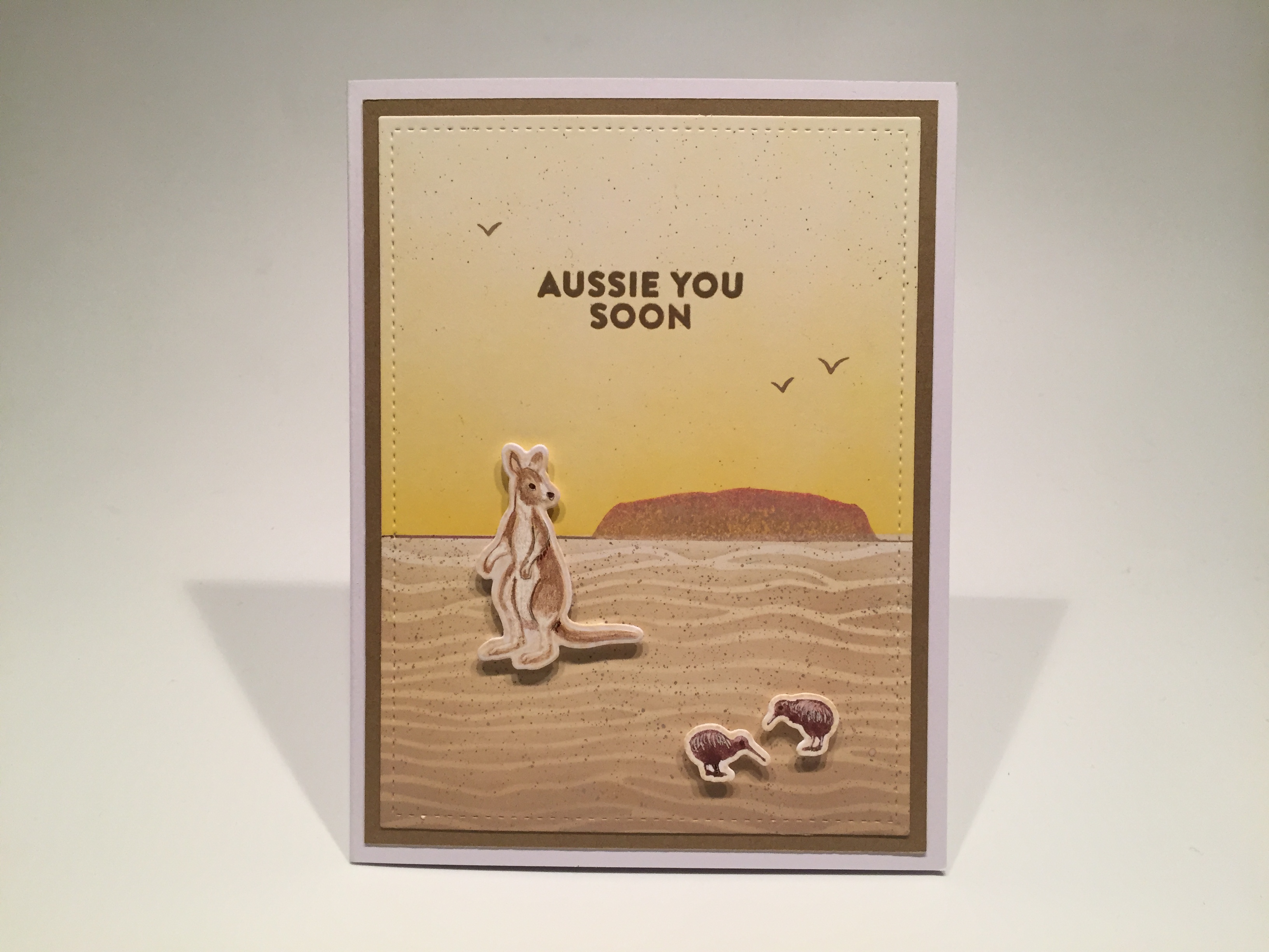
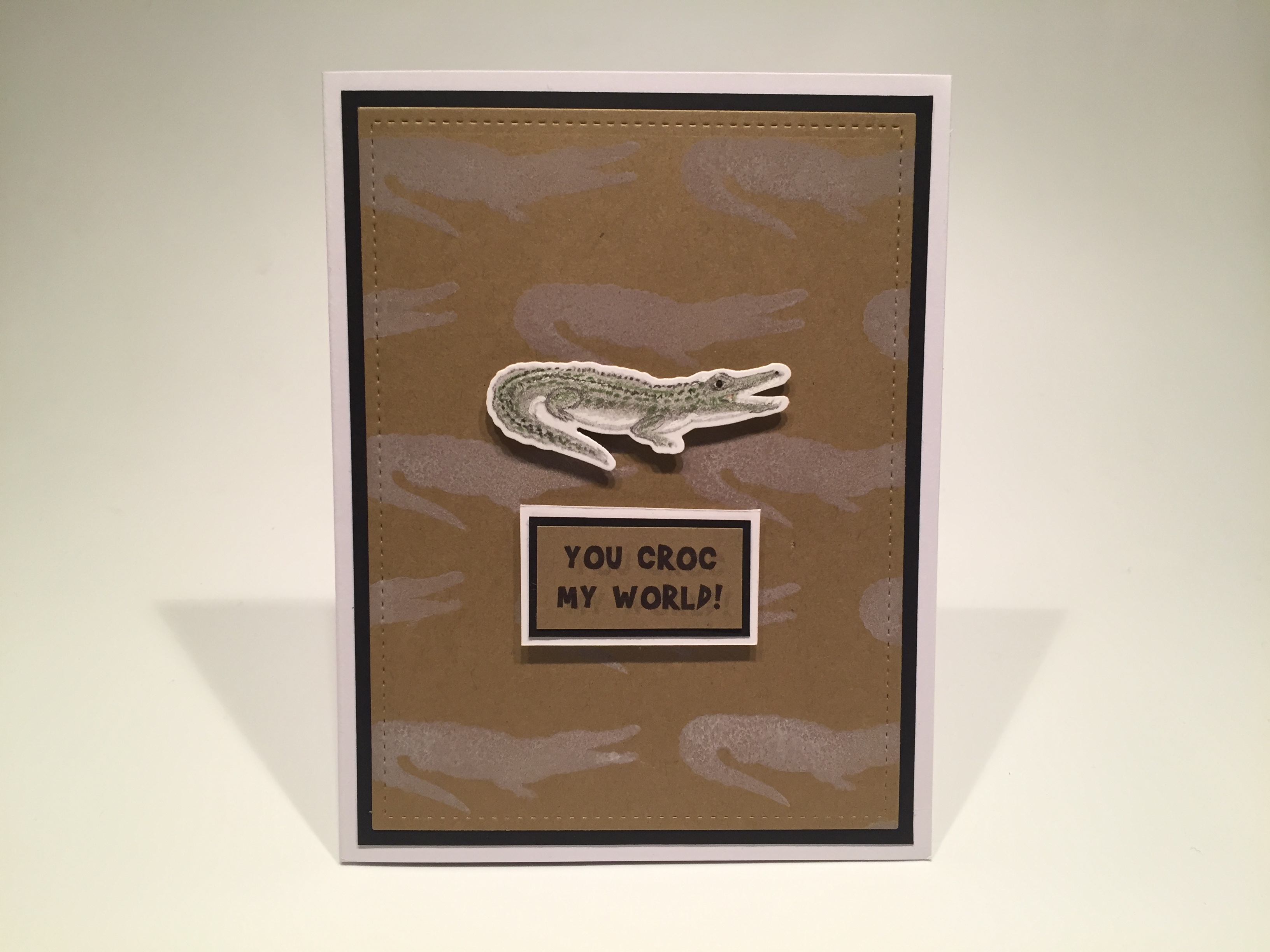
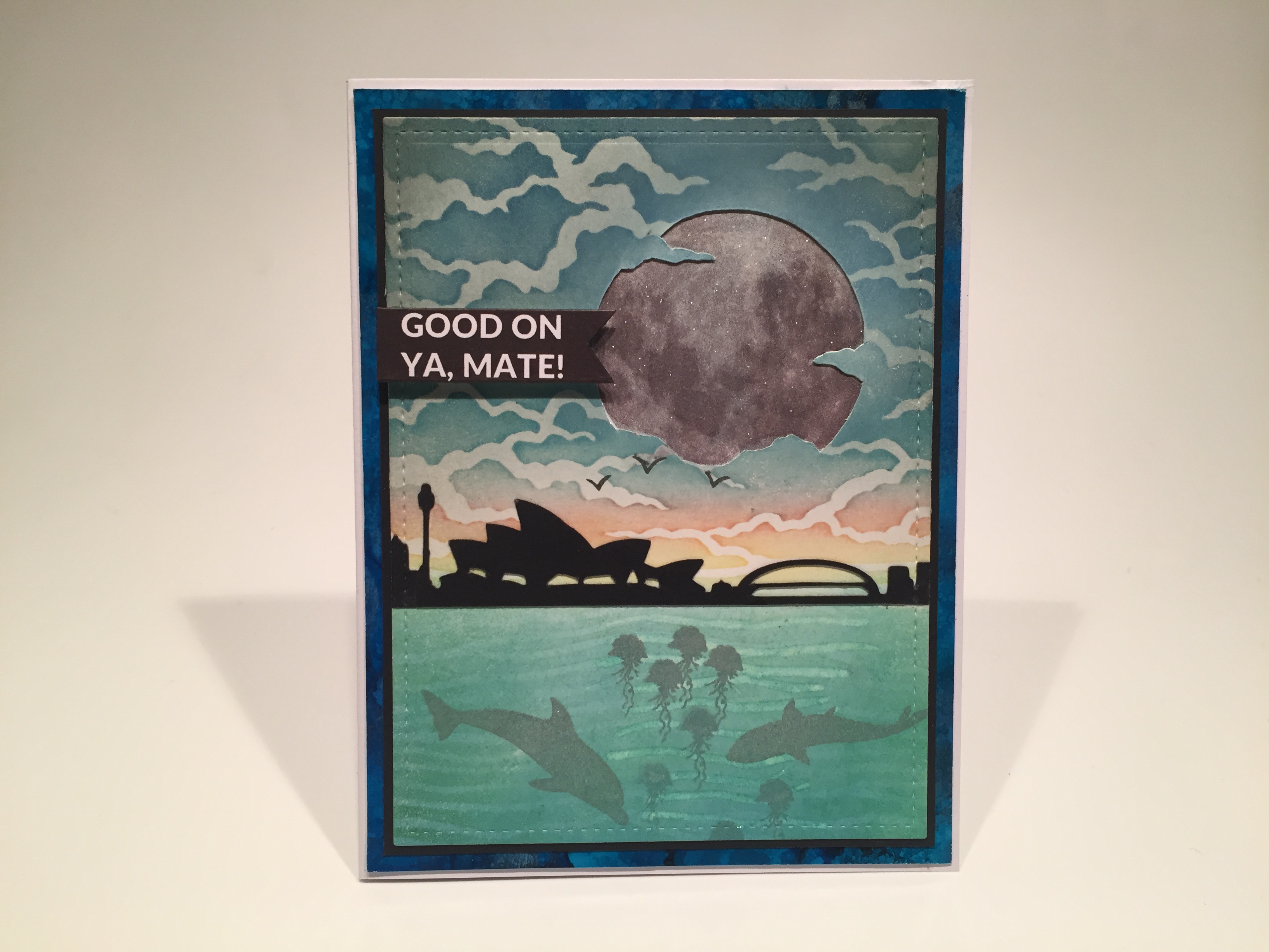
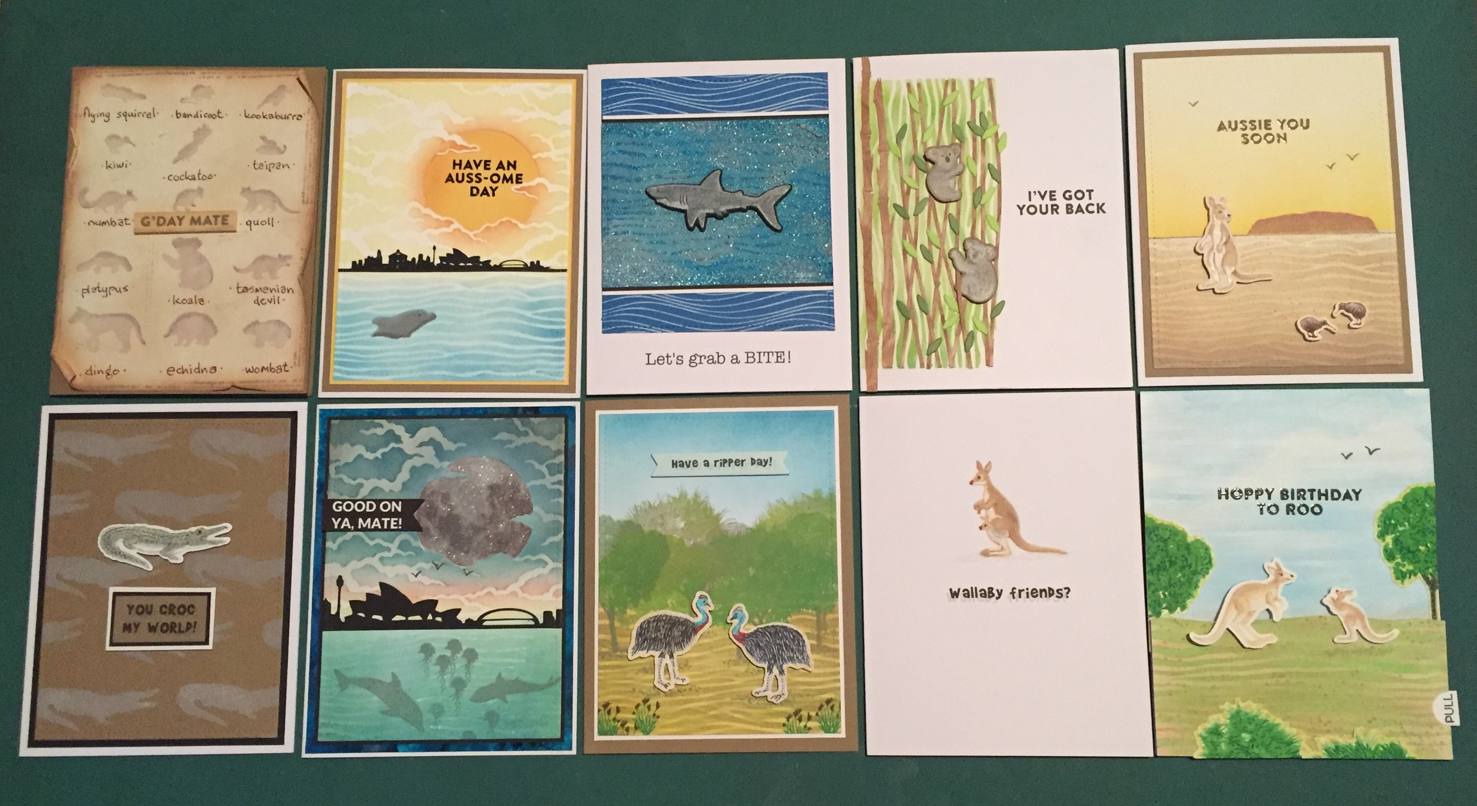
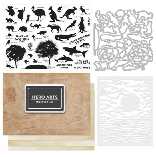 Our 6″ x 8″ stamp set features silhouettes of Australian animals, plants, birds, fish, and even Ayers Rock. Some ‘Aussie’ sentiments (with some good puns!) round out the image stamps, and of course we get 31 coordinating frame cuts to die cut all the stamps. For extras this month, we get this great 5.25″ x 6.5″ background stencil, and full size pad of Intensive Black ink. Finally, we get two 5.5″ x 8.5″ Cherry Wood sheets and 3 adhesive -backed Birch Wood sheets. Quite a collection! I really enjoyed the trip to Venice last April and am looking forward to spending a little time in the Land Down Under!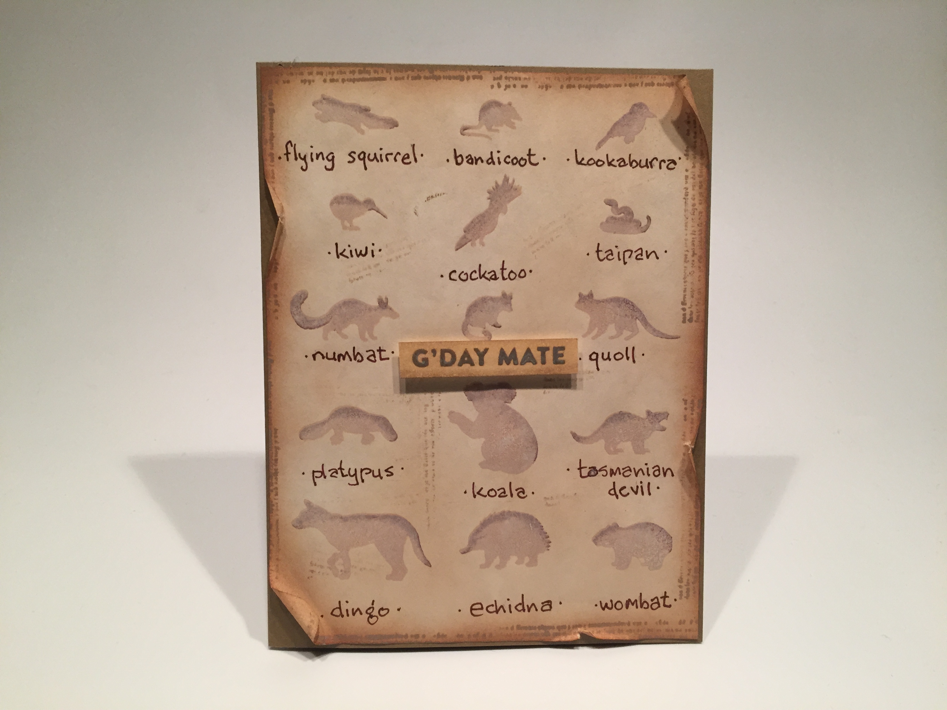
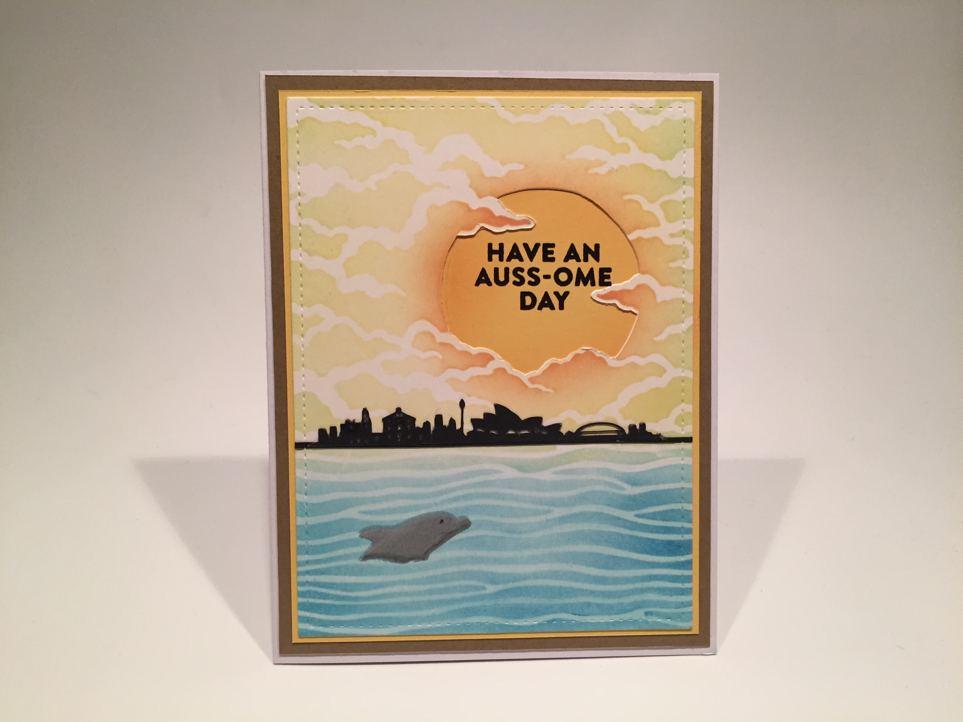
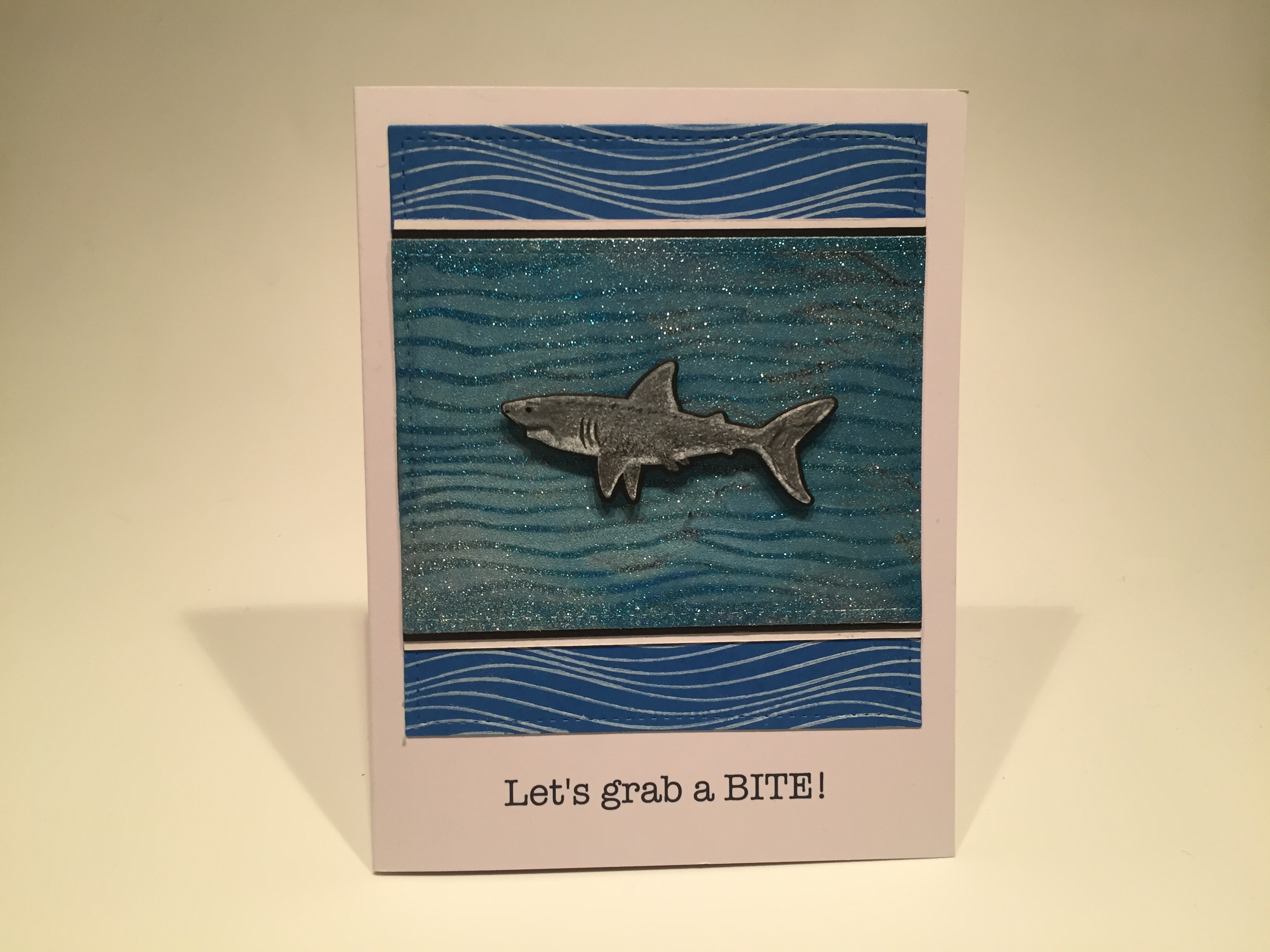
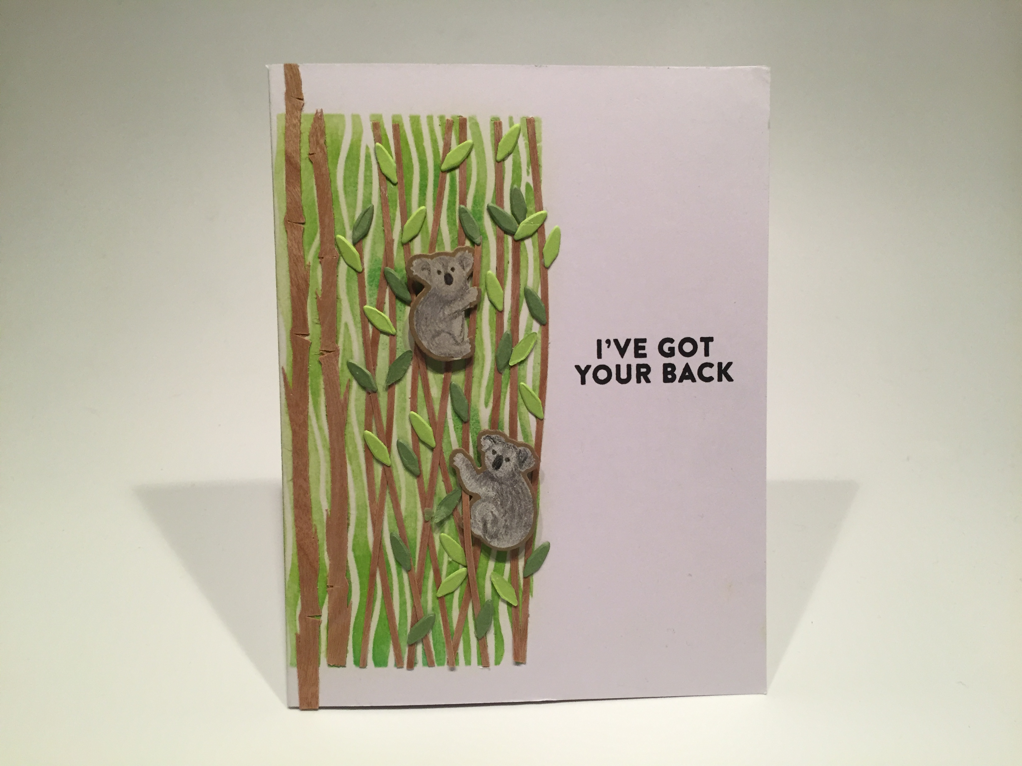
 my Silhouette software and the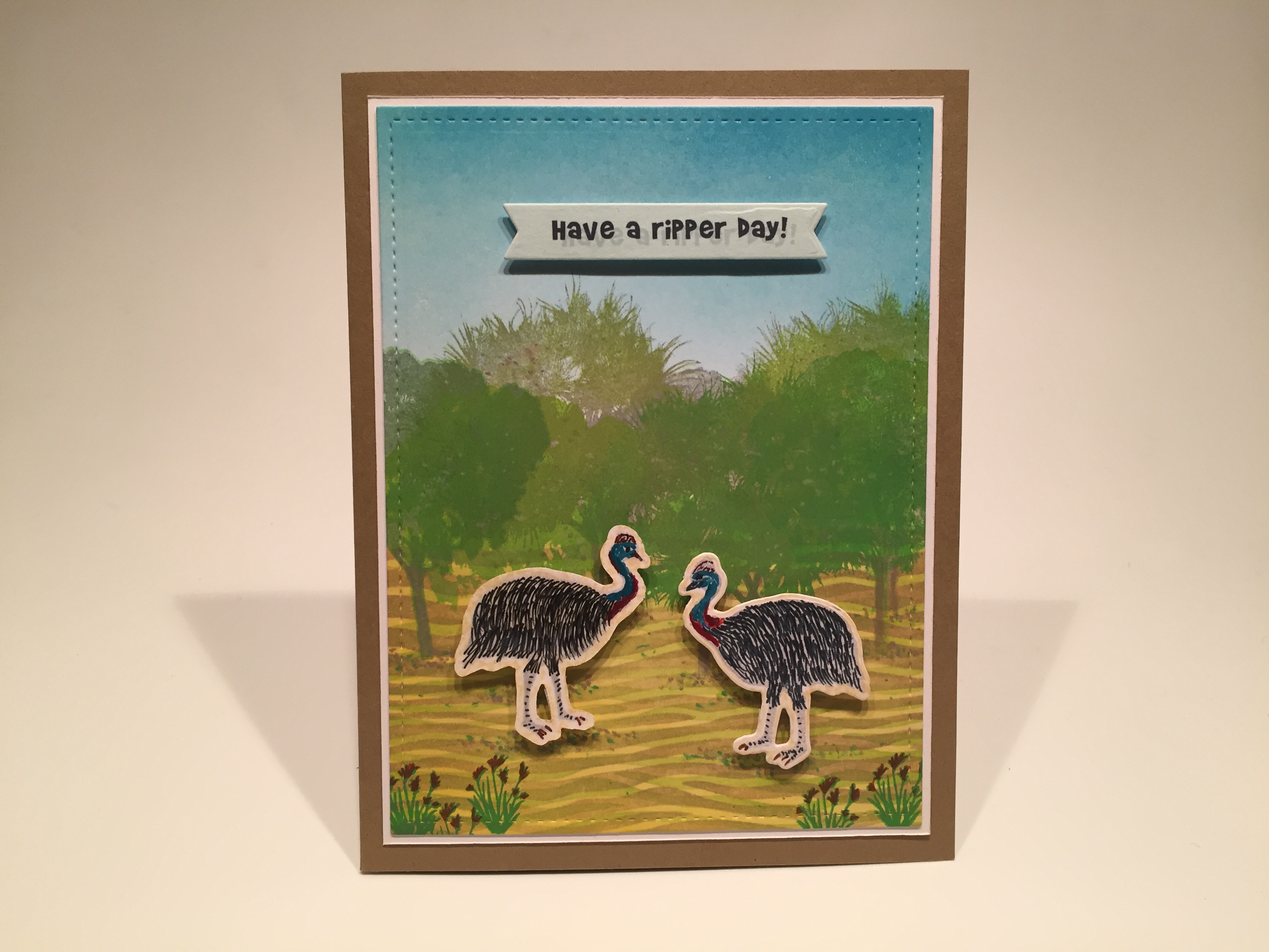
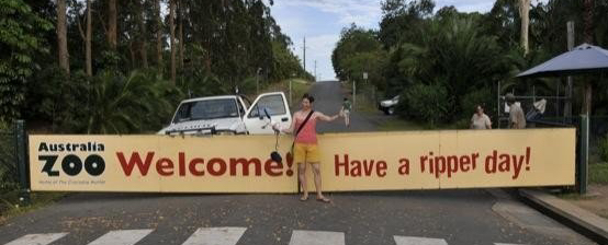 Looks like this is the entrance gate to the Australia Zoo! “Have a ripper day!” becomes a bit of a pun paired with these extremely large and dangerous birds – cassowaries have three claws and their center claw is like a dagger around 5″ long – sounds like a ‘ripper’ to me!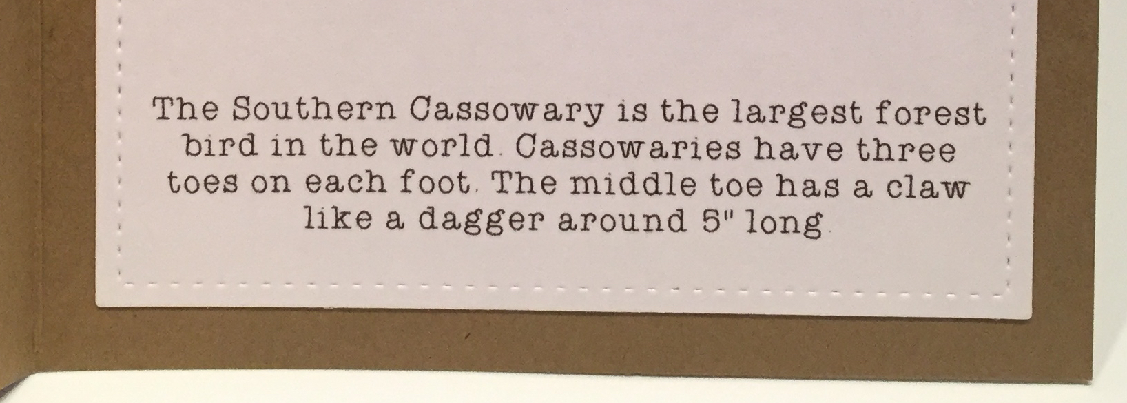
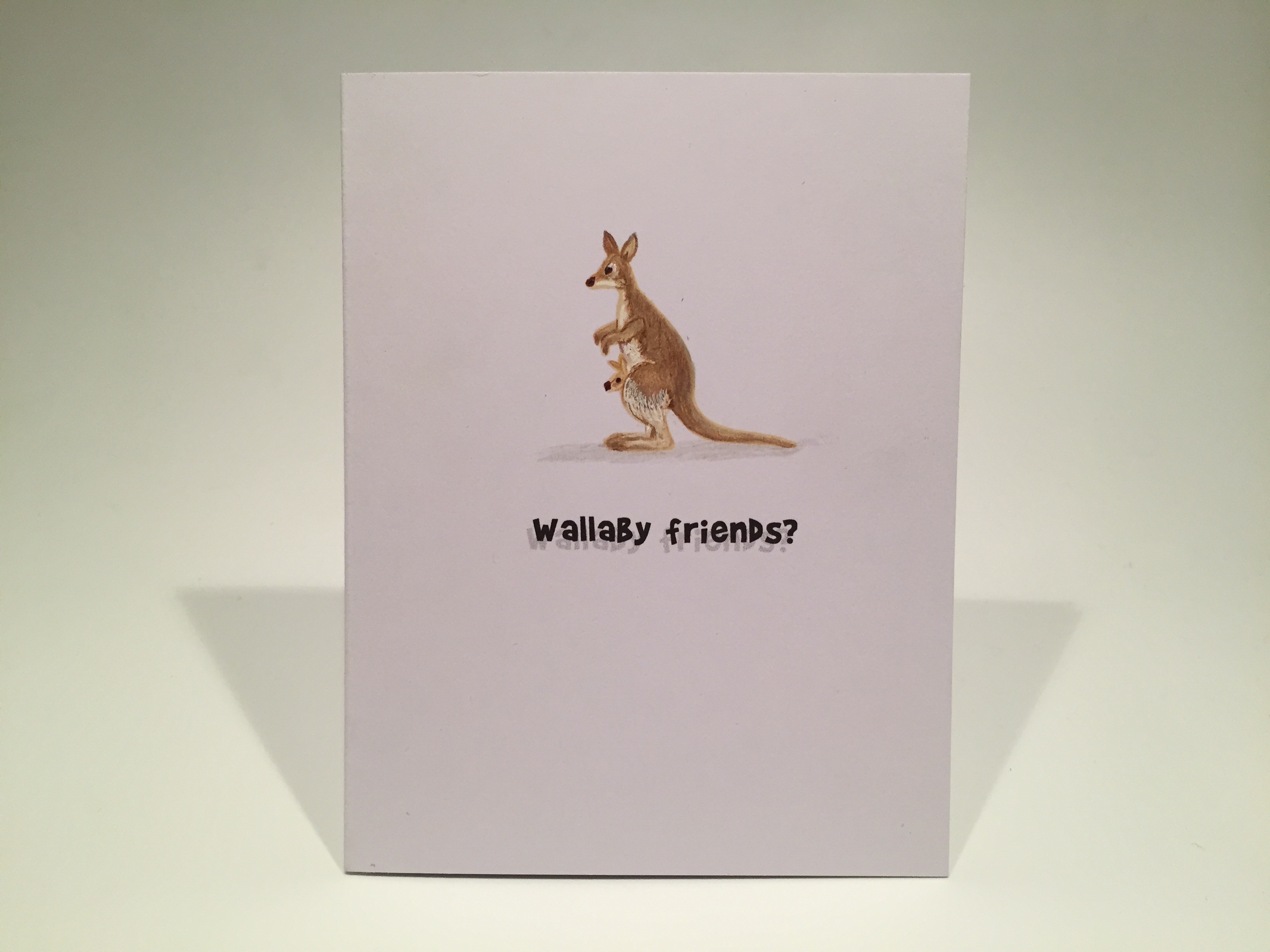

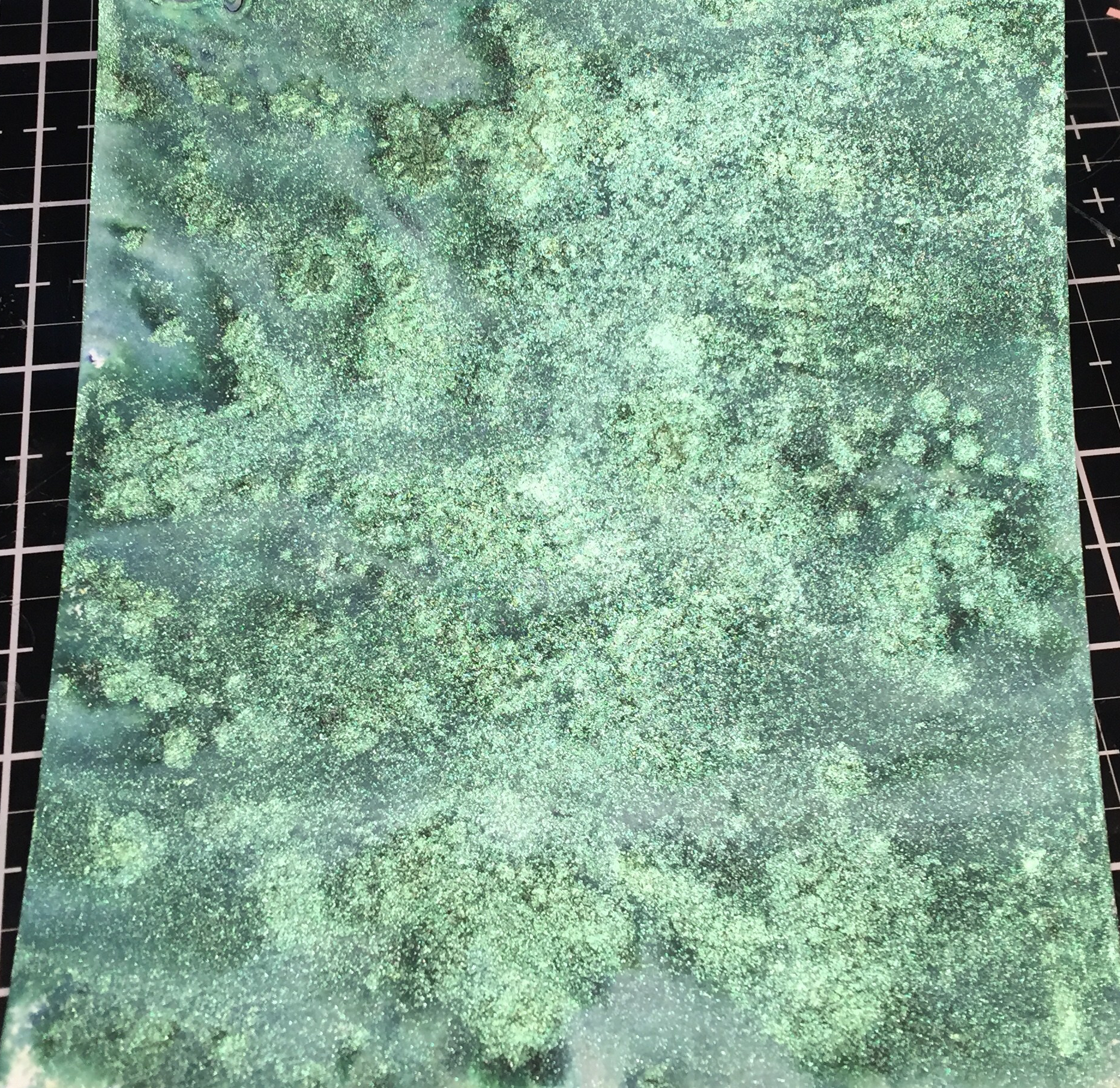 Last month, our Sunray Crossette Nuvo Shimmer Powder was really fun to play with, and I wanted to check out the Green Parade Shimmer Powder included in this kit. I spritzed a sheet of watercolor paper with water, then sprinkled the powder onto the wet paper. Lots of dark tones in this green – I swear this almost looks like the surface of some distant moon…! I wasn’t quite sure what to do with this panel, so I let it dry and turned my attention to the Specialty Paper in this kit. We got two sheets of handmade paper with actual flower petals embedded in the paper fibers. I was at a loss on how to use this paper in a card until I realized that handmade paper should be able to take some painting… it’s just thin watercolor paper, right?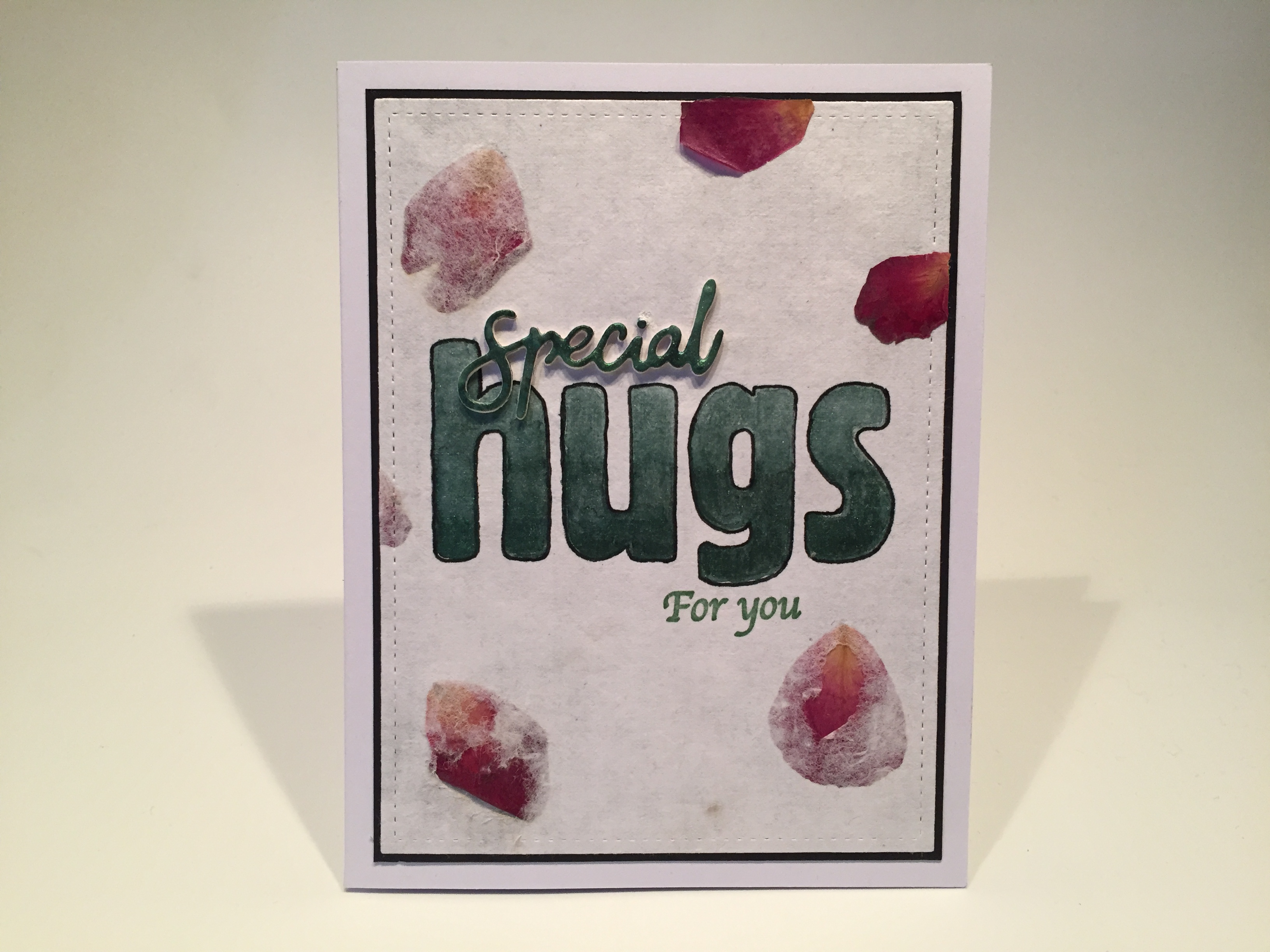
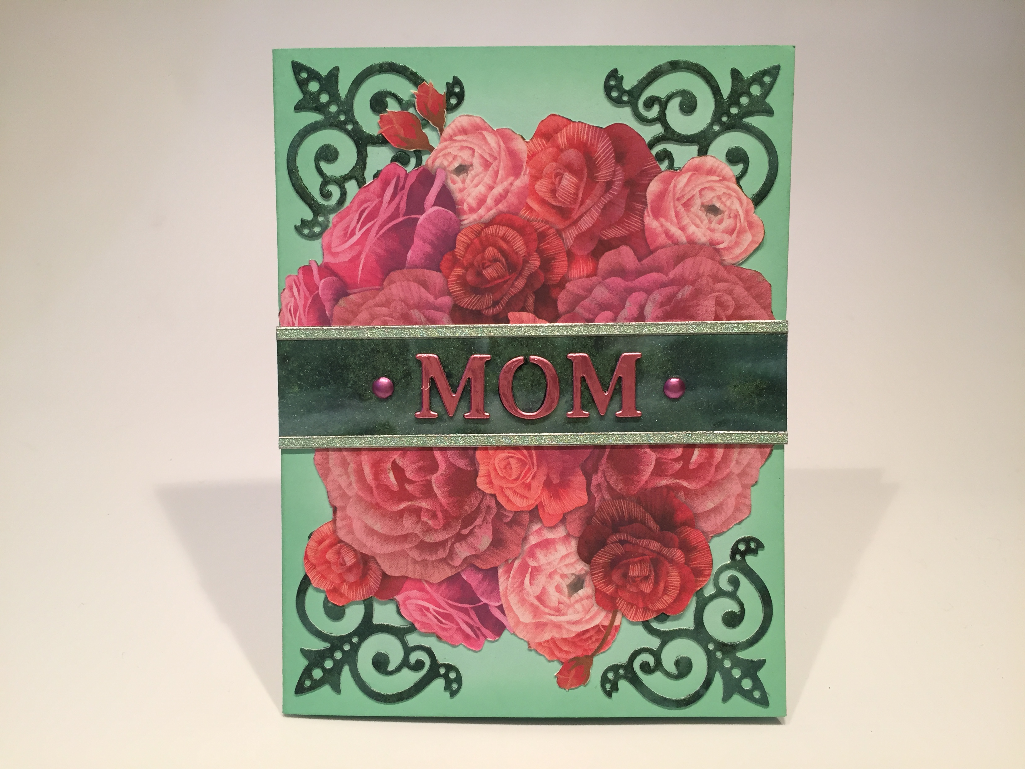
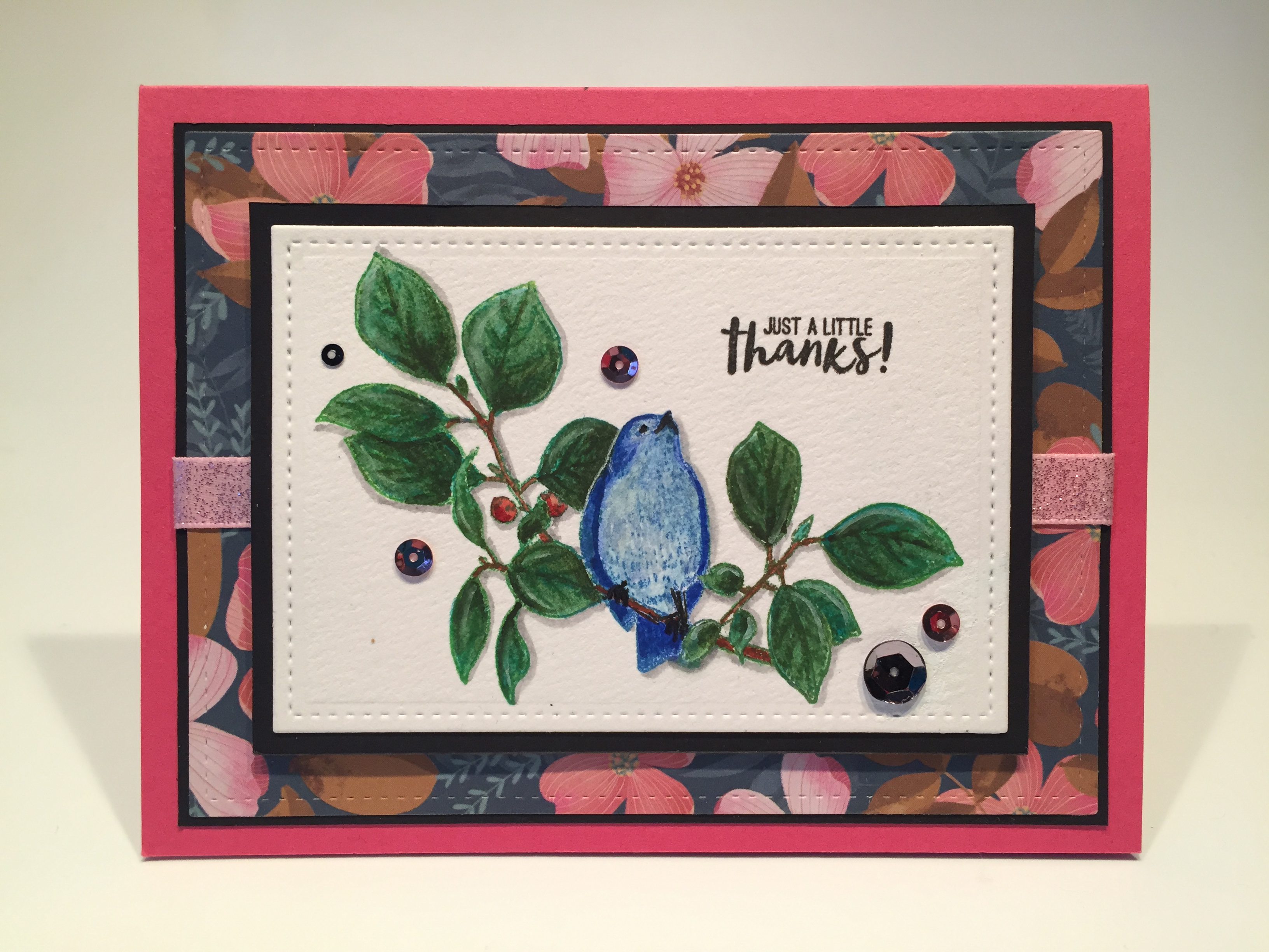
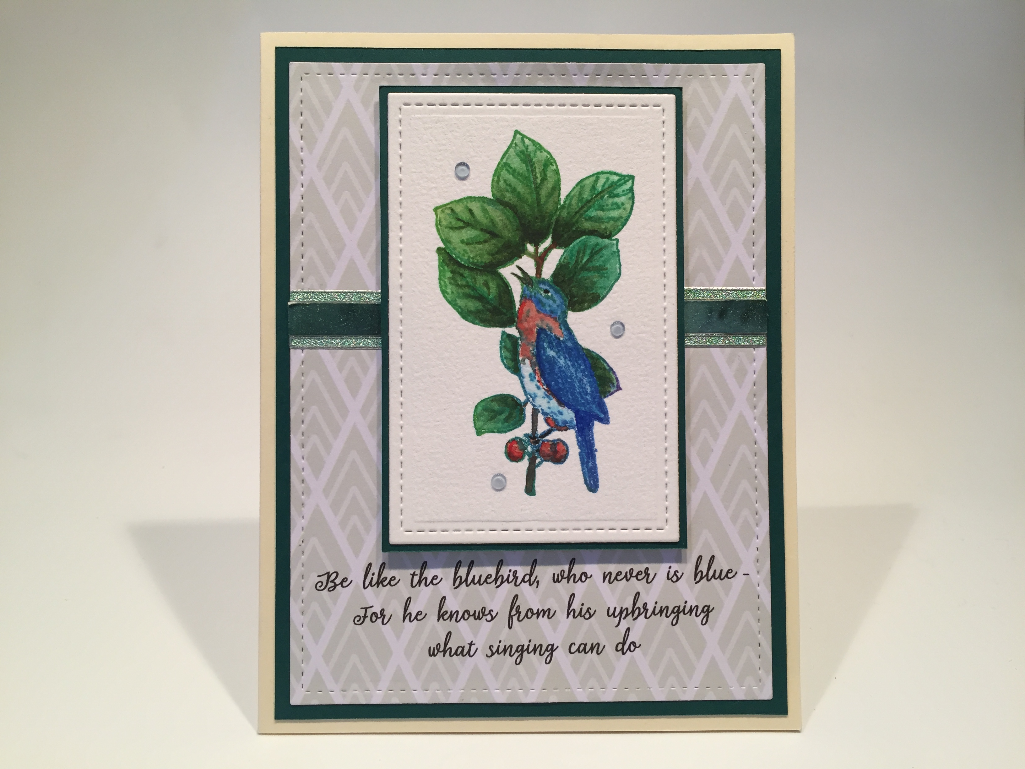
 and I do credit him on the inside writing surface. The background is mounted to a thicker dark green mat and glued to the Cream card base. I added a strip of my shimmer painting and two straight peel offs to go behind the artwork, and attached the front panel using foam tape. A few Blue Babe Nuvo Crystal Drops (LFL Feb. 2020 Kit) adds a dash more blue to this sweet encouragement card. I’m loving this card a lot… I’m getting a little more adept at that no-line watercoloring and maybe I’m pleased simply because there’s no pink!
 I stamped this on my last White card base from the kit, and colored all with my
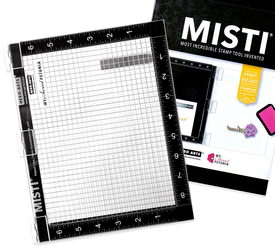 and came out with a line of black and white MISTI’s. I have had my Mini MISTI (in the original PINK) for a few years, and am thrilled to now have the
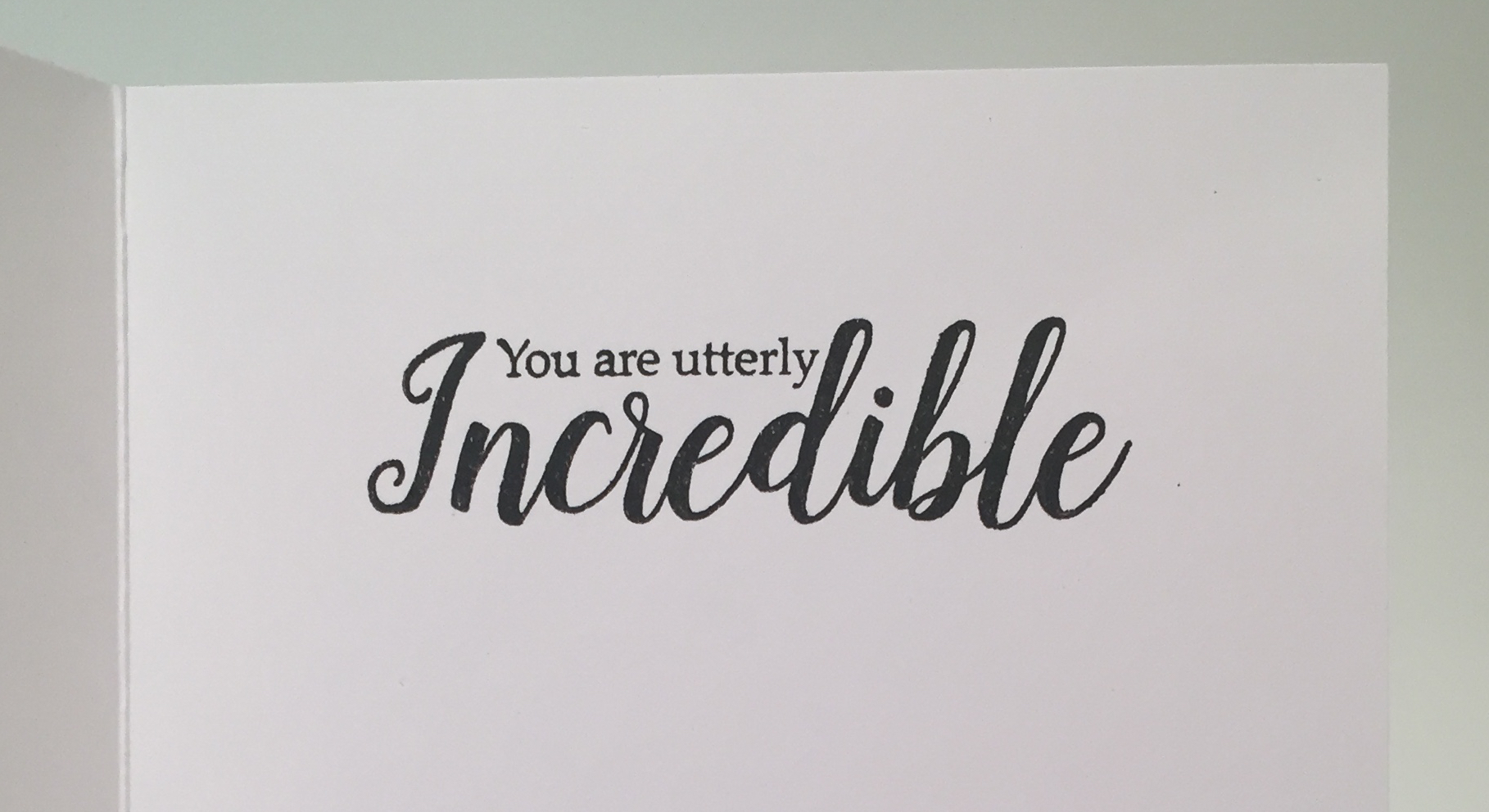 I was thinking about this sentiment to use on this card, and stamped that on the inside using
 I grabbed some
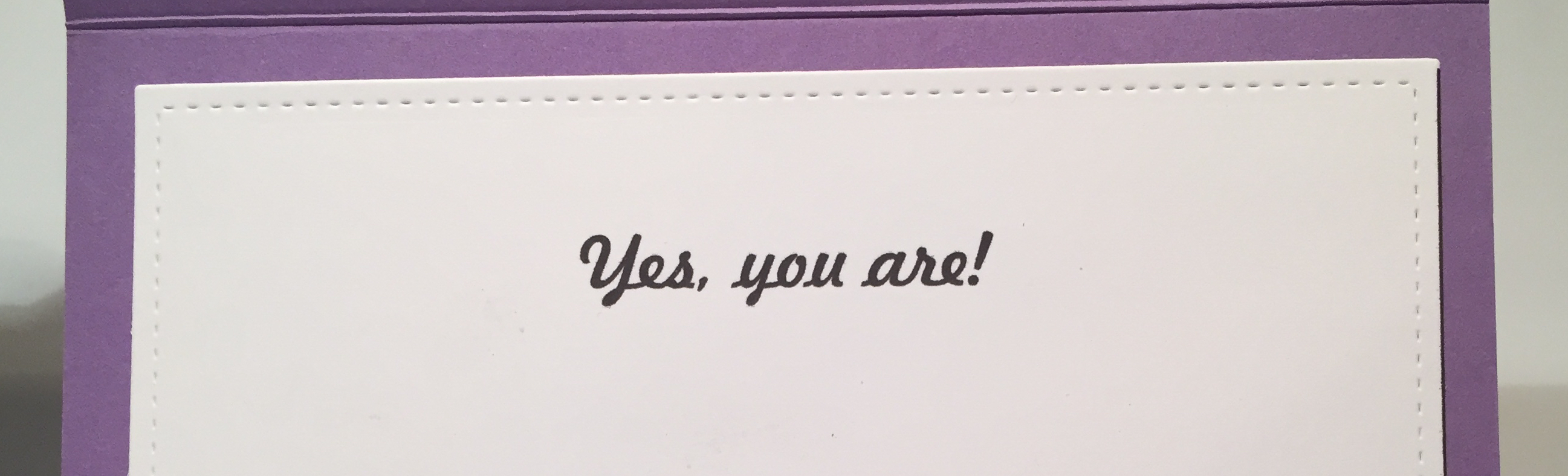 I did experiment with adding a “you are” to this sentiment. The LFL 4/18 kit has a “You” and an “are” stamps… fairly large, and the LFL 12/17 kit has a “you are” that is smaller. I decided to go to the inside and added “Yes, you are!” on the inside writing surface – printing that using my
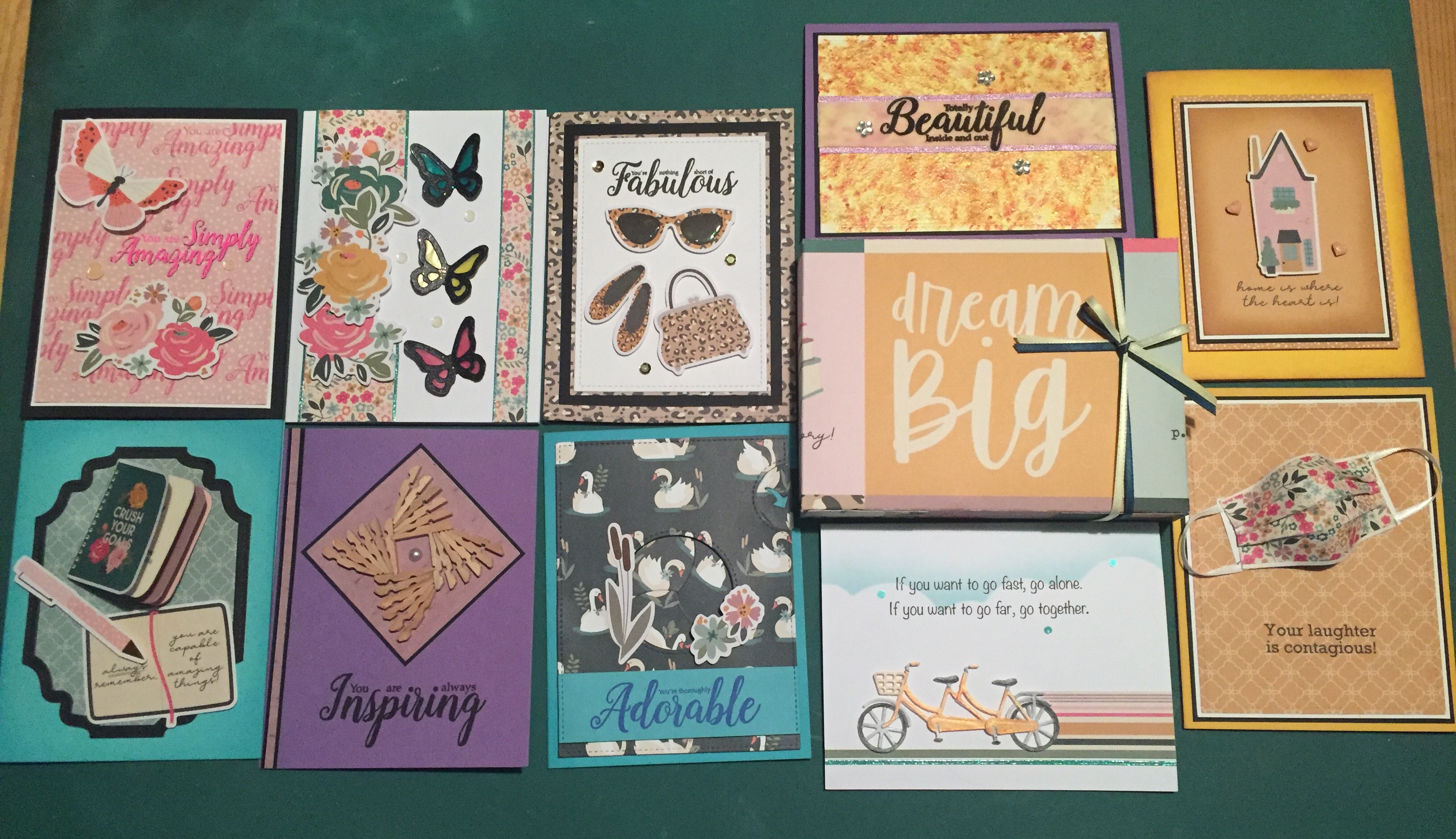
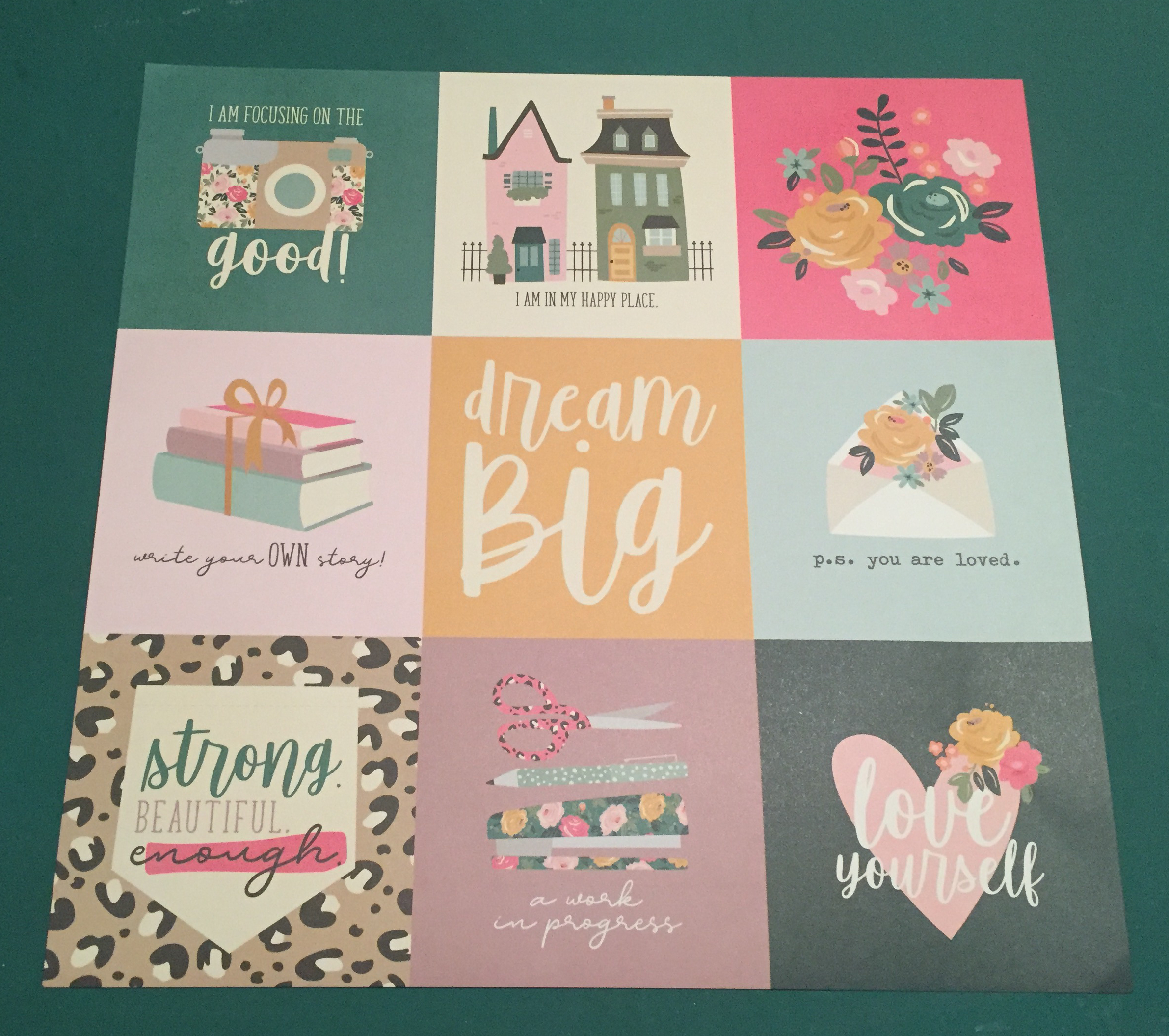
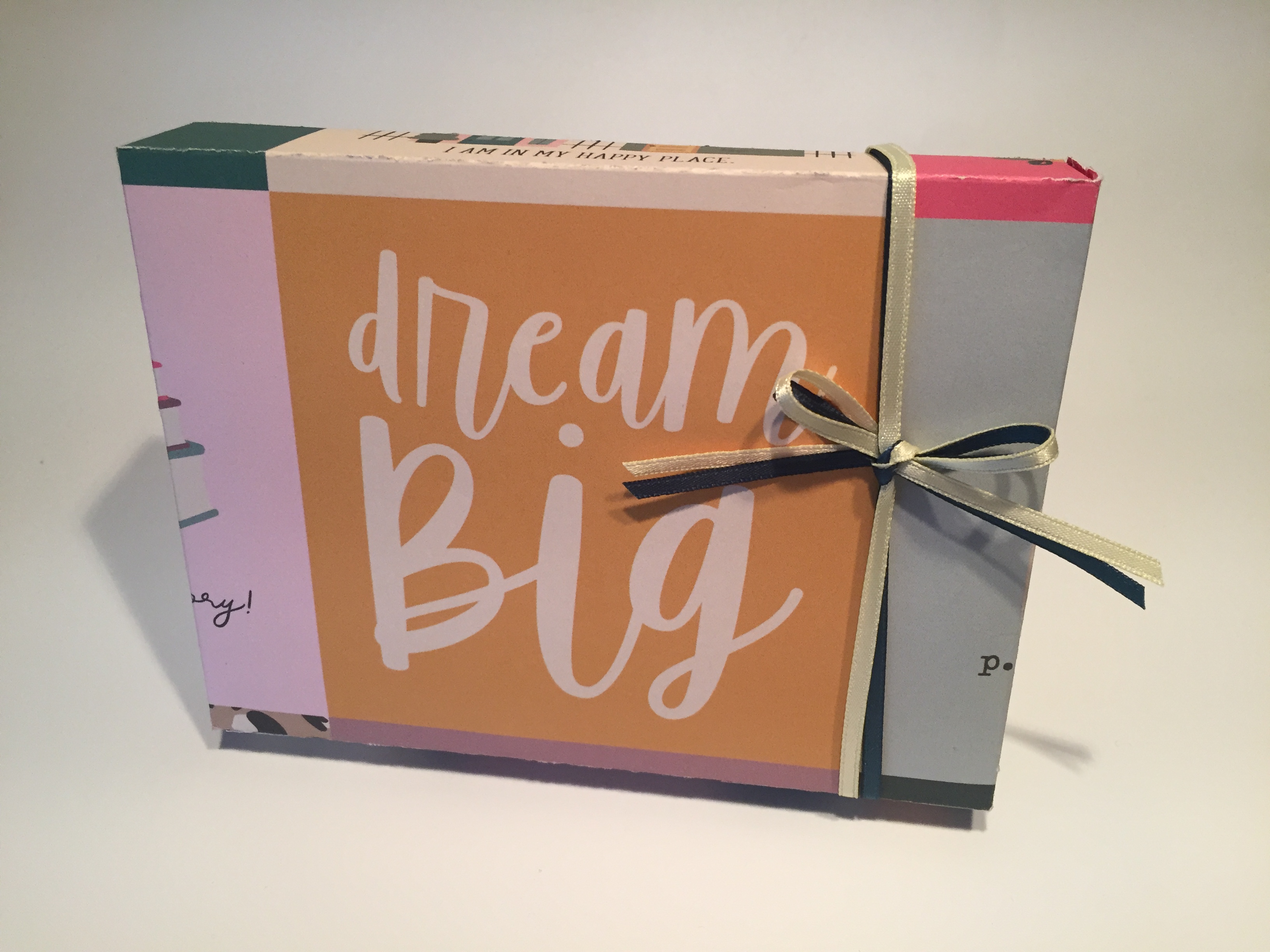 I thought about creating a belly-band to hold this set together but decided to make an actual box using the 12″ x 12″ cut-apart sheet with the 4″ x 4″ panels. Most box-making patterns are basically an envelope with added depth. I wanted this box to feature the “dream big” sentiment on the front so I placed the 12″ x 12″ sheet right side up on my score board and scored at 2″, 3″, 9″, and 10″. Then, rotating the paper 90 degrees to the right, I scored at 2.75″, 3.75″, 8.25″, and 9.25″.
 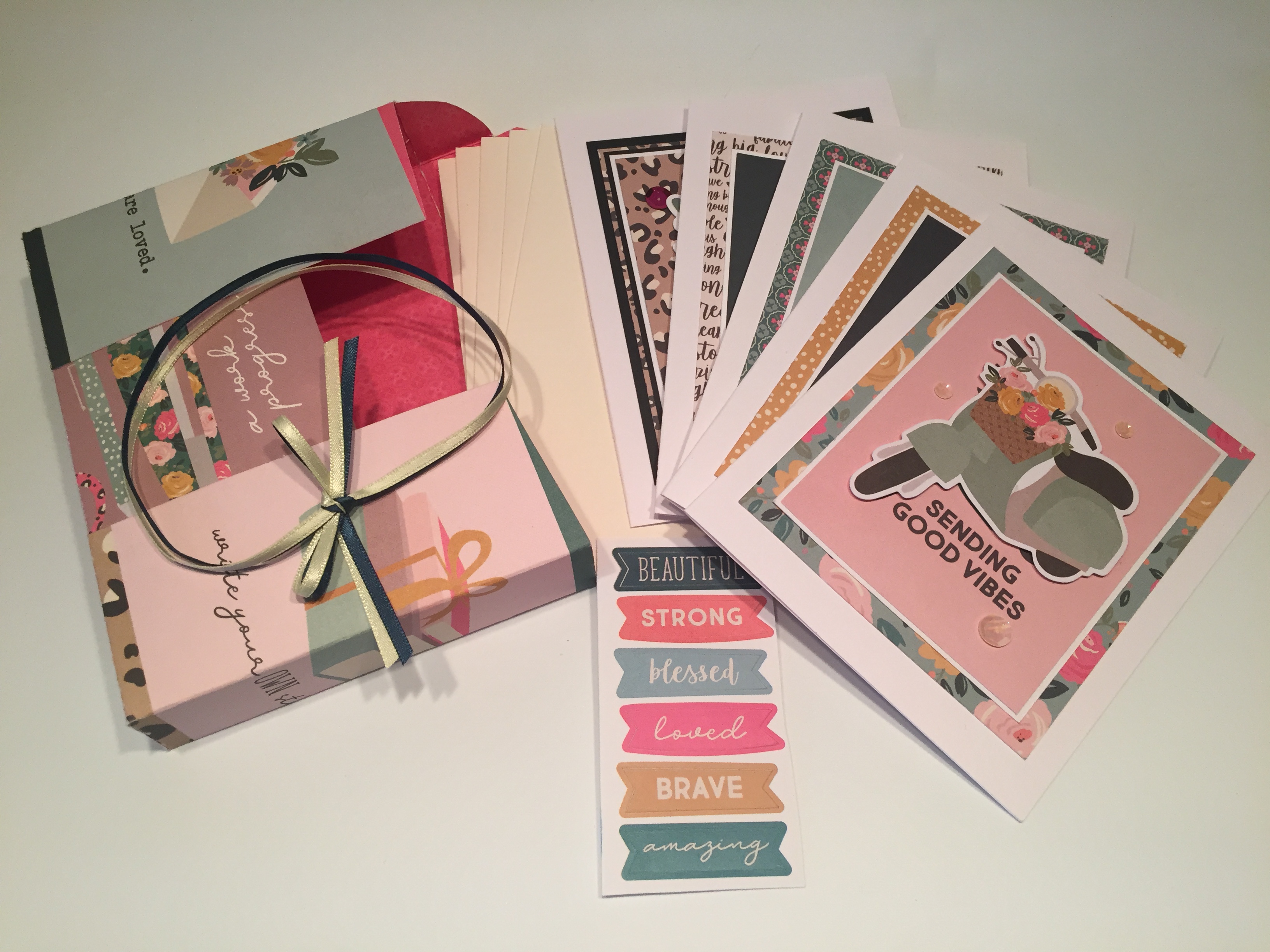 Then it’s a fairly simple matter of cutting away the bits you don’t need, folding and gluing your box together. I added five ivory envelopes and the strip of banner stickers to finish out this set and tied the box shut with some of the yellow and teal ribbon included in the kit. I really love this little package with cards and envelopes and stickers! I think this will make a great gift anytime!
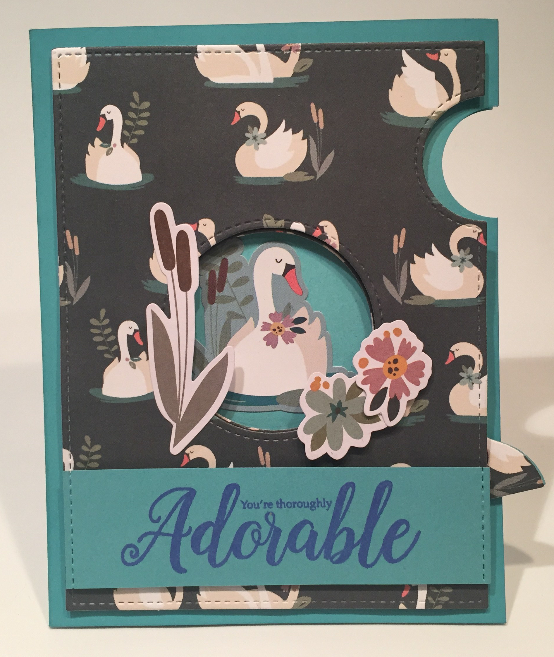 I die-cut the iris dies from the swan pattern paper for the viewable portions, and black card stock for the inner workings. I tried to die-cut the moving iris pieces (they call them the sausages) so the swans would go in the same direction as the pattern paper, but I didn’t take into account where the pull tab was, so, though the swans on the iris are all in the same orientation, that doesn’t match the orientation on the full panel. I’ll have to keep experimenting with that!!
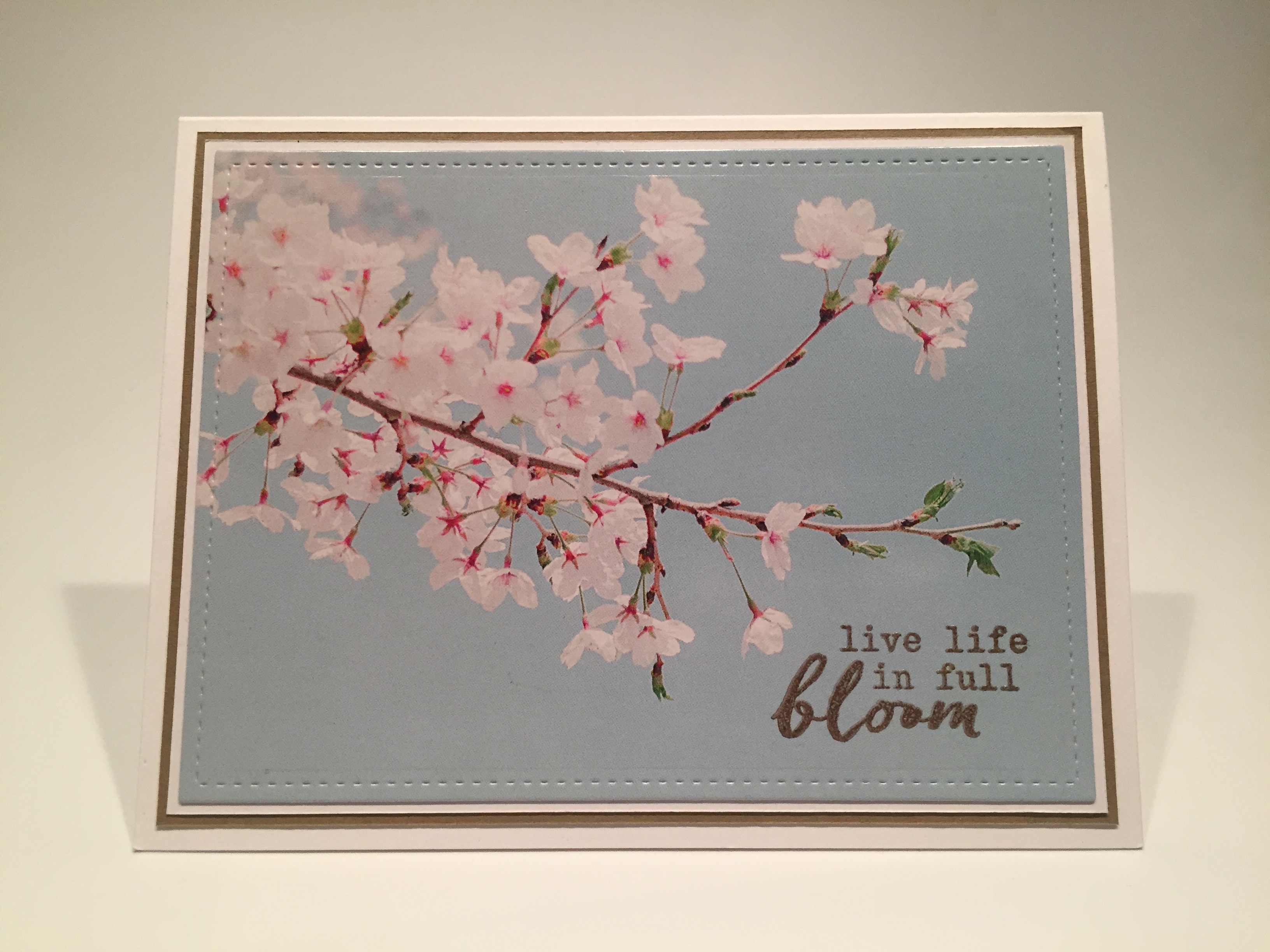
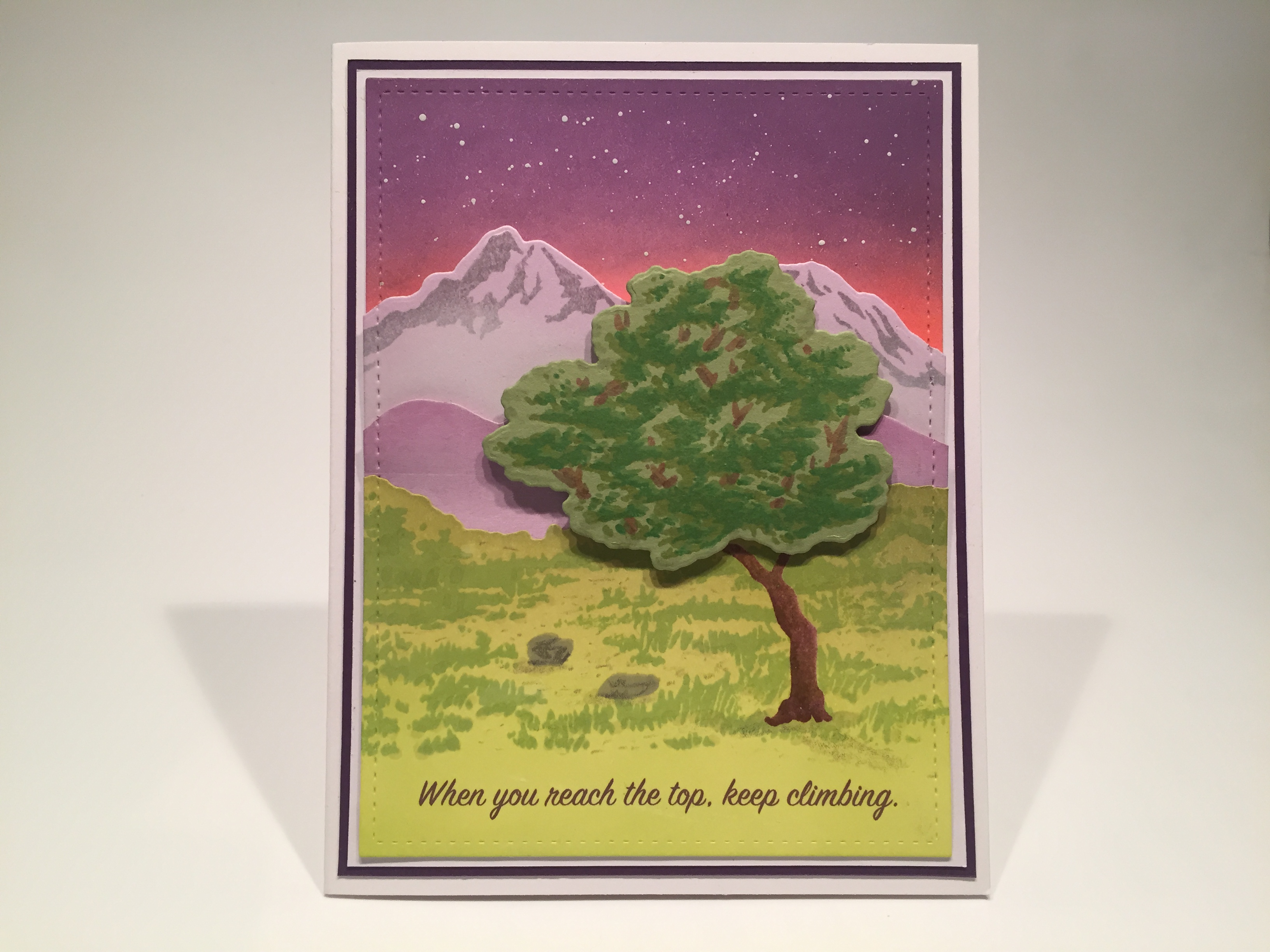
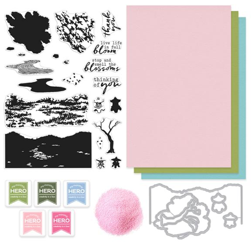 This kit is a (sorely needed) bright splash of a cherry-blossom spring with Japan as the inspiration for this new HeroScapes 6″ x 8″ stamp set. Three layering stamps – grass, a tree and a zen sand garden are the highlights of this stamp set with four smaller layering stamps including a couple of stone lanterns and a pair of rocks. Four sentiments and some floating blossoms finish out our stamp set which is then complimented with five frame cut dies, and five Hero Arts ink cubes in Green Hills, Field Greens, Dusty Blue, Cotton Candy, and Rose Madder. I always LOVE getting inks with out MMH kits! We also get six sheets of 8.5″ x 5.5″ Hero Hues card stock – two each in Peony, Kiwi, and Mist, and a half-ounce oz. pot of Pink Puff embossing powder. Looks like we’re channeling the Far East with our kit this month!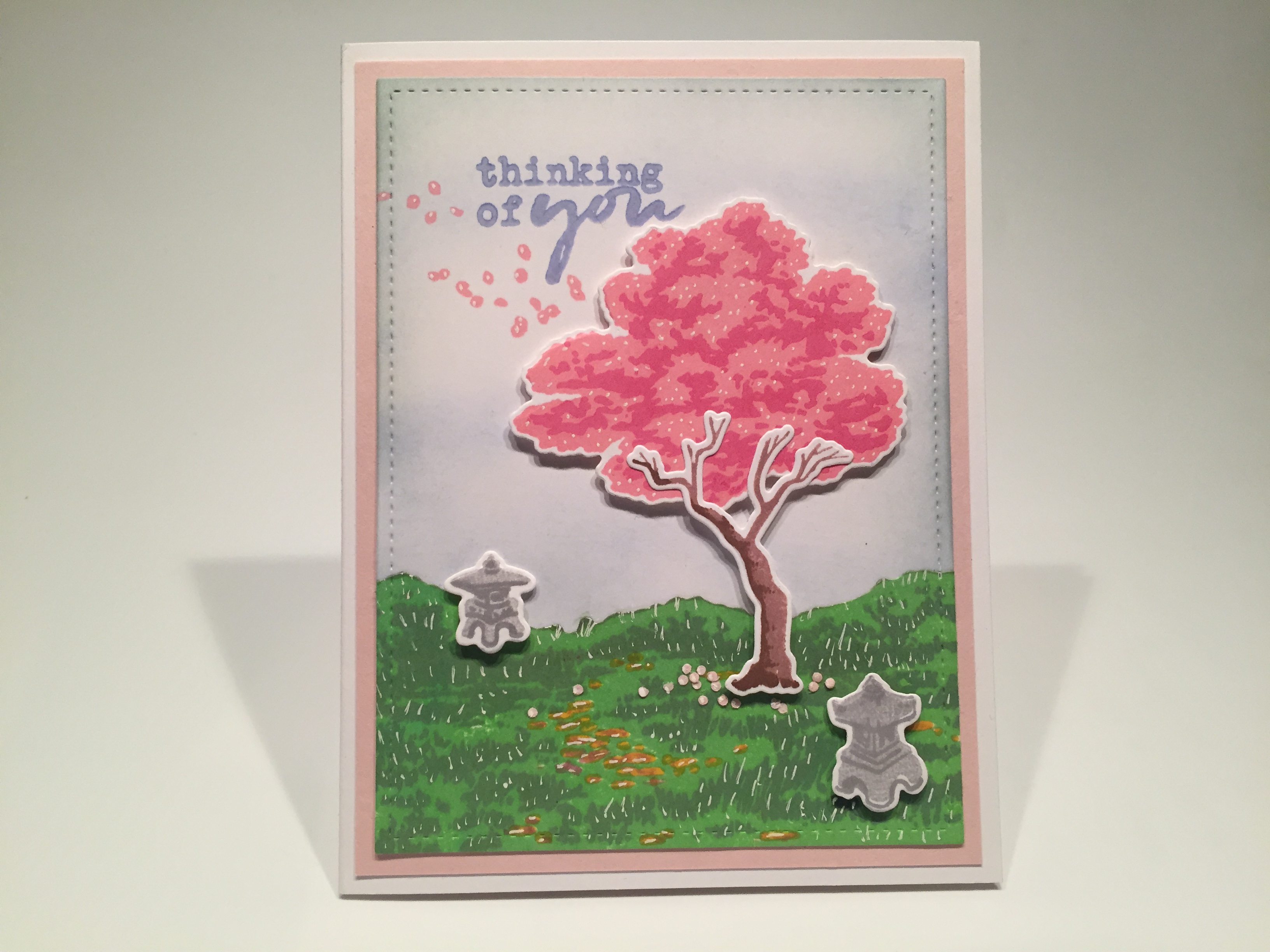
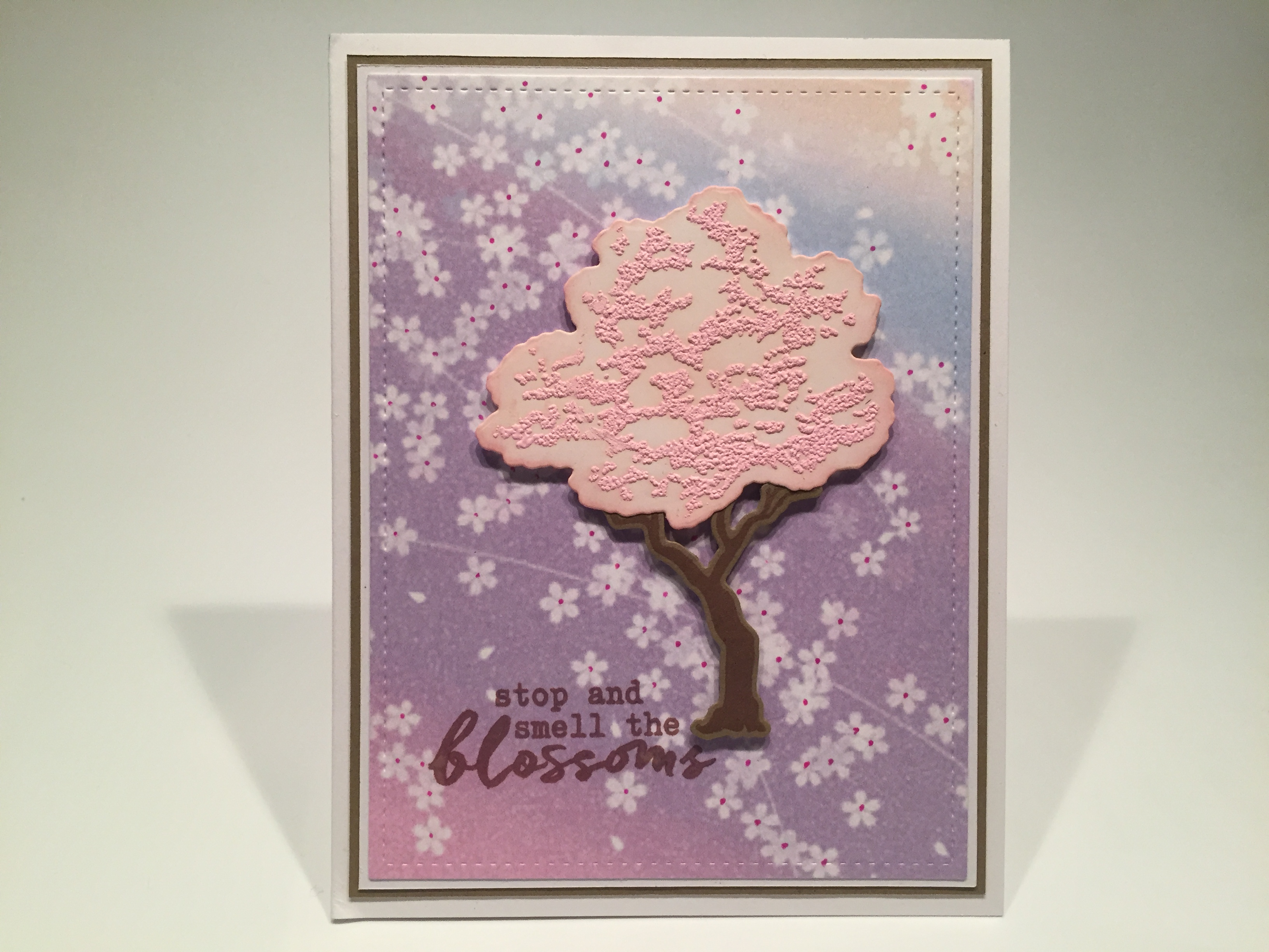
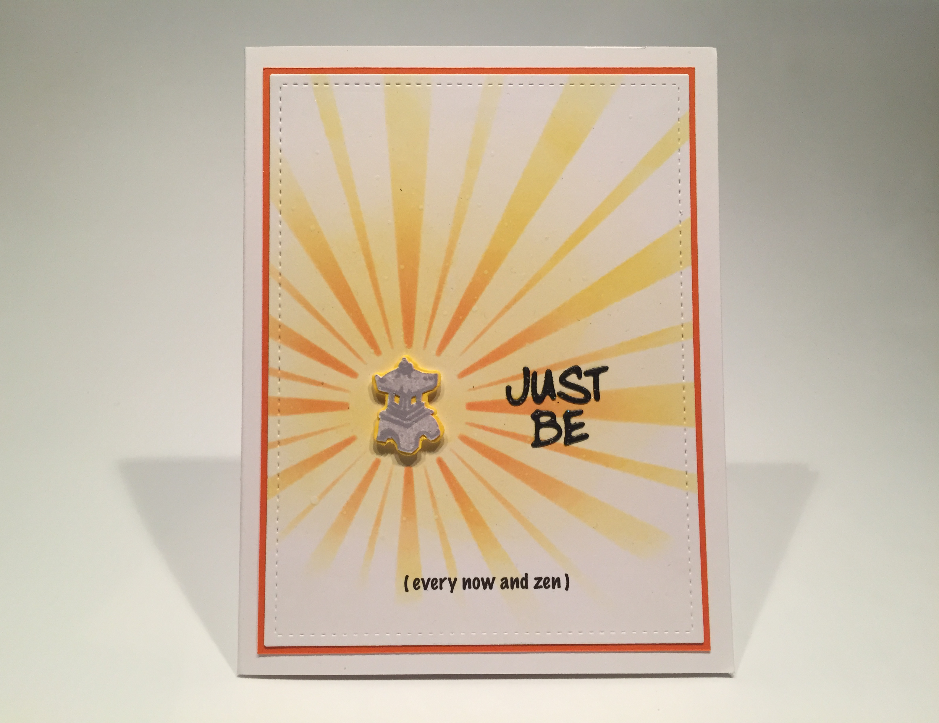
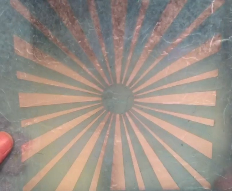 I used my homemade sunburst stencil to do this background, inking blending with HA Lemon Drop, Creamsicle, and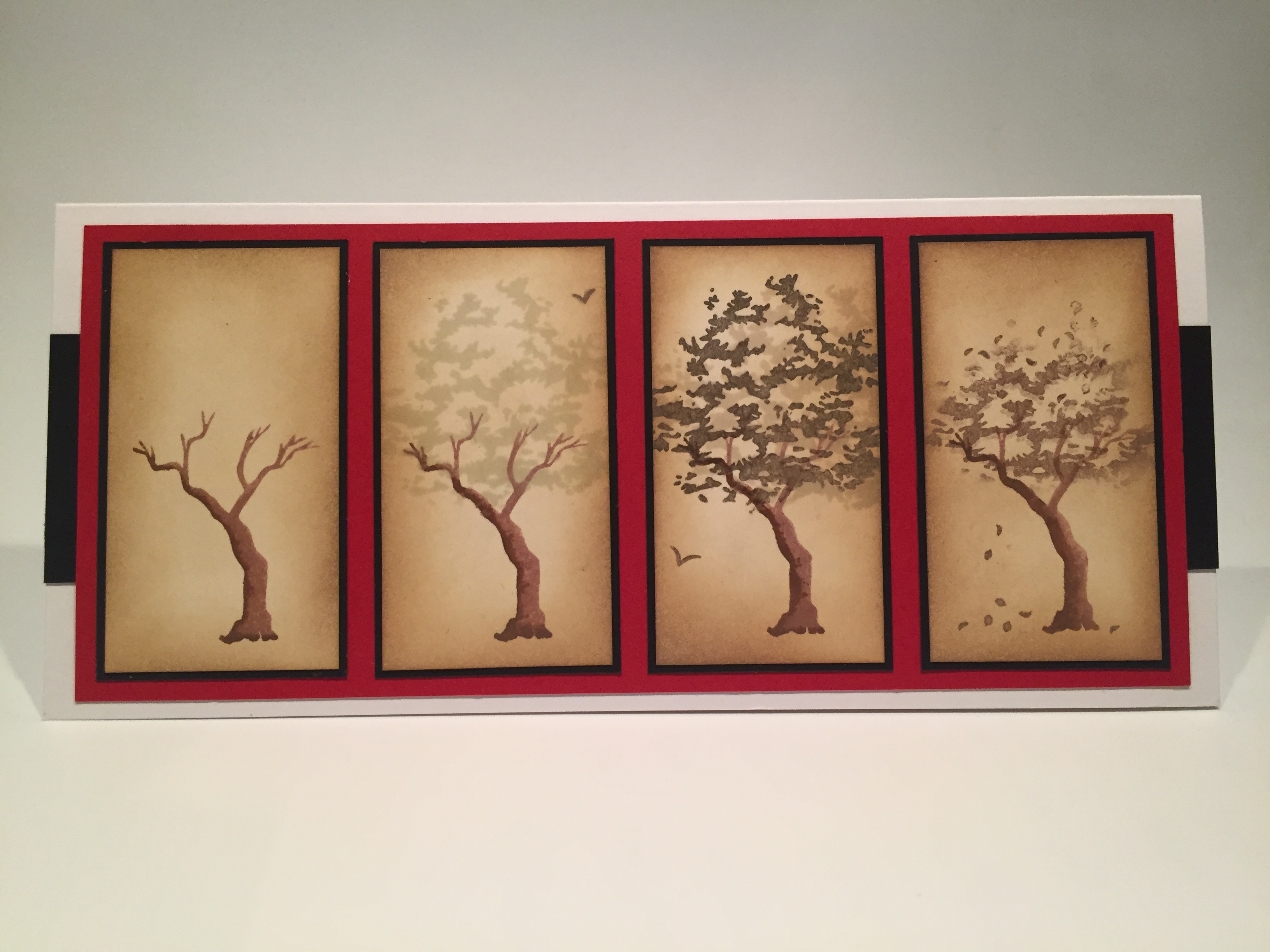
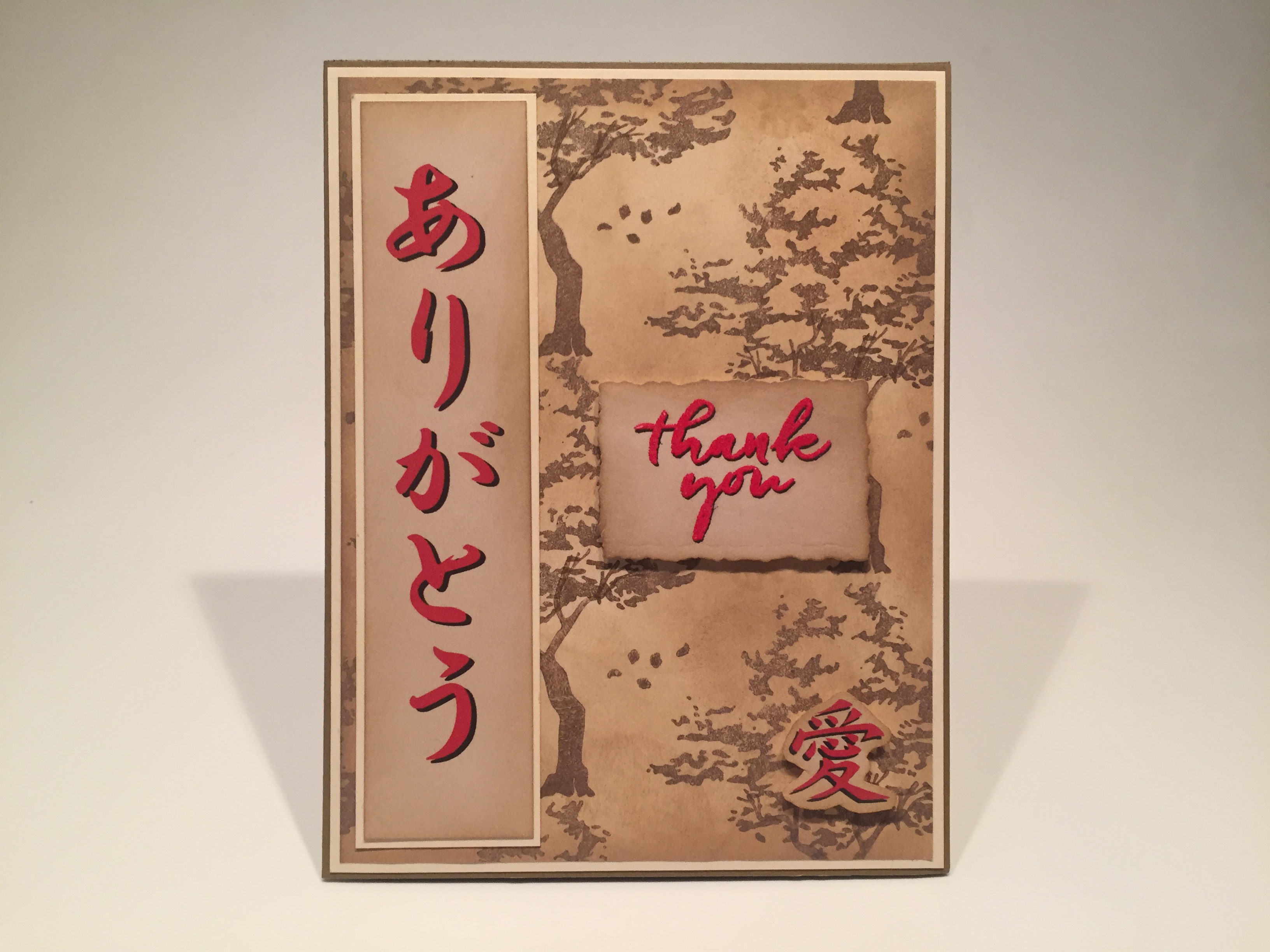
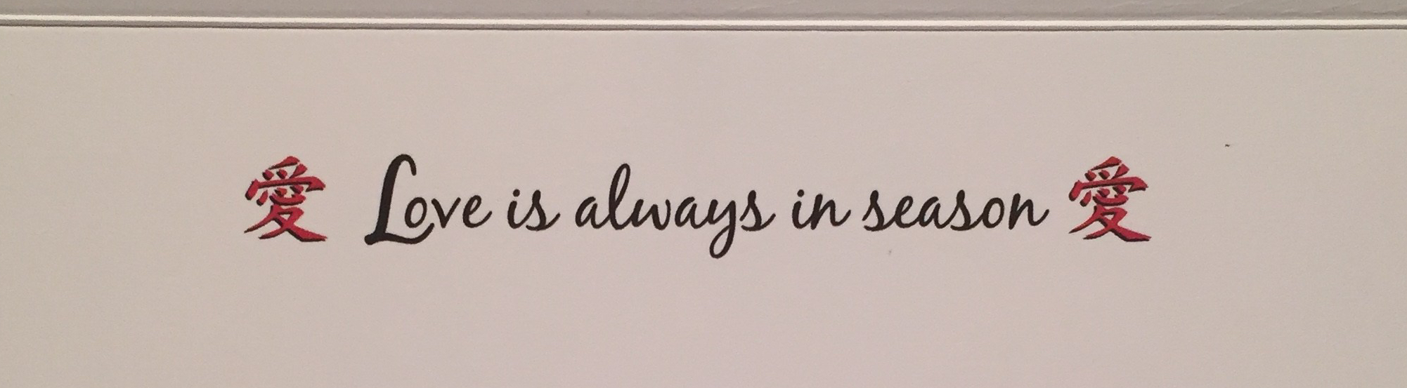 Of course this card has a sentiment which I printed on the inside of the card using the Black Jack font and adding the Japanese for ‘love’ on the two sides. This is a great valentine card – or maybe an Anniversary card or any kind of an occasion when you’d like to express your own long-term feelings for someone special! I really like this, and am thrilled to finish up this batch of cards with a real Japanese inspired card.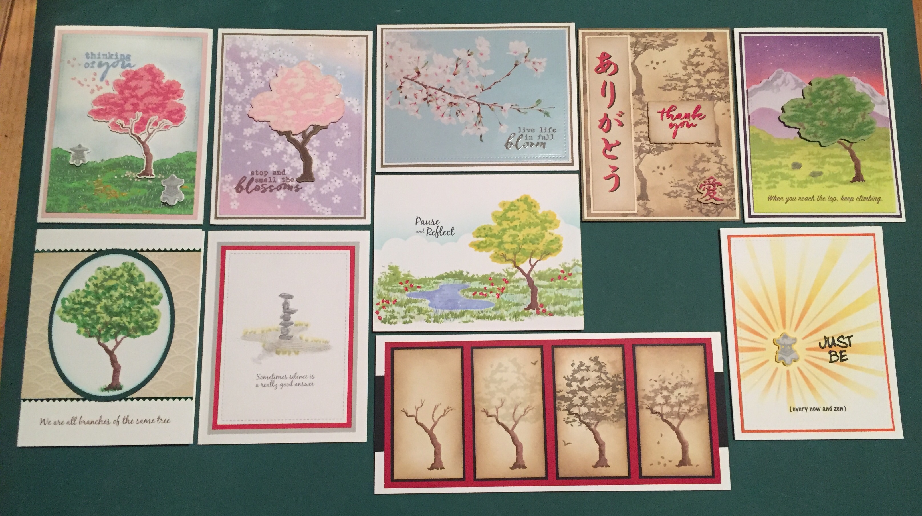
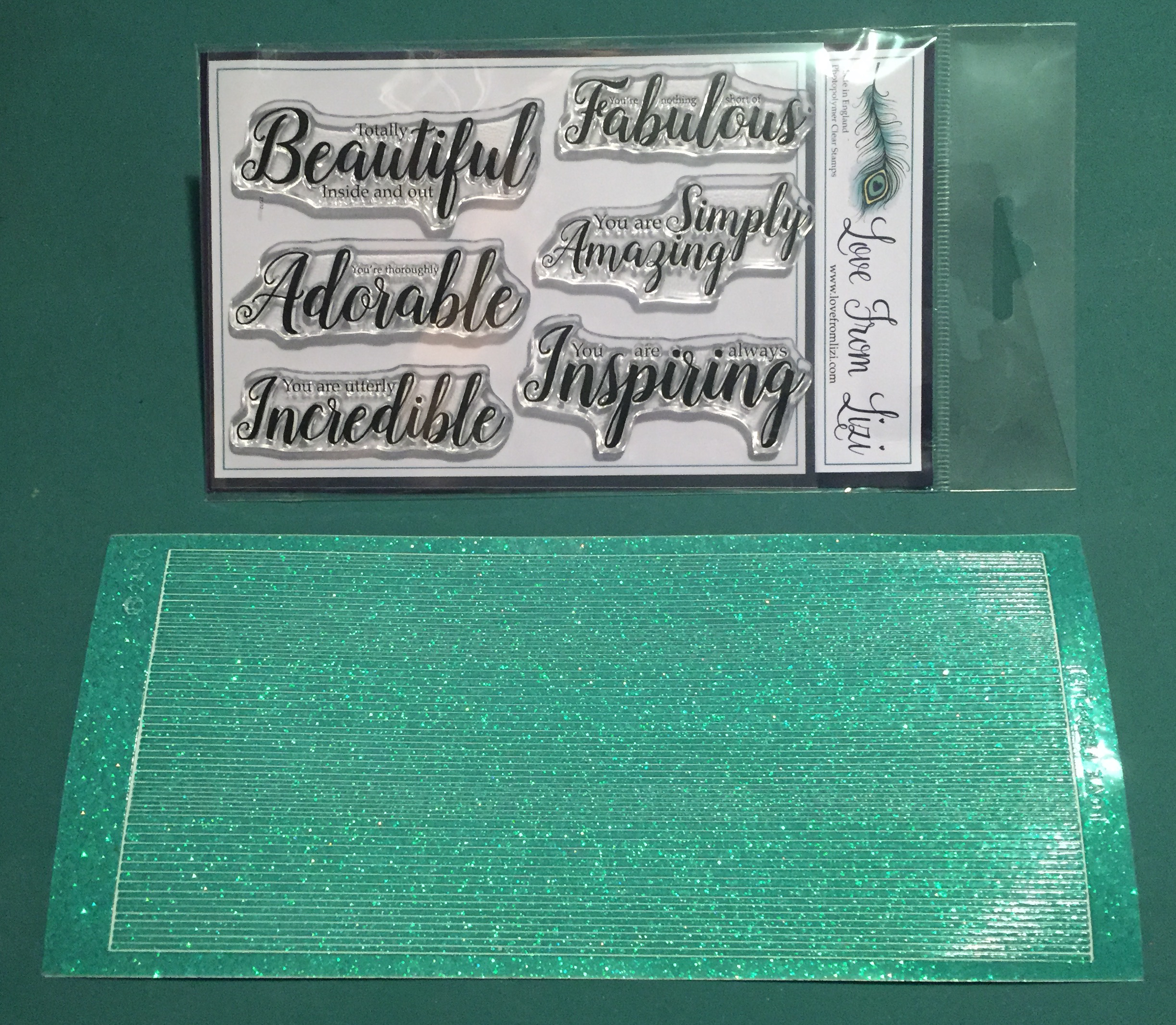
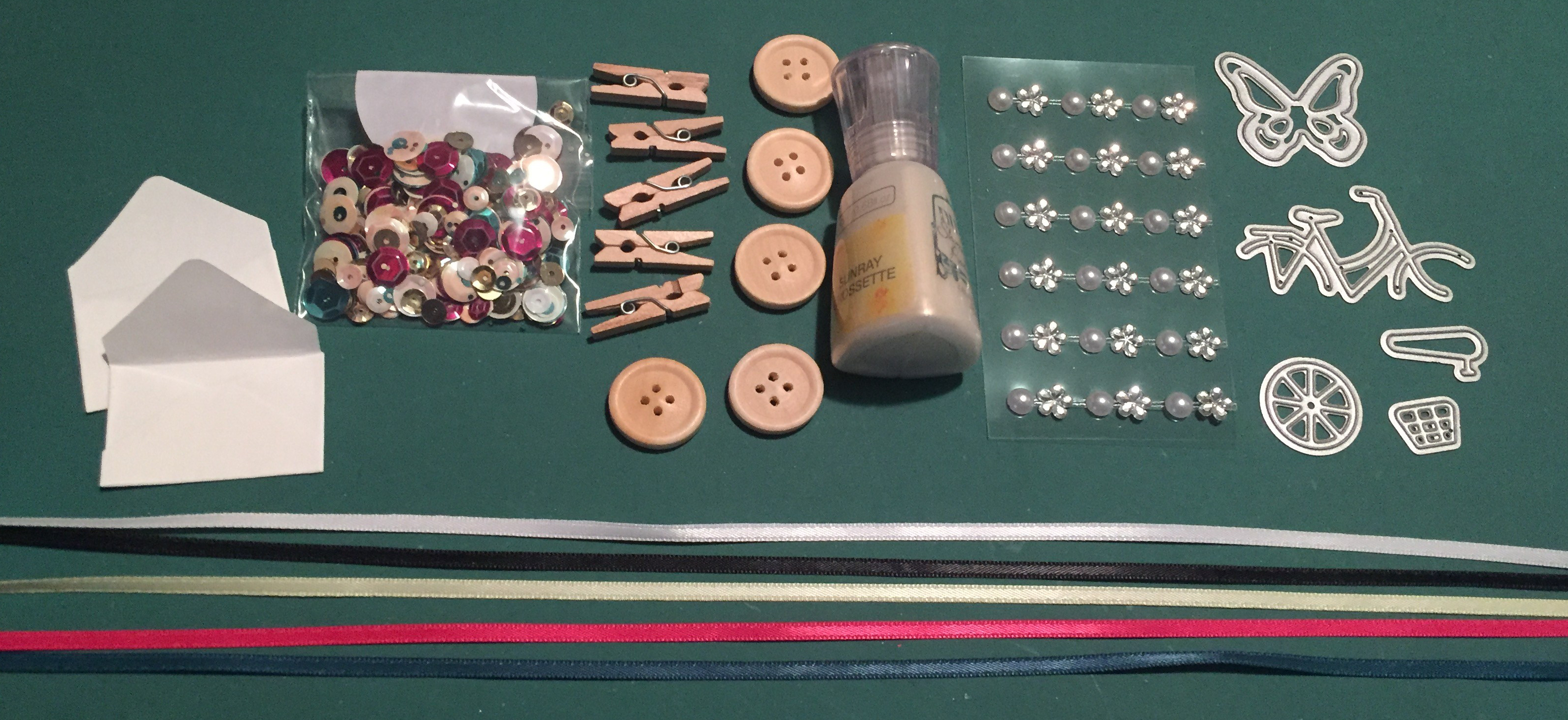
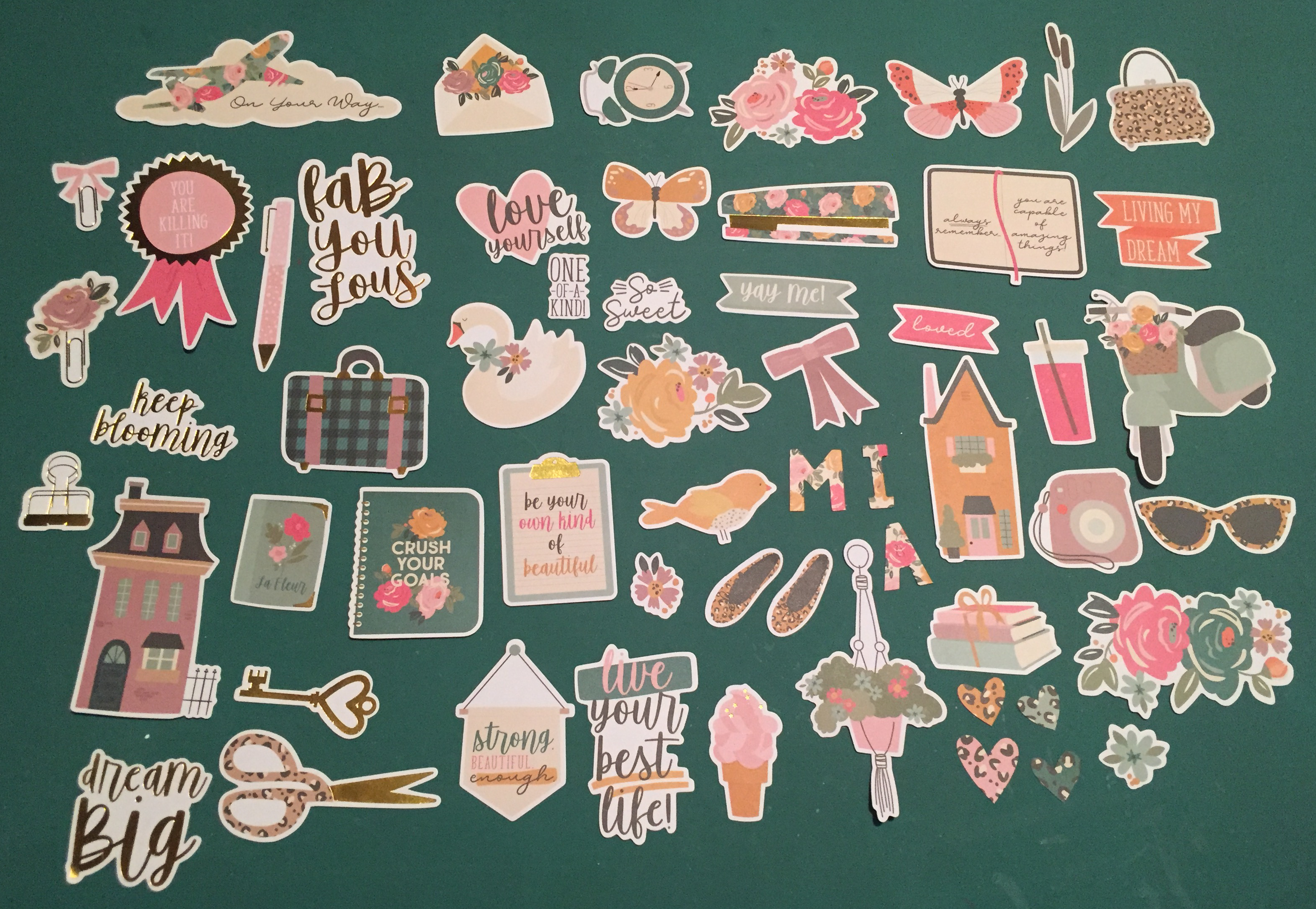
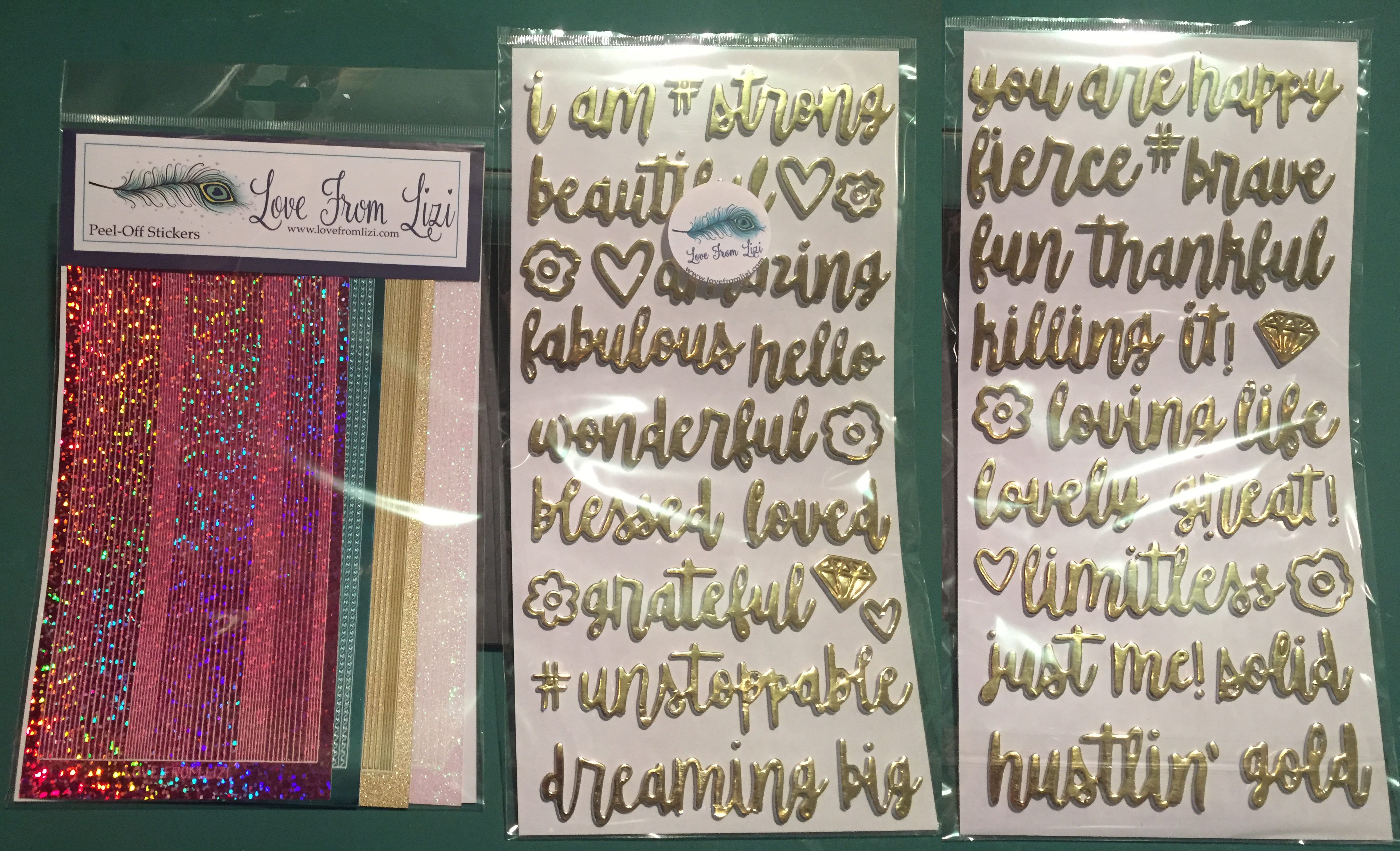
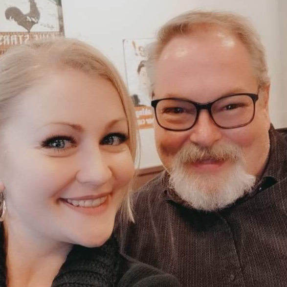 Lizi was visiting NYC for a little R&R (and shopping therapy!) and we met up for coffee and cake at a little coffee shop right by the theater where I work. It was almost surreal getting to meet and chat with her – I could have bent her ear all day…! I look forward to the next time!
