
DISCLOSURE: This site contains some affiliate links to products. I may receive a commission for purchases made through these links (at no cost to you). As an Amazon Associate I earn from qualifying purchases. Thank you!
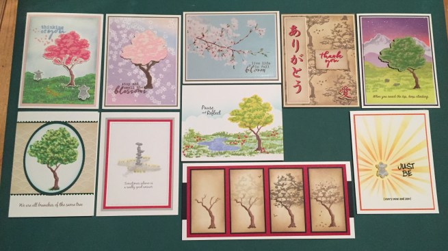
Hello Folks! Scott here with my 10 cards inspired by the My Monthly Hero March 2020 kit. Between production delays at Hero Arts and the lock-down of NYC I didn’t get my kit till late and… I have to admit… I am having a hard time feeling very creative… so I must apologize for the tardiness of this post. I am safe and healthy, and I hope you and yours are as well!
 This kit is a (sorely needed) bright splash of a cherry-blossom spring with Japan as the inspiration for this new HeroScapes 6″ x 8″ stamp set. Three layering stamps – grass, a tree and a zen sand garden are the highlights of this stamp set with four smaller layering stamps including a couple of stone lanterns and a pair of rocks. Four sentiments and some floating blossoms finish out our stamp set which is then complimented with five frame cut dies, and five Hero Arts ink cubes in Green Hills, Field Greens, Dusty Blue, Cotton Candy, and Rose Madder. I always LOVE getting inks with out MMH kits! We also get six sheets of 8.5″ x 5.5″ Hero Hues card stock – two each in Peony, Kiwi, and Mist, and a half-ounce oz. pot of Pink Puff embossing powder. Looks like we’re channeling the Far East with our kit this month!
I figured I’d put the contents of this kit to the test on my first card… I grabbed a bunch of Neenah 80# Solar White Classic Crest card stock and got to stamping..!
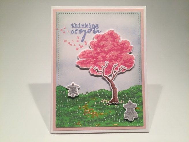
The only ink on this card not from the kit is the Hero Arts Sandstone and Cocoa inks (from the July 2019 kit) used on the tree trunk, and HA Soft Granite for the stone lanterns. A light blending of the Dusty Blue ink for the sky… The two green inks for the grass… The two pink inks for the tree and blossoms in the wind. Everything is die-cut using the included dies and I also trimmed the whole scene down with a Lawn Fawn Stitched Rectangle die and matted that on a piece of the Peony card stock before gluing it down to a 110# Neenah Solar White card base. The grass is glued flat to the background and the tree and lanterns are attached using foam tape. The sentiment is stamped with the Dusty Blue ink and embossed with clear embossing powder.
I did use a touch of Spectrum Noir alcohol markers for the stones on the ground, but still felt the whole scene was a little flat. That made me break out my White Gel pen and go a tiny bit crazy on this whole card adding white highlights (almost!) everywhere. If you don’t focus directly on them, they do add a little bit of life to this pretty picture. I also used a tiny hole punch on some of the Peony card stock and scattered some ‘fallen petals’ at the base of the tree. This appears to be pretty much what HA had in mind with this kit. Pretty even in pink!
But this doesn’t quite feel like cherry blossoms to me… I think of cherry blossoms as more white with just a touch of pink… Let’s try something else…
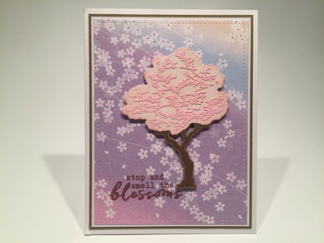
I found this pattern paper in my image stash from who knows when and trimmed that down with a LFSRD, mounted that on thin white and kraft mats and glued it down to a white card base. I stamped the tree trunk (on kraft card stock) and sentiment using Walnut Stain Distress Oxide ink and die-cut the tree trunk. I die-cut the tree foliage from a scrap of white card stock and did a little ink blending on that with Tattered Rose Distress Oxide ink. Then I stamped the foliage detail stamp on the cut out with VersaMark ink and embossed it using the Pink Puff embossing powder.
I glued the trunk to the back of the foliage and used foam tape to attach both to my card front. This feels a little more like a cherry tree in blossom, but it also felt like it needed a tiny pop of color. I grabbed a red gel pen and added little spots of red to the center of the background flowers. That adds a touch more interest to this card! And this pattern paper is kind of spot-on perfect to use with this kit!
I’ve said I don’t do this often, but, for the second month in a row, the stamp and die packaging in this kit featured a beautiful image I simply could not resist!
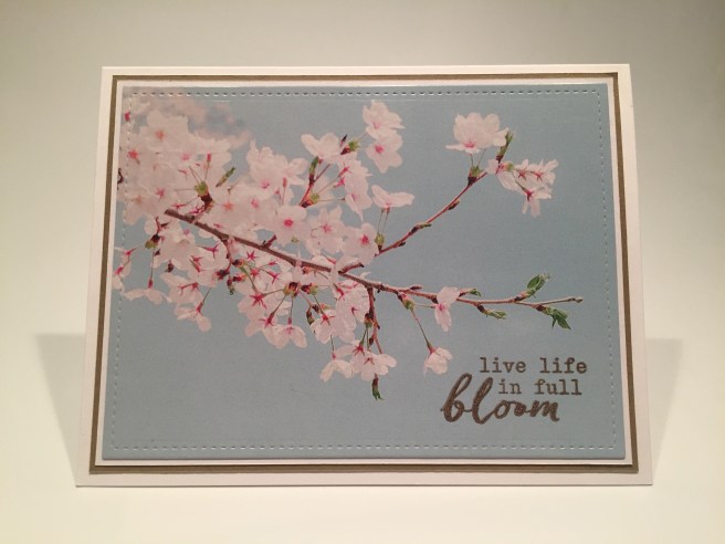
I think this image gave me the idea to add the little red dots to the pattern paper in the previous card! I die-cut this using a LFSRD and glued it to thin white and kraft mats before gluing all down to a white card base. I stamped the sentiment using Acorn Archival Ink and embossed it with clear embossing powder so it wouldn’t smear. Now here’s some “full bloom” for you! I think this is quite lovely!
That takes care of three of the four sentiments in this kit… All that’s left is “thank you”.

I started this card by making my own pattern paper on some on some plain “parchment” type paper. Hero Arts recently partnered with My Sweet Petunia to create a line of MISTI stamping tools in the Hero Arts palette of Black and White.  I did have a Mini-MISTI in my stash (original pink!) but I am thrilled to now have the fill-size Hero Arts MISTI in Black and White now! I did share this pattern stamping on social media, and I was very pleased with the results.
I stamped the tree trunks and foliage using Stampin’ Up Tip Top Taupe ink and stamped the detailed stone lantern stamps using Simon Says Stamp Barely Beige ink. Then I blended Frayed Burlap and Vintage photo Distress Oxide ink over the whole background. I trimmed the background to 4″ x 5.25″, matted that on a thin Ivory mat and glued both to a Kraft card base. I really like this, and considered just stamping the “thank you” in the middle, but I thought this card needed more than that.
So I went searching on the internet for the Japanese symbols for Thank You and found this nice vertical rendition. I imported that into my Silhouette Software, colored it red, and gave it a black off-set shadow and a beige background. I trimmed that printed piece to 4 7/8″ tall and 1 1/8″ wide and matted that on more Ivory card stock and glued it directly to the background.
I am super pleased with the sentiment! After practicing a few times with my new MISTI, I stamped the “thank you” sentiment using VersaFine Onyx Black ink on some of the extra beige printed paper. When that was nice and dry, I shifted the stamp a TINY bit, stamped it again with VersaMark ink, and embossed it with Love From Lizi Cherry Red embossing Powder. That gave me a really good black shadow on the red embossing – LOVE THAT! I die-cut the sentiment with a Spellbinders Deckled Rectangle die, and used the same inks to distress the whole piece.
I felt this card needed one more accent, so I found the Japanese symbol for “love”, colored it red, gave it a black shadow, fussy cut it out, distress inked it the same and mounted it on the bottom right with some foam tape. I mounted the sentiment piece with foam tape as well, and now I have a “Thank You” card that fits in perfectly with the theme of this kit. LOVE THIS CARD! Of course Red is a classic Japanese color…!
Now that I have used all the sentiments in the kit, I decided to search out some real “zen” sayings to use on the rest of my cards. This one caught my eye first.
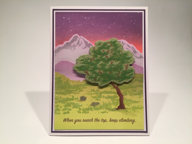
I thought this sentiment gave me the perfect excuse to break out some of the pieces from the MMH July ’19 kit. I die cut the Mountain and Hillside dies from the July kit using a couple of shades of purple card stock from my stash, stamped the detail mountain stamp with HA Soft Granite Ink, and added some “mist” ink blending at the bottom of both using HA Unicorn White Ink.
I took a panel of white card stock and die-cut the grass piece from that. I stamped the tree trunk (HA Sandstone and Cocoa) and clear embossed it that so it would resist ink added on top. I ink blended the grass portion with Twisted Citron and Peeled Paint Distress Oxide ink then stamped the detail grass stamp using HA Fresh Lawn ink. I also added both layers of the stones from the kit amongst the grass using HA Soft Granite ink.
I took the other half of the die-cut grass panel and ink blended the sky using HA Reactive ink in Creamsicle and Grape Slush, and finished that off with a light sprinkling of stars using my Permanent White gouache paint. Once all four panels were colored, I spaced them out and die cut all with a LFSRD. Before attaching the panels together, I turned to my Silhouette Software and my ‘piggy-back’ printing method to print the sentiment in brown using the SignPainter font.
I wanted a bit of dimension between these layers so I die-cut a ‘template’ of plain paper with the same LFSRD, and glued the sky portion to the paper. then I added the mountains with squares of foam tape along the top edge and then the hillside with more squares of foam tape on the top edges, and then added the grass panel flat – making sure to stay within the limits of the template. Then I cut a thin white mat and and thin dark purple mat and glued them all together and down to a white card base.
The tree-top is die-cut from a piece of green card stock and stamped with the detail layer in the Green Hills ink and then shifted a tad and stamped again in the Field Greens ink. I added some branches amongst the foliage usining my Spectrum Noir alcohol markers, attached that to the card front with foam tape, and dabbed in some light suggestions of shadows for the rocks and tree with a grey colored pencil. Combining elements from both MMH kits was a lot of fun, and gave us a really lovely card!
I’ve been itching to try a one-layer-wonder card with this kit, and wanted to try filling a landscape orientation with these stamps. I’ll have to cut some masks, but I’m ready!
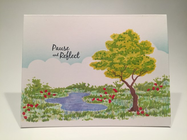
I stamped the tree trunk in HA Sandstone and Cocoa, and the pond in Dusty Blue. I placed the tree so the trunk would mask the end of the detail grass stamp so it would be easy to do a repeat stamp on the right side of the tree. Thereby our 4.25″ wide grass stamp fills up the 5.5″ of the card. I cut a mask for the pond and the tree trunk and that was all I needed. I stamped the detail grass using HA Lime Green ink and shifted the stamp over to stamp the grass on the right side of the tree. The tree top is stamped in HA Lemon Drop reactive ink and the leaves in Lime Green Fizz reactive ink.
I clear embossed some of the water ripples (from the 7/19 kit) on the surface of the pond for a little watery reflection, and stenciled in the line of clouds using the MFT mini Cloud Edges stencil and some Broken China Distress Oxide ink – I did use a die cut of the tree-top for masking. Because I didn’t stamp the grass background, I still had a lot of white space on the ground. I grabbed my Prismacolor pencils and filled in all the white with multiple green colors – keeping my pencils sharp and using short strokes to imitate grass. That worked so well, I continued on the stamped grass, some in the pond, and even added extra colors to the tree top.
Very pretty, but it needed a pop of color. I took he two ‘floating petals’ stamps from the kit and embossed them in the LFL Cherry Red embossing powder to provide some flowers for our scene – just the right touch! I did print this “zen” sentiment last, using Silhouette Software and the Black Jack font. I like the slight gag that a pond will ‘reflect’! Okay maybe I’m reaching here, but I’m very pleased with this one-layer-wonder card!
I thought there had to be another way to color this tree… someway to maybe get more than 2 or 3 colors going on there at the same time. I reached for my alcohol markers.
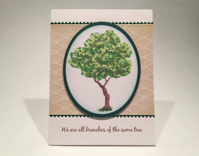
I grabbed my Light Green Spectrum Noir markers 1 through 5 and used a negative mask of the tree top to mask off the shape, and filled the tree top opening with dots and dabs of all five markers. As it started to fill up, I did try to give it a little shape with the dots, and when I was happy with the coloring, I stamped the detail tree stamp on top using the Field Greens ink from the kit. THAT’s what I’ve been looking for!! LOVE IT! I stamped the tree trunk with HA Sandstone and Cocoa inks, and added a touch of grass at the bottom.
I die-cut the tree and dark green mat with the HA Oval Nested Frame dies, did some light ink blending on the tree oval with Broken China Distress Oxide ink, and then glued them both together. I printed this background from my image stash, and die cut it with a LFSRD (3.74″ tall) and trimmed it to 4.25″ wide. I printed the sentiment (very topical!) in brown using the Black Jack font directly on the white card base. I glued the background to the card front, edged that piece with some Love From Lizi Green Mirror Sway peel offs, and mounted the tree oval using foam tape. I think this is my favorite tree from all my cards this month… and I think this sentiment is absolutely perfect here!
Six of my last 7 cards had that tree stamp… let’s see what I can do with other stamps!
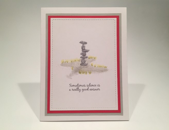
Here’s a zen garden fo you…! I stamped the two rock stamps in a variety of directions to make this rock stack using HA Soft Granite ink. This from Wikipedia: Rock balancing has also been described as a type of problem solving, and some artists consider it as a skill in awareness. Sounds pretty ZEN to me!! I masked off the bottom three rocks and stamped both layers of the zen garden using SSS Barely Beige ink for the background, and HA Soft Granite for the rake marks. I added some tiny touches of foliage around the perimeter of the ‘sand’ with alcohol markers and used my colored pencils again to add some detail to the rocks and a bit of a shadow on the ground.
I printed this sentiment (love this one too!) in grey using the Black Jack font again, and trimmed the front panel with a smaller LFSRD. I matted that on a red and then a grey mat and glued all to a white card base. I really like the “rock balancing” I was able to achieve with just two rock stamps! Though mostly flat, this card has great dimension!
I had to search high and low and truly rack my brain for a pun this month…
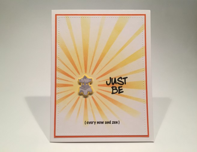
And I think this fits the bill very nicely!! The little stone pagoda stamps are generally used as lanterns in a zen garden, so I decided to light one up!  I used my homemade sunburst stencil to do this background, inking blending with HA Lemon Drop, Creamsicle, and Fruit Punch Reactive inks.
I stamped the larger pagoda using Soft Granite ink, and fussy cut it out along with the two ‘windows’ on the sides. I die-cut a scrap of yellow card stock with the pagoda die and glued the two pagoda pieces together. I printed the pun on the front panel using my Silhouette Software and the Marker Felt font, and die cut the main sentiment from Black Tie glitter card stock using and old Marker Micro Alpha die. Since the “JUST BE” had some glitter, I added some flicks of my Spectrum Noir Sparkle pen all over the front panel for a light touch of sparkle all over!
I die-cut the front panel with a LFSRD, matted that to a thin orange mat and glued both to a white card base. I glued the sentiment flat to the card front, and added the pagoda with a little foam tape. I think we’re all learning how to JUST BE these days! Makes me giggle!
I had the idea for this card almost from the beginning, and I had to fuss around with a number of different approaches before this card finally came to me.
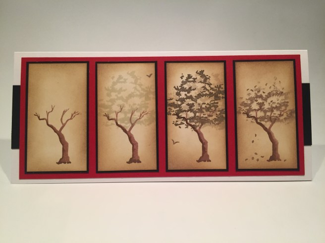
“I think I’m turning Japanese, I think I’m turning Japanese, I really think so!” I really wanted to do a card featuring the tree in all four seasons, and played around with the stamps for a long time before I realized that I could emulate my Thank You card and do the four trees as screens… very Japanese! This is on a 9″ x 4″ card base (fits in a business envelope) and the panels are each 1.75′ x 3.25″ cut from some ivory card stock. The tree trunks are again stamped with Sandstone and Cocoa inks, the foliage is stamped in SSS Barely Beige, Stampin’Up Tip Top Taupe and Early Espresso inks. The birds are from the July kit, and the petal stamps are simply falling on the last tree.
I ink blended all over the four panels again using Frayed Burlap and Vintage Photo Distress Oxide inks, matted them all to thin black mats and then down to the red card panel cut to 3.75″ x 8.5″. I added two strips of black card stock (1 7/8″ tall) to the center of the card base on each side, and glued the completed panel on top of those. Of course this card has a sentiment which I printed on the inside of the card using the Black Jack font and adding the Japanese for ‘love’ on the two sides. This is a great valentine card – or maybe an Anniversary card or any kind of an occasion when you’d like to express your own long-term feelings for someone special! I really like this, and am thrilled to finish up this batch of cards with a real Japanese inspired card.
Thats my 10 cards using the My Monthly Hero March 2020 kit. I’m very pleased with the wide assortment of cards I achieved, and the very Zen nature of most of them. As I mentioned, this kit sold out very quickly. If you don’t want to miss out on future kits, I would highly recommend subscribing. If you subscribe to the six-month plan you can skip out on a kit if it’s not to your liking. Personally, I find that I make some of my best cards with kits I thought held no interest for me! Sometimes you just have to do it!
It has been an absolutely crazy month here in NYC, (you can imagine) and I have been surprisingly UNMOTIVATED to create. I am working from home (fortunately) and thought I’d be crafting up a storm, but I can’t shake this depressive ennui and brain-deadening despair as this pandemic continues to spread. We’ve got field hospitals erected in Central Park for God’s sake! PLEASE stay safe, be healthy, wash your hands often, and stay home if you can!
As a special treat with this post, if you send me a note at cardcutups@gmail.com, I’ll send you a pdf with all my sentiments, patterns and Japanese characters used on my cards this month! Thank you so much for sharing your time with me here, I hope I was able to distract you for a little while and give you some fresh ideas for using this kit. Please remember to Like me, List me, Pin me, Post me, Share me with all of your friends… Don’t touch your face, and as always, I wish you happy crafting!
