Hello Folks! Scott here with a bit of a mid-month diversion with some Altenew products! I was recently invited to join Altenew as an affiliate and was able to get some items off my wish list to share with you today! I do have a good amount of Altenew products – a number of stamp sets and stencils and blending brushes, 3D dies and press plates, card stock sets, big, thick washi tapes, double-sided foam tape and even a few inks… not a whole lot of Altenew stuff, but it feels like I do have a little bit of everything.
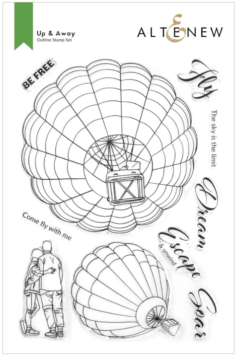
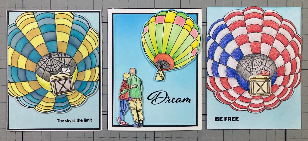
I have been lusting after this 6″ x 8″ “Up and Away” stamp set for a while now… such a unique perspective on hot air balloons… and you know how much I like to color!! Some perfectly appropriate sentiments in this set, and I also appreciate that there is a stamp featuring a couple folks enjoying the launch!
There is also the “Up and Away Bundle” available that includes the “Up and Away Simple Coloring Stencil” (5 in 1), and the “Up and Away Die Set”. I couldn’t resist getting the whole bundle since I thought the stencils would come in handy if I wasn’t feeling like coloring all these balloon panels on my own…!
The big balloon viewed from below is about 4.75″ diameter! BIG! So I reached for a large panel of 80# Neenah Solar White card stock and stamped the big balloon using VersaFine Onyx Black ink.
Wow! This thrills me to no end!! Using the stencils, I colored the Balloon with Broken China, Faded Jeans, Squeezed Lemonade and Fossilized Amber Distress Oxide inks. Now, the stencils only color the balloon itself, so you are still left to color the inside of the balloon and the basket on your own (or not!). I used my Prismacolor Colored pencils to color the basket, the scoop (or wind guard) and the basket. I really liked combining the ink-blended stencils with some hand coloring… very satisfying. When all was colored I die-cut the balloon with the matching die. I did take this moment to mark the big die with a sharpie reminding me which side of the die is the top!
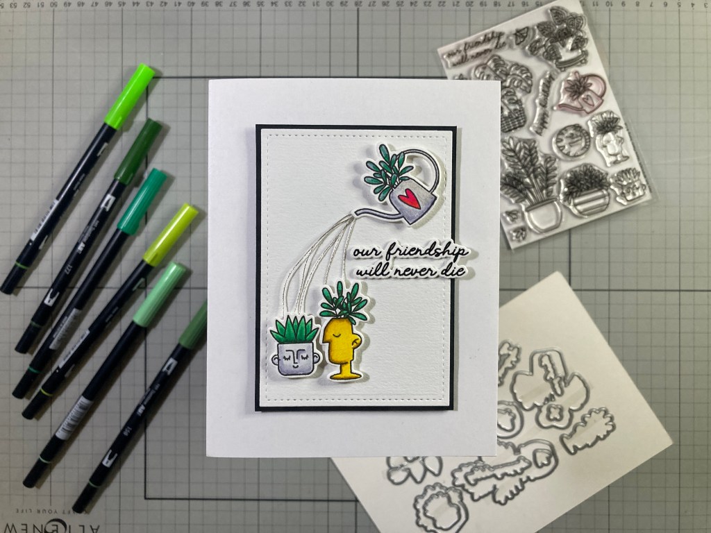
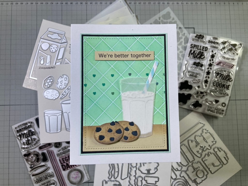
I cut a piece of Hero Hues Arctic card stock to 4″ x 5.25″ and stamped the sentiment with Onyx Black ink and embossed that with Clear Embossing powder. Then I added a thin Black mat and glued both to an A2 White card base. I trimmed the three sides of the balloon to 4″ x 4.5″, colored the White die-cut border with an alcohol marker, and mounted that to the card front with Altenew Foam tape. I’ve been on a little bit of a Blue and Yellow kick lately, and I really like the Distress Oxides on this balloon instead of the stereotypical bright primary colors one tends to think of for Hot-Air Balloons.
There is a smaller balloon stamp in this set and I was really looking forward to coloring that couple!
This is more of a bright sun-shiny balloon! I stamped both images with Onyx Black ink on 80# Neenah Solar White card stock and, using the stencils, ink-blended the balloon with Hero Hues Lemon Drop, Key Lime Fizz, Green Apple, and Fruit Punch Reactive inks. I did use a tiny micro-applicator brush for some of the darker shadings. and though the basket does have a stencil, the inside of the balloon and the apron and scoop still need to be colored (on not!). Again, I used my Prismacolor Colored pencils to finish the ballon and color the couple. I did use the matching dies to cut out both pieces, but I ended up fussy-cutting the couple for a little cleaner detail, but stuck with coloring the die-cut border on the balloon with an Alcohol marker.
The background is a panel of White card stock ink-blended using an Altenew Large Blending brush (my favorite big ones!) with Hero Hues Splash and Blue Hawaii Reactive inks. Those large, flat bristle brushes never fail to give me beautiful blends. I die-cut that panel to 3.75″ x 5″ with a Lawn Fawn Stitched Rectangle die and stamped (and embossed) the sentiment as usual. I added a thin Black mat behind and then glued both down to a White card base. The balloon and couple are attached with Altenew Foam tape and they both “break the frame” a little bit – I like that!
Altenew has some of the best packaging in the industry with standard tri-fold instructions that have full-size examples and color options for almost all of their sets. There’s a caption on this packaging that says “Time to Color!” Okay!
After all, it WAS just the 4th of July last weekend! I was still in a colored pencil mode so I stamped this on a 4.5″ x 6″ panel of Stonehenge White card stock with VersaFine Onyx Black ink and colored away! If you look, you’ll see there are 7 White Stripes and 6 Red Stripes (just like the flag) and I like that the White fields in the Blue section match the White stripes. (I imagine if you saw this balloon from a distance, you should see red and white stripes spiraling around the sides) (I may be crazy!) I cut a simple paper mask and ink-blended Splash Reactive ink around the bottom of the balloon.
To make this shaped card-front, I scored the left edge of the stamping at 1/4″ (remember this is on a panel of 4.5″ x 6″ card stock) and folded that back to be the hinge. Then I fussy-cut the top of the balloon from side to side. Then I trimmed the bottom of the panel away at 5.5″. I stamped and embossed the sentiment as usual (very appropriate!!). I took two A2 panels of white card stock and glued the hinge between them to make the card. I did add some more Splash Reactive ink blended on the inside of the card for the bit of sky above the balloon. I like this card quite a lot and it really got me thinking about the truly endless options there are for coloring these balloons!
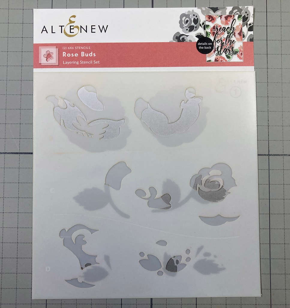
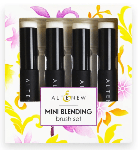
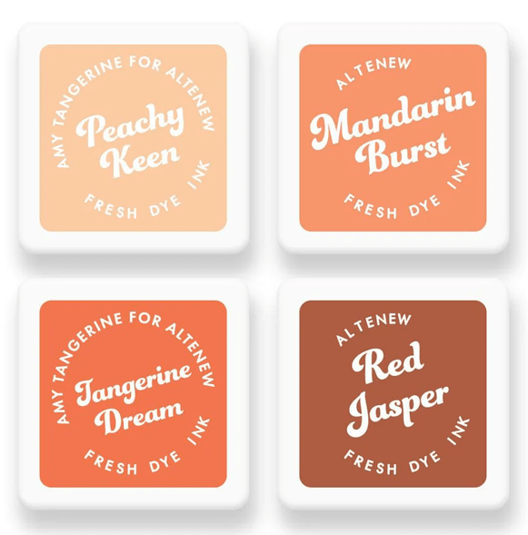
I did take this opportunity to get a few more things from Altenew! I am always a sucker for a Rose, so I grabbed the Rose Buds Layering Stencil set (retired) along with a Mini Blending Brush set and the Tropical Tango Ink Cube set with Peachy Keen, Mandarin Burst, Tangerine Dream, and Red Jasper Fresh Dye inks.
I got these inks because I think I have fewer oranges in my ink stash than any other color, and I thought some orange roses would be fun way to use this new stencil.
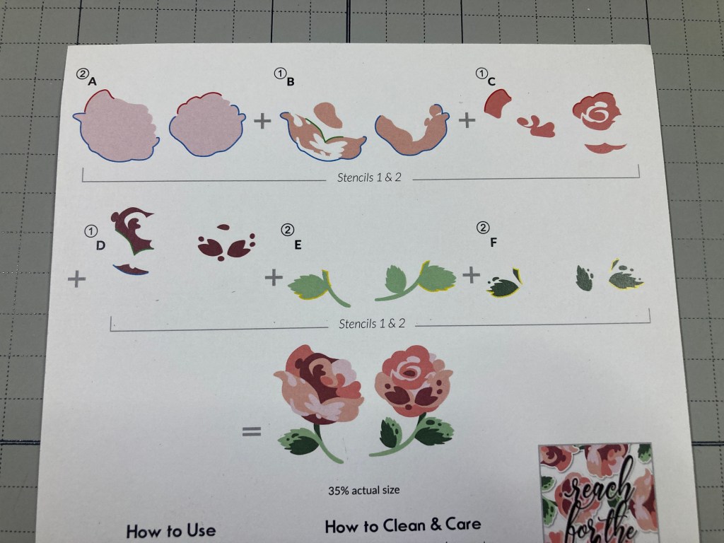
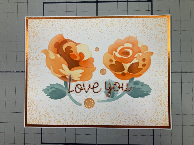
Florals are what initially attracted me to Altenew, and they are still going strong with this pair of stylized roses – Love it! I stamped all four sides of an A2 panel of 80# Neenah Solar White card stock with a Concord & 9th Splatter Texture stamp using Peachy Keen ink. I traced the stencils on a panel of paper to help with my placement, and ink blended the roses with the Mini Blending Brushes and the four inks. I used Altenew Misty Morning and Cloudy Sky Crisp Dye inks for the leaves – though these inks are technically in the Grey family, they lean very green – and work perfectly well for the leaves!
I trimmed the roses to 5.25″ x 4″, added a thin Metallic Orange mat behind, and glued those to an A2 White card base. I wanted a die cut sentiment but didn’t want anything big and bulky – I found this Love From Lizi “Love You” die that was perfectly delicate. I die-cut that from more Metallic Orange card stock and die-cut its shadow from some thick vellum. I glued the letters to the vellum and then flat to the card front. Three glitter enamel dots add a sparkly finishing touch to these bright orange roses. I’m sure my Altenew floral stash will continue to grow!
And that wraps up our mid-month tangent for today. As I said, I have admired and used Altanew products for many years with consistently great results and these new goodies still hold up to that reputation.
The Up and Away Bundle is a terrifically fun Hot-Air Balloon set with unique stamps and extremely useful stencils and dies. And if you need a good coloring fix, you can come up with thousands of possibilities with these balloons.
And the Rose Blooms Stencil set is a welcome addition to a history of terrific florals that Altenew is so well known for!
I hope you enjoyed this little foray into some Altenew Products this month! If you see something you might like to add to your own stash please use my links listed below. I do get a small commission (at no cost to you) when you use these links, and that helps keep the wheels spinning and the lights on! (And I’d love to show Altenew that I’m worthy of their attention…!)
Thank you for spending a little time with me today. Your clicks are always appreciated! If you enjoyed this post, please click the Like Star at the bottom of the page, and if you wish to be notified when a new post comes out, just click the Follow Me button at the top of the page. And don’t hesitate to send me a note if you have any questions, comments or just to say Hi!. Please take a moment to Like Me, List Me, Pin Me, Post Me, share this post with all your crafty friends… and remember… Don’t run with scissors! As always, I send You and Yours Love and Light and Happy Crafting!!
DISCLOSURE: This site contains some affiliate links to products. I may receive a commission for purchases made through these links (at no cost to you). As an Amazon Associate I earn from qualifying purchases. Thank you!
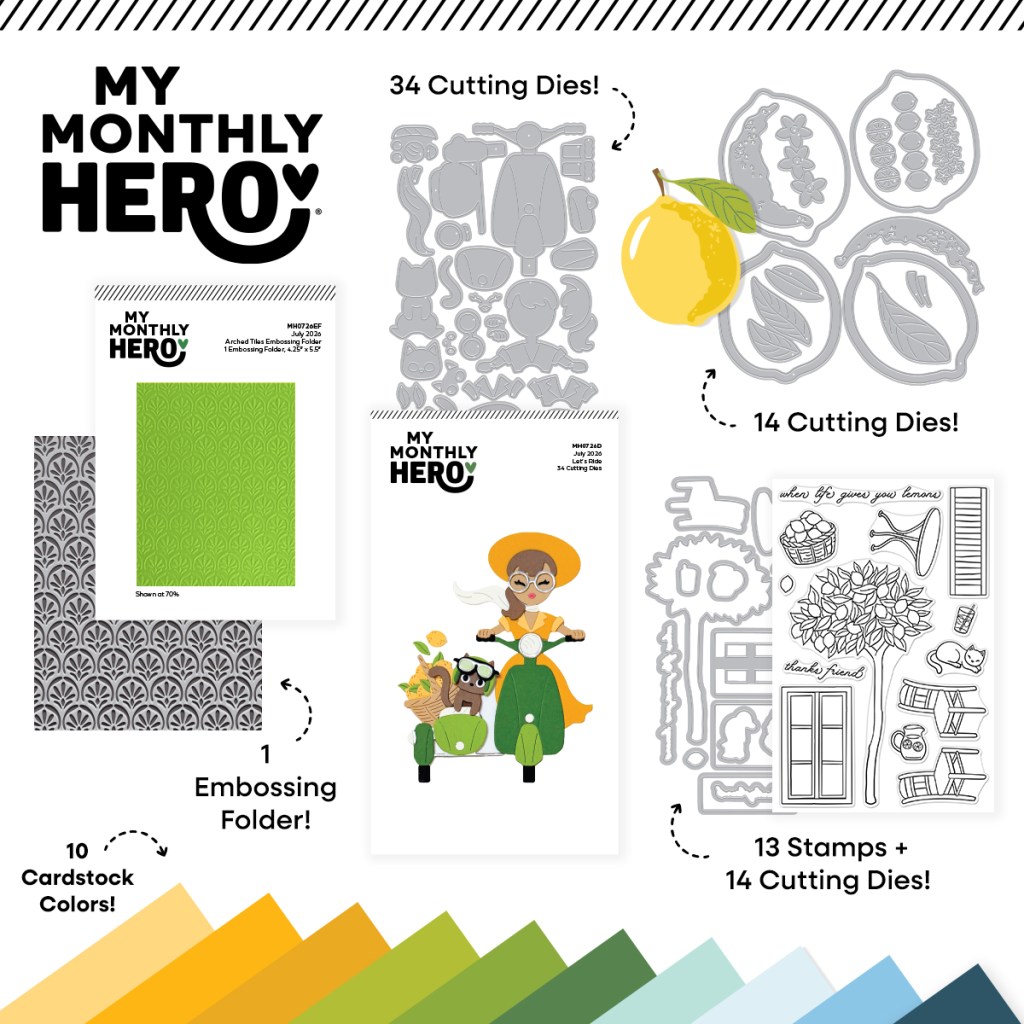
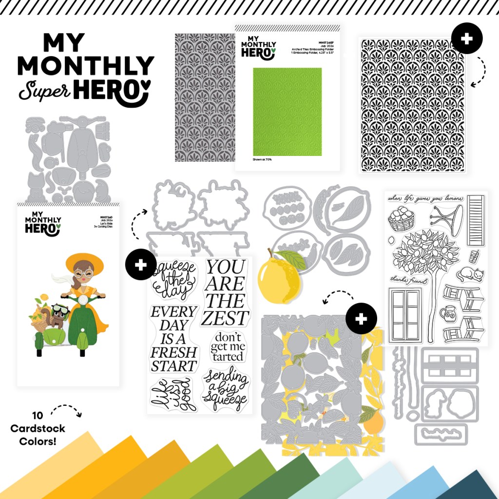
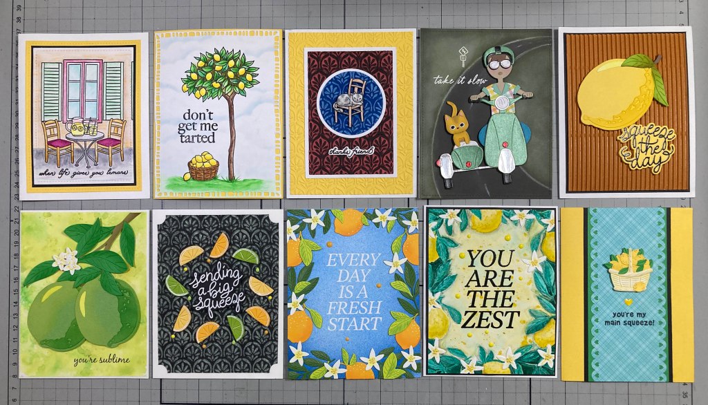
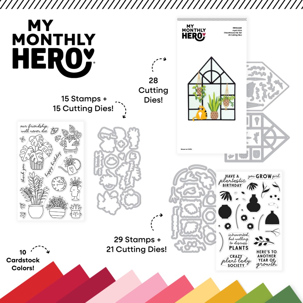
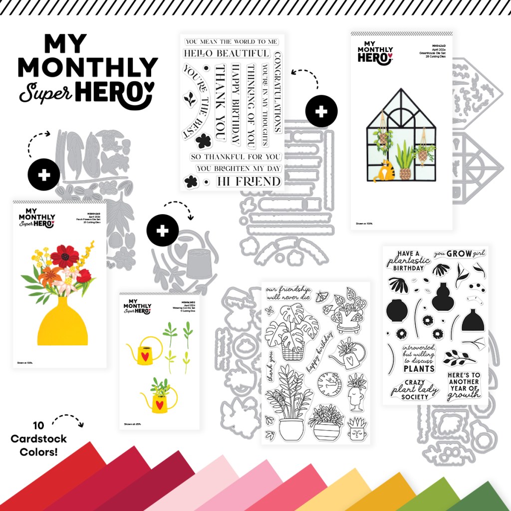
Hello Folks! Scott here once more with my 10 cards inspired by the My Monthly Hero & My Monthly Super Hero Kits for July of 2026. “You’re the Zest” is the theme this month and these kits are full of all sorts of zesty citrus images, sentiments, and some fun summer pastimes as well!
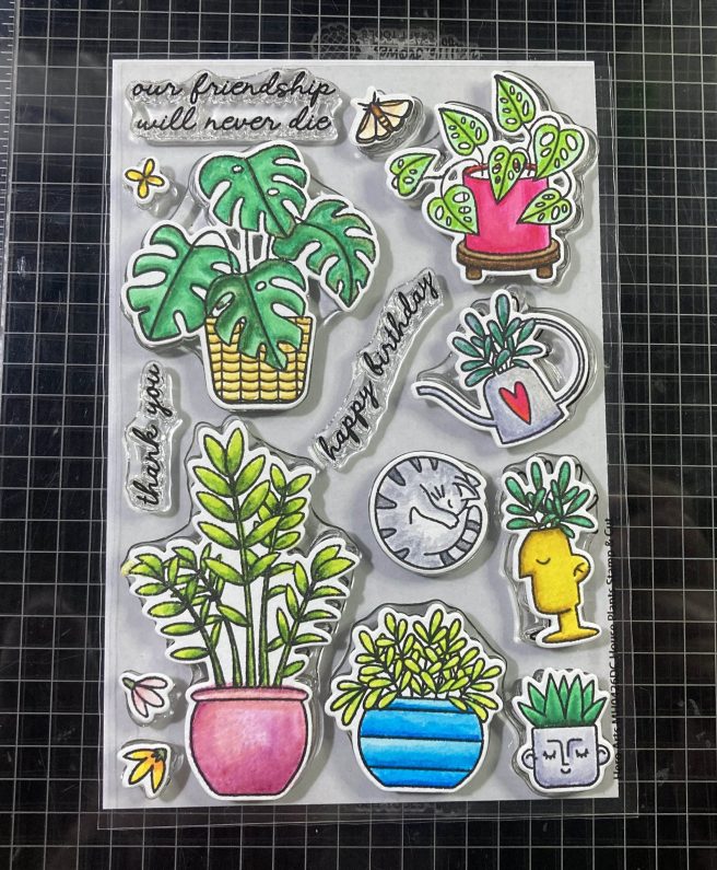
We start the My Monthly Hero kit with the “When Life Gives You Lemons Stamp and Cut”. YAAAAY! Stamps we can actually color!! A great lemon tree and cafe set-up with cutting dies for all the images and both sentiments. Then we get the “Arched Tiles Embossing Folder”. We rarely get embossing folders in the kit so this is exciting. Next we have the “Let’s Ride Die Set” – a cute scooter with side-car. It bothers me a little that there is no helmet for the driver… but there is a helmet for the cat…! Next is this “Citrus Shaker Die Set”. We also get 10 half-sheets (8.5″ x 5.5″) of Spellbinders Color Wheel Card stock in Beeswax, Saffron, Tuscan, Peridot, Rainforest, Fern, Mint, Breeze, Malibu, and Oceanside.
The My Monthly Super Hero Kit comes with everything in the Monthly Hero kit, and this “Squeeze The Day Stamp and Cut” set. All-sentiments but at least we have a pun or two! With the two sentiments from the Monthly Hero Kit stamp set, that makes 8 sentiments total for this whole kit… I was surprised by this Arched Tiles Stamp Set! A full background stamp that matches the embossing folder in the Monthly Hero Kit. The “Citrus Frame Die Set” wraps up this fruity kit.
Despite my questions about some of these sets, I AM THRILLED that we actually get some stamps to color this month!
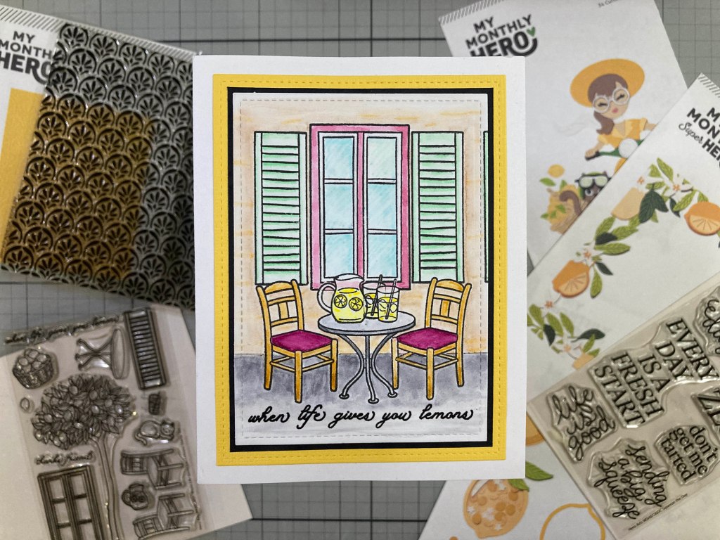
You may know that I am not a big fan of die-cut edges on my stampings, so I would prefer to mask out my stamps in order to create a scene from multiple stamps – there are 10 images in this little scene, so I fear the die-cut borders would overrun the images! This is all stamped on a panel Bristol Smooth card stock with VersaFine Onyx Black ink. I began the stamping with the pitcher and glass on the right. I cut masks for them both and stamped the second glass in the center. I masked off the second glass as well. Then I stamped the cafe table and two chairs. I cut masks for the top of the two chairs and then stamped the window and shutters. Five small masks is all it took to stamp this vignette – and not a die-cut border in sight!
I colored the scene with my Zig Clean Color Real Brush markers. Ahhhhh… it does feel good to color!! I stamped the sentiment with Onyx Black ink and embossed it with Clear embossing powder. I die-cut the vignette to 3.25″ x 4.5″ with a Lawn Fawn Stitched Rectangle die, added a thin black mat and a yellow mat cut to 3.75″ x 5″ with another LFSRdie. I glued everything to a white card base and wished I was sitting at this table somewhere dreamy…! I did contemplate making this a landscape card with another window and shutters but decided against that. That’s why there’s that extra bit of a shutter on the right… I like that…! Makes it feel like the vignette continues beyond our view…
And we have even MORE stamps to color!!!
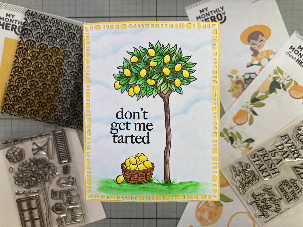
AND a PUN to boot!! This is stamped on Bristol Smooth card stock with VersaFine Onyx Black ink and colored with my Zig markers. I used a Cloud Edges stencil and my Pebbles Chalk Palette to add the clouds in the background, then stamped and embossed the sentiment as usual. I had to jump into the Super Hero “Squeeze the Day” stamp set for this sentiment, because there are only TWO sentiments in the whole MMH kit this month! I die-cut the colored panel with a Moda Scrap Framed Rectangle die and glued it to a Yellow A2 card base. LOVE this pun and the lemons almost make my mouth water!
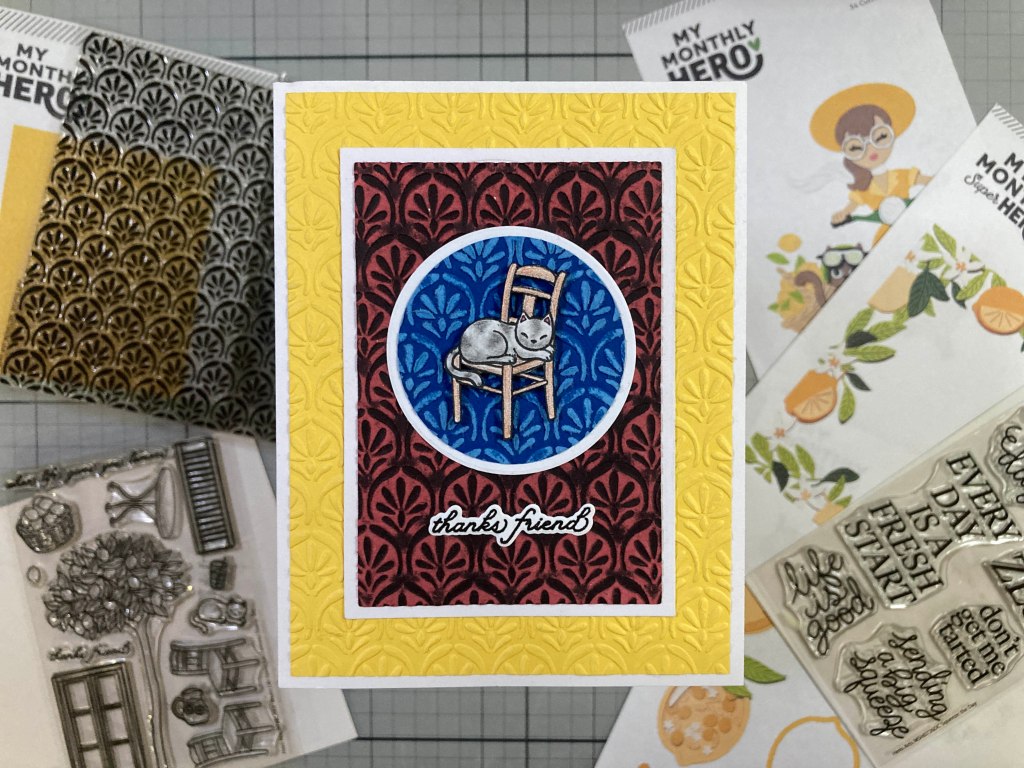
I still have to use the cat from the Life/Lemons stamp set, and we have a new embossing folder to play with!
I stamped the cat on a scrap of Bristol Smooth card stock and cut a matching mask, and then stamped the chair for him to be sitting in… kind of a big cat… or just a smallish chair..? I did color them with my Prismacolor colored pencils and then fussy-cut them out – taking time to color the cut edges with a black marker.
With this “Arched Tiles Embossing Folder” I thought to reach into my stash of color core card stocks and found this nice 2″ circle already die-cut from some Core’dinations Dark Blue Color Core card stock. I embossed that with the folder, and sanded off the positive side to get the light blue. I cut a 2.75″ x 4′ panel of Red/Black Chalk Core card stock by Core’dinations, embossed that with the embossing folder, and sanded off the negative embossing for the Red/Black panel. I added 1/8″ white mats around the circle and rectangle embossing.
Lastly, I used the folder to emboss a panel of Yellow card stock cut to 4″ x 5.25″, and glued it down to an A2 White card base. I stamped and embossed the sentiment as usual, and die-cut it out with its matching die. I glued the Red and Blue panels and the sentiment flat and added the sleeping cat/chair with thin pieces of foam tape. Not only do I really like the cat on the chair, but I love the 3 versions of the embossing folder all on this one card! Thanks friend!
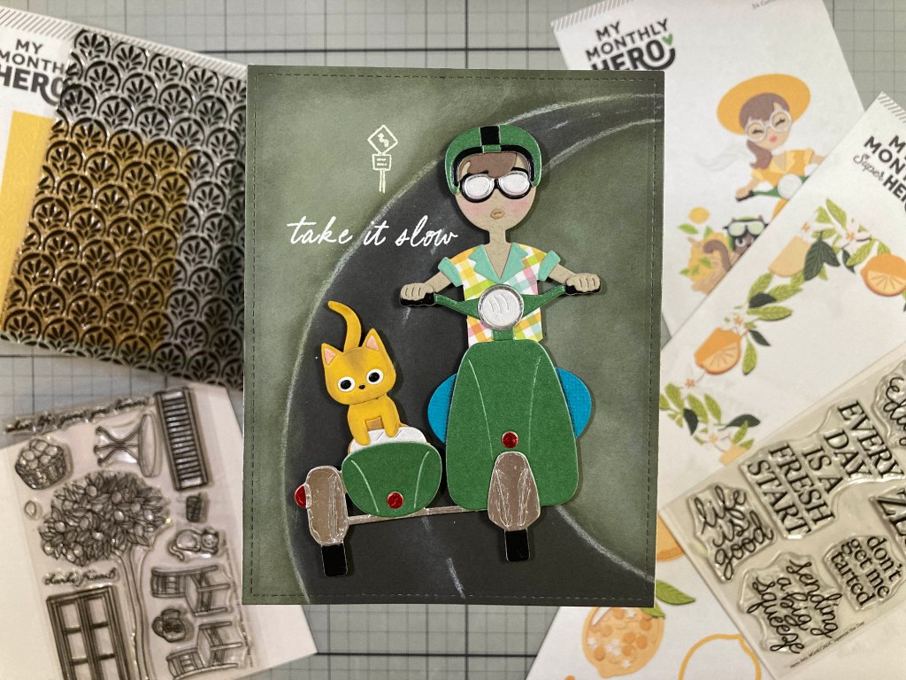
That covers every stamp in the Life/Lemons stamp set… now there’s the “Let’s Ride Die Set”… You know I am just itching to get a guy on that scooter – AND give the poor fellow a helmet!!
AHA!!! Success!!! A young man at the wheel! I was thoroughly entertained putting this card together! First I had to adjust the shirt so it didn’t cinch down to a tiny waist. I cut the Head/Body die normally, then I partially die-cut the shirt from a scrap of Plaid pattern paper stopping the cut right at the armpits. Then I simply cut straight down from the pits to make the top long enough to go behind the scooter. Then we have the helmet – the goggles fit our driver just fine, but the helmet is made to fit the cat (figure that!). I die-cut the helmet twice – from Pearlescent Green and Black card stocks. I split the Green/Black helmet down the center, and cut off the curved sides from the Black/Green helmet. I spread the Green/Black (center-cut) helmet to cover his head and filled in the center with the Black/Green helmet.
The rest of the assembly is perfectly straight-forward – I used my Pearlescent card stock scraps to give the scooter a metallic feel, I used the lips die but turned them upside down, and I used the Sun Hat from the die set for his knees – that was the perfect touch to complete my masculinization of these die-cuts! I added light touches of shading to the cat and some blush to our driver with Chalk pastels. I am perfectly pleased with this young man! And the cat’s kind of cute too!
I die-cut a panel of Dark Grey card stock with a 4.25″ x 5.5″ LFSRdie and, with the help of a couple of Oval dies, sketched out the road. Using Twisted Citron and Forest Moss Distress Oxide inks, I blended in the sides of the road and outlined the road with a White Charcoal pencil and blended it out with my finger. I grabbed the Hero Studio Card Kit of the Month for July of 2025 for the road sign and the sentiment stamps – those are stamped with Unicorn White ink and embossed with White embossing powder. I mounted the scooter and occupants at a little angle with foam tape. I was very happy to give our driver a helmet and goggles, and I think these dies can work well if you want to make a masculine card!
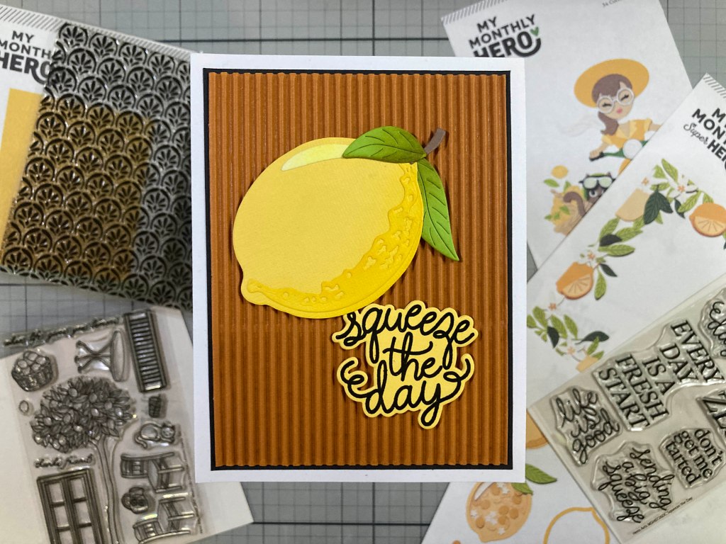
Now we have the Citrus Shaker Die Set – I know people love to receive shaker cards… but we just did Balloon shaker cards a couple of months ago, and I didn’t feel like a lemon shaker made much sense…!
But there are good dies in this set without having to go the shaker card route! I die-cut the two main pieces of the Lemon with some Canvas Textured Yellow card stock, and ink blended Hero Hues Lemon Drop Reactive ink on the bottom of the whole lemon and all over the die-cut shadow piece. I die-cut the highlight from smooth White card stock and lightly blended Lemon Drop ink on that as well. I die-cut the leaves from the Rainforest card stock in the kit and blended some Forest Moss Distress Oxide ink on the bottom of the leaves. The stem is cut from a scrap of Brown card stock and the lemon is assembled with liquid glue.
I stamped the sentiment on some smooth Yellow card stock with Onyx Black ink and embossed that with Clear embossing powder. I die-cut the sentiment (and three blanks) with the matching die and glued them all together. The background is a very old piece of Burnt Orange corrugated card stock from DCWV cut to 3.75″ x 5″ with a thin black mat glued behind (3 7/8″ x 5 1/8″). I attached the lemon with foam tape and glued the sentiment flat to the corrugate. I like using textured card stocks for organics… just a little more detail for the eyes to enjoy! And this is a good pun as well!!
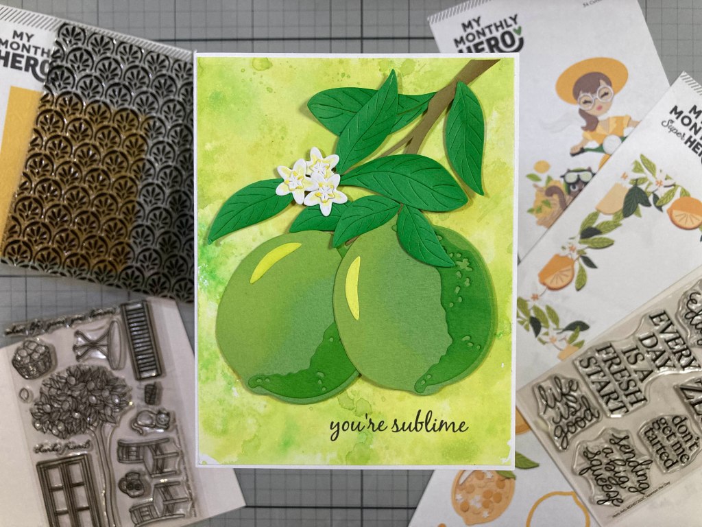
I couldn’t resist using the same dies to come up with some Limes instead of lemons… especially with a fun sentiment!
I die-cut and assembled these limes the same as the lemon – using textured card stock for the fruit blended with Twisted Citron Distress Oxide ink for the highlights and Green Apple Reactive ink for the shadows. Again I used smooth white card stock blended with the Twisted Citron ink for the highlights. I die-cut the leaves from more canvas textured card stock and did a little touch of ink blending with the Green Apple ink. I free-hand cut a simple branch from some Brown card stock and die-cut the larger and smaller flowers from White card stock. I gave the flowers a little touch of Yellow with my Zig markers and glued the small flowers to the centers of the large flowers.
The background is a panel of White card stock ink-smushed with Twisted Citron and Green Apple inks. I printed this sentiment on the background using my Silhouette Software and the Black Jack font, and trimmed that to 4 1/8″ x 5 3/8″ and glued it to a White card base. I assembled the branch, limes, leaves and flowers together and mounted them to the card front with thin foam tape. I actually researched lime trees and a branch will produce fruit and continue to grow sprouting new flowers and fruit. And I couldn’t resist this pun-y sentiment!
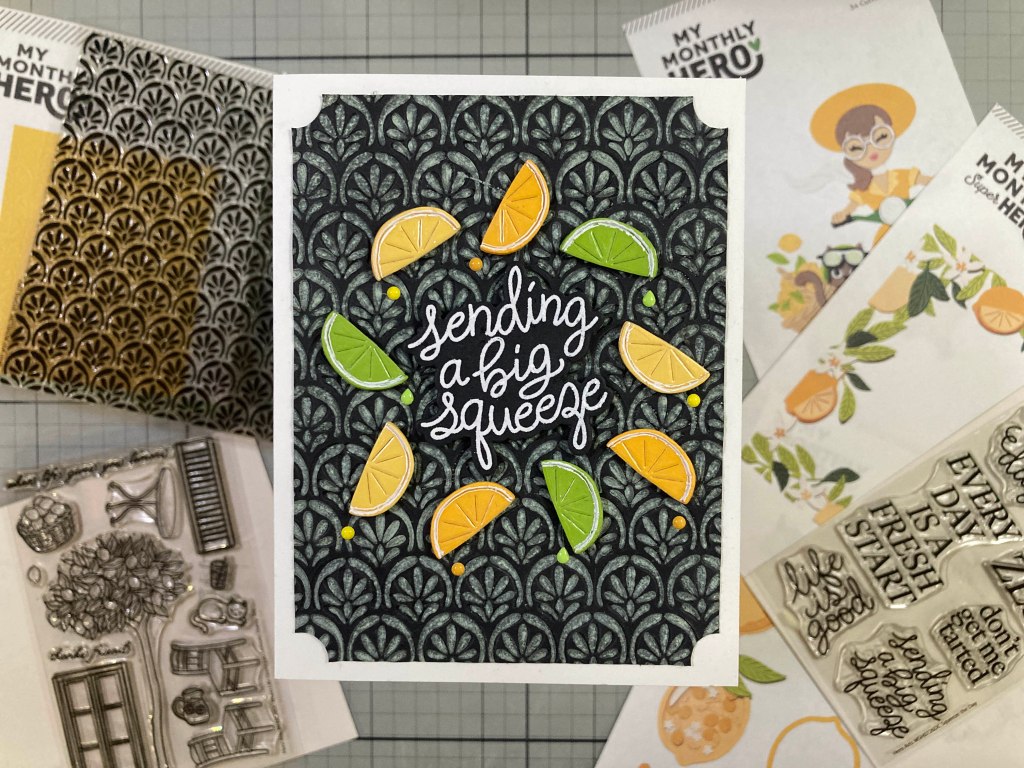
I’ve already broken into the “Squeeze the Day” sentiment stamps, so the next new item in the Super Hero Kit is the Arched Tiles Stamp that matches the Arched Tiles Embossing Folder.
I stamped and embossed this a few times and just couldn’t get the embossing to totally line up with the stamping. It would line up terrifically at the top of the stamping but – because your card stock is getting stretched when it goes through an embossing folder – the embossing and stamping would get out of alignment halfway down the panel. I found two things that can help that and used them for this card. First, I used thin card stock – 60# or 65# max (less thickness / less stretching). I stamped this with Twisted Citron Distress Oxide ink on cheap 60# black card stock. I gave the back of the card stock a light misting of water and then I embossed it backwards – debossing the stamped pattern. That gave me the best result of all the experiments I tried. (Of course you can always just ink up your embossing folder (either side) if you want an absolutely perfect match!)
I trimmed my stamped and embossed panel to 3.75″ x 5″ and used a 1″ hole punch to cut the notches in the corners. I like that! The fruit slices are die-cut from Beeswax, Saffron and Rainforest card stock from the kit. I added small squares of clear packing tape to all three colors and die-cut the slices from that so they’d be nice and juicy (shiny). The rinds are all cut from the plain card stocks and glued together. A White Gel pen adds some visible pith to the slices. I stamped the sentiment on matching Black card stock with Unicorn White ink and embossed that with White Embossing powder. I die-cut the sentiment (and two blanks) with the matching die, then stacked and glued the layers together. I arranged everything on the background and attached all with thin foam tape.
I added some enamel dots for a little more “juice” using the Spring Enamel Stickers (MMH 4/22) for the lime drips and Sunset Enamel Dots (MMH 9/25) for the Yellow and Orange dots. I wish they made more enamel “drips” in all sorts of colors! These fruit slices are from the Citrus Frame Die set and I thought they worked extremely well all on their own!
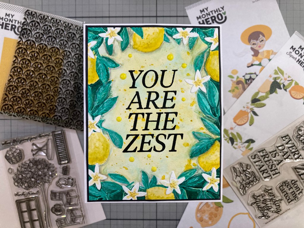
Speaking of the Citrus Frame Die Set, I think it’s about time for us to work with that large window die!
I die-cut the full frame from the Fern card stock to begin with, and die-cut the fruit dies (twice) from Saffron card stock. I cut the three leaf dies twice from Peridot card stock, and cut 10 flowers from White card stock and 10 centers from some watercolored card stock. I did some soft shading on all the die-cuts with my Pebbles Chalk Palette (and a little yellow Zig Marker on the flowers) and added some dotted texture to the fruit with a White Gel pen. I glued all the pieces together as indicated on the full die-cut – a little bit of sleuthing required to match everything up – I believe I flipped a couple pieces of fruit over to make them match better, and I added some extra leaves here and there…! But no cut-up fruit segments still on the bough!
I created this background with my new Copic Air Brushing System – Though I don’t have any Copic markers, I have lusted after one of these for a while and I heard that they might be discontinued, and Blick Art Supply was having a sale so I grabbed one for myself. Since this system truly works best with Copic Markers, I did splurge and bought a small set of a dozen Copic markers – this background is airbrushed with B24 and B37. I will need some more practice, but this isn’t too bad for my first try…! I stamped the sentiment directly on the background with Unicorn White Pigment ink and embossed it with White Embossing powder. I glued the Citrus Frame die cut to the background and then down to an A2 White card base. A few more Orange Sunset Enamel Dots gives us a little more shine and I just love these colors!!
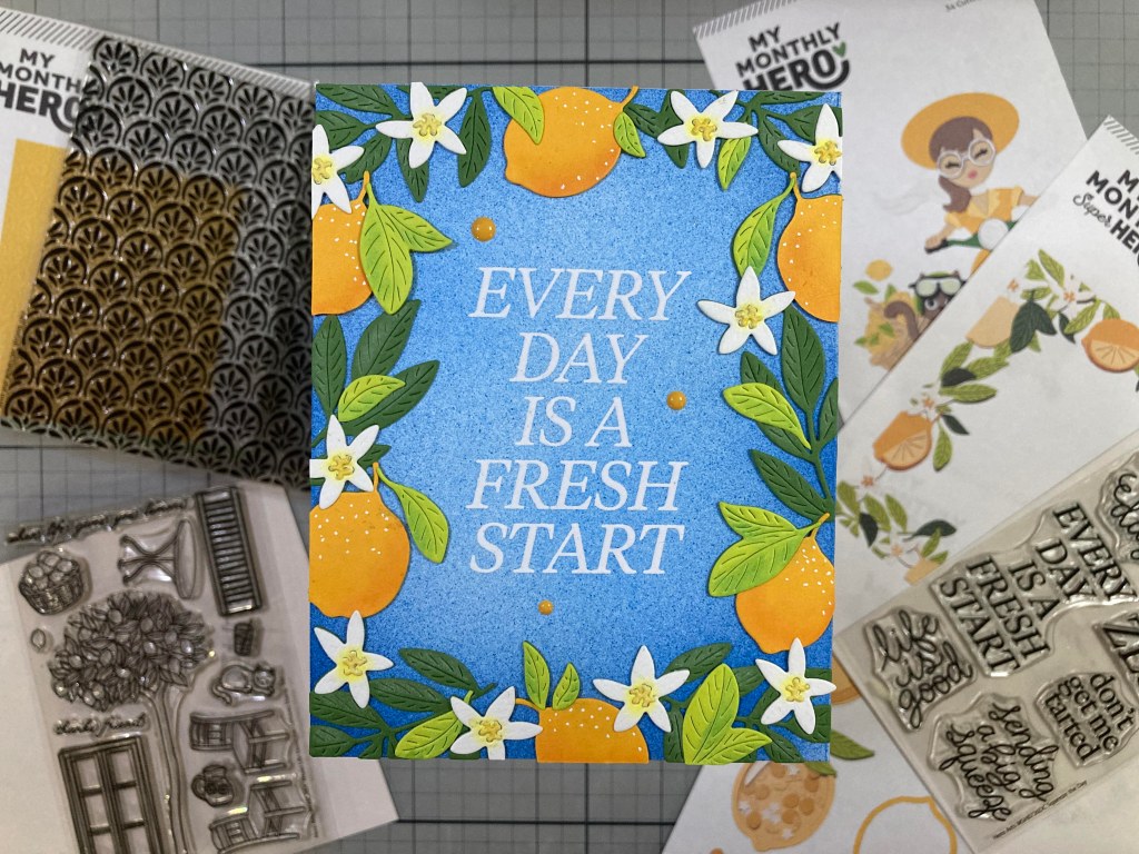
At this point I was eager to do some more coloring, but I’ve already used all the image stamps in these kits… so I decided to emboss the Citrus Frame Die on some watercolor card stock using the embossing mat and plate that came with my Platinum Six Die Cutting machine.
Though I am far from an expert at watercoloring, I do enjoy the process, and I really should make the time to practice more! This is all painted with Daniel Smith watercolors and I try to paint in thin layers and build up to the darker colors… This is certainly a little bit more free-form than what the die-cut assemblage gives you, but I’m really pleased with how this turned out. I did die-cut 10 flowers and centers from more watercolor paper, added a little color to those and glued them in place on top of the painted card. – that way I didn’t have to worry about keeping the flowers White while watercoloring the rest – AND the die-cut spots for the flowers had no detail whatsoever.
I stamped the sentiment with Onyx Black ink and embossed it with Clear embossing powder, and trimmed the panel to 4″ x 5.25″. I added a thin Black mat behind and glued those to an A2 White card base. A batch of Yellow Sunset Hero Hues Enamel dots is scattered around for a touch of shine and dimension. I do love this pun a great deal and it obviously works perfectly for any lemon-themed card! And breaking out my watercolors felt really good and serves to remind me that watercoloring is always a viable coloring option!
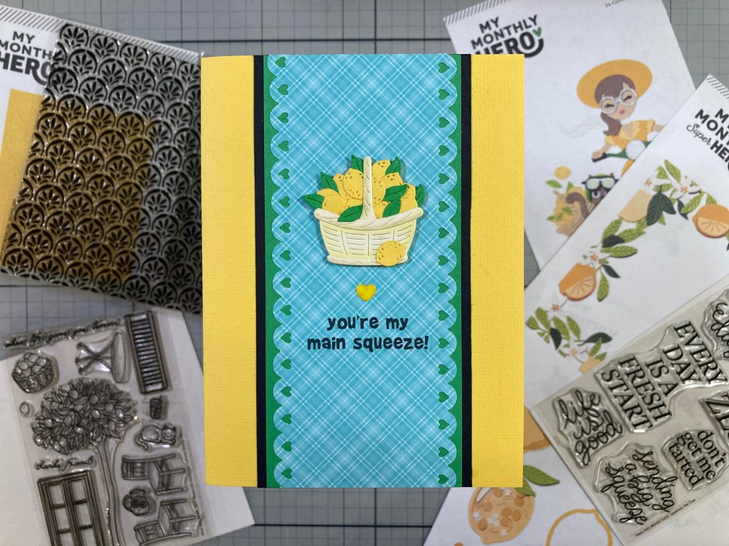
I feel like I’ve really stretched the boundaries of the kits this month, and that last card took a lot of time… let’s go with something simple for my last card this month. I haven’t used the basket and lemons in the Let’s Ride die set yet…!
A very non-traditional Valentine with lemons! I die-cut the basket and trim pieces from some plain Ivory card stock and did a little shading with my chalk pastels before gluing the pieces together. I die-cut the lemons from the “Lets Ride” and “Citrus Shaker” die sets from textured Yellow card stock and the leaves from the “Let’s Ride” die set from plain green card stock. I piled all the lemons and leaves in the basket with one stray lemon down front.
I picked this Blue plaid pattern paper from the SSS April 2017 card kit and trimmed it down to 5.5″ tall by about 2 3/8″ wide using an old American Crafts Border punch (love those hearts!). I printed the sentiment directly on the pattern paper using my Silhouette Software and the Brady Bunch Remastered font. I glued the Blue plaid down to a 5.5″ x 2.5″ plain Green mat and then down to a 5.5″ x 2.75″ Black mat. Those are glued to the center of a textured Yellow card base. Our basket of lemons is attached with thin foam tape. I colored one of the Clear enamel hearts from the Spring Enamel Stickers with a Yellow alcohol marker, stuck it down to a plain piece of White paper and trimmed the excess paper away (making the heart opaque) and glued that on the card front. Another card that almost makes my mouth water!
And that’s a wrap on another 10 Cards 1 Kit post inspired by the My Monthly Hero and Super Hero Kits for July of 2026! Truly a bright and cheerful batch of cards! Finally, some really good opportunities to do some coloring this month!
It feels like I’ve used almost everything in these kits… I did use every stamp except for the “life is good” sentiment, I used the embossing folder (and stamp) a few times, and even though I didn’t make shaker cards or the Girl on the scooter, I do feel like I gave all of the die sets their proper due. I really do like all of these card a great deal… something about Lemon Yellow just brightens my mood and fills the soul! Let me know which cards are your favorites!
If I’ve managed to catch your eye with these great new card kits from Hero Arts, and you’d like to grab one of these for yourself, please use my links listed below! I do get a small commission (at no cost to you) when you use these links, and that helps keep the wheels spinning and the AC blasting so I can keep sharing some ideas for these new kits!
Thank you very much for spending some time with me today. Your attention is always appreciated! If you enjoyed this post, please click the Like Star at the bottom of the page, and if you wish to be notified when a new post comes out, just click the Follow Me button at the top of the page. And don’t hesitate to send me a note if you have any questions, comments or just to say Hi!. Please take a moment to Like Me, List Me, Pin Me, Post Me, share this post with all your crafty friends (anybody have a lemon tree in their backyard?). And remember… Don’t run with scissors! As always, I send You and Yours Love and Light and Happy Crafting!!
DISCLOSURE: This site contains some affiliate links to products. I may receive a commission for purchases made through these links (at no cost to you). As an Amazon Associate I earn from qualifying purchases. Thank you!
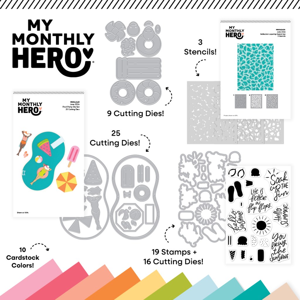
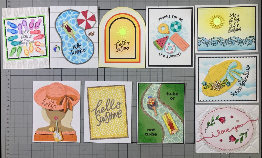
Hello my dear Folks! Here we go again with my 10 cards created with the My Monthly Hero & My Monthly Super Hero Kits for June of 2026. Summer is in the air as we dig into these “Soak Up the Sun” themed kits. Even after last week’s heat wave, I am definitely ready for some warmer temps!
To kick off the My Monthly Hero kit we have the Hello Summer Stamp and Cut set with five sentiments and some summer icons silhouette stamps – and dies to cut everything out.
Then we have the Reflection Layering Stencil Set that includes three stencils to color this fun watery pattern.
The Pool Party die set comes next with a large kidney shaped pool and a young lady with an assortment of pool floats and umbrellas and a popsicle to boot! I guess there are no guys at this party… that seems kinda boring…! (let’s see if I can fashion a gentleman swimmer from these dies…!)
We also get this small Fun Floats Die Set with a variety of pool floats and even a Ducky preserver! WOW! That’s a lot of dies in this kit! We finish out the Hero kit with 10 (8.5″x5.5″) sheets of Spellbinders Color Wheel card stock in Tutu, Dahlia, Coral, Carrot, Beeswax, Peridot, Seaside, Waterfall, Teal Topaz and Fawn.
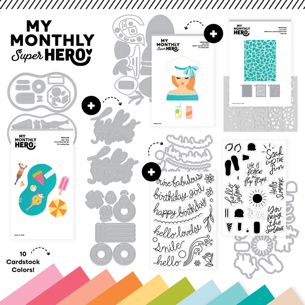
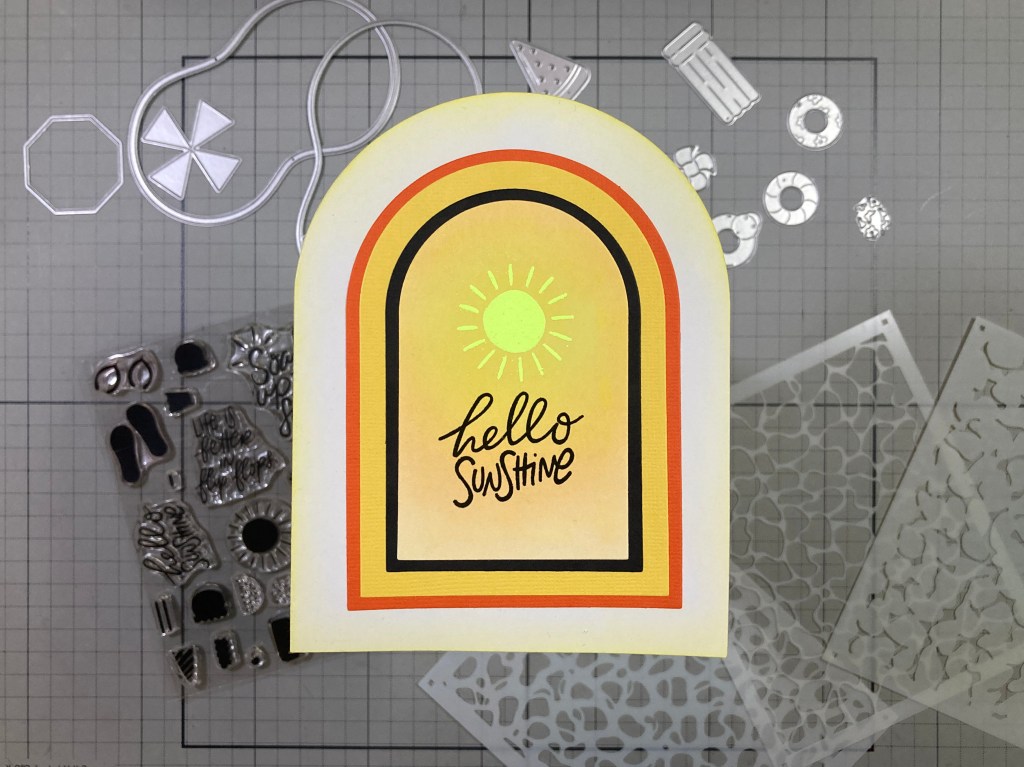
The My Monthly Super Hero Kit includes everything in the Hero Kit AND this Sippin’ Summer Die Set which makes a lady with downcast eyes and a big sun hat, along with a can (or glass) of something sippable!
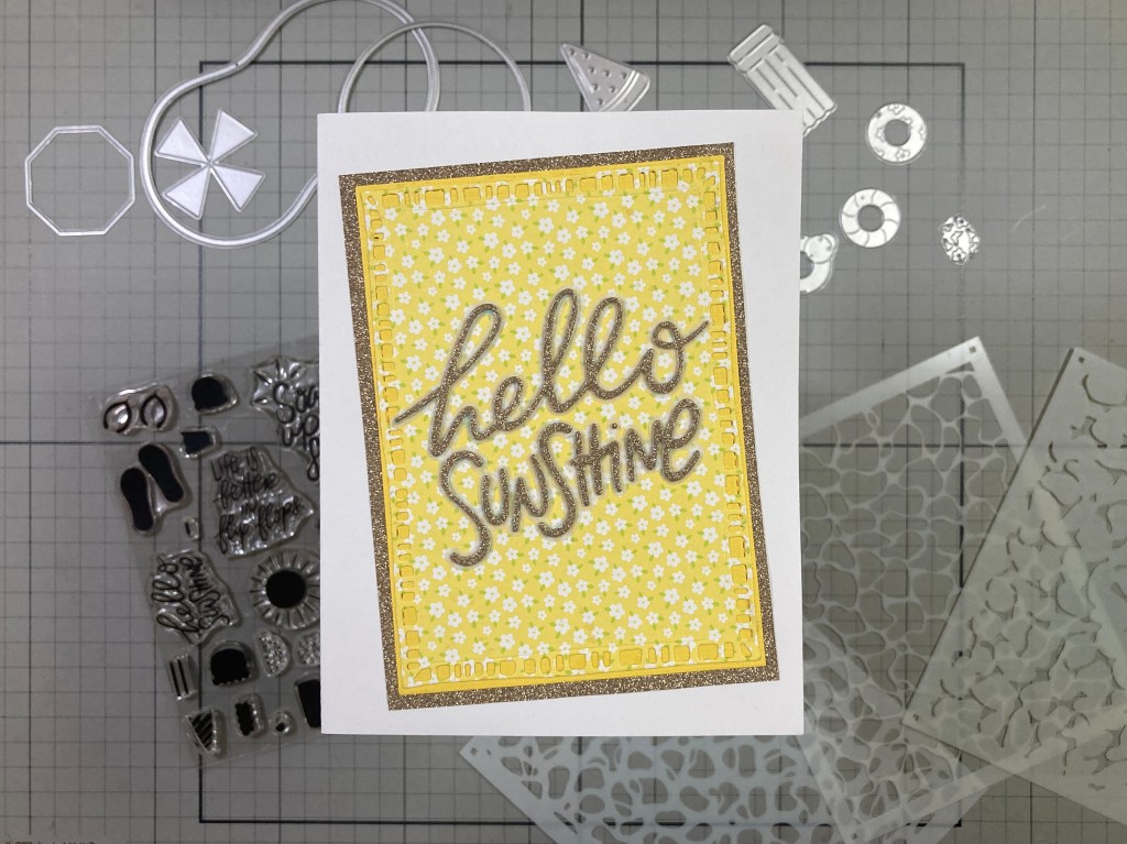
Then we get a nice, large Hello Sunshine Die Set which includes the sentiment die and a shadow die as well. Not a very big shadow, but definitely helpful when assembling this sentiment.
Then we wrap up this whole kit with the Fabulous Phrases Stamp and Cut. Six more sentiments that appear to be curved to fit on the large sun hat in the Sippin’ Summer die set, and a few flowery icons. All the sentiments and images have matching dies as well.
Another great value with these kits though I am a little disappointed that there are not more stamps to color… maybe next month! I will go through this whole kit and try to make 5 cards with the Hero Kit and 5 more using the whole Super Hero Kit. Let’s see how much of this packed kit I can use on 10 cards! This first card seems perfectly appropriate to get us started!
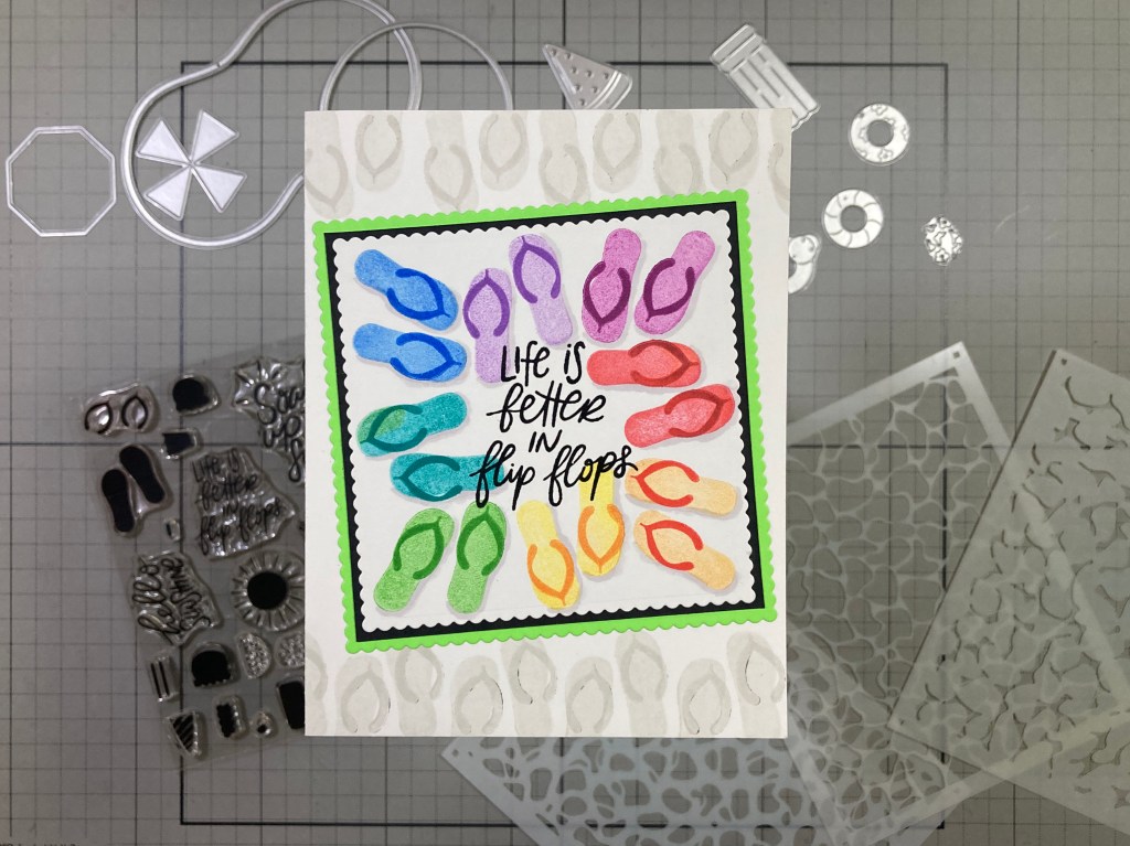
I reached for my Gina K Designs 4″ Wreath Builder Template to stamp these flip-flops in Hero Hues Fruit Punch, Creamsicle, Lemon Drop, Green Apple, Blue Raspberry, Blue Hawaii, Thistle, and Berry Smoothie Reactive inks. All the straps are stamped repeatedly in the same colors except for the Orange and Yellow which have straps of Red and Orange respectively. I did stamp the four outward facing thongs first, then repositioned the stamps for the four pair facing inward. When the stamping was complete, I stamped the sentiment with VersaFine Onyx Black ink and embossed that with Clear embossing powder.
I did take a Light Grey Alcohol marker and added some subtle shadowing around the flip-flops. That gives this footwear a bit more presence! I die-cut the stamped panel to 3.5″ x 3.5″ with a Tonic Studios Scallop Square Layering Die Set, added a thin Black mat behind and then added a Fluorescent Green mat die-cut at 3.75″ square with the same Scallop dies. I stamped the flip-flops across the top and bottom of an A2 White card base using Hero Hues Contour ink, then I glued the matted and inked panel on top at a fun angle. Remember when we used to call these thongs and nobody even snickered..!!??
Now we have the Reflection Layering Stencils. I was eager to see how well these worked and did learn that you do want to use your lightest color for Stencil 1, darker for Stencil 2, and darkest for Stencil 3. that seems to work best!
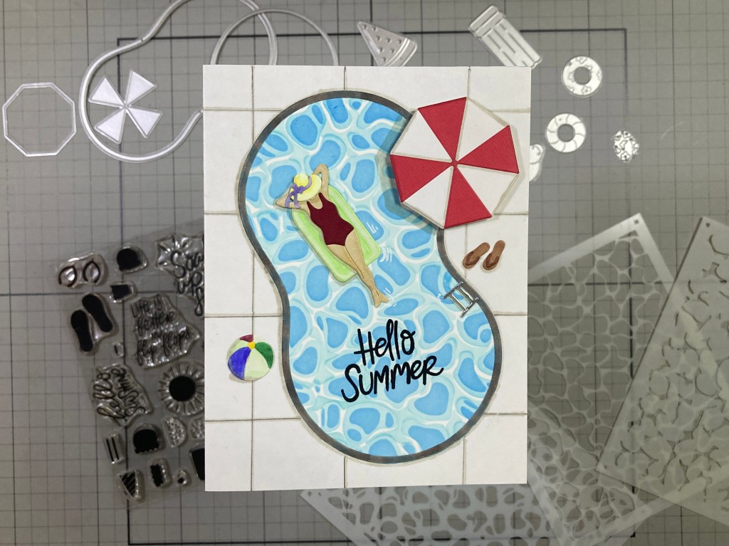
This Reflections Stencil is inked in Hero Hues Pool Party (#1) Splash (#2) and Blue Hawaii (#3) Reactive inks. I really do like the pattern the stencils give us!! I die-cut the Kidney Pool from the stenciled pattern and die cut the edge of the pool from White card stock and colored it with a Grey Alcohol marker. I glued those to the front of an A2 White card base. I die-cut the “ladder” from some Silver Metallic card stock and die-cut the umbrella, flip-flops and bathing suit from colored card stocks.
I die-cut our lady and her hat and bow, her pool float and beach ball from White card stock and colored them with my Alcohol markers. I actually used the top of the popsicle for her float – a little smaller than the Watermelon float in this set! I assembled all the die-cut images (those flip-flop straps rank as teeny-tiny fiddly bits) I stamped the sentiment in the water with Versafine Onyx Black ink and embossed it with Clear Embossing powder. I drew on some “concrete” lines to fill in the background using a pencil and a Light Grey Alcohol marker, and then I glued the assembled images in place. I mounted the umbrella on some foam tape for a little added dimension, and then added a little more umbrella, beach ball, and pool float shadows with a Light Grey Alcohol marker. Party of One? Right this way!
I do have a particular Embossing powder I wanted to try with the Sun stamp in this set, so I did a mock-up first to see how well it would work…
This is Neon Lemon Embossing powder from Love From Lizi! It works terrifically well! I ink blended Lemon Drop and Creamsicle Reactive inks on a small panel of White card stock and when that was well-dried, I embossed the Sun using VersaMark ink and the Neon Lemon embossing powder. Then I stamped and embossed the sentiment as usual.
I broke out my Spellbinders Essential Arches dies and and cut the inked panel with the 2.25″ wide die. The Black mat is 2.5″ wide, the Yellow mat is 3″ wide and the last Orange mat is 3.25″ wide. I die-cut a White card base with the 4.25″ wide Arch die and did some light ink-blending on the edges with Lemon Drop ink. I glued the matted and inked panels on top. LOTS of shine on this card without a single embellishment!
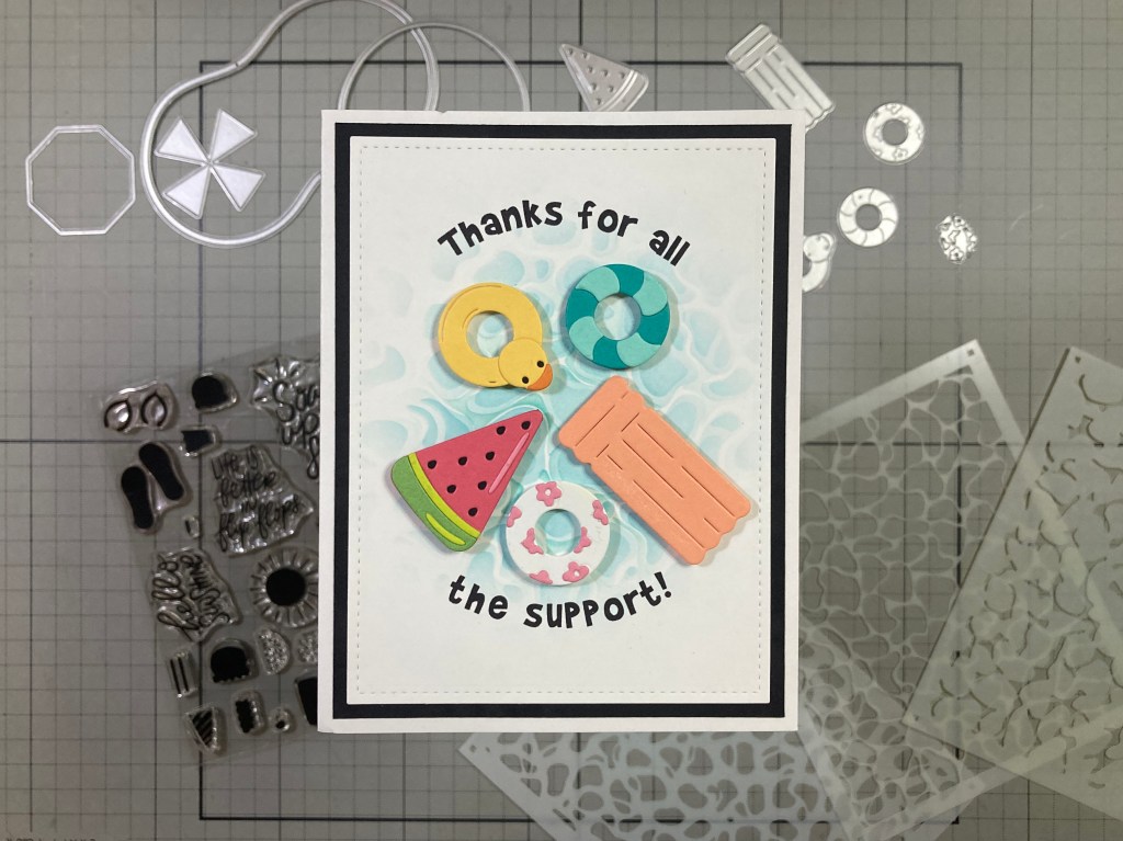
The Fun Floats Dies Set gave me the idea of doing a card just featuring pool floats! There are four complete floats in this die set and when added to the two floats in the Pool Party set, that’s SIX (seven if you count the popsicle top as a float!).
I did use only the Color Wheel Card stock in this set for our pool floats here! I started by ink-blending a circle of the Reflection stencils on a panel of White card stock ONLY using Pool Party Reactive ink – lightly for stencil #1 then darker for Stencils #2 and #3. A single color works very well with these stencils! I die-cut all the floats from the card stocks in the kit and assembled all the pieces together – some very small fiddly bits! (The Black and White is from my stash). Gotta love that duck and watermelon slice!
For a sentiment, I could have put “Soak up the sunshine” or “Hello summer / sunshine”. “You bring the sunshine” doesn’t work… even the sentiments in the Super Hero Kit don’t really do it for me! I finally came up with this Thanks sentiment as a little visual double-entendre..! Using my Silhouette Software, I printed this sentiment right on top of the reflections stenciling using the Brady Bunch Remastered font (one of my favorites!) and my piggy-back printing method. I die-cut the panel to 3.75″ x 5″ with a Lawn Fawn Stitched Rectangle die and added a 4″ x 5.25″ Black mat before gluing them both to a White card base. All that’s left is to add the floats with some foam tape! I did think about making these all shiny with Glossy Accents or even giving them white “reflections” with a gel pen, but I really liked the simple straight-forward approach for these die-cut pool floats – let them “shine” all on their own!
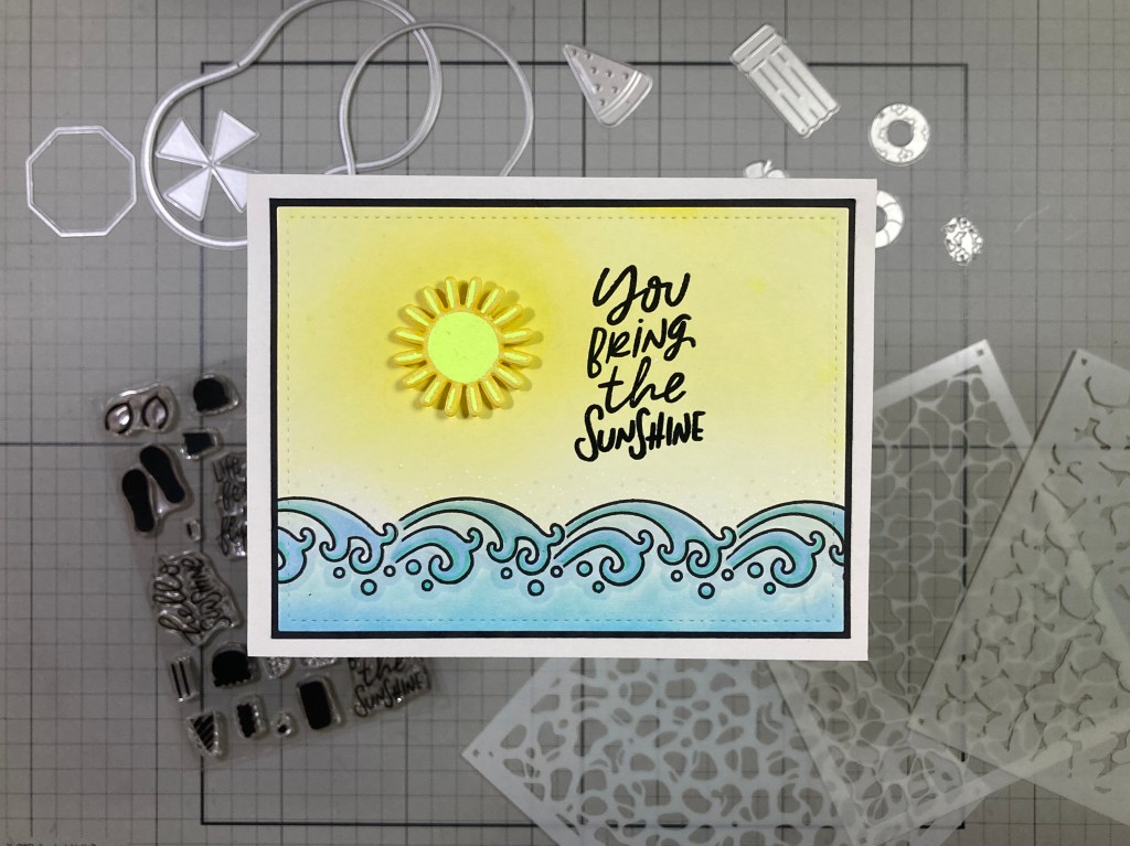
By this point I’m really dying to do some coloring… any coloring…! I’m going to have to jump into the Fabulous Phrases Stamps in the Super Hero kit for something to color…!!
Okay… so it’s just waves… but at least I got to COLOR the waves!! I played around with this “wave” stamp for a while – in a few configurations – before I decided to just cut a mask for the front of the wave and group them together – that stamp does have very long “tails”. I stamped the line-up of waves on a panel of White card stock using VersaFine Onyx Black ink and when that was dry, I colored the waves with my Ohuhu Alcohol Markers. I ink-blended Lemon Drop Reactive ink on the top of the panel concentrating the color on the mid-left. When that was all dry, I stamped and embossed the sentiment as usual.
The sun is die-cut from the mock-up I did for the “hello sunshine” card – no point in wasting it! The panel is die-cut to 3.75″ x 5″ with a LFSRdie and a thin black mat is added and glued to an A2 White card base. I did add some soft dots of blue around the top of the waves, but the shine on the sun and the sentiment is all the sparkle that’s needed!
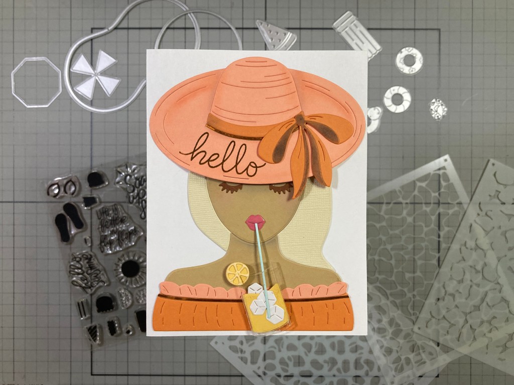
Now we have the quite large Sippin’ Summer Die Set. Lots of girls this month… not sure if I should feel slighted or not?
Very interesting die set! Truly unique to my stash! I die-cut her face and shoulders from the Fawn card stock in the kit and her dress and hat from Carrot and Coral card stocks. I die-cut her hair and eyelashes from some linen textured card stocks – I do like that texture in her hair – and I die-cut her lips from Dahlia card stock with packing tape on top for shine. I did do a “master” die-cut of her out of plain White card stock and then began gluing the die-cuts on top. I did take the time – as I was gluing her together – to add some soft shadows on her neck and jaw line – you can see a touch of pink on her cheeks too – I just used my Pebbles Chalk Palette to add those subtle touches.
This sun hat is almost 4.25″ wide!! I assembled the hat separately, adding more shading with chalk pastels – the dark parts of the bow are cut from Carrot card stock and colored with the chalk pastels – just rub it in good and it won’t go anywhere! Now a lot of the sentiments in the Fabulous Phrases Stamp set won’t fit on the brim of this hat if you use the bow – which I wanted to use – so I just stamped the “hello” on the brim with Root Beer Reactive ink and embossed it with clear embossing powder before assembling the hat together. I added some thin Orange/Gold Peel-offs from Love From Lizi on her dress and around the ribbon on her hat. Nice touch of sparkle!
I die-cut the glass from a thin piece of acetate and cut the extra “can” part away from the top using the “can top” die as a guide. The lemonade and lemon are die-cut from Beeswax card stock – I used a white gel pen to make the pith of the lemon slice lighter – and I die-cut the cubes from White and the straw from Seaside card stock. I glued the cubes to the “lemonade” and glued that behind the acetate with a thin bead of liquid glue just along the side edges. I cut the lemon slice and placed it on the “rim” of the glass, slipped the straw in the glass (and her lips) and started glueing everything down to a White card base. I used some foam tape behind the glass and under the brim of her hat where it is in front of her head. I do think this is a totally wacky die-set that I may rarely ever use, but it actually makes a nice card!!!
Once again, we get a large sentiment die in the Super Hero Kit… a big “Hello Sunshine” in a thin hand-written font…
I found this great pattern paper in an old Simon Says Stamp card kit (March of 2017) and thought it would work perfectly with this sentiment. I die-cut the pattern paper with a Moda Scrap Framed Rectangles die (just under 3.25″ x 4.5″) and glued that to a piece of Beeswax card stock cut to 3.25″ x 4.5″. I die-cut the sentiment from an old DCWV Glitzy Glitter cardstock stack in Gold, die-cut another from White card stock and glued them together.
I die-cut the shadow die from some thick vellum and glued the stacked sentiment on top. The shadow die is not very much bigger than the sentiment die so it practically disappears on this card, but, trust me, it is very handy for assembling this sentiment together. I added a gold mat (3.5″ x 4.75″) behind the pattern paper stack and glued the sentiment on top. Talk about teeny-weenie fiddly bits – just try keeping track of the tittle on the “i”!!! The intense glitter on this card just makes me smile!
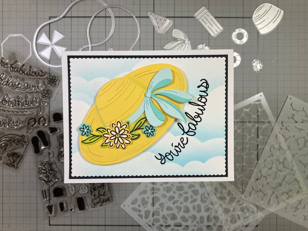
I mentioned the size of the sun hat in the Sippin’ Summer Die Set – seems big enough to feature on a card all by itself!
I die-cut the hat pieces from some Yellow textured card stock from my stash (SO close to the Beeswax card stock in the kit) and did some soft shading to the hat with my Chalk Pastels as I glued the pieces together. The ribbon and bow are cut from Seaside and Waterfall card stocks and glued to the hat. I stamped the big Daisies on Beeswax card stock, the leaves on Peridot card stock and the small flowers on Teal Topaz card stock using VersaFine Onyx Black ink and die-cut them all with their matching dies. I gathered them into a simple arrangement (that’s one Big daisy with three of the Coneflowers behind it in the center) and glued those to the sun hat.
I ink blended a panel of White card stock with Splash Reactive ink and a Cloud Edges stencil, decided on my sentiment placement, then stamped and embossed the sentiment as usual. Then I had to do some partial die-cutting with my Square Scallop dies to get a 3.75″ x 5″ inked piece. I added a thin Black mat behind and glued those to an A2 White card base. I attached the hat with foam tape including more foam squares under the edges of the bow. Finally, I added a small clear gem in the center of the flower spray. That’s a nice hat floating by… and certainly kind of fabulous!!
This card is way off theme, but I’m trying to use all the stamps in the kit, and I’m still jonesing for a little more to color…!
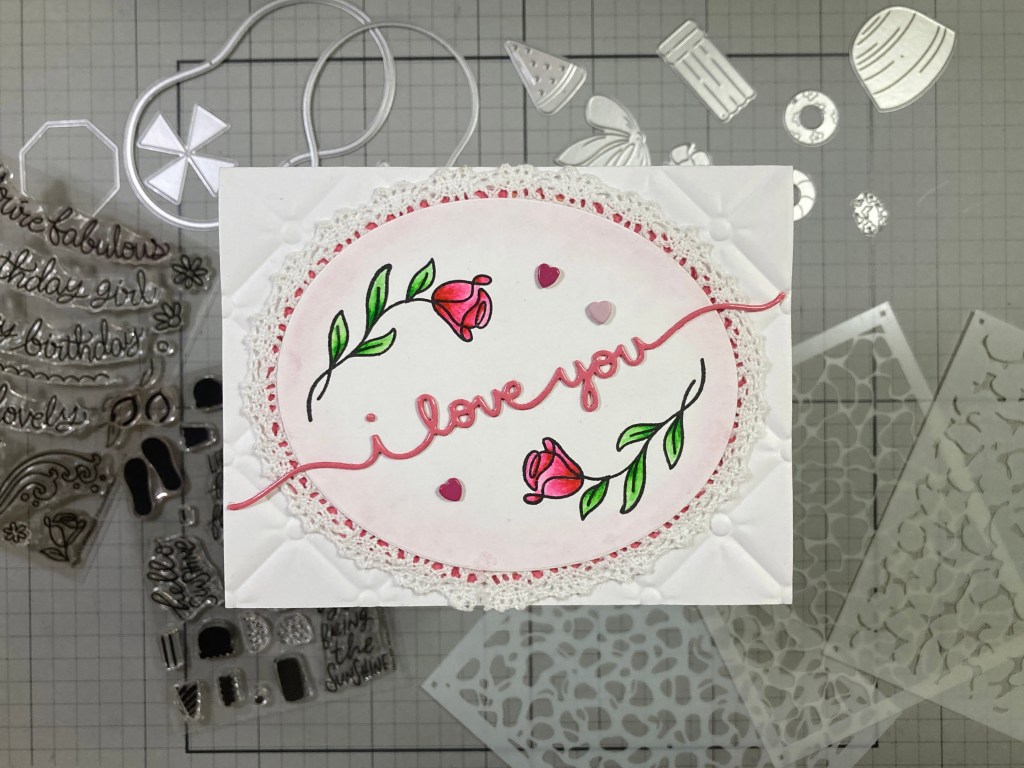
A sweet, classic valentine! I played around with the Rose and leaves stamp until I came up with this arrangement. I stamped these on Bristol Smooth card stock with VersaFine Onyx Black ink and colored them with my Zigg Clean Color Real Brush markers. Ahhhhh… even better than coloring waves!! I die-cut the colored panel with a HA Nesting Ovals Infinity die (4.5″ tall) and lightly inked some Fruit Punch Reactive ink around the perimeter. This oval was crying out for some lacy trappings so I moistened a piece of lace ribbon and stretched it around the oval perimeter and taped it in place to dry under weight. When dry I went back and added liquid glue to hold the lace in place. Then I added a a mat of Dahlia card stock (cut with the next larger Oval die) behind the lace.
Using an old Lawn Fawn Scripty Borders die, and the Dahlia card stock that already had packing tape on it (lips!) I die cut the sentiment (keep track of that tittle!). I embossed the front of a White Card base with the Spellbinders Tufted 3D Embossing folder and glued the lacy oval on top. I glued the sentiment down letting the ends hang over the oval and the lace. Three little enamel hearts add a little more texture and shine to wrap things up. I do love these roses!
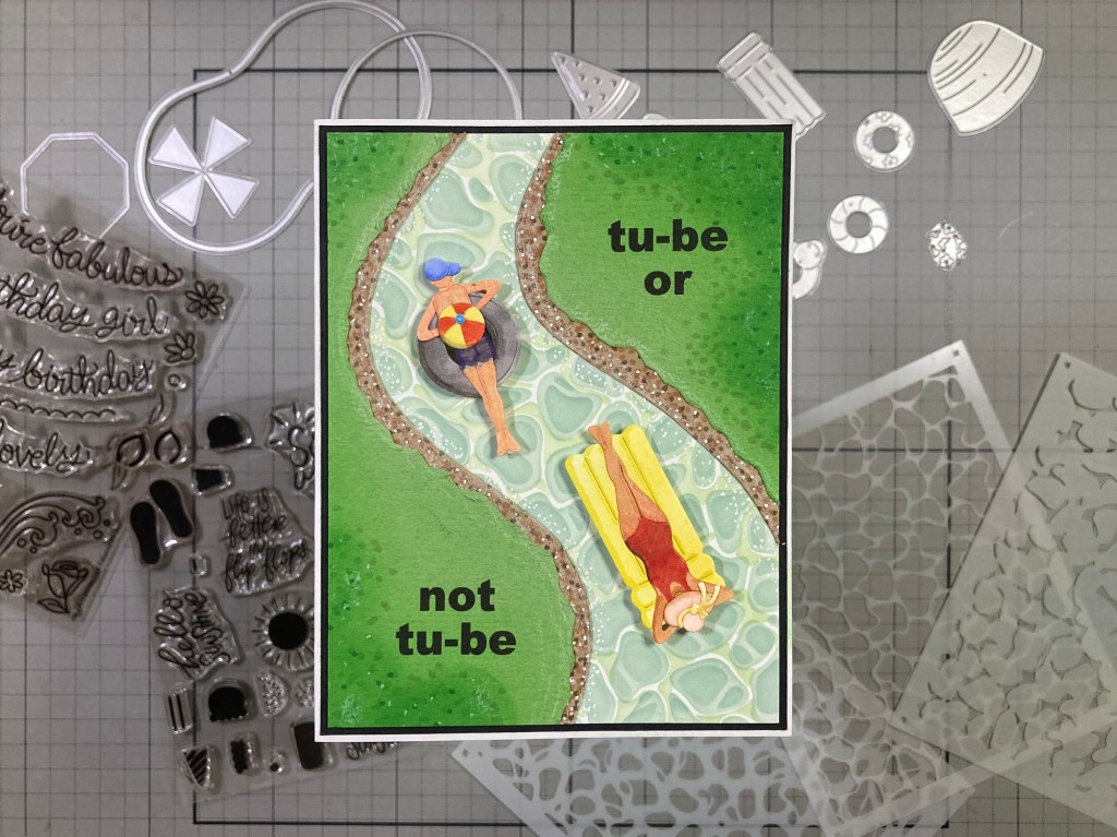
After college, I spent 7 years living in the Phoenix, AZ area and was pleased to have been able to go tubin’ on the Salt River – it was always a huge party of friends and acquaintances forming virtual inner tube flotillas bobbing along the river. I also mentioned that I would try to find a way to get a man to join the party!
This river isn’t nearly as big as the Salt River, but I think it gets the idea across! And we have a Gent on the inner tube! AND a pun!! HA!! I ink blended the Reflections Stencil on an A2 panel of White card stock using only Altenew Misty Morning ink – I knew this “Grey” had a definite green tint and thought it would feel a little more natural than blues. I free-hand cut the “river” from the stenciled panel so I was able to use the off-cuts as patterns for the riverbanks, and I could then lay out my pun-y sentiment. Using my Silhouette software and the Arial Black font, I printed the sentiment on a panel of textured linen Green card stock.
Then I cut the two layers for the banks – Kraft card stock and the textured Green. The Kraft shore goes over the edges of the river, and the “greenery” is trimmed back and distressed with the edge of a scissors. I glued everything together and used Green Apple Reactive ink, some Alcohol markers and a White Gel pen to add texture and detail to the greenery, shore and water – I think this has a nice flow… a good sense of movement!
Our die-cut folks are all cut from Neenah Solar White card stock and colored with my Ohuhu Alcohol markers – even her swimsuit is colored on. For the gent, I just trimmed the curves off the female die cut (mostly hips), removed his head and arms, gave him a bit of a neck for his head, flipped the arms down so he wasn’t in the same pose, colored some cut-offs for his trunks and then cut off the trunks and shortened his legs a bit. His hat is cut from her hat die (easy!) and his beach ball is the center off-cut from the white tube on card four. To help with coloring, I taped the cut out to the back of the big beach ball die so I could run it through my die-cutting machine and get the score lines on the small ball!
I trimmed the background panels to 4″ x 5.25″ and added a thin black mat before gluing them down to an A2 White card base. Our assembled participants are mounted with thin foam tape for a little more dimension. I and couldn’t resist printing this sentiment completion on the inside of the card – BEFORE assembly!! This card tickles me and evokes fond memories!
And that wraps up our ten summer party cards – okay, there’s one valentine but most everything is a party! I did manage to use almost everything in this kit – I never got to the silhouette ice cream stamps and I only used a couple of the Fabulous Phrases sentiment stamps but I did use those ephemera stamps in that set… and a lot of the card stocks too!
This is a bright colorful batch of cards this month – perfect for spreading around a little summer-time cheer! My favorite part of this kit has to be the Reflection Layering Stencil Set and the Pool Party dies are terrifically fun, and who would have thought that you could get a sweet vintage Valentine out of a “Soak Up The Sun” Kit!
If you like the ideas I’ve come up with or something different has clicked and you want to grab a kit for yourself, please use my links listed below. I do get a small commission from whatever you buy through my links (at no cost to you) and it is always supremely appreciated!
Thank you for spending a little time with me today. Your clicks are always appreciated! If you enjoyed this post, please click the Like Star at the bottom of the page, and if you wish to be notified when a new post comes out, just click the Follow Me button at the top of the page. And don’t hesitate to send me a note if you have any questions, comments or just to say Hi!. Please take a moment to Like Me, List Me, Pin Me, Post Me, share this post with all your crafty friends – And remember… Don’t run with scissors! As always, I send You and Yours Love and Light and Happy Crafting!!
DISCLOSURE: This site contains some affiliate links to products. I may receive a commission for purchases made through these links (at no cost to you). As an Amazon Associate I earn from qualifying purchases. Thank you!
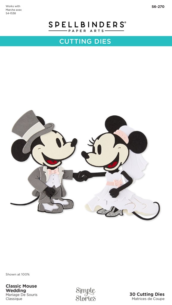
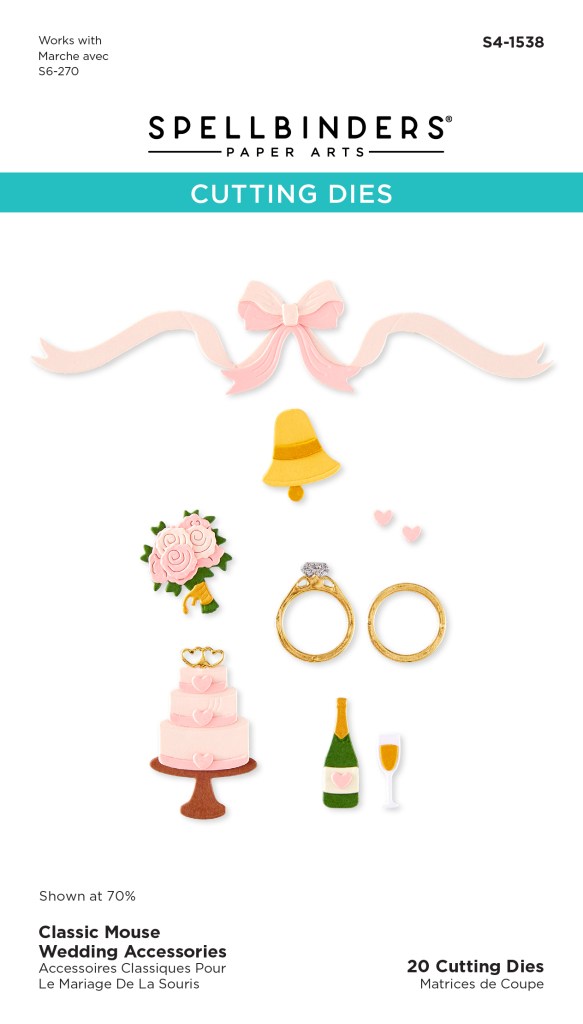
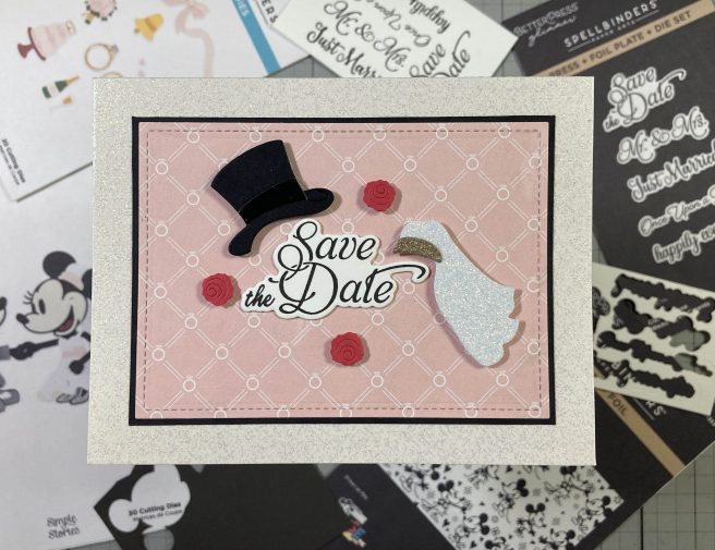
Hello Folks! Scott here with yet another new Spellbinders release in the Classic Mouse Collection – it’s that time of year for a Wedding! Another completely adorable set highlighting a very celebratory moment! Again, you DO NOT need the original Steamboat Willie Duo die set – everything you need is included in this collection!
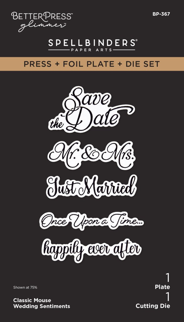
Bride and Groom all decked out! And they have a new set of arms that lets them hold hands!! I love that you can make the Bride’s dress full (as shown) or short! Also, a perfect group of sentiments that you can PaperPress with inks or Glimmer Press with foils! AND the die to cut all the sentiments is included! Love that “Once upon a time…” sentiment.
And we get accessories!! Cakes and rings and bows and bells! The little bouquet will actually fit into the Bride’s hand if you like! And there’s a terrific background Press + Foil plate of our Classic Mouse pair – so infatuated… so detailed!
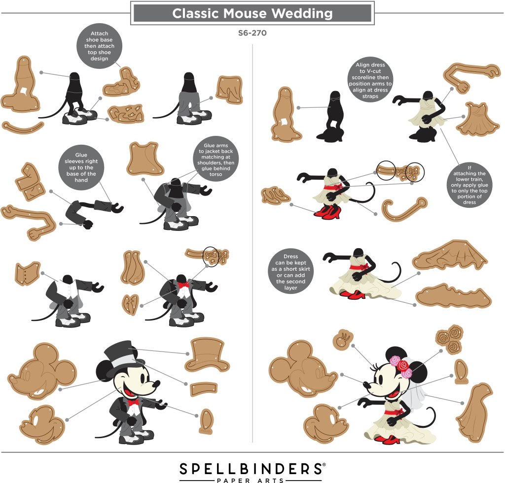
Fortunately, there is an assembly guide over at spellbinderspaperarts.com for our wedding couple. Fairly straight forward assembly, but note that for the Groom, his sleeves get glued to his arms, then his arms are glued to the jacket back before gluing to the Groom body – and remember, shoes and pants first! Our Bride doesn’t even have sleeves!!
Though I don’t know of anyone with wedding plans in their future, you never know…!!!
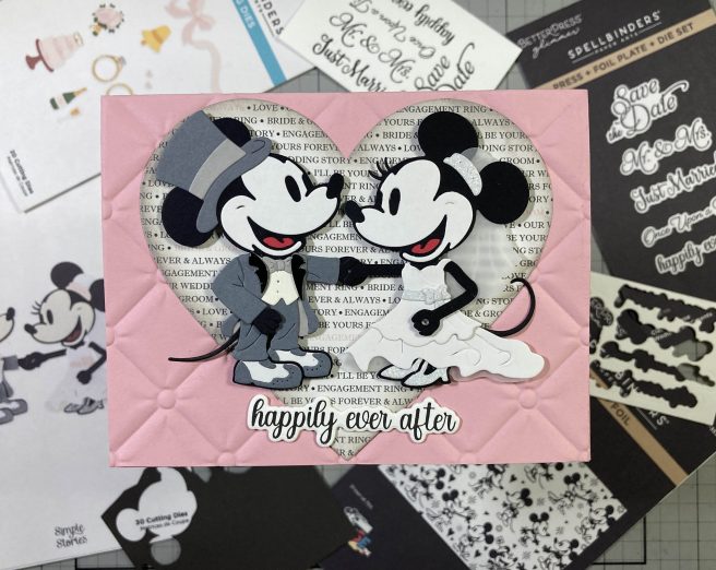
Downright delightful! Especially if the intended couple are Disney fans!! And I know LOTS of weddings take place in the Happiest and or Most Magical Places in the world! Wouldn’t those couples be absolutely thrilled with a card like this? Whenever I get die sets with lots of small pieces I gravitate right to my scrap card stock stash. Our Groom is done up in a Grey Tux with an Antique Ivory vest and Glossy Black lapels. Our Bride features a white gown with glittery shoes, belt/bow and headband holding a Vellum veil – I also did the back side of her dress in vellum – very classic!
I embossed the front of a Pink A2 Card base with the Spellbinders Tufted 3D Embossing folder, and I found this old pattern paper (Echo Park) in my stash – from the Simon Says Stamp June 2017 Card Kit. I die-cut that with the largest Heart die in the HA Nesting Hearts Infinity dies set and ink blended some Hickory Smoke Distress Oxide ink around the edges. I used the BetterPress to ink the sentiments on a panel of Cotton card stock using VersaFine Onyx Black ink and then die-cut all the sentiments with the matching die. I did cut another blank of the sentiments and stacked and glued them together for a touch of dimension and strength.
I glued the pattern paper heart flat to the front of the embossed card base and added the couple using foam tape – I did glue the tips of their tails flat! I glued the sentiment flat to the card front. I debated whether to give our Bride the bouquet featured in the Accessories set, but I wanted to make this card using only the main die set. So (at Joel’s suggestion) I settled on giving her a diamond ring with the addition of a small gem to her finger – perfect touch! When I look at this picture it feels like the heart is die-cut into the card front and the pattern paper is behind… total optical illusion! Cool!
I really liked the “Save the Date” sentiment in the Classic Mouse Sentiments set and thought someone could actually do all of their wedding stationary to the Classic Mouse theme with this collection!
Terrific invitation and very simple to assemble! The pic doesn’t really show it, but the top hat has a Glossy Black band and the veil is in Golden Glitter and White Glitter. AND, believe it or not, this pattern paper came from the same SSS 6/17 kit – and it is “tufted” just like the embossing folder on the first card! I HAD to use that! I die-cut the pattern paper to 4.5″ x 3.25″ with a Lawn Fawn Stitched Rectangle die, added a thin Black mat and glued those to a glittery White card base. Looks like I’m breaking out all the sparkles for this collection! I glued the sentiment flat to the card front and added the die cuts with foam tape. You could easily add the invitation and reply card inside!
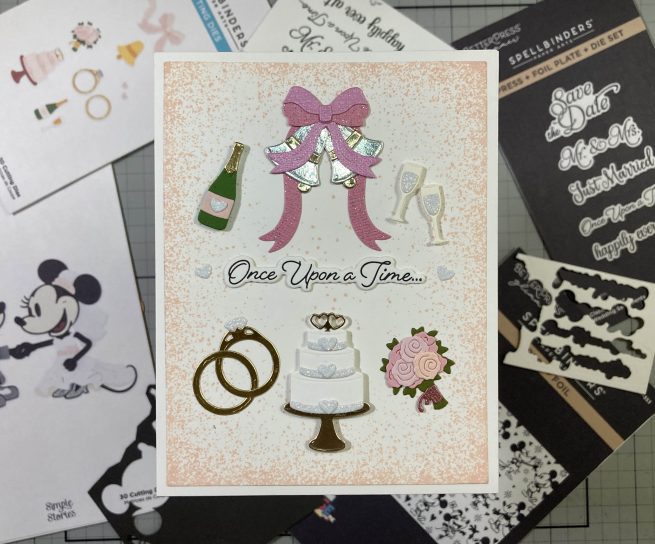
Of course, I can’t ignore the Wedding Accessories… (though I have to admit I’ve had my fill of tiny die-cuts this month)!
Throwing caution to the wind, I decided to use ALL the die-cuts from the Wedding Accessories on one card! This actually began with me fiddling around with the bow and ribbons and trying to figure out how to use them on a portrait card instead of a landscape card! I trimmed the trailing ribbons shorter and glued them to the bow so they were hanging downward instead of straight across. Then I figured the bells would go nice in all this ribbon, so I slipped two Silver and Champagne Gold bells between the ribbons. Everything else is straight-forward according to the dies – I have to admit my favorite die in this set is the open double-heart “pick” in the top of the cake – the cake die even cuts a little hole to slip the “pick” into! Silver, Gold, Champagne Gold, White Glitter, Pink Glitter – there’s plenty of shine for this vignette!
I stamped the Concord & 9th Splatter Texture Stamp around the perimeter of an A2 White panel with Tattered Rose Distress oxide ink and added more splatters across the center. I trimmed that panel to 4″ x 5.25″ and glued that to a White card base. The bells & bow, intertwined rings and bouquet are glued flat to the card front and the cake, champagne and glasses are attached with thin foam tape. The sentiment is glued flat to the center and highlighted with the two remaining glitter hearts on the ends. I love that sentiment so much! And I used every accessory die on one card!
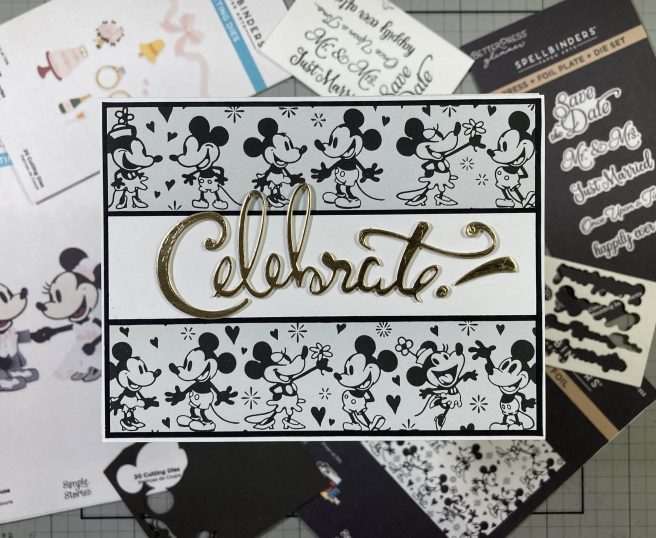
The Happiest Place Press + Foil plate thrilled me when I saw it – so cute and so detailed – I thought it would make perfect backgrounds for the whole Classic Mouse Collection!
Using my BetterPress, I stamped the plate on a panel of Pebble BetterPress Cotton card stock (some of that comes with the BetterPress system) using VersaFine Onyx Black ink. Terrific, practically perfect print! However… that background is so adorable and so detailed, that it literally overshadows almost anything placed on top – I tried the Classic Mice, I tried sentiments from this collection, I tried ribbons and bows, wedding cake, etc… all I could see was the background! (I can only imagine what a focus-puller a foiled background would be!) When all else fails bring out the big sentiments!!
This background plate is easily divided into three strips – they are still oriented in a landscape fashion but you can get three strips out of one plate. Instead of cutting my background apart, I just covered up the center strip with a 1.25″ strip of White card stock trimmed with a thin Black mat on the top and bottom. I cut the background to 5.25″ x 4″ and added a thin Black mat behind and glued those to a White card base. The sentiment is an OLD Darice die from my stash (I don’t know if I’ve ever even used this die!) cut from Champagne Gold card stock and glued to two more layers of thick White card stock. Perfect sentiment for this joyous background! A big bold die-cut Thank You sentiment would work with this background if you want to keep your thank you cards on theme!
I am always up for more items in the Classic Mouse Collection – one of my favorites of all time! If you’ve been bitten by this collection or if I have whetted your appetite for these cute critters and you’d like to get some of this collection for yourself, please use my links below – I make a small commission (at no cost to you) when you use these links to shop at Spellbinders. That helps keep this page up and running and keeps more inspiration coming your way! Thank You!!!
Thank you for sharing some clicks with me today… I hope you enjoyed another mid-month diversion as I keep exploring the Simple Stories Classic Mouse collection! If you enjoyed this post, please click the Like Star at the bottom of the page, and if you wish to be notified when a new post comes out, just click the Follow Me at the top of the page. Don’t hesitate to send me a note if you have any comments or questions! Please take a moment to Like Me, List Me, Pin Me, Post Me, basically, just share this post with all your crafty friends – especially any Disney Fans planning a wedding! Remember… Don’t run with scissors! And as always, I send You and Yours Love and Light, and Happy Crafting!!
DISCLOSURE: This site contains some affiliate links to products. I may receive a commission for purchases made through these links (at no cost to you). As an Amazon Associate I earn from qualifying purchases. Thank you!
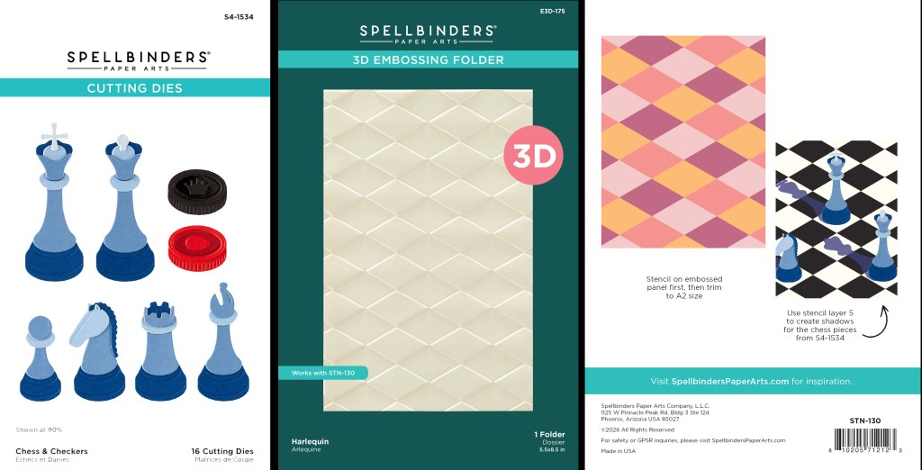
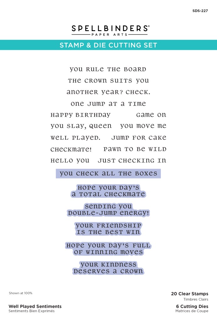
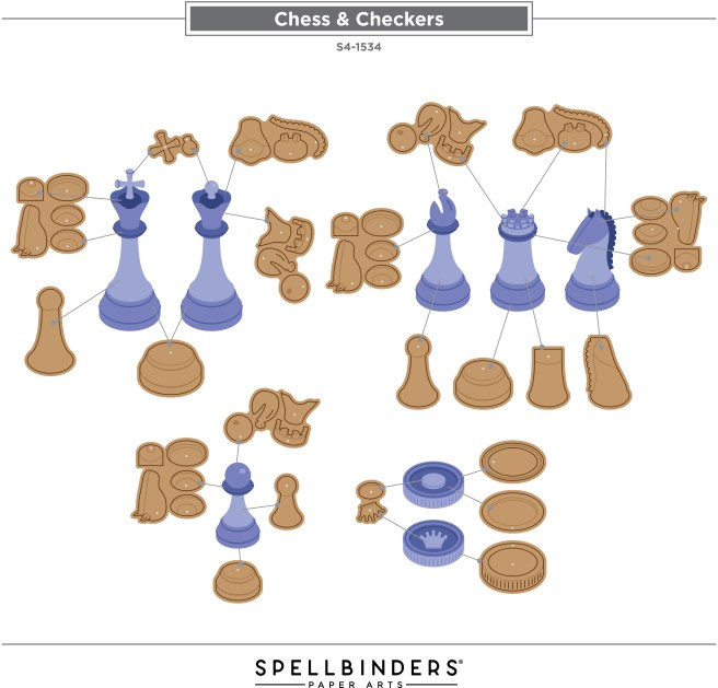
Hello Folks! Scott here with a NEW collection from Spellbinders that caught my eye – the Checkmate Collection. Not only did I think these Chess and Checkers dies were so clever and unique but paired up with an embossing folder and layering stencils, I thought this collection might be perfect for masculine cards!
The Chess and Checkers Die Set creates all the needed Chess pieces as well as Checkers! The Harlequin 3D Embossing Folder is terrific all alone, but really shines when paired with the Layered Harlequin stencils and the nifty shadow stencil for all the chess pieces!
There is also the Well Played Sentiments Stamp and Die Set that adds to the fun of this collection. 20 sentiments and the blue highlights are the 6 cutting dies included with this set. The top die will cut all the single-line sentiments above it. Some perfectly appropriate sentiments here as well as a few good puns!
Fortunately, Spellbinders has a terrific assembly guide available on-line to assist you in assembling all the chess pieces. I love the classic rendering of all the chess pieces – has anyone ever played a game of flat chess?
I wanted to put together all the chess pieces to start with, but I thought I’d stick to the classic Black/White colors, and instead of having to think of different shades of Black and While for the pieces, I decided to grab some Pearlescent card stocks out of my stash – I thought they would show off the layering and give us a sense of shine on the pieces.
The picture doesn’t show it, but both the Black and White pieces have a great amount of pearlescent shine that shows off the details delightfully! And you just gotta love those shadow stencils! I’ve never been a big chess player but I quickly became a little obsessed with creating an accurate representation of a chess game for this first card.
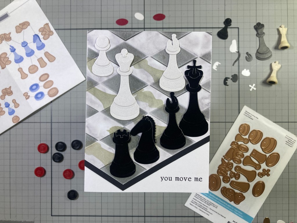
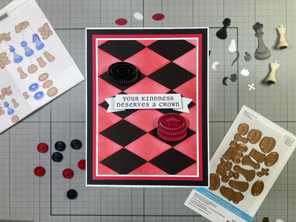
I found an old 6″ x 6″ piece of Grey Marble pattern paper (Simply Marbleous from Stampin’Up!) and embossed it with the Harlequin Embossing folder. I used the Layered Harlequin Stencil (2 of them) to ink blend Hero Hues Licorice Reactive ink into the recessed diamonds. I picked a black corner at the bottom of the embossed/inked panel and trimmed away the two sides to make this “corner of the board”. I added a 3/8″ Black mat along the “board” edges and trimmed the whole panel to 4.25″ wide. A fancy marble chessboard! Standard chessboards are 8 spaces by 8 spaces, and the most spaces you can get in a line with this embossing folder is (almost) 7, so no way can we show a whole board on an A2 card. HA!
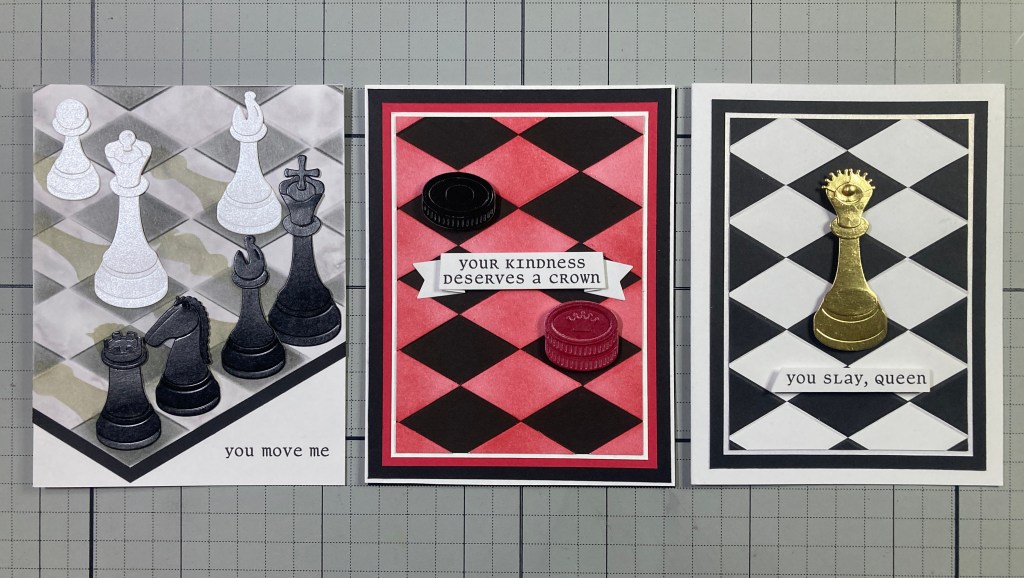
I decided where to place my chess pieces – I wanted to show off all the pieces – and I had to consider where their shadows fell as well. This is not a likely scenario for a real game, but I kind of like seeing all the Black pieces lined up in a row! I used the shadow stencil from the stencil set and ink blended Concord & 9th Dove ink through the stencils for all the pieces. I found that if you keep the shadow stencil straight up and down the shadows should fall right in place. I glued the “chessboard” panel on an A2 White card base and trimmed off the top to match. I glued the chess pieces in place and stamped the sentiment in the open corner – a nice little pun perfect for a Black and White Valentine! Looks like we caught somebody right in the middle of a game!
I like that card so much, I figured I’d go for broke with even more Black & White… what if we cut the embossing apart? I’m not sure what possessed me, but I embossed an A2 panel of Black card stock and an A2 panel of White card stock in the exact same place on the embossing folder. Then I sliced up the white panel into individual diamonds just following the embossed lines. I did take care to keep everything in order and everything facing up the same way. Then I took the recessed White diamonds and glued them into the recesses on the Black embossed panel. That was fun!
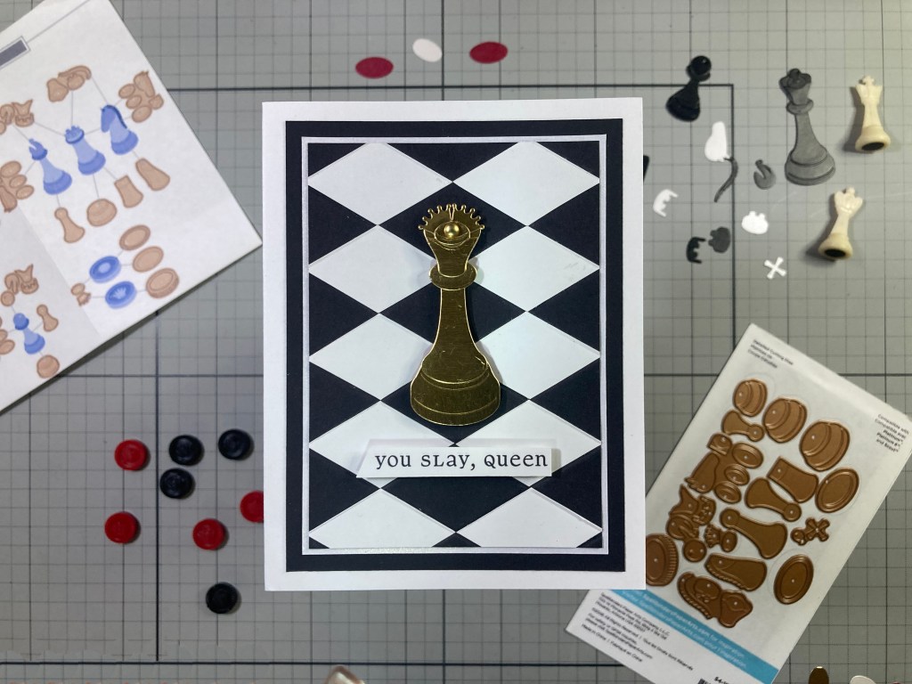
I couldn’t resist this sentiment! And of course one must have a Gold Queen! I assembled her using Tim Holtz Metallic Gold kraft card stock and added two Gold crowns (from the checkers dies) around the back of her crown, and added a Brushed Metallic Gold dot in the center. Fancy! I trimmed my paper-pieced background to 3.25″ x 4.5″ and added a thin White Glimmer mat (1/16″) and a thicker (3.75″ x 5″) Back mat behind before gluing all down to an A2 White card base. I stamped the sentiment on a scrap of White card stock and cut it out with a rakish angle on one side. I did double-up that card stock for a little added strength. I mounted the Queen and the sentiment with foam tape. This makes me smile! And you don’t have to be a chess nerd to appreciate it!
After paper-piecing that background together, I realized that I had another set of embossed White diamonds just waiting. Of course I had to emboss another A2 panel of Black card stock so I could paper piece the White diamonds on all the raised embossings. But wait… I was going to do a Checkers card next…
While I was trying to stay true to my search for classic accuracy, I realized that classic Checker Boards are Red and Black. Now, I could use the stencils to ink in the White diamonds, but if I just use normal dye ink, the black won’t show any of the ink so I can just go crazy all over the whole panel and not worry about getting Hero Hues Cherry Core ink on the Black diamonds! That was fun! I assembled the checkers with more Pearlescent card stocks and stacked up the two red checkers for our “crowned” checker. Now, Checkers are played only on the Black squares, so I took that into mind as I trimmed the background panel to 3.375″ x 4.625″ (a bit larger than the last card so I was able to preserve the whole width of the Black diamonds). A thin White mat (1/16″), thicker Red mat (1/8″), and thicker still Black mat (3/16″) are stacked behind the background and all are glued to a White card base.
I stamped the sentiment on a scrap of White card stock and die-cut it with a Lawn Fawn Everyday Sentiment Banners die and folded the ends back and forth for some dimension. I used foam tape to attach the checkers to their respective Black squares, and attached the sentiment with foam tape in the center and glued the ends down flat. Now, there are only four sentiments in the Well Played Sentiment Stamps that I would say are specifically for Checkers games, but a lot of the sentiments work just as well for checkers as for chess!
Of course my anal-retentive ways focused my mind on these very straight forward classic representations of chess and checkers, but you can’t go wrong embracing a classic design in Black and White (and Red)!
The great thing about this collection is how much versatility it offers! You can make your Chess and Checker pieces any color of the rainbow, and that holds true for the Layered Harlequin Stencils as well. And of course you can use that Harlequin Embossing folder (and stencils) for a wide assortment of different cards – no chess or checkers needed!
If I’ve managed to catch your eye with this great new collection from Spellbinders, and you’d like to grab some of these sets for yourself, please use my links listed below! I do get a small commission (at no cost to you) when you use my links and that helps keep the wheels in my ol’ noggin going round and round and sharing with you what inspiration these new products spark!
Thank you very much for spending a little time with me here today. Your attention is always appreciated and it thrills me on a daily basis! If you enjoyed this post, please click the Like Star at the bottom of the page, and if you wish to be notified when a new post comes out, just click the Follow Me button at the top of the page. And don’t hesitate to send me a note if you have any questions, comments or just to say Hi!. Please take a moment to Like Me, List Me, Pin Me, Post Me, share this post with all your crafty friends – especially any Chess or Checkers Fans! And remember… Don’t run with scissors! As always, I send You and Yours Love and Light and Happy Crafting!!
DISCLOSURE: This site contains some affiliate links to products. I may receive a commission for purchases made through these links (at no cost to you). As an Amazon Associate I earn from qualifying purchases. Thank you!
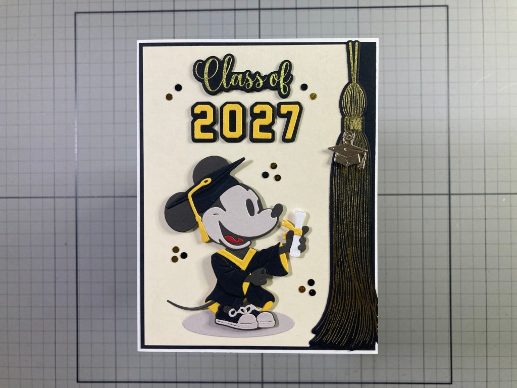
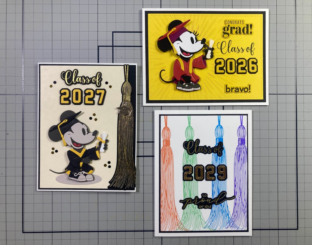
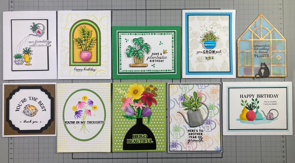
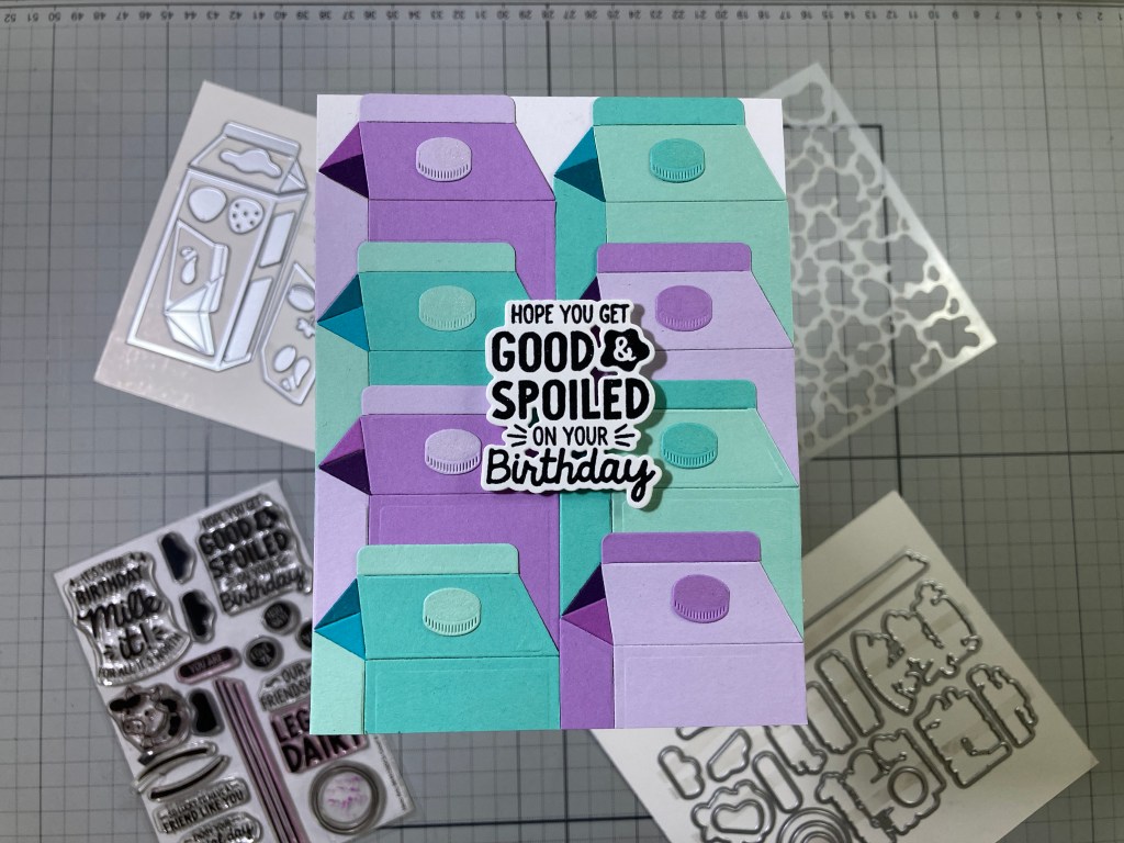
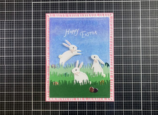
Hello Folks! Scott here with my ten cards featuring the NEW My Monthly Hero and My Monthly Super Hero kits for May of 2026. “Yay Day” is the theme for this month (get it? May Day?) and Birthdays seem to be the “YAY” on tap in these kits. I certainly use more birthday cards than anything else, so I have no qualms in adding to my Birthday card stash!
My Monthly Hero Includes: • Happy Birthday Die Set • Big Present Die Set • Birthday Icons Stamp & Cut • Tiny Tags Die Set • 10 Sheets of Cardstock One 5.5”x8.5” sheet of each color (Blush, Tutu, Dahlia, Chiffon, Coral, Carrot, Beeswax, Saffron, Seaside, Waterfall)
My Monthly SUPER Hero Includes everything in the regular MMH above, PLUS: • Big Balloon Shaker Die Set • A Train Alpha Die Set • Make a Wish Stamp & Cut
That’s a lot of Happy Birthdays!! There are minimal stamps this month, but I have become used to this new year of Hero Arts Kits and their propensity to be a little die heavy. As usual, I will do my first cards just using the My Monthly Hero Kit and then add in the Super Hero Kit items for the later half of my cards. First on the list is the Happy Birthday Die Set.
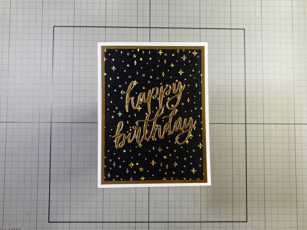
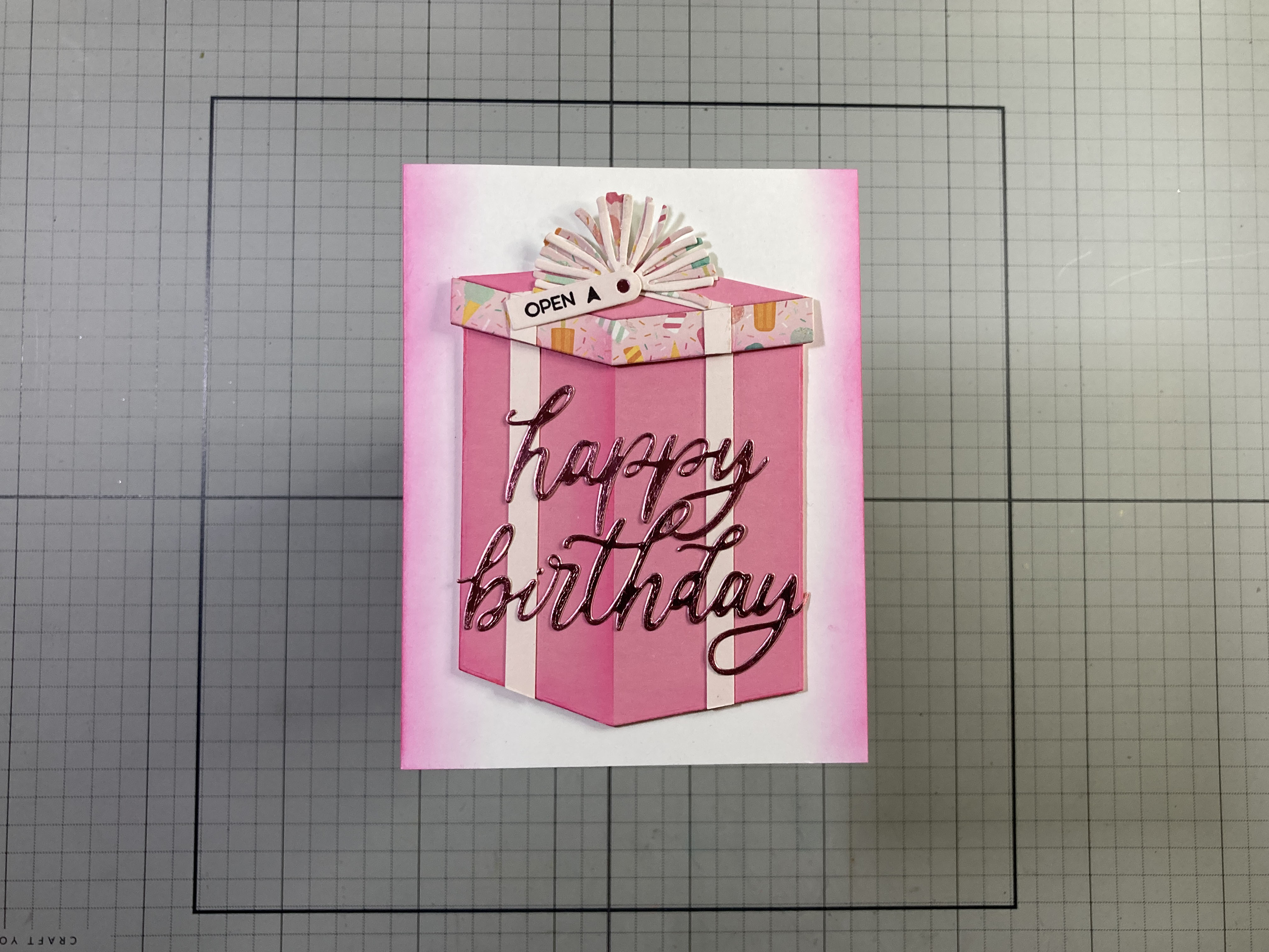
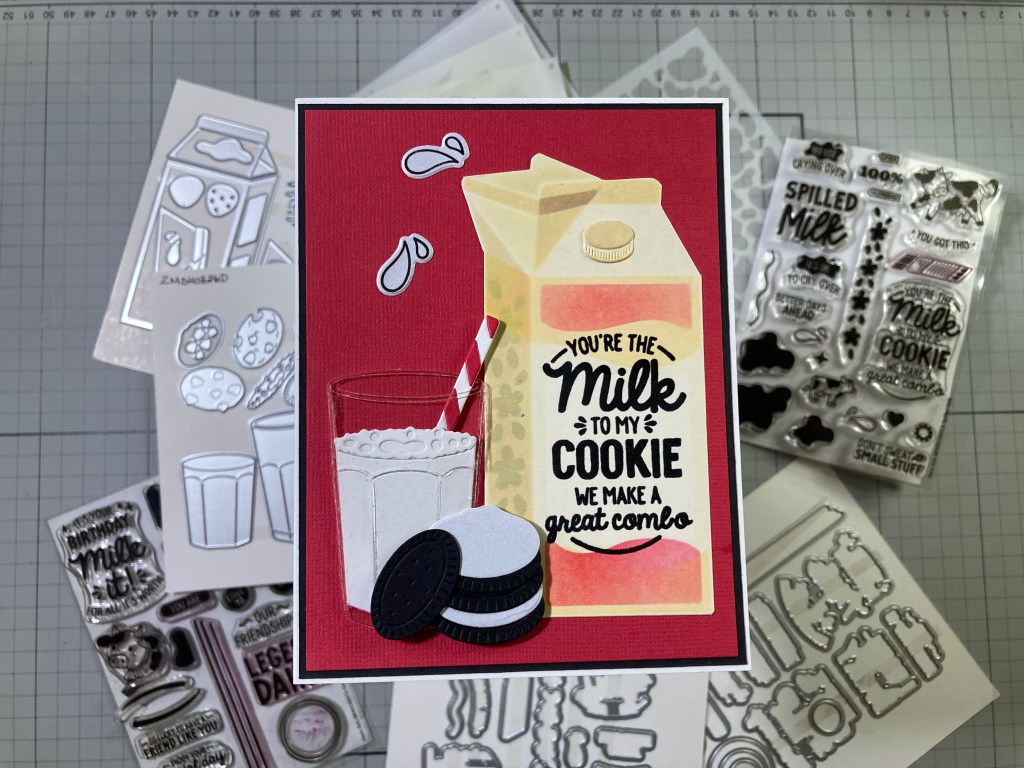
This die-cut sentiment is big enough to command attention all on its own! Most of my Birthday greetings these days are for older folks (like me!) so I thought I would try to class up some of these Birthday cards! I broke out my Spellbinders Glimmer Hot Foil press and used an old Hero Arts Twinkling Stars foil press plate with some Speckled Aura foil on Hero Hues Pitch Black card stock. Love the reflective colors on that Gold Speckled Aura foil! I trimmed the background to 3.75″ x 5″ with a Lawn Fawn Stitched Rectangle die and glued that to a 4″ x 5.25″ Gold mat cut from Tim Holtz Metallic Collection Kraft-core card stock, and then I glued both to an A2 White card base. I die-cut the sentiment from the same metallic gold card stock and glued it in place. Perfectly sparkly and appropriate for a grown-up greeting!
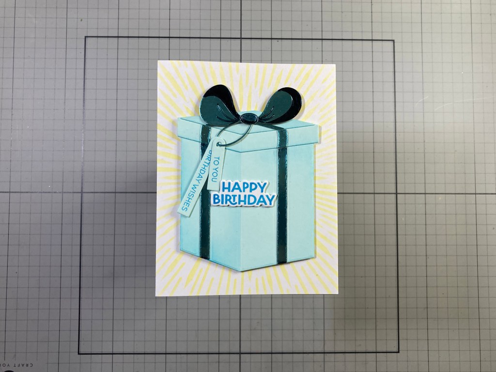
The Big Present Die Set is next on the list… A nice big present with ribbons, bows and tags for accessories!
I die-cut the main parts of the Big Present from the Seaside card stock in the kit and ink-blended the shading with HA Splash Reactive ink and some Post-it Notes for masking. I glued the present pieces together. I die-cut the ribbon and bow pieces from Tim Holtz Metallic Confections Kraft-core card stock in Blue, and added color to the shaded parts of the bow with a dark Grey Alcohol marker before gluing them all in place. I die-cut the loop of string from the Blue Metallic card stock and the two skinny tags from Seaside card stock.
I stamped the sentiment (from the Birthday Icons Stamp and Cut set) using HA Splash reactive ink on White card stock and I embossed the sentiment with Clear Embossing powder. I also stamped the smaller sentiments on the skinny tags with the same ink. I die-cut the sentiment with its matching die and die-cut two more blanks to stack together. I slipped the tags onto the string loop and tucked the loop up under the bow so the tags hang freely, and then I glued the stacked sentiment on the front of the present.
On an A2 White card base I stenciled the “sunburst” on the card front using the Sun Stencil from the My Monthly Hero February 2024 Premium Kit, and Hero Hues Lemon Drop ink. I added the present to the front with foam tape for a little dimension. Nice BIG present (at least on an A2 card!) and the shading helps it feel more dimensional. This is not my favorite die-cut bow of all time, but it is whimsical and works well for a lighthearted Birthday greeting.
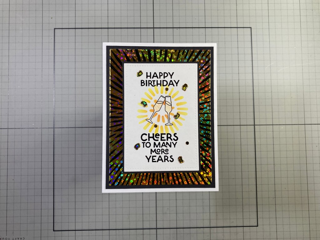
And now, the Birthday Icons Stamp and Cut set. There is one sentiment that goes perfectly with one of the icon stamps.
The champagne glasses obviously go with this sentiment! I stamped the glasses on a panel of White card stock using VersaFine Onyx Black ink. One of my favorite ways to mask off small images like these glasses is to take a piece of low-tack tape and tape over the stamped glasses – the ink will leave an image of the glass on the tape. Then I stick the tape down to my craft mat and cut out the glasses using a craft knife – then you can place the tape mask back over the champagne glasses. I stenciled the small burst behind the (masked off) glasses using the Doodles Stencil from the My Monthly Hero Premium Kit of April 2023 with Lemon Drop and Creamsicle Reactive inks. I stamped the sentiments with VersaFine Onyx Black ink and embossed them with Clear embossing powder. I colored the champagne with my Ohuhu Alcohol markers and added some sparkle to the spirits with a Spectrum Noir Sparkle Pen.
The background is a panel I had left over from the 2/24 MMH kit. I took the leftover foil (Gina K’s Gold Sequins Fancy Foil) from this card and foiled it to a piece of Black Toner paper. I had stored this extra panel with the Sun Stencil, and I thought it would add another classy touch to a Birthday greeting. I cut the foiled panel to 3.75″ x 5″ and glued it to a 4″ x 5.25″ Black mat. (I did cut out the center of the foiled panel before gluing it to the mat). Both are glued to an A2 White card base.
I die-cut the stamped panel to 2.75″ x 4″ with a LFSRdie and added a thin Black mat before gluing those down to the card front. I stamped the “confetti” stamp on the excised center of the foiled background using StazOn Jet Black solvent ink and die-cut them with their matching die – then I fussy-cut the individual confetti pieces and glued them along with some Flat Gold Sequins on the card front for a little added bling. Time to break out the Champagne!!
When we get a stamp set filled with smaller images – or “icons” as such, I do tend to take one stamp at a time, and go with simple vignettes.
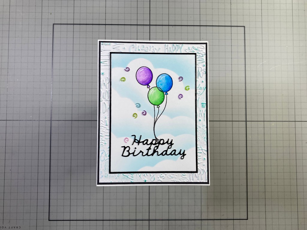
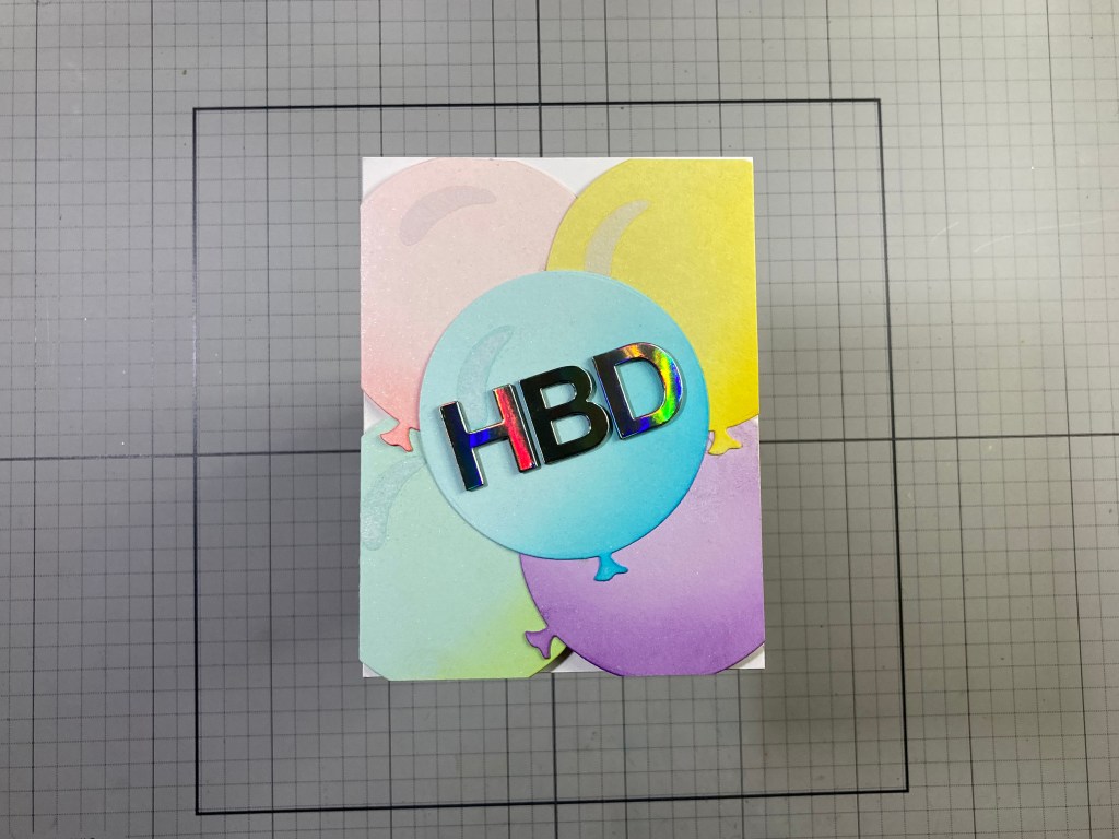
This makes me smile! I stamped the Ballon stamp on a piece of Bristol Smooth card stock and colored them with my Zig Clean Color Real Brush markers. I used a cloud edges stencil and the Splash Reactive ink to blend in the clouds – strategically avoiding the balloons! I trimmed the inked panel to 3.25″ x 4.5″ and added a thin Glossy Black mat behind. The sentiment is an old Love From Lizi die cut from more Glossy Black card stock and glued to the inked panel right at the end of the balloon strings.
The background is an old Sizzix Happy Birthday 3-D Embossing folder on White card stock with Splash ink lightly rubbed on the raised embossings. (You can see Cheers and Happy and Wish etc.!) I trimmed that to 4″ x 5.25″ and glued it to a thin Black mat and then down to a White card base. I glued the inked panel on top of the background and added some Rainbow Spirals sequins (from the MMH Feb. 2020 kit) for more shine. Can’t beat balloons in the clouds!
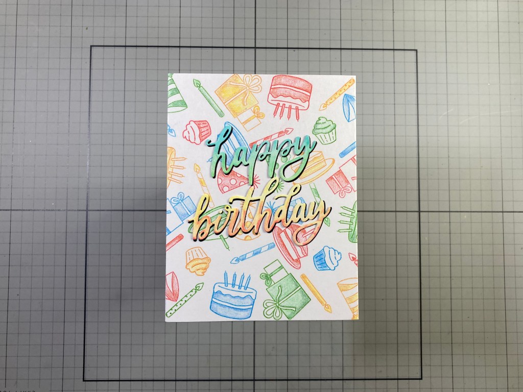
Another way to use a stamp set full of small icon images is to use them to make backgrounds. I have created a few “turnabout” stamps in the past and thought this group of icons would make a great “turnabout” stamping!
I stamped my “turnabout” stamp using Hero Hues Fruit Punch, Splash, Green Apple and Creamsicle Reactive inks, and colored all the icons with my Prismacolor Colored pencils. Since this is a background, I selectively colored the stamps, leaving some areas white and doing simple blends where there was color. This is nice and colorful, but not too loud about it! I trimmed that to 4.25″ x 5.5″ and glued it to a White card base.
I ink blended a swatch of Splash and Green Apple Reactive inks on a scrap of White card stock and another swatch of Fruit Punch and Creamsicle Reactive inks, and die-cut the sentiment from that. I cut another sentiment in Black and glued that a touch offset behind the colored sentiment. I glued the sentiment flat to the card front and added a l little sparkle to the lettering with a Zig Wink of Stella Sparkle pen. I really do like this “turnabout” arrangement!
Here’s a copy of the stamp arrangement I created that uses the “turnabout” method to stamp these icons in four colors. I have a 6″ square sheet of acetate with diagonal lines on it, and I arranged the 9 stamps in one triangular quadrant and through a little trial and error, got the stamps evenly spaced out to fill the 6″x6″ square. Once you are happy with the spacing of the 4 quadrants, and you have stamped it 4 times, you can use the stamping to spread out the stamps into all four quadrants.
You can download a PDF of this pattern right here:
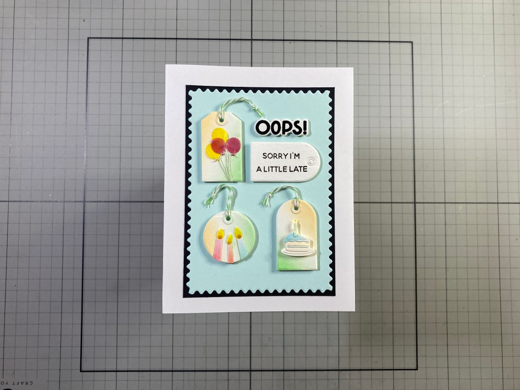
I’ve used most of the stamps in the Birthday Icons Stamp set but I haven’t even touched the Tiny Tags Dies Set…
I die cut the three tags from the same ink blended card stock I used for the sentiment on the last card – using the white spaces between the Creamsicle and Green Apple inks. I also die-cut the reinforcement rings from the same colors and glued them on top of the holes. I used a candle die from the Stamp and Cut set to die-cut the candles from the Splash, Creamsicle, and Fruit Punch sections of my blended card stock. I trimmed off the flames and die-cut replacements from some Yellow Glassine (or Kite paper) and added small dots of Red Glassine behind the yellow. I glued the three candles to the round tag.
I die-cut the balloons from the die set in the same Yellow and Red Glassine and tied thin white string to their knots and glued them to the rectangular tag. I die-cut the cake pieces from the same pre-blended card stock and assembled them on the arched tag. I tied Green and White bakers twine through the holes in all three tags. I die-cut the arched tag again from some Muli-media card stock and stamped the sentiment with Onyx Black ink. I stamped, embossed and die-cut the “OOPS!” from the same card stock. I die-cut a piece of the Seaside card stock with a SSS Modern Postage Stamp Rectangle die, glued that to a thin Black mask and then down to a White card base. I arranged all of the die cuts on the front and attached everything with foam tape. I did stamp the “Happy Birthday” sentiment on the inside. Though these Tiny Tags would work perfectly well on the Big Present, I think they also work quite well as a group!
Well, we had so many items in the My Monthly Hero kit this month that it took me six cards to cover everything! Moving right along to the My Monthly Super Hero supplies!
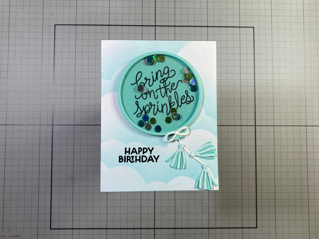
More balloons in the clouds!! The Big Balloon Shaker Die Set is exactly that… a BIG balloon! I die-cut the frame die and the background die from the Waterfall card stock in the kit. I die cut the background balloon die from a piece of acetate as well and glued that to the back of the frame die cut. Since the window frame around the balloon is so thin, I thought just stacking up multiple frame cuts to give it some thickness would be easier than trimming foam tape to 1/8″ wide!. I cut four frames from 110# White card stock and glued them together before coloring the edges to match the card stock. I stamped the sprinkles sentiment from the Make a Wish Stamp set on the balloon back with Onyx Black ink and glued the colored and stacked frame dies behind the acetate.
I die-cut the confetti from an assortment of colored metallic card stocks and sandwiched them between the balloon background and the balloon frame. I did try to cut back on the static electricity with a Swiffer floor cloth and a light touch of powder to the confetti – that does what it can! I die cut the Bow and String from HA Antique Ivory card stock and the three tassels from Seaside and Waterfall card stocks. I assembled the tassels and glued the Bow on the top of the knot and the string in place on the back of the balloon.
On the front of an A2 White card base I stenciled more clouds with Splash ink and the Cloud edges stencil, and stamped the sentiment with Onyx Black ink and embossed that with Clear Embossing powder. I glued the Balloon shaker and string into place and trimmed off the string at the bottom right. Then I arranged and glued down the tassels. I thought the tassels were a bit frivolous at first, but I came to appreciate how much movement they convey!
Of course, you don’t have to make a shaker card from those balloon dies… pardon me… those BIG balloon dies!
I die-cut the solid balloon die from Spellbinders Mint and Seaside and Chiffon and Hero Hues Lavender and Canary card stocks. I added shading to all the balloons with Reactive inks in Key Lime Fizz, Splash, Taffy, Thistle and Lemon Drop. I die-cut the larger balloon highlight through some masking paper and used the mask to ink blend some Unicorn White ink on the balloons and them embossed that with clear embossing powder for some shine.
I glued the balloons together so they were slightly larger than an A2 card and trimmed the top, right, and bottom sides before scoring the left side at 4.25″. I folded the scored balloons over and glued the flap to the back of a 4.25″ x 5.5″ card panel. Once dried, I added another matching panel to the back effectively covering up the “balloon” hinge. I die-cut the HBD using the A Train Alpha Die set from some holographic metallic card stock and die cut two more from Black card stock. I stacked and glued them together. For a little more sparkle I sprayed the Balloons with some Sheer Shimmer Mist and then glued the HBD down to the center balloon. These balloon dies are large enough to make a whole card front with just four balloons, but odd numbers are more pleasing to the eye! HBD!
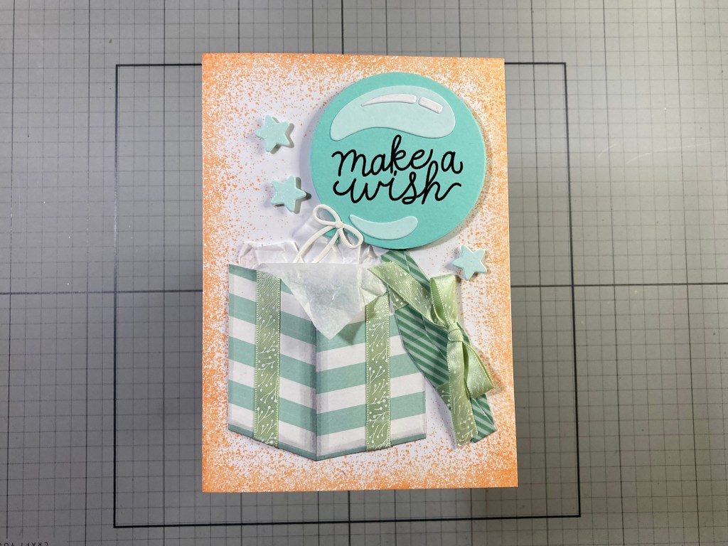
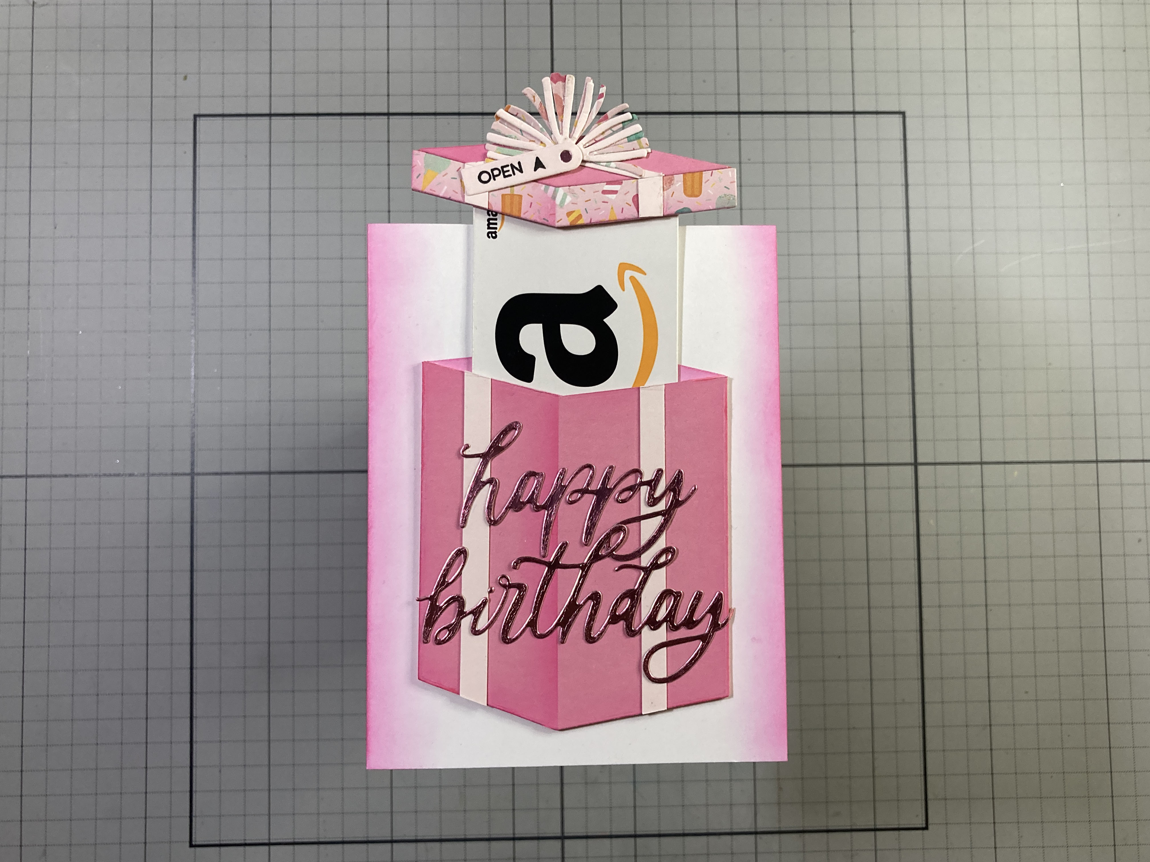
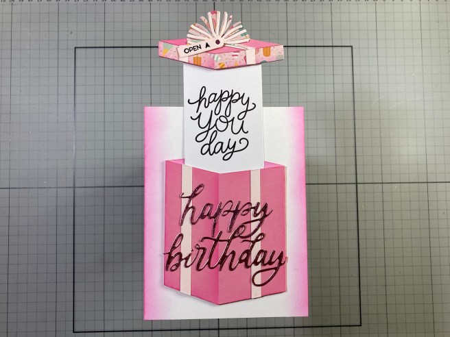
I was determined to find a way to make the BIG Present dies and the Big Balloon dies work together on one card. They are both so BIG that I had to make a BIG card (5″ x 7″) to accommodate them both!
This card started as an experiment to see if I could make real ribbon work on the Big Present. I die-cut the Present twice from some old striped Pattern paper matching the stripe to the right side of the die for one, and matching the stripe on the left side of the die for the other. When trimmed and glued together, they gave me this fun “wrapped” package. I die-cut the Lid from some Glitter Pattern paper, glued it in place and added all the ribbon. Instead of worrying over the thin ribbons on the Lid of the Present, I just camouflaged those with the bow!
I die-cut the balloon from Waterfall card stock and stamped the sentiment with Onyx Black ink and embossed it with Clear Embossing powder. I die-cut the big highlights from Seaside card stock and the small highlights, bow and ties from HA Antique Ivory card stock and glued everything together. I thought it would be fun to have the balloon coming out of the present so I cut the lid off and added some white tissue paper on the inside of the present.
On a 5″ x 7″ card base I stamped the Concord & 9th Splatter Texture Stamp around all four sides with Creamsicle reactive ink. That’s my first time using this stamp set and I LOVE the splatter texture all around! I glued the present and lid flat to the card front and added the Balloon using thick foam tape. I die-cut three stars from Seaside card stock, added some Wink of Stella Sparkle pen to all three and attached them to the card front with thin foam tape. I know some of you folks like these larger cards, and it certainly works well if you want to highlight both of these BIG dies together!
Since I cut the top of the Present off for this last card, I became obsessed with having a present inside the gift box!
The Big Present die as it is, is not big enough to hide a gift card inside so I just did some partial die-cutting to make the present bigger. This box is right at 4.25″ tall compared to the normal die cut present which is right at 3.75″ – so I added a good half an inch to the overall present height. I die-cut the (taller) present (and the box top) with the Tutu card stock in the kit and die-cut the edge of the lid with some old pattern paper. I did more shading on the box using HA Taffy Reactive ink and Post-it Notes for masking. I glued everything together and cut off the lid. I added the ribbon using 1/4″ strips of Chiffon card stock on the sides and 1/8″ strips of the same to the top of the lid. I die-cut the three big tassels from the same pattern paper and the three smaller tassels from Chiffon card stock and glued them all together to make this fun pom-pom for the top of the box. That’s another good use for those tassel dies!
I die-cut the sentiment from some Pink Metallic card stock and glued that to the front of the present. I ink blended Taffy Reactive ink along the sides of an A2 card base. I stacked two layers (just under 1/2″ wide) of 110# card stock together to make channels for the gift card behind the present. I glued those to the back of the sides and bottom of the box and trimmed them off to match. I also die-cut another lid from White card stock, ink blended Taffy ink on it and slipped it behind the present to make the inside back of the box – I had to trim the edges to size, but that made a perfect box back.
To assist in carrying the gift card, I took a piece of White card stock cut to 2+1/8″ wide (the size of a gift card) and 4″ tall and slid that into the channel behind the present (and in front of the back). I placed the lid on top with just a bit of an overhang on the box and cut the top edge to match the box top. Then I glued that sheet to the top edge of the lid. For a final touch (once the gift card is removed) I stamped the “happy you day” on the card carrier. The gift card actually holds on with simple friction where the carrier is glued to the lid.
I die cut one of the small tags from the Big Present die set from Chiffon card stock and stamped the “open” and the arrow on that using an MFT Interactive Labels stamp set and Onyx Black ink. I glued that to the pom-pom and added a little metallic pink dot in the hole. All that’s left is to glue the box to the card front (being careful not to add any glue in the card channel). The gift card slides inbetween the carrier and the lid, and the whole thing slips right into the box easy as pie! I like this Big Present Die set much more now that I’ve figured out how to use it as gift-card delivery system!
How’s that for ten Birthday cards! Not a lot of stamping and coloring this month but lots of fun Birthday greetings and even a couple surprises. I do love the gift card coming out of the Big Present – made even BIGGER by ME!
Some very classy, colorful and fairly grown-up birthday cards here! I do like the big “happy birthday’ sentiment die, and I really like my “turnabout” stamp for some lively birthday backgrounds, and, of course, everybody loves receiving a shaker card! If you have a big list of Birthdays to cover this year, and you’d like to grab one of these kits for yourself, please use my links below. I do get a small commission (at no cost to you!) from anything you by at Hero Arts if you use these links – it is always superbly appreciated and helps keep the gears turning and the ideas coming!
Thanks so much for sharing your time with me here today! I hope I was able to provide you a little Birthday inspiration and maybe a smile or two! Let me know which cards are your favorites! If you enjoyed this post please click the “Like” star at the bottom of this page, and if you wish to be notified of new posts click the Follow Me button at the top of this page. Please, take a few moments to Like Me, List Me, Pin me, Post Me, basically, just share this post with everyone and everywhere you can, and remember… Don’t run with scissors!! As always, I send you and yours Love and Light, and Happy Crafting!
DISCLOSURE: This site contains some affiliate links to products. I may receive a commission for purchases made through these links (at no cost to you). As an Amazon Associate I earn from qualifying purchases. Thank you!
So far, in addition to the original Steamboat Willie Duo Die Set, the Classic Mouse Collection has released Christmas add-ons, and a Love collection (Valentine), and now we get to see our Classic Mouse Graduate! What sets this collection apart from the other add-ons is this die set is all inclusive – it does NOT require having the Steamboat Willie Duo die set like the Christmas and Love accessories dies required. There is one body and head and then you can select whether to make the mouse a boy or a girl graduate.
The mouse dies are complimented with this Press + Foil Plate + Die set. The Graduation Tassel is the perfect image to give to a Press + Foil Plate – the detail in that tassel is incredibly fine! And I do love the fact that apparently, many people are making their Foil Plates and their BetterPress Plates interchangeable. That saves us consumers money and was just the incentive I needed to jump on the BetterPress bandwagon!
My only conundrum with this new release was wrapped up in my own school colors – Black and Gold for High School and Black and Yellow at College. I also did a search for graduation pictures and the vast majority of graduation gowns are Black! There are a few Blues, Greens and Reds, but most everybody’s gown is Black. So how does a black robe look on a Black mouse body…? Hmmmm…! I decided to embrace the “Classic Mouse” theme and made my first graduate Mouse in shades of Grey!
There is an assembly guide available at Spellbinders for some helpful guidelines in putting your graduates together.
I do prefer to skip the “mouth” die and die-cut the tongue with the head die to paper-piece it into place. Also, remember that all of the dies are designed to leave a thin black outline around everything. Also, the front of the robe die also cuts that piece in half right where the zipper would go… I did find it much easier to line the gown up to the body (and the debossed guideline) by taping the two halves together. AND… make sure you get the tails between the robe layers!
I do have a nephew that is graduating from High School next year… and he goes to my old Alma Mater! So Black and Gold it is! The lining on my actual graduation gown was black, but I felt that making the lining Gold would be a great way to add some color and dimension to this robe, while still staying true to the school colors! That would work for adding any school colors to these graduates! There are also two new hands with this die set that has the left hand reaching out to accept a diploma. With a little finesse, you can get the fingers to “wrap” around the diploma! I love the tennis shoes too, but I do think you should start the assembly with the shoes lest they get in the way of the robe.
I used card stocks from my paper scraps to die-cut all the mouse parts and glued the mouse together. I used my Glimmer Hot Foil System from Spellbinders, Gold Foil and Hero Arts Pitch Black card Stock to foil the sentiment and the graduation tassel. I die-cut them both with their matching dies. I die-cut the year from Pitch Black and Goldenrod card stocks and glued them together. I die-cut two more blanks for the sentiment and the background of the numbers and stacked them up for more dimension.
I cut a piece of plain Ivory card stock to 4″ x 5.25″ and partially die-cut (just the right side) the tassel on the right side of the card stock. Then I glued the die cut tassel to the matching cut edge on the ivory card stock. I cut a piece of plain Black card stock to 4 & 1/8″ X 5 & 3/8″ and glued that behind the Ivory before gluing both to an A2 White card base. (I did have to trim off a bit of the tassel on the bottom right). I wanted a little grounding for our mouse so I used the plate die (from the MMH September 2018 kit) and and did a top/bottom partial die-cut to give me the medium Grey ellipse under the graduate. I glued the sentiment and year in place and added our graduate with foam tape. I do glue the tip of his tail down to keep it from getting caught on anything.
I die-cut the graduation cap charm from some Tim Holtz Champagne Metallic card stock and I die-cut the ring on top of the charm a second time and used that partial ring to attach the charm to the tassel. Gold and Black flat sequins adds some festive sparkle and highlights the sentiment. I did add a gold-foiled and die cut “You Did It!” to the inside of this card. Now, I’m way ahead of the game, and I am all set for the nephew’s graduation NEXT year!
If you have any pearlescent card stocks in your stash I think they are perfectly suited to a cap and gown for graduation!
Since I have a colored robe here, I figured we could do a regular Black and White mouse. Again, I used card stock scraps for all the die-cutting. I did use Gina K. Wild Dandelion card stock for the background. I used my BetterPress System and BetterPress Black ink to emboss the sentiments on the background. Unfortunately, I got the “Congrats grad!” sentiment just a little bit crooked, so I re-did that sentiment, and the “bravo!” and the “so proud of you” sentiments on the same card stock used for the stole and tassel, and die-cut them all out with their matching dies. At least the “Class of” sentiment came out straight!
I stenciled the sunburst (lightly) behind our mouse with the Sun Stencil from the MMH February 2024 Premium Kit and Fossilized Amber Distress oxide ink. That gives a little highlight to our graduate! I die-cut the background panel to 5″ x 3.75″ with a Lawn Fawn Stitched Rectangle die and added a (5.25″ x 4″) black mat and glued those to an A2 White card base. I glued the die cut sentiments flat (over their pressed sentiments) and glued the year in place.
I added the mouse in place using foam tape, and I added the die cut “so proud of you” sentiment on the inside of the card. I die-cut a Black banner using the Lawn Fawn Everyday Sentiment Banners die set, trimmed it to length, and glued the sentiment on top. Love using pearlescent card stock on the cap and gown! No Bling Needed!
The Classic Mouse Graduation Sentiments Press + Foil + Die Set is terrifically useful for graduation cards all by itself! No graduating mice needed!
The tassel die is so detailed and works great with the BetterPress plates. I used a Porcelain BetterPress Cotton Card Panel to press (stamp) the tassel four times using Ranger Archival Inks in Deep Purple, Manganese Blue, Monarch Orange, and Vermillion. Any pigment ink you have will work with the BetterPress plates… you don’t have to use the BetterPress inks. I trimmed the pressed (stamped) panel to 3.75″ x 5″ with a HA Rectangle Infinity Die, added a thin Black mat and glued those to a White card base.
The sentiments are Glimmer foiled with Gold on Pitch Black card stock and die-cut with their matching dies. The year is die-cut from Pitch Black and Gold Metallic card stocks and glued together. The sentiments and date are glued flat to the card front and I added an assortment of clear star glitter pieces for some graduation sparkle! I actually intended this to be a 2026 graduation card, but I guess I was too focused on getting the date glued down straight and square, and forgot to pay attention to whether the numbers were right side up or upside down! Hopefully, one of my nieces or nephews will be graduating in 2029!?! HA!
As you know, I am not the greatest fan of die-cutting, but this Classic Mouse Series has me totally captivated… and the simple fact that this is a stand alone set makes it a terrific addition to this line! No extras needed!!
This is a great trio of graduation cards…! The cap and gown for the mice are flat out adorable, the tassel Press + Foil die is amazing all by itself, and I love the numbers with their shadow dies – those should prove quite useful over the years! If you’d like to grab these all inclusive sets for yourself, please use the links below! I do make a small commission from whatever you buy through my links at Spellbinders, and that helps keep the wheels churning and the inspiration coming! It is (as always) supremely appreciated!
Thank you so much for sharing some time with me today… I hope you enjoyed another mid-month diversion as I keep exploring the Simple Stories Classic Mouse collection! If you enjoyed this post, please click the Like Star at the bottom of the page, and if you wish to be notified when a new post comes out, just click the Follow Me at the top of the page. And don’t hesitate to send me a note if you have any comments or questions. Please take a moment to Like Me, List Me, Pin Me, Post Me, basically, just share this post with all your crafty friends – especially any Disney Fans! And remember… Don’t run with scissors! As always, I send You and Yours Love and Light, and Happy Crafting!!
DISCLOSURE: This site contains some affiliate links to products. I may receive a commission for purchases made through these links (at no cost to you). As an Amazon Associate I earn from qualifying purchases. Thank you!
Hello Folks! Happy Spring!! Scott here with a new set of 10 cards featuring the My Monthly Hero & Super Hero kits for April 2026. The theme for this kit is “Plant Lady Society” – just look at the number of plants and flowers in this kit!
My Monthly Hero Includes: • House Plants Stamp & Cut • You Grow Girl Stamp & Cut • Greenhouse Die Set • 10 Sheets of Cardstock – 1 of each color, 5.5″ x 8.5″ (Poppy, Pomegranate, Cranberry, Blush, Tutu, Dahlia, Beeswax, Tuscan, Rainforest, Fern)
My Monthly SUPER Hero Includes everything in the regular MMH above, PLUS: • Hello Beautiful Stamp & Cut • Fresh Flowers Die Set • Watering Can Die Set
LOTS of cutting dies in these kits! More than 100 dies! PHEW! This appears to be the first of the New MMH/SH kits that doesn’t have any explicit cross-over between kits. The Hello Beautiful Stamps are all sentiments, so they can be used with both kits, but there are eight sentiments in the MMH kit alone, so the extra sentiments aren’t necessary. As usual, I’ll make the first five cards using just the MMH kit and then the last five cards will use everything all together!
At least we do have some good stamps for coloring! I don’t often do this, but I thought I would stamp all the images from the House Plants Stamp set with VersaFine Onyx Black ink on some Canson Mixed Media Card stock. I reached for my TomBow Water-Based Dual Tip markers to color everything. The Mixed Media card stock takes the watercolors very well, and it’s easy to blend the markers with each other or with light touches of water and a paintbrush.
To kick off my card making, I decided to use the matching dies to cut everything out. It’s always fun to lay out my colored and die-cut images directly on the stamp set. Haven’t done this in a long while !
Though we had a huge snowstorm just a month ago, and temperatures still seem reluctant to rise, I am all set for some Spring card making! And just look at all the colored and die-cut images I have available! I do often take my clues from the sentiments in a set, so here we go…!
I stamped the sentiment on a scrap of the Canson Mixed Media card stock with VersaFIne Onyx Black ink and embossed it with Clear embossing powder. I die-cut it out along with two blanks and glued them all together. I die-cut a piece of the Mixed Media card stock to 2.75″ x 4″ with a Lawn Fawn Stitched Rectangle Die, and decided on my layout so I could add DMC Silver Metallic thread through the background. Using a needle, I got the 5 pieces of thread through a hole in the background (where the watering can spout will be) and I glued those down to the back of the card stock. Then I added a thin Black mat behind, and attached them both to an A2 White card base with foam tape.
I arranged the silver thread on the card front and added the two potted plants with foam tape. I attached the watering can with more foam tape and glued the spout to the top of the threads. I glued the sentiment in place letting it hang off the side a little bit. I thought these head vases conveyed the friendship theme perfectly!
I have mentioned before that I don’t particularly care for the white borders that most dies leave around an image. On the first card I just kept the background white – that helps camouflage the white borders… but there are more ways to hide those borders than just keeping your backgrounds white!
You can color those borders to match whatever background you want! This works very well as far as I’m concerned! I used the Spellbinders Essential Arches dies to make the plant arch. I like that there are 16 dies in this set so there’s a big assortment of sizes. I cut the Acid Green arch to 2.5″ wide and the Yellow Ochre arch to 2″ wide. I die-cut the frames from Auburn Pearlescent card stock using the next size smaller dies (2.25″ & 1.75″) and glued those frames on top of the colored card stocks.
I die-cut another piece of Mixed Media card stock to 3.75″ x 5″ and used my old metal Stampendous Flourishes stencil to ink blend Fossilized Amber and Twisted Citron Distress Oxide inks onto that piece. I stamped the sentiment on a scrap of Mixed Media card stock with VersaFine Onyx Black ink and embossed it with Clear embossing Powder. I die-cut that with the matching die along with one blank and glued the two together. I colored the white borders of the die-cut with an Ohuhu Alcohol marker to match the Yellow Ochre background.
The stenciled panel is glued to a White card base, the two Arches and the stacked sentiment are glued down flat, and the potted plant is attached with foam tape. I did add this “explainer” to the inside of the card using my Silhouette Software and the Dream State font. I printed that on a scrap of plain white card stock die-cut to 3.75″ x 5″ with a LFSRDie. That makes me giggle and justifies a birthday card with a potted plant. I guess “let’s get potted!” would work too!!
There is a decent Birthday pun in the You Grow Girl Stamp set… so lets use that with another House plant!
That’s a good pun for any Birthday gardener! On a Green A2 card base, I used the HoneyBee Spring Leaves A2 Pierced Cover Plate die on the front. I die-cut another panel of the Mixed Media card stock to 3.25″ x 4.5″ with a Moda Scrap Framed Rectangle die and added thin Green, Black and White mats behind that before glueing all to the card front. I stamped and embossed the sentiment as usual directly on the card front. I made a little “shelf” for my plant with a piece of woodgrain pattern paper with a small black “shadow” glued behind. I glued the plant to the shelf and mounted them to the card front with foam tape. For embellishments, I added the single bloom stamp in the corner of the sentiment, and added these Dragon Scale Sequins (from the MMH August ’19 kit) for some fun sparkle! I like that the Pierced cover plate die adds the same pattern to the back of the card front so you can see the whole thing when the card is opened!
The images in the You Grow Girl stamp set are all basically silhouette stamps – perfect to use for backgrounds!
I stamped the background on Mixed Media card stock using Simon Says Stamp Barely Beige ink and all the pots and plants in the You Grow Girl stamp set. (I really like the cone flowers stamped upside-down on the round pot!) to finish the background, I spattered Black Soot Distress Oxide ink lightly on the stamping. I die-cut that panel to 3.25″ x 4.5″ with a LFSRdie and added a thin (1/16″) black mat and a thicker Blue mat using the 3.75″ x 5″ LFSRdie. I glued those together and then down to an A2 White card base.
I stamped, embossed and die-cut the sentiment as usual, die-cut three blanks and glued them all together. I trimmed the top leaf off of the potted plant and added my little pink bloom in it’s place. I mounted the potted plant with foam tape and glued the stacked sentiment below. I wanted to add the other small bloom from the House Plants Stamp set and decided to add it to the card with a small craft spinner – yes! the little bloom spins!! More Dragon Scale sequins add some fun sparkle and those spinners are small enough for this tiny little flower! Interactive fun!
That brings us to the Greenhouse Die Set. The die cuts the greenhouse to 3 & 7/8″ x 5 & 1/8″. Big enough for a shaped card!
Thinking it would be fun to “walk into” the green house, I die-cut a piece of wood-block pattern paper with the detailed Greenhouse die and glued that to a piece of thick vellum die-cut with the Greenhouse outline die. I die-cut another detail die from the same vellum, colored it with an alcohol marker, and glued it on the back of the vellum (the inside) to cover up the glue from the front piece. I die-cut the Blue background with the outline die and then added the structure and shelves with 1/8″ strips of the same wood-block pattern paper. I tried to match the inside structure to the detail die structure (minus the arch).
I die-cut all the decorative dies from my card stock scraps. All the detail dies layer together to make a cat, a large-leaf potted plant with a decorated pot, and two types of hanging plants in macrame hangers. That wasn’t quite enough for me so I used the pot-pattern die to make a bunch of new greenery that I glued into a simple “tray” cut from brown card stock. The flowers are die-cut from Yellow and Orange card stock scraps with the small flower die in the House Plants set and their centers are die-cut from the triple-bud die in the You Grow Girl set. I die-cut some extra pots and another small “tray” of seedlings using the small round-leaf dies used in the hanging plant on the right.
I wanted something to “hang” the plants on, so I die-cut six small Dark Grey dots with the tiny dot die and glued them to the intersections of the inside beams, and modified one for the cat’s nose. I placed the hanging plants on their “nails” and glued all the other plants in place. I stamped and embossed the sentiment on the front as usual and added the cat at the door using some dry adhesive. I didn’t worry about covering up the back of the cat because there’s a door there!
I cut a 1/4″ wide piece of vellum to 2.75″ long and scored two fold lines (very close together) down the center. I creased the vellum on both score lines and glued that to the front and back panels as my hinge. The double crease allows for some thickness inside the card without warping the front. For a final touch, I cut a scrap of White card stock with the Greenhouse outline die, trimmed 1/8″ from all the edges, and glued that to the back of the card for a writing surface. Admittedly, there’s a lot of small fiddly dies here, and that’s generally not my go-to method for card making. But there is definitely a certain allure in holding a tiny potted plant in a macrame hanger in the palm of your hand!
That’s a pretty thorough examination of the plain Hero Kit – now we can add in the Super Hero supplies and go all out. Of course, there was that cat stamp from the House Plant set that was taxing my brain – this is the only image in this whole kit that is viewed from above – the perspective just doesn’t work with the plants… I think this may help:
Skip the plants entirely and go for the cuddles!! I stamped, colored and die-cut another cat (orange tabby) the same as the first cat. Then I cut both cats from between their tails and ears, to their face and along the bottom of their front paws to their pits. That allows the two cats to be intertwined together in a cuddly embrace! That works well with this sentiment from the Hello Beautiful Stamp and Cut set along with the thank you sentiment from the House Plant set. I thought this whole idea would work best on a square card!
I die-cut more Mixed Media card stock with an old LDRS Fancy Squares and Little Things die and cut a black frame from the larger die in the set and glued them together. I stamped and embossed both sentiments as usual directly on the card front. I did give a little bit more of a curve to the large sentiment. I cut a panel of Auburn Pearlescent card stock to 4″ x 4″ and glued that to a 4.25″ square card base. I glued the stamped panel to the card front and added the intertwined cats with a spot of foam tape on the top of their heads, and their tails glued flat to the card front. A couple of tiny Copper jewels highlights the sentiment and gives us some sparkle. I really like using that cat stamp like this!
I figured I’d spend a little more time with the silhouette stamps in the You Go Girl stamp and cut set…
I decided to shoot for a little more of a watercolor effect for these stamps so I colored the stamps with my TomBow markers and gave them a light spritz of water before stamping them on more Mixed Media card stock. The flowers took a few stampings to get to their final color and then I die-cut all the blooms with their matching dies.
I die-cut an oval from a 4.25″ x 5.5″ panel of Mixed Media card stock with a HA Oval Nested Frame die-cut and arranged my bouquet before stamping the stems with Twisted Citron Distress Oxide ink. The stem stamps are not as long as I needed, so I extended their length by hiding the seams behind the sentiment. I die-cut the oval frame from Green card stock using the original Oval die and the next smaller die and glued that to the stamped oval. I glued all the flowers in place at the end of their stems, and stamped, embossed, die-cut and stacked the sentiment (+2 blanks) as usual.
I took the leftover panel of Mixed Media card stock (with the oval cut out) and embossed that with a Taylored Expressions Burlap embossing folder and ink blended a little Twisted Citron ink around the edges. I glued that to an A2 White card base and pieced the stamped oval back into the opening. I glued the sentiment in place (covering the stem seams) and added some HA Clear Enamel Dots for some highlights. Using watercolor markers to color your stamps is a fun way to hint at watercoloring without completely abandoning the fact that these are stamps.
That covers a couple of the sentiments from the Hello Beautiful Stamp and Cut set – time for the Fresh Flowers Die set!
I do believe this card uses every single die in this set! Again, I reached for my card stock scraps to die-cut all the layers of flowers, stems, and leaves, and assembled all the blooms using light touches of Alcohol Markers for some subtle shading. I do think I am getting better at matching my Ohuhu Alcohol markers to my colored card stocks! After a good amount of wrangling, I came up with a pleasing arrangement and gathered the stems in a bunch to go into our vase which I die-cut from a piece of Tim Holtz Metallic Jewels kraft-core card stock.
I took a 4.25″ x 5.5″ panel of Hero Hues Kiwi card stock and die-cut that with a Waffle Flower Tiny Diamonds Die and glued it down to a White card base. I stamped, embossed and die-cut the sentiment on a scrap of Kiwi card stock along with two blanks and stacked them together. I glued the flower stems behind the vase and glued the vase and blooms flat to the card front. The thickness of the card stocks gives us plenty of dimension in the arrangement without having to use any foam tape. The sentiment is glued on top of the vase and I added more HA Clear enamel dots to some of the flower petals since they are so “fresh”. This is a great die set with lots of variety if you like die-cutting flowers! There are many types of flowers and leaves, and the stem dies are long enough that you can fill up a big 5″ x 7″ card or even a tall Slim-line card quite easily!
I do like that a number of the sentiment dies in the Hello Beautiful stamp set are single dies but will cut out the individual words on some of the larger sentiments! That’s very handy!
And that gives us the Watering Can Die Set in the Super Hero kit – looks like the same watering can as the stamp in the House Plants Stamp and Die set only larger.
On a 4.25″ x 5.5″ panel of Mixed Media card stock (and with the help of my MISTI) I stamped the Watering Can from the House Plants Stamp set in a simple pattern using HA Fruit Punch, Creamsicle, Lemon Drop, Green Apple, Blue Hawaii, and Purple Galaxy Reactive inks. I trimmed that panel to 4″ x 5.25″ and added a thin black mat before gluing them down to a White card base. Makes a perfect background for this die-cut Watering Can!
I die-cut the Watering Can from Light Grey card stock and glued the pieces together before doing some ink blending on the can with Hickory Smoke Distress Oxide ink and some HA Unicorn White pigment ink. Since the can was cut from thin card stock, it was quite flimsy, so I die-cut another whole can from Dark Grey card stock and glued it behind the grey can with a little offset on the bottom and left sides. That adds strength to the die cut and a little more dimension as well. The opening at the top of the can was left open for the plants. The plants are cut from three shades of Green with the darkest shade glued to the backs (with a little offset) of all the leaves. I glued all the plants in the can opening and added a patch of Black card stock behind the opening.
The sentiment is stamped on more Mixed Media card stock with VersaFine Onyx Black ink and embossed with Clear embossing powder and die-cut with the matching die. I die-cut one more blank sentiment and glued the two together. I attached the can to the card front with foam tape down the center and the handle and spout glued flat. There is a touch of foam tape behind the far right and far left leaves as well. I glued the sentiment directly under the can and added the happy birthday sentiment from the House Plants Stamp set on the inside. More Plantastic Birthday Cards!
Of course there is another Birthday sentiment in the Hello Beautiful Stamp set. A nice BIG sentiment!
I decided to return to the You Grow Girl Stamp set since I hadn’t spent any serious time with these silhouette pot stamps, and I actually haven’t used any masks for a flat one-layer card this month. I used Cincord & 9th inks for the pots – first I stamped the round pot with Poppy and Cranberry inks and cut a mask to cover that pot. Then I stamped the large pot with Buttercup and Stardust inks and the right pot with Oceanside and Peacock inks. I masked off the plants on the watering can stamp and stamped the can with C&9 Mushroom ink. I did have to complete the top of the can and handle and used a simple circle template for assistance.
I masked off the tops of the pots and stamped the plants in them with C&9th Parsley, Clover and Evergreen inks. Again, that Cone Flower stamp works perfectly well stamped upside down in the red pot! I reached for the “Ice Rink” stamp from the MMH October 2018 kit, masked off the potted plants and watering can and stamped that with Oceanside ink – there’s a puddle!! I colored the can and the puddle with my Tombow markers and a wet paint brush.
I decided where the sentiments would go and die-cut the colored panel to 4.5″ x 3.25″ with a LFSRdie. I created the sub-sentiment using my Silhouette Software and the Times New Roman font. I printed that directly on the panel using my piggy-back printing method. I stamped and embossed the HB sentiment as usual directly to the card front. I added a thin Black mat and a thicker Hero Hues Arctic mat behind the stamped panel and glued everything down to an A2 White card base. Finally, I added some highlights to the puddle with a White Gel pen. This has got to be one of my favorite plant puns… and with the addition of the watering can in this set, I just couldn’t resist!
And before you know it, that’s all ten of my cards created with the My Monthly Hero and Super Hero kits for April 2026.
Look at that! We’ve got Four Birthday cards this month! I guess that’s not too surprising seeing as how there are three different Happy Birthday sentiment stamps in this set! I am pleased that we had a decent amount of coloring to do this month, but I have to admit I do find it a bit tedious fiddling around with layering dies to create (rather smallish) flowers, and then you have to arrange them in a pleasant bouquet! I do try my best, but I am NOT a florist! HA!! I really enjoyed figuring out a logical use for the cat stamp, and I truly love opening the “door” and “walking” into my green house! The Hello Beautiful Stamp and Cut has a bunch of terrific sentiments, and the three die sets are good fun and offer lots of possibilities, but, I am always up for more coloring!!
If you are tired of this endless winter and are longing for spring, you might like to grab one of these kits for yourself. And for a change, just buying the My Monthly Hero kit this month isn’t compromised by needing something in the Super Hero kit. If you do go shopping at Hero Arts – for these Kits or anything else – please use my links listed below – I do get a small commission from anything you buy at HA (at no cost to you!) and that helps keep the plants sprouting and the crafty inspiration coming! It is, as always, genuinely appreciated!
Thank you for sharing some of your time with me here today! I hope I inspired you and shared a smile or two with you! You are the reason I do this post! Let me know which cards are your favorites! If you enjoyed this release please click the “Like” star at the bottom of this page, and if you wish to be notified of new blog posts just click the Follow Me button at the top of this page. If you would take a few moments to Like Me, List Me, Pin me, Post Me… share this post everywhere you can and with everyone you can, and remember… Don’t run with scissors!! As always, I send you and yours Love and Light, and Happy Crafting!
DISCLOSURE: This site contains some affiliate links to products. I may receive a commission for purchases made through these links (at no cost to you). As an Amazon Associate I earn from qualifying purchases. Thank you!
Hello Folks! Scott here once again with the NEW My Monthly Hero and My Monthly Super Hero for March of 2026! This is month number three for the return of the My Monthly Hero / Super Hero kits from Hero Arts and the theme this month is quite unique: “Milk It”
My Monthly Hero Includes: • You Are Legen-Dairy Stamp & Cut • Holy Cow Stencil • Milk Carton Die Set • 10 Sheets of Cardstock – 1 of each color, 5.5″ x 8.5″ (Poppy, Pomegranate, Bellini, Beeswax, Saffron, Windy, Celestial, Alabaster, Truffle, Raven)
My Monthly SUPER Hero Includes everything in the regular MMH above, PLUS: • Spilled Milk Stamp & Cut • Milk & Cookies Die Set • Milk Carton Layering Stencil Set
There’s a number of large sentiments here, and a very unique milk carton die (and stencils). I don’t believe I have anything quite like this kit in my stash! For those who only subscribe to the MMH kit I will continue to make five cards from that set along with five other cards using the whole Super Hero kit.
Since the Legen-Dairy stamps seemed rather sentiment heavy, that’s where I began!
On a panel of White card stock I stenciled the Holy Cow stencil with Hero Hues Licorice Reactive ink. That was a touch too perfect for me, so I wiped over the stenciling with a dry cloth and softened the edges of the spots a bit… it actually looks a little more “hairy”! I stamped the sentiment and the two swooshes on White card stock with VersaFine Onyx Black ink and embossed them both with Clear Embossing powder and die-cut them out with their matching dies. I stamped the HOO-RAY and LOVE YA dots on White with VersaMark ink and embossed them with Blue and Goldenrod Embossing powder (from the MMH March ’22 kit) and die-cut them both out.
I trimmed the cow-spot panel to 2.75″ x 4″ with a Lawn Fawn Stitched Rectangle die and glued that to a White mat cut to 3.25″ x 4.5″ with another LFSRdie. I glued both of those to an A2 Black card base. I die-cut two more blanks of the sentiment and swooshes, then stacked and glued them to the stamped and embossed pieces. I glued the sentiment and swooshes to the card front and added the colorful dots with foam tape.
Since this was a Black card base I did add a writing panel on the inside trimmed to 3.75″ x 5″. The sentiment is stamped with VersaFine Onyx Black ink and the panel was glued to the inside. This card was my easy intro to this new kit… and a great B’day card for any of your lactose-tolerant friends!
There’s not a lot of image stamps in this kit so I knew I had to start using that Milk Carton die sooner rather than later!
I die-cut the Milk Carton dies from some plain White card stock and did a little ink-blending (with the help of some masking strips) on the top and side using Antique Linen Distress Oxide ink. Then I attached the top and bottom pieces together with tape on their backs. I stamped the cow on the front of the carton masking off the cow’s body between the bell and the ear. Then I stamped the cow on some masking paper and fussy-cut the mask out. I placed the mask over the cow and stamped the ring around the cow. That’s about as close to a “logo” as I can get with the stamps in this kit. I stamped the stripes on the side and the sentiments using Hero Hues Fruit Punch Reactive ink and embossed the sentiments with Clear Embossing powder.
I die-cut the cap and did a little more ink-blending to it before glueing that to the milk carton. This cow frame is actually the leftover stenciling from card #1… I did place the frame back under the stencil and added a touch of Frayed Burlap Distress Oxide ink over the Licorice ink for a little bit of a warmer feel. I backed the open frame with a plain piece of Black card stock and glued those to a White A2 card base. I colored the ring around the cow with a Red Pigma Micron pen, her collar with a Brown Pigma Micron Pen, and the Bell with a Silver Gel pen. I added a touch of color to the snout and horns with a pale Ohuhu Alcohol marker.
Using foam tape, I attached the Milk Carton to the card front at a jaunty angle and stamped this sentiment on the inside of the card for a little extra touch! I did get a lot of satisfaction fiddling around with the cow stamp and the ring stamp to get them to work together.
Since the cow head is the only image stamp in this set I decided to do some reverse stamping to get a second cow!
It has been a while since I did any reverse stamping…! I used to do reverse stamping using a silicone mat… but with the advent of so many sticky mats made from stamp material, I got to thinking and wondered if I could reverse stamp using my sticky mat – it’s already loaded into my MISTI! Well, it worked very well just using VersaFine Onyx Black ink. Simply make a tape hinge for your cardstock and stamp directly on your sticky mat, then fold your card stock over on its hinge and press into the stamping on your mat. Worked quite well for me and the ink washes off your sticky mat if you go after it right away!
I stamped the left-facing cow on the right and colored their collars with Pigma Micron pens in Blue and Purple, and their bells with Gold and Silver gel pens. I did use my Pebbles Chalk Palette to add a little color to their snouts and horns and a touch of shading on their bodies. I arranged the sentiments above and below the pair, then stamped them with Hickory Smoke Distress Oxide ink and embossed them with Clear Embossing powder. I didn’t have a die on hand that really fit this arrangement, so I trimmed the stamped panel to 2.75″ x 3+3/8″ using my Tim Holtz Deckle Paper trimmer.
I lightly traced the outline of the deckled panel onto the center a piece of White card stock cut to 3.75″ x 4+3/8″ (1″ larger that the deckled panel), and then I stamped the cow spots on the edges of the “frame” using Hero Arts Granite ink. I knew I was going to add a mat to the stamped panel so I could easily stamp the spots right up to the traced outline and the mat would cover any stamp edges.
I glued a 4″ x 5.25″ piece of Black card stock to the front of a White card base and glued the spotted “frame” on top. I did add a thin Black mat to the back of the stamped (and deckled) panel and added that to the card front with foam tape. A Red Enamel Heart glued between the cows adds a pop of color and a little touch of dimension.
That takes care of BOTH versions of the Legen-Dairy sentiment in this set… let’s get back to the milk carton dies and try something a little bit more graphic.
I’m not totally sold on this sentiment, but I figured it deserved a shot… and I thought that the more milk cartons, the more some might become spoiled..?? HA! This card started as 4 cartons then became 6 cartons and then settled in at 8 cartons. Paper piecing can be fun with the right set of dies! These cartons are all die-cut from Altenew Shades of Purple and Sea Shore Gradient Cardstock sets – 4 shades of each color. And I didn’t waste card stock either – each carton is only long enough to hide behind the carton in front of it.
I taped all the cartons together on their backs and glued them to a top-folding A2 White card base (I did have to trim off a sliver of the card base from one of the long sides to fit the width of the cartons). I stamped and embossed the sentiment as usual, and then die-cut it along with 2 blanks. I stacked and glued all the die cuts together and mounted them to the card front with foam tape. For a little birthday sparkle, I added some Spectrum Noir Sparkle pen to the tops of all the caps – it doesn’t register in the pic but it’s very apparent in person!
In my never-ending quest to use every stamp in a stamp set, I added this sentiment on the inside of this card – stamped with VersaFine Onyx Black ink and Hero Hues Splash Reactive ink. Goes well with the Good & Spoiled sentiment!
Looking back at these last four cards, it appears I may have become the victim of the stereotypical white cow with black spots syndrome… I did grow up in Kansas and even went to school with Dairy Farmers – I guess that stuck in my head…
Here’s some color! And we even have another sentiment that was with the Milk Carton Die set – and it’s a good pun!!! The Holy Cow stencil is ink blended with Hero Hues Splash, Lemon Drop, and Fruit Punch inks – fairly easy to get a good rainbow going with these three inks! I die-cut the stenciling to 2.75″ x 4″ and glued that to a 3″ x 4.25″ mat of White Mylar Glitter card stock. Finally, a thin mat of glossy Black card stock is glued behind, and the matted background is glued to a White card base.
I die-cut the sentiment from some Tim Holtz Metallic Jewels card stock and I cut three more blanks from White card stock. I glued all the die cuts together before gluing the whole stack to the card front. I stamped the cow on some Altenew Soft Lilac card stock (in the Shades of Purple Gradient card stock set) using Versafine Onyx Black ink and I embossed that with Clear embossing powder. I fussy-cut the cow so I wouldn’t have a big die-cut border. I stamped and embossed the ring on White card stock exactly the same and die-cut it with the two circle dies in the set. I colored the rings (including the borders left by the die-cut) with Red, Blue and Yellow Ohuhu Alcohol markers. I glued the cow into the ring with some of him peeking over the edges.
And here’s the surprise… The Cow Spins! These new little Charm Spinners have been making the rounds lately, and I couldn’t wait to give them a try! They are SO SMALL (about 0.5cm around and less than 1/8″ tall) and SO EASY to SPIN!
I measured where the center of the ring should be (behind the cow) and glued the spinner to that spot. I glued the bottom of the spinner to the center of the card front and let everything dry before trying to spin it. I got that spinner almost dead center (you can see the rings barely waver when it’s spinning) and it seems to spin for the longest time! (It did take me about 6 takes to get this video clip where the cow head stops in the right place!!) I LOVE IT!
That covers the My Monthly Hero set! I actually used every single stamp in the You are Legen-Dairy Stamp set and I am more than ready to move along to the Super Hero kit! I decided to start small…! Or so I thought!
I wanted to pair the small cow and the Small Stuff sentiment together… at first I thought it would just be that tiny vignette in the center of the card… but I got a little carried away. I had this tag (2.5″ x 4.5″) sitting on my desk and decided to stamp the vignette (VersaFine Onyx Black ink and Clear Embossing powder) on the tag. Then I figured I should add some of the Holy Cow stencil on the tag – ink blended with Frayed Burlap and Antique Linen Distress Oxide inks. Then I thought it needed a frame and instead of something square, I went with this arched frame die-cut with Spellbinders Essential Arches dies.
The frame is cut from some old White Sizzix Texture Roll – 185# card stock that can be washed and scrunched and distressed and looks like leather… how appropriate! I have more of the Sizzix Texture Roll in Tan, so I washed and scrunched a panel, did a bit of light stenciling with Walnut Stain Distress Oxide ink and die-cut that to 3.75″ x 5″ and glued it to a White card base. Great faux-leather effect…! I thought the single tag seemed lonely, so I cut another tag from some plain Ivory Card Stock and tied the two tags together with some twine (a cow tail?). I glued those to the card front and finally added the “be fearless” sentiment (from the Tim Holtz Small Talk sticker pad) with foam tape. I think that’s enough! Much more fun than a simple vignette!
The big cross-over between the plain hero and super-hero kits is the Milk Carton Layering stencils. They fit the Milk Carton Die Set perfectly. But, I figured we didn’t have to stencil on the die-cuts, so I just stenciled both cartons on some Ivory card stock.
I stenciled this carton using Antique Linen, Frayed Burlap and Walnut Stain Distress Oxide inks and HA Fruit Punch Reactive ink (I didn’t add any ink to the full front stencil). It’s an easy task to fussy-cut both of the stenciled cartons out – just use a ruler or your trimmer for perfectly straight cuts. I added the ink-blended cap to the top of the carton (redundant, huh?) and stamped and embossed the sentiment as usual on the front of the carton. I also stamped the “flowers”? or “milk splashes”? along the side of the carton with HA Soft Granite ink. I believe that’s where they belong.
When I realized that the two Glasses dies in the Milk & Cookies Die Set were slightly different sizes, I realized the smaller glass is supposed to be the milk – the larger glass (which has a bottom) is also a tiny bit wider. I’m sure these were meant to glue the milk (and the bubble layer) on top of the big glass leaving the bottom and sides showing – indicating that the “milk” is inside the glass. I wanted to actually put the milk IN the glass, so I die-cut the class from a piece of acetate and glued the White milk (and bubbles) BEHIND the acetate. In an attempt to camouflage the glue, I placed the die-cuts face down (milk and bubbles on top) and ran a thin bead of glue down the side edges – let that dry thoroughly, and the milk held on to the acetate quite nicely. The straw (cut from White and Red card stocks) helps hold everything together as well! Note that the straw does come out of the glass at the rim!
The cookies are die cut from Pitch Black card stock and some White pearlescent card stock and glued together. The background is some Textured Red card stock cut to 4″ x 5.25″ with a thin Black mat and glued to an A2 White card base. I glued the carton down flat, and added the milk glass and the cookies with thin foam tape. For an embellishment, I stamped the two milk drops on more of the Pearlescent White card stock using StazOn Jet Black ink, die-cut them out and glued them to the card front. I really like the “glass” glass, but I do wish there were outline dies for the two cartons.
I wasn’t completely sold by the “Spilled Milk” sentiments, but decided I needed to try and give them a chance as well!
I die-cut a carton from White card stock and used the stencils for some selective shading using Antique Linen and Frayed Burlap Distress Oxide inks and HA Splash Reactive ink. I did stencil the back piece of the open carton before gluing it in place. I stamped the side of the carton with Fruit Punch Reactive ink and stamped the large cow on the front with HA Granite ink.
I stamped the sentiments with Walnut Stain Distress Oxide ink and embossed them with Clear Embossing powder. I die-cut the sentiments along with 2 blanks and glued them all together. The background is an experiment in ink resist using Gesso – I sponged some White Gesso onto a panel of White card stock, let that dry and then ink blended Distress Oxide inks on top – the Gesso takes the ink differently than the plain paper and gives us another interesting “leather” texture. The inked panel is cut to 5″ x 3.75″ with a LFSRdie, a thin Dark Brown mat is added and both are glued down to a White card base.
I trimmed the bottom half of the carton away and glued that flat to the card front. I die-cut “splashes” from more of the Pearlescent White card stock and glued them under the spout. I glued the stacked sentiments in place, and, with the carton on its side with milk spilling out, I think this works decently well as an encouragement card.
That covers the three main sentiments in the Super kit… now I can work on some sentiments of my own!
The 100% stamp in the Spilled Milk Stamp set inspired this card. This is the closed carton I stenciled and fussy cut the same as card seven. I created the “Whole Milk” part of the sentiment using my Silhouette Software and the Gill Sans Ultra Bold font and I printed that directly on the stenciled carton. The cow, “100%”, the starburst and “open” were stamped with VersaFine Onyx Black ink and the side panel was stamped with Fruit Punch Reactive ink. I also re-stenciled the scallops towards the bottom with VersaMark Embossing ink and embossed those with White Embossing powder.
The background is ink blended directly on a White card base with a PinkFresh Studio Slimline Layered Starburst stencil in Antique Linen Distress Oxide Ink, Fruit Punch Reactive ink and Lemon Drop Reactive ink. Since the slimline stencil is only 3+3/8″ wide, I masked off 3/8″ on the top and bottom of the card front before stenciling. I attached the milk carton to the card front at a jaunty angle with foam tape.
Of course the payoff comes when you open the card. I printed this sentiment on the inside of the card using my Silhouette Software and the Gill Sans Ultra Bold font. I did print this before doing any stenciling or assembly on the card. For a final touch and a dash of sparkle I added some confetti sequins to the card front. Almost a valentine!
I haven’t used the chocolate chip cookie dies yet, and there was one more die-cut glass idea I wanted to try…
For a “frosted” glass try cutting the big glass from some thick Vellum! I die-cut the big glass from 40# Bazzill Vellum and assembled the milk/bubbles and glass the same as the acetate glass. I did take a moment to cut away a bit of the bubbles where the straw goes into the milk – even more realistic! I tell you, the vellum may work better than the acetate for this die-cut glass. The straw (White and Light Blue card stock) again helps hold everything together!
The cookies (2 pieces-top and bottom) are die-cut from some GKD Sandy Beach card stock and ink blended with Frayed Burlap and Antique Linen Distress Oxide inks and then spattered with HA Brown Acrylic Speckle before gluing together. The chips are die cut from Pitch Black card stock and glued in place. A little Antique Linen Distress Oxide ink lightly blended over the chips pulls them away from straight Black.
The background is a panel of White card stock cut to 3.25″ x 4.5″ with a LFSRdie. The tile pattern was scored into the card stock with my Scor-Buddy and the whole panel was ink-blended with Key Lime Fizz and Splash Reactive inks. I do like that blend! The “table” is more Sandy Beach card stock cut to size with the same LFSRdie and ink blended along the top edge. Once the Background inking was good and dry I did go back over the “grout lines” with a White Gel pen – that really makes the tiles pop! I glued the “table” to the tiles and added a thin Black mat and a thin Spellbinders Mint mat and glued those to a White card base.
I printed the sentiment on a scrap of Sandy Beach card stock using my Silhouette Software and the Hiragino Maru Gothic Pro W4 font. I die-cut that to size with a Lawn Fawn Everyday Sentiment Banners die and cut a second one to glue behind for some added thickness. I glued the glass flat to the card front and the cookies with a touch of foam tape. I played around with some enamel heart embellishments but decided to add these tiny heart glitter pieces to make a pattern in the tile. This is old Martha Stewart Wintermint Heart glitter! I don’t use it often but it comes in handy sometimes! Just the right amount of sparkle and just the right color. I’m loving this card!
That makes 10 cards inspired by the My Monthly Hero and Super Hero kits for March of 2026! This is a terrifically unique kit this month and should prove to be quite a versatile addition as a milky part of my stash!
Definitely unique, milky and a little pun-y! These cards all feel thematically concise this month! I almost used all of the stamps in the kit, and I did use all of the specialty dies (except the strawberry – I had a bad experience with strawberry milk once, and I just couldn’t bring myself to even consider it)! It was good to do some reverse stamping, and I need to remember to play with that Sizzix Texture Roll more, and I will certainly be on the lookout for more things I can set to spin! This kit may have taxed my brain a little bit, but I ultimately had a great time coming up with these cards!
If you have all sorts of fun ideas about what you could do with a milk carton, and you’d like to grab one of these kits for yourself, please use my links below – I do get a small commission from anything you buy at HA (at no cost to you!) and that helps keep the wheels turning and the new ideas coming! It is, as always, supremely appreciated!
Thank you so very much for sharing your time with me here today! I hope I was able to provide you a little inspiration and maybe a chuckle or two! Remember, YOU are the reason I keep posting! Let me know which cards are your favorites! If you enjoyed this post please click the “Like” star at the bottom of this page, and if you wish to be notified of new blog posts click the Follow Me button at the top of this page. Please, take a few moments to Like Me, List Me, Pin me, Post Me, basically, just share this post everywhere and with everyone you can, and remember… Don’t run with scissors!! As always, I send you and yours Love and Light, and Happy Crafting!
DISCLOSURE: This site contains some affiliate links to products. I may receive a commission for purchases made through these links (at no cost to you). As an Amazon Associate I earn from qualifying purchases. Thank you!
Hello Folks! Scott here again with 10 new cards featuring the new My Monthly Hero & Super Hero kits for February of 2026! The theme this month is “In Full Bloom” and it’s just in time for us all to start dreaming of Spring! Much of the country is dealing with exceedingly low temperatures this week and a good dose of Spring is just what we need!
My Monthly Hero Includes: • Hoppy Spring Stamp & Cut • Field of Flowers Layering Stencil Set • Springtime Blooms Die Set • 10 Sheets of Cardstock – 1 of each color, 5.5″ x 8.5″ (Cascade, Fern, Rainforest, Mint, Carrot, Coral, Bellini, Chiffon, Beeswax, Alabaster)
My Monthly SUPER Hero Includes everything in the regular MMH above, plus: • Hoppy Spring Layering Stencil Set • Wildflowers Stamp & Cut • Bunny Trio Die Set • Grass Die
It is good to have some stencils in this kit this month – and great that they’re layering stencils in both the Hero and Super Hero kits. The Hoppy Spring Layering Stencil Set in the Super Hero kit actually fits the Hoppy Spring Stamp and Cut in the Hero Kit. Yes… it seems HA is tempting us to get the Super Hero Kit again this month! The Super Hero Kit sold out almost immediately last month!
As usual, I like to take the sets one-by-one, so, let’s start with the Hoppy Spring Stamp and Cut set from the Hero kit.
You probably know that I am not a big fan of the borders left on stamped images by their matching dies, and often prefer to do a little mask-cutting to create a vignette using only the stamps. This scene was easy to stamp as I only had to create a mask for the front bunny.
I stamped the front bunny using VersaFine Onyx Black ink on Bristol Smooth card stock and stamped a second one onto masking paper and fussy-cut that out. Then it was a simple matter of masking off the front bunny and then stamping the flower and the other two bunnies on top – again using VersaFine Onyx Black ink.
When the ink was nice and dry, I colored the scene with my Zig Clean Color Real Brush markers. I did reach for my Pebbles Chalk Palette to blend in the soft background colors – very subtle but grounding! I die-cut the colored panel to 3.75″ x 5″ with a Lawn Fawn Stitched Rectangle die and added thin Black and Yellow mats behind that before gluing them all down to an A2 White card base.
I could not figure out where a sentiment should go on this little vignette, so I just left the front alone and added our sentiment to the inside of the card. There is an interesting juxtaposition of the large flower and the small bunnies – I do believe bunnies are probably as big as or even larger than most flowers, but this must be a special First-Of-Spring flower that stands taller than anything else!
Another scene occurred to me that was along the same lines as that first card but uses the other stamps in the set…!
This time, I had to cut a mask for the petal and the large egg, and I just stamped the top part of the largest flower and then completed the stem with a ruler and a Pigma Micron pen. This is all stamped and colored with the same materials used in the first card, but this time I left myself little room for a sentiment which is stamped with Versafine Onyx Black ink and embossed with Clear Embossing powder.
You may notice the butterfly is flying downwards… the butterfly stamp was still attached to the largest flower stamp when I removed it from the backer, and I simply left it as is without noticing it was facing down… But butterflies fly in all directions, so I decided to leave it as is. I did think of the petal as a bit of a blanket protecting the eggs, but whether that reads or not is debatable! I again used my Pebbles Chalk Pallet for the soft background… so easy!
I die-cut the colored panel to 3.5″ x 4.75″ with a HA Rectangle Infinity Die, and added thin mats of Black and Pale Yellow before gluing them all down to an A2 White card base. I highlighted the eggs with some white dots using a White Gel pen for a little bit of added texture. I do love coloring with my Zig markers, and I really like the flowers on this card.
Those two cards use up most of the stamps in the Hoppy Spring Stamp and Cut set, so let’s move along to the Field of Flowers Layering Stencil set.
I did get the NEW release of Sarah Renae Clark’s Color Cubes (Vol. 1 & 2) for my Birthday (in December) and since I always find it a little daunting picking colors for layering stencils, I turned to the Volume 1 Spring tab, and selected card #187 for a color palette to use with the layering stencils. I selected Hero Hues Blue Raspberry, Green Apple, Grape Slush, Fruit Punch, and Splash Reactive inks to match the palette. The Blue Raspberry was probably the most off from the palette, but I did see a lot of Blue in that Dark Green color and the Blue raspberry worked quite nicely!
I did find it completely enjoyable to search and match a palette card from the Color Cubes, and I didn’t fret about choosing my own colors or reverting to my old standbys…!
Isn’t that a pleasing color palette! I used Grape Slush and Splash for the flowers on stencil #1, Fruit Punch (light on the dots and heavy on the tulips) for stencil #2, Green Apple (light and dark) for Stencil #3, and Blue Raspberry for stencil #4. I die-cut the stenciled panel to 3.75″ x 5″ with a LFSRdie and added a thin mat of Metallic Green from the Tim Holtz Metallic Jewels Kraft-Stock pad and glued that to an A2 White card base.
I thought the background was a little busy for any die-cut flowers or stamps from the Hero set, but figured that nice big sentiment would work. The “thank you” is an old Darice Sentiments for Card Making die set that has been in my stash for many years… this may be the first time I’m actually using it! I die-cut the sentiment from more of the Metallic Green Kraft card stock and added three die-cut blanks behind the Green for a nice chunky sentiment, and glued those to the card front. I did grab the little dots die from the Springtime Blooms Die set and die-cut all 9 of them from the same card stock and added them to the card front for a little extra bling that just happens to match perfectly!
It must have been working with that metallic card stock that gave me the idea for this next card. I do like using more than just ink with my stencils… how about some added texture too!
Nuvo Embellishment Mousse in Cornflower Blue was used for Stencil #1, Gold Hero Wax used for Stencil #2, Nuvo Embellishment Mousse in Citrus Green for Stencil #3, and Olive Hero Wax for Stencil #4. Of course, I had to let each layer dry before moving to the next stencil, and after I had done the first stencil, I realized that the depth of the Mousse (or Wax) could interfere with the accuracy of the other layers… I did my best to minimize the over-smooshing by pressing very hard through the stencils with my palette knife. That worked surprisingly well, though I did get some overflow especially with the last stencil. All of the stenciled embellishments have a great shimmer, and the Gold Hero Wax positively shines!!
I reached for the pale Greenish-Yellow Metallic card stock from the Tim Holtz Metallic Confections Kraft-Stock pad for the thin mat and the sentiment. I trimmed the background panel to 3.75′ x 5″ by hand (didn’t want to risk sending it through the die cutting machine) and added the thin mat behind before gluing them to the card front. The Hello sentiment dies are from the Love From Lizi June 2021 card kit. I cut one from the Metallic card stock and two from plain white card stock. I glued one of the white ones behind the metallic sentiment, glued those to the shadow die (cut from thick Vellum) and then glued the other white Hello layer behind the vellum. That adds some lift to the whole sentiment so it doesn’t have to compete with the textures on the card front. Very different look than the ink-blended stenciling!
That still gives me the Springtime Blooms Die Set in the Hero kit… The two largest flowers have extra petal layers too!
I die-cut the blooms from the Chiffon card stock included in the kit – 1 big bloom with two layering petals, and 2 of the small blooms with 2 doubles of the layering petals. I received a 12 pack of Conte a Paris Pastel Crayons for Christmas so I decided to try using them for some color blending on the petals. These are waxier and much firmer than regular pastels, and have superb pigments – very interesting to play with and they gave me some nicely shaded petals for the flowers.
I did use a large ball stylus to give all the petals some shape… in the center of the bloom from the front, and along each petal from the back. I think that gave the blooms terrific dimension without adding too much depth. I glued the petals together – 3 pieces for each bloom – and die-cut the centers from some textured gold paper. I did use the ball stylus to add a little shape to the centerpiece of the large bloom and mounted that in place with glue carefully applied around the edges. I glued the smaller centers directly to the center of the blooms.
I die-cut the all the stems from plain Green card stock from my stash and when I realized how thin the stems were, figured I should double them up for a little strength. So I die-cut the stems again from some lighter Green card stock and glued the two colors together (a little off-set) to create some “shading” on the stems without having to color them. I die-cut the “dotted” stem twice from both colors of green and glued them together with the darker green on top. I die-cut a batch of dots from Metallic Red and Metallic White card stock and glued all those dots to the ends of that stem.
I masked off an inch all the way around a White A2 card base and ink blended some Hero Hues Lemon Drop Reactive ink in the center… heavier to the right and lighter to the left. Before removing the masking I spattered some HA Brown Acrylic Speckle over the inking and let that dry. I decided on an arrangement of flowers and stamped the sentiment on the card front using Walnut Stain Distress Oxide ink and embossed that with Clear Embossing powder. I glued all the flowers to the card front and die-cut the little string tie from some Auburn Pearlescent card stock and glued that in place. Spending just a little time giving the petals some shaping really brings these Springtime Blooms to life!
That’s a pretty thorough examination of the Hero kit… time to play with the Super Hero kit! More bunnies and blooms!
The Super Hero kit starts with the Hoppy Spring Layering Stencil Set – providing stencils to color all the flowers and bunnies in the Hoppy Spring Stamp and Cut set. This is what the layout looks like taken directly from the stencils. I did stamp the outlines after stenciling with Concord & 9th Dove ink for the flowers and Mushroom ink for the bunnies. I got the stamps lined up with the stencils pretty good! Careful with those stems!
You could also stamp the images and then use the stencils to color them individually. You would just have to take some extra care with the layering. I used Hero Hues Lemon Drop and Creamsicle Reactive inks for the blooms, HA Green Apple Reactive ink and C&9th Parsley ink for the stems, C&9th Dove ink for the left bunny, Antique Linen and Vintage Photo Distress Oxide inks for the center bunny and Walnut Stain Distress Oxide ink for the bunny on the right. Ultimately, I decided to forego the stencil arrangement and just die-cut everything out!
The smallest bloom and the two small bunnies make up this fun vignette. I die-cut some White card stock to 2.25″ x 3.5″ with a LFSRdie and stamped the sentiment towards the bottom with Hickory Smoke Distress Oxide ink and embossed it with Clear Embossing powder. I added a thin Dark Grey mat behind. I die-cut a plain piece of Green card stock to 3.25″ x 4.5″ and embossed that with the Spellbinders Leafy 3D Embossing folder using HA Green Apple Reactive ink on the negative side to add a bit of a darker background to the embossed leaves.
I added a thin Dark Grey mat behind the green embossed panel and glued those to the center of a White card base. I glued the sentiment panel in the center and then glued the die-cuts in place with the flower in the hands of the grey bunny. I added some Black Nuvo Drops to the bunny eyes and even added a white dot for a little more personality.
And I have all those other stenciled die-cuts just staring at me…
This background is colored with my new Conte a Paris pastel crayons. These colors blended together so beautifully and held tight to the card stock when rubbed in. I love having another option for creating blended backgrounds, and I think the softness of the colors lends itself well to a springtime theme!
I trimmed the background to 3.75″ x 5″ and stamped the sentiment using Hickory Smoke Distress Oxide ink and embossed that with Clear Embossing powder. I added a Dark Grey mat to the background and glued those to an A2 White card base. I added the die cuts using thin foam tape and glue – the right bloom and the bottom of the stems are glued flat and everything else is attached with foam tape. The smell of these flowers reminds me of you!!
That appears to be the big crossover between the Hero and Super Hero kits this month… now we have the Wildflowers Stamp and Cut. I decided to do something a little different with these stamps.
I arranged all the bloom and leaf stamps in a grouping and stamped the group on the opposite ends of some plain Black card stock using Hero Arts Unicorn White ink. I let that ink dry and then colored all the white stampings with my Prismacolor Colored pencils. I think this is about the only way to actually color on Black card stock… unless you’re using some type of Gouache or Acrylic paint markers. I really like the bright blooms on a black background!
I trimmed the stamped and colored panel to 3.75″ x 5″ and added a thin White mat and a thin Black mat before gluing them all to a White card base. I stamped the sentiment with Hero Arts Unicorn White ink and embossed it with White Embossing powder. I do have a clipboard covered with a non-stick craft mat that has lots of different colors (and brands) of Enamel dots already dried and standing by. I chose a bunch of different colors and used them for the centers of all the blooms. Those add a great dimension to an otherwise flat card! And a couple of Maroon Enamel dots finishes up the sentiment and pulls the whole card together.
Sometimes, when faced with an assortment of flower stamps and dies, I find that narrowing the scope down to just one type of flower helps me to focus on a design that might feel a little innovative and yet isn’t necessarily so…!
The Wildflowers Stamp and Cut set has two different sized Cone Flowers so let’s use those. And I hate white die-cut borders so let’s stamp these on colored cardstock! I stamped a pair of the cone flowers on Pale Yellow card stock with C&9th Buttercup and Poppy inks, and on the darker Yellow card stock I stamped the pair with HA Lemon Drop and Creamsicle Reactive ink. I stamped one pair on Orange card stock with HA Creamsicle Reactive ink and C&9th Marmalade ink. For the last pair I stamped light Purple card stock with HA Grape Slush Reactive ink and C&9th Eggplant ink. Using ink cubes and a small blending brush helps to blend the colors on the flower stamps. I did stamp the two flower centers on each color of card stock as well using VersaFine Onyx Black ink.
I die-cut the the flowers and centers with their matching dies, and instead of gluing the centers on top of the petals, I cut away the center from the petal stamps and glued the centers behind the petals. That makes for a seamless flower without a die-cut border between the center and the petals. I think that really enhances the look of these flowers. I stamped all the stems and leaves on Light Green card stock using HA Green Apple Reactive ink, and again on dark Green card stock using C&9th Evergreen ink and die-cut them all out. I did stamp the shortest stem on both Green card stocks once more to use as extras at the bottom of the bouquet.
I glued the yellow flowers to the light green stems and the orange and purple flowers to the dark green stems and arranged them in a pleasing bouquet along with the six leaves. Since some of the stems were short, I added my extra stems (cut in half so I had four) at the bottom of the bouquet to fill out those shorter stems. I thought the colors of these flowers worked especially well on a Black background, so I die-cut a panel of Glossy Black card stock to 2.75″ x 4″ with a LFSRdie and I die-cut a panel of Rainbow Mirror card stock to 3.25″ x 4.5″ and glued them together and then down to a White card base.
I picked the Glossy Black and Rainbow Mirror card stock because I had this pre-made sentiment that I wanted to use. It’s from a Spellbinders / Simon Hurley “Must Have Sentiments” Glimmer Plate and Die set that I got along with my Glimmer Hot Foil machine a year or so ago. I actually glued the bouquet flat to the card front – the only dimension is the layering of the card stock – and I added the sentiment with foam tape. I really love this card!
That leaves us with the Bunny Trio Die Set and the Grass die (though I find it hard to imagine any card maker without a grass die in their stash)!
Finally a Happy Easter card that features the rest of the dies in the Super Hero kit. I die-cut a 3.75″ x 5″ panel of White card stock with a LFSRdie and colored the sky with my Conte a Paris Pastel Crayons. I might have to give those a try with a cloud stencil..! I die-cut three grass dies from Altenew Green Meadows Gradient card stock set and trimmed them to size with the same LFSRdie. I die-cut the bunnies from some 110# White card stock and (since there are bunny tail dies) I flocked one side of a piece of Scor-Tape with Inkadinkado Linen White Flocking Powder, die-cut the tails from that and stuck them to the bunnies butts! I don’t use my flocking powders often, but they sure come in handy sometimes!
I die-cut the bunny bows from Chiffon card stock and glued them to the bunnies, then I die-cut the eggs from more of the Metallic Confections card stock. I stamped the sentiment in the sky with Hero Arts Unicorn White ink and embossed it with White Embossing powder. I glued the grass strips to the panel, and hid the eggs among the grass and tucked the bunnies in place gluing them on their bottoms and using thin foam tape on their heads/ears. I did use my Pebbles Chalk palette to blend some pink onto the bunnies ears and noses, and used some light grey to add a touch of shading on their bodies. Very subtle. I also added Black Enamel dots to the bunnies eyes.
I took a 110# White card base and used an Ohuhu Alcohol marker to draw a pink border on the card front. Then I glued a White die-cut Moda Scrap Framed Rectangle to the card front and glued the main panel on top of that. Though I thought it was frivolous at first, I do love the fuzzy bunny tails, and the frolicsome nature of these coy bunnies. Happy Easter!
And that wraps up my ten “In Full Bloom” cards inspired by the My Monthly Super Hero kit for February 2026. Thanks to some cute bunnies, this kit inspired a wide variety of springtime greetings.
If you are jonesing for a little spring these days, the February 2026 My Monthly Hero Kits fits the bill! I think the bunnies are adorable, the layering stencils work beautifully, and there is a large enough assortment of flowers to satisfy almost anyone! And whether you like coloring, or ink blending and stenciling, there’s more than enough options for everyone!
If you want to grab one of these kits for yourself, please use my links below – I do get a small commission from anything you buy at HA (at no cost to you!) and that helps keep the wheels turning and the inspiration coming! It is always supremely appreciated!
Thank you so much for sharing your time with me here today! I hope I was able to inspire you and perhaps send a little spring warmth your way! Let me know which cards are your favorites! If you enjoyed this post please click the “Like” star at the bottom of this page, and if you wish to be notified of new blog posts click the Follow Me button at the top of this page. Please, take a few moments to Like Me, List Me, Pin me, Post Me, Basically, just share this post with everybody you can, and remember… Don’t run with scissors!! As always, I send you and yours Love and Light, and Happy Crafting!
DISCLOSURE: This site contains some affiliate links to products. I may receive a commission for purchases made through these links (at no cost to you). As an Amazon Associate I earn from qualifying purchases. Thank you!