
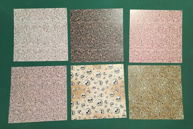
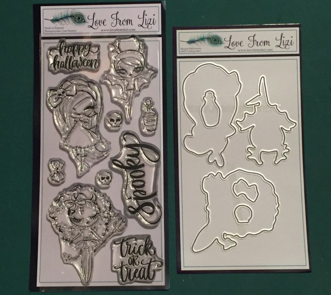
Hello folks! Scott here with the new Love From Lizi September 2018 Super Card Kit! This month, Love From Lizi turns TWO! HAPPY BIRTHDAY LIZI! To honor this momentous occasion, Lizi has come out with this “Happy Haunting” Super Card Kit that features products manufactured especially for Love From Lizi !! This kit has already sold out but Lizi has some of the add-ons for this month still available, and will probably release this stamp set for sale in the coming months. Remember… if you go shopping at Love From Lizi, please use my link: http://bit.ly/LFLlink
 I do use the included card stock as card bases (A2 cards as usual) Sometimes the color of a card base will inspire the design of a card. This month, it’s all about Halloween here!!
One of my favorite things about the Love From Lizi Card Kits is that we usually get some unique and/or new-to-me supplies. This month was no different with the inclusion of a full-size tub of Brusho Crystal Colors in Black. I’ve never played with powdered watercolors before, so I grabbed some of my Strathmore 140# watercolor paper and started experimenting! I taped my paper to a board and added some clean water and started adding the Bruso to the wet paper… WOW! Lots of colored powders make up the black color here. I’d add more powder, and spritz more water, and after a few rounds of powder and water came up with this:

After creating this, I am going to have to re-think my ‘galaxy’ coloring methods! This background inspired my first card this month.

On a white card base (I do save the LFL Copic-friendly white card stock for alcohol marker coloring, and substitute a sheet of 110# white card stock from my stash). I did spatter some permanant white water color over that Brusho background for stars and that completed the ‘galaxy’ look. I die cut that background with a Lawn Fawn Stitched Rectangle die (surprise!) and matted that onto a piece of the Dusty Pink specialty card stock and glued those to the card front. I used one of my Darice circle dies to cut out a little ‘moon’ from the Blush specialty card stock and glued that directly to the background. I took the Witch ephemera piece from the kit, and mounted that over the moon with some foam tape, and added the pun-y sentiment from the decoupage sheet in the same way. A few drops of the Wisteria Purple Nuvo drops and some Glossy Accents on her eyes adds a little more shine to our witch,  and of course, I couldn’t resist adding another pun to the inside of this card! “Spell, yeah!” (Black Jack font) works perfectly and provides a little more of laugh when the card is opened. I really love that ‘galaxy’ background, and the clear drops on her eyes add a lot of life to this image!
Now that I have done some free-for-all ‘painting’ with the Brusho powder, I thought I would try and see how much control I could exert with this medium. I am a control freak! I figured a moon would be useful with this Halloween kit so I came up with this.
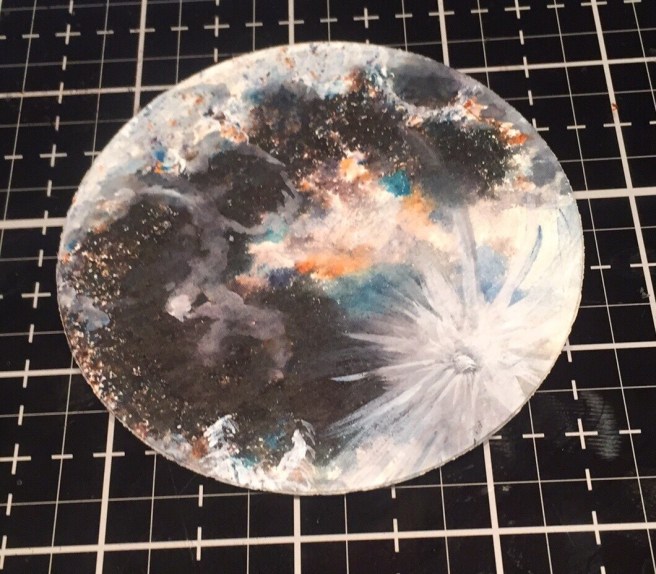
I did add some of my permanent white watercolor to this (note the Tycho Crater on the lower right) but all the colors and speckling came directly from the Brusho Powder! Now that’s my idea of using those watercolor powders to do my bidding! LOL!
If you saw my un-boxing, you know I got a big kick out of that Owl ephemera piece and decided to pair that up with this watercolor moon.
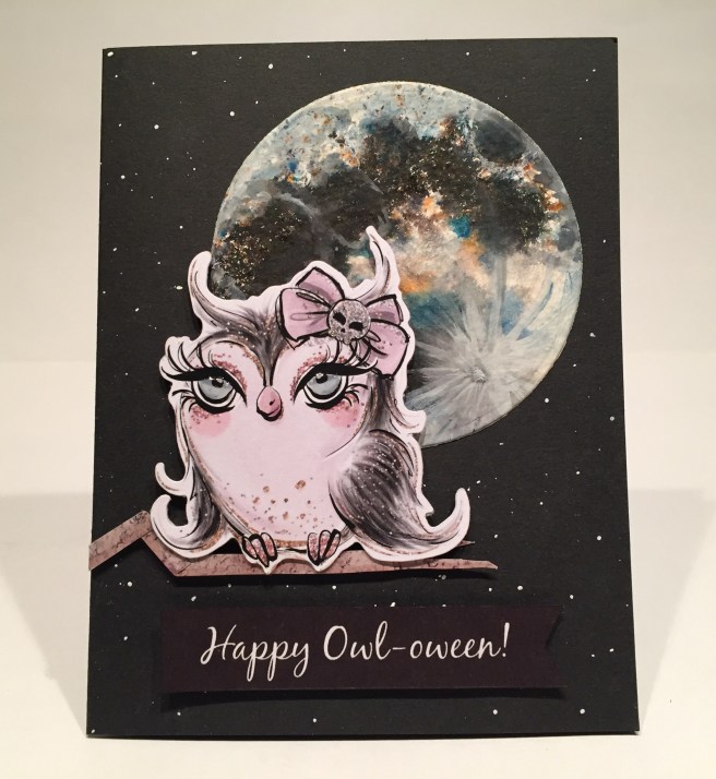
On a black card base, I again spattered some of my permanent white watercolor for a light background of stars directly on the card base. I glued the moon directly to the card front with my Ranger Multi Medium Matte glue, and cut out the thinnest stripe from the striped pattern paper that came with the kit. With the aid of a couple of folds, I fashioned a branch from that stripe for my Owl to stand upon and attached that along with my owl to the card front using foam tape. Halloween cards kind of lend themselves to puns so I am off and running already with this “Happy Owl-oween!” sentiment I printed up using my Silhouette software and the Black Jack font again. I trimmed that into a banner shape and foam taped that to the card front as well.  I did think this was the perfect opportunity to use the “trick or treat” stamp from the stamp set and added that to the inside of this card using VersaFine Onyx Black ink (I do ALL my stamping this month with this ink). I also added Glossy Accents on the owls eyes (BIG eyes here!) and again that brought so much life to this card! BEWARE!!! I am just getting started with the Halloween puns this month!!!
We got a terrific new curly-cue cobweb stencil in the kit this month and I though it would be fun to try some ‘reverse stenciling’ with this highly detailed cobweb. Basically, I’m just using the stencil as a stamp – inking up the surface and applying that to card stock. Now, the manufactured cut edges of the stencil are minutely higher (thicker?) than the body of the stencil, so if you ink your stencil and apply that directly to card stock, chances are pretty good that you will only transfer the edges of the stencil. Here are my experiments:

Clockwise from top left: 1. Hero Arts Unicorn White ink and white gel pen 2. HA Unicorn White ink and silver stardust gel pen 3. Golden Crown embossing powder (LFL) 4. Silver Dollar embossing powder (LFL) 5. Pumpkin Pie embossing powder (LFL) 6. HA Unicorn White ink with a good spray of water. For the embossed pieces, I coated the stencil with some VersaMark ink, laid that on the card stock and ran it through my die-cutting machine using an embossing mat. That really pressed the ink into the card stock and gave me really good results with all the embossing powders. And you can get a good impression from most of your water-based inks if you spritz the stencil with a good amount of water. I was just experimenting here, but I really like the subtle variations in color on cobweb #6!
I also took a little time to go ahead and assemble all four of the decoupage pieces included in the kit. YOWZA! there are some incredibly small pieces to these decoupage cut-outs – I don’t think I’ve ever trimmed foam tape this small! I like to use EK tools 3D-Dots with this layering decoupage. At 1/16″ thick, these are the thinnest, highest quality foam squares I have ever seen.

Those arms on these “Ghoul-ettes” are super thin! I think my foam squares are thicker than some of the widths I was trimming it down to!! I did persevere and got all four of our “Ghoul-ettes” assembled using all the decoupage pieces. Really fun dimension!
I thought that cobweb and the decoupage “Ghoul-ette” with a book would work well together for my next card. And maybe that book she’s reading is a cook book (or a spell book if you like). That ephemera cauldron would work nicely here too!
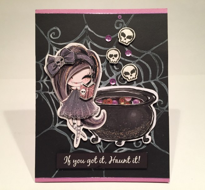
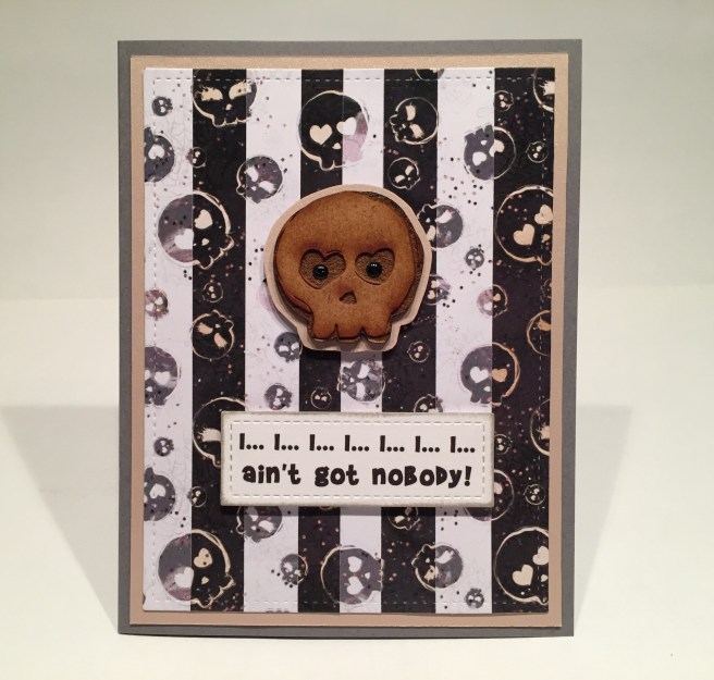
I trimmed down my white cobweb to fit (the stencil is a 6″ x 6″ stencil with a frame, so it won’t completely fill the 5.5″ length of a card front) and glued that to the Posy card base and added a couple of the thinnest Lilac peel-offs to the top and bottom edges. I did make a little mini-shaker out of the inside of the cauldron using only the smaller sequins from the Happy Haunting Sequin Mix (doesn’t shake much, but looks cool!) and glued the cauldron and the Ghoul-ette together before mounting them to the card front with foam tape. I stamped the skulls from the stamp set with VersaFine ink and used the included die to cut out the two larger skulls and just fussy-cut the smaller one. I colored the skull on the hair bow with my Stardust gel pen and used my Spectrum Noir Sparkle Glitter Brush Pen to add some shine to the skulls. I attached the skulls with some foam tape and added a few sequins as if they were all ‘bubbles’ rising from the cauldron! And, here it comes… my second pun-y sentiment for this month: “If you got it, Haunt it!” printed using my Silhouette software and the Black Jack font. I thought white text on a black background was very appropriate for a lot of these cards this month, and I love how it kind of feels like it’s white embossing! I do complete this card with the “happy halloween” stamp from the kit on the inside of the card – I think every card this month sports a sentiment on the inside! I really like pairing this Ghoul-ette up with the cauldron – it gives some context to the book she’s reading and the skull ‘bubbles’ reinforce that as well!
Okay, lets dig into some of that Love From Lizi Happy Haunting pattern paper pad now. I really liked that ‘striped’ pattern paper and thought those stripes looked a lot like birch trees. I considered cutting all the stripes away from the pattern paper and gluing them to black card stock to get a ‘night sky background’, but then thought it would be very interesting to play with a ‘reverse’ night sky with a moon poking through the trees…!
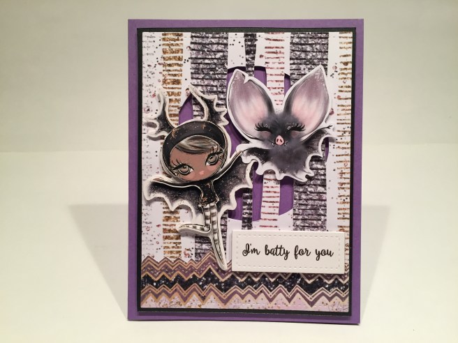
I traced a circle on the pattern paper (another circle die to the rescue!) and used my craft knife to cut the circle out while leaving the ‘trees’ intact. I then die-cut the pattern paper with a stitched rectangle die and matted it to a piece of the Black specialty card stock (with the center cut out!) and foam taped it to the Lilac card base for some added dimension behind the ‘trees’. I also took a small piece of the chevron pattern paper and fussy-cut one edge, die-cut it to size and added it to the bottom of my card front for a little suggestion of ground. I paired up the decoupage Bat Ghoul-ette with the ephemera bat and attached their ‘hands’ together as if they were dancing in the forest… I attached those to the card front with more foam tape (you can never have TOO MUCH dimension!) and printed out the “I’m batty for you” sentiment using the Ballerina Script font. I sized that sentiment to fit my smallest stitched rectangle die and glued three layers together  before foam mounting them to the card front. Another “happy halloween” stamped on the inside, some more Glossy Accents on her eyes for a little shine, and there you have it! I loved pairing these two ‘bats’ together and with the Ghoul-ette’s leg kicked up in the air, it really feels like they’re dancing through the forest!
We got some terrific wood-veneer die cuts in the kit this month – nicely sized, well detailed and darker than most veneer pieces we see, and I was eager to use the large wood-veneer skull for my next card.
 I took the white and black skull pattern paper, and noticed that it was the exact same pattern on both pieces so I stacked them on top of each other and started cutting strips. Then it was a simple process to match the patterns and create a black and white striped paper with the pattern running uninterrupted across all pieces. I LOVE that! I die cut my finished stripes with a stitched rectangle die and matted that to a piece of the Blush specialty glimmer paper before gluing them to the Dark Gray card base. I did cut a mat for the skull from more of the same glimmer card stock and added that to the card front with foam tape. And I LOVE this sentiment…!! Makes Me Laugh every time I sing it. YES… you got to sing this one! LOL!! I printed this sentiment using my favorite Brady Bunch Remastered font, die cut it with a stitched rectangle die, and foam taped it to the card front.
  Another stamp of “happy halloween” on the inside of the card and I thought that was it. But something was missing… I experimented coloring the eye sockets with a black gel pen on the smaller wooden skull but did not care for that effect. The sockets are very textured on their bottoms (probably a result of their lase-cutting) and that kind of flattened out the shine from the gel pen. AHA! Black Nuvo Drops in the eye sockets give this fellow some GREAT personality and shine and makes me laugh even harder! He looks kind of irritated! LOL!
Last year, with the LFL Thanksgiving Special Edition kit, I made a sketch file on my Silhouette Portrait for a background of ‘swirling wind’ to use for a “Sweater Weather” card. I love the fact that my Silhouette will not only cut out shapes, but that it will also draw shapes with any pen or marker that will fit in the holder. I had another great ‘witch’ sentiment that I wanted to use and I thought this would work well for a witch on her broomstick.
I ‘sketched’ the swirly lines using my white gel pen on a piece of the Graphite specialty card stock and used my largest stitched rectangle die to cut that to size and glued it to the Dark Gray card base for my card front. I mounted the decoupage witch to the card front with foam tape and printed this double-pun sentiment using the Black Jack font on some plain white card stock. I did size the sentiment so I could die cut it with a Spellbinders Deckle Rectangle die, and I went ahead cut two more layers and glued them all together for some added thickness.  I distressed the edges of that sentiment with a little Pumice Stone Distress Ink and mounted that to the card front with foam tape. A few pink sequins from the sequin mix add a little bling for a nice finishing touch. Of course, I have to continue using the “happy halloween” stamp on the inside of this card as well… I guess you could say that stamp is on a roll!! I’m SO GLAD this stamp is in this stamp set! I only have one teeny tiny “Happy Halloween to You” stamp in my stash! And I have to admit, I really enjoy this double-pun sentiment!
Okay, one more card using my Silhouette Portrait – this time using it for cutting!

I cut the “333” (Impact font) from a piece of the pattern paper and also from a piece of black card stock, and glued those together to create an offset shadow, and glued those directly to a white card base. I mounted the ephemera Devil Ghoul-ette with some foam tape on top of the numbers and added a few Nuvo Drops for some shine. I was still looking for a pop of color so I stamped the bow from the stamp set, colored that with my Zigg Clean Color Real Brush Markers and used the included die to cut it out. The white outline around the bow wasn’t working on this image so I went ahead and fussy-cut the bow right to the stamped edges and added that to her hair with a spot of foam tape. Some Stardust glitter pen on the skull and now we’ve got a nice pop of color on the front of this card.  Ok… so… what in world is a “333” sentiment mean? Well, all you have to do is open the card to reveal the joke. That’s right… this Ghoul-ette is only “half-evil” LOL! This is printed in the Ballerina Script font on the writing surface inside the card. This makes me laugh so hard. I love the nondescript numbers on the front and the final reveal when the card is opened. I think most of us would agree that we are all only half-evil..!!! Still makes me giggle just writing about it!!
I haven’t used that large “Spooky” sentiment from the stamp set yet, and I thought that since it was so large, it might make a nice background stamp.

Oh, yes!! I stamped that “Spooky” sentiment multiple times on the black card base with VersaMark ink and embossed it with Ranger Clear embossing powder for a really nice, shiny, tone-on tone look for the background on this card. I added double rows of the Lilac mirror peel-offs to opposite corners of the card front for a sort of ‘partial frame’ effect (you’ve seen me do that before) and that adds a lot of shine to this card. I stamped the bottles from the stamp set and colored them with my Zigg markers before die-cutting them out with the included die. I glued those bottles to the hands of the ephemera ghost and used foam tape to mount this image to the card front. Of course the “I’m just here for the BOOS” sentiment (Brady Bunch Remastered font) is so completely apropos, that I couldn’t resist! And when I saw the bottle stamp included with the stamp set I knew this card was in my future!!  LOL! I did take the time to finish out this card with the “happy halloween” stamp on the inside writing surface, and once again, I love the pop of color that the green bottles add to the front of this card! I guess I’m getting a little tired of all the soft pinks, lilacs and grays that comprise most of the color palette in this kit.
Okay then… let’s do some COLOR! I stamped the Ghoul-ette stamps from the kit on my Bristol smooth card stock and went at them with my Zigg watercolor markers.
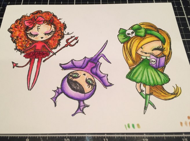
I was really itching to color the devil Ghoul-ette in reds, and red, violet and yellow-green are split complimentary colors, so that’s the route I took coloring these stamps. Of course I was planning on using them all together on one card so I thought I could get away with such a radical color intervention here! LOL!

On the Posy card base, I paired the pink ‘terrazzo tile’ pattern paper and the soft pink cobweb pattern paper to make my background. I used the Lilac mirror peel-offs to lay out a bit of a perspective tile pattern on the ‘floor’. I though that was really interesting! I checked our hallways here in our building, and the terrazzo floors here have metal ‘grout lines’ between the pieces of tile so the mirror peel-offs were perfect! I think of this as my ‘disco’ floor! I trimmed the background to size (WHAT!? no stitched rectangle die???!!!) and added a thin black mat before gluing the background to the card base. Then it was a simple matter of arranging our three Ghoul-ettes on the card front. I decided to bring in the large ephemera skull to give the small Bat someplace to stand so she wouldn’t get lost in the background. Everything is mounted to the card front using foam tape and you have to open the card to see my favorite pun of the month!
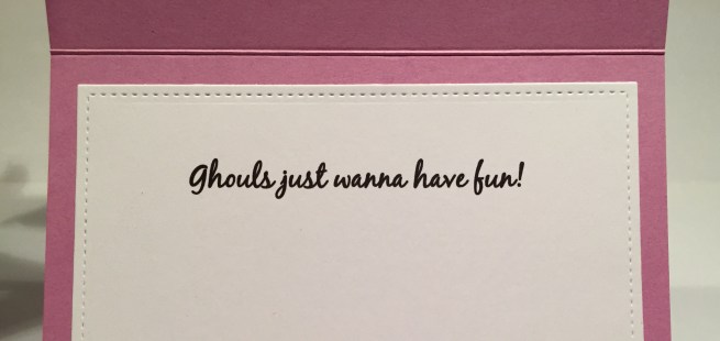
Oh, heavens this one makes me laugh and laugh and laugh…! What a delightful pun!! And I think it’s ultra perfect this month since all of our images are girls!! This is printed in the Black jack font again – I went back and forth between this font and the Ballerina Script font in an effort to emulate the font of the stamp set – I think the Ballerina font is closest to matching, but I didn’t like the lower-case ‘w’ so I used the Black Jack font for my sentiments that had a ‘w’! Makes perfect logical sense, right??!!! LOL!!!
And that brings us to my last card of the month!

Color junkie that I am, I really liked the Pumpkin Pie embossed cobweb I created earlier. That embossing powder was included with the Love From Lizi October 2017 card kit and it worked so well on this spider web. Nice glitter in that embossing powder! I dug around in my leftovers from that month and found a piece of the Burnt Orange specialty card stock that matched the embossing powder perfectly! (natch!) That inspired a little interactive card for you all!
Needless to say, this cards thrills me to no end!! This is the very same technique I used for my “Swinging Girl Card” from a couple of months ago. I didn’t fuss with the thin card stock spacers on this card and instead opted for foam tape as the spacer between the card front and the Lilac card base. I die-cut the cobweb with a stitched rectangle die and matted that on a piece of that Burnt Orange specialty card stock and then drew a line with my Emboss It pen on a scrap of black card stock and embossed that with more Pumpkin Pie embossing powder and fussy cut it out to use as my swinging web strand.  I did spend a little time coloring up the wood-veneer spider from the kit using my Spectrum Noir Alcohol Markers on her bow and then topping the bow and eyes with my orange Sakura Glaze Pen for a touch of shine. Some white gel pen for the bottom of her eyes really makes them pop and I used my Stardust gel pen on the skull in the center of the bow and a spot of red glaze pen on her lips. I think those glaze / gel pens work really well on these wood-veneer pieces and adds a little touch of shine as well.
I really didn’t want to cover up any more of that cool orange cobweb with my sentiment and thought it would be a blast to hide the sentiment behind the spider so she reveals the complete phrase only when she swings back and forth. I got the biggest kick out of that!!
I created the “CREEPIN’ IT REAL” sentiment on my Silhouette using the Taco Modern font and sized it to work with my Darice Banner die. I chose to print that on some photo paper for the extra bright colors and some really nice shine, and was pleased to get a really good match with the orange! I outlined the banner die-cut sentiment with some thin Lilac mirror peel-offs and that was the perfect touch to really highlight the sentiment. I did of course complete this card with the “happy halloween” stamp on the inside writing surface.  I love the classic orange and purple Halloween colors on this card, but I do have a little bit of a bone to pick here. Spiders have 8 legs. Bugs have 6 legs. I guess that’s being really picky… LOL!! Ultimately, it doesn’t detract from my overall enjoyment of this card! I’m just sayin’…!! LOL!
That completes my 10 Cards 1 Kit collection featuring the Love From Lizi September Super Card Kit. I did manage to use every stamp in this stamp set, I used two of the wood veneer die cuts, 5 pieces of ephemera, and 8 Ghoul-ettes! I didn’t get to any of the ribbon this month… I think I must have been so enamored with the spool that the ribbons came on that I didn’t want to disturb it!! LOL!! Even though every card here has ‘eyelashes’ somewhere, and even though this is an extremely feminine kit, as a whole, I think this collection of cards feels more Halloween-y to me than girly! I really enjoyed all the puns this month and hope you get a kick out of them too!

Thank you so much for joining me here today! Please let me know if you have any questions or comments – you can email me directly from the ‘CONTACT’ page at the top if you like! I’d appreciate it if you shared this post with any Halloween Junkies you may know or anyone else you think might be interested! Please Like Me, List Me, Pin Me, Post Me, Don’t Run with Scissors, and, as always, Happy Halloween!
 Hello folks! Scott here with the new


 The cup is mounted to the card front with
 For some final touches, I wrote ‘Cafe’ on the little sign with a brown
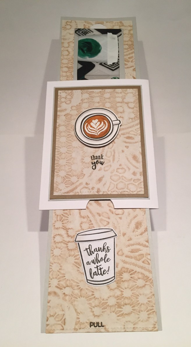


 stamped all the images with Onyx Black ink on Bristol smooth card stock and colored everything with my Zigg real brush markers. After coloring, I stamped all the sentiments and die cut all the shapes. My card base is 110# white card stock cut to 8″ x 9″ and folded to make a 4″ x 9″ card. I sponged the heart background with the

 Now here’s a sentiment for our times..!!! ROTFL!! I actually sketched this sentiment on Ivory card stock using my Silhouette Portrait, the
  Here I was mostly interested in seeing if I could adapt that to-go cup lid into a dome-topped lid for a couple of frappes! When stamping the lids, I wiped away the ink from the back (top) of the lid before stamping. If there was any ghosting of that line, it was easy to use my
  I searched for some frappe images on line for some coloring inspiration, and am thrilled with my mocha and strawberry frappes! I printed this fun sentiment on one of my graduated circles backgrounds (SSS Barely Beige ink on kraft) using my Silhouette software and the Smoothie Shoppe font (naturally!). Then I die-cut that background with a stitched rectangle die and matted that on a thin white mat and a thicker red
  for the cups, and foam taped both of the cups to the card front. I did stamp and color a couple of the straws, and, using my craft knife, cut two small slits at the top of the whipped cream and just under the top of the dome to slide the straws through. A tiny highlight of blue colored pencil on the domes adds to the ‘see-through’ lid illusion. I did go ahead an make this an actual Birthday Card with the addition of the sentiment on the inside of the card (Smoothie Shoppe font again) and a little slot to hold a gift card. With the prevalence of ‘blended drinks’ at coffee shops these days, I thought it only fitting to do this frappe card and I had a great time figuring out how to make those iconic dome top lids.
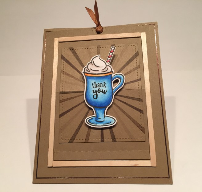
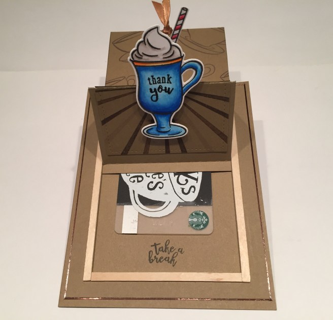
 I die-cut more of that brown glitter paper with a stitched circle die to back the mugs, and foam taped the circle and the mugs to the card front. Of course I dipped into my (seemingly) never ending stash of of song lyric puns for this fun sentiment. I printed and cut this sentiment using my Silhouette Portrait (

 Since the printed card was in silver, I decided to emboss the stamp right on top of the journal card in gold. I used the
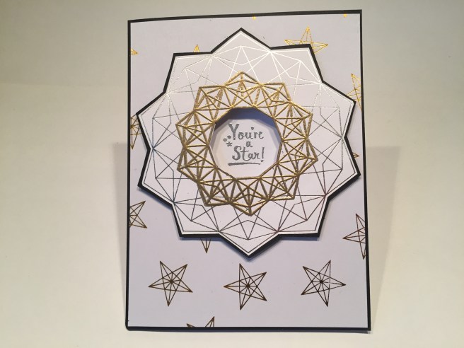
 I outlined that piece with the

 Once that was dry, you add the
 I added some thin foam strips to the top and bottom of the CELEBRATE! ribbon and added that to a strip of my silver glitter card stock for a little recessed dimension behind the letters and glued those together down to the card front. I mounted the presents with the
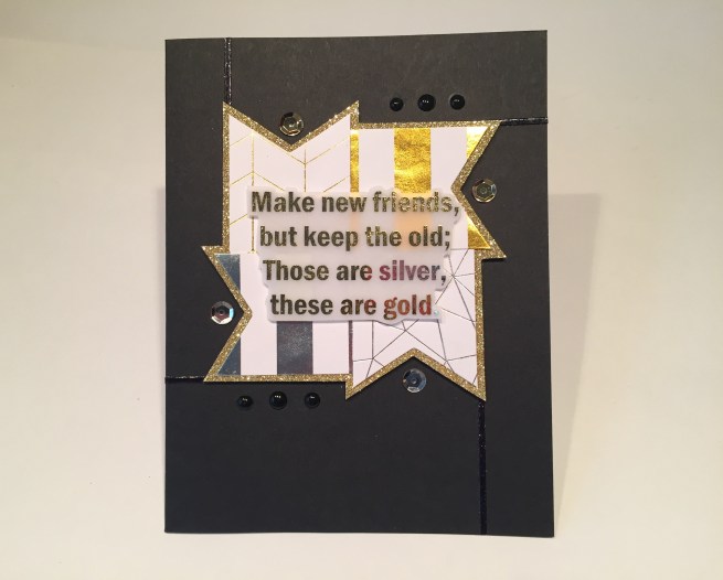
 I fussy cut that sentiment out and, with some carefully placed foam dots, mounted that to the center of the banners. I thought this sentiment was a perfect companion to the “Best and Loveliest Friend” stamp from the kit, so I stamped that on the inside writing surface with
  Feels like a big spangly bracelet or maybe a fancy metal belt…! On my last black card base, I glued down a line of the gray velvet ribbon and two lines of the thin gray satin ribbon for a ‘base’ and arranged the metal charms on top of that using my thin foam dots. I did add the little bronze gems from the

 That covers my 10 Cards for the
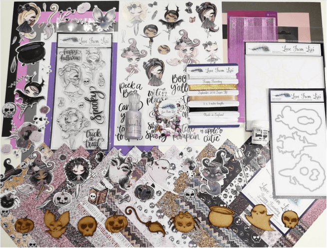
 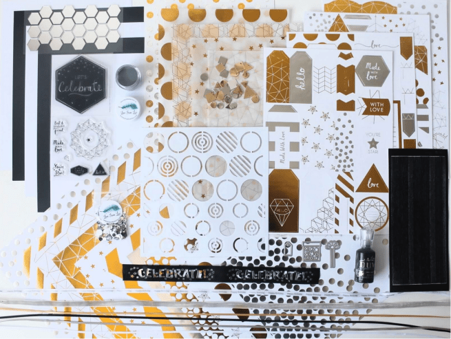 I think Lizi is calling this the Super Shine Card Kit and it certainly lives up to it’s name! This is another unique collection of supplies that only Love From Lizi could put together!
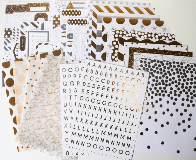
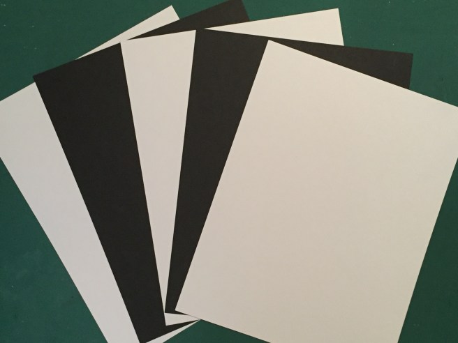 To begin with this month we get 3 sheets of smooth White ‘Copic-friendly’ card stock and two sheets of black in 8.5″ x 11″ letter size. That Black card is super hefty and very thick!
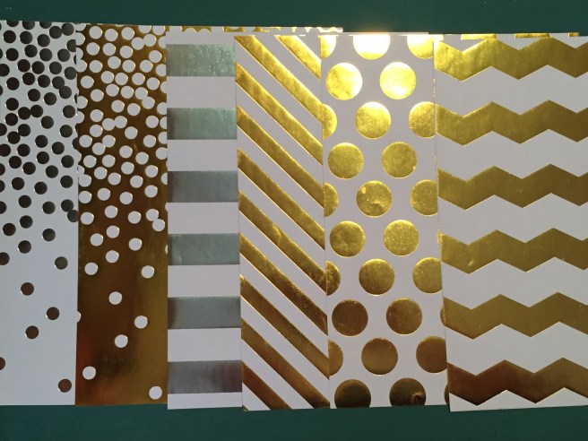 Then we have this huge parade of A4 (
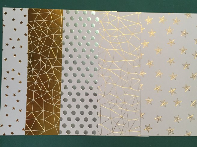 Now this isn’t real thick card stock but it’s not paper either – seems just the right weight to use as background and highlights on cards. And LOTS to work with! We also get four
 And for just a little more icing on the cake, Lizi included 4 sheets of die cut elements too!
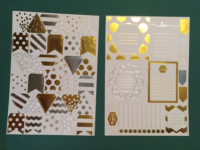 There is a sheet of banners in both square shapes and triangles (I like that they have ‘flaps’ to go over some string (or ribbon!)), and this sheet of what looks like ‘journal-ing cards’ – these would work perfectly as a writing surface inside our cards!
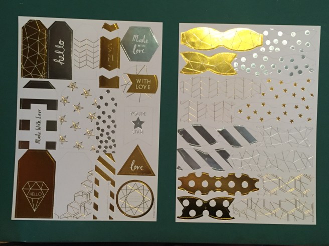 The third sheet of die-cuts feature tags and labels – some with sentiments and some without, and our fourth sheet has 8 die-cut paper bows in various patterns. These have small holes at the end and the centers of the ‘bow’ die-cuts and no ‘center wrapping strip’ so it appears that we are to assemble these using brads or other poke-through fasteners. That is a hefty bunch of papers in this kit! Enough to make dozens and dozens of cards!
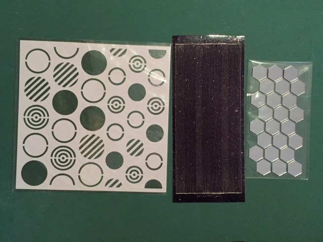 Our stencil this month is this large 8″ x 8″ sticky-back stencil of different circular patterns. This is just like the stencil we got in the LFL November 2017 kit that had the tree shapes. Our LFL peel-off stickers are in Black Glitter… LOVE THAT! and we also get 24 sticky-backed hexagon mirror pieces. Talk about SUPER SHINE! WOW!
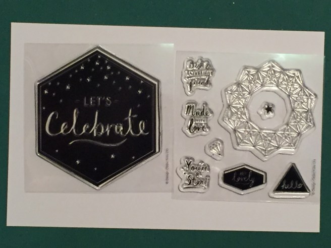 We receive these two small stamp sets with this kit – The large ‘Let’s Celebrate’ hexagon and the smaller set that features a detailed line-art star and five tiny sentiments that fit the opening in the center of that stamp – there’s ‘Best & Loveliest Friend”, “Made with Love”, “You’re a Star”, “Hey Lovely” and “hello”. Pretty standard greetings but some very unique shapes. Finally that brings us to our coveted Embellishments bag!
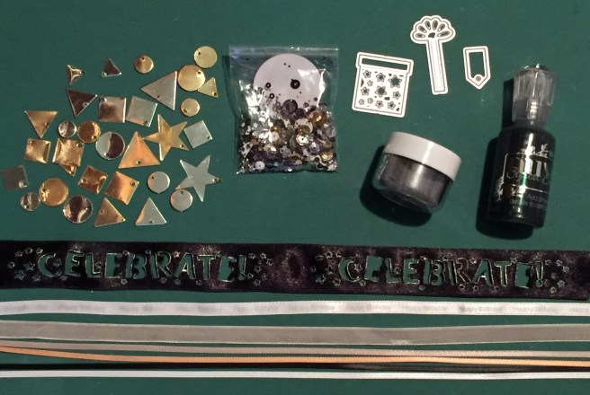 Lizi always includes an assortment of ribbon in her kits and this month is no exception. First, there’s that 1″ wide black die-cut ribbon that says ‘CELEBRATE’ (mine needs a light pressing to straighten everything out), a 3/8″ wide grey velvet ribbon, and a 1/4″ white satin ribbon printed with ‘happy birthday’ in silver. Ther is also another batch of that terrific 1/8″ wide satin ribbon in Grey, Caramel, Black and White. My ribbon stash has grown by leaps and bounds since I began with Lizi!! We always get a bottle of Nuvo drops in Lizi’s kits – this month they are the Ebony Black Crystal Drops – and we are treated to a NEW Love From Lizi embossing powder in Silver Dollar! WOO-HOO! Our die this month is a ‘present’ die in three parts: the package, the ribbon and bow, and the tag. Totally adorable! We get our sample package of the Super Shine sequin mix in silver, gold, and black (naturally) and a big assortment of these gold and silver metal charms in an assortment of shapes and sizes!
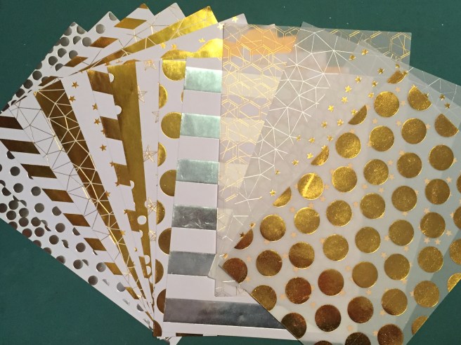 The Bumper Pack includes another batch of eleven pattern papers and four vellum sheets in the same colors and patterns as the papers included in the kit (double-down!!)
 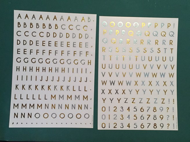 The Bumper Pack also includes these great foiled alpha stickers in silver and gold – LOTS of letters here – and a collection of die-cut sheets with new and different elements.
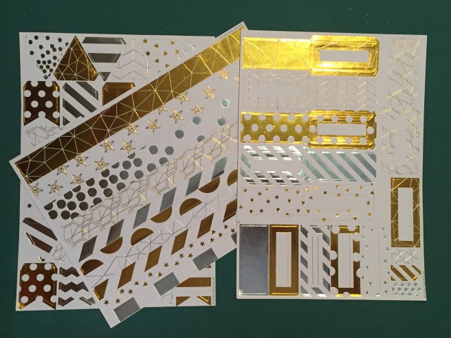 The only repeat here is the sheet of die-cut banners in triangles and squares and that’s where the similarities end! We get a sheet of die-cut strips in different patterns and this sheet of labels and tags on the right… These remind me of luggage tags – with a front and a back and a place for your address! There’s a few smaller flags and simple labels too.
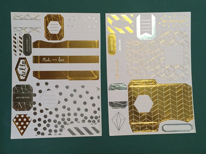 Here are two sheets of die-cut gift card pockets – looks like there are four of them with some assorted tags and labels to fill out the sheets.
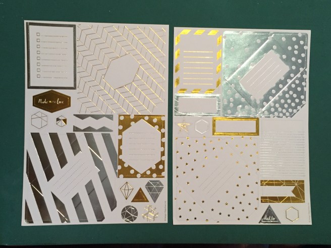 We get these two envelope / note card die-cut sheets that would make 4 cards instantly!
 Then we get two copies of two different Gift Box die-cut sheets that will make matching boxes for small presents! Looks like the left sheets make more rectangular shaped boxes and the right sheets make thinner, broader boxes. Again, these 28 additional sheets included in the Bumper Pack come in at about $9.25 for the entire pack. Great bargain!
 This month our 6″ x 8″ stamp set includes a finely detailed County Fair silhouette stamp and assorted rides, signage, a plane trailing an aerial banner, and an assortment of scene builder stamps and sentiments. These are accompanied with 10 coordinating frame dies and a 4.25″ x 5.5″ fancy background die that compliments this summery theme. We also get three Hero Arts ink cubes in Red Reactive, Blue Reactive and Unicorn (white). As someone who doesn’t have a lot of ink pads in my stash, I LOVE getting ink cubes in our kits. Lastly, we get 3 postcard backers in a kraft color to complete our goodies. All of this is wrapped up with some lovely 1/4″ red and blue satin ribbon. Now, it seems pretty obvious how one is intended to use these stamps and dies, but I was interested in seeing what kind of variety we might be able to achieve with these goodies. Let’s go to the FAIR!
 I stamped the ‘Ticket to FUN’ ticket stamp on the gold paper with some
  ticket” so I couldn’t resist adding a “You’ve got a Golden Ticket” sentiment to the inside. I created that on my
  I liked the idea of this card so much, that I took the negative die-cuts from the background die, and created a second
  (almost) identical card. I did change the sentiment on the inside to read “I’ve got a Golden Ticket” which is a more faithful quote to Willy Wonka and the Chocolate Factory… I almost like the second card more than the first – not sure if it’s the white framing versus the gold framing or the change in sentiment, but both cards are perfect for any gift-giving occasion and a definite TICKET TO FUN!!
 The hot-air balloon stamp caught my eye next, so I stamped that seven times on some
  county fair silhouette stamp and traced the edge of that on some
 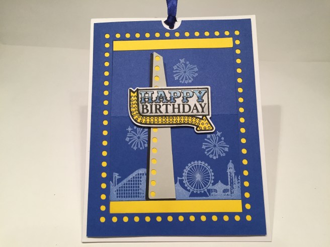 Taking a cue from the ‘lights’ on the arrow part of the stamp, I decided to add ‘lights’ around my sliding window for this card. I cut the card front mechanism from a piece of blue card stock from my stash, and also cut a yellow ‘frame’ to color the ‘lights’ while still leaving the window white. I stamped a portion of the long fair stamp on the bottom of the window flap in the Unicorn ink and stamped a few fireworks above the fair in the same ink. LOVE that Unicorn ink on a darker card stock and that long County Fair stamp is highly detailed. I stamped the sentiment sign on some scrap white card stock and yellow card stock with VersaFine Onyx Black ink and fussy cut the arrow portion away from the yellow card stock and paper pieced that to the white stamping. I wanted to highlight the ‘signage’ aspect of this stamp (and wanted it to stand up above the fold of the sliding window), so I created a sign-post to mount the birthday stamp on. I did create this ‘post’ on my Silhouette Portrait and repeated the ‘light’ motif on the front grey card stock – my yellow card stock again colors the ‘lights’ and I added a bit of a black shadow to the left side of my post. I colored the white portion of the stamp with some colored pencils in blues and grays, and I die-cut that stamp and added that to the ‘post’ with some foam tape and then glued the whole assembly to the bottom half of the sliding easel piece. A couple of thin strips of the same yellow card stock on the top and bottom of the folding piece frames our image nicely, and all is foam taped to a white card base. A piece of white card stock (cut wider than the window) provides the ‘pull-tab’ and a touch
 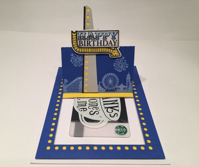 of the blue satin ribbon indicates where the recipient is to pull. Now, you could easily create a sentiment that is revealed behind the easel when pulled, but I opted for a ‘hidden’ gift card – plenty of room for a greeting or added sentiment on the inside. I love the Unicorn ink stamping on this card, I love this Sliding Window mechanism, and I love the ‘retro signage’ feeling of this Birthday stamp. I am looking forward to utilizing this sliding window pop-up on more cards, and experimenting with different edge designs around the window. I am very pleased with this new interactive card!
 Worked beautifully! This is the first time I’ve tried this acetate and I thought it lived up to it’s promise exceptionally well. I grabbed some of my old Yellow Jewel tone Recollections card stock and cut that down with my
  ‘concession’ stamp with VersaFine Onyx black ink on a scrap of Bristol Smooth card stock and colored that with my Zig Brush Markers. I was thinking of a sentiment that wasn’t in the stamp set, so, with a little trial and error (and my ever-useful
 Now, why is “Life like a Carnival Game” you may ask? Inside, I am offering both an optimistic and a pessimistic response to that question. In the same font(s) I printed “You can’t WIN if you don’t PLAY” on the writing surface, and also created an optional cynical response as well
  with an inside that simply reads “RIGGED”. LOL! Oh, boy, that one really makes me laugh. My older brother is actually works with a carnival and has been a ‘carny’ for his entire adult life. I spent a summer on tour with him after college (lots of State Fairs and Canadian Stampedes) and learned that most of the rumors, superstitions and legends about carny folk are true!! LOL! And having that Circus font in my stash gave me free reign to create almost any sentiment I can imagine!
 After gluing those two die-cuts together, I used my stitched rectangle die to cut them out into a frame for my card. On a piece of white card stock, I stamped a portion of the fair border stamp in the bottom of the frame in the Red Reactive ink and embossed that with clear embossing powder, stamped the sentiment in VersaFine Black Onyx ink, embossed that with clear embossing powder as well, and filled in the ‘WORLD’ with my colored pencils in two shades of red. I stamped the merry-go-round on Bristol Smooth card stock and colored that with my Zig Brush Markers, and die-cut that out before mounting it to my card front on foam tape. I dug out my
  I used my LF stitched rectangle die to cut down the pattern paper (SO perfect with this kit!), matted that on a thin white mat, and after stamping the ‘fence’ border stamp on the top and bottom in the Blue Reactive ink, glued all down to a plain blue card base. I stamped and die cut 10 of the arrow stamps and colored those with my
  With the help of the ‘Oval guide with 10 Sections’ from the Gentleman Crafter, I foam taped all the elements to the center of the card front. You can’t quite tell what this card is about until you open it and see the sentiment on the inside. “Wish you were here!” is a terrific sentiment and is almost pun-y when used in this way. I printed this on the writing surface using the
  With a little diligence, I was able to maintain the thin frame on the top and sides of that die-cut, while moving the center oval down to the bottom of the card. I ink blended a plain white card base with my
  There was also that ‘WELCOME’ sentiment that fit in the plane’s aerial banner so that seemed appropriate for this card as well. First, I ink blended a background on some Bristol smooth card stock with my SSS Hybrid inks and cut that to size with a LF Stitched Rectangle die. I wanted to try and do another acetate embossing with the Ferris wheel stamp but I was not very successful at getting the embossing powder to stick with this stamp… tried four times to emboss this stamp on that acetate, but every time I die-cut it I would lose some of the embossing…. SO… I stamped the Ferris wheel on some Bristol smooth card and colored it with my Zig Brush markers, die cut it, and satisfied my need to ‘see through’ this stamp by fussy cutting out the center spokes. I think that helped this piece feel more like a part of this card! I stamped the plane and the pointing hand with VersaFine black onyx ink and the ‘WELCOME with the Red reactive ink, colored the hand with my Zig markers and die-cut them both. I stamped the ‘come one..’ sentiment in the Blue Reactive ink directly on the card front and clear embossed that. I embossed the star border stamp in white just below the main sentiment and turned to my computer to print out the “to the greatest BIRTHDAY PARTY on Earth!” in red and black using that Circus font and the
  Naturally, an invitation isn’t worth much unless it contains the information you need. On the inside of the card I created the necessary “For:” When:” and “Where:” labels (there’s that Circus font AGAIN!), and took this opportunity to stamp all of the balloons along the bottom of the inside. I colored the balloons with my Zig markers and added a touch of highlight to each of them with a
  I did use some Bristol smooth card stock and my
  But wait… there’s more!! I really like the “Love A Fair” pun but though we could goose it up a notch with another pun on the inside of the card. This one really tickles my funny-bone! I though “Carnival Knowledge” was the perfect compliment to the “Love A Fair” sentiment on the front and is one of the most interesting puns I’ve come up with in a while! This is printed using the same fonts as the front sentiment with the addition of those cool parentheses in the
  I have a bunch of pictures in my image files relating to carnivals and circuses, so I went digging though my stash and found some great print-ables that fit these postcards and the theme of this kit splendidly. I simply sized the images to fit the postcard, printed them out, cut them to size and sent them through my
  I really enjoyed playing around with this kit, and looking for (hopefully) unique ways to use these stamps and dies. We did manage to get a couple of puns, a few gift-card offerings, an invitation and one interactive birthday card! A pretty good variety of cards this month that aren’t all slavishly referencing the County Fair! I did manage to use all but three of the stamps in this set – I didn’t use the “Hello There” that fit the airplane banner, or the small cloud stamp, or the triangle banner border stamp, but I did use all of the sentiment stamps and probably more hot-air balloons than anyone! LOL!!! Mission Accomplished! I do hope you enjoy these cards as much as I do – my goal is to try and inspire you to think outside of the box a little bit and come up with your own take using these fun stamps and dies. If you appreciate the extra detail, pictures and product links I include here on my postings, please drop me a note to let me know. You can always go to the CONTACT page here and e-mail me directly if you have any questions or comments. Thank you for sharing your time with me here, I hope your summer is going well and you are enjoying some extra time with friends and family. Please share this post with anyone you think might be interested, and Happy Crafting!!
 I was really intrigued with that infinity stamp, so the first thing I did was grab my
  Came out GREAT! Now, if you look very closely you can see some seams that are slightly off, but due to the nature of this illustration, it is virtually unnoticeable! This stamp has starfish, conch shells, whelk shells, nautilus shells and some oyster shells. I was eager to do some coloring on these groovy seashells, and knew that I wanted to use my
 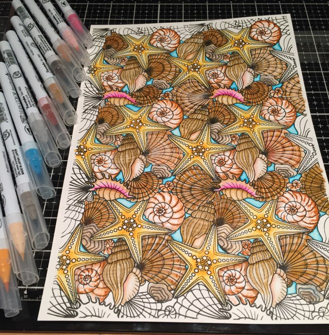 That’s why I chose to use the Bristol Smooth card stock. I put some music on and lost myself in this pattern for a couple hours. I realize that the Zigg markers will blend with each other, but I have always liked using water and a brush to move these markers around… and besides, I was shooting for more of a realistic look and didn’t want the shells to be too bright. I was completely thrilled with how nicely this turned out! I should be able to get a number of cards from this (just under) 12″ x 8″ infinity pattern. As I was coloring, I was looking for a shell that would lend itself to being cut out from the pattern, and, if you look at the stamp itself, there is only the one whelk shell (next to the starfish) that is on top of all the other shells and ready to be cut out. However, if you stamp the repeating pattern, you do end up with one Starfish (down the center) and the conch shells (though rather small..) that are on top of the other shells too, and can be fussy cut away from the pattern. Hmmmm…!
 Time to start cutting the seashells apart…!!! I wanted to feature one of the starfish on this card and found a way to fussy cut an edge on this stamped pattern in line with the starfish, and also fussy cut one starfish completely away from the pattern. I wanted to use the sand included in the embellishment bag to cover some of my ivory card stock to go under the cut edge of my pattern, but I realized the sand was a touch damp (I know retailers dampen play sand to cut down on the dust) so I was having a hard time getting it to stick to anything. I threw all my sand in a low oven to dry it out and reached for my new Sand embossing powder from the My Monthly Hero June kit and used that for this card instead. That works terrifically well with this stamp – very nicely in scale with the shells! I glued the embossed ivory card flat to the Kraft card base, before adding a thin black mat on the square side of the shells and foam taping that up on the card base. I added some sparkle to the fussy-cut starfish with my clear
  Besides the stamps, most of the images in this kit are on the decoupage sheets, so I started looking for images that would pair with the sentiments in the stamp set. The only decoupage that had any ‘waves’ was the sailboat sheet that had a “By the Sea” sentiment printed on the background (layer 1) piece. I cut a piece of scrap white card stock to match the dimensions of the ‘layer 1’ piece and added some clouds to that with a
 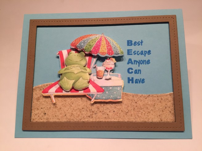 By now my sand is nice and dry from it’s slow bake in the oven so I wanted to try using that again. I cut a Kraft frame with two stitched rectangle dies and cut a piece of ivory card stock with a
 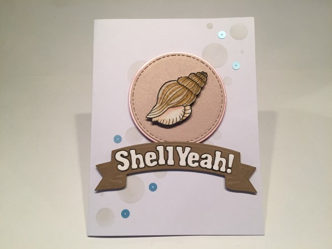 I mentioned the whelk shell from the stamp that was a complete shell just waiting to be fussy cut, so that’s what I did for this next card. On a white card base, I stenciled some ‘bubbles’ using the stencil included in the kit from the bottom left to the top right using some
  I attached the banner to the card front with more foam squares, added a few sequins from the Summer Sprinkles sequin mix, and to finish this card up, I stamped a ‘congratulations’ sentiment (from the
  We received a great ice cream cone die (with a Flake die!) in our kit this month and I wanted to do some fiddly inlay work with it! The cones are die-cut from Kraft and Ivory card stock and the ice cream is cut from the Pink and Oyster White specialty card stock and I dug up this ‘chocolate’ shimmer paper from the August 2017 Love From Lizi Card Kit (I TOLD you I keep all my scraps!! LOL!!). I simply colored all the cut out detail pieces with my alcohol markers before gluing them back in place. On the white card base, I glued a 3″ wide panel of the Blush specialty card stock down the middle and added the three small satin ribbons from the kit on the sides. I do run my ribbon through a
 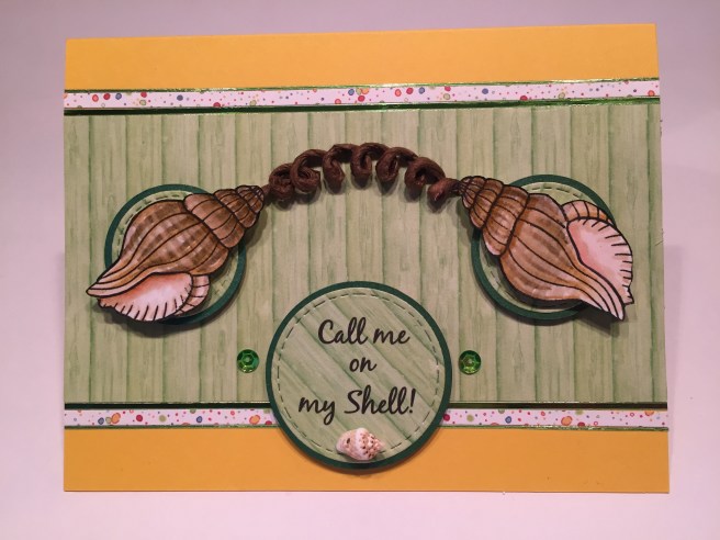 I was so enamored of that whelk shell, that I cut two more out of my colored stamps for this fun card. On the Golden Sunshine Yellow card base, I glued down a 2 and 5/8″ strip of the green wood plank pattern paper, outlined that with some LFL Mirror Green peel-offs (from the LFL January 2018 kit – perfect match!) then a small strip of the dotted pattern paper and another thin green peel-off. I die cut three circles from the same pattern paper with my stitched circle dies and cut mats for them from the Forest Green specialty card stock with my Orbis circle cutter (I’m starting to love that circle cutter)! The sentiment was printed on the larger circle in the
  and that great pun of a sentiment from the stamp set. I trimmed the stamped and colored shell sheet down to 5″ x 3.75″, and matted that on a thin black mat. On my Kraft card base, I ran some
  I was kind of itching to use this sentiment on a card this month, and I thought the little beach house decoupage was the perfect image to go along with my “Beach, Please!” LOL! Once again, the “Summer Fun” sentiment printed on the beach house background (layer 1) really didn’t appeal to me, so I assembled the decoupage starting with layer 2. I cut a piece of light blue card stock from my stash to 5.5″ x 3.75″ and distressed the edges with Peacock Feathers Distress ink and glued that to the Red Berry card base. I cut a piece of my ivory card stock with a stitched hillside die and ink blended the beach with Antique Linen and Vintage Photo Distress inks before printing the sentiment (
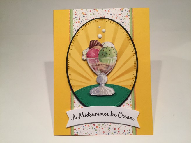 Of course, “A Midsummer Ice Cream” is a pun on Shakespeare’s “A Midsummer Night’s Dream”! This makes me giggle uncontrollably! I used the ice cream sundae ephemera piece for this card after fussy-cutting it away from it’s pink background! I used my
  Of course, I can’t leave well enough alone, and came up with a double pun for this card. On the inside we get “Lord, what cool these morsels be!” (Lord, what fools these mortals be!) LOLOLOL!! Knowing what’s inside sends me into fits every time I look at this card. I may have a warped sense of humor but I love the look of this card (invitation to an Ice Cream Social??) and I think that pun-y sentiment is terrifically funny and figure that most people probably know what A Midsummer Night’s Dream is, even though they may not recognize one of the most famous quotes from that play. I hope it tickles you as much as it does me!!
 That wraps up my 10 cards for this month, folks! I really enjoyed working with this kit a lot, and I think I did pretty good job of avoiding all the pink…!! LOL! I really loved coloring that stamp and think I managed to come up with quite a wide variety of cards that are fun and unique! I hope you enjoy them as much as I do! As usual, I have gobs of leftovers including one sheet of smooth white card stock, four complete decoupage sheets, lots of pattern papers, some specialty card stock scraps, and loads of embellishments including one whole sheet of foam squares. I did manage to use a little bit of most everything in this kit but I didn’t get to any of the wood veneer die cuts, printed or not. I love that infinity stamp, and that, with all the extras (including the ‘Bubbles” stencil) will find loving homes in my stash! Unfortunately, this card kit has sold out already, but I do know that Lizi still has the decoupage sheets, pattern papers and add-ons available, and will very likely release the ‘infinity’ shell stamp set for sale in her mid-July release! If you want MORE decoupage… Lizi has an Oh, Baby mini kit available (my Oh Baby kit video
  This month we are treated to some layering stamps in our 6″ x 8″ stamp set – a set of three ocean layering stamps and 3 clouds-each with 2 layers. These are the first layering stamps I own – It’ll be fun experimenting with them! We also get 7 sentiments in this stamp set and 12 beach-y silhouette stamps as well as their 12 coordinating frame cuts. To compliment the layering stamps we get a set of four Hero Arts ink cubes in Soft Granite, Soft Sky, Summer Sky and Deep Ocean. My first set of gradient ink pads too!! We also get .5 oz. of Sand Embossing Powder (very interesting!), 1 fl. oz. of Sea Foam shimmer spray, and a set of 16 Beach Enamel stickers with a very cool matte finish in fun colors. Looks like this kit is the perfect opportunity for me to practice my ink blending! For a little extra challenge, I’m going to ignore my Bristol smooth card stock and do all my ink blending on plain 110# white card stock. I think that will encourage me to blend with a light hand!
 Since I had never played with a layering stamp I thought I would try out the ocean stamps with a variety of colors and see what I could come up with. Very interesting results here. Looks like you might even be able to flip those stamps around and make a cloudy sky… but first, lets make a card using the ocean stamps as intended and using the gradient inks included in the kit.
 I feel like this is the card that the kit was encouraging me to make. I stamped the ocean stamps with the three blue ink pads and used the BACK side of one of the cloud stamps to stamp the little island on the edge of the horizon – I think I saw Jennifer McGuire stamp with the back of a cloud stamp to make an island – great effect! I added the palm tree stamp to the island but made the trunk a little bit taller (I though it was a little stubby..!) I did fussy cut an ‘ocean’ mask to mask off the ocean when blending the beach and sky, and I used one of the cloud dies to cut out a
  Well… I guess something like this works if you must have a horizontal scene! I used the same inks for this card as I used on my first card except I used
  Let’s try some different ocean colors! Again, very similar to the prior two cards but I only used two of the ocean stamps in
  Now… for the sentiment… one of my co-workers celebrated a birthday on Saturday, and not only does he love going to the beach whenever he can, he also has a terrifically morbid sense of humor…! I had to make this one for him! I created this sentiment using my
 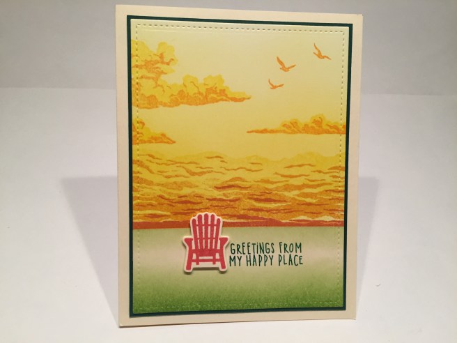 Now I turn everything on it’s head and use those ocean stamps for a ‘cloudy sky’ horizon. No blues on this card at all! I stamped the layering stamps in the
  Enough with the seascapes! Lets do something graphic! I covered a piece of white card stock with the Sea Foam glimmer spray from the kit – really nice color, great shimmer and a completely changing appearance as it moves through the light. I noticed that many of the beach-y icon stamps were very similar in size as well as the “Sea you soon” sentiment, so I arranged the stamps in a pleasant grid around the chair and stamped everything in Walnut Stain Oxide ink. I really like the sentiment off to the right side of the grouping, and I thought the chair was more important than the sentiment anyway! It
 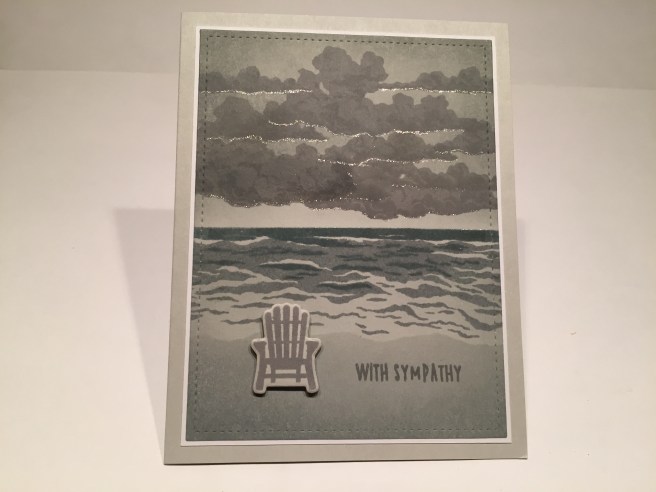 I grabbed a piece of my standard Staples Gray card stock (110# available in stores) and stamped all of this with the Soft Granite ink. I did not stamp the solid ocean stamp – letting the gray card stock be the background color, and I used some clear embossing on the smallest (darkest) ocean stamp – love that shine! I had a great time overlapping the three cloud stamps to fill up the sky, and even got the cloud shadows to subtly show up too! The sentiment is embossed as well and again, the chair is stamped and die-cut and mounted with foam dots. I did do some ink blending around the sky and on the beach with Iced Spruce Oxide ink (using my ocean mask again) and that gives this card a slight hint of green. I went back to my Stardust glitter pen for this card but instead of glittering up the waves (no moon here..!) I gave a the clouds a little silver lining on their bases. There’s the touch of grace that this card needed! Again, I die-cut the card front, used a thin white mat, and my standard grey card base. Actually, a very striking sympathy card!
 AHA! I’m using the ocean stamps on a landscape card and they fill the whole card front! VICTORY!!! LOL!!! I’m calling this my ‘sandbar card..! On a white card front, the smaller wave stamps are stamped in Broken China and Faded Jeans Oxide ink to match the angle of the HELLO stamp, and the sandbar is blended with Antique Linen and Vintage Photo Oxide inks and here’s the perfect chance to use that Sand Embossing powder with the HELLO stamp! I think that powder is more effective in smaller doses than in large swaths. I mean… sand isn’t really that reflective, is it? LOL! I thought it did work great on this sentiment, and I brought back the footprint stamp to indicate that someone trampled this message into the sand and then kept going…! LOL!! Lots of dots to soften the edges between the sand and water, die-cut the card front and another thin white mat and a dark blue card base. This is a very interesting card! The more you tilt the top of the card the more pronounced the perspective is – the illusion gets better and better! This card was great fun to create and I think the ‘sandbar’ illusion is unique and very cool..!
 Back to some big bold graphics with the beach ball stamp! On a white card front, I used one of my
 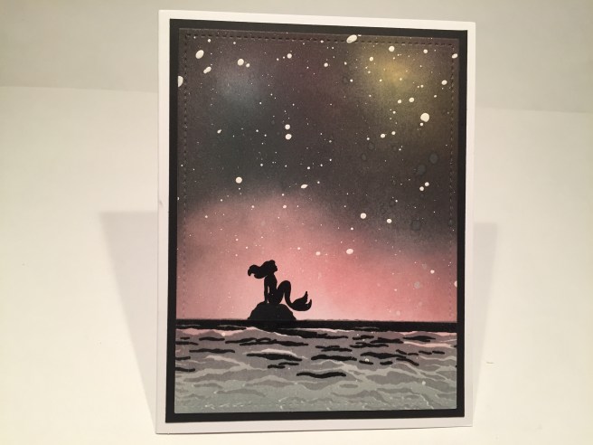 On a white card front, I started with my ‘galaxy’ – sponging in some Worn Lipstick, Broken China and Fossilized Amber Oxide inks in three sections. I used Seedless Preserves Distress ink to start bringing in some darkness around the edges and soon graduated to Black Soot Distress ink do go really, really dark! Not too bad for my first galaxy! Of course a light spray of
  I die cut the card front with a stitched rectangle die, mounted that on a black mat and glued all down to a white card base. I adore this mermaid stamp! I think she looks great against the pink ‘galaxy’. By now, I have used all seven sentiments in the stamp set, so I reached for my Hero Arts ‘Many Everyday Messages’ stamp set for the touching ‘miss you’ sentiment on the inside of the card. I just couldn’t bring myself to add any text to the front of the card! Of course, I will do many things differently the next time I do a ‘galaxy’ background – use smaller ink sponges, spatter with a smaller brush, add more color under the black, etc, but I’m very pleased with how this background turned out and I think this is a perfectly stunning card!
 That’s my 10 cards for the My Monthly Hero June 2018 Kit. I managed 6 ‘seascapes’ that are pretty different from each another, a ‘sandbar’ card, a ‘great plains’ card and two strictly graphic interpretations of this stamp set. I did manage to work in a couple of puns, a ‘miss you’ card, a sympathy card, and a birthday card. I was worried that all my cards would look the same this month, but I think I got a pretty good variety of looks with this group! I really enjoyed playing with my first set of layering stamps, and am always thrilled to get new ink pads in a kit! And heaven knows I can use all the ink-blending practice that I can get! I did think this month’s kit didn’t have quite the same variety that the May kit offered, but I am very pleased with the assortment of cards I came up with this month, and can’t wait to see what Hero Arts has in store for us in July! Thank you so much for sharing your time with me today… please pass this along to anyone who might be interested and I wish you Happy Crafting!
 As is the practice now, we get 5 sheets of 8.5″ x 11″ letter size card stock – 2 copic-friendly smooth White, one Golden Sunshine Yellow, one Red Berry, and one Sky Blue. We get four specialty card stock (half-sheets) all in a pearlescent shimmer – Forest Green, Oyster White, Soft Pink and (Lizi calls it) Blush but I think it’s more of a pinkish beige.
 We get 12 sheets of 6″ x 6″ single-side card stock featuring an assortment of beach-y icons and fun patterns. The circular floats, the ice creams, the shells and the bunting banners all have glitter accents for a little extra sparkle. Looks like we’re headed to the beach!
 I’ve been with Lizi for a year now and this is the first time our monthly kits include eight decoupage sheets!! Now, remember, European decoupage is all about layering images on top of each other for a 3-D effect, instead of the American version where decoupage is all about gluing multiple layers down as flat as possible.
  Every sheet is die cut so you just have to pop your images out, and they have numbered each layer so you know to start with Layer 1 for the bottom, add layer 2 on top of that with foam dots, layer 3 on top of 2 and so on to complete your 3-D image. Each one of the decoupage sheets is different and features little animals (or are they stuffed toys?) in various summertime activities. There is also a lot of glitter highlighting different parts on all of these pieces! Earlier this year, I did do a 10C1K video for Lizi’s “Oh, Baby” Special Edition Card Kit that shows off this decoupage technique nicely. You can check that out here if you’re interested:
  The “Let’s Shellebrate” stamp set is extremely special this month. It is an ‘infinity’ stamp, meaning that the patterns match up on all four sides so you could actually cover a 12″ x 12″ (or larger!) piece of paper with this pattern stamp. A very nice pattern of assorted shells that is just begging for some intense coloring! There are also 4 individual shell stamps and 3 sentiments: “Happiness come in Waves”, “Let’s Shellabrate!” and “Best Escape Anyone Can Have” (BEACH). VERY interesting stamp set! We get another stencil this month: a 4′ x 4″ Love From Lizi exclusive stencil “Bubbles” (we didn’t get the negative cuts this month) – and our featured die is a nicely detailed ice cream cone with a chocolate ‘flake’ bar for dipping, and some Candy Floss Pink glitter peel-off pin stripe stickers. These are translucent glitter again and will change appearance depending on what color they are mounted on top of. Very cool!
 And that brings us to the Embellishments Bag! WOO-HOO! First, we get our ribbon for this month: a full meter of 5/8″ grosgrain ribbon in blue with little white cabanas, and three 1/8″ thick satin ribbons in Lemonade, Teal Zeal and Orange. Our Nuvo Crystal Drops this month are ‘Simply White’, and we get four large ephemera die cuts that match the beach-y elements of our kit this month. Lizi has thoughtfully included two sheets of foam squares to compliment the decoupage sheets in the kit, as well as a sample pouch of the ‘Summer Sprinkles’ sequin mix. Also included are 9 small beach-y wood veneer die-cuts and four little shell beads (yes, there are holes in those shells for stringing!). Lizi’s big “let’s throw in something unique this month” is a small bag of play sand. That’s right! Good old fashioned sand-box sand! What Fun! We also get two larger wood veneer pieces that are actually printed (the cabana and the ice cream) and a sheet of puffy banner / bunting stickers. Wow! Lots of fun items this month. I always love the fact that Lizi doesn’t fill her kits up month after month with different varieties of the same items, but actually tries to regularly change things up and keep us thinking on our toes!
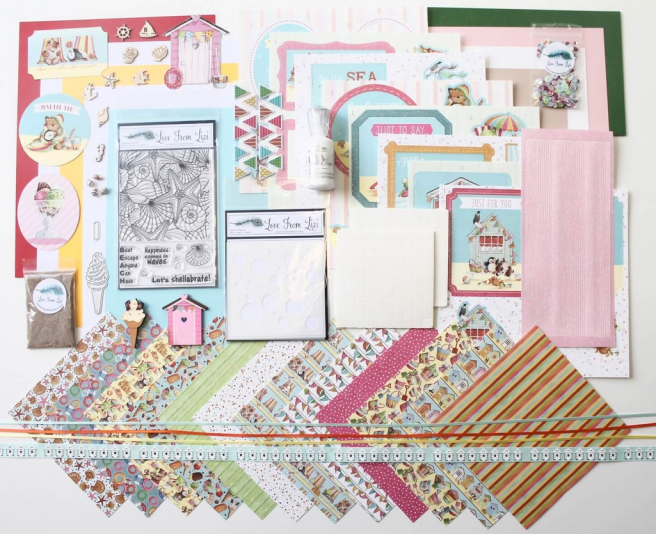 That’s all the goodies in the Love From Lizi July 2018 Card Kit. As of posting, there are still kits available at Lizi’s website, so if you’d like to get in on some of this summer fun, please use my link to shop:
 Collection One: Six 6″ x 6″
  Farm’ pattern papers from Doodlebug
 Gingham Ribbon; Farm Animal Stickers from Pebbles; and more matching KG sequins. Collection Four: Six 6″ x 6″ ‘
 of KG sequins. In addition to the four ‘collections’, you also receive four envelopes and a great stack of letter-sized card stock (Scrapping for Less is now sending six sheets of colored card stock and two sheets of white in their card kits) – I believe all the colored card stock is from My Favorite Things – Wild Cherry, Sour Apple, Banana Split, Whip Cream, Kraft, and Black Licorice. And the two sheets of white card stock
  is Neenah 110# smooth white solar crest card stock. All the card stock is terrific! You get all of these collections at the Double Dip level and you can upgrade to the Banana Split level for even
 more goodness! This month, the Banana Split level treated us to one full-size bottle of
  Now, Collection One – ‘Country Kitchen’ didn’t have any sentiments in the stamp set, and the ephemera that I received only said ‘Home’, ‘From My Garden With Love’, ‘Homemade with Love’, and ‘Tomatoes’, so I decided to create my own sentiment using the alpha stickers included in the collection. I was inspired by the two chicken emblems from the stamp set, and the chicken outline pattern paper, and that great salmon plaid pattern paper (hey, the alpha stickers are pink!). So, on a Whip Cream card base I assembled my first card using the suggested Sketch #1 and a fun sticker-ed birthday greeting. This birthday card makes me giggle!!
 I did decide to use the black card stock (and some of the white) included in the kit for mats, accents and stamping instead of card bases, and I also used the second half of the Whip Cream card stock as the base for this sentiment and the round chicken stamp. I stamped the second chicken stamp on a strip of the background paper for my vertical stripe, then matted the sentiment with the chicken pattern paper and I am actually surprised at how closely this follows the card sketch. Other than my
  Moving on to Card 2, Collection Two (Down on the Farm), and card sketch #2, my second card is created using only the kit supplies. Okay, I did use a
  That fun ‘cow on a blue field’ pattern paper and the cow hide pattern paper provided the stripes on the Sour Apple card base. I did stamp the little flower from the stamp set using
  Card 3, Collection Three (Tiny Checks), sketch #3, and we’ve moved into the piggy stamp set (with a ‘tiny check’ stamp)! And that MFT Tiny Check pattern paper, so I wanted to play with some patterns on this card. Again, my card is very faithful to the card sketch, but I managed one piece of interesting construction here. I cut the light blue check pattern paper on a diagonal with a stitched rectangle die, and then I attached that to the dark blue check pattern paper and matched the pattern and then cut the dark blue into an eighth-inch mat before matting that on some more Black Licorice card stock. It is almost unnoticeable, but you can see it if you’re looking – I do think that it really pulls your eye in to the center image.
 On the Banana Split card base, I glued down my background layers and then stamped the check ‘tablecloth’ stamp using the SSS Watermelon Hybrid ink on the Neenah card stock – fussy cut those rectangles out – and mounted them to the card front with foam tape. I stamped the two pigs in VersaFine black ink and colored them with my
  Card number 4, ‘Farmhouse’ Collection 4, and sketch #4 bring the cute lambs out to play. I stamped and masked the lamb stamp to make a pyramid of sheep with VersaFine black ink on the Neenah card stock and colored the sheep with my alcohol markers. There was some really beautiful pattern paper in this collection, so I paired up the green leaf pattern with the little flowers pattern paper and matted those on the Black Licorice card stock before gluing them down to the Kraft card base. I trimmed the stamped piece down to size, matted that on some black and added that to the card front with some foam tape. The sentiment is
  stamped in black on the Neenah card stock, matted on the black card stock and foam taped to the card front. As I was finishing up this card, I thought I would use some black glaze pen to add some shine to the sheep’s eyes but my glaze pen was too big and all my little lambs started looking crazed. Big fail! So I stamped six new sheep heads, colored them the same, fussy cut them out and added them back to their bodies with some foam dots. WOW! That really made this card POP! I added a small bow to my black sheep using the black and white twine and I have to admit that this card actually thrills me! SO nice!! I did enjoy using the card sketches for these first cards and was truly surprised at how closely I adhered to them. I can see their usefulness in providing folks with inspiration!
 I did use some of my
  On the Sour Apple card base, I used a strip of the salmon check pattern paper (collection four) cut to 3.5″ wide and fussy cut along the long edges following the checked pattern. I don’t have any fancy scallop dies or straight decorative die cuts (really, my LF stitched rectangle dies are the only card-size dies I own) so I find it very effective to fussy cut pattern papers along the pattern lines. I stamped the ‘milk’ stamp from Collection One using
  On a piece of the Neenah white card stock I stamped the cow from the ‘Barnyard’ stamp set in Collection Four six times. I actually stamped the back row on the BACK of the card stock so I could trace them on the front and have my ‘herd’ facing in different directions. So I really didn’t need any masks at all! I stamped one more cow on a scrap of card stock and colored her with my Zigg Markers and fussy-cut her out for my main image. To reinforce the pop of the brown cow, I colored all the other cows in black and white using colored pencils – nothing highly detailed, just enough to give them some color. I cut the card front with a stitched rectangle die, matted that on a thin piece of Black Licorice card stock and glued that all down to the Wild Cherry card base. The brown cow is attached with foam dots, so she’s the only real dimension on this card. I did add a touch of my
  I stamped this barn using my SSS Intense Black ink (my least juicy black ink pad) on a piece of my
 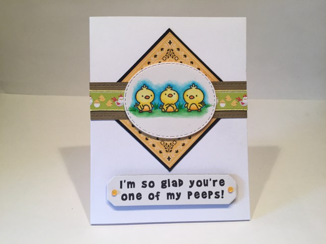 I stamped the three chick stamps on a small piece of Bristol Smooth card stock and colored them with my Zigg clean color markers, and die cut that out with one of my stitched oval dies. I cut the strip of hens and chicks from the stripes of pattern paper in Collection Two and used the yellow gingham ribbon (Collection Three) for a little trim on the edges of that strip. I cut a one inch strip of my own
 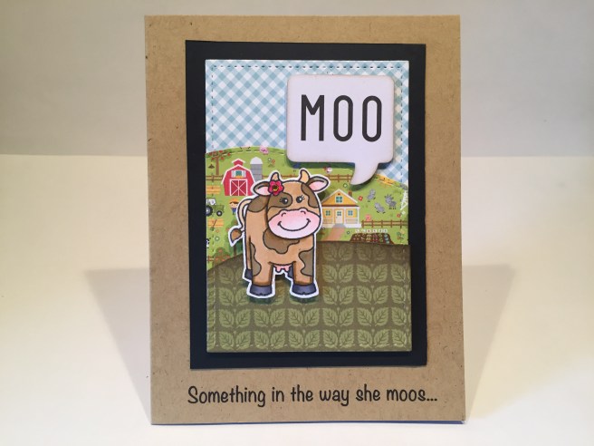 Go ahead… sing it to yourself… this is a GREAT pun for a cow card! I created this fun scene using a
  Back to my printer for this sentiment using the Noteworthy font again and I was able to print the sentiments directly on the last Kraft Card base. Of course the sentiment completes on the inside (I couldn’t resist a double-pun!) and I am laughing even as I write this! SO MUCH FUN!
 Though I have lived in New York City for almost 30 years now, I