
Hello folks! Scott here with 10 cards featuring the My Monthly Hero June 2018 Kit.  This month we are treated to some layering stamps in our 6″ x 8″ stamp set – a set of three ocean layering stamps and 3 clouds-each with 2 layers. These are the first layering stamps I own – It’ll be fun experimenting with them! We also get 7 sentiments in this stamp set and 12 beach-y silhouette stamps as well as their 12 coordinating frame cuts. To compliment the layering stamps we get a set of four Hero Arts ink cubes in Soft Granite, Soft Sky, Summer Sky and Deep Ocean. My first set of gradient ink pads too!! We also get .5 oz. of Sand Embossing Powder (very interesting!), 1 fl. oz. of Sea Foam shimmer spray, and a set of 16 Beach Enamel stickers with a very cool matte finish in fun colors. Looks like this kit is the perfect opportunity for me to practice my ink blending! For a little extra challenge, I’m going to ignore my Bristol smooth card stock and do all my ink blending on plain 110# white card stock. I think that will encourage me to blend with a light hand!
 Since I had never played with a layering stamp I thought I would try out the ocean stamps with a variety of colors and see what I could come up with. Very interesting results here. Looks like you might even be able to flip those stamps around and make a cloudy sky… but first, lets make a card using the ocean stamps as intended and using the gradient inks included in the kit.
 I feel like this is the card that the kit was encouraging me to make. I stamped the ocean stamps with the three blue ink pads and used the BACK side of one of the cloud stamps to stamp the little island on the edge of the horizon – I think I saw Jennifer McGuire stamp with the back of a cloud stamp to make an island – great effect! I added the palm tree stamp to the island but made the trunk a little bit taller (I though it was a little stubby..!) I did fussy cut an ‘ocean’ mask to mask off the ocean when blending the beach and sky, and I used one of the cloud dies to cut out a mask for the cloud and used my 1/2 inch circle punch to cut the sun mask before ink blending the sky with SSS Hybrid Ink in Lemon Zest (a little lighter at the horizon..!). I ink blended the beach with Antique Linen Distress Ink and in Vintage Photo Distress Oxide ink. I removed the masks from the sky and softly brushed the Lemon Zest over those to soften the contrast. I stamped the shadow part of the cloud and the footprints with the antique linen ink and stamped and embossed the sentiment with Walnut Stain Oxide ink and some clear embossing powder. I tried using the Sand Embossing powder on the footprint stamp but it blurred out all of the detail – those footprints are very small stamps! To add some texture to the ‘beach’ I used my Micro Applicator Brushes to dab spots of Vintage Photo, Antique Linen and Walnut Stain Oxide inks all around the edges. I loved using those applicator brushes with ink because they give a different value each time they touch the paper… darker to lighter as the ink gets used up. I added the white dots with my Sharpie Water Based Extra Fine Point marker and (though you can’t really see it in the photo) I used my Gelly Roll Clear Stardust Glitter pen to add some ‘sun reflecting on the water’ glitter on the ocean waves underneath the sun. Makes for a lovely surprise as that glitter catches the light. I trimmed the card front down a bit, and mounted that to a dark blue card base from my stash. I love the footprints walking around the sentiment and the bright summer beach scene. NOW, the big challenge will be to keep from making 10 cards just like this one! I realize that the ocean stamps are only 4.25″ wide but I wondered if it would be possible to use them in a landscape orientation?
 Well… I guess something like this works if you must have a horizontal scene! I used the same inks for this card as I used on my first card except I used Broken China Oxide ink for the sky and cloud shadows. Everything else is colored (and masked) the same here, and I punched out the sun with my 1/2 inch circle punch… I think I got the sky a little bit dark here… remember to use a LIGHT touch, Scott… but I like the end result very much! I die cut the scene with a Lawn Fawn Stitched Rectangle die and mounted that to a Kraft card stock mat and a dark blue mat and then to a white card base. Here, I used my alcohol and water color markers to do the sand texture on the beach, but I don’t like that nearly as much as using the mini applicator brushes. I also need to remember that a new stamp pad is going to be JUICY! My sentiment is a touch chunky here from over-inking with the Deep Ocean ink pad, but every card is another chance to try something new and learn what works for you (and what doesn’t!). I did add the glitter pen to the waves underneath the sun (or is that the moon?) again… that is really a beautiful touch…! This is a pretty successful effort to use those ocean stamps in a horizontal format… The ocean stamps don’t match end to end, so you are kind of limited to a 4.25″ wide ocean vista…!
 Let’s try some different ocean colors! Again, very similar to the prior two cards but I only used two of the ocean stamps in Cracked Pistachio Oxide ink and Mowed Lawn Distress ink – leaving the ‘background’ of the water in white. I stamped the sailboat in the Soft Granite ink to suggest a bit more distance, and I used my cloud masks to make one long cloud formation in the Broken China sky. Soft Granite ink for the shadows on the clouds (getting better with my placement there…!), and I only used the Antique Linen ink for the beach. The card base here is my standard Staples Ivory card stock, the mat is Recollections Kraft card stock and the card front is again die-cut with a LF stitched rectangle die. I stamped the two starfish on the same Ivory card with Linen and Walnut stain inks and die cut those out for a little dimension.
  Now… for the sentiment… one of my co-workers celebrated a birthday on Saturday, and not only does he love going to the beach whenever he can, he also has a terrifically morbid sense of humor…! I had to make this one for him! I created this sentiment using my Silhouette Software (free!) and printed that directly on the card front in the ‘Freehand 575 BT’ and ‘Futura’ fonts. Of course the inside completes the pun-y sentiment and I LOVE the juxtaposition of the “Happy Birthday!” Makes me laugh every time! (and my colleague LOVED his card!)
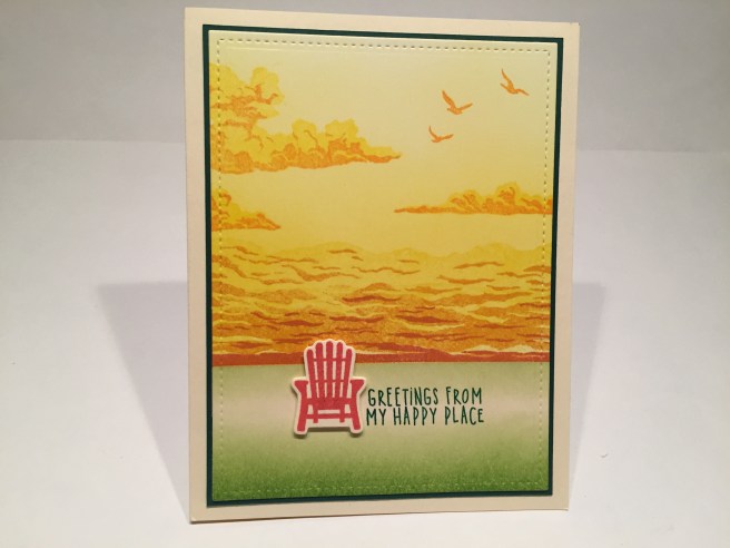 Now I turn everything on it’s head and use those ocean stamps for a ‘cloudy sky’ horizon. No blues on this card at all! I stamped the layering stamps in the SSS Lemon Zest, Orange Slush and Watermelon Hybrid inks. I continued to ink blend the Lemon Zest into the sky and stamped the clouds with the same, and the cloud shadows in the Orange Slush. I did cut apart the birds stamp to give me two stamps with three birds each and stamped those in the orange ink as well. I used the Mowed Lawn Distress ink for the ground and the sentiment. I stamped the Adirondack chair in the Watermelon ink on my Ivory card stock and die cut that out before mounting it to the card front with some foam dots. The card front is die cut with that same stitched rectangle die and glued to a thin dark green mat and attached to an Ivory card base. I really like the effect the ocean stamps give us when used upside down… and when paired with the cloud stamps, I think they evoke a cloudy horizon very nicely! Everybody’s “happy place” isn’t necessarily a beach!! This here’s a card that evokes those endlessly vast Kansas plains…! LOL!
 Enough with the seascapes! Lets do something graphic! I covered a piece of white card stock with the Sea Foam glimmer spray from the kit – really nice color, great shimmer and a completely changing appearance as it moves through the light. I noticed that many of the beach-y icon stamps were very similar in size as well as the “Sea you soon” sentiment, so I arranged the stamps in a pleasant grid around the chair and stamped everything in Walnut Stain Oxide ink. I really like the sentiment off to the right side of the grouping, and I thought the chair was more important than the sentiment anyway! It is the largest of the 9 stamps! I cut the Sea Foam panel with a stitched rectangle die and glued that to a thin dark brown mat and mounted both to another Ivory card base. I really love the iconography and the color of this card!
There is a “With Sympathy” sentiment in this stamp set, and I thought it would be interesting to see if I could do a monochromatic card using the Soft Granite ink.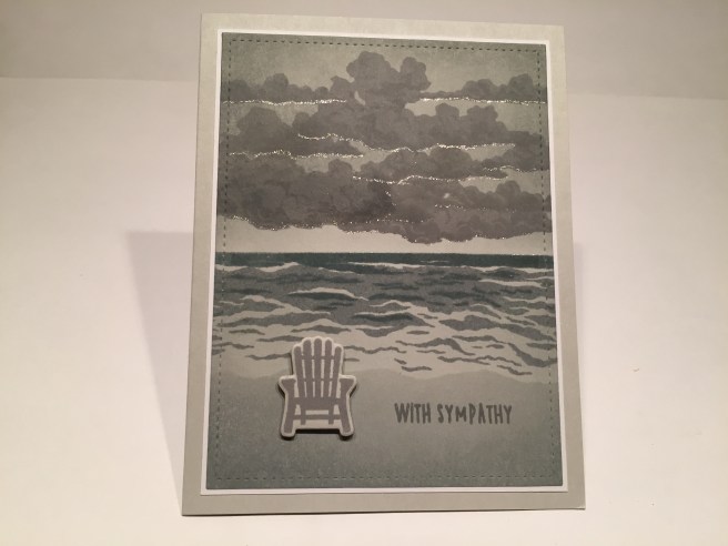 I grabbed a piece of my standard Staples Gray card stock (110# available in stores) and stamped all of this with the Soft Granite ink. I did not stamp the solid ocean stamp – letting the gray card stock be the background color, and I used some clear embossing on the smallest (darkest) ocean stamp – love that shine! I had a great time overlapping the three cloud stamps to fill up the sky, and even got the cloud shadows to subtly show up too! The sentiment is embossed as well and again, the chair is stamped and die-cut and mounted with foam dots. I did do some ink blending around the sky and on the beach with Iced Spruce Oxide ink (using my ocean mask again) and that gives this card a slight hint of green. I went back to my Stardust glitter pen for this card but instead of glittering up the waves (no moon here..!) I gave a the clouds a little silver lining on their bases. There’s the touch of grace that this card needed! Again, I die-cut the card front, used a thin white mat, and my standard grey card base. Actually, a very striking sympathy card!
I was looking to use that ‘drawn in the sand’ HELLO sentiment, and I noticed that it was the only stamp in this set that shows perspective – the top of the letters are smaller than the bottom of the letters because they are further away. That’s what gave me this idea. AHA! I’m using the ocean stamps on a landscape card and they fill the whole card front! VICTORY!!! LOL!!! I’m calling this my ‘sandbar card..! On a white card front, the smaller wave stamps are stamped in Broken China and Faded Jeans Oxide ink to match the angle of the HELLO stamp, and the sandbar is blended with Antique Linen and Vintage Photo Oxide inks and here’s the perfect chance to use that Sand Embossing powder with the HELLO stamp! I think that powder is more effective in smaller doses than in large swaths. I mean… sand isn’t really that reflective, is it? LOL! I thought it did work great on this sentiment, and I brought back the footprint stamp to indicate that someone trampled this message into the sand and then kept going…! LOL!! Lots of dots to soften the edges between the sand and water, die-cut the card front and another thin white mat and a dark blue card base. This is a very interesting card! The more you tilt the top of the card the more pronounced the perspective is – the illusion gets better and better! This card was great fun to create and I think the ‘sandbar’ illusion is unique and very cool..!
 Back to some big bold graphics with the beach ball stamp! On a white card front, I used one of my Gentleman Crafter’s Handy Guides for Pattern Stamping to assist with hand stamping the beach balls in nine colors – all Distress Oxide inks – in a perfect circle around the sentiment which is stamped in Walnut Stain and clear embossed. Using my stitched and plain circle dies I die-cut the white stamped piece and the yellow and orange graduated circles as well but thought they needed a little more definition… and I remembered this circle cutting tool I got from friends many years ago and had hardly used – an EK Success Orbis Circle Scissor which will cut over 120 circle diameters from 25mm to 150mm. Aha! This will work! I managed to cut three thin black mats for my circles and layered them all together on my white card base. For a finishing touch, I stamped the smallest ocean stamp in Soft Granite on the top and bottom of the card front – a smart suggestion of water on this ‘balls within a ball within a ball’ card. If I had thought about it, I would have clear embossed all of the beach ball stamps, but I was so intent on getting my hand stamping correct, that it slipped my mind! LOL! Still, I like this very graphic and summery greeting card!
I still have to use that cute mermaid stamp and her rock stamp, but I was a little intimidated by the plethora of cards I saw that featured the mermaid. I reminded myself that this was supposed to be ink-blending practice, so I decided to do my first ever ink-blended galaxy background! This was definitely a well-earned learning experience!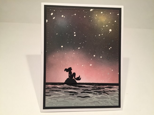 On a white card front, I started with my ‘galaxy’ – sponging in some Worn Lipstick, Broken China and Fossilized Amber Oxide inks in three sections. I used Seedless Preserves Distress ink to start bringing in some darkness around the edges and soon graduated to Black Soot Distress ink do go really, really dark! Not too bad for my first galaxy! Of course a light spray of Sheer Shimmer Spritz and some white paint spatters is what really sells the ‘galaxy’ illusion. For the ocean , I blended some Iced Spruce Oxide ink on the bottom and stamped the middle ocean stamp in Soft Granite and the small ocean, rock and mermaid in VersaFine Onyx Black ink and used clear embossing to shine up and intensify the black.
 I die cut the card front with a stitched rectangle die, mounted that on a black mat and glued all down to a white card base. I adore this mermaid stamp! I think she looks great against the pink ‘galaxy’. By now, I have used all seven sentiments in the stamp set, so I reached for my Hero Arts ‘Many Everyday Messages’ stamp set for the touching ‘miss you’ sentiment on the inside of the card. I just couldn’t bring myself to add any text to the front of the card! Of course, I will do many things differently the next time I do a ‘galaxy’ background – use smaller ink sponges, spatter with a smaller brush, add more color under the black, etc, but I’m very pleased with how this background turned out and I think this is a perfectly stunning card!
Which brings us to card #10. I know everyone likes interactive cards, and I thought I might have an idea on how to bring a little action to this card kit, so I reached for the dolphin stamp and some acetate and…
Yes! We’ve come across a small school of porpoises! OK… so that stamp is more likely a dolphin than a porpoise but I figured they were close enough that we could use this fun pun on this interactive ‘reveal wheel’ card. on a white card front I created another seascape using the Hero Arts inks for the ocean, Broken China for the sky, and Antique Linen and Vintage Photo for the sand. I did cover the ocean with clear embossing powder for a little watery shine, and I die-cut the clouds and did their shadow stamping in the Soft Granite ink. OOOOH! I LIKE those die-cut clouds!! I also stamped those other three birds in the Soft Granite ink. I stamped the ‘porpoise’ stamp four times on an acetate circle with StazOn Jet Black ink, and fussy cut most of the porpoise stamps leaving a tab connecting them all together at the center. I showed the turning wheel I created on my Silhouette last month with the bicycling card and I used the same piece to power this animation. It sticks out beyond the edge of the card just enough for your finger to catch it and turn… SPLASH, SPLASH!! LOL! I LOVE this pun-y philosophical sentiment! I printed this directly on my card front using the Noteworthy font, and added the little starfish enamel sticker to highlight the sentiment. How much fun is this card! The ‘turning wheel’ is on top of the card base and behind the sky card stock (cut to 4.25″ x 5.5″), and the porpoise acetate is on top of the sky card stock and behind the ocean and beach card front. So… the ‘turning wheel’ is turning the acetate wheel through a small hole in the sky card stock. This is a little thicker than my other spinning wheel cards because you are not just spinning the wheel by itself, but the wheel that you are moving is spinning a whole other wheel too. I think I have a completely unique method for making these spinning wheel cards, so, for the time being, I think I’ll keep this secret to myself! HOWEVER… a LOT of people asked for a How-To Video for my swinging card from the May MMH kit, and I have promised to do a video showing how I made that card. I will get that up as soon as I get caught up with my 10 card videos – so, if you’re interested, keep an eye out for that!
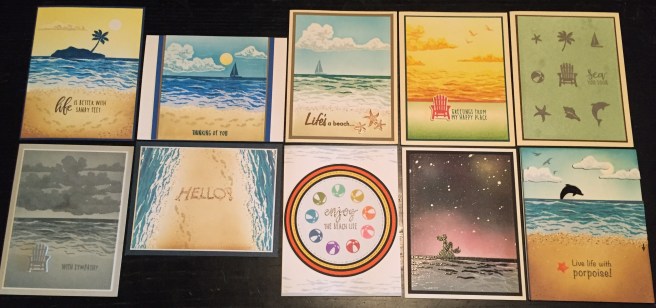 That’s my 10 cards for the My Monthly Hero June 2018 Kit. I managed 6 ‘seascapes’ that are pretty different from each another, a ‘sandbar’ card, a ‘great plains’ card and two strictly graphic interpretations of this stamp set. I did manage to work in a couple of puns, a ‘miss you’ card, a sympathy card, and a birthday card. I was worried that all my cards would look the same this month, but I think I got a pretty good variety of looks with this group! I really enjoyed playing with my first set of layering stamps, and am always thrilled to get new ink pads in a kit! And heaven knows I can use all the ink-blending practice that I can get! I did think this month’s kit didn’t have quite the same variety that the May kit offered, but I am very pleased with the assortment of cards I came up with this month, and can’t wait to see what Hero Arts has in store for us in July! Thank you so much for sharing your time with me today… please pass this along to anyone who might be interested and I wish you Happy Crafting!

Well, I think you gave it away how U did the wheel porpoise in the video or am I making up things again in my old age? LOL Wonderful sets of cards!
Question: when I load up a new FONT, then I go to use on my PAINT, or silhouette software, which Im JUST learning ( cough) is that new font already there or do I have to bring it in somehow? IF YOU HAVE TIME!
LikeLike
Your use of this kit is inspired . Hope you do a tutorial on how to make the porpoise jump . Thanks for sharing your art .
LikeLike
Thank YOU, Alice! Always greatly appreciated! Stay tuned… and … Spread the Cheer!
LikeLike
I believe you would have to put that new font in your font folder or font library to have it appear in you font options… Hope that helps!!! Scott
LikeLike
I want this kit at that great price, but wasn’t available to order it before it sold out. Can you help me???
LikeLike
Sorry Nancy – I have no affiliation with Hero Arts. Sorry I cannot help…! Scott
LikeLike