
Hello Folks! Scott here with my 10 cards featuring the My Monthly Hero July 2018 “County Fair” Kit. This is my third month as a MMH subscriber and, once again, I am eager to play with these unique stamps and dies that come in this kit. This month our 6″ x 8″ stamp set includes a finely detailed County Fair silhouette stamp and assorted rides, signage, a plane trailing an aerial banner, and an assortment of scene builder stamps and sentiments. These are accompanied with 10 coordinating frame dies and a 4.25″ x 5.5″ fancy background die that compliments this summery theme. We also get three Hero Arts ink cubes in Red Reactive, Blue Reactive and Unicorn (white). As someone who doesn’t have a lot of ink pads in my stash, I LOVE getting ink cubes in our kits. Lastly, we get 3 postcard backers in a kraft color to complete our goodies. All of this is wrapped up with some lovely 1/4″ red and blue satin ribbon. Now, it seems pretty obvious how one is intended to use these stamps and dies, but I was interested in seeing what kind of variety we might be able to achieve with these goodies. Let’s go to the FAIR!
This is only the second “fancy background die” that I own, so naturally, I started die-cutting this on a bunch of different papers. I had some mirror gold paper at hand, so I cut that with the background die and that’s what gave me the idea for this first card. I stamped the ‘Ticket to FUN’ ticket stamp on the gold paper with some StazOn Jet Black ink and die cut the ticket out to add to the center of the background die. This IS a “golden
  ticket” so I couldn’t resist adding a “You’ve got a Golden Ticket” sentiment to the inside. I created that on my Silhouette Software and printed it in dark yellow and black using the Marker Felt font and the Circus font (that Circus font is so appropriate and will get quite a work-out this month!!) It also seemed appropriate to add a space for a gift card on the inside, so I grabbed some gold photo corners that I happened to have in my stash, and used two of those to add a gift card holder under that sentiment.
 I liked the idea of this card so much, that I took the negative die-cuts from the background die, and created a second
  (almost) identical card. I did change the sentiment on the inside to read “I’ve got a Golden Ticket” which is a more faithful quote to Willy Wonka and the Chocolate Factory… I almost like the second card more than the first – not sure if it’s the white framing versus the gold framing or the change in sentiment, but both cards are perfect for any gift-giving occasion and a definite TICKET TO FUN!!
 The hot-air balloon stamp caught my eye next, so I stamped that seven times on some Bristol Smooth card stock with my VersaFine Onyx Black ink. I though I was just going to color the balloons in solid rainbow colors, but quickly realized that you could add some patterns to this basic striped balloon stamp with a fine tipped permanent marker. I used my 005 Pigma Micron pen to add patterns to the last four balloons, and colored them all with my Zig Clean Color Real Brush Markers. WHAT A BLAST! Seems the possibilities are almost endless for these balloons – though possibly constrained by the small size of this stamp. NOW… do I want to use all these balloons on ONE card? YES! I grabbed the long
  county fair silhouette stamp and traced the edge of that on some masking paper to create a mask for my mountains and sky on this card. I used my mini ink blender and Distress inks in Antique Linen, and Vintage Photo to color the ‘mountain’ and my ink blending brushes with Distress Oxide ink in Broken China, along with my MFT Mini Cloud Edges stencil to create the sky. I stamped the “Enjoy the Ride” sentiment in VersaFine Onyx Black ink and embossed that with some clear embossing powder. That sentiment fit well in a die I had from the Sizzix Tim Holtz Compass Blueprint set, so I added that die-cut to the center of my card with some foam tape, and arranged the hot-air balloons (on more foam tape) at different heights across the front of the card – it kind of looks like they have all just taken off. One balloon is on top of the sentiment and one is behind the sentiment so everything is sharing space on the card front. A tiny bronze crystal from my stash balances out the right side of the sentiment banner and VOILA! We have a really fun card with no reference to the ‘county fair’ theme. This is a versatile stamp set!
I really liked the “Happy Birthday” sentiment stamp, and though I didn’t think it had a lot to do with the County Fair theme, I did like the ‘retro signage’ theme that it implied. I had recently watched Jennifer McGuire’s Sliding Pop-Up Cards video that featured the Sunny Studios Sliding Window die, and thought I could come up with a similar mechanism using my Silhouette Portrait – it is pretty straight forward and has mostly straight lines, so I set about creating my own Sliding Window card front – the added bonus being that I can change out the decorative edges surrounding the window at my pleasure.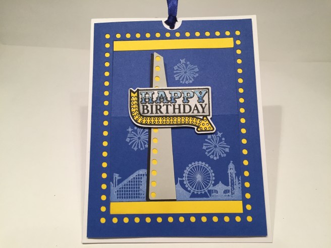 Taking a cue from the ‘lights’ on the arrow part of the stamp, I decided to add ‘lights’ around my sliding window for this card. I cut the card front mechanism from a piece of blue card stock from my stash, and also cut a yellow ‘frame’ to color the ‘lights’ while still leaving the window white. I stamped a portion of the long fair stamp on the bottom of the window flap in the Unicorn ink and stamped a few fireworks above the fair in the same ink. LOVE that Unicorn ink on a darker card stock and that long County Fair stamp is highly detailed. I stamped the sentiment sign on some scrap white card stock and yellow card stock with VersaFine Onyx Black ink and fussy cut the arrow portion away from the yellow card stock and paper pieced that to the white stamping. I wanted to highlight the ‘signage’ aspect of this stamp (and wanted it to stand up above the fold of the sliding window), so I created a sign-post to mount the birthday stamp on. I did create this ‘post’ on my Silhouette Portrait and repeated the ‘light’ motif on the front grey card stock – my yellow card stock again colors the ‘lights’ and I added a bit of a black shadow to the left side of my post. I colored the white portion of the stamp with some colored pencils in blues and grays, and I die-cut that stamp and added that to the ‘post’ with some foam tape and then glued the whole assembly to the bottom half of the sliding easel piece. A couple of thin strips of the same yellow card stock on the top and bottom of the folding piece frames our image nicely, and all is foam taped to a white card base. A piece of white card stock (cut wider than the window) provides the ‘pull-tab’ and a touch
 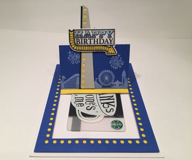 of the blue satin ribbon indicates where the recipient is to pull. Now, you could easily create a sentiment that is revealed behind the easel when pulled, but I opted for a ‘hidden’ gift card – plenty of room for a greeting or added sentiment on the inside. I love the Unicorn ink stamping on this card, I love this Sliding Window mechanism, and I love the ‘retro signage’ feeling of this Birthday stamp. I am looking forward to utilizing this sliding window pop-up on more cards, and experimenting with different edge designs around the window. I am very pleased with this new interactive card!
I was eager to work with the roller coaster stamp from the stamp set, but I wanted to ‘see through’ the ‘structural supports’, and since the die only cut the outline of this stamp I decided to break out my Heat Resistant Acetate sheets to stamp and emboss the roller coaster. I stamped the coaster with VersaMark ink and embossed that with my Simon Says Stamp Steel Navy embossing powder, and die cut that with the matching frame die.  Worked beautifully! This is the first time I’ve tried this acetate and I thought it lived up to it’s promise exceptionally well. I grabbed some of my old Yellow Jewel tone Recollections card stock and cut that down with my LF stitched Rectangle Die before stamping the corner ‘track’ stamp on the bottom left and top right of that panel using the Blue Reactive ink and clear embossing powder. I thought the ‘track motif’ worked especially well with the coaster stamp! I added a portion of the long County Fair stamp towards the bottom of the panel with the Hero Arts Soft Granite ink (masking off the left side of the Ferris wheel) and stamped the “I’m here for you” sentiment with the Red Reactive ink and embossed that with some clear embossing powder before using my colored pencils to add a little shading to the open letters. I added the short ‘lights’ border stamp below the sentiment simply embossing that in clear for a subtle definition under the sentiment. I glued the stamped panel to a thin mat of Red Jewel tone Recollections card stock and glued those to a white card base. I cut some thin strips of foam tape to back my coaster die-cut and added that towards the bottom of the card front. I am really thrilled with that emboss-able acetate and I love being able to see through the coaster structure to the fair ground behind! Lots of embossing here, but this stamp set really seemed to beg for it!
I recently purchased (on CLEARANCE) some dies from LDRS Creative and I thought this Fancy Rectangle die felt very carnival-like to me. So I used those to die-cut some yellow and orange and Red Jewel card stock for my main element on this card. I stamped the  ‘concession’ stamp with VersaFine Onyx black ink on a scrap of Bristol Smooth card stock and colored that with my Zig Brush Markers. I was thinking of a sentiment that wasn’t in the stamp set, so, with a little trial and error (and my ever-useful Silhouette Software), I replaced the ‘SNACKS’ sign from the center of the stamp with a ‘GAMES’ sign to go along with my sentiment (that is using the Arial Rounded MT font). I used the Circus font and the Goudy Heavyface BT font for my sentiment and printed those up in orange and black to match the card. I took a light blue card base and using my ink blending brushes, cloud edge stencil and the Unicorn ink, lightly added some soft clouds to the background. I did stamp that short ‘light’ border stamp on the top and bottom of my card front and embossed those with white embossing powder. I glued the die cut pieces together, offsetting the dark red for a little bit of a shadow, and foam taped that shaped panel to the card base, then added the ‘concession’ stand (with foam tape) to the front panel.
  Now, why is “Life like a Carnival Game” you may ask? Inside, I am offering both an optimistic and a pessimistic response to that question. In the same font(s) I printed “You can’t WIN if you don’t PLAY” on the writing surface, and also created an optional cynical response as well
  with an inside that simply reads “RIGGED”. LOL! Oh, boy, that one really makes me laugh. My older brother is actually works with a carnival and has been a ‘carny’ for his entire adult life. I spent a summer on tour with him after college (lots of State Fairs and Canadian Stampedes) and learned that most of the rumors, superstitions and legends about carny folk are true!! LOL! And having that Circus font in my stash gave me free reign to create almost any sentiment I can imagine!
Lets move on to the merry-go-round stamp now, and the obvious ‘You Make The WORLD Go Round’ sentiment stamp. I just happened to have the negative die-cuts left over from the previous card and thought the dark red and yellow went especially well together. After gluing those two die-cuts together, I used my stitched rectangle die to cut them out into a frame for my card. On a piece of white card stock, I stamped a portion of the fair border stamp in the bottom of the frame in the Red Reactive ink and embossed that with clear embossing powder, stamped the sentiment in VersaFine Black Onyx ink, embossed that with clear embossing powder as well, and filled in the ‘WORLD’ with my colored pencils in two shades of red. I stamped the merry-go-round on Bristol Smooth card stock and colored that with my Zig Brush Markers, and die-cut that out before mounting it to my card front on foam tape. I dug out my Darice Border die zig-zag and die-cut some scraps of the dark red card stock and added some Nuvo Crystal Drops in Morning Dew (clear) for some shine and dimension. I glued the frame to the white card stock, adding the zig-zags to the sides, and mounted the whole panel to a light blue card base with foam tape. A little red heart brad underneath the sentiment adds a touch more bling to this card. I really LOVE the frames that the LDRS die created and the way the merry-go-round nestles so nicely in the top of the frame. VERY CARNIVAL!
I was at a little bit of a loss on how to use the “HERE” arrow stamp from the stamp set, and came up with this idea that turned out better than I thought it would. Thanks to a perfect piece of pattern paper from the Tim Holtz Idea-Ology Mini Stash Etcetera paper pad, and my Gentleman Crafter’s Handy Guides for Pattern Stamping templates, I decided to feature that stamp all on it’s own for this next card! I used my LF stitched rectangle die to cut down the pattern paper (SO perfect with this kit!), matted that on a thin white mat, and after stamping the ‘fence’ border stamp on the top and bottom in the Blue Reactive ink, glued all down to a plain blue card base. I stamped and die cut 10 of the arrow stamps and colored those with my Spectrum Noir Alcohol markers in red, blue, yellow and a pale gray. I die cut a scrap of that gold card stock with an Alpha die from my stash (I believe that die came from the Love From Lizi ‘Oh Baby’ Card kit) and cut 4 more out of some scrap black card stock and glued them all together with the golden ‘U’ on top.
  With the help of the ‘Oval guide with 10 Sections’ from the Gentleman Crafter, I foam taped all the elements to the center of the card front. You can’t quite tell what this card is about until you open it and see the sentiment on the inside. “Wish you were here!” is a terrific sentiment and is almost pun-y when used in this way. I printed this on the writing surface using the Black Jack font. I was actually surprised at how well this card came out and how it feels very carnival-like even without using any of the rides or county fair stamps.
I wanted to see what options we might have with that fancy background die, and I was intrigued by Jennifer McGuire’s technique of using that die on a larger piece of card stock and wanted to see if I could accomplish something similar using just a 4.25″ x 5.5″ piece of card stock. I did a partial die-cut with the frame die and came up with this card. With a little diligence, I was able to maintain the thin frame on the top and sides of that die-cut, while moving the center oval down to the bottom of the card. I ink blended a plain white card base with my Simon Says Stamp Hybrid inks in Lemon Zest, Orange Slush and Watermelon and used the Lemon Zest alone on the top die-cut. I stamped the “HELLO” stamp with Acorn Archival Ink and colored that with my Zig Brush Markers and printed the ‘sunshine’ portion in brown w/ a black outline using the Potama font. I added some sparkle to the top die cut with my Spectrum Noir Sparkle pen and here we have a very simple but effective HELLO card that practically glows all on it’s own!
That ‘come one, come all’ stamp just screamed INVITATION to me, so that’s where I went. There was also that ‘WELCOME’ sentiment that fit in the plane’s aerial banner so that seemed appropriate for this card as well. First, I ink blended a background on some Bristol smooth card stock with my SSS Hybrid inks and cut that to size with a LF Stitched Rectangle die. I wanted to try and do another acetate embossing with the Ferris wheel stamp but I was not very successful at getting the embossing powder to stick with this stamp… tried four times to emboss this stamp on that acetate, but every time I die-cut it I would lose some of the embossing…. SO… I stamped the Ferris wheel on some Bristol smooth card and colored it with my Zig Brush markers, die cut it, and satisfied my need to ‘see through’ this stamp by fussy cutting out the center spokes. I think that helped this piece feel more like a part of this card! I stamped the plane and the pointing hand with VersaFine black onyx ink and the ‘WELCOME with the Red reactive ink, colored the hand with my Zig markers and die-cut them both. I stamped the ‘come one..’ sentiment in the Blue Reactive ink directly on the card front and clear embossed that. I embossed the star border stamp in white just below the main sentiment and turned to my computer to print out the “to the greatest BIRTHDAY PARTY on Earth!” in red and black using that Circus font and the Lucida Grande font. The long fair stamp is actually stamped end to end (half of the Ferris wheel is on both ends) with the Red Reactive ink and clear embossed. I did use my emboss-it pen to add some ‘ground’ to the bottom of that stamp so it wasn’t at the very bottom of that panel. All the die-cuts are attached with foam tape, and then the card front is matted on dark blue card stock before gluing down directly on a plain white card base.
  Naturally, an invitation isn’t worth much unless it contains the information you need. On the inside of the card I created the necessary “For:” When:” and “Where:” labels (there’s that Circus font AGAIN!), and took this opportunity to stamp all of the balloons along the bottom of the inside. I colored the balloons with my Zig markers and added a touch of highlight to each of them with a Gelly Roll white gel pen. I like the allusion to The Greatest Show on Earth here.. but I have to admit, a little over-ambitious to do an invitation like this for more than just a few people.!! Party of one, please! LOL!!
Now we haven’t had any bone-fide puns with this batch of cards, so I thought this little combination of sentiments fit the bill perfectly. I had so much fun with my ink blended galaxy sky behind my mermaid with last month’s kit that I decided to have another go at the galaxy technique. A little more subtle on this card but I still think it came out great!  I did use some Bristol smooth card stock and my finger daubers sponges with my distress inks for this galaxy sky. I also used a different brush with my permanent white Gouache water color paint for the stars this time and got a little bit of a finer spatter. I die-cut the galaxy panel with a stitched rectangle die, and stamped the Fair border stamp with VersaMark ink, embossed that with white embossing powder, and then added three fireworks in the sky in the same manner. I added a thin white mat behind the galaxy panel, and a thin mat of some striped paper I stamped with the Red and Blue reactive inks before gluing all down to a plain white card base. Of course, “Love A Fair” is the pun we’ve been waiting for, and I created that using the Circus font (yes, AGAIN!) and the Palatino font (in italics) and sized it to fit the ticket die from the kit. And YES, that IS pink… I thought it went well with the pinks in the galaxy..!! I layered four of those die-cut tickets together to make a nice chunky sentiment and attached that to the card front with some foam tape. Three little clear sequins in the center of the fireworks and a light spritz of my Sheer Shimmer Spray adds just the right touch of sparkle to this card.
  But wait… there’s more!! I really like the “Love A Fair” pun but though we could goose it up a notch with another pun on the inside of the card. This one really tickles my funny-bone! I though “Carnival Knowledge” was the perfect compliment to the “Love A Fair” sentiment on the front and is one of the most interesting puns I’ve come up with in a while! This is printed using the same fonts as the front sentiment with the addition of those cool parentheses in the Chopin Script font. This card makes me ooh and aah and snicker behind my hands..!!! LOL! This would be a great valentine card for someone looking to take their relationship to the next level… if you know what I mean!
I almost forgot about the post card backers that were included with this kit! DOH! I have a bunch of pictures in my image files relating to carnivals and circuses, so I went digging though my stash and found some great print-ables that fit these postcards and the theme of this kit splendidly. I simply sized the images to fit the postcard, printed them out, cut them to size and sent them through my Zyron Sticker Maker to add a solid layer of glue to their backsides. I mounted them to the postcards and used my Distress Glaze to make the cards water-resistant. I REALLY love the Kissing Booth advertisement and the harlequin and ballerina are perfectly stunning. I’ve always thought postcards generally sport images that don’t necessarily have anything to do with the content of the note, so I was strictly going for the aesthetic here and not trying to make any more of a statement than simply trying to stay true to the theme of this kit.
Counting the postcards and the extra Golden Ticket card, that makes 14 cards this month! I really enjoyed playing around with this kit, and looking for (hopefully) unique ways to use these stamps and dies. We did manage to get a couple of puns, a few gift-card offerings, an invitation and one interactive birthday card! A pretty good variety of cards this month that aren’t all slavishly referencing the County Fair! I did manage to use all but three of the stamps in this set – I didn’t use the “Hello There” that fit the airplane banner, or the small cloud stamp, or the triangle banner border stamp, but I did use all of the sentiment stamps and probably more hot-air balloons than anyone! LOL!!! Mission Accomplished! I do hope you enjoy these cards as much as I do – my goal is to try and inspire you to think outside of the box a little bit and come up with your own take using these fun stamps and dies. If you appreciate the extra detail, pictures and product links I include here on my postings, please drop me a note to let me know. You can always go to the CONTACT page here and e-mail me directly if you have any questions or comments. Thank you for sharing your time with me here, I hope your summer is going well and you are enjoying some extra time with friends and family. Please share this post with anyone you think might be interested, and Happy Crafting!!

Fabulous!
LikeLike
These are amazing!
LikeLike
Love all of these designs, especially what you achieved with the layout guides Scott. Awesome!
LikeLike
Thank you, John! So nice to hear from you!! I found your templates many moons ago and have used them for many of my cards over the years! I always try to direct people to your site and template downloads! WOO-HOO! Thank you, sir!! Scott
LikeLike