DISCLOSURE: This site contains some affiliate links to products. I may receive a commission for purchases made through these links (at no cost to you). As an Amazon Associate I earn from qualifying purchases. Thank you!
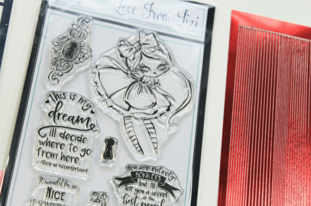
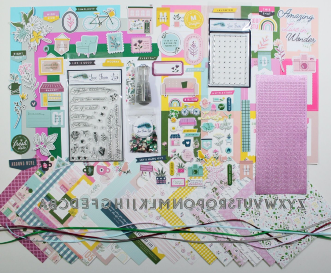
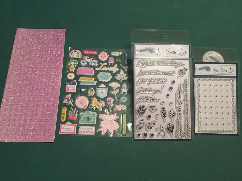
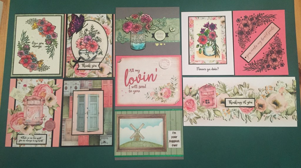
Hello Folks! Scott here with my 10 cards inspired by the EXCLUSIVE September 2020 Love From Lizi “Wonderland” Super Card Kit. Every September Lizi celebrates the anniversary of LFL with a super-sized card kit packed full of goodness for your crafting pleasure.

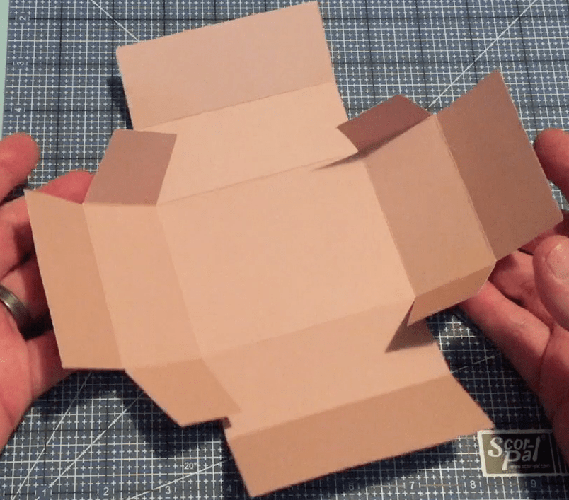
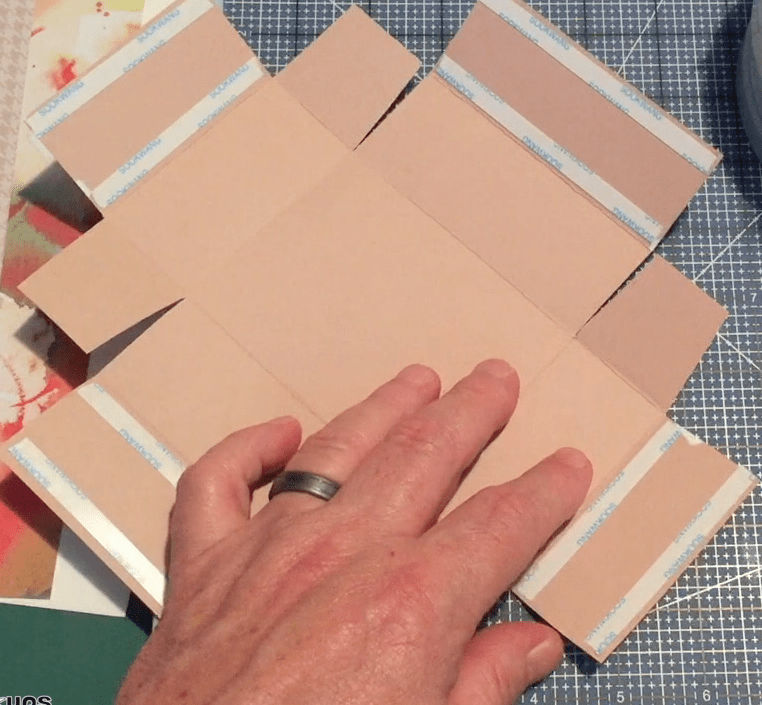
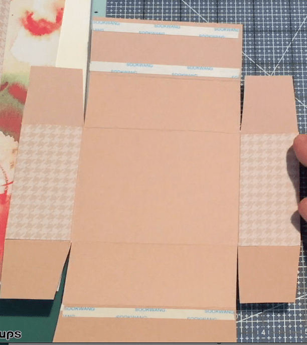
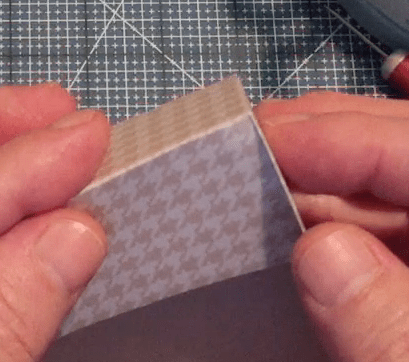
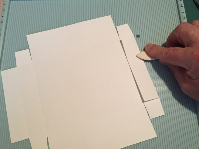
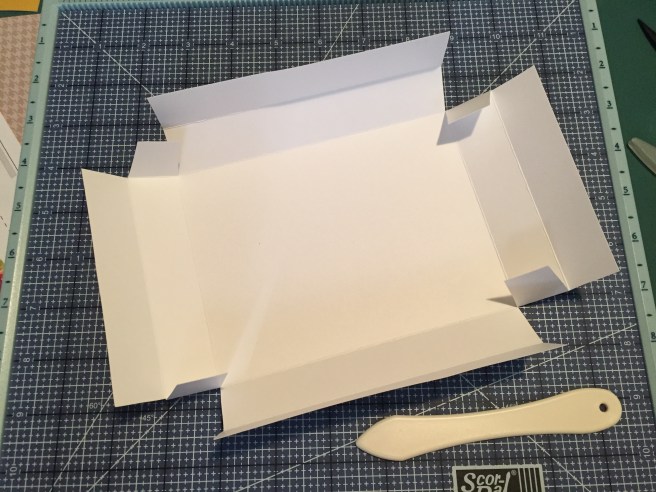
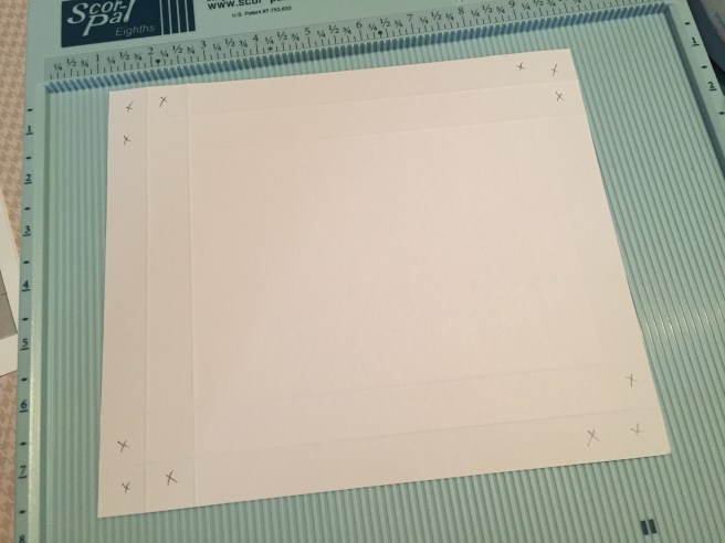
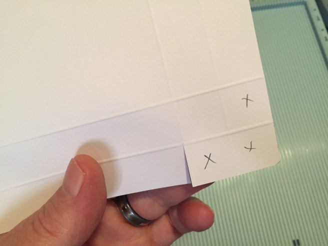
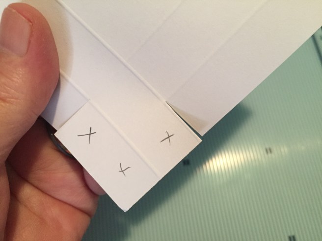
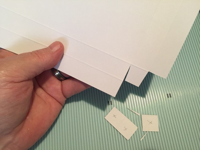
Alice in Wonderland is the theme for this kit and all the add-ons, so I thought I would try to stay true to the spirit of this set with my ten cards. I always begin my LFL kits by cutting our colored card stock in half to use as card bases.

Despite having a pack of 100 ephemera pieces, I was thrilled at the opportunity to color some stamps this month. I stamped Alice, the key and keyhole on the included alcohol marker friendly card stock using Memento black ink and colored them all with my Spectrum Noir Alcohol Markers. I added a little more stitching to the bottom of Alice’s dress with a purple Pigma Micron pen, and die-cut all the pieces with their matching dies. I cut the purple and yellow pattern paper on a diagonal and glued that down to a Pink card base.
I carefully stamped the sentiment (very topical!) with Memento black ink – there are a lot of sentiments in this kit with very small fonts. I fussy-cut around Alice’s right hand and slipped the key in there so she had something to hold onto, and mounted all the die cuts using foam tape. I added some white highlights to Alice with a thin white gel pen, and finished up this card with three purple enamel glitter dots and some Lilac mirror pin stripe peel offs. I really like the harlequin pattern paper turned on an angle for a completely different look. This is a very classic interpretation, exactly what you would expect from this kit. It’s even Pink!!
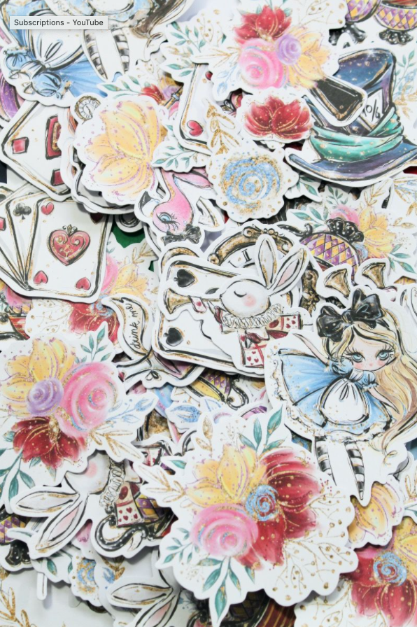
Speaking of all those ephemera pieces, I thought I’d tackle some of those before moving along with more a=stamping and coloring. There’s also those acetate sentiments….

There are lots of flowers in our ephemera pack, so I thought a sweet “Get Well” bouquet would be nice. I even went so far as to create my own little decoupage image using the assorted ephemera pieces. The bottom layer is the large piece with the flower arrangement coming through a keyhole (works as a vase for me!) the second layer is just the flowers fussy-cut away from their border and foam taped on top of the back piece. The pink rose and yellow flower have their borders cut away as well and are foam taped on top. Really nice dimension for this little bouquet.
On the Green card base I laid out a ‘partial frame’ using the Ruby Red pin stripe peel offs from the kit, and the White pin stripe peel offs from the Wonderland variety peel off pack. I die-cut a plain white banner using a Lawn Fawn Everyday Sentiment Banners die, and placed the acetate “Get Well Soon” sentiment on top. I know a lot of folks were asking about how to adhere these acetate sentiments to our cards, and I just used two of the green enamel dots (with a spot of blue behind) to hold the sentiment to the banner. Works perfectly and actually adds a little dimension to the foiled sentiment. The decoupage flowers are glued to the card front, the sentiment banner is attached with foam tape, and more enamel dots finish out this cheerful Get Well card. When we get ephemera pieces with duplicates, you can always create your own decoupage images!
SO MANY EPHEMERA PIECES! You could make dozens of cards just using all the ephemera pieces included in this kit!
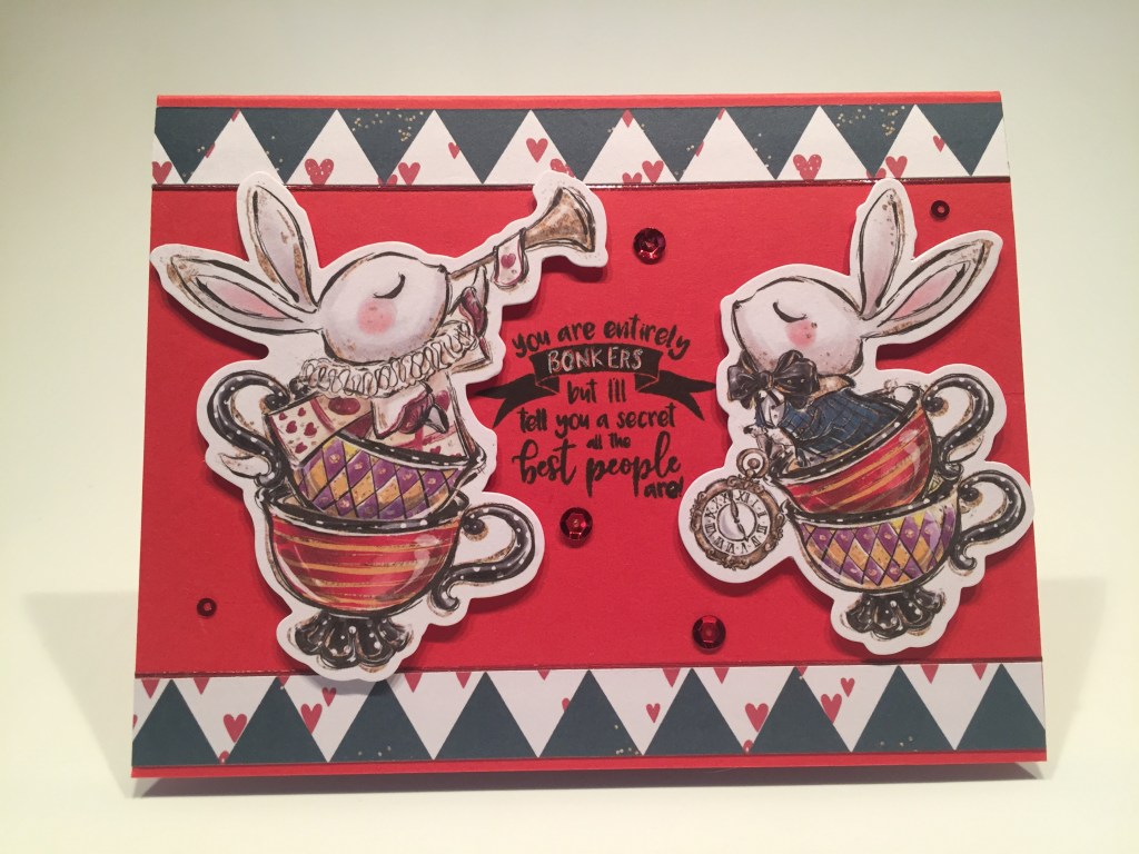
I decided to pair up the two “bunnies in teacups” ephemera pieces and match them to this fun “BONKERS” sentiment. I trimmed this pattern paper down to look more like a zig-zag than a harlequin pattern, and glued those to the top and bottom of the Red card base. I lined those with more of the new Ruby Red peel offs and stamped the sentiment in the center with Memento Black ink. I did highlight the BONKERS with a white gel pen. I attached the bunnies with foam tape and added some sequins from our mix for a little added sparkle and shine! I think these were the only ephemera pieces facing each other… but they certainly make for beautiful card… you could make dozens more with all the ephemera in this kit!
But I’m here to color and spend a little time in Wonderland… Let’s look at that Alice stamp again! Here’s my take on Alice falling down the rabbit hole! That’s where it all begins!

When I first looked at the Alice stamp, and before I had seen that image colored, I didn’t realize that she had long hair. I actually thought that stamp line to her left was part of her dress..!? Well, of course, when colored it makes perfect sense, but I realized it would be easy to NOT stamp that part of her hair and instantly give Alice a bit of a bob! LOVE IT! This Alice is stamped and colored the same as my first Alice, (I just wiped away the extra line of hair before stamping) and I couldn’t resist giving her a darker skin tone to go along with that new haircut! I did add more stitching lines again along the hem of her skirt. I saw that on some original Alice illustrations and thought they added a lot of character and movement to her dress. I finished Alice by fussy-cutting her out.

I did include this sentiment on the inside writing surface. Stamped with Memento ink on a light piece of warm grey card stock.
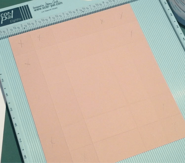
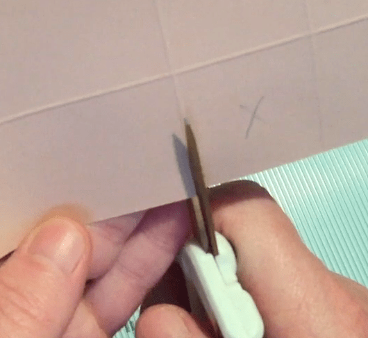
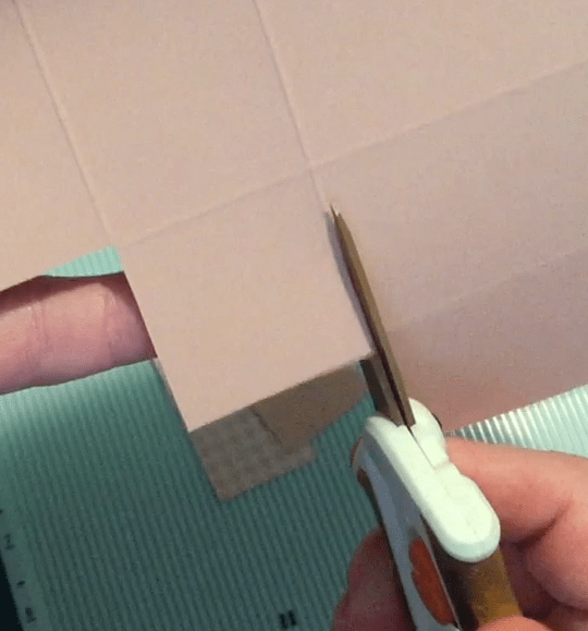
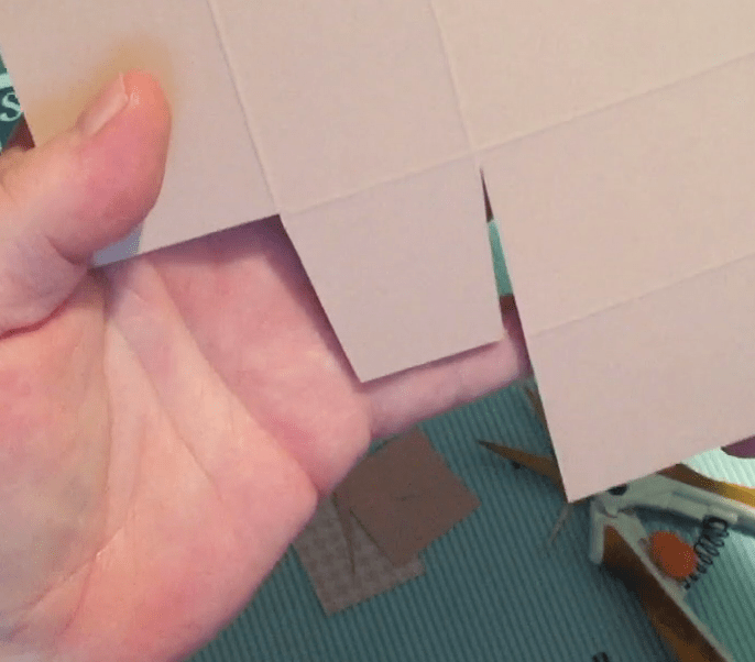
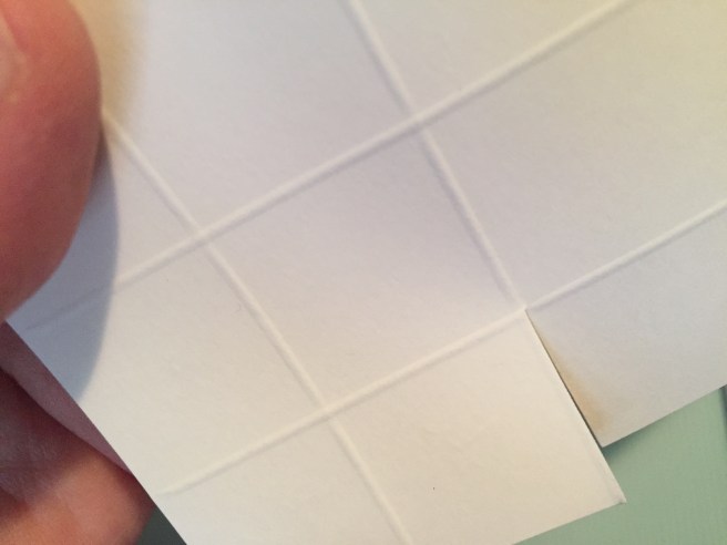
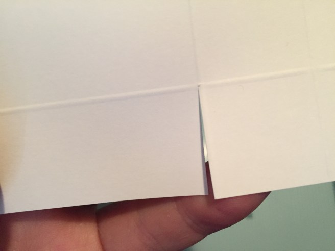
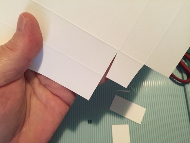
For the “hole” on the front of the card – first, I cut a piece of pattern paper to 4″ x 5.25″. On the bottom I measured in one quarter inch on both sides and marked those points. On the top, I marked the center and a quarter inch to each side. Cut along those quarter-inch lines from the bottom to the top and you have your two side pieces. (The center piece you cut out can be cut down the center to make another card!)
I positioned the two pattern pieces on the Navy card base and lightly traced the inside edges of both. I masked off those lines (including the top and bottom edges) and ink blended the edges of the “hole” with Hero Arts Unicorn White ink. I added dots of texture with a couple white and gold gel pens and when I was happy with that, I glued the pattern paper in place. Pop Alice up (side-down!) with some foam tape and I can almost feel the wind rushing past. In the original book, there’s all sorts of stuff lining the walls of the hole so I thought this pattern paper was quite appropriate! Love this card… LOVE her hair!
We also have a teapot and two cups in the kit stamp set. Tea is certainly pun-able!!

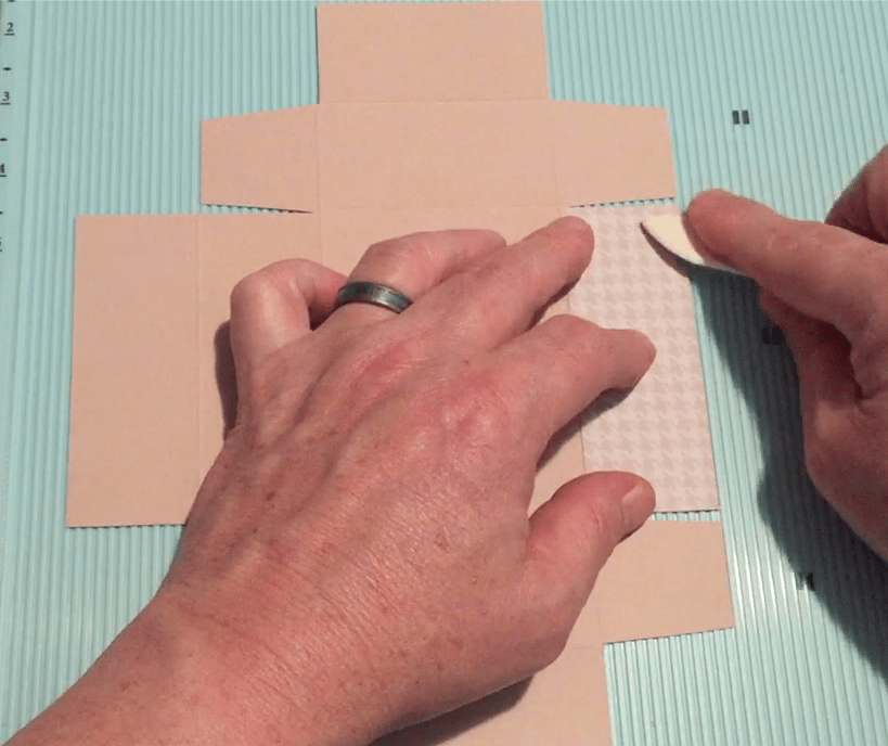
Stamped the teapot and cup on Lizi’s white card stock, colored with my alcohol markers and die cut with the included dies. I trimmed out a little tablecloth from the pattern paper and gave it a score for the edge. The white card stock background is actually scored to look like bead-board but it’s hard to see in this pic. The bead-board card stock is glued to the Blue card base and the front edge of the tablecloth and the tea service are mounted with foam tape.
I did print and cut this pun-y sentiment using my Silhouette Portrait machine and the Typewriter Hand font. I cut three extra blanks of the sentiment so I could glue them all together for some added dimension on the sentiment! A few of the blue enamel dots above the tea cup adds some shine and sparkle. Hey there, Bestie! Makes me grin!
I was so thrilled to get all four of the add-on stamp sets this month! MORE Wonderland!

This White Rabbit might be my favorite stamp from this whole set! I stamped him and the sentiment on Lizi’s white card stock, and colored the rabbit with my alcohol markers. I traced the plaid on his coat and the edges of his watch with a gold gel pen. I colored the two large capitals in the sentiment with the gold gel pen and the smaller caps with a gold colored pencil. Using the included die, I partially die-cut the rabbit and trimmed the rest to go around the sentiment. I think that is very effective here and certainly highlights the focal point of the card!
I stamped the medium watch stamp from this set along the top and bottom edges of the Green card base using VersaMark ink and embossed them with the LFL Golden Crown embossing Powder. I cut the White Rabbit pattern paper to 2.5″ x 5.5″ and glued that to the center of the card front. I lined the top and bottom edges of that pattern paper with more white peel offs and attached the rabbit and sentiment with foam tape.

I figured this card was perfect for a belated birthday wish, so I printed this sentiment on the inside writing surface using the Fearing Madness font (how appropriate!!) A perfect occasion for the White Rabbit!!
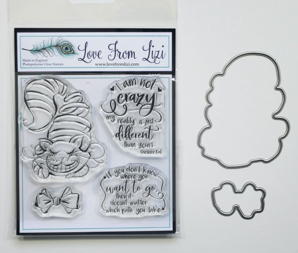
I liked the effect of having the image and sentiment all on one layer of card stock so I thought I’d try that again with the I’m Not Crazy Cheshire Cat set.
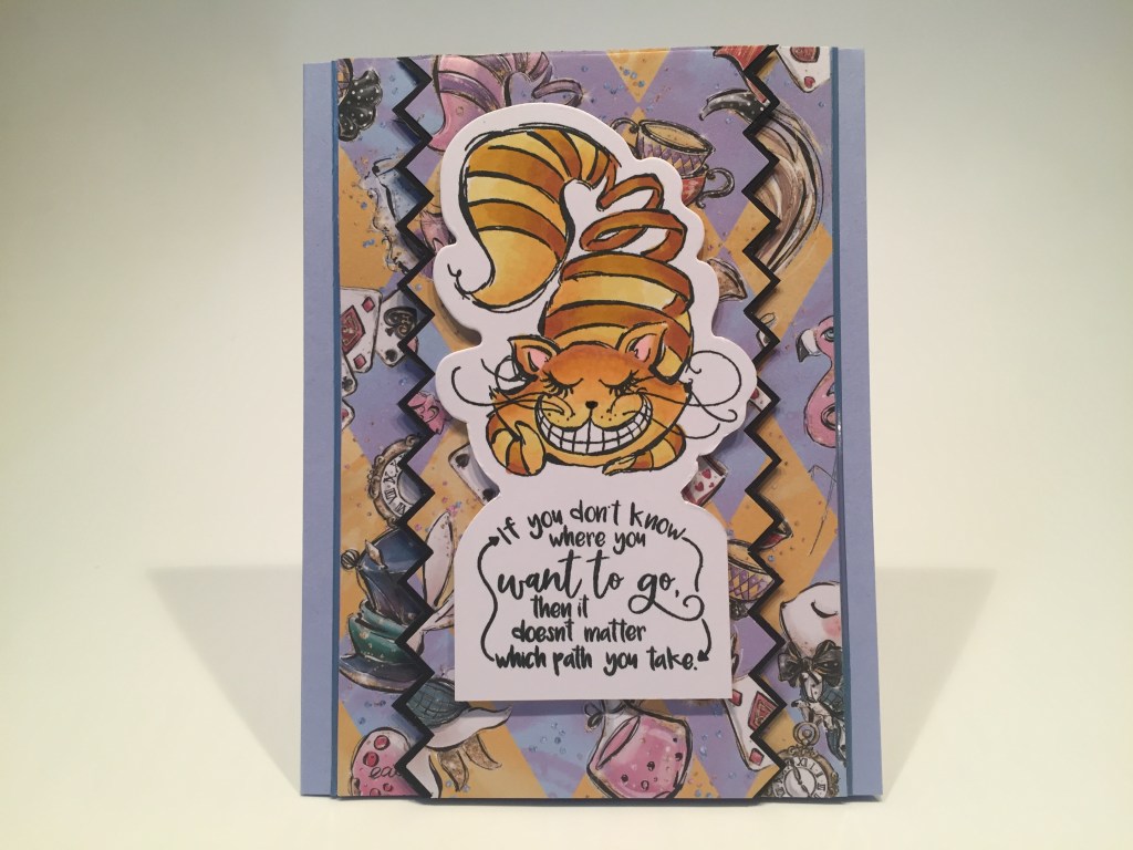
I had to resist coloring this Cheshire cat purple, so I thought a golden tabby would work! Stamped, colored and cut just like the last card. I used an old American Crafts border punch for the zig-zag pattern paper and the black mat, glued those together and foam taped them on top of two strips of the same pattern paper glued to the Blue card base and trimmed on the edges with Denim Blue mirror peel offs. Add the cat with foam tape and here’s another Wonderland card with a sentiment that could actually be useful!
Who can avoid a cake that says “Eat Me!? The Drink Me stamps and dies were calling …

I love this sentiment! And a quick snack is always a great start to an adventure! I stamped, colored and die-cut the cake and decanter as usual, and stamped the sentiment on the right end of a 2″ x 5.5″ scrap of white card stock. I cut a piece of the pattern paper to 2″ x 5.5″ and also cut two 1/8″ strips of the same paper. I glued the sentiment strip to the Navy card base, added the thin strips above and below, and then glued the 2″ pattern paper over the top. I mounted the treats with foam tape and added an assortment of sequins for the last touch of sparkle. I don’t think anyone is going to grow larger or smaller with these treats, but I do think they provide some good encouragement!
One more stamp set to go… The Gone Mad stamps and dies feature the Mad Hatter’ Hat.

I hadn’t used any of the ribbon included in the kit yet, so I thought I’d try weaving some on a diamond (harlequin) shape. I fiddled and fussed with this for a long time… My diamond is 2″ x 4″ (through the center, point to point) and I’m not sure even that is completely correct… the angle of the weave was really tricky, but I finally got a piece that I was satisfied with… I did glue the ribbon weave to a larger black mat which helped contain some of my errant edges… I’ll just use the images to cover up the messy bits!
The hat is stamped, colored and die-cut the same as all my other images, and I embossed the sentiment using VersaMark ink and HA Red embossing Powder. I fussy cut the sentiment out, and die-cut a piece of pattern paper with a LF Stitched Rectangle die. I glued the pattern paper to a black mat and then to the Red card base. I glued my diamond weave in the center and used some foam tape and glue to attach the hat and sentiment. A fun assortment of enamel dots adds shine and sparkle, and I think this is a fun, nicely textured and interesting card. I’m trying to be more brave with my alcohol markers!
I’ve already said how much I like that White Rabbit stamp… Alice’s adventures start when he disappears down the rabbit hole and she follows… I don’t think I can make him vanish down a rabbit hole, but maybe…
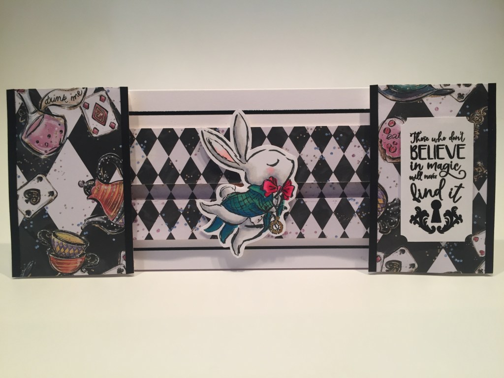
A slimline card and an interactive slider all in one!! The White Rabbit isn’t running down a hole but he does appear and vanish behind the panels on both ends!
Was that a rabbit running past? I spent way too much time making this card work! I actually show the assembly of this card on my YouTube video. To begin with I spent a good amount of time making the slider channel – matching up the patterns for the extra length and to try to camouflage the channel itself. I glued the channel background just below the center of this 3.5″ x 9″ card base. I know 3.5″ x 8.5″ seems to be the standard for slimline cards these days, but I wanted as much width for the rabbit run as possible. This still fits in a #10 envelope!
I attached the top and bottom of the center channel using a double layer of foam tape – on the outer edges to allow room for the penny to slide in the channel. I also added a couple of ‘racing stripes’ above and below the center raceway using the LFL Black pin stripe peel offs (in the Wonderland pin stripe pack) I stamped, colored and die-cut the rabbit just the same as my other images, but I did trim his white die-cut border down so he’d fit behind the side panels easier. The side panels are cut to 2.25″ x 3.5″ and their side edges are stiffened with an eighth inch strip of black card stock. The side panels are both going to be mounted with FOUR laters of foam tape – carefully trimmed to allow room for the rabbit to hide behind.
For the first time, I used some My Favorite Things Slider Elements to make the rabbit slide. These are like little flat plastic Tic-Tacs and substitute for foam tape when attaching your die-cut to a penny. I thought they would provide little to no resistance and let my White Rabbit slide across this card easily! I glued two to a penny (end-to-end) using some E6000 glue (I wanted to make sure they weren’t going anywhere) and attached the White Rabbit to the elements with some permanent glue dots. I slid the slider rabbit into the channel, added stoppers at the two ends and mounted the side panels.
I stamped the sentiment (from the Gone Mad stamp and die set) on a scrap of white card stock with VersaFine Onyx Black ink and embossed that with clear embossing powder. I trimmed that down to 1.25″ x 2.25″ and used a hole punch to invert the four corners. I glued 3 pieces of card stock to the back of the sentiment for a little bit of dimension and glued that down to the right panel. This card is absolutely adorable! That rabbit can run across this card so fast you almost miss him! You have the power in your hands! Love it!
That’s my 10 cards using the Love From Lizi September 2020 Super Card kit! I am an old fan of the Alice books and really enjoyed making these cards with this super kit! Certainly a colorful collection of cards and I’m thrilled that most of them are Wonderland themed.

I did use a little bit of everything in this kit, but I still have 94 ephemera pieces, 16 full sheets of pattern paper (and lots of scraps) a sheet of White card stock, a half-sheet of pink card stock and bunches of embellishments. As of posting, this kit is still available at Love From Lizi! If you do go shopping with Lizi please use my links… it is always supremely appreciated – especially these days as I am still on furlough here in NYC!
Love From Lizi September 2020 Super Card Kit: https://shrsl.com/2gq7d
Love From Lizi Oh Dear stamp and die set: https://shrsl.com/2gqf6
Love From Lizi I’m Not Crazy stamp and die set: https://shrsl.com/2gqf4
Love From Lizi Drink Me stamp and die set: https://shrsl.com/2gqf9
Love From Lizi Gone Mad stamp and die set: https://shrsl.com/2gqf7
LFL Wonderland Pin Stripe Peel Off pack: https://shrsl.com/2gqey
LFL Wonderland Variety Peel Off pack: https://shrsl.com/2gqeu
You can also subscribe to the Love From Lizi kits and you’ll never miss out on the fun!
Monthly Subscription to Love From Lizi Card Kit – US and Canada: https://shrsl.com/23usr
Monthly Subscription to Love From Lizi Card Kit – UK: https://shrsl.com/2b1ev
Monthly Subscription to Love From Lizi Card Kit – EU: https://shrsl.com/2b1es
Monthly Subscription to Love From Lizi Card Kit – Worldwide excluding US, EU, and Canada: https://shrsl.com/2b1ey
Thank you so much for sharing your time with me here. You know it means a lot to me! I hope I was able to highlight the extensive value and fun possibilities of this new, exclusive kit created to celebrate the Fourth Anniversary of Love From Lizi. I send you all my best wishes of health and happiness – please be safe out there – I offer prayers for those on the west coast affected by wildfires – and I send virtual hugs to you all! Please Like me, List me, Pin me, Post me, Share me with all your friends…! Don’t go chasing rabbits…! And as always I wish you Happy Crafting!