10 Cards 1 Kit / Simon Says Stamp October ’17 “Brushstroke Messages” Card Kit

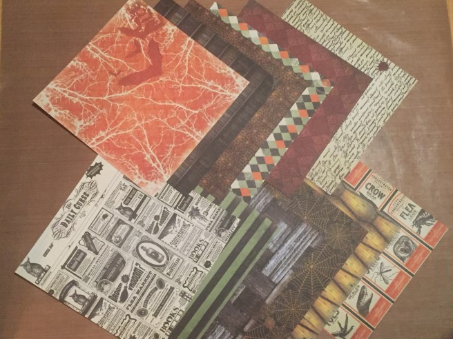
Hello folks, Scott here with my 10 cards from the Simon Says Stamp “Brushstroke Messages” Card Kit for October 2017. This kit is chock full of mirrored card stock, embossing powder, and embossed pattern papers – lots of shine this month.

SSS10.17

As you can see, this kit has sold out at Simon Says Stamp, but most of the kit supplies are available on their own. This month the stamp set is the “Brushstroke Messages” Stamp set which includes 5 bold brush stroke stamps and a little brush stroke heart along with six different sentiments – “thank YOU”, “YOU ARE loved”, “happy BIRTHDAY”, “YOU’RE GOING TO ROCK THIS”, “JUST WANTED TO SAY YOU’RE AMAZING”, and “YOU GOT THIS”.  We get 12 double-sided sheets of  My Mind’s Eye 6 x 6 BLUSH Designer Card stock Paper with rose gold foil accents – the gold foiling is very nice, and the papers feature dark navy blue, a blush pink (sigh), and ivory to go along with the rose gold foil. We are treated to a die this month – the Small Spiral Flower wafer die which is about 1″ square, and a full pot of Simon Says Stamp Steel Navy Embossing Powder, as well as a Ranger “Emboss It” pen in clear and Ranger’s .5oz. Mini Multi Medium Matte Glue,  and a disposable mini applicator adhesive brush. The card stock in this kit includes a sheet of Tonic Studios Burnished Rose Mirror card stock, and 1 sheet each of Simon Says Stamp 100# card stock in Ivory, Smoke Gray, and Soft Navy. Only 3 sheets of card stock, so I have to add to that to get card bases for 10 cards.IMG_3917 I search through my stash and discover that I don’t have any card stock that matches this color pallet. My Ivory is much darker, my Gray is much lighter, and none of my dark blue card-stock is even close to the same color. So I do something that I have never done before with any card kit – I cut the Soft Navy and Smoke Gray card stock into quarters and mount them onto simple white card bases from my stash. I guess there’s a first time for everything, and I do end up with 4 Soft Navy card bases, 4 Smoke Gray card bases and 2 Ivory card bases.img_3918-e1508181637399.png I worried that I didn’t have any ink pads that would match this kit either, so I did a little stamp test and did find that my Stampin’ Up Stampin’ Spot in ‘Night of Navy’ matched the Soft Navy card stock very well! I have to admit this stamp kit and color pallet did not particularly inspire me (more pink and no images to color!) so let’s see what I can come up with…IMG_3901
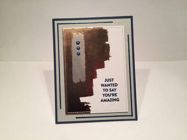
I started with a piece of the pattern paper that had a large swatch of the gold foil paired with the ivory, and cut that out with one of my Lawn Fawn Stitched Rectangle dies. I ended up using almost all of the Stitched Rectangle dies in my stash – both the large and the small – I do love the sharp detail that the stitching adds. I decided to use some of my Gray card stock from my stash (Staples Cover Stock in Gray) and cut a mat at 4″x 5.25″ to go on top of the Soft Navy card base. I used the Emboss It pen to draw corners on the top left and bottom right corners of the gray mat and embossed those with the Steel Navy embossing powder – really nice embossing powder – great color and great shine! I felt like the gold embossing was a little overpowering, so I took the medium brushstroke stamp and stamped it vertically on the foil with VersaMark ink and embossed it with some of my own silver embossing powder. I figured I could add silver embossing to this pallet in compliment to the grey colors, and this vertical stripe did break-up the large expanse of foil on the pattern paper. I DID have something in my stash that matched this kit – the Nuvo Crystal Drops in Navy Blue matched the navy blue in the kit perfectly! Three drops of those on the silver embossed ‘brushstroke’ added just the right touch of texture and shine. I stamped the sentiment in VersaMark ink and embossed it with the Steel Navy embossing powder – REALLY nice embossing powder!! I like this card a lot, and discovered that the ‘rose gold’ foiling on the pattern papers reads a little more like copper when it isn’t paired up with the blush pink in the pattern papers. Aha!! Let’s see if I can create 10 cards from this kit that are real elegant, masculine cards!IMG_3902For this card, I wanted to try to emboss the Spiral Flower Die on the mirror card stock without cutting it out. It took me a couple of tries to find the right pressure on my die-cutting machine, but I got a good embossing of the die on the top of a 1.5″x 3.25″ piece of the mirror card stock. I added two rectangles of the navy pattern papers to match, and mounted all three on 1.625″x 3.375″ gray card stock mats that I embossed on their edges with my silver embossing powder. I embossed the sentiment on the mirror card stock with the Steel Navy powder from the kit, which worked very well. I thought three dots of the Nuvo Crystal drops under the mirror card stock would finish this card but, with everything mounted on foam tape to the Soft Navy card base, the card felt a little dark to me. I reached for my Love From Lizi Silver Glitter Peel Off stickers to add touches of glitter over and above the rectangles – that brightened up the whole card quite a bit! IMG_3903For the next card on the Soft Navy card base, I embossed some scrap card stock with my silver embossing powder and the Steel Navy embossing powder, and die-cut the Spiral Flower die three times from each. I used the negative space from the die cuts and glued them to the card base along its opening edge. I took one of the navy pattern papers and embossed some irregular stripes of Steel Navy using the Emboss It pen from the kit. I cut one edge of the navy pattern paper with one of my stitched hillside dies and cut a matching curve on a piece of my gray card stock to use as a mat – the left side of the gray card stock has a stitched detail using my Ellen Hutson Stitching Lines die. The gray and blue are glued together and foam taped up on the card base. I again embossed the sentiment on my gray card stock with the Steel Navy embossing powder, cut that out with one of my Stitched Rectangle dies, and mounted that on the pattern paper with foam tape. I think the negative pieces of the Spiral Flower die are a little more abstract than flower-y and I really like the lack of any gold foiling on this sharp Thank You card. IMG_3904
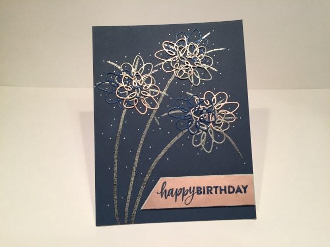
One more Soft Navy card base to go…! I die cut three Spiral Flower die cuts from the mirror card stock to add to the silver and navy die-cuts left from the previous cards, and layered them all together (three times) to make this card. I was going for a ‘fireworks’ thing here and I think these look like fireworks (everyone who has seen this card live still thinks they are flowers, but what can you do with people who have no imagination?  LOL!!). I did draw the trails and ‘explosions’ with the Emboss It pen and embossed them in my silver embossing powder – maybe if I had forgone the firework ‘trails’ they might look less like flower stems…?? Nevertheless, I added dots of my silver Sharpie extra fine point metallic pen to the ‘explosions’ and made a simple banner from the mirror card stock to which I embossed the sentiment in Steel Navy. I added a tiny gray card stock mat behind the banner and foam taped it up on the card base. Fireworks or Flowers, I like this card a lot and think it’s a very classy, very potent, birthday card. IMG_3907Now I move along to the Smoke Gray card bases. I take the Emboss It pen and draw a ‘mat’ on the Smoke Gray card base and emboss it with the Steel Navy powder. I cut one of the navy / gold foiling pattern papers with a Stitched Rectangle die and glued that to my card base. I selectively cut three small rectangles (with another Stitched Rectangle die) from a second piece of pattern paper (avoiding the blush pink portions) and added those to the navy pattern paper with foam tape. I actually double-embossed the sentiment on the center rectangle. I used my Tim Holtz Stamp Platform to stamp the sentiment in VersaMark ink, embossed that with the powder from the kit, then returned the piece to my stamp platform to stamp it a second time with VersaMark ink and embossed it a second time. This gave me a nicely textural sentiment with lots of shine. I love that Steel Navy embossing powder! And card #5 is another dashing guy card! IMG_3908
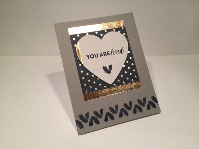
I am working my way through the sentiments in the stamp kit, and only have the “YOU ARE loved” sentiment still left to be used. I’m still trying to keep things masculine here, so I cut a heart shape out of one of the pattern papers (capturing a little slice of the foiling on the left edge) with one of my Darice Nesting Heart Dies and stamped the sentiment on that with my Night of Navy Stampin’ Spot. I mounted that up on foam tape to a square of the polka-dot pattern paper (cut with a Darice Nesting Squares die) glued down to the Smoke Gray card base and highlighted with a couple strips of the mirror card stock on the top and bottom. I used the brush stroke heart stamp to stamp a single heart at the bottom of the die cut and to create a pattern across the bottom of the card base – both in Night of Navy ink. I think this is about as masculine as you can get with this sentiment! Now that covers all the sentiments in this stamp set. Last month’s Simon Says Stamp card kit was all about birthdays (I made 6 Happy Birthday cards) so I decided to add more Thank You cards to this batch. Second only to Happy Birthday cards, Thank You cards are always useful to have on hand!IMG_3910 Now, I really like this card a lot, and think of it as kind of hyper-masculine! (it’s the pin-stripes!) Again, on the Smoke Gray card base, I cut a piece of that great pin-striped pattern paper and glued it to the center of my card base, and added two thin strips of the mirror card stock to the sides. I double-embossed the sentiment (again) on the ivory & gold foil pattern paper cut out with another Stitched Rectangle die. I really love the sentiment spanning both the foiling and ivory parts of this pattern paper – textural and shiny – I think that Steel Navy embossing powder really holds its own with the gold foiling! I  used foam tape to mount the sentiment to a piece of the polka-dot pattern paper (you know I love stripes and polka-dots together!) and glued those to another piece of the mirror card stock cut out with a larger Stitched Rectangle die. Those three layers are then foam taped over the pin-striped pattern paper and another Thank You card fit for the stout-hearted is borne!  IMG_3912Though I don’t have any gray ink pads in my stock, I know that stamping with VersaMark ink will create a ‘watermark’ on your card stock – so I stamped the large squarish brushstroke stamp in the middle of another Smoke Gray card base. I figured I would then emboss the ‘Thank You’ sentiment on top of that watermark. WELL… I don’t know if it was the humidity or what, but I couldn’t get my VersaMark ink to give up its stick! I tried using my heat tool, my EK Powder tool, and nothing I did would completely remove the sticky from that ink. SO… I ended up just stamping the sentiment on the watermark with the Night of Navy ink pad and then embossing the entire center stamping with clear embossing powder from my stash. The Lawn Fawn Stitched Rectangle dies make great frames when paired up, so I cut the smallest frame from the random ivory & foil polka-dot pattern paper, and the third frame from the regular ivory & foil polka-dot paper. The second and fourth frame are cut from the mirror card stock. I glued the polka-dots down to the card base and elevated the mirror card stock frames with the Darice double-sided sticky foam strips that we received with our SSS July card kit. I think this card is very striking and it’s amazing how much the dimension of the frames really pulls your eye into the center sentiment block.   Now I still have 3 of the brushstroke stamps still to use, so I paired up the long skinny and the long thick brushstroke stamps and stamped themIMG_3913 with my Night of Navy Stampin’ Spot on the top and bottom of the Ivory card base. I added a strip of the random foiled polka-dots pattern paper down the middle, and two thin strips of the mirror card stock right in the center. I like how the mirror stripes echo the stamped stripes. For the sentiment, I recently purchased this Spellbinders “Be Amazing” stamp and die set on sale at Scrapbook.com and thought the “Be Amazing” sentiment went right along with the theme of this kit re: ‘just wanted to say you’re amazing’. LOVE these stamps that have an outline die!! I stamped and embossed this on vellum with the Steel Navy embossing powder – WOW! Really sumptuous!! I die-cut the vellum and a piece of white fun foam with the included die, ran the vellum through my Xyron Sticker Maker, and stuck it down to the foam die-cut. A little Scor-tape to attach the sentiment and it makes a very chunky  embellishment that I didn’t have to cut and glue 5 pieces of card stock together to create! After using all the navy in this kit, I really enjoyed the light feeling and brightness here! Now I have one more Ivory card base and one final brushstroke stamp from the set to use, so another Thank You card couldn’t hurt, and as much as I like the Steel Navy embossing powder, I was getting a little tired of the navy and the grey and the gold….IMG_3915
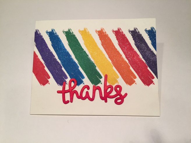
Anybody looking for some color this month!!?? LOL! I decided to throw caution to the wind and go for some really big color! With the assistance of my Tim Holtz stamp platform, I stamped the brushstroke at an angle across the Ivory card base with Ranger Archival Ink in Deep Purple, Manganese Blue, Emerald Green, Monarch Orange, Vermillion, and I used the SSS Hybrid ink cube from the April ’17 kit in Lemon Zest for the yellow. The sentiment is a Lawn Fawn Scripty Thanks die and I used some Stick It adhesive sheets to attach some white card stock to one side of a piece of fun foam, added more Stick It to the back of the foam, and then I die-cut the sentiment and colored the card stock side with some red Spectrum Noir alcohol markers. I was able to use the Stick It adhesive on the back of the fun foam to attach the sentiment to the card front. I did use my Spectrum Noir Sparkle Pen to add some sparkle to the brushstrokes and the die-cut. Here’s another nice chunky sentiment that’s casual yet quite lively! Of course, I love this card and actually felt a little liberated making something truly cheerful and bright!!    IMG_3920That concludes my 10 Card 1 Kit post this month! That’s 4 Thank You cards, 1 Birthday card, and 5 cards of affirmation..!!! I think this is a very handsome set of strapping cards! I am quite proud and personally thrilled that I was able to complete 10 cards without using any of the blush pink!! WOO-HOO!!  LOLOLOL!! Thank you so much for joining me here – I hope you enjoyed!  If you have any questions, please go to the contact page and send me a note! Please, please share this post with others, and Spread the Cheer!!

10 Cards 1 Kit / Love From Lizi October 2017 Card Kit

Hello Folks! Scott here with my 10C1K post of the Love From Lizi October 2017 Card Kit!

OTA5QzhFQURFODMzMjNGMzYzMzM6NDQ3YmM5MGU2MGEwYmU4ZmQ3MTc4MjMyY2E0YjM1NzA6Ojo6OjA=

This month’s kit is loaded with all sorts of Halloween oriented goodies and a unique stamp set featuring skeleton bones and pun-y (you heard me right) sentiments! I was thrilled at the masculine qualities of this card kit – no pink in sight – and was eager to dive in!! Lizi’s kits feature European-sized card stock (always 5 sheets) and I usually begin by trimming down the 11.7″ x 8.3″ cardstock to 11″ long, and can then divide the sheets into two card bases measuring 5.5″x 4.125″ – just an eighth of an inch narrower than a standard A2 card. As usual, I start with the stamps to get the juices rolling…

IMG_3862

This was possibly the most obvious pun in the stamp set..! I dug out my (what’s turning out to be invaluable) Staples Ivory cover stock to do my stamping on (you can see how closely that Staples cardstock matched the off-white card base from the kit). I used Tim Holtz’ Distress Oxide ink in Walnut Stain to stamp the humerus bone stamp in a bit of a parade across the card. I wanted to match the angle of the washi tape that was included in the kit, so I used my Tim Holtz Stamp Platform to help me line everything up correctly. I scooted the cardstock over a 1/2″ between stamps. I lightly colored the bones with the Chameleon Pen included in the kit (in BR1 Taupe), and stamped the sentiment in the same Walnut Stain ink. I used that great washi tape from the kit to frame the stamping and added little strips of the black shimmer specialty paper to the edges of the tape. All of this is glued down flat to the off-white card base from the kit. I am really struck at how sharp and masculine this card turned out, and it really doesn’t have to be used for Halloween – I believe that’s the most interesting thing about this stamp set – what one would think of as Halloween images but NO Halloween sentiments! I liked this so much, I decided to continue the theme through a few more of the stamps and sentiments.

IMG_3863

I think I was just so pleased to be able to make a pure unabashed masculine card with lots of style, that I wanted to run with it for  little bit..! Here I used the rib-cage stamp and the ‘Stole my heart’ sentiment on the Ivory cover stock and added a die-cut ‘you’ (trimmed from a Lawn Fawn I Love You Border die) cut from the bronze shimmer specialty paper. Again, using the washi tape to frame things up and I repeated the bronze shimmer paper in strips down both sides. Again, everything glued flat to the off-white card base and VOILA another hyper-masculine card. No sequins or sparkles, but the specialty paper adds a nice shine to the card. I could do a whole set of cards like this..!

IMG_3864

So I shall!! Here I’m using the pelvis stamp and thought I could clarify the sentiment by adding the “Hip” “Hip” die-cut from that same bronze specialty paper. I used a text die from my stash – “Marker Micro” from Die-Versions – to die-cut the letters, added the strips of washi tape, two strips of the bronze paper and a couple strips of the black satin ribbon from the kit. Here, all was glued down to the chocolate card base, and I completed the sentiment on the inside of the card. IMG_3882
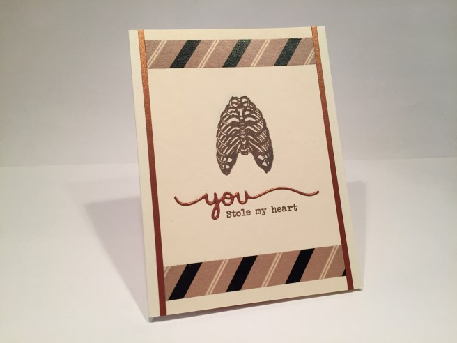
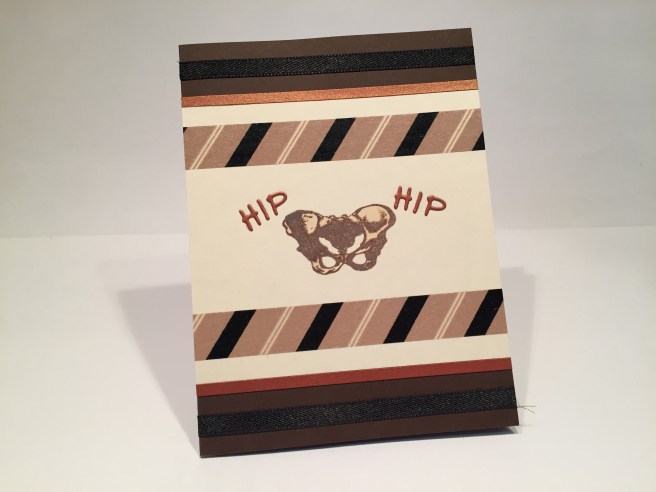
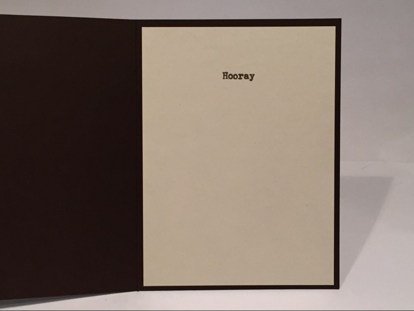
I thought it was great fun to have to open the card to  finish the sentiment! Again , that Staples Ivory cover stock was used for the inside, (trimmed down to 5.25″x3.875″) and it makes me giggle to see the simple “Hooray” all alone inside. I suppose if the ‘Hooray’ was on the outside, you wouldn’t have to clarify things with the ‘Hip Hip’, but I really liked the ‘you’ on the last card and wanted to continue along with that same feeling. Well, three cards do not make a complete set, so I had to do one more masculine card.

IMG_3865

What better way to represent ‘I Love You to Pieces’ than with all of the bone pieces from the stamp set! (Though I almost ran out of room!!) I did color the stamps with the Chameleon pen from the kit (almost got the skull too dark) but it does add a nice dimension to the stamps. I printed the sentiment using my Silhouette software in Sign Painter font on the bottom of the Staples Ivory cardstock, and had enough room to add some (thin) washi tape to the top and bottom, and strips of the black shimmer specialty paper along the sides. Once again, all is glued down flat to the chocolate card base, and my sojourn into masculine, non-Halloween cards is complete. I do like the fact that you don’t HAVE to make Halloween cards from this kit, and think it was very smart to have different non-Halloween sentiments featured with the stamp set. I wasn’t finished with these stamps yet, and wanted to see if the seemingly innocuous sentiments could be manipulated into something that WAS Halloween oriented.

IMG_3875

Here’s my shaker card for this month. I thought it a little macabre to have someone’s spine on display in a bell jar, and that certainly adds another (darker) dimension to the ‘Got your back’ sentiment! Instead of creating a frame for the shaker, I used vellum to create ‘reflections’ around the edge of the acetate and that did a pretty nice job of hiding the foam tape. I also used a bit of my white gel pen to add more highlights on the vellum. There is also vellum behind the spine to add to the illusion, and the spine is stamped, fussy cut and mounted on foam tape to kind of ‘float’ in the bell jar. A few ovals cut out with my Silhouette creates a nice base for the bell jar on top of a black cardstock ‘table’ and mounted to that intricate pattern paper that looks like wallpaper. I stamped the ‘Got your back’ sentiment in Walnut Stain oxide ink on a scrap of the Staples Ivory cover stock and die-cut with a Lawn Fawn Stitched Rectangle die. The sentiment is attached with foam tape and the whole assembly glued down to the black card base. I added stripes of the Pumpkin Pie embossing powder on either side of the pattern paper, and thin strips of the green specialty shimmer paper to add some pop! I pulled all the smaller sequins out of the sequin mix to use for the shaker bits, and added a Halloween IMG_3884
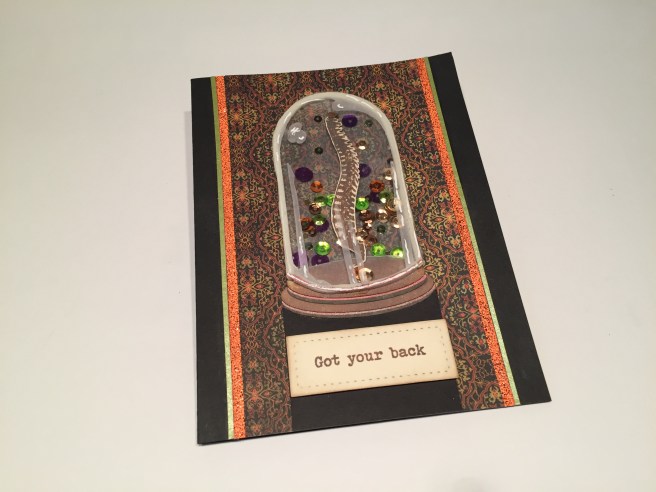
sentiment from my image stash to the inside. This is a fun card though rather subtle in its scare value… certainly a double entendre in any case! The embossing powder is very interesting and gives you a glitter-y textured effect when heat-set – not shiny and smooth. I think the bell jar is very old-fashioned and a little reminiscent of Frankenstein’s laboratory, and I had a great time creating a (seemingly) frame-less shaker element. This bell jar shaker concept is something I will have to experiment with some more – Maybe with some colored vellum?

IMG_3866

When I first saw Lizi’s unboxing, I knew I wanted to make bottles for the large extract labels included in the kit. It took a little finessing (the labels were a little larger than I anticipated) but I was able to come up with a decent apothecary bottle shape that would fit the labels. I created the shape and cut it out using my Silhouette and some core-dinations Auburn Pearl cardstock that I have had in my stash for years – it has a nice glass-like shimmer to it. My favorite part of these labels is the description of what each extract is for – the Spider Hair “Improves perception” and so on…! You could easily personalize these ‘treatments’ based on the descriptions. I really wanted the bottle to actually be the card for this design so the surprise with this card is how it opens – the

bottle itself flips up to reveal the Happy Halloween inside. Some thin cork sheeting from my stash adds just a touch of a stopper to the bottle top and the assemblage is mounted to some black and kraft cardstock from my stash. I did Shimmer Spritz the black for a good bit of sparkle (the close-up shows the sparkle), and added some highlights to the bottle with a gold sharpie. I loved these labels quite a bit and had a blast picking out ‘concentrates’ for friends and family. IMG_3885

I knew I was going to make a whole set of these bottle cards (I will probably turn the other 6 labels into cards as well..!) so I didn’t really include these on my 10 card count so on we go with some real Halloween Greeting card fun..!

IMG_3869

This card makes me laugh just looking at it. Yellow card base, strips of that groovy black lace from the kit down the sides, purple mirror peel-offs on the edges of the bookcase pattern paper, and the focal image. I cut out a head shape on my ivory cover stock, and colorized the gauze in the kit with a CT4 Spectrum Noir marker, printed and cut a couple of eyeballs out of the same Ivory cardstock to glue to the head shape, and then I started wrapping! There are at least 2 layers of gauze on this head. I did find that folding over an edge of the gauze helped to define the ‘wrapping’ and soon I had a pretty convincing mummy head. But why the yellow? IMG_3870
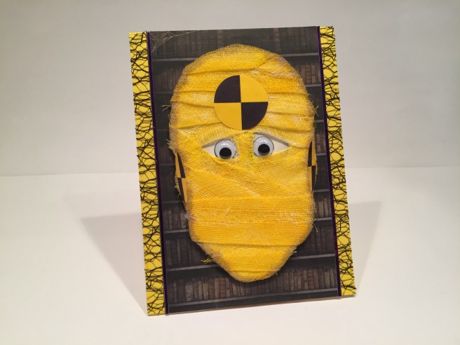
Surely you saw this pun coming from a mile away..! I couldn’t resist the bright colors and I concluded that  Lizi expects us to make mummies with her inclusion of surgical gauze in the kit. I fount the yellow and black calibration circles on-line and, after sizing them, printed and cut them out with my Silhouette and glued them to the appropriate spots on my mummy’s head. The medium size googly eyes from the kit fit my printed eyeballs perfectly, leaving a touch of color around their edges. I added a touch of shading around the head with a Spectrum Noir GB2 marker and just left the stray threads of the gauze as they were. This fellow looks like he has been through one too many crashes, and tickles my funny-bone to no end!

IMG_3871

This month Lizi included another 12″x12″ sheet of vellum images and I loved the bats with the moon and the trees. I found a pic of the moon on-line and printed that on my Staples Ivory cover stock, ran the vellum through my Zyron sticker-maker and mounted them together to create this background. I cut some of the ‘woven wood’ pattern paper with a couple of stitched hillside dies and inked them up with the Walnut Stain oxide ink and some Black Soot Distress Ink to give them a little more of an earthy feel. The coffin pattern paper caught my eye and I immediately wanted to try something with the idea of opening the lid of a coffin. I cut out a single coffin from the pattern paper and glued it to some scrap black cardstock to make a little ‘mini-card’ that I could add some surprises to on the inside. IMG_3888
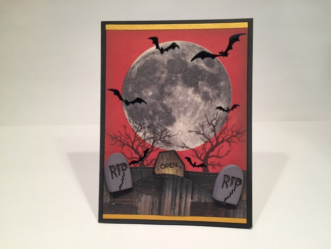
I fiddled around a bit and came up with a simple pop-up that says ‘BOO” (there’s that Brady Bunch Remastered font again!) with a little trick-or-treat graphic as well (all highlighted with a little stardust glitter pen). I did stamp a simple ‘OPEN’ on top of the coffin with a MFT ‘Interactive Labels’ stamp that I recently bought. I also broke down and purchased a Versafine Onyx Black Ink Pad to use with these little fine stamps and I’m pleased to say the ‘OPEN’ stamped perfectly on the front of the coffin. I trimmed the back attachments from the gravestone buttons and added them to the hillside as well as a couple of thin strips of the yellow shimmer specialty paper to the top and bottom to complete this scene on the front of this black card base. IMG_3873Of course, I can’t leave well enough alone, and had to add a bit of a pun on the inside of this card as well. Again, printed up with my Silhouette software on the Staples Ivory cover stock in the Typewriterhand font. Just another little bit to drive this card home and give an appropriate Halloween wish to the recipient. I have to admit, I love the moon here, and the coffin that you can pull up out of the ground with a little pop-up action. Add a simple pun, and you have an interactive card anyone would enjoy.

As far as my personal Halloween craft stash goes, I literally have only 3 stamps and 1 die in my collection that are Halloween oriented. I was thrilled to be able to finally use my Darice Spider Web Background die with this kit. With the inclusion of the spider sequins, the plastic spiders, the decorative webbing, and the spider web pattern paper this was my chance to bring it all together for a fun Halloween card.

IMG_3874

I die-cut the spiderweb from vellum and trimmed off the bottom right corner. I added a few spider sequins here and there on the spiderweb pattern paper, and covered them all with  light layer of the webbing. I die cut a heart from a scrap of red shimmer cardstock and topped it with a good layer of Glossy Accents. A single strand of grey DMC embroidery floss wraps around the heart and attaches to a bit of the web on the top right. I did (again) cover the edges of the yellow card base with the black lace, and glued my assemblage on top with the smallest purple peel-offs for a frame. I printed the sentiment (Typewriterhand font again) with my Silhouette on Ivory cardstock, cut with a stitched oval die and layered that with foam tape on a piece of the purple glitter ribbon and then on a scrap of shimmer red cardstock that matches the heart. The inside of this card sports the same Happy Halloween sentiment as the shaker card. I did cover the plastic spider’s back with the Nuvo Glitter Drops from the kit, and used my stardust glitter pen to draw fine lines on the vellum webs. I got the spider to glue down to the card fairly easily using Ranger Multi Medium Matte for glue, and weighing the spider down with a jar of jelly while it dried. I was a little worried that this card might turn out to be overly busy, but was actually surprised at how pretty this is. On to Card #9 (or #10, or #15) depending on how you’re counting!

IMG_3876

Pretty self-explanatory here…!! I actually traced the hand image from an old AllState Insurance logo I found on-line using my Pigma Micron pens on Bristol smooth cardstock and colored with my Zigg Clean Color Real Brush Markers. Appropriately Frankenstein-y! I found the bloodshot eyeballs on-line and topped them with some Glossy Accents for a little dimension and shine. I cut the fingertips to be able to slide the eyes behind, and mounted it all on foam tape to the miniature Extract Label pattern paper. I edged the labels with strips of the diamond pattern paper, and the medium purple peel offs. I printed the sentiment on the extra strip cut away from the off-white pattern paper in the kit using Lucida Blackletter font and added a spot of the Nuvo Glitter drops on the ends. The inside of the card has the same Halloween graphic as the shaker card, and this is about as ghoulish as I could manage while still keeping my tongue firmly in my cheek…!  I haven’t used the door die included in this kit, yet so let’s wrap this month up with that.

IMG_3877

I love this card! I die cut the door die twice from some old dark blue and dark red Recollections textured cardstock from my stash, and swapped the inlays between them. I did die-cut the windows from my Ivory cover stock and added a touch of alcohol markers to add a little life to the light behind the doors and I also die-cut the doorknobs from some gold cardstock. I found this ghost image on line, and managed to add some tie-dye patterns to his sheet and a peace sign to his bag (using my Silhouette software, of course). Everything is foam taped to the glimmer black specialty paper that I scored to suggest siding and a curb. I did use the peel offs for a frame on the orange card base – love the shine on these purple peel offs!!  IMG_3878If you haven’t jumped to the pun yet… here it is… “Hippy Halloween!” LOL! This probably dates  me way more than I would like to admit, but I adore this fun Halloween Card. The sentiment is printed on my Ivory cover stock in the Brady Bunch Remastered font – I think that font is going to get the prize for ‘Most Used Font’ this year! I really enjoy the colors that the tie-die introduced with this card and I really like the simple ‘scene’ created with the doors and scored shimmer paper. I think this little trick-or-treat-er is coming to your door next! WOW! That’s 16 cards for this month! I tried to create as much variety as possible with this kit and I hope I was able to inspire you to reach beyond the obvious and create cards that are usable all year round! Thank you so much for joining me here – if you have any questions please don’t hesitate to send me a comment here. THANK YOU and Happy Halloween!!   – Scott

UNBOXING – Love From Lizi October 2017 Card Kit

Hello Folks! Scott here with my Unboxing of the Love From Lizi October 2017 Card Kit!

OTA5QzhFQURFODMzMjNGMzYzMzM6NDQ3YmM5MGU2MGEwYmU4ZmQ3MTc4MjMyY2E0YjM1NzA6Ojo6OjA=

As usual, the October Card Kit is chock full of great supplies, and this month the kit is Halloween themed! Let’s start with the LFL exclusive Stamp Set:

IMG_3851

Now, I have a bone to pick with this Stamp Set! (Sorry! I couldn’t help it!) What a great set of stamps! One could almost assemble a complete skeleton here..!! And to make things better, the sentiments are all puns!! This is a very interesting combo of great Halloween images paired up with fun sentiments that can be used most anytime! Very cool!

IMG_3843

We get 5 sheets of A4 Cardstock (11.7″x8.3″) in Black, Cream, Bright Yellow, Deep Brown and Orange. This is standard letter size paper in Europe. It is easy to trim it down to 11″ and then split the 8.3″ in half for a standard A2 card base (just slightly smaller at 4.15″). Then we get 5 half-sheets of ‘specialty’ metallic cardstock in Copper, Golden Yellow, Graphite, Burnt Orange and Citrus Green. We also get that interesting piece of black lace that’s fairly stiff and lightly shiny – very interesting!

IMG_3844

Pattern paper is next with this great collection of 12 6″x6″ single-sided pattern papers – great Halloween colors, and fun patterns… love the yellow coffins and blood splattered handwriting! Green and black stripes is quintessential Halloween, and the harlequin patterns are great fun as well.

IMG_3846

WE also get this great 12″x12″ sheet of bottled extract labels (cut below the horizontal labels for shipping). The Chicken Toes and Spider Hair make me laugh! Though I do believe Octopus Ink is a usable cooking ingredient these days!

IMG_3847

On the back of the Extract Labels is this great tree and bat pattern in  oranges and reds.

IMG_3848

And vellum images return this month with this 12×12 collection of 7 Halloween panels with black embossing. I love playing with the vellum images that Lizi often includes, and I think of them as a very European craft staple. Love the moon and bats!

IMG_3850

Of course we get a Chameleon Pen – this month in the color BR1 / Taupe, and the Love From Lizi Peel Off Stickers!!! PURPLE MIRROR PEEL OFFS!  STUNNING! (I wanted to break out last month’s peacock die when I saw these peel offs!) Can’t wait!

IMG_3852

And now the goodie bag of embellishments! We get over a yard each of Orange and Black 1/4″ satin ribbon, black rick-rack, and black and white baker’s twine. Middle left to right is a FULL roll of washi tape in Taupe, Black and Cream stripes, a jar of LFL Embossing Powder in ‘Pumpkin Pie’ which is orange and brown with glitter. The die this month is this great Door die which seems very intricate and begs for inlay die-cutting! We have three RIP plastic Gravestone buttons, and 3 sets of googly eyes in three different sizes. We get more glitter with the Nuvo GLITTER Drops this month in ‘Midnight Sky’ – kind of a grey-blue with tons of multi-color glitter throughout. We also get 2 plastic spiders on a nest of ‘spider web’ flossing, and on the bottom, actual surgical gauze in 2 widths (did someone say “mummy”?) and that lovely 2.5″ wired ribbon of glittery purple!

This month’s Card Kit seems to be right up my alley…!!  There’s NO pink and puns are included!! I can’t wait to start playing around with this kit and see what I can come up with…! I’m not real big on Halloween celebrations, and I don’t think I’ve ever sent anyone a Halloween card, but this kits sparks my imagination and I see Halloween cards in many of my friends and families future…!! Thanks for joining me here, and I will do my best to come up with some fun and unique ways to use this kit! Spread the Cheer!!


10 Cards 1 Kit / Simon Says Stamp September 2017 “Best Birthday” Card Kit

Hello Folks! Scott here with my 10 Cards 1 Kit post for the Simon Says Stamp September 2017 “Best Birthday” Card kit. This Card Kit comes with the “Best Ever” clear stamp set,

1_384823_ZM

a custom paper pack (8 double sided 6″x6″ sheets) inspired by the Doodlebug Fairy Tale collection, custom Doodlebug Sprinkles epoxy sticker assortment, 2 Jillibean Soup “Small Heart” shaker tags, 2 Jillibean Soup “Balloon” shaker tags, 1 Jillibean Soup “Small Heart” shaped shaker, 1 Jillibean Soup “Balloon” shaped shaker, and 5 sheets of Simon Says Stamp cardstocks in Audrey Blue, Doll Pink, Lavender, Cotton Candy, and 120# White. I found it a little odd that we got 4 tags but only 2 shaped shakers, and even odder that we got no sequins, no rhinestones, NO shaker bits of any kind? In contrast to other SSS Card Kits I have received, this kit feels rather light on supplies. But, I do seem to constantly run out of birthday cards, so I eagerly dug in did my best to come up with a nice variety from the supplies provided. We did get 5 sheets of cardstock, which I cut down and folded into 10 card bases.

IMG_3808

As usual, I started with the stamps on a piece of white cardstock (die cut with the Lawn Fawn Stitched Rectangle die) from my stash. I stamped the cloud with my SSS Intense Black Ink, cut a mask for the cloud from 1″ Post-it tape, and then stamped the rainbow stamp coming out of the top of the cloud. I colored the rainbow and cloud with my Zigg Clean Color Real Brush Markers, blending the rainbow to lighter shades on the left. After coloring, I stamped the other sentiments (I do really like that script-y ‘happy birthday’ sentiment), but this still felt a little bare to me. I remembered that I had received the SSS ‘Magical Birthday’ stamp set as a freebie on one of my first SSS orders, and it did have that great ‘wishing you a’ stamp that finished out the sentiments very nicely. I did cut the ‘FROSTING YUM.’ away from the cake sentiment and moved it into the inside of the cardIMG_3831for a bit of a finale.  I used my EK Tools Powder Tool to neutralize the sticky on the epoxy sticker, and used a spot of foam tape to give the cupcake a little more dimension. I mounted the white cardstock using foam tape on the star pattern paper and mounted that on the Audrey Blue card base. A lot of these sentiments were quite small but the ‘FROSTING YUM.” font was extremely small. I may have to break down and get a Versafine Onyx Black ink pad to help stamp these small sentiments a bit more legibly…!

IMG_3811

I have seen these style of plastic shaker containers around for a while and wanted to try one for myself, so I reached for the ‘Small Heart’ shaker tag and shaped shaker for this card. I covered the tag with that great rainbow heart pattern paper, used one of my American Crafts Border Punches on the bottom edge of the Doll Pink card Base, and used some black cardstock from my stash to mat behind both. When I saw the original reveal of this kit, and realized that there were no shaker bits included, I happily purchased some Queen & Co. ‘Toppings’ to use with this kit. I had been pining for these ‘Fimo Fun’ Toppings ever since I saw them a number of months ago, and here was the perfect opportunity to add them to my stash. The heart shaker is full of red and pink hearts from this topping set – they really look like little polymer ‘Millefiori’ slices and I thought they worked perfectly as the shaker bits for this card. I do like the repetition of heart shapes throughout this card – definitely a theme going on here…! I used some of my pink peel off stickers from the Love From Lizi July Card Kit to form a frame around the card, and used some pink and white bakers twine (from the same LFL July Card Kit) tied in the hole on the top of the tag. Another one of the (tiny) stamp set sentiments in the bottom corner and we have another card completed. Though I am getting a little tired of all the pink in my card kits this season, I do really like this ‘Doll Pink’ cardstock.

IMG_3814

Now on to the ‘Balloon’ shaker tag and shaped shaker. I thought this looked more like a hot-air balloon, so I covered the tag with the smiling clouds pattern paper, added a purple pattern paper hill and matted that all on top of a piece of scrap white cardstock. I used that terrific rainbow stripe pattern paper behind the balloon, and filled the shaker with Queen & Co. ‘Tiny Bubbles’ Toppings in all six rainbow colors (yes, I also bought this set along with the Fimo Fun set!) – these almost look like little candies inside the balloon! I cut a crude little ‘gondola’ out of the orange pattern paper, outlined that with my Pigma Micron Pen 03 and drew a couple of straight lines to suggest the rigging. The “You Send Me Soaring” sentiment is from the Stampin’ Up ‘Sky is the Limit’ Sale-A-Bration stamp set from 2016. A few of the epoxy stickers from the kit and another shaker card is air-born!

IMG_3815

Back to the stamps… I really think stripes and polka-dots work great together, so I used the big polka-dot pattern paper to cover 2/3 of the Cotton Candy card base (more pink!) and die cut a circle through the front of the card so that great rainbow heart gets seen both on the front and on the inside of this card. I cut a frame for the window out of a scrap of white cardstock with my stitched circle dies (because my stash of pink cardstock is almost nonexistent!) and colored it with my Spectrum Noir BP1 (bright pink) alcohol marker. I used that same marker to color the heart along with LV1 (lavender), IB2 (ice blue), LG3 (light green), CT4 (citrus), OR2 (orange), and DR2 (dark red), and then covered the whole heart with my Spectrum Noir clear sparkle pen. I took great pleasure in IMG_3817
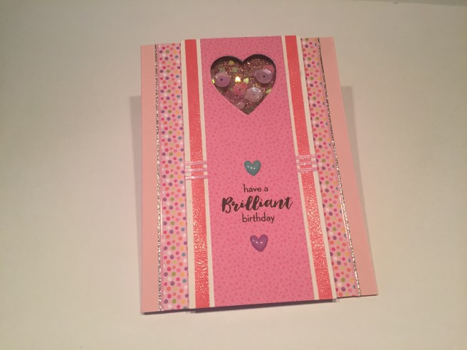
figuring out where to stamp the ‘best birthday ever’ sentiment over the heart where you can’t see it until you open up the card. The simple ‘Happy Birthday’ sentiment is stamped on the outside of the card, and with a few epoxy ‘sprinkles’ and one pink peel off sticker, we have a very cute (albeit very pink) card with a little bit of a surprise inside.

Just a couple of colored rainbows, and I’m already itching to see how else I can color and use these stamps beyond the simple obvious rainbow approach.

IMG_3819

Here, I’ve stamped the rainbow stamp 5 times in a row, overlapping both ends at the width of the rainbow. I really like the Gothic arch effect where the stamps overlap. I colored the stamps with colored pencils, letting the overlapped ends blend naturally. Lots of color achieved here without using the rainbow motif. I fussy cut the rainbows out, and used foam tape to mount them on some of the purple pattern paper with the scalloped edges punched with my American Crafts Border Punches. I stamped the heart border along the top of the pattern paper using Archival Ink Deep Purple, and the ‘best friend’ stamp (in SSS Intense Black ink) over one of the arches. I stamped the ‘sending lots of color your way’ on a scrap of white cardstock and added a thin strip of the rainbow stripes pattern paper to the bottom. I used foam tape to mount the ‘color’ sentiment at the bottom of the rainbows, and everything is attached to the Lavender card base. Three of the epoxy dots from the included stickers – blue, green, purple, add a little sparkle and shine, and just happen to match the three central arches. Now, this could be used as a birthday card, but I avoided a birthday sentiment so I can use this card for other occasions – that’s three Birthday cards and two love / friendship cards so far…

IMG_3820

And now I’m having some fun with the small candle stamp. I am not and have never been a great stamper, and have used stamp platforms to assist me for most all of my stamping.  I am proud to say that the candles here were all hand-stamped – no stamp platform used!  I did find The Gentleman Crafter’s handy guides for pattern stamping on-line and used the circular grid with eighteen sections on top of my light board to stamp the candles in a radial circle. I used the Tim Holtz distress oxide inks in Wilted Violet, Broken China, Cracked Pistachio, Fossilized Amber, Spiced Marmalade, and Fired Brick. I did do a practice run on some plain paper which helped me figure out how to line the stamps up to get a nice even circle in the center. Though the distress oxide inks are not a PERFECT match, I thought they were close enough to suffice. I do not have a lot of stamp pads in my stash, so I found it a little difficult to perfectly match the pattern papers in this kit with the ink pads that I own. I did stamp the sentiments in SSS Intense Black ink and mounted the white cardstock with foam tape on the rainbow stripe pattern paper (my favorite!). I did cut out the center of this rainbow mat to conserve some of that paper for other uses. Everything is mounted on the 120# white card base, and I added a few Fimo Fun Toppings for accents. That candle stamp is a great stamp, and I can see many uses for it in the future. I do love this card, and the juxtaposition of what is a basically a simple card, with a little more complex pattern of stamping! Maybe this will encourage me to embrace the chaos and try a little more hand-stamping with other cards!

I still have the two shaker tags left, and, even without the ‘shaped shakers’, I figured I can use them make more shaker cards. I decided to embrace the PINK and made this card.

IMG_3833

I opened up the shaker tag and cut off the tag ends to make a full size panel down the front of this card. Once again, displaying my affinity for stripes with polka dots, I used the solid stripe stamp from the set to stamp and clear emboss a couple vertical stripes on the sides of the shaker tag using Worn Lipstick distress oxide ink. I covered the center of the heart shaker tag with the pink-on-pink pattern paper and mounted that on foam tape to the pink polka dot pattern paper. I decided that the heart opening was a little small for this arrangement, so I enlarged the window a little bit with one of my heart dies. I backed the shaker window with some core’dinations Glitter Silk cardstock in pink, and filled the window with whatever pink sequins I could find. I did add some Martha Stewart heart shaped glitter in Sugar Plum (discontinued) and some of the clear Tiny Bubble toppings to finish filling out the shaker. The sentiment is from the Paper Pumpkin July 2016 “What a Gem’ kit, and after adding a couple of the epoxy hearts from the set, I finished out the sparkle on this card with the Love From Lizi pink and silver glitter peel off stickers. The three horizontal stripes of pink peel offs in the center were useful in camouflaging the fold line in the center of the shaker tag. I think the abundant use of sparkling, shining, and glittery accents reinforces the ‘Brilliant’ sentiment!

Even though I am not a huge pink fan, I did like that card a lot and, since I still had one Doll Pink card base to use, decided to make one more perfectly pink card.

IMG_3826

This card is pretty self-explanatory. I stamped the ‘HAPPY BIRTHDAY” border stamp on a scrap of white cardstock, added more of that pink polka dot pattern paper on top, and mounted those flat on the Doll Pink card base. The circle die cut is actually the piece I cut out of the window card (#4) stamped with the ‘best friend’ sentiment (curved a little more than natural to fit). I liked the two sizes of polka dots together and I did have that pink frosted cupcake sticker to use as well, so I mounted the sticker to the die cut with a spot of foam tape and used more foam tape to attach the die cut to the card. I outlined the pattern paper assemblage with more LFL pink peel off stickers (I’m addicted!), stamped the ‘birthdays are for…’ sentiment on the card base (I did not use the ‘frosting yum.’ portion) and added 3 epoxy dots (polka dots!) from the sticker sheet for some added shine. Surprisingly, I didn’t turn into a big pink blob of quivering cytoplasm after completing two VERY pink cards in a row…!!

I have now used all the stamps in the ‘Best Ever’ stamp set except for the little smiley faces. Now, I’m not much for putting cute little smiley faces on things, but I did come up with an idea that would justify the use of one of these faces.

IMG_3827

I used my stitched sun die to make an ‘epoxy’ sticker that would match the cloud and rainbow stickers from the Doodlebug Sprinkles collection. I did have to cut the sun down quite a bit to make it more size appropriate to use here, but after stamping one of the smiley faces on it (with a little touch of blush) and covering it with Glossy Accents, I think it looks like it could have come with this set! I used the + and = stamps from the SSS August Card Kit to complete the equation (stamped in SSS Key Lime and Orange Slush Hybrid inks from the SSS April Kit) and clear embossed them to match the shine of the stickers. The stickers are mounted flat to a scrap of white cardstock edged with the Ellen Hutson Stitching Lines die and foam taped up on the ‘confetti’ pattern paper with little strips of that great rainbow stripe pattern paper top and bottom, and all mounted to the Lavender card base to finish it off. I added little raindrops with the tip of my Spectrum Noir alcohol marker in AB1 (a new color – Aqua Blue) under the cloud, and topped them all with a tiny spot of Glossy Accents. I think this is great fun, and just needed an appropriate sentiment to complete. I found this quote which seemed very appropriate.IMG_3834    I created this sentiment in my Silhouette software in the ‘Times’ font and printed it directly on my cardstock then trimmed it down with a Lawn Fawn Stitched Rectangle die. This perfect sentiment ties everything together and makes this card one of my favorites!

I have now used all the stamps in the ‘Best Ever’ stamp set, and I still have the ‘Balloon’ shaker tag and a 120# white card base to use, so I got this wild idea to abandon the whole colorful rainbow theme of this set to make a monochromatic card.

IMG_3830

And here’s my Silver and White Christmas Card!! I outlined the tag and the right edge of the card base with my Love From Lizi Silver Glitter peel off stickers, (ADDICTED, I said!). I had to make some homemade silver glitter paper (I actually did not have ANY silver glitter paper in my stash – lots of silver papers but nothing with glitter!!) to die cut the branches with a Darice Border die, (I used the branches to cover up the crease on the tag) and to make the little ornament topper to cover the balloon nipple. I used Sheer Shimmer Spritz on the tag and the scrap of grey cardstock on the back of the ornament shaker to add some more glitter, and used more of the LFL peel off stickers to add a little pattern to the grey backing of the shaker window. I did outline the ornament with my Sakura Stardust pen, and I used some silver cord from my stash for the hanger and bow, a silver grommet in the tag hole and a tassel I made from DMC silver metallic thread, and some old silver rhinestones for the shaker bits. The sentiment is from the Paper Pumpkin November 2016 ‘Wonderful Winterland’ kit, stamped with VersaMark ink and embossed with Ranger silver embossing powder.  I did try stamping the sentiment with my Delicata Silvery Shimmer stamp pad, and also tried it with the WOW! Cloud 9 glitter embossing powder (from the SSS August kit) but I think the Silver embossing was the easiest to read. I love this card a lot – I think I was a little overdosed with all the rainbows and colorful papers in this kit and I found it extremely satisfying to do a simple silver and white card.

I do like this ‘Best Ever’ stamp set quite a bit even though it doesn’t give us a lot of images. While in the midst of making these cards, someone at work celebrated a birthday and I was able to come up with a quick and easy gift card using this stamp set.

IMG_3806

The package is actually a set of inexpensive alcohol markers for my colleague who recently discovered the joys of coloring, so the sentiment was extra perfect!

So that makes 6 Birthday Cards, 3 friendship/love cards, 1 Christmas card and a gift card for this month’s kit. I really did enjoy all the bright colors in this kit, and I hope I was able to provide a little inspiration for you and your card making adventures, whether you bought this kit or not. Thank you for all your support and Happy Crafting!!

Love From Lizi Birthday Hop!

For the Love From Lizi Birthday Hop, we were all given this great ‘Peacock Feather’ die from Sizzix. I love the fact that this die not only cuts the feather, but also cuts two smaller pieces for the ‘eye’ at the end of the feather.


Since I had an extra card base and all my materials from the LFL September Super-Card Kit still out, I decided to stick to that theme for my Birthday Hop Card.

IMG_3772

Here’s all the supplies I used for this card: a Lawn Fawn Stitched Rectangle die, the Peacock Feather die, Spectrum Noir alcohol markers in BT2, BT3, BT4 and the Spectrum Noir Sparkle Pen, My Zigg 2 Way Glue Pen, and EK Tools 3D Dots. I love these foam squares – they are in two sizes and very thin – actually listed on the label as 1/16″ thick – so they cut very easily and the adhesive is quite strong. I used my leftover Mint card base and die-cut the feather from the green and purple pattern paper (I covered the pattern paper with the sparkle pen BEFORE I cut the die). I cut the background out of the purple pattern paper with the stitched rectangle die, and cut the center of the ‘eye’ and a background mat from the dark blue specialty paper, and the larger ‘eye’ piece from that spot gloss pattern paper. I also used a piece of vellum. I wanted to give a little lift to the feather, so I traced the feather die on the vellum, and fussy-cut it with a little bit of an extra border to go behind the feather die-cut. This cut vellum backing is a little trendy right now… Lots of dies (especially sentiment dies) are coming out with a background / outline die in addition to the main die. I thought this would help the feather pop a little visually as well as adding a touch of dimension.

IMG_3776 (1)

I used my Silhouette to create the sentiment in Abadi MT Condensed Extra Bold font and printed that directly on my purple pattern paper background, which is mounted to the dark blue specialty paper mat and then onto the mint card base. I did some coloring and shading with the Spectrum Noir markers on the feather itself, and then glued that to the cut vellum backing with the Zigg glue pen. I added the ‘eye’ pieces to the feather and then used the foam squares (trimmed very thinly) to mount the feather assembly to the card. I thought “your are not here to be AVERAGE you are here to be AWESOME” was a perfect sentiment that played right along with the inspirational theme of the September Super-Card Kit – and I do think that Peacock Feather die is pretty awesome! Very detailed, very feathery, and unmistakably peacock..! I can see me using that die on a regular basis!

The Love From Lizi Birthday Hop is a GIVEAWAY!

– To enter the giveaway you must like and comment on each video by 18th September
– The grand prize is a years free subscription to the Love From Lizi monthly card kit (including shipping)
– There are several other prizes that include stamps, dies, embossing powders and more
– The giveaway is open worldwide
– The winner will be announced within the Love From Lizi Channels October card kit unboxing on September 19th.

https://lovefromliziblog.wordpress.com/2017/09/02/love-from-lizi-first-birthday-celebrations-and-giveaways

Needless to say, that grand prize is worth  more than $500.00… Please play along and help us celebrate www.lovefromlizi.com’s First Birthday!!  GOOD LUCK TO ALL!

10 Cards 1 Kit / Love From Lizi September 2017 Super-Card Kit

Hello Folks! Scott here with my first 10C1K post as a new Design Team Member for Love From Lizi! This is a Super -Card Kit by any definition, with bonus supplies included so we can all celebrate the First Birthday of LoveFromLizi.com on September 2nd.

OTA5QzhFQURFODMzMjNGMzYzMzM6NWY5M2Q1MjViMDRhNzI3ZmM5NzVlODhjZGFmYjYxODY6Ojo6OjA=

This kit is overflowing with lovely cardstocks, specialty cardstocks, three styles of 8″x8″ pattern paper with a watercolor theme, and, of course, tons of embellishments, some new Love From Lizi embossing powder, a new stamp set deisgned by Lizi herself, and more..! PHEW! As usual, I turn to the stamp set to get started with my Kit.

IMG_3739

I wanted to try the Love From Lizi “Emerald City” embossing powder first, so I stamped the wreath with the included VersaMark ink cube, and embossed it with the new Love From Lizi brand powder. Really, really, nice embossing powder – super-smooth and super-shiny. I stamped the sentiment in Stampin ‘Up ‘Night of Navy‘ ink in the center of the wreath. I was originally going to cut all these images out, but, as I was using my Tim Holtz Stamp Platform to stamp with, I ended up stamping the flower image (with Ranger Archival Ink Deep Purple) nicely placed in the four corners of the white cardstock. I colored the flower stamps with three of the Chameleon pens  we have received in the LFL kits – the grey from July, the green from August, and the purple from this kit. This arrangement looked so nice, I decided NOT to cut everything out. I threaded the organza/satin/glitter ribbon behind the wreath and added the three organza ribbon roses to the wreath. I used a blue sequin from the Peacock Pride sequin mix at the center of each flower and topped those off with a small dot of the Nuvo Crystal Drops. I mounted this to the purple card base, and with a few silver stars from the sequin mix trailing down the middle of the card, and, of course, the silver glitter peel offs for outlining, and my first card is complete – I really like the purple / green combination with just a touch of blue.

IMG_3741

I was eager to see what I could do with the sheet of lace included with the kit, as well as the Nuvo Gilding Flakes, so I coated the lace with my Zigg 2-way glue pen and let it dry before taking the silver Gilding flakes to it… I had to use an old toothbrush to clear the flakes from the open areas of the lace, but, surprisingly, it worked and gave the lace an almost metallic look! I stamped and embossed the sentiment on a piece  of the blue specialty paper – this took me a few tries… first I tried embossing in silver, but I didn’t think that showed up very well.. I tried embossing with the Emerald City green, but I didn’t think that showed up very well either, so I ended up using white embossing powder – not only did this pop, but the white really points up that the lace is silver…! I did emboss the satin rose leaf with the Emerald City embossing powder using the leaf stamp from the LFL July Kit. I die-cut the sentiment with a Nestabilities Deckled Rectangles die, and mounted that on top of a scrap piece of cardstock with the edges covered with the silver glitter peel offs. That really shows off the deckled edges of this die. I used that gorgeous opalescent pattern paper and wrapped the lace, the organza/satin/glitter ribbon, the cool grey velvet ribbon and the square rhinestone ribbon buckle around on the left, defined the edges of the lace with more peel offs, and mounted the sentiment on the right side with foam tape. I glued everything down on top of the dark blue cardstock and, WOW! – you can make some truly beautiful cards with this kit – this one feels very fancy, very high-end to me… a $10 card if I ever saw one!  LOL!!

IMG_3743

If you have followed me at all, you know I am a little image-obsessed, so I looked around for some ‘girl’ images to compliment the feminine sentiment in this kit, and ran across the Mona Lisa – any more iconic you cannot get!! I paired that up with one of the canvas-textured pattern papers (get it?!) and embossed the sentiment on a scrap of my own Kraft cardstock in the Emerald City green, and matted both on a small black mat (from my stash), and added the graphite specialty paper as a ‘frame’ around the artwork. These were all mounted to the canvas pattern paper with foam tape, and then glued to the kraft card base along with one of the kraft envelopes from the kit. Notice the ‘monogram’ on the envelope… yes… there is something inside…

IMG_3744

Need she say more??  LOL! This card tickles me to no end…! The letter is just a scrap of ‘parchment’ paper and I wrote the ‘letter’ with a Pigma Micron pen 02.  I love the whole idea of a ‘card within a card’ and think this is a little bit of giggle heaven!

IMG_3746

I actually had this great graphic in my image stash and was so amazed at how well the colors matched this canvas-textured pattern paper, that I had to use her. I stamped the sentiment on a scrap of watercolor paper (to compliment the canvas-texture) with Ranger Archival Deep Purple ink, and cut it and the purple specialty paper out with a stitched oval die. I glued those together, and used foam tape to mount it to the pattern paper. I printed and cut 4 of the girl images on my Silhouette, and glued them together to make a pseudo-chipboard piece, and used foam tape to attach it to the card. The pattern paper is glued to the purple card base and trimmed with more silver peel offs and a few silver stars from the sequin mix.  I love the combination of the sentiment and the image on this card – a GREAT encouragement card for young and old alike!

IMG_3749

I wanted to color something, so I reached for the sheet of color-able stickers in the kit, and colored one with my Zigg Clean Color Real Brush Markers, in colors to compliment this floral pattern paper. I mounted the sticker to the purple specialty paper, added a light purple heart gem in the center, cut that out with a stitched circle die and used foam tape to mount it to the card. The sentiment is stamped with the Archival deep purple ink again on a scrap of light purple cardstock (from my stash), mounted to the pattern paper which is glued to the dark blue card base and, YES, ONCE AGAIN, trimmed out with the silver glitter peel offs.!! (I’m currently looking to see if there are any 12-step programs that will address my peel off addiction!) I’m usually not one for flowers – but I wanted to highlight this terrific sentiment, and  I thought the stickers complimented this pattern paper very well – kind of blending together to focus on the sentiment. At this point, I have used every stamp in the stamp set and am ready to move on to the terrific peacock die!

IMG_3752

This is a GREAT die – lovely and intricate and it cuts “like buttah”! Of course I went for a shaker card! The peacock and the frame are both cut from the purple specialty paper – acetate glued behind the frame and the peacock glued on top. Foam strips around the frame and attached to a circle of this lovely pattern paper with plenty of the ‘Peacock Pride’ sequin mix for the shake. I used another piece of that organza/satin/glitter ribbon across the bottom and added my Dr. Seuss quote printed on the same pattern paper in Century Schoolbook font. This peacock die is extraordinary – it has amazing detail while still being a fairly small die. LOVE this shaker card!

IMG_3753

Now, I want to try some die-cut inlay with that peacock die, so I cut the peacock out of the Blue specialty glimmer paper, used the purple specialty paper for the feather inlays and some of the LFL gold mirror specialty paper from her July kit for the ‘eyes’ on the feathers as well as the peacock’s eye. Though it was a little fussy and keeping track of those tiny little pieces drove me a little nuts, the end result is well worth the headache! Such a beautiful die! The peacock is mounted on the mint specialty paper and that on the graphite specialty paper and those foam taped to the pattern paper background (all cut with the Lawn Fawn Stitched Rectangle dies). I love this sentiment I printed and cut on my Silhouette – the script words are Sign Painter font and the block letters are Britannic Bold font – and I did print five of them and glued them all together for more of a ‘chipboard’ look. The sentiment is mounted over the dark grey velvet ribbon with foam tape, and the sequins are a combination of the kit mix and some from my stash. There’s a touch of the Spectrum Noir Sparkle Pen on the sentiment, and all is on the mint card base. I really like this sentiment and I think it works perfectly with this die!

IMG_3755

The lace still fascinates me so I wanted to see if I could color it with an alcohol marker – I used the green Chameleon Pen from the August kit and it colored the lace beautifully. Now… how to attach the lace to a card front. I laid the slightly oversize piece of lace face down on a piece of newspaper and used my Aileens Super Tacky Spray Glue to give it a light coat of adhesive. I immediately moved the lace to the card base and VOILA! it stuck down perfectly – there is no sticky on the top… no edges wrapped around the sides of the card… I was pleasantly surprised that the spray adhesive worked so well, and I think it looks terrific on the white card base, as well as adding a great texture to the card. I adjusted the “She turned her can’ts into cans…” sentiment to be “Turn your can’ts into cans and your dreams into plans” in the Sign Painter font on a piece of scrap white cardstock and cut it and the green and graphite specialty paper with the Stitched Oval dies again. I love pairing up the organza/satin/glitter ribbon with the velvet ribbon for some added plush, and, with the addition of a few sequins, we have a unique ‘lace’ card! I would be interested in trying this with some different patterns of lace as well!!

IMG_3760

I was jonesing for a little whimsy by now, and I hadn’t satisfied my coloring demon yet, so I found this cute image and had to pair it with this fun sentiment. Traced onto some white cardstock with a pigma micron pen and colored with my Zigg Clean Color Real Brush Markers, I printed the sentiment in… yes, you guessed it, my font of the year: Brady Bunch Remastered! A dot of the Nuvo Crystal Drops to top off the tail feathers is a nice simple highlight for this design. You can’t really see it here, but I did cover his tail with the Spectrum Noir Sparkle pen – very glittery in real life! This is my ‘clean and simple’ card for this kit – a simple mat of the dark green specialty paper and a kraft card base make for a totally whimsical card that stays true to the ‘encouragement’ (and peacock) themes in this kit.

And now… for the final card this month… I was interested in trying something unique with the peacock die, and seeing if I could fashion a different way of using it. I came up with the idea of cutting off the tail and adding my own…

IMG_3735

Of course, once I got this on a card, I needed a lot more ‘feathers’ to fill in the space. I made a little teardrop pattern and traced and cut all the ‘feathers’ from that great shimmer pattern paper, and here’s the result:

IMG_3758

This came out better than I imagined! I printed the sentiment directly on the purple watercolor pattern paper (in Bradley Hand font) using my Silhouette, and affixed the trimmed die-cut and ‘feathers’ with little spots of foam tape – I have some EK Tools 3D dots that are only 1/16″ thick – just thick enough for a little lift but thin enough to be able to trim them down to size easily. I added tiny dots of the Nuvo Crystal Drops to help disguise the trimmed tail of the die cut, and all over between and around the tail. Mounted on the dark green card base, and trimmed with more peel offs, I consider this card to be the best of both worlds: stunning yet whimsical. I love the range of colors I got from the pattern papers, and I am liking those Nuvo Crystal Drops more and more every time I use them.

That wraps up my first ‘official’ 10C1K post as a new member of the Love From Lizi Design Team. I hope I was able to share some usable ideas with you, and possibly inspire you to think a little outside the box with this month’s kit! Be sure and tune in on Saturday, September 2nd for a Love From Lizi Birthday Hop on YouTube with chances to win terrific prizes including a one-year subscription to the Love From Lizi Card Kits!

UNBOXING – Love From Lizi September 2017 Super-Card Kit

Hello Folks! Scott here with my unboxing of the Love From Lizi September 2017 Super-Card Kit. Love From Lizi has their first birthday coming up on September 2nd, so she has assembled a SUPER Card Kit to let us all join in the celebration with her! THIS KIT DOES NOT DISAPPOINT!
IMG_3700

We get SIX sheets of A4 (European Standard) cardstock this month! White, Mint, Kraft, Dark Blue, Forest Green and a warm Purple. That’s an extra piece of cardstock to start with! AND FIVE half-sheets of specialty cardstock with a great shimmer… Purple, Dark Blue, White, Forest Green and Graphite – there’s an extra sheet of specialty cardstock too..! And along with all this great cardstock we get an A4 sized piece of white lace..! I’m looking forward to seeing how I can use this lace on my cards this month!

IMG_3696

The pattern paper in this kit is certainly SUPER – to begin with, we get 16 sheets of 8″x 8″ pattern papers this month, beginning with these specialty pattern papers – the top three are a thick canvas texture cardstock, the middle three are beautiful glimmer cardstocks, and the bottom two are spot gloss pattern paper cardstock. All the pattern papers this month are following a watercolor theme as well as coordinating smartly with the solid cardstocks in the kit.

IMG_3694

Then we have 8 sheets of 8″x 8″ double-sided pattern papers – one side has a little bit more detail to the designs and introduces some warmers colors into the palette.

IMG_3695

While the reverse sides are a little more of a watercolor wash and looser designs – all these pattern papers are lovely and I especially like the top two on the right stack – That red looks like a storm at sunset to me…! That comes to TWENTY-SEVEN cardstock pieces in this month’s kit. Super-Card Kit indeed!

IMG_3702

Of course, a Love From Lizi kit is never complete without her addictive peel off stickers in three widths, and this month they are silver glitter peel offs! The glitter is totally encased on the stickers, and won’t rub off no matter how hard you try! We also get this great sheet of ready-to-color stickers in a nice medium-weight cardstock that have MORE of that great silver glitter sprinkled among all of them. The Stamp set this month has a new look !! Exclusive to Love from Lizi and completely designed by Lizi herself, this stamp set features a free-form wreath image, a flower image and 5 sentiments: “She believed she could, So she did”, “This girl can!”, “You go Get it”, “She turned her can’ts into cans, and her dreams into plans”, and my favorite, “Nevertheless, she persisted”. LOVE that last sentiment – very topical especially for those of us in the States. HOWEVER… as a member of the male gender, I find it a little unfortunate that 4 of the 5 sentiments have “girl” or “she” in them. The “You go Get it” sentiment is gender neutral, but it would be nice if, for instance, the “cant and can” sentiment read: “Turn your can’ts into cans, and your dreams into plans” That would apply to anyone regardless of sex…! I’m just saying..!

IMG_3692

Finally, we have the embellishment goodie bag!! I’ll try to describe these from left to right, and top to bottom. As always we get a Chameleon Pen in PR4 Purple Grape (yumm!) and a Spectrum Noir Sparkle pen in ‘clear’ – This is very similar to the Wink of Stella clear glitter pens, and lays down a lovely amount of glitter! BONUS!! A bottle of Nuvo Crystal Drops in Navy Blue, 3 mini organza bows, 2 mini kraft envelopes, a canvas star and heart with eyelets, 3 grey satin mini roses, 3 grey satin mini bows, 3 organza mini roses, a VersaMark ink cube, and a NEW Love From Lizi Embossing Powder in ‘Emerald City’ – ultra-fine embossing powder that is supposed to give a high-gloss shine when heat set.  We get 3 chalkboard stickers – two round and one banner, 8 burlap butterflies in two colors and two shapes, a circular and a square ‘ribbon buckles’ – these are LOVELY – studded with rhinestones and they slip onto a 3/8″ ribbon perfectly – 5 different ribbons and cords – a jute twine, a silver tinsel cord, a 3/8″ cool grey velvet ribbon, a 3/8″ warm grey velvet ribbon, and a 1″ organza ribbon trimmed in grey satin and silver glitter – more than a yard of each!! BONUS!! A beautiful Love From Lizi exclusive peacock die – very detailed and just begging to be used! We also get a sampler package of the Tonic Nuvo Silver Gilding Flakes, and, of course, a sequin mix – this month the mix is ‘Peacock Pride’ and it has blue, green, and silver sequins in a variety of sizes and some tiny silver stars. WOW! now that’s and embellishment pack worth writing home about!! Today is Monday, August 21st and there are still a few kits available at https://lovefromlizi.com/products/love-from-lizi-september-17-card-kit-65171. So, if you are interested, move fast! Lizi’s kits always sell out fast!! Thank you all for your support and I hope you stick with me as I embark on my journey as a new member of the Love From Lizi Design Team!!

Simon Says Stamp August ’17 “Together” card kit

Hello Folks! Scott here with my ten cards from the Simon Says Stamp August ’17 “Together” Card Kit. This kit featured 16 single-sided designer papers and one sheet of Studio Puff stickers from the Pinkfresh Studio “Live More” collection. The pattern papers are very thick, sturdy cardstock, but I wasn’t bowled over by the patterns – lots of white and pink… fairly muted colors, and the stickers didn’t do much for me either. This Card Kit is still available at Simon Says Stamps – I think that says a lot as to the popularity of this particular kit…! We did get a full size Distress Oxide ink pad in Cracked Pistachio, a WOW! Cloud 9 glitter embossing powder, and 5 sheets of SSS cardstock.IMG_3620

The stamp set this month is the You + Me clear stamp set – very sentiment heavy. Interesting corner stripe stamp and the border stamps are nice… but the last thing I need is more LOVE and THANKS sentiments…! I think this text heavy stamp set is the main reason this kit has not sold out… But I am determined to create some cards that stretch the boundaries of this kit and possibly help those who did purchase this kit think outside the box a little bit.

IMG_3649

For my first card, I started playing around with the border stamps, and used the plus stamp to stamp out a heart shape on a piece of the pattern paper. I recently received my new Tim Holtz Stamp Platform and that was invaluable in helping me create this stamped and fussy-cut heart. The YOU + ME = AWESOME is the best sentiment stamp in this set, and everything has been stamped with the Cracked Pistachio Distress Oxide ink on the Mint card base. I did clear embossing on the sentiment and the top and bottom stamps for a little shine, and added little strips of the + pattern paper for a little extra color… one of my old red heart brads matched up nicely and echoes the heart cut-out and the red pluses on the pattern paper. I used my VersaMarker Pen to add the Cloud 9 glitter embossing powder around the heart. This is the first time I have used ‘glitter’ embossing powder and I found it didn’t stick to the VersaMark ink very well… even after heat setting, a lot of the glitter would brush away fairly easily. I don’t know if this is indicative of other glitter embossing powders, or just my inexperience of using it, but I had to ink and emboss a couple times to get this effect. Nice sparkle, but I think I’d just as soon use real glitter! I do like this finished card and I especially like how the plus stamp on the grid paper kind of looks like cross-stitching!

IMG_3650

The “There is beauty in Simplicity” sticker caught my eye… I was tempted to just stick that in the middle of the Orange Peel card base and call it done, but I couldn’t help but add a little bit of decoration. The orange stripe down the side was cut from one of the pattern papers, and I stamped the dashed line border stamp right next to that with the Orange Slush Hybrid ink that we got in the SSS April ’17 card kit. Perfect match, and the hybrid quality of the ink allowed me to do a little clear embossing on top of that stamp. I rounded the outside edges of the card base with my WRMK Corner Chomper, added three sequins from the Paper Pumpkin ‘Season of Gratitude’ October 2016 kit for a touch of sparkle, and I don’t think I can get any more ‘simple’ than that. 3 sequins, 2 stickers, 1 stamp and a strip of pattern paper.

IMG_3652

The TH Stamp Platform to the rescue again…! I stamped the “LOVE you endlessly” sentiment using the SSS Barely Beige ink pad (received in the SSS June kit) on the light brown grid paper over and over again to cover the whole card face, then stamped the same sentiment using Walnut Stain Distress Oxide ink on a bit of the leftover white grid paper, and trimmed that down to a little flag. I fussy-cut the edge of the pink diamond pattern paper to tuck under the edge of the brown grid paper and mounted this all to the Banana card base. I used an Ellen Hutson Stitching lines die to cut the edge of the card base – I like that it repeats the flag end of the sentiment and the cut edge of the diamond pattern paper. I added some golden gemstones from the Love From Lizi July ’17 card kit under the sentiment – I just used a piece of tape to pick the gemstones up off the acetate sheet they came on, and transferred them directly to the card – made them nice and straight and evenly spaced without a lot of fussing. I also used a border peel off sticker in Chocolate Brown from the Love From Lizi August card kit to define the left edge of the card. These Border Peel Off stickers have become my favorite sticker with so many uses – they come in three widths and are an easy way to add a touch of shine and a lovely accent wherever you use them.

IMG_3653

Once again, the TH Stamp Platform helped me accurately place the corner stripe stamp in the center of the Mint card base to form a center square as my focal point. I’m loving this new stamp platform! The corner stripe is stamped in Worn Lipstick Oxide ink (from the SSS June card kit), the sentiments are stamped in Broken China Oxide ink and the arrow border is stamped in the Cracked Pistachio Oxide ink – these colors work great together and I really enjoyed having the sentiment go around the corners and edges of the stripe stamp. A simple square of pattern paper (this is the one sheet of pattern paper in this kit that I REALLY like) to fill in the center square, and one of the puffy stickers on top of that – a little sappy, but it goes well with the sentiment. Three Moonshine Confetti sequins (from the SSS July kit) add a spot of bling, and I am really pleased with this card.

IMG_3654

I was getting tired of not having any images in this kit to work with, so I raided my stash, and found this photo – I actually made a Birthday Card that is very similar to this card a couple of years ago. The Polaroid frame I created on my Silhouette and cut four of them in plain white cardstock and glued them together to make a nice thick chunky frame. A strip of the blue-green stripe pattern paper across the front of the Slate card base, and I stamped the sentiment in Mint Macaron ink from Stampin’ Up (discontinued) which matched the blue-green stripe much better than the Cracked Pistachio ink. I did print the picture on photo paper so it does have that photo gloss to it, and mounted the whole ‘Polaroid’ up on foam tape. A lovely, touching, simple card. WITH AN IMAGE!

IMG_3655

The ‘Don’t Quit’ puffy sticker caught my eye, and I added “Your Daydreams” in Arial Black font printed on white cardstock to complete that sentiment. The pattern paper had a grey and white ‘marble’ pattern in the cut-out corners – once I got rid of the marble design, I liked this pattern paper much better..! That also allows the Slate card base to help us zero in on the focal point. The little triangular puffy stickers matched perfectly and added some nice texture, and I used a new Extra Fine Point Metallic Silver Sharpie to add a touch of shine to the cut-out corners. I really like the tips on these water-based markers – Extra Fine Point indeed! “Don’t Quit Your Daydreams” is a fun and unique sentiment!

IMG_3656

Here we go with the TH Stamp Platform and that corner stripe stamp again…! AND the Worn Lipstick, Cracked Pistachio, and Broken China Oxide inks (I think those three colors work great together). By masking the corner of the stamp at a 45 degree angle, I was able to get a very good ‘striped square’ for a shaker window frame. I stamped the stripes and sentiment on white cardstock – the corner stripe stamp was only 5″ long (before the corner) so I had to stamp the stripes on both ends of the card and hide the seam behind the shaker. Thank You TH Stamp Platform!! My favorite pattern paper returns in the back of the shaker window, and for a couple of thin strips to help transition from the white cardstock to the Ivory card base. The sequin mix is from the Paper Pumpkin June ’16 kit, and I added one of the tiny puffy stickers in the middle of the shaker window. I like this card a lot – It’s good to be reminded of the impact a shaker windows adds even when it’s a very small part of the card!

IMG_3658

This card actually embraces the pattern papers in this kit. I found this great cat and dog silhouette on-line and created a ‘hand-cut die’ for cutting them out of two pattern papers. (more pink..!!!) Those shapes were traced with my Pigma Micron 05 archival ink pen, and mounted on the light brown grid paper with two different thicknesses of foam tape. The XOXO pattern paper matched the Orange Peel card base perfectly, the sentiment is stamped in Walnut Stain Oxide ink, and there’s a couple of the Chocolate peel off stickers to highlight the center panel. I enjoy this card a great deal – I actually wish I had these cat and dog shapes as a real die! I’ve about exhausted the stamps and pattern papers in this kit (at least the ones I like!), and by now, I am really aching to COLOR SOMETHING!!

IMG_3659

HOORAY FOR COLOR!!  I found this cute image on-line (similar to the picture of the boys on the Polaroid card) and had to use it. I traced it directly to the Ivory card base with my Pigma Micron 05 pen, and colored it with my Spectrum Noir alcohol markers. (For a detailed – yet sped up – coloring process check out the video for this card kit) The sentiment and the arrow border are stamped in the Cracked Pistachio Oxide ink, and here we have a very bright, colorful, single-layer card. I think this is a terrific Thank You card! And NOW.. I have used EVERY sentiment stamp in this kit!

IMG_3661

I was a little dismayed at the YOU + ME = AWESOME stamp in this kit because the AWESOME was so close to the YOU + ME = that, try as I might, I could not get a good stamp of just the YOU + ME =. I tried masking the stamp, I tried masking the paper, nothing would give me a good stamp. (You + Me = a lot of things… not just AWESOME!)  I wish SSS had taken that into consideration when making this stamp and had given us a little more room between the two lines! Nonetheless, I printed the sentiment myself (in Arial Black font) on the Banana cardstock, framed that with some of the Cloud 9 embossing glitter (and my VersaMarker pen) and mounted that on foam tape to a piece of the pattern paper. I added more Cloud 9 embossing glitter to the top and bottom of the pattern paper with scor-tape – I think the scor-tape holds this glitter embossing powder much better than the VersaMark ink does – even after heat setting. I mounted this all on my own black card base which I had coated with a spray of Sheer Shimmer Spritz. I wanted this card front to be very simple, yet still hint at the treasures inside:

IMG_3662

YOU + ME = MAGIC  !!!!  (even better than awesome!)  This is a Twist and Pop card that has been out there in the card-making world for some time. I mastered the pattern for this card a while ago, but haven’t had an occasion to use it yet… until NOW! I colored and cut the word MAGIC on my Silhouette using the Brady Bunch Remastered font (I am getting a LOT of use out of that font!) and used the Shimmer Spritz to add some sparkle, I found this great fireworks image on-line to use for the top background, and added the Banana card stock to provide writing space at the bottom. I used my Sakura Stardust glitter gel pen to outline all the edges, and some of the SSS Moonshine sequins to add some real bling. This card makes me very happy!! When I do one of these Twist and Pop cards again, I will use lighter weight cardstock for the mechanics… !!

On a final note for this post, It has been announced that I am now a Design Team member for the the Love From Lizi shop! HOORAY!! I am very excited for my first Design Team assignment! As such, I have had to embrace new avenues of social media for this assignment, so you can now find me on Instagram @cardcutups and on FaceBook @cardcutups as well as here and on YouTube. I hope you will join and follow me on these other platforms as well. As always, thank you so much for your attention and support, and please send me any questions or comments you may have – I will try my best to answer everyone. HAPPY CRAFTING!

“All Tim Holtz Card” with new Tim Holtz Stamp Platform

I got my new Tim Holtz Stamp Platform!! Thinking I may make an ‘All Tim Holtz’ card to break in my new tool!!!

IMG_3556

I recently got this Sizzix / Tim Holtz Alterations stamp and die set “Compass Blueprint” that caught my eye on line. This was right around $19 for the set – which seems to me a very good price considering you get 3 nice rubber stamps and 5 dies. Brand name dies are so expensive, you’ll often pay $20 just for 5 dies with no extras. I haven’t used this set yet, so It seems a good one to use with my ‘All Tim Holtz’ card…!!

IMG_3627

I rarely buy 12’X12″ paper packs – no real need for that big of patterned paper when making cards. However, I can’t resist a deal, and I have always admired Tim Holtz’s paper packs. When I found this Crowded Attic Paper Stash by Tim Holtz Idea-ology on-line for $9.29 I jumped at the deal. Regular price for a 12X12 TH paper pad runs at least $15. A heck of a bargain! I like the Tim Holtz pads because they offer the initial full page designs reduced to quarter-page size (6X6) and then even smaller at 2″. That makes what might be too large of a pattern for a card, more in line with the scale of an A2 card. I think I will use this Paper stash for my “All Tim Holtz’ card to christen my new Tim Holtz Stamp Platform.

IMG_3630

We received a new Tim Holtz Distress Oxide ink pad in Worn Lipstick with the Simon Says Stamp June 2017 ‘Blissful’ Card Kit. I was so impressed with this ink that I did purchase the other 11 pads from this first release of Oxide Inks. I LOVE THESE INK PADS. So versatile, very blend-able, works great for stamping, reacts with water… the list goes on and on with this new line of Distress Inks. Of course, the minute I got that whole set, Ranger released the second set of 12 Oxide Ink pad colors… sigh… So… let’s add the Walnut Stain Distress Oxide ink pad to do my stamping, and my ‘All Tim Holtz’ card is starting to take shape! A simple Kraft card base will work well. I like the Recollections (Michael’s) Kraft card stock – very inexpensive, and I like the nice medium tone with this card stock – not too light, not too dark. I tend to shop the sales at Michael’s where you can get the 50 sheet card stock packs for $2.50. Now that’s a bargain at a nickle a sheet!

IMG_3552

The Crowded Attic Paper Stash by Tim Holtz Idea-ology has a great map of the Pacific Ocean… Of course it’s way too big in the 12″ X 12″ sheet but it’s perfect for an A2 card in the 6″ x 6″ size. There are also a number of 6″ X 6″ distress colors on the back sides of the reduced patterns. I really like the dark red, brown, sage green and beige colors on this other sheet from the pack, so I’ll use those colors for the different parts of the compass. I do want to conserve as much of that map pattern paper as possible so I divide that piece into four 6″ X 1.5″ pieces. I can get four cards out of that one piece of patter paper that way.!

IMG_3555

Okay… lets wrap this up! I seem to have lost or inadvertently deleted my stamping pics so let’s just go right to the finished card! I did all the the stamping in the Walnut Stain Distress Oxide ink… basically just stamping the whole compass stamp on each of the papers. I did use the Tim Holtz Stamp Platform to stamp the kraft card base and then added the map pattern paper in place to stamp it again… that prevented me from having that thin blank line between the papers where the stamp cannot reach if you stamp both papers together. I then used all of the die cuts for the compass pieces and the banner, and I layered everything up with foam tape. I spattered the whole card with some plain white watercolors, added some mini brads on the sides of the banner and the center of the compass, and for a final touch, traced the shadow lines on the ‘needle’ with my Sakura Gelly Roll Stardust Gel Pen. Along with the brads, that Stardust pen adds a nice touch of glimmer to an otherwise very ‘distressed’ card – I like this card a lot – the papers all go together very well, matching up with the hints of red, green and beige on the map pattern paper. Next time, I will die-cut all the pieces but probably skip the foam tape between the 2 ‘needle’ pieces. 

IMG_3644

LFL August 2017 Card Kit Add…

I posted  this on the Love From Lizi group over at FB but thought I should add a post about this here. I mentioned that I had not made a shaker card with the LFL August Card Kit, but someone asked me about my fridge magnet and did I ‘seal’ the magnet to protect it from kitchen grime? No, I hadn’t, but that got me thinking and I made this adjustment:

IMG_3614

I cut a simple frame from some gold glimmer specialty paper along with a piece of acetate and foam mounted that to the existing magnet with a bunch of the ‘Cookies and Cream’ sequins from the kit. I even went in and covered the sides of the foam strips with some gold glitter paper (from the LFL July kit) to kind of ‘seal’ in the whole magnet. Just a little extra effort here and we have a shaker magnet for your fridge!

IMG_3615

As you can see, the magnet still sticks to the card base with no problem. It even shakes without falling off the card..!! Plenty of sequins but not so many that you can’t make out the sentiment. I don’t know why, but this did not occur to me until the question about sealing the magnet came up. And now I can say that I DID make a shaker card with the Love From Lizi August 2017 Card Kit. Hope you enjoy this little extra tidbit!!