Hello Folks! Scott here with my 10 cards from the Love From Lizi July 2019 Card Kit. Lizi is calling this the Summer Fruits kit and it features the ‘eyelash girls’ introduced in the LFL September ’18 “Happy Haunting” kit – this month the costumes are minimal!
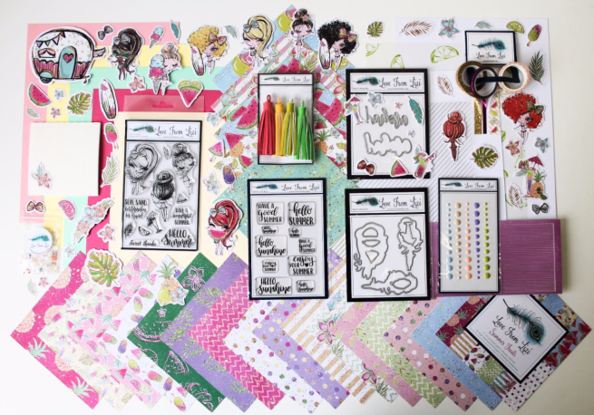
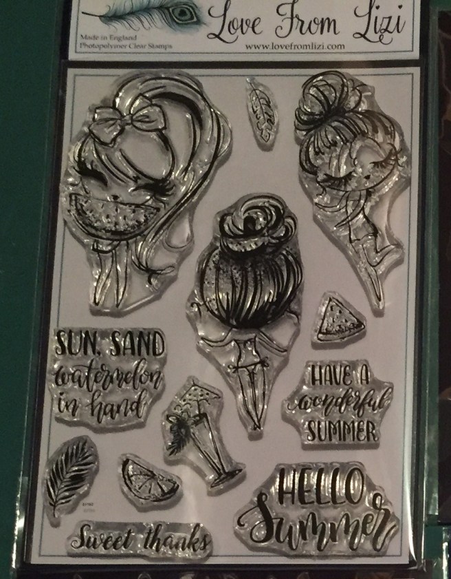
This is our second Love From Lizi manufactured kit in the last year – everything is designed, created and manufactured specifically for Love From Lizi. As usual, we get tons of supplies in this kit and a few surprises! I did get some of the add on products this month including  the two add on stamp sets – “Summer Loving” (on the left) and “Summer Girl” (on the right) which gives me another two of the ‘eyelash girls’ and that terrific camper stamp! Since Lizi provided us with some extra copic-friendly card stock this month, I decided to go ahead and stamp all of the image stamps on a half-sheet of that card stock using VersaFine Onyx Black ink. I grabbed my Spectrum Noir alcohol markers to color everything. I also did a little paper piecing here and there on the girls – can you tell? – the bows, some clothes, and the surfboard!
We did get matching dies for the stamps in this kit, so I did another, “color, cut, and display on the stamp set” picture. 
I did try to match my coloring with the palette of this kit – paper piecing helps – but other than hair, there’s really not a lot to color on these girls – Just lots of skin and lots of hair!
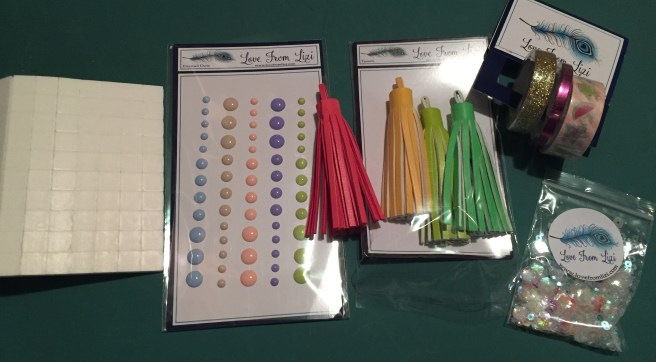
I did cut the 5 colored card stock sheets in half, and used some for card bases and some for card panels… wherever inspiration took me.
Now, I have probably never sent a ‘Summer’ themed card to anyone ever, but you know I like to try to use all the images and sentiments in our stamp sets on my ten cards. I should at least be able to use these four sentiments! We’ll see how successful I am with this kit – some of the props in these stamp sets are pretty tiny – not to mention the extremities on the girls themselves!
There is that “watermelon in hand” sentiment that obviously goes with the watermelon girl, so lets start there! I think we can combine a sentiment or two with her as well!

I die-cut a piece of white card stock with a Lawn Fawn Stitched Rectangle die and ink blended some Lucky Clover Distress Oxide ink around the edges. I thought it would be fun to highlight the five new colors of embossing powders Lizi introduced in the July release – Neon Grapefruit, Neon Lemon, Cherry Red, Neon Lime, and Peony Purple – so I die cut five chevron borders using a Darice Borders die and embossed each with a different color powder. All of those are terrifically bright and fairly fine embossing powders, so I thought I would try them on the sentiments as well, The Neon Lime matches the Lucky Clover ink nicely, and I LOVE that Cherry Red!
I glued the embossed chevron stripes right next to each other along the bottom of the card panel, and matted that to a thin mat of the Raspberry Pink card stock, and glued those to a Pink card base. I attached the girl and the leaf to the card front using the foam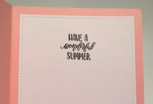 squares included in the kit, and embellished with three blue enamel dots. They match the bow and skirt on the girl perfectly! (both paper pieced) I did continue the sentiments on the inside of the card stamping the “Have a wonderful Summer” on the inside writing surface. I think all three of these sentiments work very nicely together! I like how the Pink and Raspberry Pink card stocks and the green ink blending on the white card panel echo a watermelon! And if that slice of watermelon is any indicator, then that watermelon must be bigger than her head! LOL!
That knocked out three sentiments from our stamp set right there! All that’s left on this stamp set is the “Sweet thanks” sentiment. Since all of our ‘sweet’ images in the stamp sets were very small I decided to turn to some of the images in our pattern papers.

I don’t think we can get any more pink than this card!! The pink grapefruit and lime image, along with the pineapple and the watermelon slices are fussy cut from the pattern papers and arranged together for the focal image on this card. I glued all three cut-outs together and traced their outline on the pink pineapple and lime pattern paper and fussy cut a reverse mat about a quarter of an inch wider. I glued the cut pattern paper to a Raspberry Pink mat and then down to another pink card base.
I stamped the “Sweet thanks” with Onyx Black ink and mounted the fruit arrangement with some foam squares. I did add a couple of fussy-cut pattern paper flowers for a little extra interest and embellished the card with a row of the miniature fruit pieces from the sequin mix along with a few clear sequins. I’m pleased that the pattern papers provide us with some fruit images that are large enough to hold their own on a card front! A very sweet, very PINK thank you card!
My attention was drawn to the ephemera girl holding an ice cream cone that is almost as tall as herself! Seems like the perfect image for this oft repeated sentiment!

I printed this sentiment on a white card base using the Brady Bunch Remastered font and my Silhouette software. I used a stitched hillside die to cut the edge of the ice pops pattern paper and glued that to the left side of my card front. I attached our ephemera girl with some foam squares, added three purple enamel dots below the sentiment and a thin Mauve Moonstone peel off along the edge of the pattern paper. The thinnest pin stripe peel offs will actually follow a curve fairly easily. I like using these ephemera pieces and die-cut images on a white background because it camouflages the white borders.  Did you notice the asterisk at the end of the sentiment? Oh yes… there is more to come! Seems like there’s always a condition when someone says they love you more than something (or someone) else! “Unless it’s mint chocolate chip” is printed on the inside of this card just the same as the sentiment on the front. Now THAT makes me laugh! A nice valentine or ‘love you’ card that doesn’t necessarily have anything to do with summer!
The ‘Summer Loving’ add on stamp set has that “life is better in a bikini” sentiment and one of the girl images that’s actually wearing a bikini is the one with her back to us. That pretty much pulls your focus right to her bikini!! I swear that has got to be one of the tiniest little bikinis EVER!!

I cut a 2″ strip of that lovely blue-green shimmer pattern paper and glued that to the middle of a Mint card base. I stamped and clear embossed the sentiment towards the bottom of that strip. The “is” in that sentiment is so tiny I had to reinforce it with a white gel pen. It would probably read okay stamped on white but it was very hard to read when it was stamped on this pattern paper.
I reached for the new LFL Bubble peel offs in Green Mirror and edged the pattern paper with the medium bubble strips. I like those new Bubble peel offs!! I added a strip of our mauve mirror washi tape on either side and then thin strips of the Raspberry Pink card stock to the outside of the washi tape. The smallest Bubble peel offs fit on those strips perfectly, and I added a super thin strip of both to anchor my girl mounted with foam squares. A few sequins for more sparkle on this shimmer pattern paper and I also stamped the “sea you soon” sentiment on the inside – gives us a little purpose for this card! And it’s a nice pun!
I was eager to use the bonus “aloha!” die included in our kit this month, so I took a scrap of white card stock and did some quick ink blending with Simon Says Stamp Watermelon and Lemon Zest hybrid inks and die-cut the “aloha!” from that.

I also die-cut two more layers from some plain white card stock and glued all three layers together for a nice chunky sentiment. Keeping track of that tiny little dot for the exclamation point was a little tedious, but I like the end result!. I cut more of that shimmer pattern paper with a LFSRD and matted that on a black mat before die-cutting the “aloha!” shadow die from the center. The pattern paper and mat are glued down to a Sunshine Yellow card base, and the die cut “aloha!” glued into that opening. I like doing those reverse mats – it’s a nice way to stretch your card stock! I added the ephemera pieces to the two corners with some glue and foam squares and finished this card with some enamel dots, a little Glossy Accents on the sunglasses, and the “Have a good summer” epoxy sticker in the lower right corner. I like that fact that Aloha means both Hello AND Goodbye! If I only knew someone living in or headed to Hawaii!
I like the “Eat beach sleep repeat” sentiment on the “Summer Loving” stamp set. Particularly appropriate because we have that great camper/caravan stamp as well!

On a Cream card base, I masked off the top third with some post-it notes and ink blended some Spiced Marmalade Distress oxide ink above the line, and some Frayed Burlap Distress Oxide ink below the line. I added some texture to the ‘sand’ with a disposable micro applicator brush and some Walnut Stain Distress Oxide ink. I like the variation that these applicator brushes provide. I added some white dots to the ‘sand’ using a white gel pen and added a thin strip of the leftover blue-green pattern paper for a thin horizon of ocean in the distance.
I stamped the sentiment using Stampin’ Up Early Espresso ink and the birds  (from the SSS “Sea you soon” stamp set) in Walnut Stain Distress oxide ink. I fussy-cut the camper and the surf board girl and added them to the card front with foam squares. It seemed only appropriate to add the “Have a wonderful summer” sentiment on the inside of this card. A relatively simple but very nice beach scene – I really like that camper stamp!
Watermelon seemed particularly prevalent in this kit – let’s play with some puns!

I die-cut the striped pattern paper on an angle with a LFSRD and printed the “You’re one in a MELON” sentiment using my Silhouette software and the BlackJack and Brady Bunch fonts. I cut a mat to size from a scrap of white card stock and covered the edges with our gold glitter washi tape before gluing it behind the pattern paper. Both of those are glued to a Raspberry Pink card base. This is our third girl from the stamp set included with our kit – I fussy cut a slice of watermelon from the pattern papers and placed that in her hands and attached both to the card front with foam squares. Again, we have another watermelon that’s got to be bigger than this girl’s head! Fun pun!!
I couldn’t resist this pun – maybe considered a simple joke – but this cracks me up!
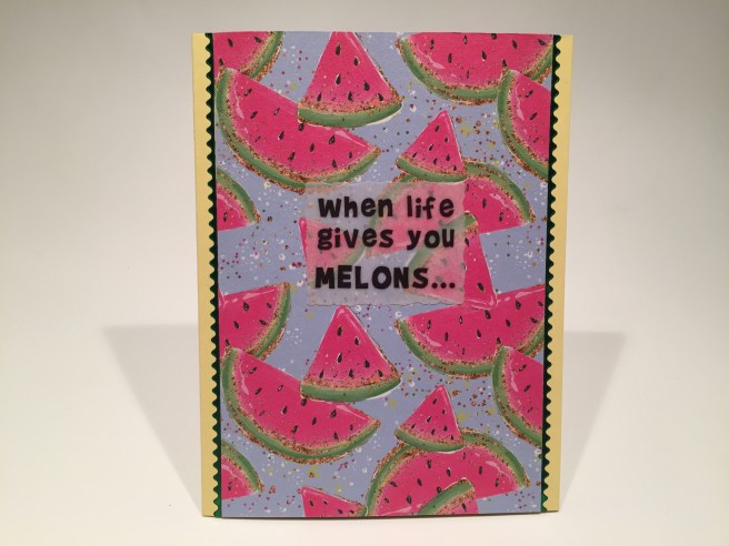
I cut a 3.75″ panel of that terrific watermelon shimmer pattern paper and glued that to a Sunshine Yellow card base. I ran a couple strips of the Green Mirror Sway peel offs down either side and turned to my Silhouette software for this sentiment. I stuck two pieces of vellum together using my Xyron sticker maker and printed “when life gives you MELONS…” using the Brady Bunch font on the doubled-up vellum. I let that dry for a while and die-cut it with a Spellbinders Deckled rectangle die, ran it through the sticker maker again and glued it to the card front.  The big kick comes on the inside with the completion of this sentiment – “you just might be dyslexic!” That makes me giggle every time I say it! I added the small watermelon wedge and the lemon from the stamp set(s) around the inside sentiment to kind of drive home the whole melon = lemon gag. A simple card with a terrifically funny sentiment. Sometimes I just can’t help myself!
The “Summer Girl” add on stamp set had a “Girls just want to have fun” sentiment, and I was a little surprised that Lizi didn’t go for the obvious pun here… it is Summer!!
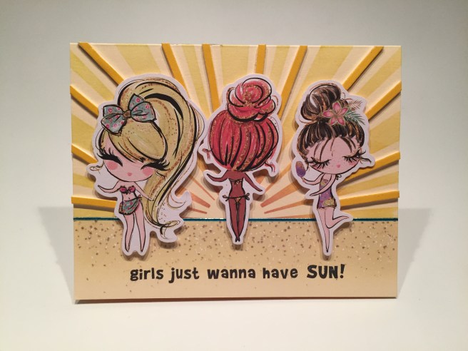
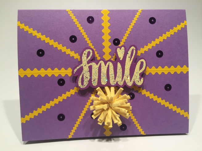
On the Cream card base, I took my homemade sunburst stencil, and using the SSS hybrid  inks and my Cheap-o blender brushes, ink blended this sunburst on the top half of the card front. I did the same technique for the sand as the camper card using Antique Linen Distress Oxide ink (a little lighter). I printed the “Girls just wanna have SUN” sentiment on the bottom of the card front using the Brady Bunch font again, and added my blue ocean horizon line using the new Denim Blue Mirror peel off from the Summer Fruits peel off bundle. I chose three of the girls from the ephemera pack and mounted them to the front with foam squares. I like our center girl facing the sun! Then I cut apart the yellow tassel from our embellishment bag and added the strips to the sunburst on the outside of the girls. That adds a LOT of dimension to the sunburst almost making it pop off the page. Who can resist this practically perfect sentiment? My apologies to Cyndi Lauper!
One more card to go, and I still haven’t used the ephemera camper/caravan or the tiny eyelash girl from the Summer Girl add on stamp set – she seemed a little bit smaller compared to the other girls so I thought maybe…!
I reverse stamped the girl from the “Summer Girl” stamp set and colored her before fussy cutting both girls. I trimmed the white border around the camper and figured out it’s placement on a Mint card panel. I traced around the camper and colored the card panel to look like the inside of the camper, as well as the outside landscape.  I cut a slot for the hinge in the card panel above the camper roof and added a pull tab so it would flip the front of the camper open. I also cut out the window on the front of the camper to give a hint of what’s inside. I printed the sentiment on my last Mint card panel using the Noteworthy and BlackJack fonts, and cut that to match the camper and glued it on the back of the ephemera camper. Everything is mounted to a sturdy black card base with some foam tape and double-sided adhesive, and I finished off the night sky with the smallest sequins and stars from our sequin mix.
This is the first ‘pull-tab flip-up reveal card’ I’ve done and I think I need to finesse the mechanics a bit… but it’s basically just a folded hinge that is a touch ABOVE the slit on the card front so when you pull the tab it flips the image over. If I find a reason to do another one of these type of cards, I promise I’ll do a detailed how-to! I think I was much more interested in creating a plausible scene inside this camper than I was in perfecting this mechanism! I do think this is completely adorable and a pretty cool surprise!
That’s my 10 cards featuring the Love From Lizi July 2019 Card Kit. I think we have a pretty good assortment of cards from this kit – some good puns and jokes and only five cards are specifically summer-themed! And not too heavy on the pink!

I did manage to use all 5 of the girls (6 if you count the reverse stamped girl!) and 7 of the sentiments from the stamp set(s). I didn’t use every single prop in our stamp sets, but I used all of the card stock except one piece of white. I used bits and pieces from 10 sheets of our pattern paper pack (10 more untouched!) and quite a few ephemera pieces. I didn’t get to use the vellum or the acetate specialty papers in our kit – I just didn’t find a need for them, but I did use a little bit of most everything else in our kit! Lizi packs her kits with so many supplies you can make so many more cards from this kit – as is the same with ALL of the Love From Lizi Card Kits!
At posting, this kit and many of the add-on and July release products are still available at lovefromlizi.com. If you go shopping with Lizi, please use my link: http://bit.ly/LFLlink. Thank You!! Even though this is rather a feminine kit, I did enjoy creating these cards – and I know any member of the fairer sex in my orbit would be thrilled to receive one! Thank you so much for sharing your time with me here! Your support and encouragement means so very much to me! If you have any questions or comments please let me know! (you can always click on the CONTACT page at the top of this post to email me directly) Please follow me on Instagram at #cardcutups, and please give my FaceBook page a thumbs up: https://www.facebook.com/cardcutups/ Remember to Pin me, Post me, Like me, List me, share me with all your friends, don’t run with pineapples, and as always… HAPPY CRAFTING!!
DISCLOSURE: This site contains some affiliate links to products. We may receive a commission for purchases made through these links. Thank you!!


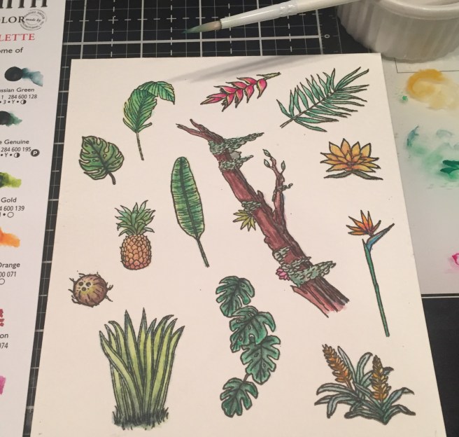
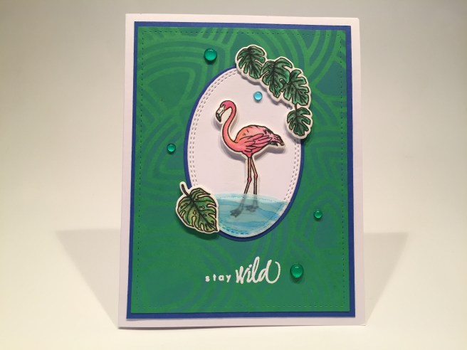
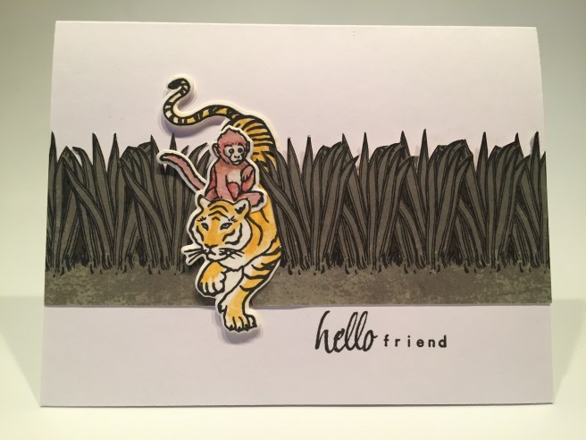
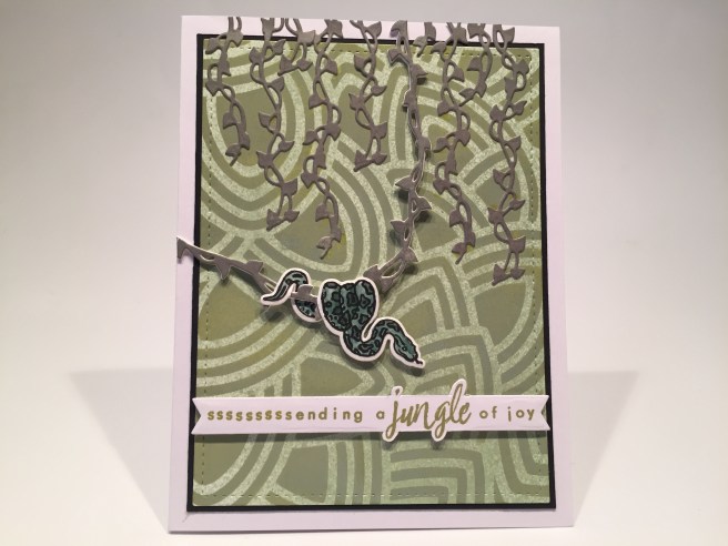
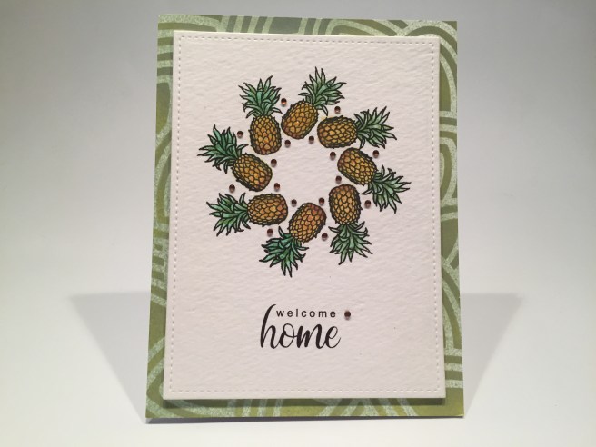
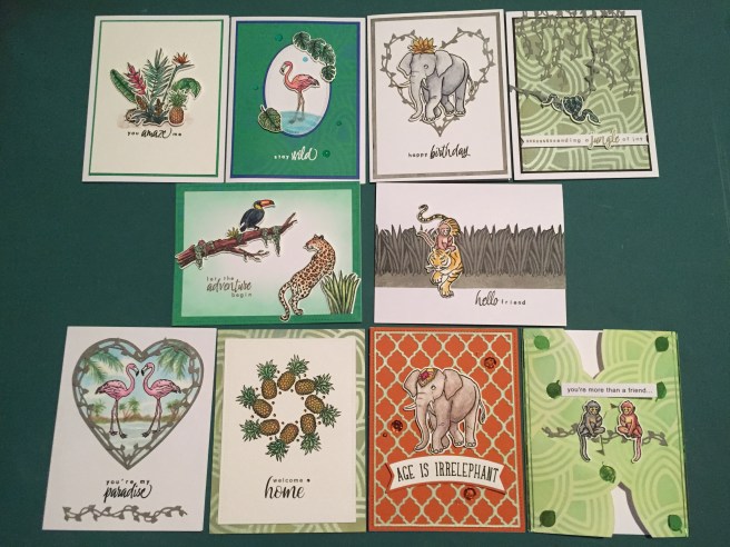
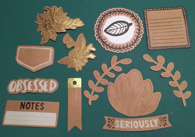
 Flowers and leafy images along with realistic animal images make up our 6″ x 8″ clear stamp set paired with seven different sentiments. Ous dies include twenty coordinating frame cuts along with two Jungle Vine Fancy Dies! We are treated this month to a Daniel Smith Watercolor Dot card “Jungle Palette” created especially for this kit. I guess we’re going to be watercoloring this month! This kit is rounded out with a 6″ x 6″ leaf pattern stencil and a brand new black dye ink cube that is darker than Hero Arts Intense Black ink – they are calling this INTENSE-ified Black Ink. I always love getting ink cubes in our MMH kits – this looks like a great kit to color and play with!


 Of course I justified this sentiment by adding a second sentiment on the inside. Using my


 I fashioned that sentiment to fit my
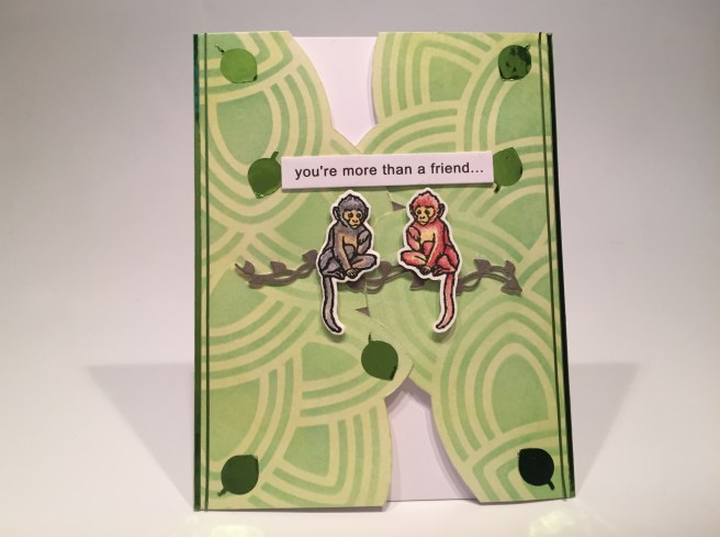


 This month, I decided to cut the card stock in half and use half of each sheet for card bases and trim the other half down to Acard-sized panels. I augmented the card bases from the kit with five white card bases from my stash, and I kind of like the option of having extra colored card panels to play with!
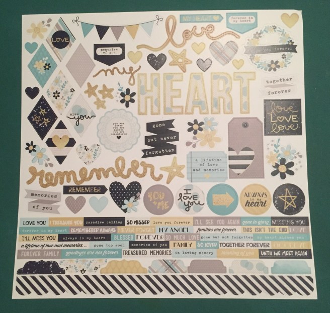
 panels on one side. Along with the two 12″ x 12″ cut-apart sheets also included in this kit, we have an embarrassment of cut-apart riches this month! I think it must have been that teal ombre, the wreath, and the dandelion panel that made me want to play with these. I went right ahead, and, disregarding the patterns on the back of these, cut both sheets down to eight panels. I wasn’t quite in the mood for a sympathy card right off the bat, so I decided to turn one of these panels into a masculine valentine.


 I did go ahead and add a sentiment on the inside of this card. One of the small sentiment strips from the sticker sheet went perfectly with this sentiment and is a great prelude to a personal note. More pretty!
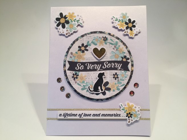


 I actually did a little stamp surgery on the “Forever in our Hearts” stamp from the


 On a Teal card base I grabbed my home-made ‘water ripples’ stencil and stenciled the bottom half of the card base using Salty Ocean Distress Oxide ink. I stamped the sentiment with the same ink and clear embossed that as well. I die-cut the two swans and three water lilies from our White specialty card stock and cut the hearts from a scrap of white glitter card stock. I took some green alcohol markers to the leaves of the lilies and glued everything flat to the card front except for the second swan who is mounted with some foam tape. I added two Teal mirror Sway peel offs (add-on peel off bundle) to the top and bottom edges of this card for a final pop of shape and shine.
  Of course, I cannot leave you without any puns this month, so on the inside of this card we get “You’re the swan that I want” (you are the swan I want – ooh, ooh, ohh, honey!) This is printed on a die-cut white writing surface using the
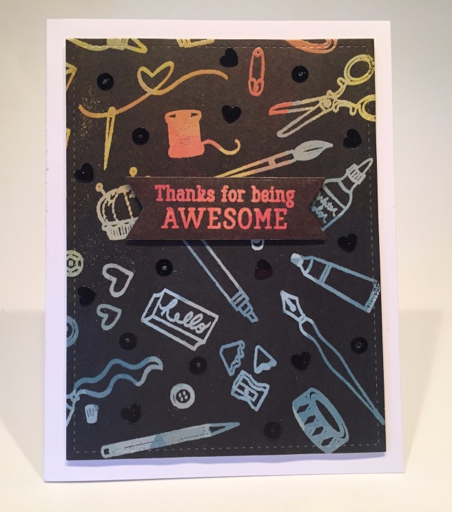
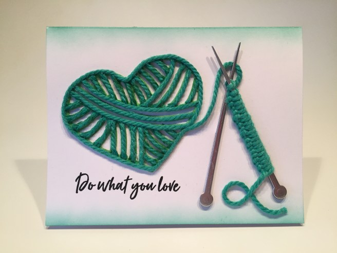
 Kit. Hero Arts is calling this “A Crafty Life is a Happy Life” kit in celebration of their 45th anniversary! This month we get a 6″ x 8″ clear stamp set featuring all sorts of craft supplies from stamping and painting to knitting and stitching along with 11 ‘crafty’ sentiments. We also get 20 matching frame cut dies and 2 Fancy Dies. I like the wide variety of crafty tools included with this stamp and die set! We also get a .5 oz. pot of Purple Sparkle Embossing Powder, a Clear Embossing and Watermark Ink Cube, a roll of Lavender Washi Tape, and five mini clothespins. I swear I have never actually purchased any mini clothespins, but over the past few years, I have acquired quite a large stash of these clothespins… obviously these mini clothespins are a popular addition to card kits and subscription boxes… Maybe I can find an interesting use for these…! If you’d like to follow along with my video, click here:
  I was also completely thrilled to receive an enamel pin marking the 45th anniversary of Hero Arts! Very nice pin in black and gold. Quite a lovely surprise!
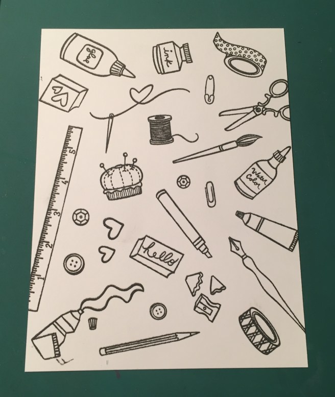

 I did stamp the sentiment on a piece of our Lavender Washi Tape using
  I did decide that I would use the “Handmade with LOVE” stamp on the back of all my cards this month. I do have a personalized stamp and a CardCutups label that I use on the backs of my cards, but I figured this was a good use for this stamp this month!

 I did add what could be the beginning of a long, soul-searching missive on the inside of this card by adding the “hi there” stamp! I’ve always liked cards with “cards” or “letters” or “envelopes” on them, and I really enjoy this “stationery” card. And, if calligraphy wasn’t enough to champion, then the simple act of writing a letter (or sending a card!) certainly is! LOL!
 Now, all “O”s wouldn’t work because then it’s just “OOOOO!” so I thought adding a few “X”s around would make the “O = hug” idea work!! But, not one to let the kisses go unnoticed, I did add “(and kisses)” on the inside as well! This is the
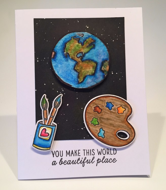


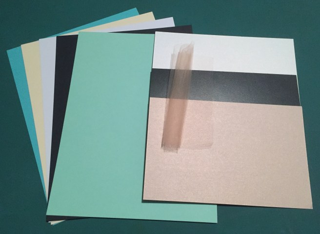


 This kit is stuffed with such a huge assortment of stamps, papers, stickers, dies, ribbons, embellishments and ephemera that it kind of feels like a free-for-all! Almost any card imaginable can be assembled using the supplies in this kit! As usual, I did make my ten A2 card bases using the five sheets of colorful card stock included in this kit. Let’s play! If you’d like to follow along with the video, please click here:
 Naturally, I have a little more to say here and added this (kind of snarky) sentiment on the inside. I printed that using the American Typewriter and
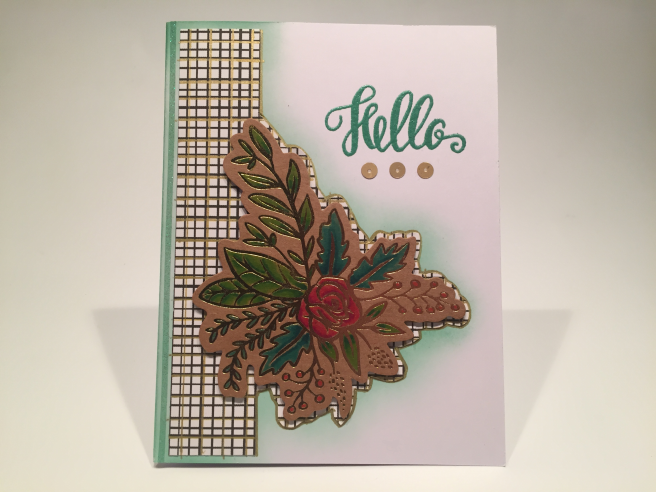
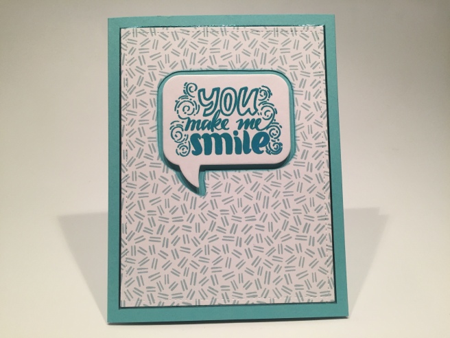
 I did want to expand on this sentiment a little bit, so, on the inside writing surface (cut with a LFSRD) I added “even when I feel like crying” (
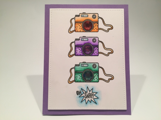
 I also seemed to remember a Love From Lizi sentiment stamp that would go along with this card beautifully! The “Happiness looks gorgeous on you!” stamp is from the LFL June ’18
 I though this was a great idea for a Spring card, and knew I had this “Happy Spring” stamp from my days as a Paper Pumpkin subscriber – this stamp is from the April 2016 Paper Pumpkin kit. I embossed that stamp on some of my yellow card stock using the
 arrangement of the gold foil flowers by using my non-stick craft mat and the die itself. I could move the stickers around and not worry that they would permanently fix themselves to the craft mat. I made a couple of slight adjustments transferring this design to my card front, but this exercise gave me a really good template to follow! I attached the die-cut to the card base with foam tape and arranged the foil stickers around it.
 Knowing that the Nuvo Drops in our kit don’t show their color on black, I reached for my
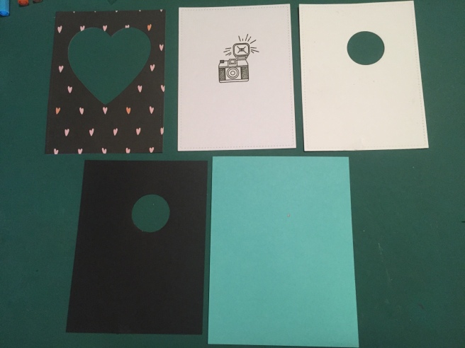
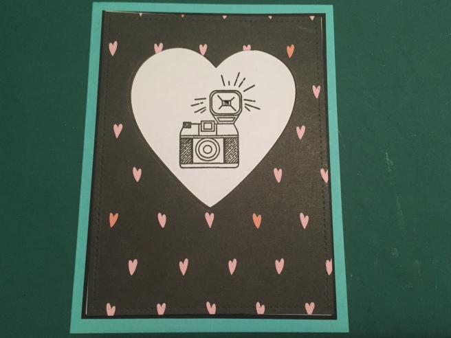
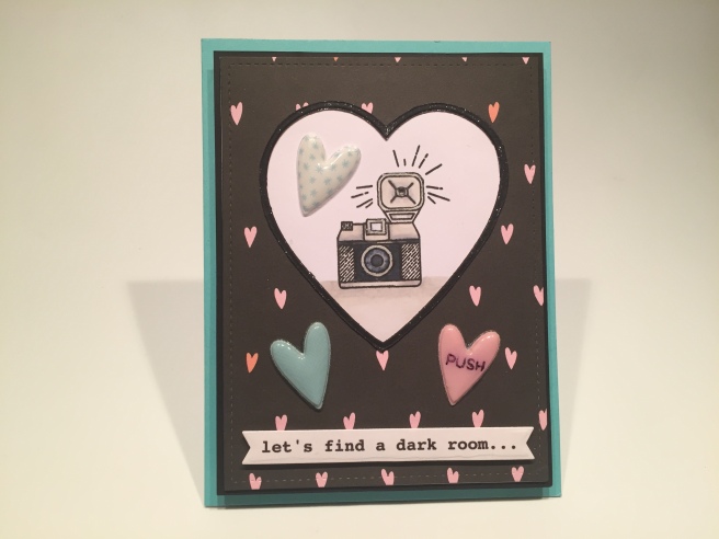
 I glued the puffy hearts in place, and used foam tape to add the sentiment banner. Naturally there is more to this sentiment continued on the inside of this card. Pretty good camera sentiment I think! Great valentine for any shutterbug or photography enthusiast! Let’s see this card in action!
 The z-fold is on the left of the front piece and on the right of the back piece. But we won’t glue them together till the end. I stamped the “PULL HERE” with Onyx Black ink (MFT interactive labels stamps) on both sides of the front piece, and then I covered the three panels and the sides of the two stamps with that fun black pattern paper. I stamped the camera on a piece of Bristol smooth card stock using VersaFine Onyx Black ink and embossed that with LFL Golden Crown embossing powder,
  and reached for my Stabilo markers again to color this. I added the “enjoy this moment” gold foil sticker from our kit underneath the camera, fussy cut the top edge of the camera and then cut straight down the two sides about 3″ making a large square below the camera.
 In addition to the fancy dies, we get a 4″ x 6″ stamp set featuring a number of Italian sentiments, some English sentiments (a few translations!) and an assortment of scene-building images – clouds, birds, a sun, some waves, a cancelled postmark, etc. We also get a collection of the new Hero Hues Premium Cardstock in Sand, Mustard, Pumpkin, Cherry, Plum, Adriatic, and Arctic colors – we get two 8.5″ x 5.5″ sheets of each color and two similar sheets of vellum. I’ve been itching to check out this card stock ever since Hero Arts released it, and I have to say it is extremely high quality and the colors are bright and vibrant! To round out our kit this month we get a Tombow Mono Drawing Pen in black, and two rolls of 1/2″ foam tape (2.2 yards) in two different thicknesses. Perfect additions for layering your die-cuts!
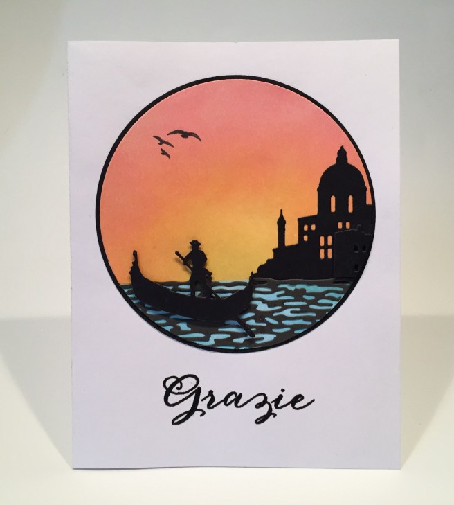

 Now, I have been tempted many times, but I’ve never used the backing card images from our stamp and die set on one of my cards, but the photograph of Venice this month was SO beautiful that I couldn’t resist! Those domes on our ‘building’ die, are modeled after the church seen in this picture – the
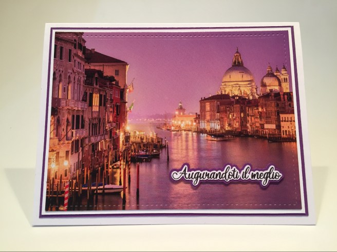
 Since we did a translation on my first card, I figured I would continue that concept here and turned to my

 I even managed to get a couple of those bow-tie pasta (farfalle) stamps on this card front as well! Yes, this printed sentiment is Italian for another one of our stamp set sentiments, so I simply stamped the ‘translation’ on the inside of the card! I think this makes a very effective retirement card – you don’t have to move to Venice for your retirement, but you can certainly travel there – or anywhere else! I really like this colorful ‘travel poster’!
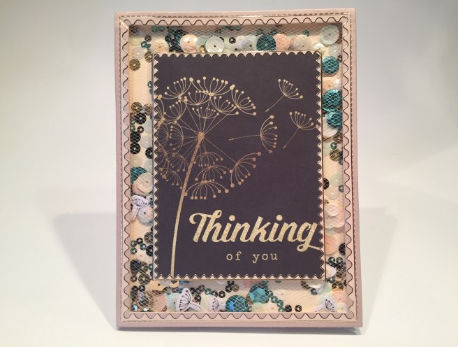
 A final sprinkling of dots using my
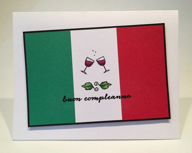
 The red wine echoes the red part of the flag, and the green leaves echo the green! Of course, I did add the “Happy Birthday” stamp on the inside (just in case!) and here we have a Birthday card that is right on theme without having to use any dies! A perfect card for an Italian or an Italophile!


 I think I am most pleased with this very simple yet surprisingly effective sentiment printed with the Arabella font on the inside of the card. I stamped the little sketched heart below my printed sentiment for a bit of a loving touch. I can think of many opportunities to use a card like this! I think this is SO SWEET!!
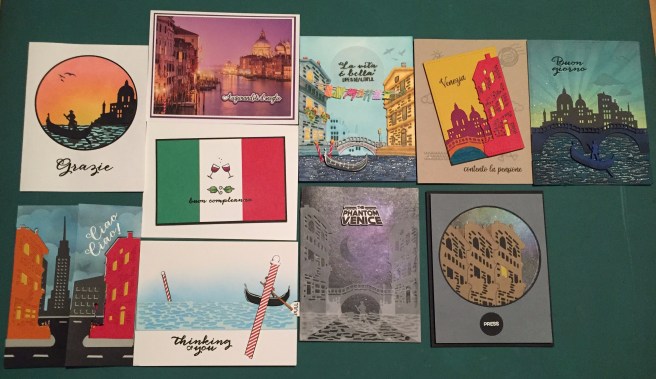
 Lizi is calling this the


 great set of painted
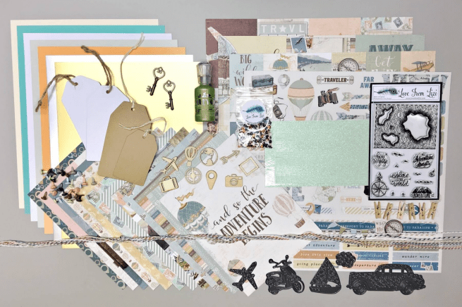

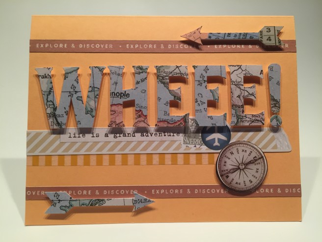
 generally give someone a card when they are going traveling – that’s something they are supposed to send to YOU
 and Ariel fonts, and cut four shadow pieces and glued them all together for a thick chunky sentiment. I mounted the scooter and the sentiment to the card front with foam squares and, true to form, added another bit of a pun on the inside, turning this card into a simple, straight-forward invitation – I think “let’s scoot” is pretty self-explanatory! LOL!!
 I attached the balloons and the sentiment to the card front with foam squares, making sure the two left balloons went over the edges, trimmed their excesses away and added some sequins for a final touch of sparkle. There was also another sticker that went with this card perfectly, so I added that to the inside of the card. “GO FAR” is a great compliment here, making this a perfect graduation or encouragement card!
 I thought the “bon voyage” stamp would work well with this card so I stamped and embossed it on the inside to match the sentiment on the front. This would be a good card to give to someone who is moving (over land or overseas..!) or maybe close friends about to take their first cruise… definitely some possibilities here! At first I thought I would be doing a lot of coloring on this map stamp, but after creating this treasure map, I can’t really imagine this stamp any other way! BONUS: A Very Masculine Card!
 Of course you have to open the card to get the whole sentiment -“You can’t control the wind • but you can trim the sail.” A perfect sentiment for a variety of occasions! I did glue the knot of the twine down to the card front, and added a few Nuvo drops for a little bit of shine. I have to admit, I really like that sailboat die!
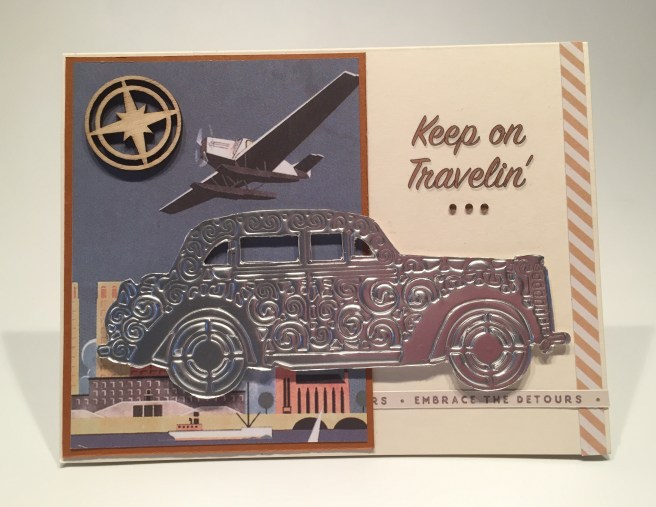
 I can see using this card for retired friends who spend 6 months of every year cruising around in their RV, or any truly devoted traveler!
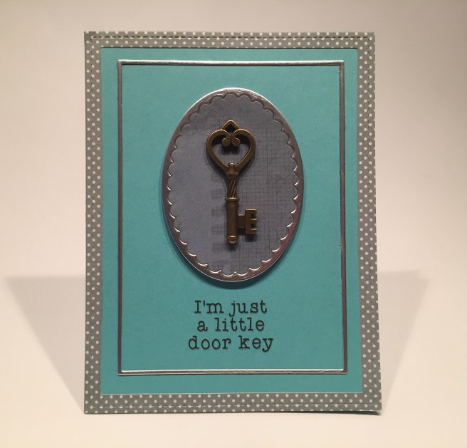
 I used my Silhouette Software to figure out where to print this pun-y sentiment – that is truly one of my favorite things about using that (free) software – you can lay out your whole card and figure out exactly where your sentiment can get printed on your card front! This sentiment is printed on the Aqua card base using the
  I glued the square frames directly to the card front, mounted the oval frame and background to the card front with some fun foam, and glued the key to the middle of the oval with my