DISCLAIMER: This site contains affiliate links to products. We may receive a commission for purchases made through these links.
Hello Folks! Scott here with my 10 cards from the Love From Lizi April 2019 Card Kit. This is Lizi’s “Bon Voyage” Card Kit, and it is stuffed with bunches of pattern papers, embellishments, cut apart sheets, stickers and a great collection of large detailed dies! This kit features a pretty masculine color palette, with all sorts of retro travel images and sentiments that seem to beg for some good old-fashioned collage type cards! If you would like to follow along with the video: https://www.youtube.com/watch?v=0zMeOv7bn5g
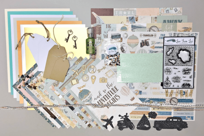
As always, I did make A2 card bases from the fives sheets of card stock in our kit (substituting my own plain white card stock for the LFL super smooth white card stock). I took that collage theme to heart for my first card this month beginning with the ‘half of a large globe’ pattern paper – the one that says “there’s no time to be bored…”.

I fussy cut the globe and “layered” strips from the pattern paper, did a little distress inking (Vintage Photo Distress Oxide ink) on the edges, added some brown and white twine and fussy cut the bottom edges of the banners. I covered the wood-veneer geotag with our Bottle Green Nuvo Drops, and glued that over the printed geotag on the globe, and added a light blue brad to the middle of the curly bracket strip. I trimmed away a single London Bus ticket from another sheet of pattern paper and three small tickets from the colorful ticket pattern paper, and glued those just off-center on the Peach card base, and edged the sides of that with medium thick peel offs from our kit. I did round the right corners of the card base with my corner chompers and used some Vintage Photo Distress Oxide ink to distress the edges.
I stamped the sentiment in the lower right corner of the card base with Distress Oxide Faded Jeans ink, and embossed that with some clear embossing powder. I mounted the globe piece to the left edge with foam tape (being sure to add an extra little foam square behind each banner). I trimmed an EMBRACE THE DETOURS strip from another pattern paper and mounted that across the front of the card with foam strips. I discovered that the cancelled stamp images on the stamp pattern paper actually fit our wood veneer stamp frame, so I ‘white-washed’ the wood stamp frame with a Picket Fence Distress crayon and glued a stamp image to the back of the frame before adding that to my collage with a foam square.
WOW! This card includes pieces from FIVE different pattern papers, two wood-veneer pieces, some twine, a brad, Nuvo Drops, and one of our stamps… now that’s a textbook definition of a collage!! LOL!
This brings me to my one question about this kit. It seems to me that you don’t 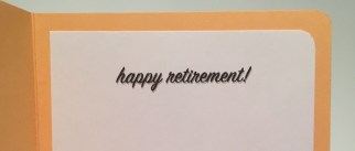 generally give someone a card when they are going traveling – that’s something they are supposed to send to YOU while they are traveling. SO I did make an effort to “find a use” for my 10 cards this month. This card is completed with a “happy retirement” sentiment on the inside printed in the Sign Painter font. That gives this card a definite purpose! Very masculine and multi-layered!
My attention was easily drawn to the dies this month – especially since we are treated to 5 different dies and they are pretty large compared to our standard kit dies.

I thought the scooter die was especially fun and quite unique, and I love this great pun of a sentiment! I cut that die from a piece of our Silver Mirror specialty card stock, glued that to a plain blue card stock from my stash and trimmed the blue paper to match the outline of the die (I did add a touch of grey alcohol marker to the tires and running board). I trimmed a piece of the map pattern paper to 2″ x 5.5″ (there’s more of that collage layering on the left) and glued that to the Soft Grey card base and lined the top and bottom with the “ADVENTURE” stamp in Hero Arts Reactive Blue ink.
I turned to my Silhouette Portrait to print and cut this sentiment using the Sign Painter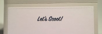 and Ariel fonts, and cut four shadow pieces and glued them all together for a thick chunky sentiment. I mounted the scooter and the sentiment to the card front with foam squares and, true to form, added another bit of a pun on the inside, turning this card into a simple, straight-forward invitation – I think “let’s scoot” is pretty self-explanatory! LOL!!
Let’s talk stickers! As is often the case, when we get 12″ x 12″ cut apart sheets in our LFL kits we frequently get a big sheet of stickers too! Some terrific stickers in this kit!

I couldn’t resist the hot air balloon stickers – all three of them! On an Aqua card base, I stenciled some light clouds on the right half of the card using a MFT mini Cloud Edges Stencil, some Hero Arts Reactive Sea Salt ink, and my life-changing cheapo brushes. Just a hint of clouds in the sky here. I glued down a 2.125″ x 5.5″ strip of our hot air balloon pattern paper to the card base, and added a couple of strips of the blue-green polka dot pattern paper to the two sides. I trimmed out the “The World is Yours” sentiment strip and added that across the bottom of the card front and outlined that with peel offs.
The sentiment is from an old Stampin’ Up stamp set in my stash, stamped in HA Blue Reactive ink on a scrap of aqua card stock from my stash, (really close match!) and loosely fussy cut out.  I attached the balloons and the sentiment to the card front with foam squares, making sure the two left balloons went over the edges, trimmed their excesses away and added some sequins for a final touch of sparkle. There was also another sticker that went with this card perfectly, so I added that to the inside of the card. “GO FAR” is a great compliment here, making this a perfect graduation or encouragement card!
And now I can turn my attention to the very unique stamp set featured this month!

I could no more resist turning this stamp into a treasure map than I could deny my own name! LOL!! I stamped this using Archival Acorn ink on a piece of ‘parchment’ stationery, and added all the little ‘landmark’ stamps on the islands. The ‘parchment’ gave me a little beige color to start with, and I sponged on more Distress Oxide inks in Frayed Burlap, Vintage Photo and Walnut Stain. Then I would wad the paper up and roll it around, open it up and flatten it down, add more inks and wad it up again. I tore the edges, added more inks and wadded it up again, this time I added a tiny spritz of water and rolled the wad between my palms quite a bit. That gave me the distressing I was looking for!
In fact, I distressed this so much, when I went to mark the treasure trail, my markers started bleeding… I finally took a red pen to the path and added a couple of thin strips of red paper for the “X”. I cut a piece of the tan stripe pattern paper to 2″ x 5.25″ and glued that to an Ivory card base. I stamped the compass rose with VersaMark ink and embossed it with the new LFL Copper embossing powder, stamped the sentiment with Walnut Stain ink and embossed that with some clear embossing powder. I added a brown peel off to the right edge of the pattern paper, and mounted the map to the card front with a solid layer of fun foam.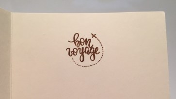 I thought the “bon voyage” stamp would work well with this card so I stamped and embossed it on the inside to match the sentiment on the front. This would be a good card to give to someone who is moving (over land or overseas..!) or maybe close friends about to take their first cruise… definitely some possibilities here! At first I thought I would be doing a lot of coloring on this map stamp, but after creating this treasure map, I can’t really imagine this stamp any other way! BONUS: A Very Masculine Card!
Let’s play with some more of those groovy dies. I had an idea for a sailboat sentiment…

On one of the white tags from the kit, I ink blended this sky using the MFT Cloud edges stencil, Broken China, Salty Ocean and Cracked Pistachio Distress Oxide inks with my ‘life-saving’ cheapo brushes. I cut a couple pieces of the blue-grey striped pattern paper (using the cloud stencil as a template) for the waves – making sure the stripes went in different directions – and sponged their edges with the Cracked Pistachio ink. I die cut the sailboat from the gold mirror specialty card stock, covered the back of the sail with a piece of vellum, and the back of the ‘portholes’ with a scrap of glitter red card stock. The waves and the boat are attached to the tag with foam squares, and now I need a cloud…!
I embossed a scrap of card stock with the new LFL Oh, Holla graphic embossing powder, and die cut the cloud from that – it catches the light brilliantly! (pun intended LOL!) and I glued it directly to the tag. I took the other white tag and covered it with the ‘London Bus ticket’ pattern paper and distressed the edges of that with some Vintage Photo Distress Oxide ink, and tied that together with the first tag. I added 2.25″ strips of the same striped pattern paper to the center of the Soft Grey card base, outlined them with peel offs, and glued the back tag right down to the card front. Then I attached the front tag using foam tape and turned to the sentiment.
I fashioned this sentiment to echo the pattern paper that’s all repeating sentiment strips. Since this was the main sentiment, I made it a little bit larger than the ones on the pattern paper. I printed this in the Arial font (again) and simply cut the whole strip to go across the whole card.  Of course you have to open the card to get the whole sentiment -“You can’t control the wind • but you can trim the sail.” A perfect sentiment for a variety of occasions! I did glue the knot of the twine down to the card front, and added a few Nuvo drops for a little bit of shine. I have to admit, I really like that sailboat die!
I was intrigued by that car die, but I thought I might try dry embossing it instead of actually die-cutting the whole thing. I figured it should be easy to trim out the shape!
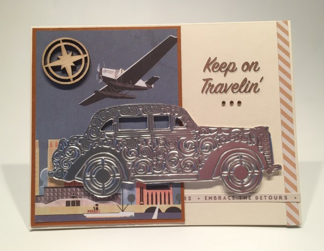
I like that a lot! This sentiment is Rick Steves’ slogan “Keep on Travelin’.” Rick Steves is the travel writer and PBS host, and I love the fact that he believes international travel makes Americans more progressive, peaceful and kind. So very important these days! I printed that sentiment using my Silhouette Software on the right side of an Ivory card base. My favorite cut apart of all our sheets was this 3″ x 4″ plane/city/harbor image. I cut that out and matted that to a thin brown mat, tucked another strip of the “embrace the detours” strip behind that, added a strip of the tan striped pattern paper to the right side of the card front, and glued the cut apart assembly to the left. I’m still trying to keep the collage theme going here!
I mounted the car with foam squares, added the wood veneer compass to the top left corner and added three little copper gems (from the LFL March ’18 Card Kit) under the sentiment for a little bit of sparkle. I did add the “not all who wander are lost” sentiment strip matted on the polka dot pattern paper to the bottom of the inside of the card. I thought it a perfect compliment to the sentiment on front! I love that embossed car! I can see using this card for retired friends who spend 6 months of every year cruising around in their RV, or any truly devoted traveler!
Every time I looked at the 2″ x 2″ cut apart sheet, pieces of a story started forming in my mind… You know I love it when my cards “tell a story” and I thought there was an interesting story to tell using those cut apart pieces. But how to tell that story…?

Yes! This is a ‘waterfall card’! I’ve never made one before, but there are a bazillion how-to videos on YouTube, so I did a little studying and, being my normal, overachieving self, made this six-layer waterfall card. These are really pretty simple interactive cards. The cut apart pieces are 2″ square, I cut 2.25″ mats for each layer from the stamps pattern paper, and the mechanism is cut from 100# brown card stock to 1.75″ x 8.25″ and I scored that at 2.25″, 2.5″, 2.75″, 3″, 3.25″, 3.5″ and 3.75″. I also cut a band of the compass pattern paper at 2.25″ x 8″ to use as the waterfall anchor. For my background, I cut a piece of the plane pattern paper at 4″ x 5.25″ Lets take a look at how this card operates:
LOL! I adore this little “travelogue”! I matched each sentiment square with appropriate travel images tracing our “trip” from inception to return! To assemble the waterfall, you simply glue the center of the compass band to the 2.25″ end of the mechanism (scored) piece. Then I added one of the mats on top of that, and the rest of the mats just below the other score lines. That gives us seven mats. You simply fold the end of the mechanism piece back under the waterfall pieces, wrap the ‘band’ around the background piece and glue it in place. You really only need to glue the band on the back – but I got a little anal, and glued the ‘band’ to the front as well… that (and the thickness of six layers) makes the last flip a little tight. Lastly, I added all the sentiment squares and pictures on top of the mats. I trimmed another piece of the compass pattern paper (1+5/8″ x 4.5″) to mat on top of the pull tab, printed my bonus sentiment “We Missed You!” on that mat, rounded the corners on the brown card stock and the mat, glued them together and added a brad with a piece of twine to the end. Once everything was assembled, I glued the whole piece on a white card base. I am thrilled with my very first waterfall card and I think those 2″ cut apart pieces worked perfectly to tell a little story! Nothing on the inside of this card, just lots of room to tell your friends how much you missed them!
It seems that when I hit card seven or so in a 10C1K post, I tend to start getting a little silly… I’ve used all the sentiments from the stamp set by now, so I’m left on my own!
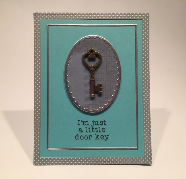
I could not resist using one of the embellishment keys from our kit with this terrific pun! Using my Lawn Fawn Stitched Rectangle dies, I die cut the large frame from the blue-grey polka dot pattern paper. I used two of my SSS Frames dies to cut the thin silver frame, the scalloped oval frame, and the dark blue-grey background. 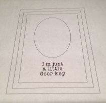 I used my Silhouette Software to figure out where to print this pun-y sentiment – that is truly one of my favorite things about using that (free) software – you can lay out your whole card and figure out exactly where your sentiment can get printed on your card front! This sentiment is printed on the Aqua card base using the Typewriter hand font.
 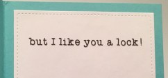 I glued the square frames directly to the card front, mounted the oval frame and background to the card front with some fun foam, and glued the key to the middle of the oval with my Multi Medium Matte glue. (nice and STRONG) This card makes me laugh so hard… especially when you open it and see that there’s more! A terrific friendship card for all the pun-appreciative friends on your list!
On our sticker sheet there were some large letter stickers – “HERE” and “VIEW”. I fiddled around with those letters for a little while and came up with this amazingly fun card.
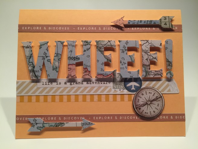
Yes, life is INDEED a grand adventure!! LOL!! This makes me giggle so much! This is my sticker extravaganza card! On the last Peach card base, I glued two strips of the “explore and discover” sentiment stripes to the top and bottom, added a strip of my own striped washi tape under the fake washi tape sticker with the adventure sentiment. I fussy cut the compass away from the long sticker banner and added that to the card front (along with two of the sticker arrows) with some foam tape.
Turns out “VIEW” is about 1/16″ taller than the “HERE” so I evened the letters up by trimming off the bottom of the W and slicing the E between the top and middle legs. That made all the letters the same height, and I took the “I” from “VIEW” and punched out a small circle and cut the remaining letter into an exclamation mark! Just perfect! I think the punctuation actually makes this sentiment work! I mounted all the letters with foam strips and I am a little overjoyed at coming up with a “WHEEE!” card! LOL!!! This is one of my favorite exclamations (especially in texts and on-line) and this card would work for many occasions! From birthdays to graduations and most any type of celebration! WHEEEEEEEEEE!! LOL!!
There were a couple of things in this kit that I haven’t used yet, and that colorful globe from the sticker sheet was calling my name… and I haven’t used the airplane die yet… and I couldn’t help thinking about the original classic Universal Pictures movie logo that had an airplane circling the globe…

For our last card this month, we have a simple interactive pull-tab card!! I cut that globe sticker in half right along the equator, and attached the southern hemisphere to the center of a piece of white card stock cut to 2.125″ x 5.5″. The northern hemisphere is attached directly to the center of the card base. I stamped the small compass rose all around the globe with Hero Arts Soft Sky ink – that’s the last stamp from the stamp set I had left to use! I dry embossed the airplane die in the Silver Mirror card stock, and fussy cut the shape. I made the pull-tab from a 1″ piece of white card stock folded in half lengthwise and glued together, and I stamped the arrow on the end using my MFT Interactive labels stamp set and Hero Arts Summer Sky ink. I added foam tape to the back of the bottom piece to make a channel for the pull-tab and attached the airplane to the pull-tab with a piece of acetate just behind the wings.
I laid the airplane on top of the card front, the pull-tab behind, and attached the bottom half to the card front. (Just remember not to glue the top of the pull-tab channel to the card base – it needs to be free for the acetate to move!) I added two more of our sentiment strips “We are Adventures” and “Wander More” to the top and bottom of the card front and trimmed them with the LFL Clear Silver Mirror peel offs. For a finishing touch and a little surprise, I added the “great adventure” sticker on top of our pull-tab. Very simple but pretty effective – I almost used the airplane sticker here, but thought the airplane die gave us a little bit more bang for the buck! “Let’s Travel the World Together” is a terrific valentine or best friend card. I love that globe sticker!

That’s my 10 cards from the Love From Lizi April 2019 “Bon Voyage” Card Kit! A wide assortment of mostly masculine cards flavored with a vintage collage esthetic! And hardly any pink! LOL! Naturally, I have gobs of supplies still left over… I did manage to use a little bit of most everything… It seems I really liked the pattern papers in this kit… I used 9 different pattern papers so I only have three uncut sheets left… I pretty much decimated the 2×2 cut apart sheet but only used 1 image from the other two… I used a good amount of the stickers but there are bunches still left. I did manage to use a little of most everything in the embellishments bag including all five dies, but I didn’t seem find a use for the clothespins… and I did get to use every stamp in our stamp set! WHEEEEEEEE!!! LOL!! LOL!!
Once again, Lizi has given us a kit loaded with so many interesting and unique products that you can let your imagination take flight (pun intended) and create whatever sets your heart on fire! I enjoyed this kit quite a lot and am particularly fond of all these cards… I did end up with a couple of ‘travel’ cards, but we also have a number of encouragement and congratulations cards, some friendship cards and even a couple of funny puns! A good variety by all counts!!
As of posting, Lizi still has a very few of these kits still available! If you go shopping at lovefromlizi.com please use my link: http://bit.ly/LFLlink
Let me know if you have any questions or comments, and which card(s) float your boat (pun intended!). LOL!! Remember to Like me, List me, Pin me, Post me, Share me with all of your friends, DON’T travel with scissors, and, as always, HAPPY CRAFTING!
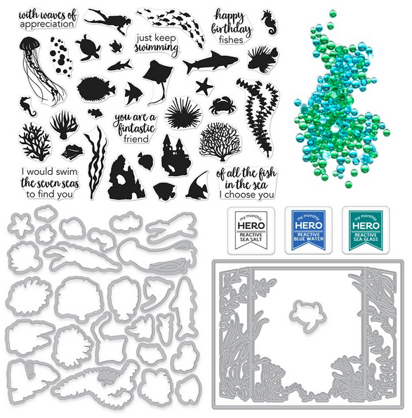
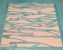 watery effects, I thought a stencil would help, so I turned to my Silhouette Portrait and created this water ripple design which I then cut from some
 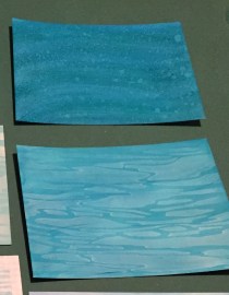 inks (Stonewashed, Sailboat Blue, Stream) blended on yupo paper, and the bottom one is topped off with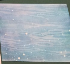
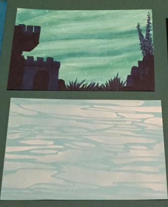

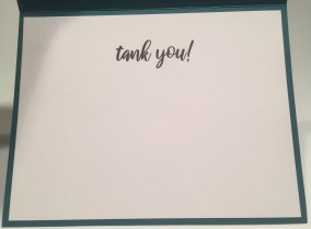 I added thin strips of foam tape behind the aquarium frame before mounting to the card front – that dimension adds a lot to the overall effect!! A few blue and green droplets complete the scene and I couldn’t resist adding to this sentiment with a nice “tank you!” on the inside of the card. I printed that on the writing surface using the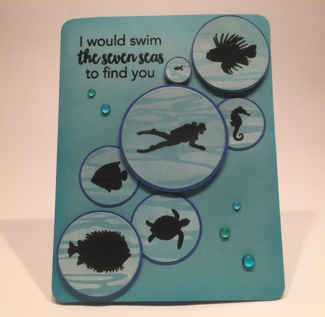
 I added more of the droplets for a little accent of color and shine. Once again, I wasn’t satisfied with this sentiment all on it’s own, so I added “if there weren’t sharks!” on the inside of the card and highlighted that sentiment with an embossed shark stamp! LOL! I think that’s funny! The block letters are the Arial font and the Rustila font is used to replicate the handwriting font in the Stamp set. I like this idea a great deal even if nobody ever notices that there are seven ‘bubbles’… LOL!!

 I did create a little cake template to assist with my stamping, and used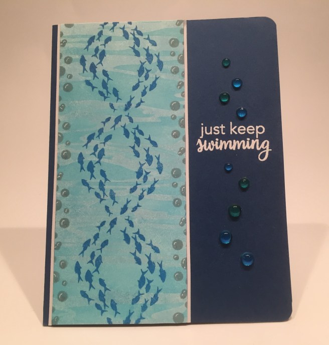
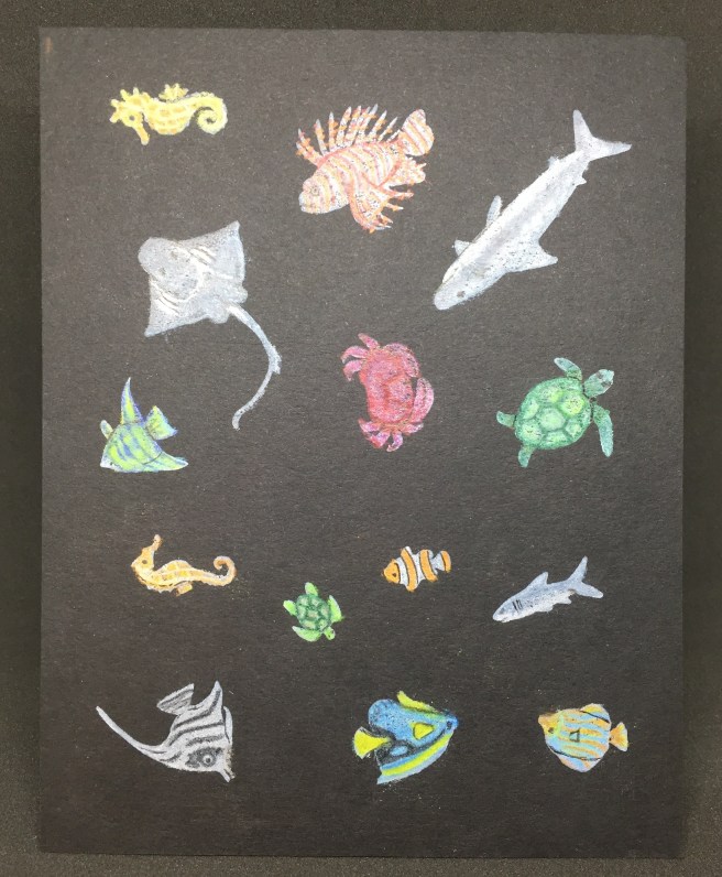

 Of course I have more to say here too!!! LOL! A GREAT pun is all set to be had – I couldn’t stop myself! “you’re a reel catch!” seems almost too perfect! LOL! I love the fact that I’ve got one of the ugliest fish imaginable as the ‘chosen one’… LOL!! Makes me giggle!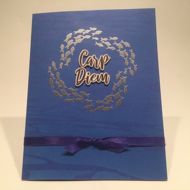
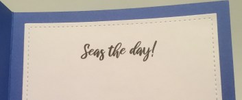 kit matches perfectly. Of course I can’t stop myself, and have more for the inside of this card! “Seas the Day!” really drives it home, huh? LOLOL! I don’t know… maybe I have some kind of a pun disease… do I need a punectomy?? I think this card is terrific fun! Fairly simple, yet highly effective!

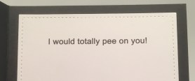 front. The ellipsis indicates more to come, and of course I have to finish this off with “I would totally pee on you!” on the inside. That’s a totally unique friendship / love card if I do say so myself!! LOL! I MUST HAVE A PROBLEM! LOLOLOL!! Oh, my goodness!
 inside of the card: “anemones closer!” OH BABY! Now THAT makes me laugh out loud! Now the three clownfish looking at all the rest of the fish makes perfect sense! I think this is a terrific pun, and so very appropriate! Another unique friendship card! I think I may have broken the all-time pun record with these cards! I guess I do need some professional help! LOL!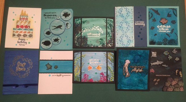


 Powder Pink Party powder before foam taping the sentiment from the decoupage sheet over the pink stripe. A couple of flower stickers from the kit on the top corners adds a finishing touch and I love being able to see the sentiment on the inside of the card! I did add the matching sticker on the inside as well, so the sentiment wouldn’t feel lonely when the card is opened! LOL! Okay, now, that’s pretty darn pink, but I think it makes for a very attractive card! This is a good example of how versatile those decoupage sheets actually are – you can use all the layers or some of the layers – however you would like!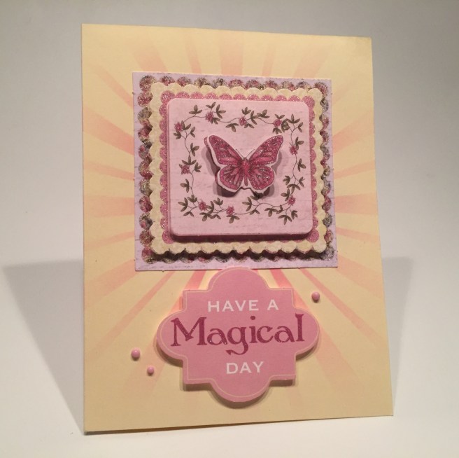
 some
some  I did fall victim to the new “Life Changing Blender Brushes” set that seems to be all the rage these days. HOWEVER, I opted for the
 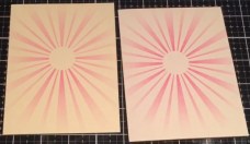 Fence Studios brush set but I can’t imagine them working any better than this inexpensive set! Now here’s a background that really focuses on that great decoupage layering. This first card is layers 1, 3, 5, and 7 from the sheet and this second card is done on a piece of my
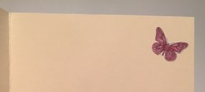 insides for my final touches, and VOILA! Two cards with three layers of decoupage on both! I can only image how thick a card would be if it was made with all seven layers included on this sheet! I’m sure that card would require a box for mailing!! We are still working with a lot of pink here… and I can’t seem to get away from those butterflies, but these are both very handsome (and very pink) cards!
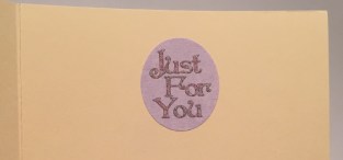 Moondust peel offs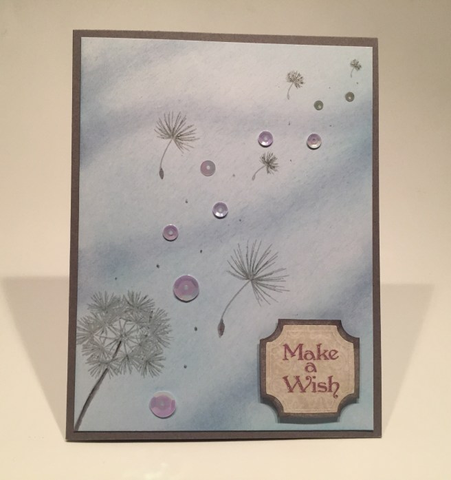
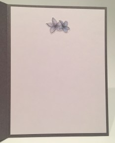 When I was a kid, blowing the seeds off of a dandelion was an occasion for making a wish, so I grabbed this sentiment from the sticker sheets and glued it to a mat of the silver pearlescent specialty paper. I did darken that mat with an alcohol marker to bring it closer in shade to the card base, and I added that to the card front with some foam squares. Some sequins in graduated sizes for a little more sparkle on the front, and a simple flower sticker on the inside adds just the right finishing touch. I really like this card! Putting it together was actually quite peaceful and calming… especially after all that pink and all those butterflies…!! LOL!
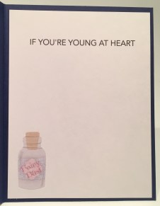 some light touches of
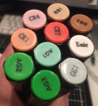 If you are interested, I actually grabbed a picture of the markers I used coloring this stamp. Red Brown (RB), Coral (CR) Alpine Green (AG) and Green Grey (GG) I used the light grey to give a touch of shadowing under all the vines and flowers. Though not immediately noticeable, I think it adds a lot of dimension to this colored stamp! And I only used the blender marker to fix a few “outside of the line” mistakes… OOPS! LOL!
 I love using Deco Foil on stencils – especially word stencils – and the “thanks” and “love” stencils in this kit are large enough to command attention on a card front – especially when foiled! I used my Sakura Stardust pen on all the stamped ‘dots’ to add a touch more sparkle and lined the top edge of the card with with a single Mint Moonstone peel off. Lastly, I defined the writing area inside the card with two of those nice vine stickers from the sticker sheets. Now, this is truly a “One Layer Wonder” card although I did cover the alcohol marker bleed-thru on the back of the card front with a piece of scrap white card stock. So sue me!! LOL!
 This is a great encouragement sentiment and it seems very appropriate with our little fairy stamp..!
 A few golden sequins from our mix highlights the sentiment and I did go ahead and designate this as a birthday card. I stamped the Happy Birthday from the add-on stamp set on the inside accompanied by the matching fairy sticker. I do believe this will be my niece’s next birthday card!! (though it’s 10 months away) I hope the battery lasts!! LOL! I love this card so very much!!! I think my niece will love it too. She’ll be turning 5!
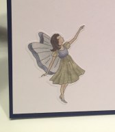 base, mounted the ornament, fairy and sentiment using foam squares, and glued the cord to the top edge of the card. For a touch of bling, I trimmed the ring off the handle of the magic wand and glued that right under the sentiment. With all the sparkle on the fairy and the embossing powder, I didn’t think any extra sequins were needed, but I did add the green fairy sticker on the inside writing surface! Fairy Christmas!! I hope this card tickles you as much as it tickles me! Makes me giggle every time I say it!
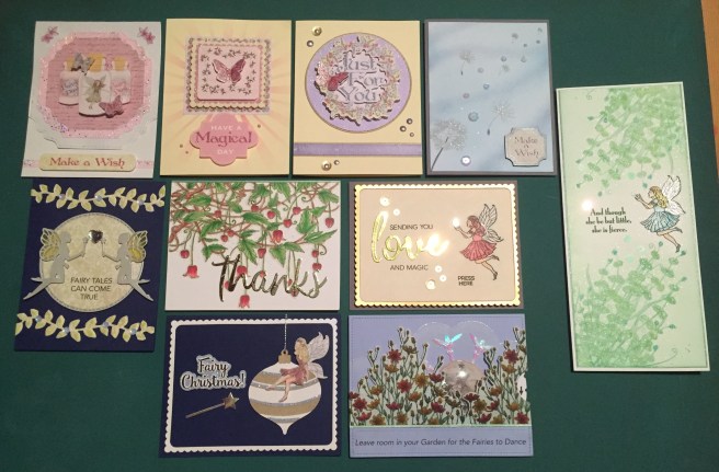 That’s my 10 cards (+1) for the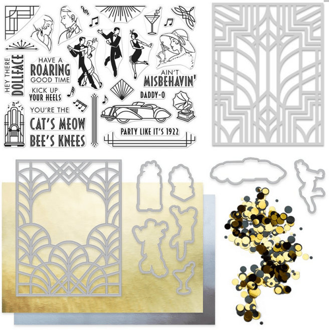

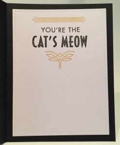 and finished off the card front with some of the gold mirror confetti in all three sizes. No more room on the front of this card, so, I turned to the inside of the card for the sentiment – “You’re the Cat’s Meow” is stamped in Onyx Black ink and the two flourishes are stamped in the Delicata gold again – coordinates very nicely with the card front! Both the front panel and the inside writing surface are glued down to a black card base, and though I wasn’t planning on it, I ended up using 8 different stamps on this one card! That’s a good start to fulfilling my obsession with using all of the stamps on my 10 cards! LOL!!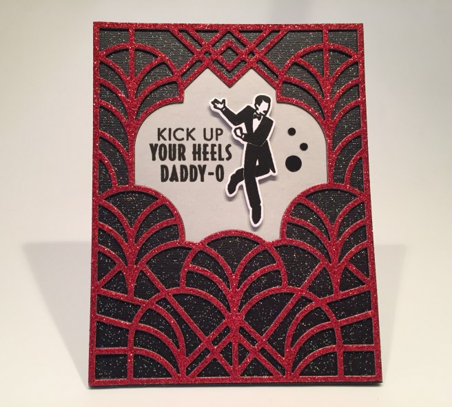
 “It’s Your Birthday! is printed on more of my grey card stock using my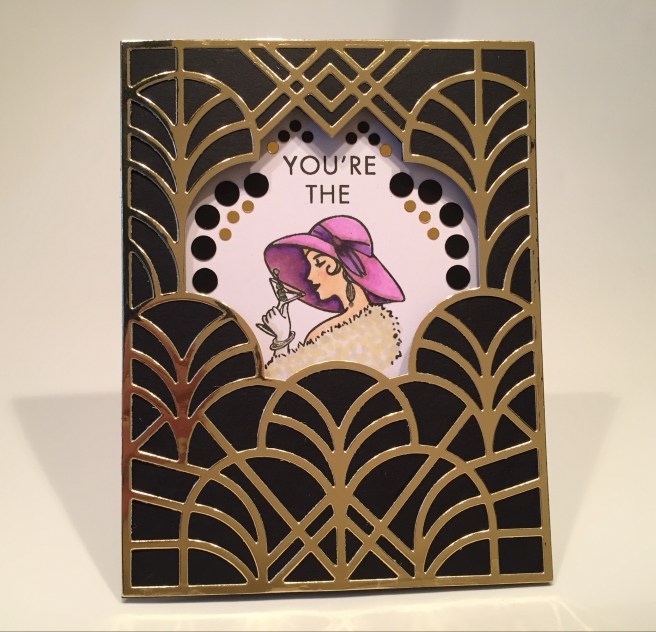
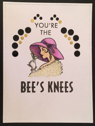 my Daddy-O card was the only combo I found that actually fit an image and a sentiment in the window together. That’s what prompted this card from me and inspired me to cut through the black card front to make this a true ‘window’ card! I did cut the “You’re The” stamp in half so I could stack the words, and stamped that and the lady using Onyx Black ink. I colored her using my alcohol markers and added a lot of the mirror confetti tracing the shape of the window so you still get that art deco feeling when you open the card to see this sentiment completed with “Bee’s Knees”! I like cutting that window through the card front – I think it opens up the possibilities of what you can do with this terrific die.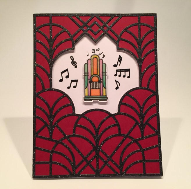
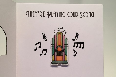 and I think this card would be a perfect anniversary card, or even a simple friendship greeting! I really like having the ‘artwork’ from the front of the card on the inside as well on these last two cards . That fancy die is certainly capable of carrying it’s own weight as a card front while still giving us a peek at what’s inside. Surprise!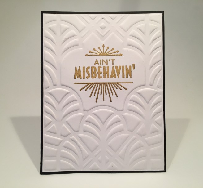
 but the effect still works well! This sentiment felt a little incomplete to me, so, I added “I’m Savin’ My Love For You” (which happens to be the next lyric in the song) on the inside writing surface. (that’s the Phosphate font again) Now that gives some real purpose to this card as a valentine or as any kind of an “I Love You” card! Clean and simple is always elegant!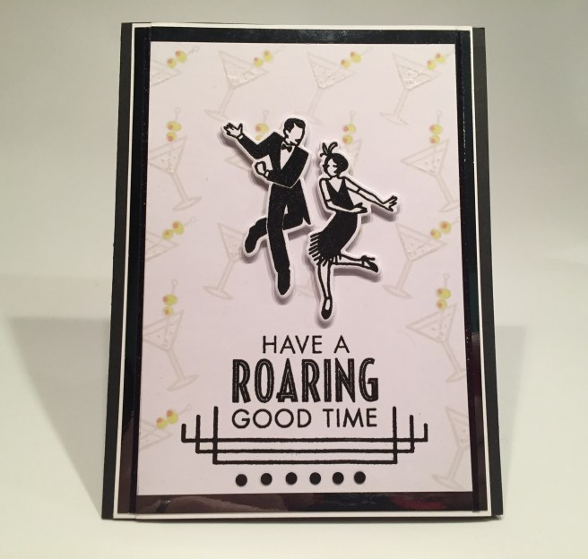

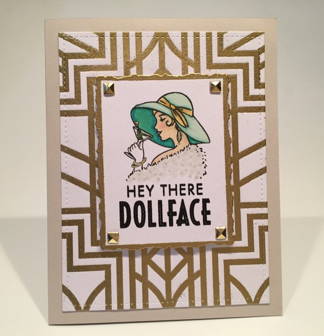
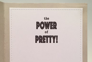 Here again we have a sentiment that feels a little incomplete to me, so I added this fun “the Power of Pretty” on the inside writing surface. I used my Silhouette Software to lay out the inner sentiment and used Courier and Phosphate fonts. I guess that might make this card a little “look-ist”, but I though it was a cute way to complete the “Dollface” sentiment and a terrific encouragement card for any young lady on your list! This stencil works great for embossing – either dry or heat embossing! Or both!
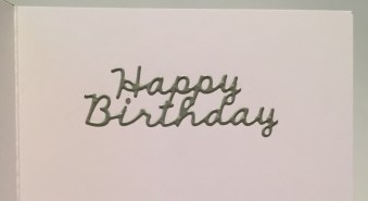 Of course I made this a birthday card with the addition of a die cut sentiment on the inside of the card cut from some shimmer silver card stock from my stash. Of course you would be 97 years old now if you were born in 1922 but I think this would be a fun card to give anyone who was into this time period or was throwing a themed birthday party!
 card base, and added the phonograph and sentiment with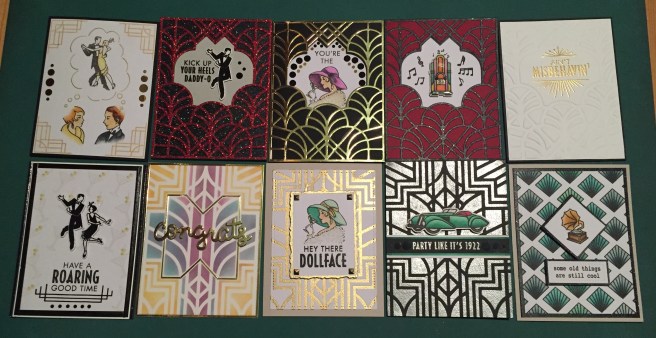



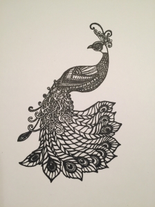
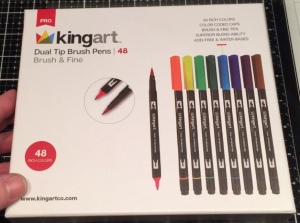
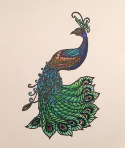 not quite as much movement as I have become accustomed to with the Zig markers. The inks are vibrant and there is a nice variety of colors and shades, and the markers certainly seem nice and juicy! The fine tip is not quite as fine as I would like but, overall, I was very impressed with these markers! Pretty as a peacock!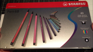
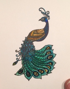 Just as I remembered, these Stabilo pens are super vibrant and colored up my second peacock very nicely. I was VERY impressed with how well they moved on the Bristol card stock and there’s a great variety of colors! I think I think I got little too much color at the top center of the tail feathers where those 10 feathers get very thin… even the 1mm nib on these markers had a hard time giving me a truly fine line… Quite lovely!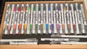
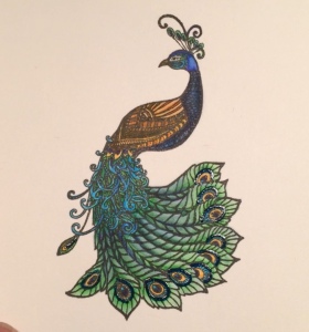 markers move very easily on Bristol smooth card stock, and while I may not have quite the same color selection as the other two sets, you can easily combine colors to get most any color you want! This peacock is a little lighter overall than the other two, but the colors are every bit as vibrant and the shading a little more subtle… this isn’t the best picture of this peacock, but you’ll see how nicely this works on a card. BTW… I did outline the ‘eye’ of the tail feathers on all three of these peacocks with a dark blue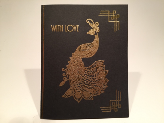
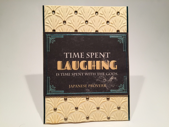 Love this sentiment! I don’t think I have ever heard this proverb before! Since the ‘framing’ on this piece was in teal, I chose to add some of the Teal Mirror peel offs to the outside frame and added little extra touches among the corner flourishes. I also added some Glossy Accents to the ‘LAUGHING’ text for some added dimension and shine. Instead of using pattern paper with this, I decided to use the embossing folder to dry emboss the front of one of the Cream card bases. I did (very lightly) sponge some
  I did consider how I could use this card, so I turned to my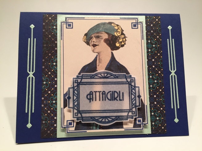
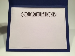 I actually have the same font used for the sentiments in this stamp set in my own font files so I did create a “Congratulation” sentiment on the inside writing surface to finish out the ‘AttaGirl’ on the front. I used my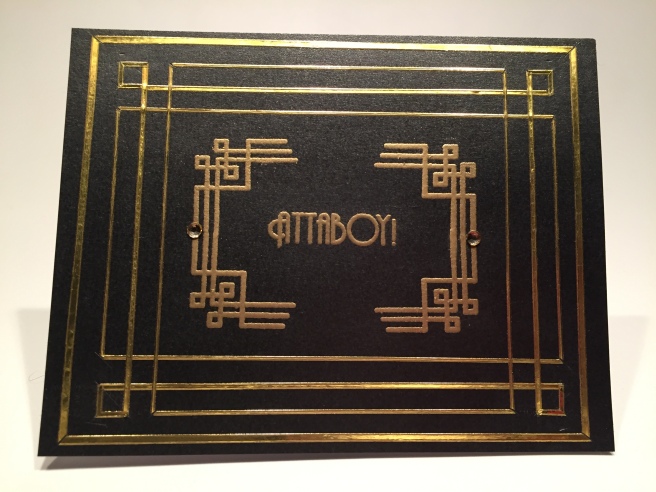
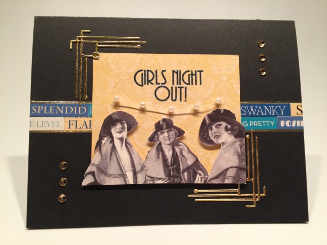
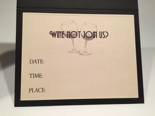 so I turned to my Silhouette Software to create the inside of this card. On a piece of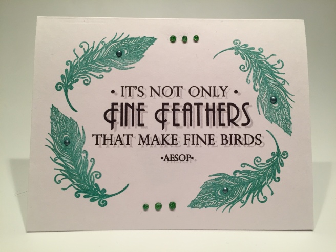
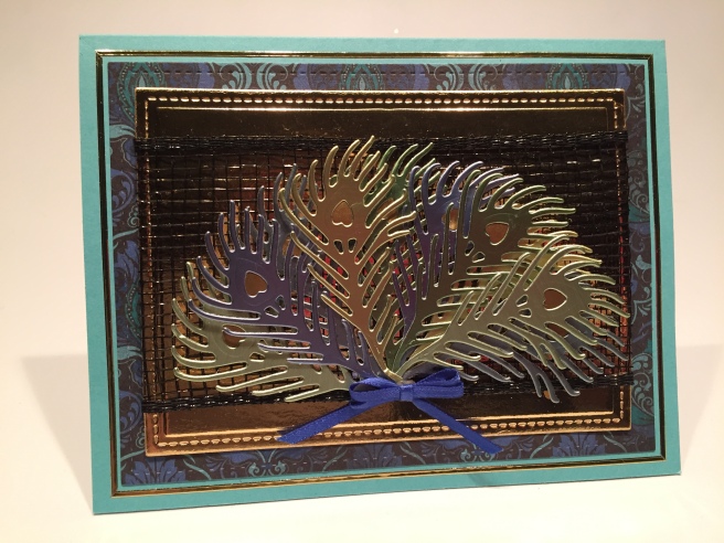
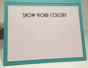 Again, using my Silhouette software and the Andes font, I printed this sentiment on a scrap of white card stock die cut with a LFSRD and mounted to the inside of our card. This is actually printed a very dark blue color with a bit of a drop shadow! I think this sentiment goes perfectly with the shiny colored feathers on the front of the card and all these encouragements go right along with the AttaGirl! theme of this card kit.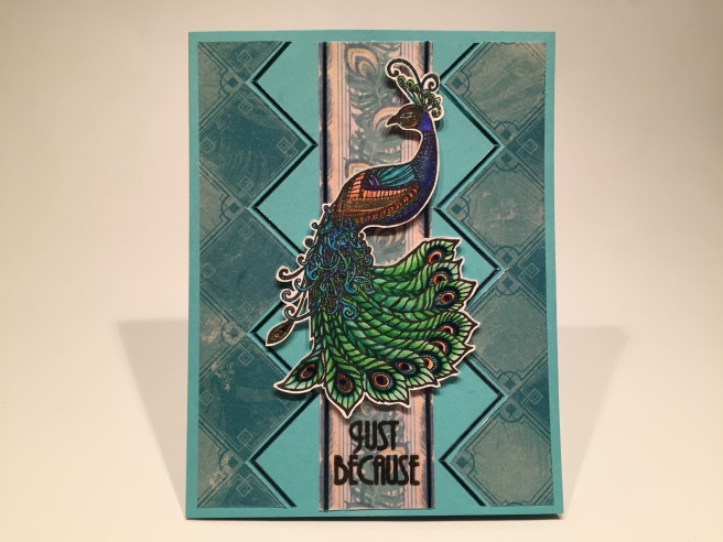
 I mounted that to the card front using 1/16″ thick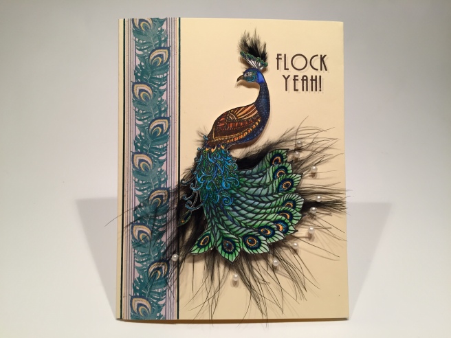
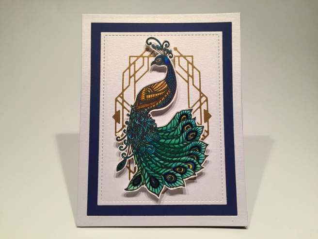
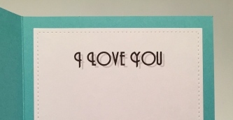
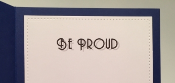 so I turned to my computer one last time to do the “Be Proud” sentiment on the inside writing surface. Another lovely encouragement card to wrap us up this month! I think these last three cards really demonstrate that coloring and cutting that peacock stamp was worth every moment devoted to them!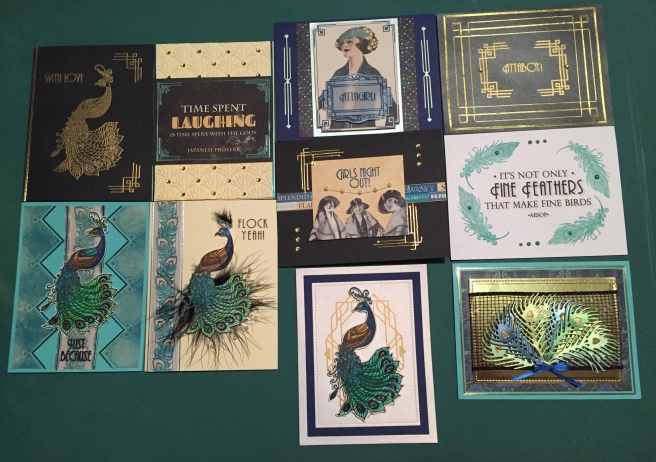
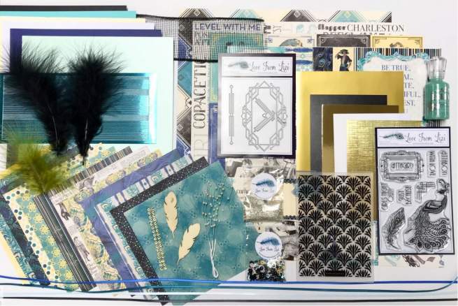





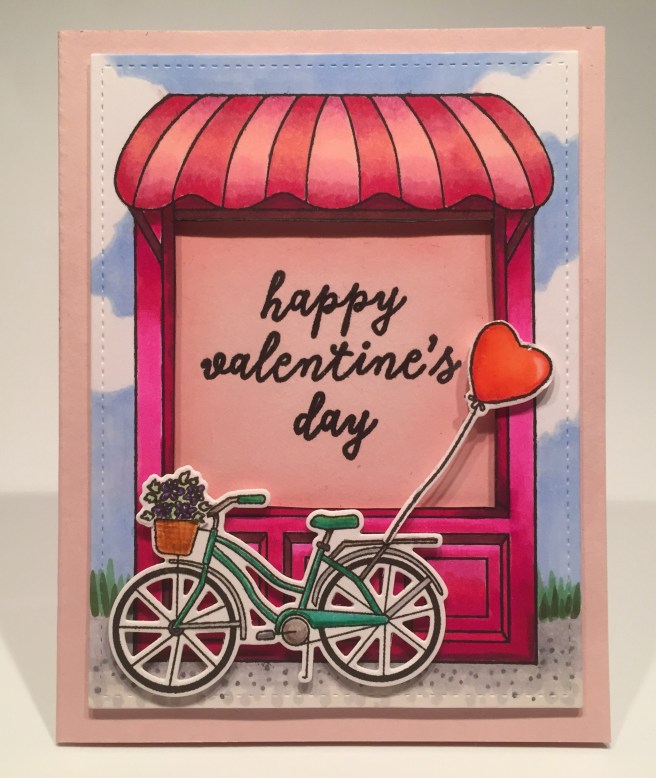
 I was really itching to put together this storefront, and was a little surprised at how large it actually is! Perfect focal point! As I did with the cafe fancy die in August, I found a ‘plant shop interior’ picture on-line, and sized it to scale with the shop before printing it out on plain paper. I glued a piece of acetate behind the window cut out, and added the second awning by gluing the top edge directly to the die cut and then adding foam squares to the bottom scallops. That gives us some great dimension on that awning as well a a place to ‘attach’ the hanging plants.
 That’s a nice valentine pun that actually could be a shop name! I did also stamp “happy valentine’s day” from the stamp set on the inside writing surface to round out the sentiment on the front!


 Just enough color to add a little interest while still preserving the ‘retro’ feel of the image. I added some dots of the Pink Glimmer lacquer along with a few pink crystals and one sequin for a little sparkle and dimension. I did add another valentine sentiment on the inside writing surface of this card and I am over-the-moon thrilled with this shaped wreath! I am going to have to try stamping this again on white card stock and actually try coloring ALL of the flower images… There’s a challenge for ya!

 I printed this sentiment directly on the card stock using my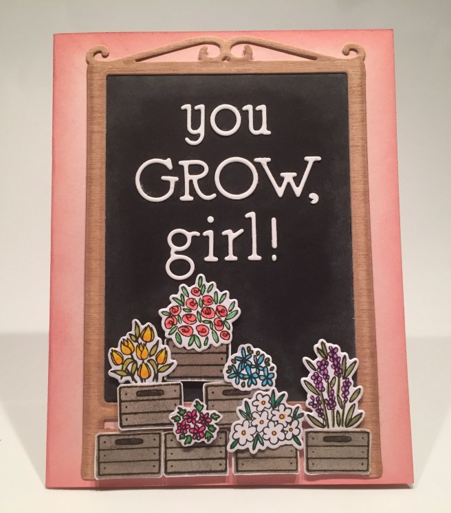


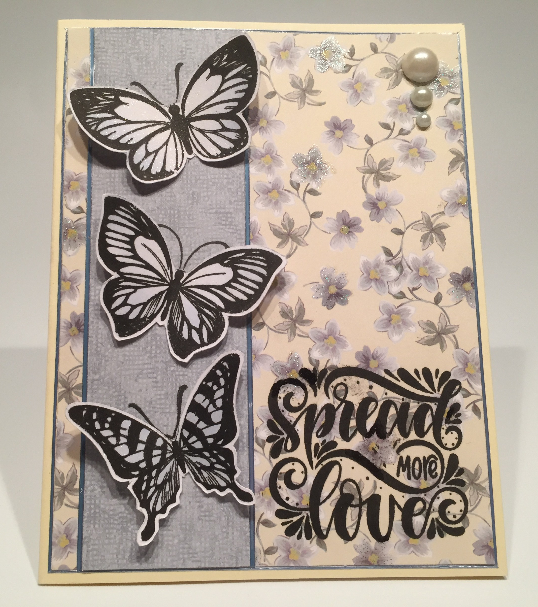


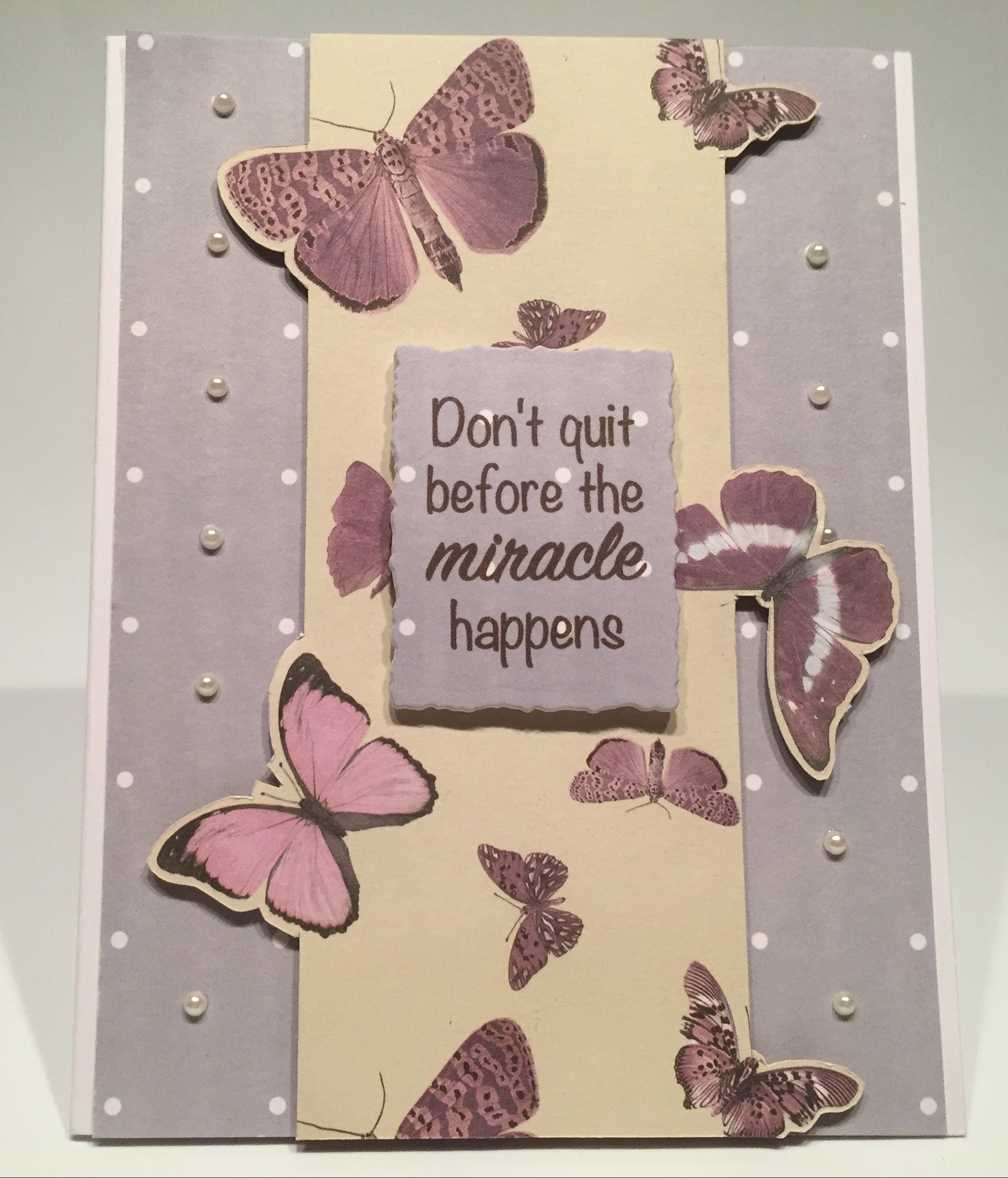


 I took a 4.25″ x 5.5″ piece of the green textured card stock and traced the stencil of this butterfly on the center top and used my craft knife to cut it out. I did the same with a piece of black card stock matching the opening and edges. I stamped the butterfly on a piece of vellum (two or three times) using StazOn ink to get as dark a stamping as possible (I don’t have any black embossing powder). I did stamp and clear emboss one of the butterfly bodies on the pattern paper between the wings and made the body a little longer so the antennae would really show up. I used my Silhouette software again to print “light up my life” in the
  I grew to really like the stamps and stencil in this kit as I worked with them, and am quite pleased with the variety of cards I managed to pull together. I did use all of the stamps in the stamp set (minus a couple bodies) and I believe I used a little bit of everything in our embellishments bag. I think the ‘with love” die was the only item I didn’t use on these 10 cards! Of course I have bunches of everything left over – five full sheets of the specialty pattern papers but only two full sheets of the double-sided pattern papers – that means I used pieces from 9 different pattern papers. It’s always the best feeling to finish up a batch of cards and then realize that you have enough left over to make a whole new batch! Of course, I file everything away in my stash for use whenever and wherever the spirit strikes me!
 CardCut-ups