
DISCLAIMER: This site contains affiliate links to products. We may receive a commission for purchases made through these links.
Hello Folks! Scott here with my 10 cards featuring the My Monthly Hero February 2019 Kit! More Art Deco from Hero Arts this month inspired by the swinging jazz of the 1920’s. If you’d like to follow along with the video click here: https://www.youtube.com/watch?v=2OE7mLUCV9c
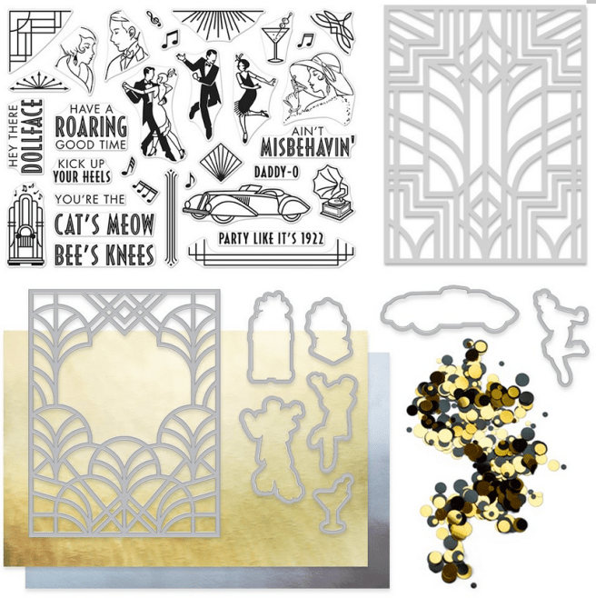
This kit comes with our standard 6″ x 8″ Clear Stamp Set featuring 32 different stamps of period images, and people dancing and quite a number of sentiments, along with 7 coordinating frame cuts and a 4.25″ x 5.5″ fancy die in a stunning art deco pattern. We are also treated to a 4.5″ x 5.75″ Stencil in another very retro art deco design. To round out this kit we get a package of Art Deco Mirror Confetti in gold and black, and 2 sheets of 8.5″ x 5.5″ reflective card stock in gold and silver. Perfect to use with that fancy die!
My last 10C1K post was an art deco inspired kit that featured peacocks, and I used that collection of cards to do some exploration of water color markers. So I decided to challenge myself to only using my Spectrum Noir alcohol markers to color the cards I create from this kit, and, of course, I always challenge myself to use all the stamps in the stamp set as well!
I know most folks will play with that fancy die to start with, but I was very intrigued by the man and woman stamps that don’t have complete heads… I kind of expected there to be some hats in this stamp kit to “finish off” the top of their heads… but no hats here… hmmmmmm… what were they thinking when they designed these stamps? thinking…

I contemplated putting one of the sentiments from the kit in their ‘minds’, but realized that this dancing couple stamp was a close enough match to these folks that they could both be ‘thinking’ about dancing with the other!
I stamped the deco corner stamp in the four corners of my card panel using Delicata Golden Glitz ink, and stamped all the people with VersaFine Onyx Black ink. I did a second-generation stamp for the dancing couple so they would appear more ephemeral. I colored everyone using my Spectrum Noir alcohol markers and tried to keep the dancing couple’s color lighter and more ‘dream-like’. I did sketch the ‘thought bubble’ by hand using an extra fine point metallic gold Sharpie – a good match to the Delicata gold ink –  and finished off the card front with some of the gold mirror confetti in all three sizes. No more room on the front of this card, so, I turned to the inside of the card for the sentiment – “You’re the Cat’s Meow” is stamped in Onyx Black ink and the two flourishes are stamped in the Delicata gold again – coordinates very nicely with the card front! Both the front panel and the inside writing surface are glued down to a black card base, and though I wasn’t planning on it, I ended up using 8 different stamps on this one card! That’s a good start to fulfilling my obsession with using all of the stamps on my 10 cards! LOL!!
OK… even I can’t wait anymore and am dying to start playing with that fancy die, but instead of going right to the reflective card stock included in the kit I reached for some glitter card stock from my stash – you know how much I like my red…!!
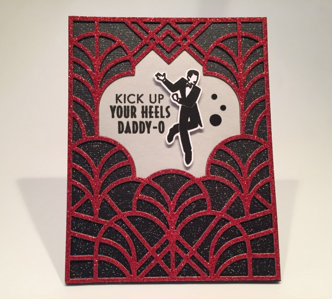
I did a little research on colors associated with the roaring 20’s and red was certainly used quite a bit, so that inspired this card using red and black glitter paper! I die cut the red glitter paper and layered that on top of two more plain black die-cuts before adding it on top of the black glitter card front. That makes the red die-cut pattern really pop off the front of this card! Great texture as well! I did cut that center window from a scrap of my standard grey card stock and stamped and embossed the double-sentiment with some clear embossing powder before gluing that place to the card front. I stamped and embossed the gent on a scrap of white card stock, used the frame die to cut him out, and mounted him to the card front with some foam squares. A few pieces of the black mirror confetti for a little extra bling, and I once again add a sentiment on the inside of the card.  “It’s Your Birthday! is printed on more of my grey card stock using my Silhouette software and the Phosphate font, die cut with a Lawn Fawn Stitched Rectangle die, and glued to the inside. “Kick Up Your Heels Daddy-O It’s Your Birthday” makes this a useful birthday card and uses that ‘Daddy-O’ stamp! And by the way, I have to admit… I LOVE that die!!
Let’s die cut that gold reflective card stock from the kit, and pair that with more black!
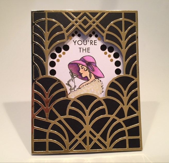
The ‘window’ in this die cut isn’t really very large… you can stamp an image in the window or you can stamp a sentiment in the window, but it’s a little tight to get both – 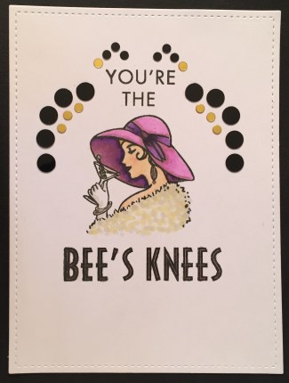 my Daddy-O card was the only combo I found that actually fit an image and a sentiment in the window together. That’s what prompted this card from me and inspired me to cut through the black card front to make this a true ‘window’ card! I did cut the “You’re The” stamp in half so I could stack the words, and stamped that and the lady using Onyx Black ink. I colored her using my alcohol markers and added a lot of the mirror confetti tracing the shape of the window so you still get that art deco feeling when you open the card to see this sentiment completed with “Bee’s Knees”! I like cutting that window through the card front – I think it opens up the possibilities of what you can do with this terrific die.
Let’s do that window through the card front again… but let’s reverse the black and red!
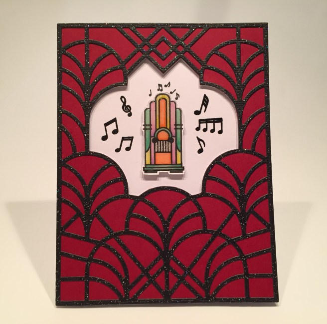
I glued a dark red card front to a white card base and die-cut the fancy die from my black glitter card stock and cut the window through the red and white layers to expose the inside of the card. I really liked this ‘Jukebox’ stamp but I thought it was a little diminutive compared to the people stamps, so I decided to feature it on this card all by itself! I stamped the jukebox and all the extra music notes in Onyx Black ink on the inside of the card and embossed the extra music notes with clear embossing powder.
Before I colored the jukebox, I decided to add a little dimension to it, so I stamped that on another scrap of white card stock, colored it with my alcohol markers, fussy cut it out (without the included music notes) and topped that off with some of the Hero Arts Clear Lacquer pen for some added shine and dimension. A little Sakura Stardust gel pen for the ‘grill’ on the jukebox and you can almost see the records turning! LOL! I had to take extra care coloring these smaller stamps with my alcohol markers but I LOVE how this came out! I didn’t find any sentiments in this stamp set that really spoke to me in combo with this image, so I turned to my Silhouette software again to create my own sentiment revealed when you open the card. “They’re Playing our Song” is printed using another great art deco font called Andes, 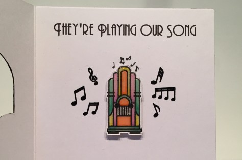 and I think this card would be a perfect anniversary card, or even a simple friendship greeting! I really like having the ‘artwork’ from the front of the card on the inside as well on these last two cards . That fancy die is certainly capable of carrying it’s own weight as a card front while still giving us a peek at what’s inside. Surprise!
There was one more technique I wanted to try with this fancy die before moving on, and this card is the result of some experiments using that die to do some dry embossing.
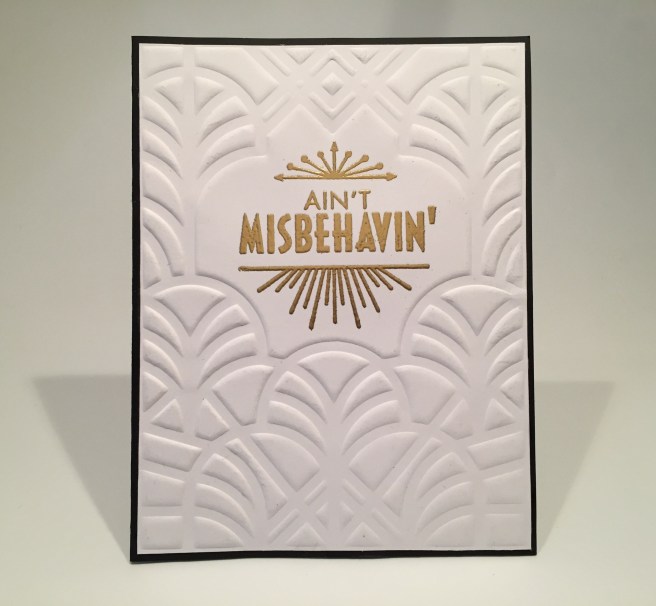
After a few attempts with different weights of card stock, I came up with this embossed background using 80# Nina Classic Crest Solar White card stock. I misted both sides lightly with water, and embossed the back side of the die on the damp card stock. I trimmed the card stock down very close to the edge of the embossing, and glued it to a black bard base. I stamped the sentiment and flourishes using VersaMark ink and embossed those with Ranger gold embossing powder. Unfortunately, I wasn’t able to get the super thin lines in the middle of the letters to register when using embossing powder, but the effect still works well! This sentiment felt a little incomplete to me, so, I added “I’m Savin’ My Love For You” (which happens to be the next lyric in the song) on the inside writing surface. (that’s the Phosphate font again) Now that gives some real purpose to this card as a valentine or as any kind of an “I Love You” card! Clean and simple is always elegant!
I think four cards using that die is quite enough… let’s get back to those dancing peeps!
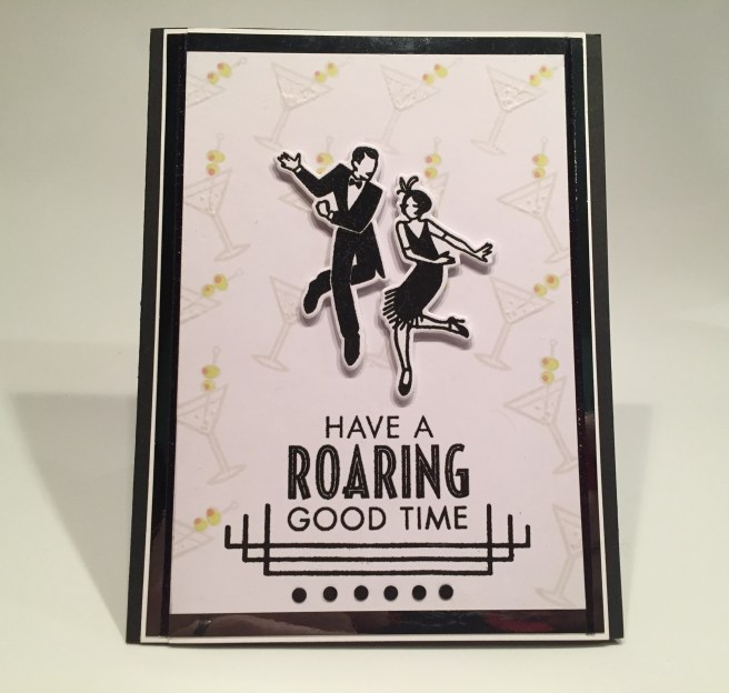
My big challenge on this card was stamping the deco frame under the sentiment. This is much shorter than the actual stamp is, and I was only able to accomplish this using a stamp platform and taking care to get that stamp as perfectly straight as possible… phew! I managed to get that stamped correctly and embossed that, along with the sentiment, with some clear embossing powder. I stamped a pattern of the martini glasses using Simon Says Stamp Barely Beige ink and colored the olives with very light alcohol markers (I love the light pop of color those olives add to this otherwise monochromatic card!). I did add some Spectrum Noir sparkle pen to the liquid in the glasses, though you can’t really see that on this picture. I stamped, embossed and die cut the two dancers and added them to the card front using foam squares, and added a row of the black mirror confetti to the bottom of the card. I glued the front panel to a piece of the silver reflective card stock included in the kit, added a thin white mat around that and mounted everything to another black card base.
Somehow, I got things way off center when assembling this card and I ended up slicing things up a bit to correct my mistakes… If you look closely, you can see an extra seam on the left side of the card front. I did add some Black Glitter peel offs to try to camouflage that seam and that helped a little, but you can still see the fix. It’s really not noticeable at first glance… and I must remember… perfect is something Hallmark strives for! LOL!
Time to start working with that stencil – I believe this is the first stencil I’ve received with a MMH kit since I became a subscriber. Another great art deco pattern!

This stencil is 4.5″ x 5.75″ so it is actually larger than a card front. I taped the stencil down to a piece of Bristol Smooth card stock, masked off the center cross with some painter’s tape and used my finger daubers and Distress Oxide ink in Wild Honey and Abandoned Coral to add color to the four corners. Then I moved the center masking to the four corners and ink blended the center cross with Peacock Feathers and Seedless Preserves Oxide ink. LOVE IT! I die cut the stenciled card front with the largest LFSRD (which just happens to be the exact size of an A2 card) and glued it down to a white card base. I couldn’t bear to cover up much of this fun ink blending so I die cut this Lawn Fawn Scripty Congrats die from the gold reflective card stock in the kit. I though that sentiment needed some more gold accompaniment so I grabbed my Love From Lizi Gold Mirror peel offs to outline the edges and add some gold around the center of the card front. Some tiny foam tape pieces give the sentiment some dimension and it fits perfectly in the center without compromising any of our stenciling! I love the big color on this card and those gold accents go perfectly with the yellows! Wowza!
One of my favorite things to do with a full size stencil is to use it as a stamp – particularly, to use it as a stamp to do some combo heat/dry embossing.
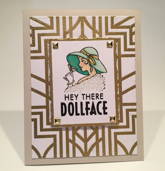
I use my powder tool to wipe down and ‘anti-static’ some white card stock, covered the stencil with VersaMark ink and ran that through my Cuttlebug layered in an embossing sandwich. Added Ranger Gold embossing powder and heat set the background pattern before I die cut the card front with a LFSRD and glued it down to a warm grey card base. I stamped the sentiment and the cosmopolitan lady with Onyx Black ink, lightly embossed the sentiment with some clear embossing powder and colored the Miss with alcohol markers. I die cut the stamped piece with a Spellbinders Deckled Rectangle die and added more gold embossing on the edges of that. I found some gold pyramid brads in my stash that I added to the corners of the stamped piece and I mounted that to the card front with foam squares.  Here again we have a sentiment that feels a little incomplete to me, so I added this fun “the Power of Pretty” on the inside writing surface. I used my Silhouette Software to lay out the inner sentiment and used Courier and Phosphate fonts. I guess that might make this card a little “look-ist”, but I though it was a cute way to complete the “Dollface” sentiment and a terrific encouragement card for any young lady on your list! This stencil works great for embossing – either dry or heat embossing! Or both!
Since this kit is all about the ‘sophisticated glamour’ of the 20’s, I thought heat embossing through the stencil would be another way to add some metallic shine to a card.

I taped the stencil to a piece of (anti-static’d) black card stock and used VersaMark ink right through the stencil and embossed that with Ranger Silver embossing powder. I trimmed that embossed piece down to be my card front and glued it down to a plain white card base. I stamped the automobile stamp in VersaFine Onyx Black ink and colored it with my alcohol markers before die-cutting it out. I embossed the sentiment on a strip of black card stock, added that to a strip of matching alcohol colored card stock and then to another strip of white card stock before gluing that all down to the card front and adding a few black mirror confetti pieces. The auto is mounted with foam squares above the sentiment – I love the pop of the green turquoise with the red upholstery on the silver and black card front.
I did think that the automobile was the one image in this stamp set that really illustrated the time period and compliments the sentiment thoroughly.  Of course I made this a birthday card with the addition of a die cut sentiment on the inside of the card cut from some shimmer silver card stock from my stash. Of course you would be 97 years old now if you were born in 1922 but I think this would be a fun card to give anyone who was into this time period or was throwing a themed birthday party!
I only have 2 stamps left from this stamp set, and I’ve been saving them for this card!

I thought this diamond shaped accent stamp went really well with this old gramophone image! I stamped the diamond in a pattern and colored the verticals rows with Green Turquoise, Aqua Blue and Vintage Blue alcohol markers – I have certainly enjoyed using my Spectrum Noir markers on this kit – it’s always good to keep me practicing, and I’m very pleased with the results. Maybe now I won’t be so hesitant to use my markers on smaller images like this phonograph…! I cut out the image with a Darice Nesting Squares die (in a diamond format, of course!) and matted that on some black glitter card stock, die cut the background with a LFSRD and added a black glitter mat to that as well.
This stamp set had seven sentiments included, so I only have three cards sporting my own sentiments this month, and I really like this playful, slightly snarky birthday card. I created this sentiment using the Courier font and sized it to fit my smallest Lawn Fawn Stitched Rectangle die. I matted that on more black glitter card stock, glued the matted background to another warm grey  card base, and added the phonograph and sentiment with thick foam squares. Love the browns and greens together on this card, and I did add a Happy Birthday (Phosphate font) to the writing surface on the inside. I really enjoy this sentiment inferring that you’re old but still cool! That applies to lots of people! At least lots of people I know! Yup… we’re all getting older every year! There’s no denying it!! LOLOL!
There we have my 10 cards created using the My Monthly Hero February ’19 Kit. I had quite a good time with this kit and I am proud to say that I did manage to use every single stamp in this stamp set! WOO-HOO! I hope I was able to share some unique ideas with you, and a little inspiration and maybe a smile or two!
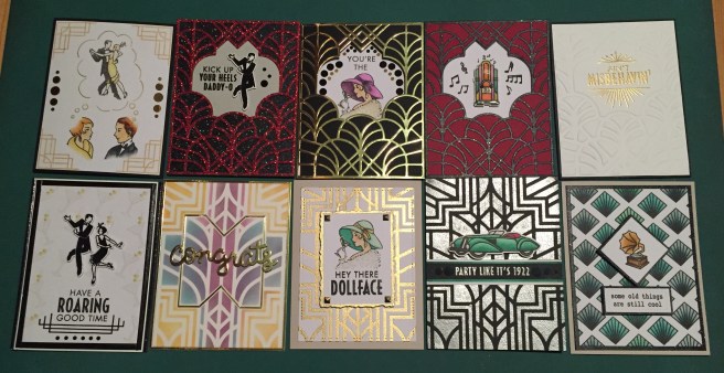
This is a nice variety of cards all together (though it would be easy to just use that fancy die for everything) and we’ve got some great colors on these cards as well! I think I managed to live up to the “sophisticated glamour and swinging jazz of the era” that Hero Arts uses to describe this month’s kit.
This kit is still available at Hero Arts (believe it or not!) and if you’d like to get one for yourself (I think that die and stencil alone are worth the cost!) please use my link: http://bit.l2-18y/2WUoUUzMMH.
There are also other terrific deco items included with the Hero Arts February release. You can shop for those as well using this link: http://bit.ly/2tcO9niHA2-18release.
And this is my general Hero Arts link: http://bit.ly/2sBmuMCHeroArts
Thank you dearly for sharing your time with me here! I always appreciate any questions or comments you my have! Please remember to Like Me, List Me, Pin Me, Post Me, share me with all your friends… don’t run with die cuts… and HAPPY CRAFTING!

You are truly brilliant! All of the Art Deck cards are wonderful.
LikeLike
Thanks Sara!
LikeLike
Holy Toledo! All fantastic – and the Ain’t Misbehavin’ knocked my socks off. Heat embossing with stencils is new to me – can’t wait to try. Scott, what did you use to apply Versamark to the openings of the stencil? I thought finger daubers might work? And I wondered if the partially headless people might nestle into the side curves of the large die, but my old eyes might be misbehavin’. Thank you!
LikeLike
Thank You, Beth!! I have a small VersaMark cube which I apply directly to the stencil/card stock. Finger daubers should work as well! I think you’re right about the stamps – someone else mentioned the same as coming form HA themselves… I like my take on it! LOL! Thanks for the encouragement and support! Tha’s what inspires me!
LikeLike
I didn’t know about the HA suggestion, just trying to figure out the missing skull head-scratcher, but definitely prefer your dreaming-of-dancing-together take as well!
LikeLike
absolutely fabulous makes from this kit. thanks so much for all this wonderful inspiration both outside and inside the cards. You totally rocked this kit.
LikeLike
Thanks so much Aileen!! Always appreciated!!
LikeLike
Hi Scott, thanks for this tutorial. I watched it on YouTube. This was the first monthly subscription I received and was a little uninspired by the theme. You really helped me out and gave me some great ideas! Thanks again! I love watching your videos.
LikeLike
Thanks so much! I’m always glad to be of service!! Spread the Cheer!
LikeLike