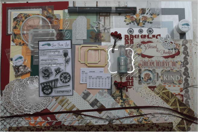
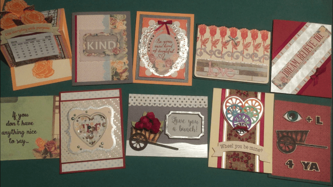
 Hello Folks! Scott here with my 10 cards from the Love From Lizi December ’17 Card Kit. This kit is sold out but some of the items may become available at lovefromlizi.com in the coming months. The pattern papers, sticker sheet and vellum images included with this kit felt very Victorian and Valentine-y to me, so that’s my mind set for this collection. • I was initially interested in the small tear-off calendars included in the embellishments bag, and wanted to do an easel card (a first for me!) featuring one of those calendars. I used a top-folding Peach card base to build on, and stamped out three copies of the blooming rose stamp on Bristol Smooth Cardstock using Distress Oxide ink in Spiced Marmalade. I colored in the stamps with an orange colored pencil and fussy cut them
 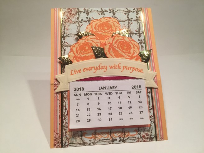 out. I attached the calendar to a plain white mat colored with the Spiced Marmalade ink, and use a touch of the thin burgundy ribbon from the kit to highlight the top of the calendar. I used the ‘trellis’ pattern paper for the main background and added two 1/4″ strips of the striped pattern paper to the sides. I pulled out some Darice Gold leaf sequins from my stash to help define the roses, and cut two super-thin strips of gold mirror card stock for some matching glitz between the pattern papers. I even stamped the flourish from the stamp set below the calendar – fit perfectly! I stamped the sentiment from the kit in Spiced Marmalade Oxide ink on a piece of my ol’ stand-by Staples Ivory card stock and die-cut that with a Darice Banner die. That die fit the calendar perfectly so I just ‘wrapped’ the edges around the sides calendar and attached both pieces to the mat. I wanted the cluster of roses to be the ‘shaped’ top of the calendar when the card is folded into an easel shape, so I attached the roses and leaf sequins to the back of the calendar assembly – I did use some foam tape to add a little dimension and definition to the roses, and scored the card front 2.5″ up from the bottom. I did look through the pattern papers and stickers to find something that would work as a ‘catch’ to hold the easel in shape, but decided that another rose would work perfectly – I stamped a fourth rose on the Ivory
 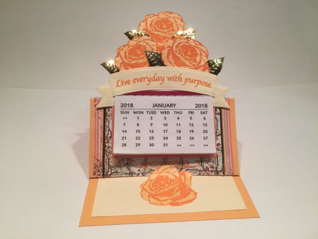 card stock writing surface inside the card, and used my craft knife to cut the top of the rose free so I could curl it up and use it as the easel catch. I am very pleased with my first easel card and I love the fact that it serves as a useful desk calendar as well as a greeting card! And orange roses seem slightly out of the ordinary (yet not unheard of) to me! • Now, I generally don’t think of myself as much of a sticker person, but there were some terrific stickers included with this kit that I was very eager to use. A couple of the stickers actually had the exact same sentiments that were included with the stamp set, so I had to avail myself of at least one of those – “If you can be anything be KIND.” I used a grey card
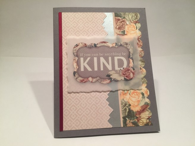 base for this card (because the background of the sticker was grey) and two different pattern papers. I punched a scalloped edge on the lovely floral pattern paper with my American Crafts Border Punch and fussy cut the edge of the pink geometric paper following along with the pattern. I separated the two pattern papers with a strip of the Platinum specialty paper from the kit and added a single ‘soft peach’ peel-off from the kit between the platinum and floral papers. I also added some of the burgundy ribbon to the left edge of the pink paper and glued everything down to the card base. I cut a piece of vellum from my stash with a Spellbinders Deckle Rectangle die and attached the sticker directly to the vellum and used some foam tape to attach those pieces to the card for a little dimension. The vellum helps the sticker pop on top of the pattern papers, and that platinum glimmer paper provides all the shine I needed for this card. A fairly simple card, but I do like the combination of the pattern papers with the sticker. • Now, I don’t think I have ever used a paper doily on any of my cards, but Lizi included 3 silver doilies with this kit so I was determined to use at least one of them! Another sticker caught my eye because of it’s unique shape and terrific sentiment, so I decide to stick with the stickers for another card. This card is on the Peach card base again, and I cut a couple of mats with my Lawn Fawn Stitched Rectangle dies out of the grey glimmer paper and the
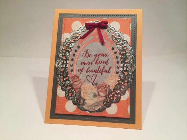 orange and white polka-dot pattern paper. I did cut about a half inch from the middle of one of the doilie to make it more oval instead of round to better match the sticker. I attached the sticker to the doily and glued those down to the polka-dot paper and used foam tape to add some depth on top of the grey mat. I did add some of the grey pearl dots from the kit to the edges of the sticker and I tied a double bow with the thin burgundy ribbon and attached that to the top of the sticker piece. Between the pearls and the silver doily, we have plenty of sparkle and shine on this card. Again, a basic, simple card that feels very Victorian to me. Must be those roses! And, of course, that doily!! • Back to the stamps! I did want to use the nice long-stemmed rose stamp on a card so I reached for the Forest Green card base and a panel of my Staples ivory card stock. Using my Tim Holtz Stamp Platform, I started in the center of the panel and stamped out a whole row of roses in Distress Oxide Fired Brick ink. Using colored pencils again, I lightly colored
 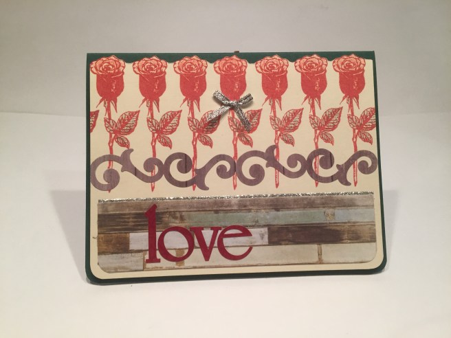 the roses with red and the leaves in green. I like the way the stamps work when stamped with colors and filled in… I think it keeps the cards bright and colorful! The curly-cue border sticker worked perfectly to ‘tie’ the roses together, and, since that sticker is wood-grained, I grabbed the wood plank pattern paper to use as a base for the sentiment. I did fussy cut the top of the roses for added interest – I’m surprised and delighted at how nicely that detail catches the eye!! The pattern paper is glued to the ivory card stock and those are foam taped up on the card base – that helps the top edge pop as well! I did use my WRMK corner chomper to round the bottom corners of all the papers – I don’t tend to do that a lot, but I though it worked especially well with this card. The ‘love’ sentiment is made from the alphabet stickers in the kit, and I centered that over the white boards on the pattern paper. I used one of the silver bows from the kit to ‘tie’ on to the center rose, and decided we needed a touch more silver to help justify that ribbon – the Love From Lizi peel-off stickers in Silver Glitter (from the September ’17 card kit) to the rescue! One thin peel-off at the top of the pattern paper does the trick and provides just the right amount of sparkle for this card. I didn’t want to leave this card just saying “love”, so I did
 add the “You are so loved.” sentiment from the stamp set on the inside of the card (more ivory card stock for the writing surface) with Versa-Mark Onyx Black ink, and added two flourish stamps in the Fired Brick Oxide ink for a bit of decoration. Very Victorian! • I did notice a few people on line talking about the fact that some of the stickers in the kit were way too big to be used on a standard A2 card – well, I’m never one to turn down a challenge, and I particularly liked the ‘DREAM. BELIEVE. DO.’ sticker that was a touch longer than 5 and 3/4 inches – too long for a straight application, but it fits on a diagonal!
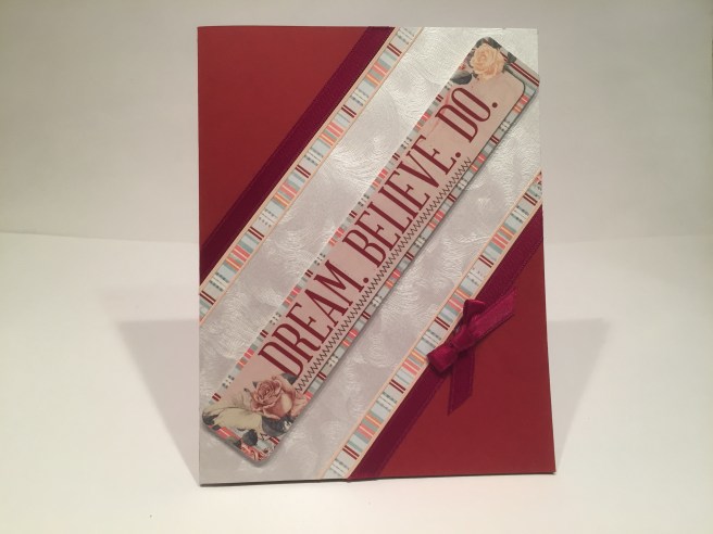 Just barely! On a Wine Red card base, I cut a 2.25″ width of the swirly embossed pearlescent specialty paper (gorgeous) from the kit and centered that corner to corner on my card base. Since the sticker had those stripes as its background, I added two 1/4″ strips of the striped pattern paper to the edges of the pearl paper, and added the thicker burgundy ribbon to the outside edges of the pattern paper, and glued all of that directly to my card front. Of course, I used the peel-offs to define the edges of the card stocks, and, after removing the sticky from the sentiment sticker with my EK Tools Powder Tool, I used foam tape to pop the sticker up in the center of the card. A small, simple bow to accent the ribbon and we have another faintly Victorian inspiration card! I do like that sentiment!! • Now, these first five cards are my ‘serious’ cards from this kit, and things do get a little sillier from here on out. If you have seen my other LFL kit videos you know I like to print on the vellum pieces with my laser printer (at work! – shhhh!!) and then use deco-foil and my Laminating Machine to foil my printed sentiments. This kit was no exception, and I was looking forward to using my Silver deco-foil for the first time! I chose the vellum piece with the door and flowers on the right side, and, using my Silhouette Software, printed my sentiment in Smoothie Shoppe font with my laser printer in the open area of the vellum. I used my silver deco-foil to cover the printed sentiment and ran it through my laminator two times. Success! Excellent silver foiled sentiment that goes along with the silver highlights on the vellum images. I sent the
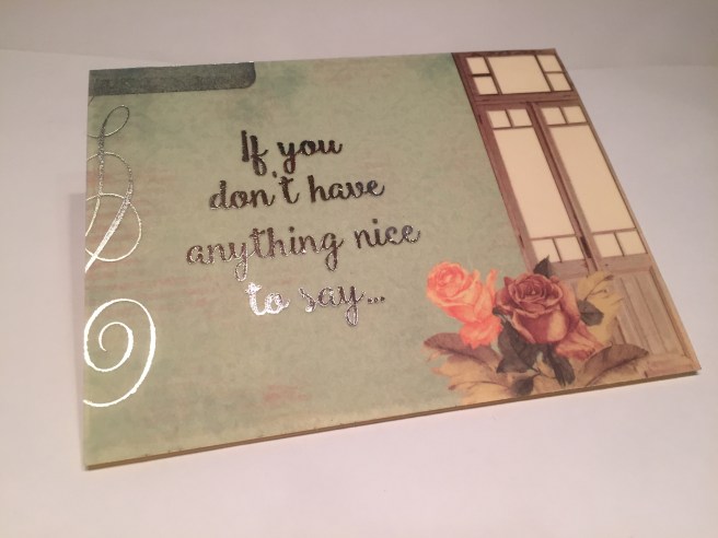 foiled vellum through my Xyron sticker maker and attached the vellum directly to the top of the Ivory card base. “If you don’t have anything nice to say…” Of course, this sentiment is continued on the inside – “come sit by me.” but I didn’t foil the inside of the
 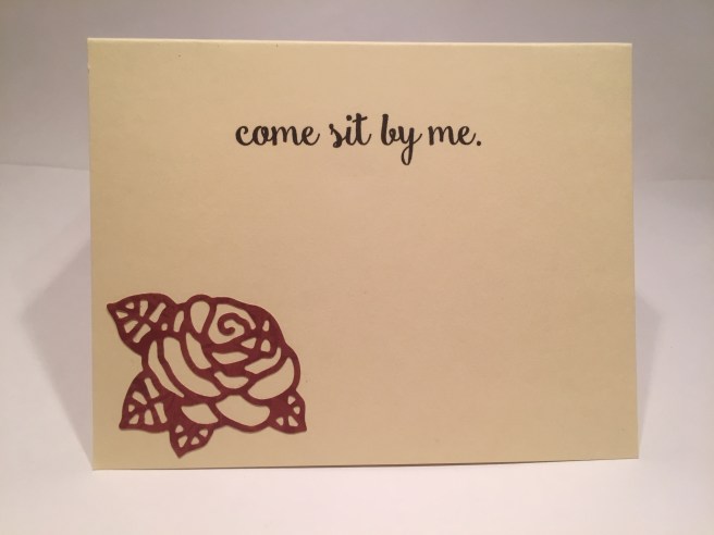 card – just a plain black print directly on the card base and accented with a die-cut rose. That is a great rose die we got with this kit – I didn’t play with it much for this batch of cards, but I know I will use this die over and over again in the years to come! This is a very simple one-layer card that actually packs a good punch!! This card makes me laugh a lot, and I am really looking forward to being able to give it to someone soon! • As usual, we do get a sequin mix in this months kit – Wild Rose is the mix – so I naturally want to make a shaker card! I used the Wine Red card base and the polka-dot vellum piece for
  this card – I was going to attach the vellum piece to my ivory card stock but I didn’t think the blue polka-dots showed up very well on top of the ivory – but I did like the ivory better than white in the open area inside the frame. So, I cut a piece of ivory card to match the frame, glued that in place and then added white card stock behind the ivory extending to the edges of the vellum. That worked very nicely, and the vellum actually gives the white card stock a bit of an ivory tint! Now that my vellum piece is stabilized, I cut out a heart window with my Darice Nesting Hearts die right in the middle, and traced the actual die with an Emboss It pen and embossed that with silver embossing powder. I added acetate behind the window, and used the matching polka-dot pattern paper for a couple of stripes on the card front and as the background for my shaker window. I added a “u” and an “r” from the alphabet stickers to the shaker background, and lightly filled the shaker with some sequins – avoiding the green sequins and not putting too many in the window so they don’t block the ‘u’ ‘r’. A random scattering of the Nuvo Drops (‘Neptune Turquoise’) from the kit match the polka dots and kind of ‘brings the shaker outside of the window’. Naturally, we need to finish this sentiment, so,
 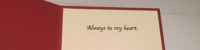 on the inside I stamped the “Always in my heart.” sentiment from the stamp set on the ivory writing surface. SO… “U R … Always in my heart.” Makes me giggle..! • Let’s try that wooden cart stamp now! I stamped the cart in SSS Intense Black ink on Bristol smooth card stock, colored it with my Spectrum Noir markers in TN1, TN2 and TN4 and fussy cut the whole image including the wheel spokes. Now what to put in the cart…? The fabric roses of course! I trimmed down their stems and taped them down to the back of the cart. I did stamp some of the leaves from the long stemmed rose stamp in Distress Oxide Peeled Paint and fussy cut those out to add around the edges of the roses in the cart. I took a piece of the tulle netting and using a light touch of spray adhesive, attached
  the netting to the front of my grey card base. I cut a piece of the wavy lined embossed pearlized specialty paper just following one of the lines to be the ‘ground’ for my cart, and cut a piece of that polka-dot pattern paper for the top. I punched a scalloped heart border with my AC border punch on the pattern paper, and used the Nuvo Drops on the middle two rows of polka-dots. That piece almost feels like an awning on the street! I created the ‘Love you a bunch!’ sentiment on my Silhouette (Ballerina Script font) and printed that on a piece of my Staples Grey card stock. I took one of the wood veneer die cut frames from the kit, and cut 1/4″ out of two of the sides to shrink it down a bit and, after gluing it back together, used silver embossing powder on the top for some shine and an almost pewter look to that frame! All is glued directly to the card front but the cart is attached with some foam tape. I love the way the red roses play off of the greys and light blue, and how they really pop on the front of this card! And a sweet simple pun. • I haven’t used that single wagon wheel stamp yet, but how can I use it and keep to my ‘romantic Victorian valentine’ theme…? And wheel puns are all too easy! I though it would be interesting to see if I could use whole wagon wheels to create a heart shape for this card. I ended up with a bit of a ‘wheel collage’ that I reinforced with a heart shape die-cut from the embossed pearlized card stock and the red pattern paper. After trying
 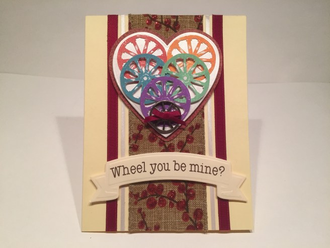 all the wheels stamped in the same brown color (BORING!) I decided to stamp them in all different colors of Distress Oxide ink – Fired Brick, Spiced Marmalade, Broken China, Cracked Pistachio, and Wilted Violet. On the Ivory card base, I ran the wide glitter-berries ribbon down the center of the card, added two thin strips of the embossed pearl card on either side of the ribbon, and added the wide burgundy ribbon to both sides as well. I attached the fussy cut wheels (yes, I cut out the spokes too!) to the heart mats with foam squares and added one of the metal wheel buttons from the kit to the point of the heart. I was actually able to push the thin burgundy ribbon through the holes of the button and tie a little bow on the front. I created the “Wheel you be mine?” sentiment with my Silhouette software in Typewriter Hand font and printed that on my ivory card stock and cut it out with the same Darice banner die used on my first card. A sweet simple pun on a bit of a wacky valentine card – I’m surprised that the rainbow wheels actually seem to work on this card – I almost went back to the brown wheels at one point, but I’m glad i didn’t! • And now we are at the final card for the month! I debated this card for quite a bit, but was ultimately won over when I figured out how to ‘sell’ the idea…!
 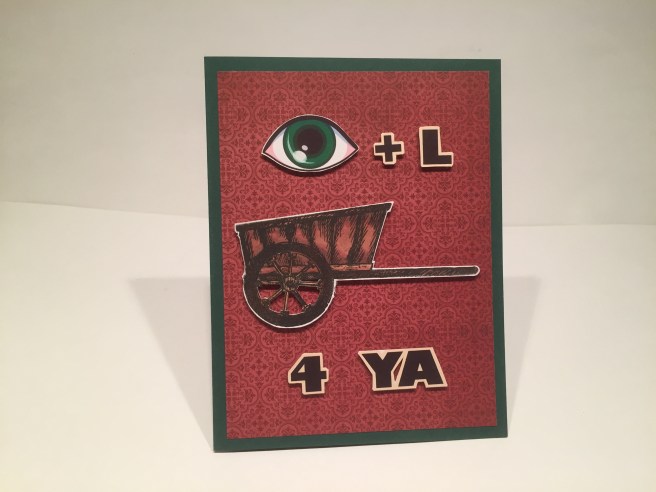 Here we have another rebus puzzle… I stamped the cart in SSS Intense Black ink on Bristol smooth card stock and colored it with my Spectrum Noir markers in RB1, RB2, and RB4. I found the eye (in green to match the card base!!) on line, and printed the letters in Gaudy Heavyface BT font and fussy cut and foam taped everything to the red pattern paper background. SOOOOOOOOO… the cart – which is not a wheelbarrow because it (appears) to have two wheels, is also known as a ‘tumbrel’ (if you have ever read A Tale of Two Cities you’ll remember the term) SOOOOOOOOO… the rebus reads “I’ll tumbrel for ya” If you were listening to rock and roll in the early eighties you remember Culture Club (Boy George) and “I’ll Tumble 4 Ya” was one of their first big hits. ANYHOW…! I thought this addition to the inside of the card would help the unknowing.
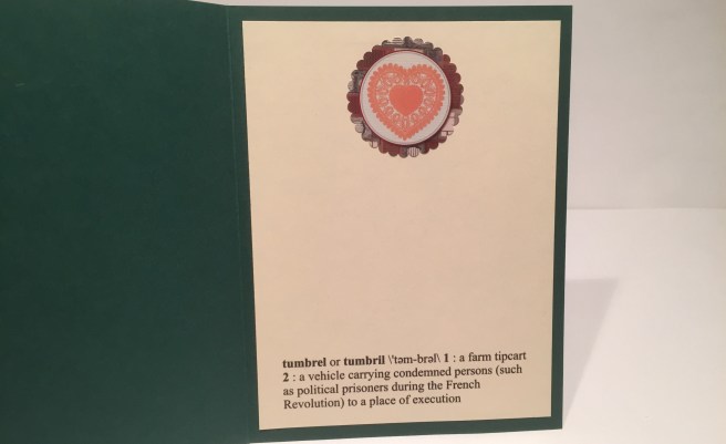 This is the actual Webster Dictionary definition of tumbrel… and naturally, I wouldn’t give this card to anyone younger than 50!! LOL! This may be off the beaten track, but I do think it makes a handsome card, and heaven knows, it has given me a lot of good hearty laughs, and I hope it gives you a giggle as well!
 • That’s my 10 cards for the Love From Lizi December 2017 Card Kit – I hope I was able to provide you with a little crafting inspiration (whether you get this kit or not) and a smile or two. If you like this style of card kit I highly recommend subscribing or at least following LoveFromLizi.com to be able to pounce when the next months kit is offered! Thank you so much for sharing your time with me today – If you have any questions or comments don’t hesitate to say something and if you go to the Contact page, you can email me directly! Please Pin and Post and Share me wherever you can! Happy Crafting!
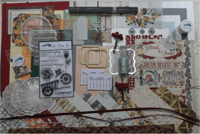 This month, we go back to receiving a Chameleon Pen in RD5 – Burgundy. Love a deep red and this should provide just that!
 Once again, Lizi is featuring 5 sheets of letter-size card stock (8.5’x11″) in Wine Red,
  Ivory, Peach, Forest Green and Grey. I really like being able to make full-size A2 cards (makes measurements for matting and layers easier!) instead of the slightly-slimmer card bases made from A4 papers. I hope Lizi keeps giving us letter-size card stocks! We also receive a 12″x12″ sheet of vellum in our kit this month! I always look forward to the
 vellum images included with the LFL kits and this month is no exception! Foil embossed in silver, and featuring some beautiful floral images, and a wagon wheel, and even a skull with foiled antlers (hope that’s not one of Santa’s reindeer! LOL!). We are also
  treated to a 12″x12″ sheet of stickers this month featuring a complete alphabet and lots of
 sentiments with floral highlights. Looks like dark red, silver, and lots of flowers are being featured in our kits this month! Not very New Year’s oriented, but Valentine’s day is coming soon, so this included piece of white tulle should come in handy when making Valentine’s Day cards! This is a very sturdy, stiff tulle and should be fairly easy to work with! (ruffles, anyone?? LOL!) Now we get to the specialty papers included in this month’s kit, and they are very special indeed!
 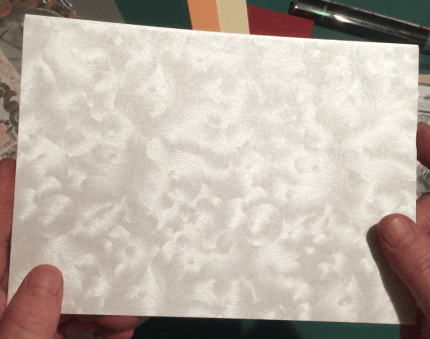 We get three half-sheets of this beautiful pearlescent white card stock in three different patterns – this swirly, almost painterly pattern,
 and a wider softer wavy pattern on the third sheet. These are totally gorgeous papers – the movement that happens when the light reflects on these papers is almost magical! I’m looking forward to playing with these!
 To finish out the specialty papers, we get two quarter-sheets of glimmer card stock in Platinum and Slate Gray. Both of these measure 4.25″ x 5.5″ so they are the same size as a standard A2 card. Very pretty.
 they are in Soft Peach and are very shiny without being glittery…! I love Lizi’s peel off sticker strips, (in three different widths!) and even though “soft peach” isn’t REALLY pink… it’s close enough in my book!!


 Shortly after posting that LFL August Card Kit, fellow crafter Beverly Stotz contacted me and mentioned that she had come across some pattern paper from Bo Bunny (on sale!) that would work perfectly with this gift book. The BoBunny Family Recipes Collection – both their
  index cards in the original book and it looks like there are 6 recipe cards on the 12×12 pattern paper, so that would make each card a 4×6 recipe card! PERFECT FIT! I decided then and there to get these papers and upgrade this Recipe Book for some actual Christmas presents this year. I didn’t have any more of the foiled vellum pieces that said “Let’s Cook Something Special Today” nor did I have any more of that lovely strawberry pattern paper that the vellum is mounted to, so I figured I should be able to use the 6X6 pattern papers to help me re-create that image on the cover. Unfortunately, I thought most of the pattern papers were either a little too busy or the patterns a little too large to stand in for the strawberry paper, so I turned to my Silhouette (and the laser jet printer at work!) to create the cover piece. I really liked the red polka-dots that were on the original vellum image, so I found a nice red polka-dot pattern on line and printed that on my
 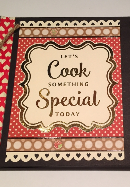 (my tried and true all purpose card stock) and cut it to size on my Silhouette. There was a fun piece of mini ‘milk bottle cap’ pattern paper in the Family Recipe Collection that matched the ivory card stock quite well so I cut strips of that paper to stand in for the strawberry pattern paper on the top and bottom of the red polka-dots. I did use the brown LFL peel off stickers from the August kit for the top and bottom of the strips, and used my
  my Silhouette and used
  I tried to find
 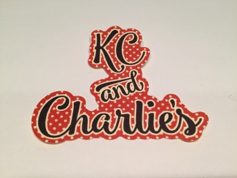 To personalize the covers, I used my Silhouette to create the pairs of names on the same red polka-dot background, and cut 4 pieces of each so I could glue them all together for a chunky, ‘chip-board’ embellishment. Okay… I think that covers all the pieces for the front cover… Let’s work on the actual ‘book’ part and the insides. I based the dimensions of this entire book on using a half-sheet of card stock for the pages – so all the pages are 8.5″ x 5.5″. For the front and back covers, I used black chip-board cut at 8″ wide by 5.75″ tall for the cover, and7/8″ wide by 5.75″ tall for the ‘spine’. I punched 1/8″ holes in the spine pieces for the twine binding, and used one as a pattern for punching holes on both of the spine pieces and all the pages. For the hinge,
  I used Tyvek from UPSP Priority Mail envelopes cut to 5/8″ wide by 6″ long – two pieces for both the front and back ‘hinge’. I did use
  I attached all the completed pieces to the cover and let them dry while I worked on the inside pages. Since I ended up printing the pattern for the cover, I ended up having a great deal of the 6×6 pattern paper left… what to do?? I figured the back of the pages seemed a little bare, so I decided to make a little “notes” section for the final recipient to jot down any notes they might find relevant. I actually scanned the back of one of the recipe cards into
  the computer so I could match the lines and font for my ‘notes’ section which I printed on my Ivory card stock and cut to 5.25″ wide by 2.125″ tall. Since all of the recipe cards had a little scalloped border around their edges, I decided to make a scalloped background for the ‘notes’ section. I created the scalloped rectangle on my Silhouette and sized it so I could get 2 pieces cut from the 6×6 pattern papers – That’s
 one of the things I love about working with my Silhouette Portrait – if you are careful and line things up accurately, you can cut right to the edges of most papers. Here you can see that I hardly wasted anything from the pattern papers I used and was able to get 2 ‘notes’ background pieces from each sheet of pattern paper. SWEET! As far as the recipe cards, I didn’t think slots in the page to hold them was very classy, so I found some
  corners to hold the recipe cards. There is more room on the back of the cards for ‘directions’ so you do need to be able to remove the recipe cards, and you don’t really want to take the whole book into the kitchen when you’re cooking, so I thought this was a sensible and decorative solution. I did create a couple of templates to help in positioning both the recipe cards and the ‘notes’ pieces on the pages, so the only thing you really have to pay attention to is matching the ‘note’ papers on the back of one page to the recipe papers on the front of the next page.

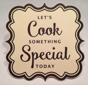 BONUS GIFT: Go to my COMMENTS page and send me a note requesting my “Let’s Cook Something Special Today” medallion for yourself! Simply specify whether you would like the file in a PDF format, or, for all the Silhouette folks out there, you can request a copy of my Silhouette file (You will need to have the
  with a flower arrangement around a block lettered “KIND”, lots of individual flower and leaf stamps, a lovely script “kind” and “kindness” stamps, block letter “KIND” and “NESS” stamps, a border stamp and (of course) a couple of small heart stamps, and a plethora of kindness sentiments. We also get a KIND bold outline
  how my shading came out – and how well it matched the Green Apple card base – that I stopped right there and didn’t add any more color to the stamp! I cut the water color paper and the gingham pattern paper with my Lawn Fawn Stitched Rectangle dies (
 Using the Green Leaf card base, I once again, die-cut the watercolor paper and pattern paper with my Stitched rectangle dies and added a small ‘intermediate’ mat of
 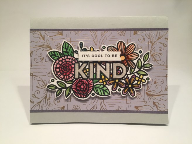 Since there was a good deal of gray on the pattern papers, I decided to supplement the card stock in the kit with a piece of gray card stock from my stash. I water colored the stamp with my
 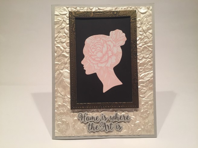 with this kit. On top of my gray card base, I have that gold embossed paper (I swear it looks like granny’s wallpaper..!) and die cut a ‘frame’ from the bronze embossed paper with two of the Lawn Fawn Stitched Rectangle dies. A scrap of black card stock provides a background for the silhouette sticker from the accent sticker sheet, and the frame is mounted up on some foam tape for dimension. I created and cut the sentiment in my Silhouette using the
  so I chose to use that “you are my home” sentiment (the one on the pattern paper was larger than the one on the sticker sheet, so I used the larger one). That sentiment is on some wood-grained pattern paper so, (after having such good results stamping on wood with my last card kit) I snagged some wooden coffee stirrers at my local coffee shop and used them for accents on this Cream card base. I stamped the border stamp on one of the stir sticks with
 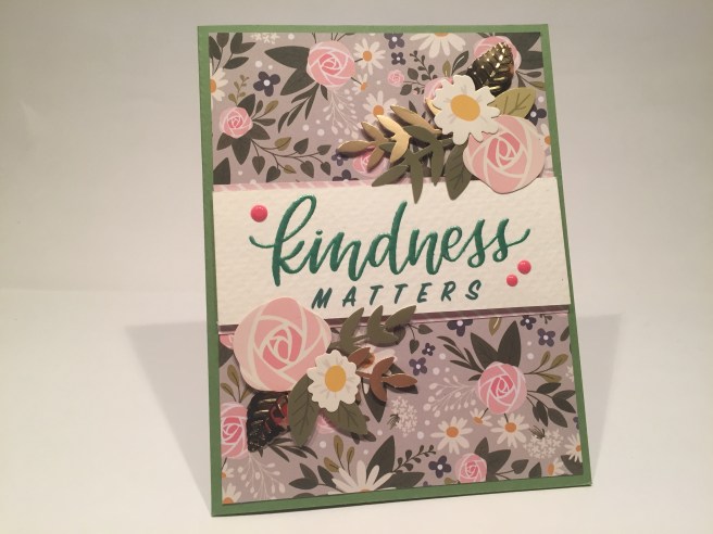 Now here’s where the stickers and the pattern paper and the stamp set came together to make a truly wonderful card. I stamped the script-y “kindness” stamp on watercolor paper with VersaMark ink, and embossed that with the Love From Lizi Emerald City embossing powder. That is really gorgeous embossing powder – so smooth and shiny – I thought it worked very well on the Green Leaf card base. I used the pattern paper that matched the flower stickers for the background of this card, and I did trim the pink stripes from the top of that pattern paper for top and bottom accents behind the sentiment strip. I created the “MATTERS” sentiment on my Silhouette in the Sign Painter font and managed to match the color of the embossing powder pretty well..! I assembled two bunches of sticker flowers (a perfect match!) and attached them with foam tape to both sides of the sentiment and let a little bit come over the edges of the watercolor paper. I added two of the Darice gold leaves to the sticker arrangements and a few spots of
  for at least one card! A smart, simple masculine hello card is the result. I mounted the ‘hi’ square from the pattern paper on foam tape to a different square from the pattern paper as a mat and glued those to the gold foil stripe pattern paper. I added two strips of the bronze embossed paper to the sides and used my peel off stickers in chocolate brown and soft gold for some delineation between papers. A few sequins from my stash, a gold heart sticker from the kit, and I’ve got a very snazzy, fairly simple hello card for anyone! I do still have one more of the large stamps embossed in gold on my watercolor paper, and I wanted to see if I could disguise or even just cover up the KIND sentiment in the middle of the flowers. I stamped the two largest single flowers from the stamp set on watercolor paper and gold embossed them to match, and, lo and behold, no more words
 in the middle of the flowers! I water-colored the flowers with my Pelikan watercolors (to match the gray/daisy pattern paper), and glued the 2 individual flowers right over the KIND in the middle of the flowers. To highlight the ‘new’ bouquet, I used it vertically on this Green Apple card base. I did a kind of half-and-half fussy cut with the flower piece and foam taped the whole thing up on the card. I did use that grey pattern paper with the daisies for a mat behind the rectangle part of the watercolor paper, and used the silver pebble embossed paper as a mat behind that. I cut that sentiment stamp into three pieces and stacked them to make the sentiment here – stamped in VersaFine Onyx Black ink and embossed that with clear embossing powder. I did use some Ranger Enamel Accents in Electric Lime to add the green dots to the stamp and the card. With the gold embossed stamp and the enamel dots, we’ve got plenty of shine on this ‘adapted’ spray of flowers! Now I still haven’t used the block print “NESS” stamp, so I paired that up with it’s natural predecessor “KIND” to make a trendy ‘sentiment only’ card. I simply adore this card.
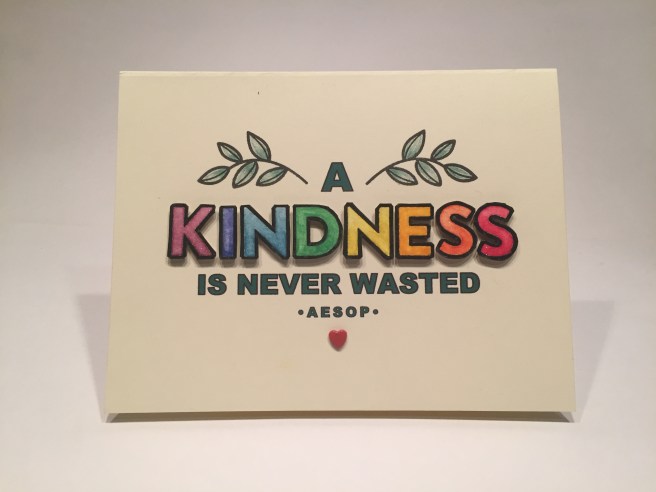 I stamped both stamps with Versafine Onyx Black ink, clear embossed them on the watercolor paper, painted them with my Pelican opaque watercolors, and fussy cut them all apart. I love this sentiment! It is the moral from The Lion and the Mouse fable by Aesop. I used my Silhouette to print the “A IS NEVER WASTED •AESOP•” on the Cream card base.
  Without even owning a machine, you can use the Silhouette software to outline your card and place whatever sentiment you wish to print anywhere on your card. Check out my
 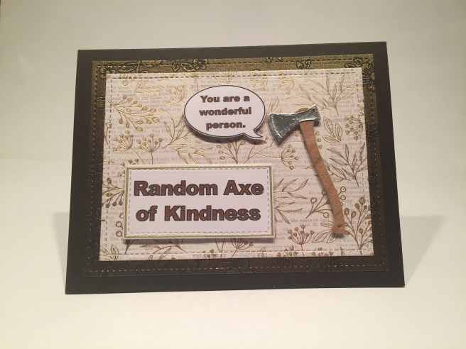 YES! It’s my ‘Random Axe of Kindness’ card!!! LOL!!! I recently got an axe die from the Spellbinders Lumberjack Days Collection “Camp Out” dies (discontinued, so I got it on a great sale!). I used my
 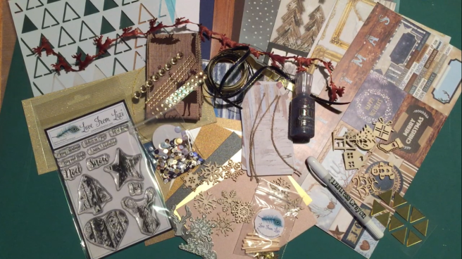 This kit is holiday oriented with kind of a ‘wood-grain’ theme reflected in the stamp set featuring a star, tree, heart and stag head rendered in wood-grain. The usual over-abundance of pattern papers, card stocks, embellishments and specialty items round out the supplies in this kit – everything from wood-grain paper to puffy reindeer trimmings, matchsticks to mirrors – this kit has a little bit of everything! I usually start with the stamp set in a new card kit, but I wasn’t particularly in the ‘holiday spirit’ yet – so I ignored the sentiments and went for a simple pun to start. I was a little obsessed with the notion of stamping on the match sticks and loved the stag head stamp so here we go…
 I had to split the matchsticks in half (lengthwise) in order to create enough surface area for the stamp – I simply attached them in a slightly off-set pattern onto a piece of
  I was having a bit of a problem figuring out how to incorporate a heart stamp into a batch of holiday cards, and figured this was the perfect opportunity. I (of course) created a writing surface on the inside of the card (cut with another Lawn Fawn Stitched Rectangle Die) with my Ivory card stock and stamped the wood-grain heart at the top again using the Walnut Stain Oxide ink. Perfect use of that heart for this out-of-season Valentine or friendship card with a simple pun that actually highlights the theme of this month’s kit! I really like how this card came out, and I will keep my eyes open for more opportunities to stamp on something other than card stock…! Now BRING ON THE HOLIDAYS…!
 I was fascinated with the puffy reindeer fabric trimmings in the embellishment bag and knew I wanted to ‘hitch’ them all together to make an “eight tiny reindeer” card! I LOVE this card. I used a light blue card base and the dark blue shimmer specialty card stock for the background. I used the bronze cording included with the embellishments to ‘hitch’ two rows of the reindeer together – on the front for the front row and on the back for the back row (I did have to use
  I did take the time to add a little something to the insides of all my cards this month, so I used another fabric reindeer and one of the sentiment stamps from the stamp set that completes the “BELIEVE” sentiment on the front of the card. Stamped in the Distress Oxide Walnut Stain ink down in the bottom left corner of the ivory card stock writing surface, this is a nice completion of the card. I did find the small sentiment stamps in the stamp set a bit fussy to stamp – they are very tiny, and I had to practice a bit to figure out how much ink the stamp would take before it all smushed out into a big blob… Most of my stamp pads are pretty juicy, so that probably didn’t help me when trying to get a good impression with these small stamps. The dark blue shimmer card stock has great depth to it and actually feels like a night sky. No sleigh with this card, but here’s eight tiny reindeer to take us straight into the holiday season!
 We were treated to a full 12″ x 12″ sheet of coordinating stickers with this kit and I was immediately drawn to this large “Merry and Bright” sticker. I mounted the sticker to a mat of the gold linen specialty paper and then to a mat of the gold glitter card stock from the LFL July 2017 Card Kit. I wanted as much sparkle for this card as possible (merry and BRIGHT!) I did hand letter the ‘may your days be’ above the ‘Merry and Bright’ with my
 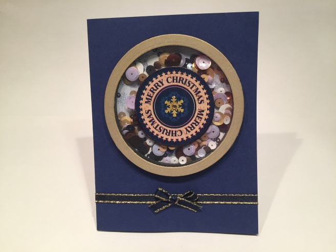 Lets do a shaker card now! I created a shaker using another great sticker from the kit. I did have to die cut the center “Merry Christmas” circle from the square shaped sticker, and I die cut a frame from the warm gold specialty card stock using my
  In addition to the sticker sheet we also got two 12″ x 12″ pattern papers. We did have a sheet of bright white (letter-size!) card stock in this kit, so I was on the lookout for something that would work with a white card base. This ‘NOEL’ piece on the white wood worked perfectly. Since I was trying to keep to the ‘wood’ theme with this kit, I found some
  and a beautiful, soft, wintry, wooden Holiday card comes to light. I really love the simple beauty of this card and am thrilled to be able to experiment with those Sticky BARC wood sheets – You can cut them, you can die-cut them, you can even PRINT on them! WOW! For the inside of this card I die-cut the BARC wood sheet with the ‘Merry Christmas’ die from the kit. I was actually worried that this die was so small that it would be very difficult to use and too small to make any kind of an impact, but I was pleasantly proven wrong – a GREAT die that is readable and just large enough to make an impression – and the great thing about the Sticky BARK is that it is sticky-backed – and with good adhesive too!! Instant wood stickers!! I will use this more!
 So I cut the acetate to 5.5″ x 8.5″ and scored it down the middle to make an A2 card base. I used a
  When I created the windy swirl sketch on my Silhouette for the LFL Thanks Giving kit, I knew I wanted to use that sketch on a card with this kit. No leaves this time, just lots of snow! I drew my swirls on that frosty pine branch pattern paper with a
  Now I need to use the star stamp for a card. Here, I stamped the star with
 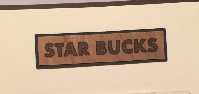 LOL!! Printed on the BARC sheet with the ‘Futura’ font in bold, and mounted to a scrap of black card stock for pop. I was amazed that the BARC wood sheet would print so well!
 It only seemed appropriate to make this a gift card holder! I have found the easiest way to include a gift card is to cut a slit the width of the gift card, add angled slits at the end about 3/8″ long and then punch the tiniest hole at the end of the cuts to relieve the stress. Careful placement of adhesive on the back about a half inch below your slit will hold everything together nicely. This card cracks me up! With the seeming ubiquity of Starbucks gift cards during the holidays, this card will certainly get some use this year!
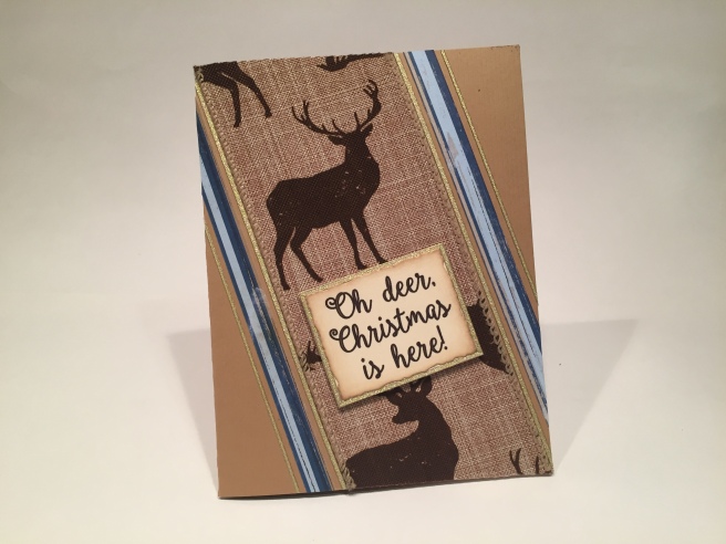 I did want to use that nice 2.5″ linen ribbon with the deer printing, so, here we have another fun pun featuring that ribbon on the embossed Kraft card base. I really enjoy the rhyme with this pun – printed on my Ivory card stock in the ‘Ballerina Script’ font, I cut that out with a
  Now the stamped trees kind of got lost on the stenciled foil background, so I ended up just cutting out two strips of the foiled triangles, and used the large ombre pattern paper to be the background for the tree stamps. I stamped the trees in three different brown inks: Walnut Stain Oxide ink and Stampin’ Up ink in
  There’s that ‘Brady Bunch Remastered’ font again – works perfectly! I printed this with my Silhouette software directly on an Ivory card base (I cut up the dark blue card base to get the two strips of foiled trees), and added the die-cut Merry Christmas (from the dark brown wood-grain sheet) towards the bottom and next to the wood veneer die cut of a gift that I colored up with a Gold sharpie. “Bearing gifts we traverse afar..” LOL! Not only do I adore this pun, but I love how this card all came together and the triangle theme that developed and is even reinforced with the design of the tree stamp! SO MUCH FUN!
 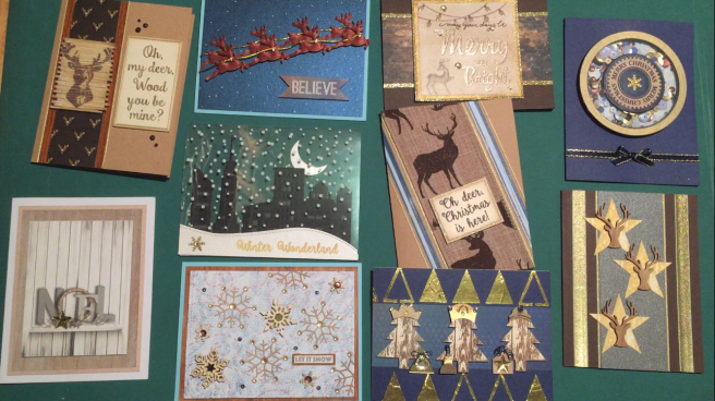 There we have a very handsome set of cards – mostly holiday in unconventional colors with a unique wood theme running throughout. I realize I didn’t have pictures of every card’s inside, but if you check out the 10 Cards 1 Kit video on YouTube, I do show every one. As with almost every Love From Lizi card kit, I have bunches of leftovers to add to my stash – LOTS of pattern papers, stickers, embellishments and ribbons. I love all three of the wafer dies, and the Heart and Star stamp should be very useful all year round! I had much more fun with this kit than I originally thought I wood, (LOL!) and am perfectly thrilled with the results. If you have any questions or comments, please ask away, and if you want to contact me directly, just go to the CONTACT page and send me an email! Thanks for joining me here today! I hope you enjoyed, and I was able to share some laughter and a little inspiration with you. Happy Crafting!!!
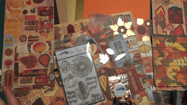 I believe this is Lizi’s first kit to come in a 12″x 12″ box and zip-lock bag, and is jam-packed with 12″x 12″ pattern papers, stickers, vellum images and cut-out sheets along with 6″x 6″ pattern pages, chip-board stickers and 5 specialty card stocks including a green cardboard with gold glimmer, a brushed gold mirror sheet and a linen textured gold card stock as well. A ‘Happy Harvest’ sequin mix, three leaf dies and an exclusive stamp set complete the set. Be sure to check out my video for a complete piece-by-piece un-boxing for this kit. I don’t generally make or send ‘autumn’ or Thanksgiving cards but after completing this batch of ten cards, I just might have to this year!!
 cards are always in season, and I adored this bunch of carrots and sentiment on the vellum sheet. I ran the vellum piece through my
  of each of my cards this month. I found the perfect compliment to this card on the 12″x 12″ cut-out sheet and I think it adds a lovely touch mounted on more of my Ivory card stock. See how closely that Ivory card stock matches the banner on this cut-out – I find myself constantly reaching for this card stock for so many cards – I recommend it as a budget ‘use it for anything’ card stock to have on hand in anyone’s stash! Having rarely used chip-board stickers on any of my card kits, I was very interested in seeing what I could create with the chip-board stickers included in this kit. There was a lovely line of leaves that drew my attention right away and inspired me to make this card. This is on that great Kraft
 embossed card stock included in the kit (There is a piece of this card stock in the November subscription card kit as well)! I trimmed the scallops off the burlap scallop sticker from the sticker sheet to make the strip down the left side of the card, and created this sentiment on my Silhouette using the Staples Ivory card stock (with the
  I used the maple leaf die from the kit to die-cut the center leaf from the brushed gold mirror card stock and used my
 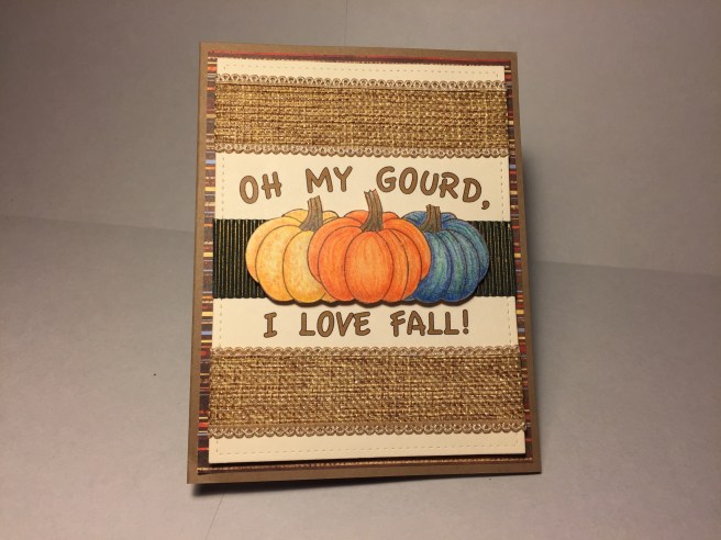 pumpkin stamp and with some simple masking, stamp three pumpkins in a row using my
  to use one of the stamp set sentiments on the inside of the card, along with a small sticker from the sticker sheet. The burlap ribbon adds plenty of sparkle to this card – no need for sequins here – and I have to admit, I am really over the moon for these pumpkins!! No more strictly orange pumpkins for me!! Ok – That’s one sentiment from the stamp set – let’s see what we can do with the others. I really like the ‘Sweater Weather’ sentiment in the kit but don’t find any pattern paper or images that seem to go along with that sentiment… If you have followed me at all, you know I rely on my Silhouette Portrait machine a great deal – from creating and cutting sentiments to cutting whole shapes to use on my cards. One thing I haven’t done with my
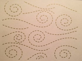 Silhouette for any of my card kit videos is use it to sketch with… Yes, you can use your Silhouette to draw with! I spent a bit of time coming up with this pattern to use with my Silhouette but am completely thrilled with the result – and now I can draw with any pen (color) I have that will fit in the carrier! This is actually drawn with a
  I used a piece of the blue pattern paper (die-cut with a Lawn Fawn stitched Rectangle die) to draw the swirly windy dashed lines in gold and framed that with a thin frame of the brushed gold mirror card stock. I embossed the sentiment in
 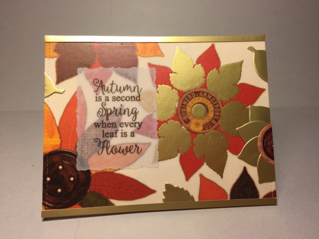 There was this great sentiment on a couple of the cut-out pattern paper images but I had a hard time seeing the sentiment printed on the patterns, so I decided to re-create this sentiment to go on top of this GREAT vellum piece featuring flowers made out of leaves. I did run the foiled vellum piece through my Zyron sticker maker and attached it to the front of my Ivory card-base. The foiled vellum piece was a touch narrower that the card base so I added a couple strips of the brushed gold card stock to the top and bottom. I did the sentiment on my Silhouette using the
 Yes, again with my Zyron sticker maker and I attached the vellum to more of my Ivory card stock before I fussy cut the center out. I trimmed the Ivory card stock down to 4″x 5.25″, filled the shaker with lots of the sequin mix and added a die-cut maple leaf cut from a piece of
  Back to the chip-board pieces! I figured I had to do a true Happy Thanksgiving card with this kit, and there was a lovely chip-board sticker that worked perfectly. I used a piece of the pattern paper covered with seasonal words for my background, added strips of the pumpkin vellum piece to the top and bottom and framed them out with some LFL peel offs in Chocolate Brown (from the August ’17 card kit). I guess I couldn’t do 10 cards without some peel off stickers somewhere! A thicker piece of the peel off stickers goes behind the chip-board sentiment, one of the chip-board flourishes is added below the sentiment and glittered up with my
  the touch of glitter on the flourish told me no sequins were needed on this card, but I did take special delight in adding a cut-out from the kit to the inside of the card. ‘Lettuce Celebrate’ is a terrific pun and totally appropriate for this Happy Thanksgiving card (note the added chocolate peel off ‘underlining’ the cut-out)! There are still a couple of the stamps I haven’t used yet, so before I get completely lost in the land of pattern papers and chip-board stickers, let’s do some coloring! I stamped the sunflower stamp (on
  to the center of the flower which adds some nice texture and shine without having to resort to glitter. This stamp is large enough to be the solitary focal point on a card, so, after fussy cutting the sunflower, I simply die-cut some of the green pattern paper with the medium leaf die from the kit to provide an anchor for the sunflower. The brushed gold mirror card stock piece is actually the center cut out (Stitched Rectangle die, again) of the frame on the ‘Sweater Weather’ card (waste not, want not!). The golden yellow mat and sentiment are some leftover pieces from a Recollections Jewel Tone card stock pack (which has since been discontinued), but it compliments this card perfectly. I found this lovely quote from Helen Keller that I printed in American Typewriter font on my Silhouette and die cut with a small stitched rectangle die and glued to a mat of that Glitter Silk card stock in orange. The sentiment and sunflower are mounted with foam tape but everything else is glued directly down to the orange shimmer card base. Since sunflowers literally keep their ‘face to the sunshine’ I thought this quote made a perfect sentiment for a lovely sunflower card. This is certainly not
  I stamped and colored these ears on Bristol Smooth card stock with VersaFine Black Onyx ink and colored them with my Spectrum Noir alcohol markers. I knew I wanted to use this ‘rows of corn’ pattern paper with this stamp, so I created the pun-ny sentiment on my Silhouette (Typewriter Hand font) and printed it directly on the pattern paper. In order to kind of drive home the -maize- part of the pun, I did color two ears as Indian ear corn, and that provided the right pop of color this card needed. Two more strips of that striped pattern paper down the sides correspond with the blue and red on the ears of corn. Everything is attached flat to the embossed Kraft card base with the center ear of corn attached with foam tape. I thought sequins would distract from the earthy, harvest feel of this card, so I avoided anything shiny or sparkly, and like the pumpkin stamp before, I may never color a simple yellow ear of corn ever again!! Between the pumpkins and the sunflower and the ear of corn stamps in this stamp set, I know I will get a lot of use out of them over the years. And can we talk about left-overs..! I still have masses of pattern paper, chip-board stickers, card stickers, a few vellum pieces and good-sized chunks of the specialty paper that will go directly into my stash! I am surprised at how much I enjoyed this kit, and am thrilled at the truly beautiful cards inspired by all the supplies included. If you have any questions at all please leave a comment or you can go to the Contact page and email me directly. I hope you enjoyed this sojourn into Autumn and the Special Edition Thanks Giving ‘Happy Harvest’ card kit from Love From Lizi, and remember, this kit is still available at
 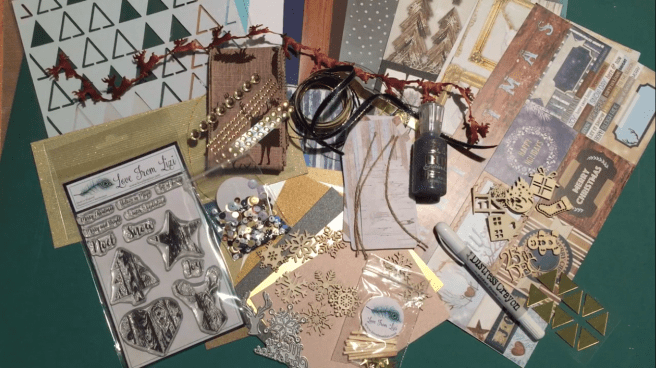 This month Lizi has gone to a different format for her cardstock – Letter-size cardstocks (8.5″x11″) for all us North Americans who haven’t adopted the metric system!!
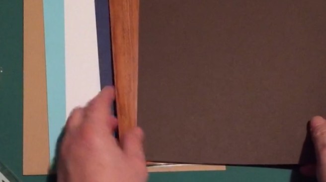 5 Sheets of 8.5″x 11″ cardstock in Bright White, Sky Blue, Dark Blue, Deep Chocolate, and tiny pin-stripe embossed Kraft cardstock, and 1 8.5″x 11″ wood grain gloss paper.
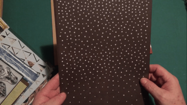 1 A4 size acrylic sheet featuring a printed snowfall pattern.


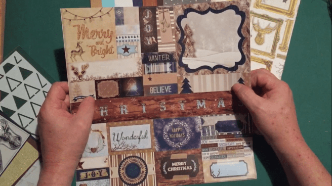 1 12″x 12″ Sheet of cardstock stickers.
 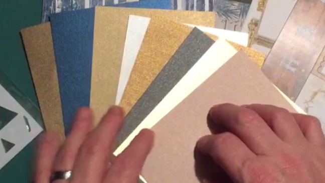 Our specialty cardstock is in a little different format this month as well – we get 8 sheets of 4.25″x 5.5″ cardstock in a Bronze shimmer, Dark Blue shimmer, Warm Gold shimmer, White shimmer, Grey or Graphite shimmer, Brushed Gold mirror cardstock, Rose Grey shimmer, and a Golden linen textured paper as well.
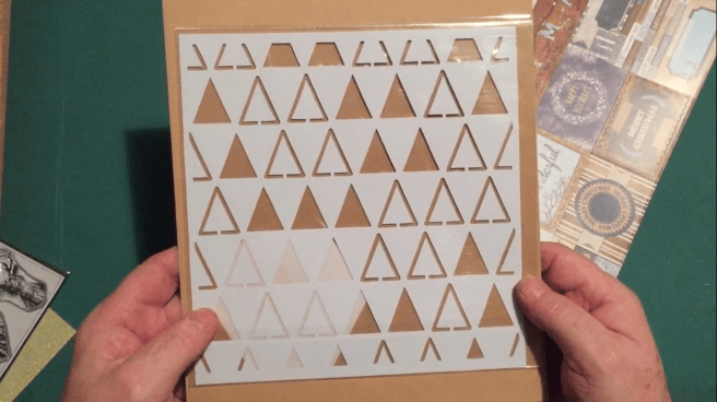 1 8″x 8″ sticky-back stencil featuring a triangle pattern.
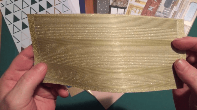 1 sheet of ‘Gold Moon-dust’ peel off sticker stripes (brushed gold with glitter highlights)

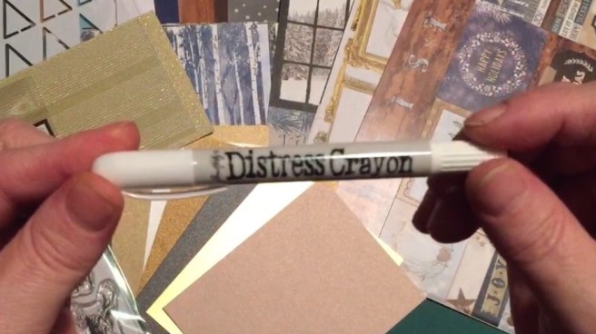 This month, instead of the usual Chameleon Pen, we get a


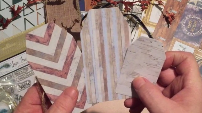 3 Tags (2 large 1 small) with wood-grain patterns and 3 natural twine ties.
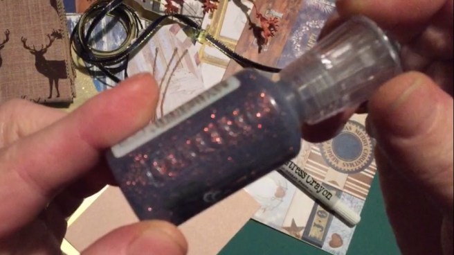 1 bottle of
  92 Soft Gold sequins in 3 sizes.
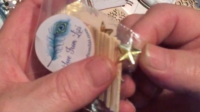 5 Soft gold star-shaped gems along with 15 wooden matchsticks.

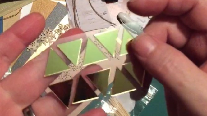 10 self-adhesive triangle mirror pieces in Gold.
 1 sample bag of the
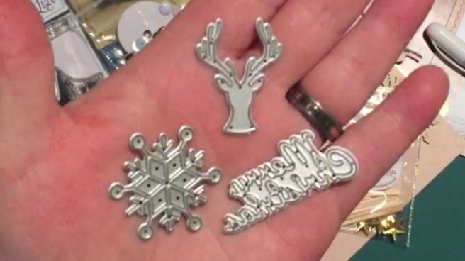 3 dies – a Stag Head, a Snowflake, and a ‘Merry Christmas’ sentiment.
 I search through my stash and discover that I don’t have any card stock that matches this color pallet. My Ivory is much darker, my Gray is much lighter, and none of my dark blue card-stock is even close to the same color. So I do something that I have never done before with any card kit – I cut the Soft Navy and Smoke Gray card stock into quarters and mount them onto simple white card bases from my stash. I guess there’s a first time for everything, and I do end up with 4 Soft Navy card bases, 4 Smoke Gray card bases and 2 Ivory card bases.
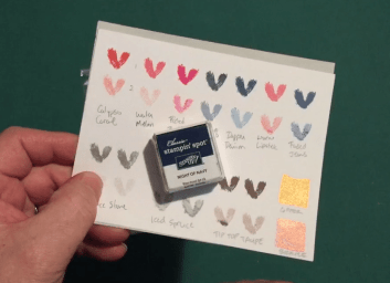 I worried that I didn’t have any ink pads that would match this kit either, so I did a little stamp test and did find that my
 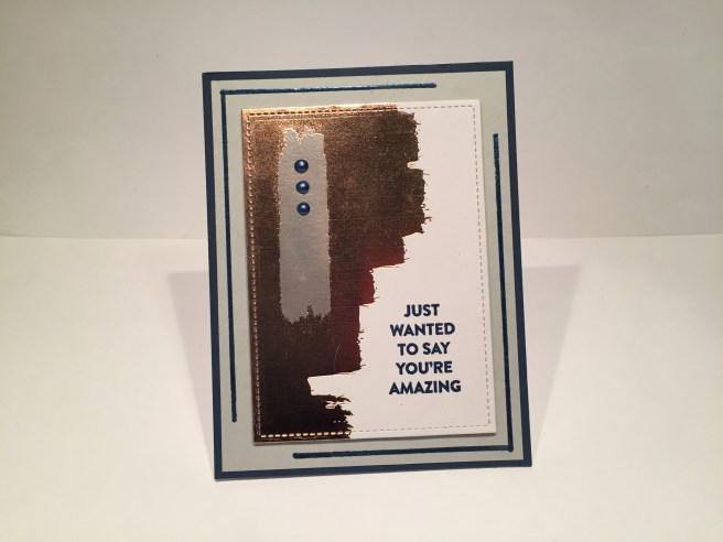 I started with a piece of the pattern paper that had a large swatch of the gold foil paired with the ivory, and cut that out with one of my Lawn Fawn Stitched Rectangle dies. I ended up using almost all of the Stitched Rectangle dies in my stash – both the
  For this card, I wanted to try to emboss the Spiral Flower Die on the mirror card stock without cutting it out. It took me a couple of tries to find the right pressure on my die-cutting machine, but I got a good embossing of the die on the top of a 1.5″x 3.25″ piece of the mirror card stock. I added two rectangles of the navy pattern papers to match, and mounted all three on 1.625″x 3.375″ gray card stock mats that I embossed on their edges with my silver embossing powder. I embossed the sentiment on the mirror card stock with the Steel Navy powder from the kit, which worked very well. I thought three dots of the Nuvo Crystal drops under the mirror card stock would finish this card but, with everything mounted on foam tape to the Soft Navy card base, the card felt a little dark to me. I reached for my
  For the next card on the Soft Navy card base, I embossed some scrap card stock with my silver embossing powder and the Steel Navy embossing powder, and die-cut the Spiral Flower die three times from each. I used the negative space from the die cuts and glued them to the card base along its opening edge. I took one of the navy pattern papers and embossed some irregular stripes of Steel Navy using the Emboss It pen from the kit. I cut one edge of the navy pattern paper with one of my
 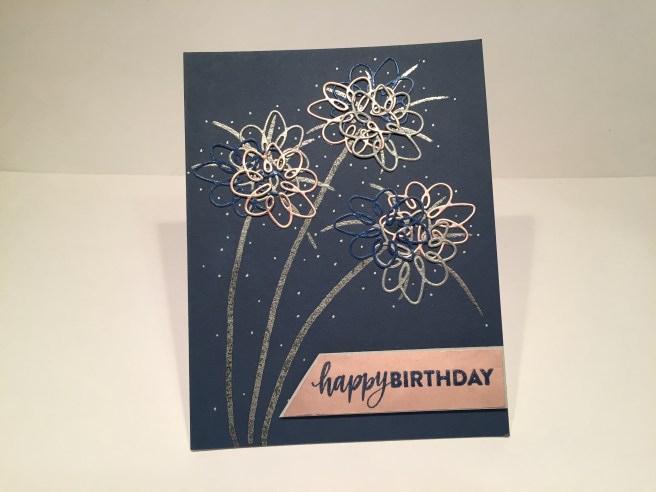 One more Soft Navy card base to go…! I die cut three Spiral Flower die cuts from the mirror card stock to add to the silver and navy die-cuts left from the previous cards, and layered them all together (three times) to make this card. I was going for a ‘fireworks’ thing here and
  Now I move along to the Smoke Gray card bases. I take the Emboss It pen and draw a ‘mat’ on the Smoke Gray card base and emboss it with the Steel Navy powder. I cut one of the navy / gold foiling pattern papers with a Stitched Rectangle die and glued that to my card base. I selectively cut three small rectangles (with another Stitched Rectangle die) from a second piece of pattern paper (avoiding the blush pink portions) and added those to the navy pattern paper with foam tape. I actually double-embossed the sentiment on the center rectangle. I used my
 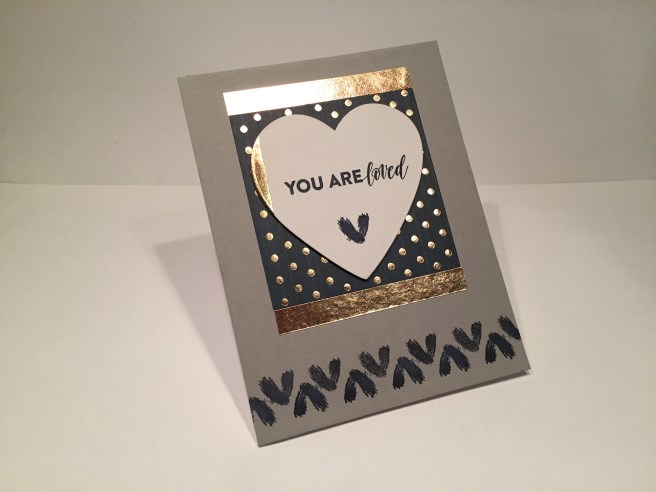 I am working my way through the sentiments in the stamp kit, and only have the “YOU ARE loved” sentiment still left to be used. I’m still trying to keep things masculine here, so I cut a heart shape out of one of the pattern papers (capturing a little slice of the foiling on the left edge) with one of my
  Now, I really like this card a lot, and think of it as kind of hyper-masculine! (it’s the pin-stripes!) Again, on the Smoke Gray card base, I cut a piece of that great pin-striped pattern paper and glued it to the center of my card base, and added two thin strips of the mirror card stock to the sides. I double-embossed the sentiment (again) on the ivory & gold foil pattern paper cut out with another Stitched Rectangle die. I really love the sentiment spanning both the foiling and ivory parts of this pattern paper – textural and shiny – I think that Steel Navy embossing powder really holds its own with the gold foiling! I used foam tape to mount the sentiment to a piece of the polka-dot pattern paper (you know I love stripes and polka-dots together!) and glued those to another piece of the mirror card stock cut out with a larger Stitched Rectangle die. Those three layers are then foam taped over the pin-striped pattern paper and another Thank You card fit for the stout-hearted is borne!
  Though I don’t have any gray ink pads in my stock, I know that stamping with VersaMark ink will create a ‘watermark’ on your card stock – so I stamped the large squarish brushstroke stamp in the middle of another Smoke Gray card base. I figured I would then emboss the ‘Thank You’ sentiment on top of that watermark. WELL… I don’t know if it was the humidity or what, but I couldn’t get my VersaMark ink to give up its stick! I tried using my
  with my Night of Navy Stampin’ Spot on the top and bottom of the Ivory card base. I added a strip of the random foiled polka-dots pattern paper down the middle, and two thin strips of the mirror card stock right in the center. I like how the mirror stripes echo the stamped stripes. For the sentiment, I recently purchased this
 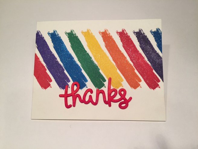 Anybody looking for some color this month!!?? LOL! I decided to throw caution to the wind and go for some really big color! With the assistance of my Tim Holtz stamp platform, I stamped the brushstroke at an angle across the Ivory card base with Ranger Archival Ink in
  That concludes my 10 Card 1 Kit post this month! That’s 4 Thank You cards, 1 Birthday card, and 5 cards of affirmation..!!! I think this is a very handsome set of strapping cards! I am quite proud and personally thrilled that I was able to complete 10 cards without using any of the blush pink!! WOO-HOO!! LOLOLOL!! Thank you so much for joining me here – I hope you enjoyed! If you have any questions, please go to the
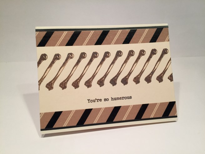
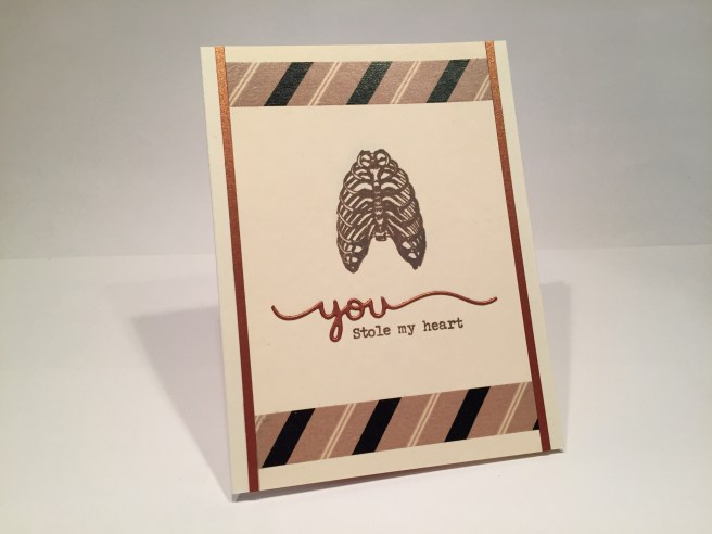
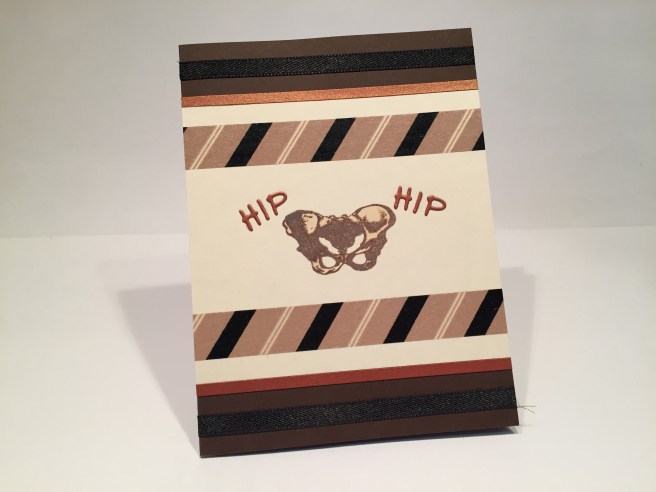
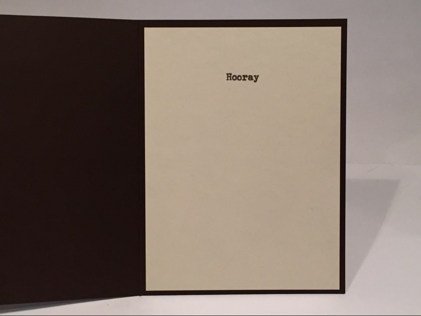 I thought it was great fun to have to open the card to finish the sentiment! Again , that Staples Ivory cover stock was used for the inside, (trimmed down to 5.25″x3.875″) and it makes me giggle to see the simple “Hooray” all alone inside. I suppose if the ‘Hooray’ was on the outside, you wouldn’t have to clarify things with the ‘Hip Hip’, but I really liked the ‘you’ on the last card and wanted to continue along with that same feeling. Well, three cards do not make a complete set, so I had to do one more masculine card.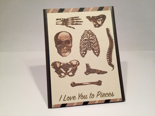
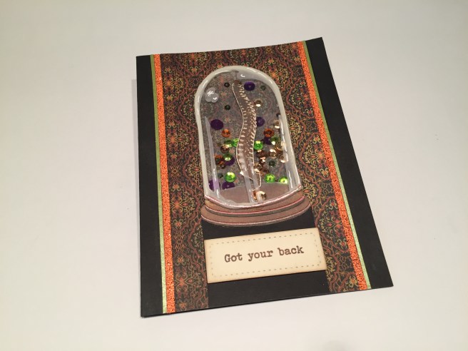
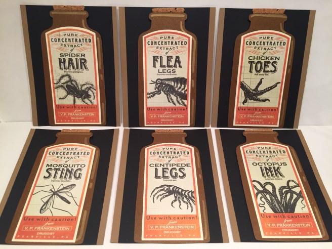
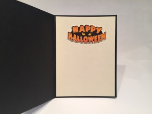 sentiment from my image stash to the inside. This is a fun card though rather subtle in its scare value… certainly a double entendre in any case! The embossing powder is very interesting and gives you a glitter-y textured effect when heat-set – not shiny and smooth. I think the bell jar is very old-fashioned and a little reminiscent of Frankenstein’s laboratory, and I had a great time creating a (seemingly) frame-less shaker element. This bell jar shaker concept is something I will have to experiment with some more – Maybe with some colored vellum?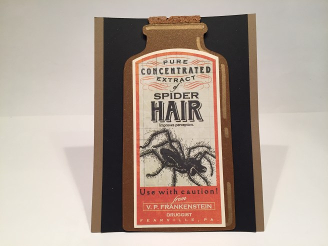


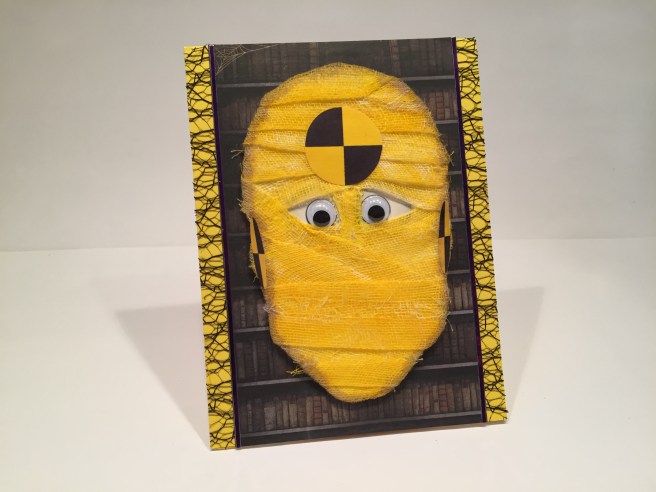
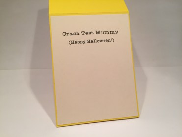 Surely you saw this pun coming from a mile away..! I couldn’t resist the bright colors and I concluded that Lizi expects us to make mummies with her inclusion of surgical gauze in the kit. I fount the yellow and black calibration circles on-line and, after sizing them, printed and cut them out with my Silhouette and glued them to the appropriate spots on my mummy’s head. The medium size googly eyes from the kit fit my printed eyeballs perfectly, leaving a touch of color around their edges. I added a touch of shading around the head with a Spectrum Noir GB2 marker and just left the stray threads of the gauze as they were. This fellow looks like he has been through one too many crashes, and tickles my funny-bone to no end!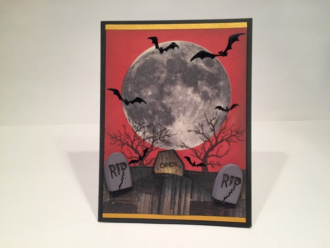
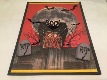 I fiddled around a bit and came up with a simple pop-up that says ‘BOO” (there’s that Brady Bunch Remastered font again!) with a little trick-or-treat graphic as well (all highlighted with a little
 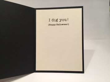 Of course, I can’t leave well enough alone, and had to add a bit of a pun on the inside of this card as well. Again, printed up with my Silhouette software on the Staples Ivory cover stock in the Typewriterhand font. Just another little bit to drive this card home and give an appropriate Halloween wish to the recipient. I have to admit, I love the moon here, and the coffin that you can pull up out of the ground with a little pop-up action. Add a simple pun, and you have an interactive card anyone would enjoy.
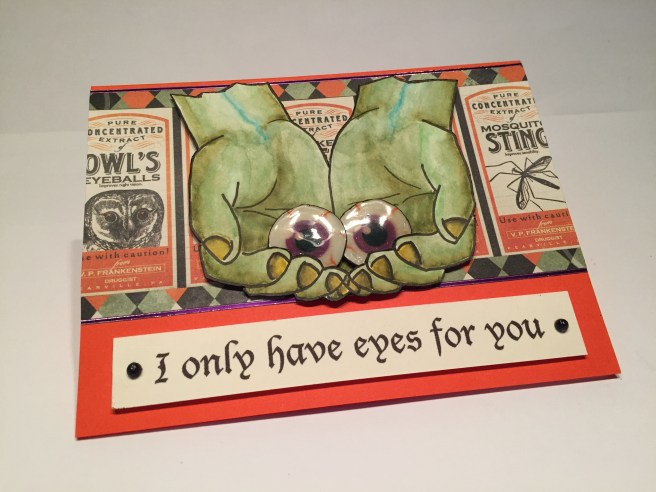

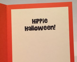 If you haven’t jumped to the pun yet… here it is… “Hippy Halloween!” LOL! This probably dates me way more than I would like to admit, but I adore this fun Halloween Card. The sentiment is printed on my Ivory cover stock in the Brady Bunch Remastered font – I think that font is going to get the prize for ‘Most Used Font’ this year! I really enjoy the colors that the tie-die introduced with this card and I really like the simple ‘scene’ created with the doors and scored shimmer paper. I think this little trick-or-treat-er is coming to your door next! WOW! That’s 16 cards for this month! I tried to create as much variety as possible with this kit and I hope I was able to inspire you to reach beyond the obvious and create cards that are usable all year round! Thank you so much for joining me here – if you have any questions please don’t hesitate to send me a comment here. THANK YOU and Happy Halloween!! – Scott