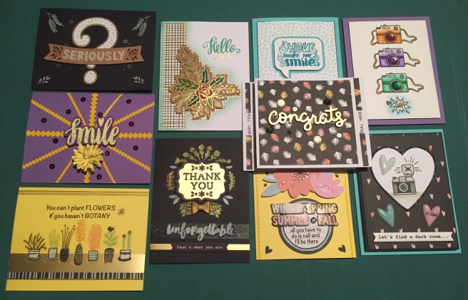
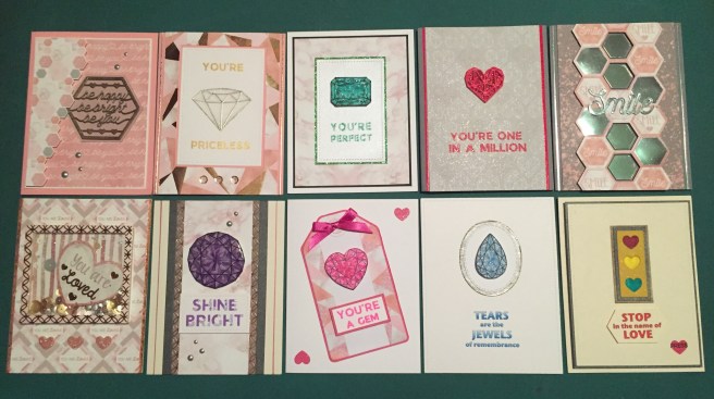
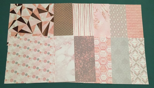
Hello Folks! Scott here with my 10 cards inspired by the Love From Lizi August 2019 “Flawless” Card Kit. This month’s kit features an assortment of gem images and icons and some unique layered sentiment stamps. And lots of PINK!
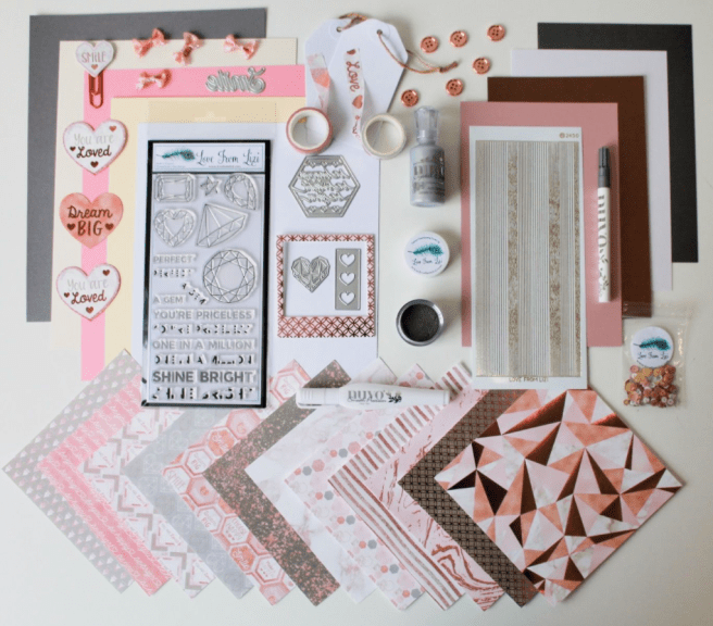
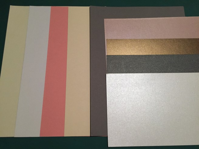
I decided to go ahead and embrace the pink this month and see where this kit inspires me! If you can’t beat ’em… join ’em! And it’s not like I’m allergic to pink or anything!! I do make card bases from all the letter-size card stock included in the kit… let’s use the pink card bases first!
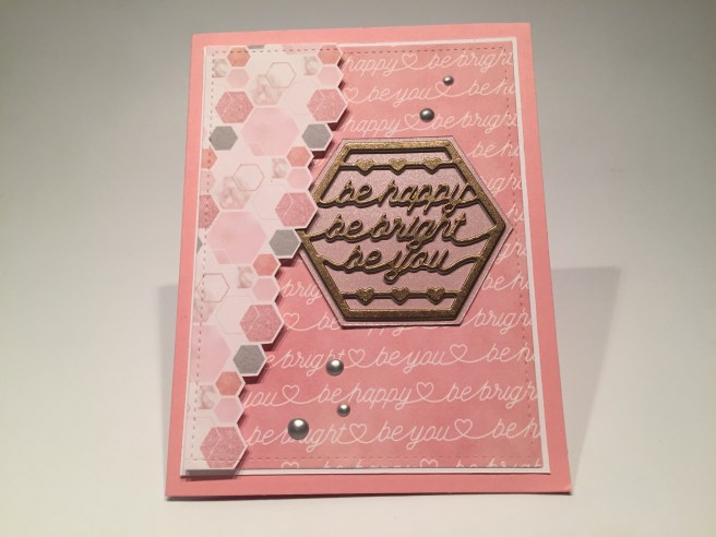
To begin with, my eye was drawn to our hexagonal sentiment die, which I paired up with the matching sentiment pattern paper and the hexagonal pattern paper. I die-cut the Bronze specialty paper with the hexagonal sentiment die, and stacked that up with 3 die-cuts from white card stock for some added thickness, and matted that on some of the pink specialty card stock. I fussy cut the hexagonal pattern paper following the right side of the darkest hexagons, and die-cut that and the sentiment pattern paper with a Lawn Fawn Stitched Rectangle die. I cut a thin mat of white for the sentiment pattern paper and glued those to a pink card base. The hexagon pattern paper is mounted with foam squares, the die cut sentiment stack is glued directly to the card front, and I added a sprinkling of the Silver Lining metallic Nuvo Drops for more shine. I think this pattern paper feels like rising bubbles to me – even though they’re hexagons! Nice and PINK but with a bit of a classic Bronze pop on our sentiment. Love those Nuvo Drops too!
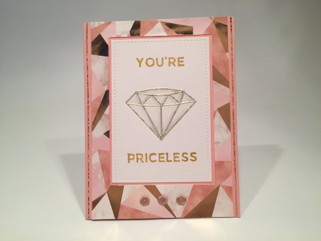
For some reason I got the idea to do this diamond stamp using the white/gold peel off stickers from the kit. I stamped the diamond using Simon Says Stamps Barely Beige on a scrap of white card stock and used the thinnest peel off stickers right on top of the stamped lines. VERY COOL! Almost like an embossed stamp but smoother and sharper and every bit as dimensional! The diamond stamp was perfect for this – nice and large without too many lines. I did add a touch of shading on this gem with a simple pencil, and added some glitz with a Spectrum Noir Sparkle pen.
I stamped the sentiment using Delicata Golden Glitz ink, and was so pleased with that sparkle, that I skipped the layering part for this sentiment. I die cut the white panel with a LFSRD, and cut a reverse mat in the center of the foiled pattern paper cut to 5.5″ x 3.875″ – that saved me a nice solid piece of that pattern paper, while still providing a nice mat for the focal piece. The pattern paper and white panel are glued directly to the pink card base, with a couple more thin peel off stickers on the sides, and a few sequins along the bottom for the finishing touch. That big white diamond balances out the pink nicely!
This is a big SHOUT-OUT to Pat Cyzauskas who reached out and shared some of her Daniel Smith watercolors with me.  BUT, she didn’t just give me a DOT card, she sent me a BLOB card!! Oh my heavens, big blobs of colors to play with! And about 60 different colors! I was in a little bit of watercolor heaven when I received this! SO… I thought I would break into this DS BLOB card and watercolor me some gems with this kit. Of course I had to go do a little research and found this great picture of birthstones featuring all different colors
 of gems. It’s not just the top cut that makes a gem sparkle, it’s the facets cut into the back of gems that give them their real sparkle and shine. Maybe I can achieve that effect with watercolors! And look at that Pink Tourmaline!
I stamped the rectangular gem on some watercolor paper using VersaFine Onyx Black ink and decided to color it as an Emerald for this card – after all, pink and green go very well 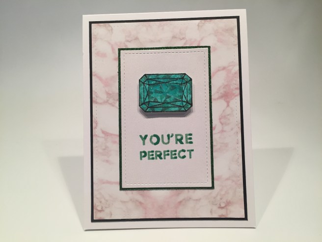 together! I simply laid down a layer of very thin water color (phthalo green) over the whole image and thought about the back of the gem coming to a point at the center – I lightly painted in some lines going from the corners of the flat cut surface to a center point, and then added layer after layer of more watercolor trying to define the facets – I did find that simply creating little triangles of color seemed to suggest facets without getting TOO mathematical about it!! I do use a very small brush, and very little water, and it seems that if you get a nice assortment of light to dark triangles, then the illusion of depth really works! I fussy cut the gem and added some Spectrum Noir sparkle pen to add some real twinkle to the emerald.
I die-cut the white specialty card stock panel and the marble pattern paper with LFSRDs and stamped the sentiment on the white pearlescent panel using Emerald Green Archival ink for the letters and LFL Emerald City embossing powder for the highlights. I matted the white panel with some green glitter card stock from my stash, added a thin black mat behind the marble pattern paper, and glued all down to a white card base. Lastly, I mounted the emerald with some foam squares and called it a day! Painting the gems like this may be a little tedious, but I had great fun creating some depth in this emerald with the “facets”. And the pink marble pattern paper goes well with the bright pop of green from the emerald.
I really liked all the dies in our kit this month, and wanted to try to use them all…
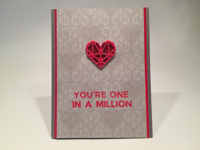
The heart die matched the design of this pattern paper, and that’s what gave me the idea for this card. Red, yes… but no Pink! I die-cut the heart from white card stock five times and glued them all together to make a chunky, chipboard-like embellishment. I embossed the top of the die cut heart using VersaMark ink and the LFL Cherry Red embossing powder. I love that embossing powder so much! I embossed the sentiment on the pattern paper, and using our Nuvo Clear Mark pen, embossed the red stripes on the edges of the 3.75″ wide pattern paper. I did add some Sheer Shimmer Spritz to the pattern paper before stamping the sentiment and adding it to the card front. Everything is glued directly to the Dark Grey card base. I didn’t really like seeing through the heart to the pattern paper behind, so I added some red glitter card stock from my stash to the back of the heart before I glued it to the card front. Shiny and sparkly and NOT pink!!
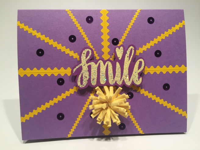
The “Smile” die-cut is in a really nice font and a useful sentiment, so I grabbed that next!
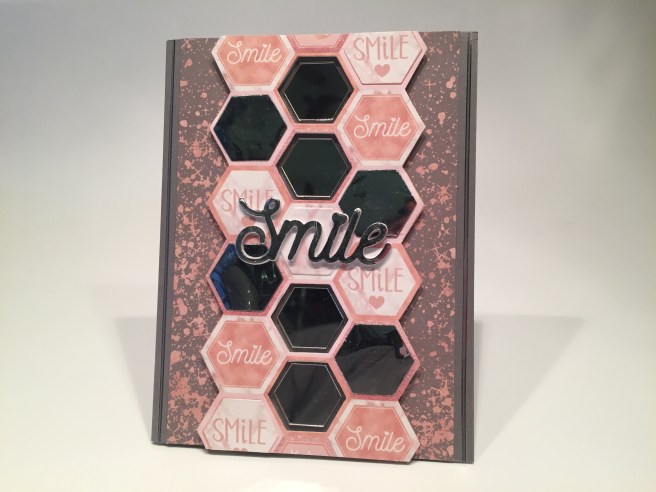
The “Smile” on the hexagonal pattern paper with the assorted sentiments actually matches the die so I fussy cut a strip of that pattern paper to capture as many “Smile”s as I could. Let’s get rid of any hexagons that DON’T say “smile”! I die-cut the four center hexagons (no “smile”s in those) with one of the LFL Nesting Hexagon dies (included in the LFL March ’18 kit and still available as an add-on with this kit) and considered making this a shaker card, but realized the spaces between the hexagons were very thin and probably would be difficult to foam tape. I reached for my Adhesive Mirror Hexagons (from the LFL August ’18 kit and an add-on this month) and saw that they fit just inside the die-cut openings. Okay… let’s try something else..!
I die-cut some silver mylar from my stash into four hexagons to cover over the four remaining non-smile sentiments on my pattern paper (also die-cut some of the marble pattern paper to cover the center hexagon). And I die-cut the “Smile” from the same mylar, and added it to a stack of four white die cuts glued together for the chunky sentiment. I cut two 1″ strips of the spatter pattern paper and glued those to the sides of another Dark Grey card base. I attached the hexagon pattern paper with foam squares and glued the mirror tiles directly to the card base inside of the die-cut openings. I glued the stacked “Smile” sentiment to the center, and added some of the medium clear/silver peel off stickers down either side.  I’m not a huge fan of simple declarative sentiments, so I decided to add to this card with an additional sentiment on the inside writing surface. I think “It makes people wonder what you’re up to!” is a fun addition to the simple “Smile” sentiment and provides a light-hearted chuckle for the recipient! This sentiment is created using my Silhouette software (it’s FREE!) and printed with the Smoothie Shoppe font. FUN!
I still felt compelled to do a shaker card this month – we did get the perfect frame for one!
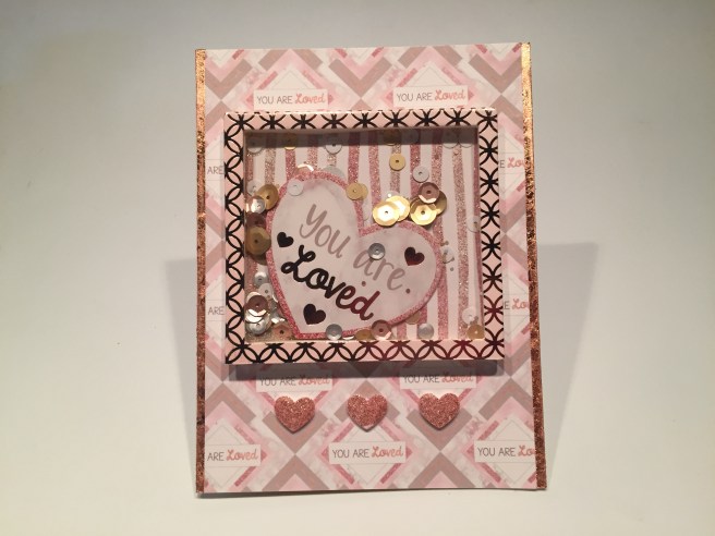
I trimmed off the wider side of the ‘polaroid’ foiled frame to make an even frame all the way around, added an acetate window behind the frame, added a triple layer of foam tape around the edges, filled it with sequins and one of the “You are Loved” die cuts from our kit, and covered the back with a piece of the striped glitter pattern paper. On an Ivory card base, I used some 1/8″ score tape to add our Tonic Copper gilding flakes to the sides and then glued a 4″ panel of pattern paper (cut to expose as many of the “You are Loved” sentiments as possible) directly to the card front, and glued the shaker element on top of that. I die cut three hearts (using the rectangle / heart die in our kit) from a glitter portion of the glitter marble pattern paper and added those below the shaker with spots of foam tape. I really like the repeated sentiments here (seems like a theme is developing!) and I love that the “You are Loved” ephemera piece is free to shake around!
Now, pink and purple are a classic combination as well, so let’s paint an Amethyst!
I painted this gem using the same technique as the Emerald on Card 3 (using mostly carbazole violet) – LOVE the facets on this – it’s bigger so you have a little more room to add triangles..! I added sparkle pen to the top, fussy cut it out and covered the whole gem with Glossy Accents. I think you would need a BIG dome of glossy accents to really make a difference on this big gem – the shine is nice, but I don’t think waiting for the lacquer to dry is worth the effect.
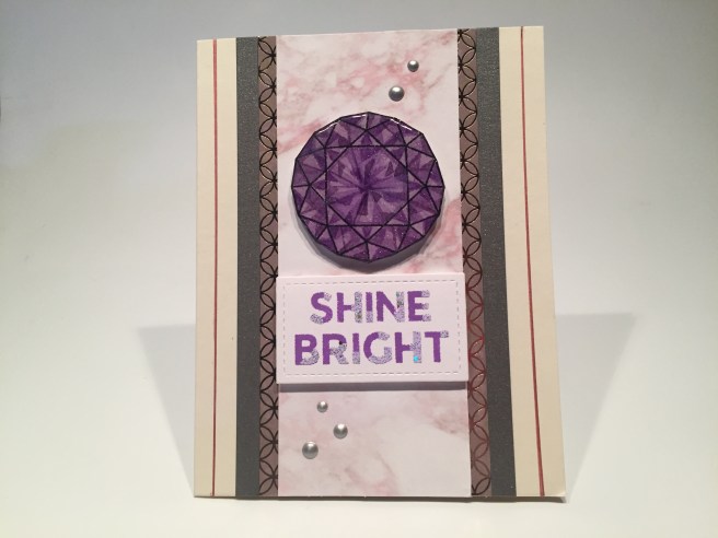
On an Ivory card base I glued down a 2.25″ strip of the marble pattern paper, to a 2.75″ mat of the foiled circles pattern paper and two 1/4″ strips of the grey specialty card stock to the sides of that. On a scrap of white card stock, I stamped the sentiment with Wilted Violet Distress Oxide ink and embossed the layering stamp with LFL Pastel Purple Party embossing powder. Now I really LIKE this one! I think you have to carefully consider the color combinations you use with these layering stamps – they seem to work best with compatible colors yet strong contrast..! And of course it helps to get the layering matched up perfectly! I die-cut the sentiment with another LFSRD, and used foam squares to attach the sentiment and the gem to the card front. Another sprinkling of our Nuvo Drops on the card front, and for a final touch, I drew two lines down the sides of the card front using a ultra-fine-tip metallic copper/rose Sharpie – that matches the foiling on the pattern paper and adds a nice sparkle as well! I LOVE painting the gems like this!
My new DS BLOB card (thank you, Pat!!) has the color “Opera Pink” – who could resist??
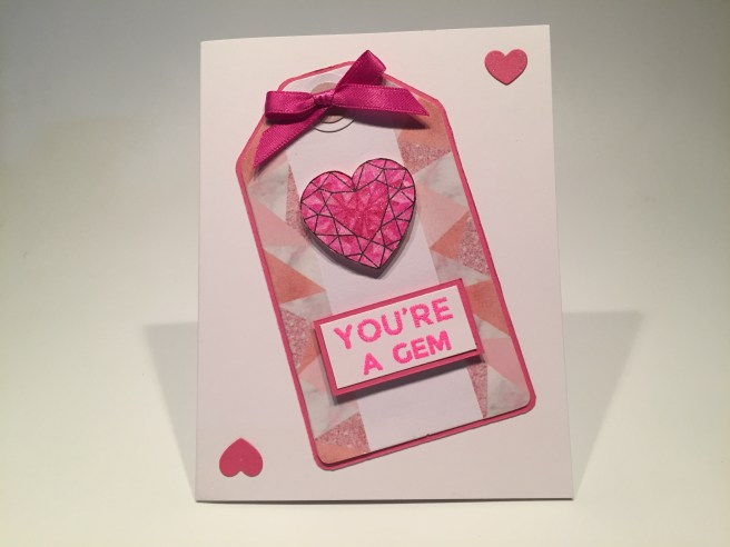
I think I got a little carried away with this “Pink Tourmaline” heart gem – after I had painted it, I realized that it didn’t really match ANY of the pink in this kit – OOPS! However, even I have some bright pink card stock in my stash! I added some of our patterned washi tape from the kit to the sides of one of our white tags, and matted that tag on some bright pink card stock. I also added a 1/2″ circle punched from the pink specialty card stock to the hole reinforcement at the top of the tag. I stamped and embossed the sentiment on some white card stock using the LFL Neon Grapefruit embossing powder, trimmed that out and added a matching pink mat. The gem and sentiment are attached to the tag with foam squares, and the tag is glued directly to a white card base. I considered using one of the pink glitter bows from the kit on the top of the tag but they didn’t seem to match very well, and I had some of this hot pink ribbon in my stash, so I tied a bow in the ribbon and added that to the top of the tag with some glue dots. Finally I die cut two hearts from my bright pink card stock, added a little sparkle pen to them and glued them to the corners for a final splash of pink! This card takes the pink theme of this kit and punches it up a few notches…! The pinkest I could imagine!
Okay, let’s turn the dial down a lot for this next card. I ran across this sentiment when I was doing research for the LFL June ’19 “Sending Love” Card Kit.
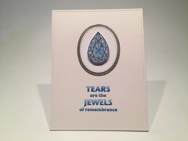
Wow! I water colored this ‘aquamarine’ gem like all the rest – in cerulean blue. I got a really good match for this lovely sentiment with my printer and the Silhouette software (Stone Sans font) and used a full-card-sized LFSRD to die-cut the card front. I matted a white oval die cut on a Platinum Tiara embossed oval and glued the ovals to the card front before mounting the gem with foam squares. I don’t know whether it’s the welcome break from all the pink in this kit, or this truly lovely sentiment, or just all the white space, but I love this card! A unique sympathy card!
The moment I saw that rectangular die cut with the three hearts, I thought of this card.
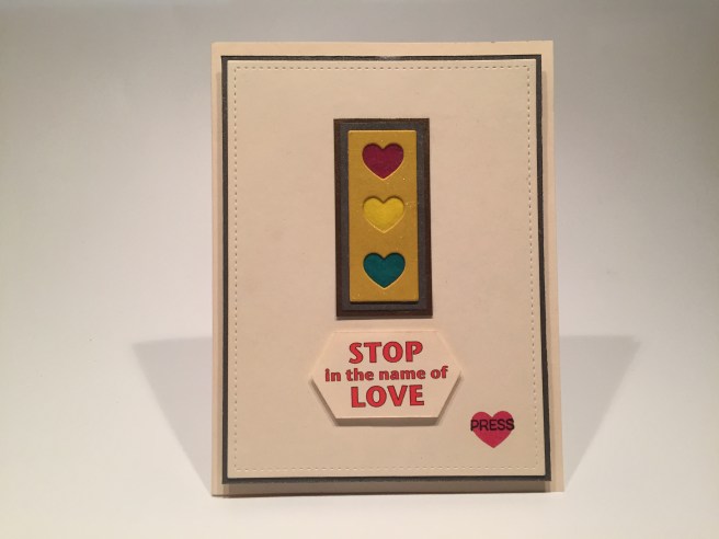
With the hearts stacked on top of each other in this rectangle, my mind immediately went to a traffic light! It’s been a little while since I did an interactive light-up card, and I thought this was the perfect opportunity. I die-cut the front panel from the vanilla card stock with a LFSRD and die-cut the heart rectangle from some Hero Hues Mustard card stock. There is a layer of white card behind the yellow (so the yellow and green glassine have white behind them) a mat of the grey specialty card and a mat of the bronze specialty card, then the vanilla card front and a thin grey specialty card mat. ALL of those layers have a cut opening behind the top heart, and the red chibitronics light is wired on top of the vanilla card base. I used glassine paper (kite paper) for the ‘lenses’ and actually doubled up the yellow and red for a little more intense color.
I actually built this whole card with the sentiment “Stop in the name Love” – even taking pics and video of the card – before I realized I was missing “of”! AARRGGHH! LOL!! I corrected the sentiment, trimmed it out and mounted it with foam squares on top of my mistake – – no one will ever know!! I stamped the “press” using the MFT Interactive Labels stamp set and Onyx black ink over the battery concealed at the bottom right. I then die-cut one more heart from the red kite paper, sent it through my Xyron sticker maker and glued it over the stamp. The whole card front is mounted to the electrified card base with 1/8″ thick foam squares. Voila! A fun interactive card without any pink!
That’s my ten cards inspired by the Love From Lizi August 2019 “Flawless” Card Kit. Five stamped gems, four featuring the dies and one shaker card! I did manage to use all the sentiments from the stamp set though I didn’t use all the layering pieces, and I didn’t get to the small star jewel stamp. But I did manage to get in a couple of my own sentiments!
I have lots of leftovers as usual, though I did use a lot more of the pattern papers than I thought I would. I only have one sheet of pattern paper that I didn’t use at all. I have a quarter-sheet of vanilla card stock left, and some decent pieces of our specialty card stock as well. I did use a little of most of the items in our embellishment bag, with the exception of the button and bows – all the extras and that great jewel stamp set will find loving homes in my stash! Actually, taken as a whole, these cards don’t read terribly pink! I was quite pleased to be able to bring some different colors to these cards and I REALLY got into water coloring those jewel stamps. Overall, a good time was had by ME!
Naturally, this kit sold out almost immediately, though there are still some add-on bits and new release products. If you’d like to subscribe to Love From Lizi so you don’t miss out on these hugely popular over-stuffed kits, or if you just go shopping at LFL, please use my link at: http://bit.ly/LFLlink Please give me a “like” on my CardCutups page on Facebook, follow me at #cardcutups on your instagram account, and remember to pin this post freely and share generously. Your support and encouragement keeps me inspired! Let me know which cards are your favorite, and if you have any questions or comments don’t hesitate to let me know! Remember, only a diamond can cut a diamond, and, as always, Happy Crafting!!
DISCLOSURE: This site contains some affiliate links to products. We may receive a commission for purchases made through these links. Thank you!!


 A perfect birthday card for the fisherman in your life! I did add a pun on the inside of this card – I thought it went quite well with the Birthday sentiment and fishing theme! I printed that sentiment using my
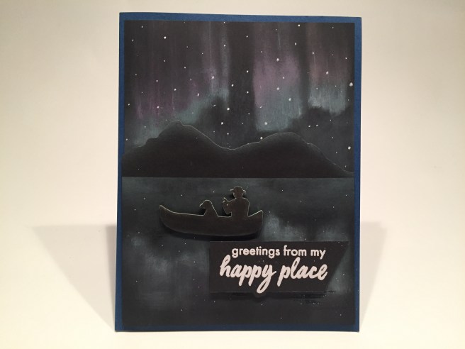
 I thought the extra “wish you were here” sentiment would be a perfect addition to this card, so I stamped that on the inside writing surface with Onyx Black ink. I think this is a pretty good representation of the Aurora Borealis, but I will definitely try some different techniques to try and get some true brightness emanating from these northern lights… isn’t there a “northern lights” stamp out there??

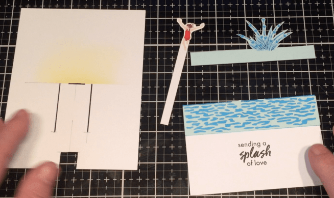
 I had an interesting idea on how to complete this stamped sentiment, so before I did anything to the front of this card, I printed “you can’t make a splash without getting wet” on the inside of the card using the Arial and
 Before I assembled everything together, I printed “avoid pier pressure” using the Arial and BlackJack font. Kind of a perfect pun for the theme and stamps this month! Finally, for a little extra “peer pressure”, I added the “wish you were here” sentiment on the inside, stamped again with Onyx Black ink. I really enjoyed stamping these images directly on the card front which avoids the ‘border’ when you die-cut the images with the dies. And a really fun pun too!


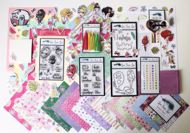
 the two add on stamp sets – “Summer Loving” (on the left) and “Summer Girl” (on the right) which gives me another two of the ‘eyelash girls’ and that terrific camper stamp! Since Lizi provided us with some extra copic-friendly card stock this month, I decided to go ahead and stamp all of the image stamps on a half-sheet of that card stock using

 squares included in the kit, and embellished with three blue enamel dots. They match the bow and skirt on the girl perfectly! (both paper pieced) I did continue the sentiments on the inside of the card stamping the “Have a wonderful Summer” on the inside writing surface. I think all three of these sentiments work very nicely together! I like how the Pink and Raspberry Pink card stocks and the green ink blending on the white card panel echo a watermelon! And if that slice of watermelon is any indicator, then that watermelon must be bigger than her head! LOL!

 Did you notice the asterisk at the end of the sentiment? Oh yes… there is more to come! Seems like there’s always a condition when someone says they love you more than something (or someone) else! “Unless it’s mint chocolate chip” is printed on the inside of this card just the same as the sentiment on the front. Now THAT makes me laugh! A nice valentine or ‘love you’ card that doesn’t necessarily have anything to do with summer!
 mirror washi tape on either side and then thin strips of the Raspberry Pink card stock to the outside of the washi tape. The smallest Bubble peel offs fit on those strips perfectly, and I added a super thin strip of both to anchor my girl mounted with foam squares. A few sequins for more sparkle on this shimmer pattern paper and I also stamped the “sea you soon” sentiment on the inside – gives us a little purpose for this card! And it’s a nice pun!

 (from the
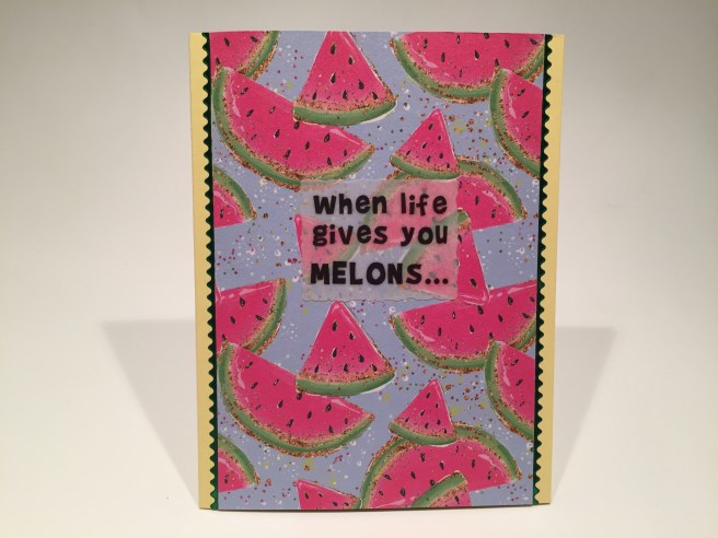
 The big kick comes on the inside with the completion of this sentiment – “you just might be dyslexic!” That makes me giggle every time I say it! I added the small watermelon wedge and the lemon from the stamp set(s) around the inside sentiment to kind of drive home the whole melon = lemon gag. A simple card with a terrifically funny sentiment. Sometimes I just can’t help myself!
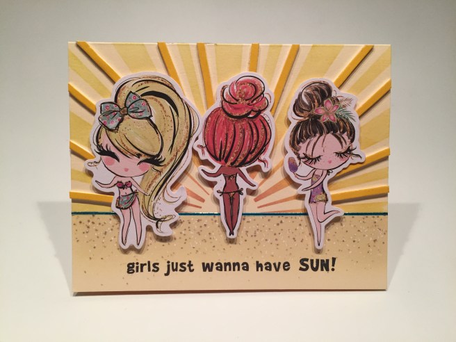
 inks and my
  I cut a slot for the hinge in the card panel above the camper roof and added a pull tab so it would flip the front of the camper open. I also cut out the window on the front of the camper to give a hint of what’s inside. I printed the sentiment on my last Mint card panel using the

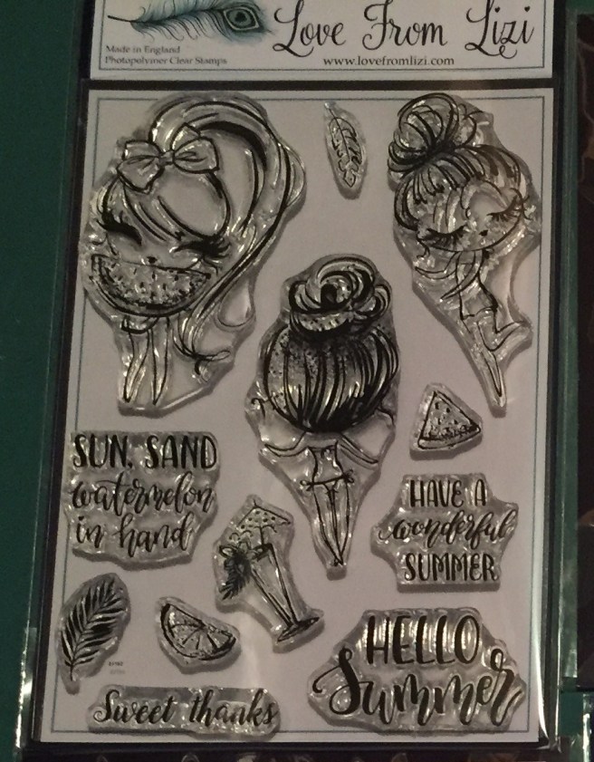


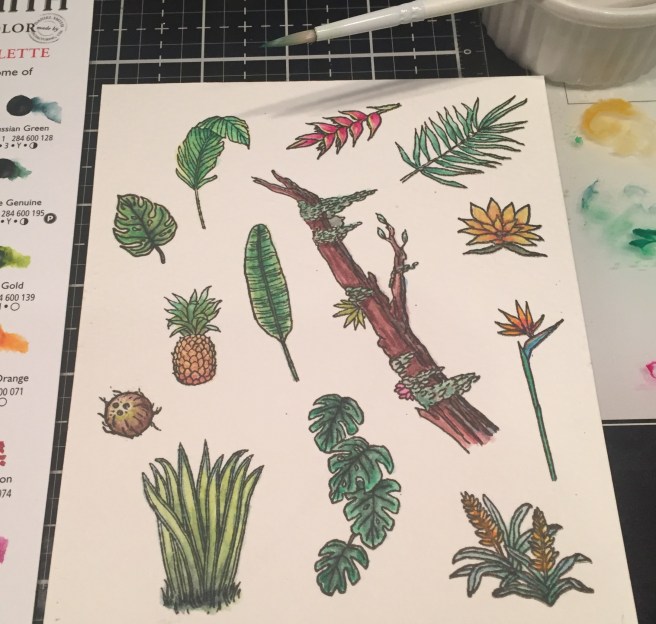
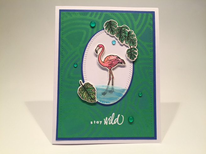
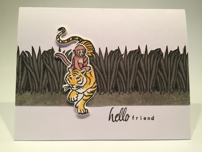
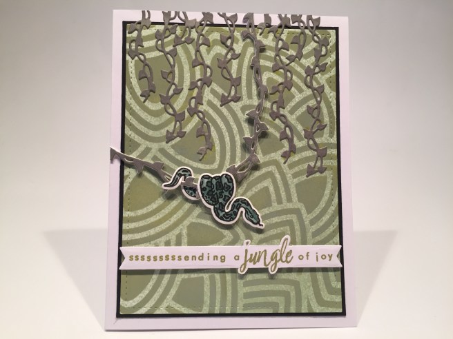
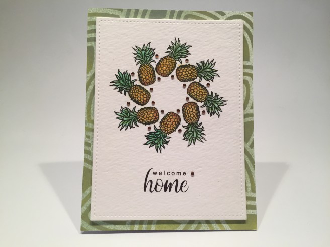
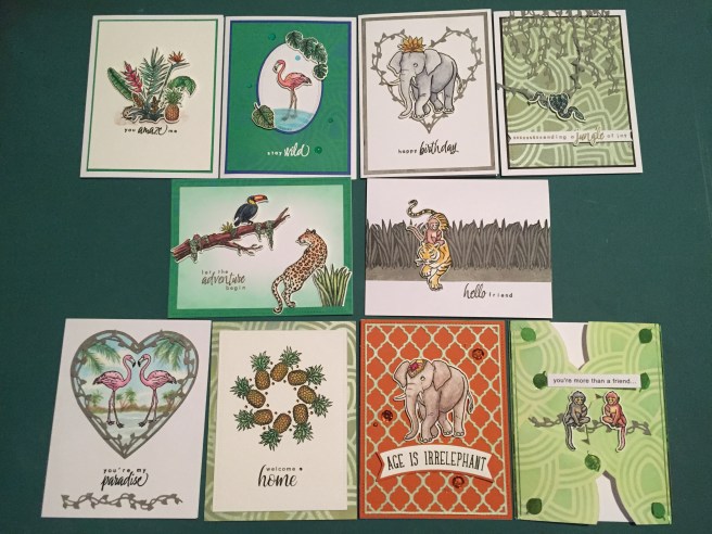
 Flowers and leafy images along with realistic animal images make up our 6″ x 8″ clear stamp set paired with seven different sentiments. Ous dies include twenty coordinating frame cuts along with two Jungle Vine Fancy Dies! We are treated this month to a Daniel Smith Watercolor Dot card “Jungle Palette” created especially for this kit. I guess we’re going to be watercoloring this month! This kit is rounded out with a 6″ x 6″ leaf pattern stencil and a brand new black dye ink cube that is darker than Hero Arts Intense Black ink – they are calling this INTENSE-ified Black Ink. I always love getting ink cubes in our MMH kits – this looks like a great kit to color and play with!


 Of course I justified this sentiment by adding a second sentiment on the inside. Using my


 I fashioned that sentiment to fit my
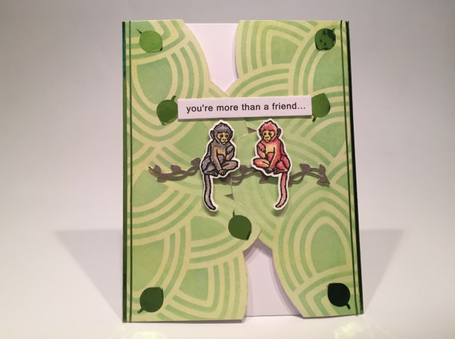


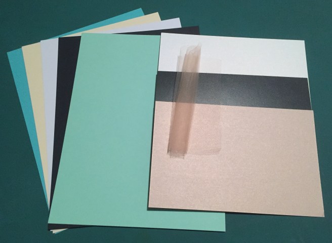
 This month, I decided to cut the card stock in half and use half of each sheet for card bases and trim the other half down to Acard-sized panels. I augmented the card bases from the kit with five white card bases from my stash, and I kind of like the option of having extra colored card panels to play with!
 panels on one side. Along with the two 12″ x 12″ cut-apart sheets also included in this kit, we have an embarrassment of cut-apart riches this month! I think it must have been that teal ombre, the wreath, and the dandelion panel that made me want to play with these. I went right ahead, and, disregarding the patterns on the back of these, cut both sheets down to eight panels. I wasn’t quite in the mood for a sympathy card right off the bat, so I decided to turn one of these panels into a masculine valentine.


 I did go ahead and add a sentiment on the inside of this card. One of the small sentiment strips from the sticker sheet went perfectly with this sentiment and is a great prelude to a personal note. More pretty!


 I actually did a little stamp surgery on the “Forever in our Hearts” stamp from the
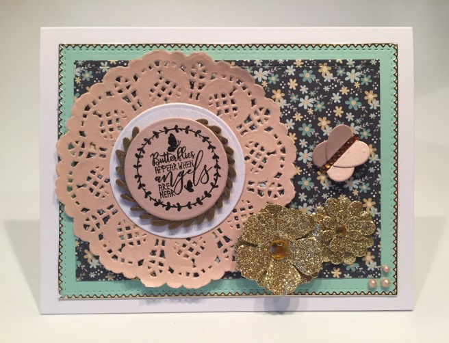


 On a Teal card base I grabbed my home-made ‘water ripples’ stencil and stenciled the bottom half of the card base using Salty Ocean Distress Oxide ink. I stamped the sentiment with the same ink and clear embossed that as well. I die-cut the two swans and three water lilies from our White specialty card stock and cut the hearts from a scrap of white glitter card stock. I took some green alcohol markers to the leaves of the lilies and glued everything flat to the card front except for the second swan who is mounted with some foam tape. I added two Teal mirror Sway peel offs (add-on peel off bundle) to the top and bottom edges of this card for a final pop of shape and shine.
  Of course, I cannot leave you without any puns this month, so on the inside of this card we get “You’re the swan that I want” (you are the swan I want – ooh, ooh, ohh, honey!) This is printed on a die-cut white writing surface using the
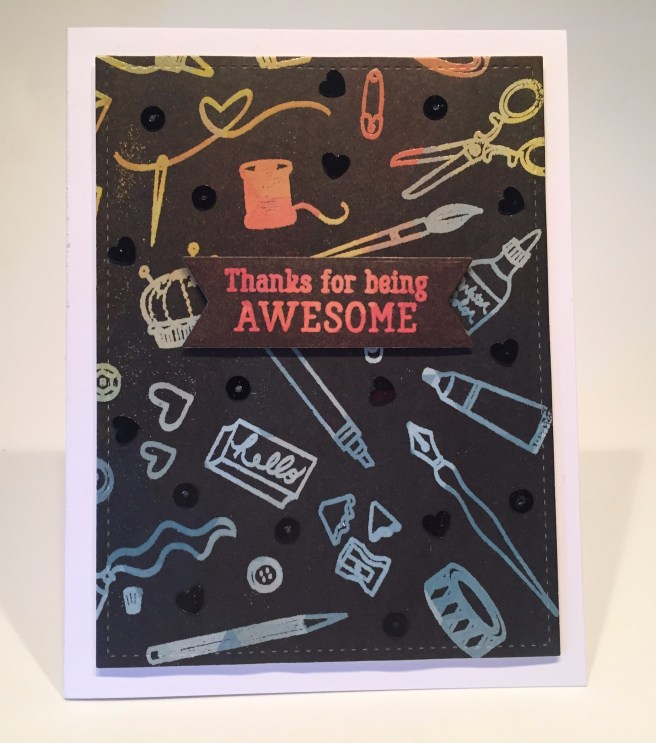
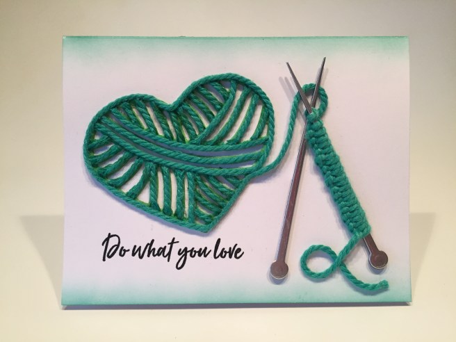
 Kit. Hero Arts is calling this “A Crafty Life is a Happy Life” kit in celebration of their 45th anniversary! This month we get a 6″ x 8″ clear stamp set featuring all sorts of craft supplies from stamping and painting to knitting and stitching along with 11 ‘crafty’ sentiments. We also get 20 matching frame cut dies and 2 Fancy Dies. I like the wide variety of crafty tools included with this stamp and die set! We also get a .5 oz. pot of Purple Sparkle Embossing Powder, a Clear Embossing and Watermark Ink Cube, a roll of Lavender Washi Tape, and five mini clothespins. I swear I have never actually purchased any mini clothespins, but over the past few years, I have acquired quite a large stash of these clothespins… obviously these mini clothespins are a popular addition to card kits and subscription boxes… Maybe I can find an interesting use for these…! If you’d like to follow along with my video, click here:
  I was also completely thrilled to receive an enamel pin marking the 45th anniversary of Hero Arts! Very nice pin in black and gold. Quite a lovely surprise!
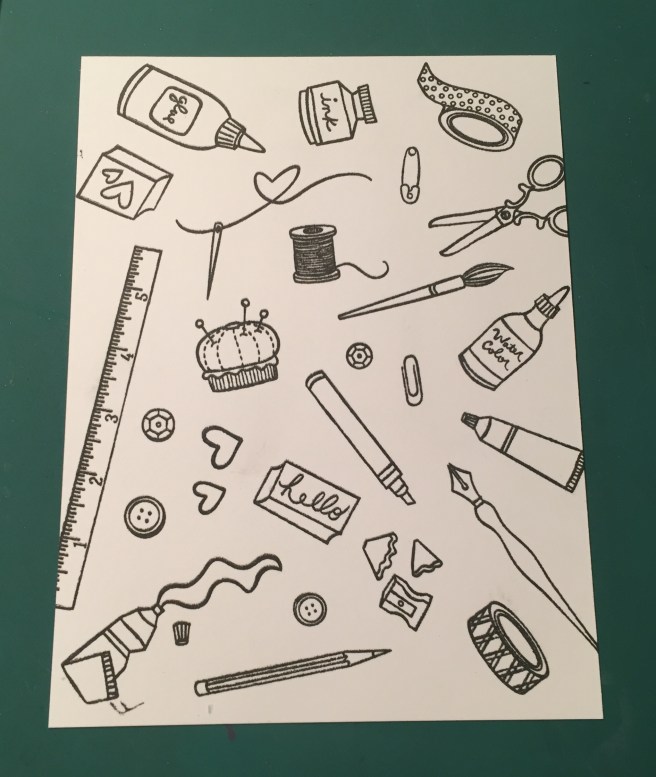

 I did stamp the sentiment on a piece of our Lavender Washi Tape using
  I did decide that I would use the “Handmade with LOVE” stamp on the back of all my cards this month. I do have a personalized stamp and a CardCutups label that I use on the backs of my cards, but I figured this was a good use for this stamp this month!

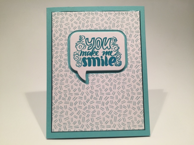
 I did add what could be the beginning of a long, soul-searching missive on the inside of this card by adding the “hi there” stamp! I’ve always liked cards with “cards” or “letters” or “envelopes” on them, and I really enjoy this “stationery” card. And, if calligraphy wasn’t enough to champion, then the simple act of writing a letter (or sending a card!) certainly is! LOL!
 Now, all “O”s wouldn’t work because then it’s just “OOOOO!” so I thought adding a few “X”s around would make the “O = hug” idea work!! But, not one to let the kisses go unnoticed, I did add “(and kisses)” on the inside as well! This is the
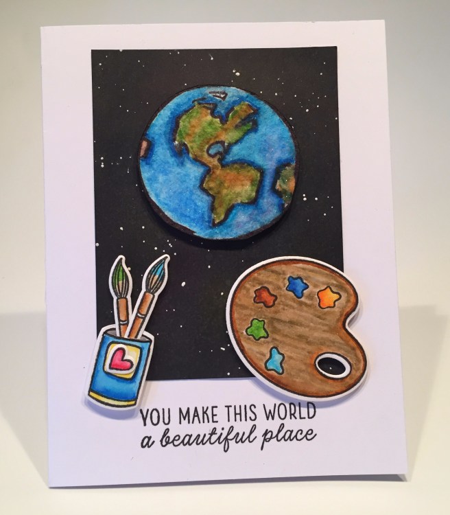


 This kit is stuffed with such a huge assortment of stamps, papers, stickers, dies, ribbons, embellishments and ephemera that it kind of feels like a free-for-all! Almost any card imaginable can be assembled using the supplies in this kit! As usual, I did make my ten A2 card bases using the five sheets of colorful card stock included in this kit. Let’s play! If you’d like to follow along with the video, please click here:
 Naturally, I have a little more to say here and added this (kind of snarky) sentiment on the inside. I printed that using the American Typewriter and
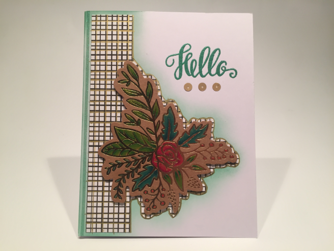
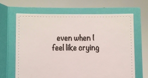 I did want to expand on this sentiment a little bit, so, on the inside writing surface (cut with a LFSRD) I added “even when I feel like crying” (
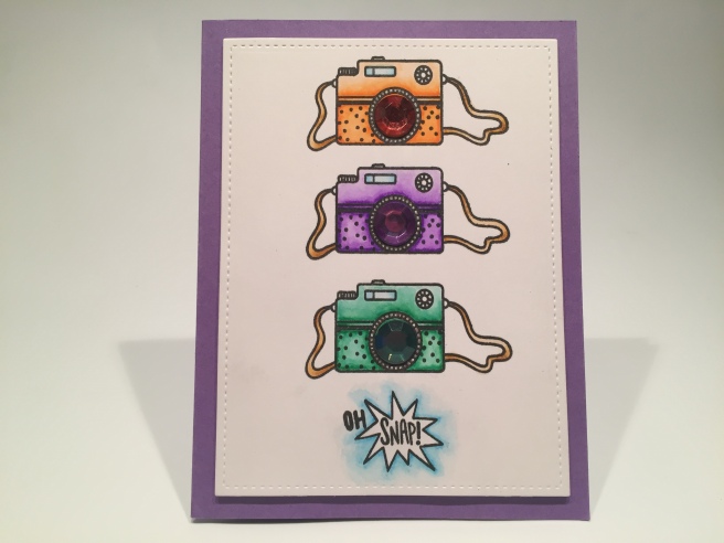
 I also seemed to remember a Love From Lizi sentiment stamp that would go along with this card beautifully! The “Happiness looks gorgeous on you!” stamp is from the LFL June ’18
 I though this was a great idea for a Spring card, and knew I had this “Happy Spring” stamp from my days as a Paper Pumpkin subscriber – this stamp is from the April 2016 Paper Pumpkin kit. I embossed that stamp on some of my yellow card stock using the
 arrangement of the gold foil flowers by using my non-stick craft mat and the die itself. I could move the stickers around and not worry that they would permanently fix themselves to the craft mat. I made a couple of slight adjustments transferring this design to my card front, but this exercise gave me a really good template to follow! I attached the die-cut to the card base with foam tape and arranged the foil stickers around it.
 Knowing that the Nuvo Drops in our kit don’t show their color on black, I reached for my
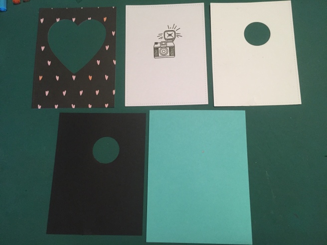
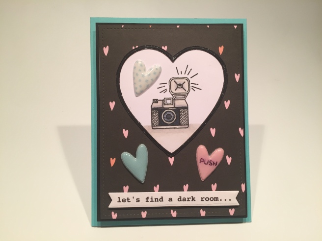
 I glued the puffy hearts in place, and used foam tape to add the sentiment banner. Naturally there is more to this sentiment continued on the inside of this card. Pretty good camera sentiment I think! Great valentine for any shutterbug or photography enthusiast! Let’s see this card in action!
 The z-fold is on the left of the front piece and on the right of the back piece. But we won’t glue them together till the end. I stamped the “PULL HERE” with Onyx Black ink (MFT interactive labels stamps) on both sides of the front piece, and then I covered the three panels and the sides of the two stamps with that fun black pattern paper. I stamped the camera on a piece of Bristol smooth card stock using VersaFine Onyx Black ink and embossed that with LFL Golden Crown embossing powder,
  and reached for my Stabilo markers again to color this. I added the “enjoy this moment” gold foil sticker from our kit underneath the camera, fussy cut the top edge of the camera and then cut straight down the two sides about 3″ making a large square below the camera.