Hello Folks! Scott here with my 10 cards from the My Monthly Hero July 2019 Kit. This kit is all about summertime fun at the lake and celebrating the great outdoors!

The 6″ x 9″ clear stamp set includes three layering stamps – the dock, mountains and trees along with assorted ‘summertime on the lake’ silhouettes. We have 14 coordinating frame cuts and two fancy dies in our die package, and we are treated to FIVE ink cubes with this kit – Lime Green, Forest, Sand Stone, Cocoa, and Dusty Blue. We get four 8.5″ x 5.5″ sheets of the Hero Hues card stock – two Meadow and two Lapis, and a half-ounce pot of Blue Pearl embossing powder. Grab your swimsuit and let’s head to the lake!

For my first card, I ink blended a sunset (or sunrise! – aren’t those prime fishing hours?) on the top third of a card front using Simon Says Stamp Hybrid ink cubes in Watermelon, Orange Slush and Lemon Zest, and the lake with a simple layer of the HA Dusty Blue ink. I embossed the large water ripple stamp on the lake twice using VersaMark ink and the included Pearl Blue embossing powder. I die cut both of our tree dies from some dark green card stock from my stash, and used the negative cut to ink their reflection in the water using the green inks from our kit. Easy reverse inking using the negative die-cuts!
I toned down the Dusty Blue lake with Salty Ocean Distress Oxide ink and added some sky reflections with the SSS Hybrid inks. I stamped the fisherman boat, the fish, birds and sentiment using VersaFine Onyx Black ink – I did mask off the bottom of the boat stamp to look like it was in the water. I glued the die-cut trees to the horizon, added some invisible thread between the fishing pole and the fish, and added more Blue Pearl embossed water ripples (and a splash for the fish) using a VersaMarker pen. I used the oval die from the MMH May ’18 kit to die-cut an oval frame from some dark grey card stock and glued that to the top of the card front. A perfect birthday card for the fisherman in your life! I did add a pun on the inside of this card – I thought it went quite well with the Birthday sentiment and fishing theme! I printed that sentiment using my Silhouette software and the Arial and Black Jack fonts, and trimmed that to a banner shape with my Lawn Fawn Everyday Sentiment dies. I really love the colors on this card – the silhouette stamps in our kit seem to dictate back-lighting – and I think that fishing line is the perfect accent – you can almost feel the tension on that pole!
When Hero Arts released this kit, Josmary Gonzales posted a lovely picture on the Hero Arts Kit Fanatics FaceBook page of a canoe being paddled on a lake in Canada with the aurora borealis in the sky above. I decide to give that northern lights effect a try!
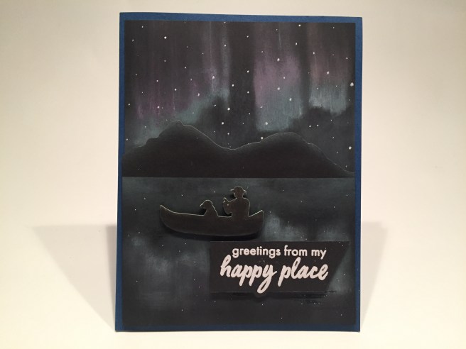
On black card stock, I used Hero Arts Unicorn White ink, Cracked Pistachio and Abandoned Coral Distress Oxide inks and my small Cheap-o Blending Brushes to create the ‘northern lights’ effect in the sky and their reflections in the ‘water’. I die-cut the mountains from more black card stock, and highlighted the edge with Unicorn White ink before gluing it to the horizon line. I stamped the boat on white card stock with VersaFine Onyx Black ink and fussy cut it to avoid the border left by the die. I did add the stars in the sky and water using a water based, extra fine point white Sharpie.
I highlighted the top (white) edges of the boat with the Cracked Pistachio ink, and attached it to the card front with foam tape. I did cut away the fishing pole, and I think it looks like he’s holding an oar instead. I embossed the sentiment on black card stock with white embossing powder, trimmed it out and added it to the card front with more foam tape. I trimmed the panel down to 4″ x 5.25″ and glued it down to a dark blue card base. I thought the extra “wish you were here” sentiment would be a perfect addition to this card, so I stamped that on the inside writing surface with Onyx Black ink. I think this is a pretty good representation of the Aurora Borealis, but I will definitely try some different techniques to try and get some true brightness emanating from these northern lights… isn’t there a “northern lights” stamp out there??
All of the scenic stamps and dies in this kit are sized to create portrait cards – I wanted to try a landscape card – after all, one would call these scenes “landscapes”!!

I actually used the Hero Hues card stock from our Venice kit for this card – Mustard for the sky and Arctic for the lake. A little ink blending with the SSS Hybrid inks for the sky, and I stamped the sentiment with Onyx Black ink and embossed the entire lake piece with the Blue Pearl embossing powder. VERY water-like! I stamped the mountains, trees, and plants on white card stock using the inks from our kit, and stamped the float line (and the birds) with Spiced Marmalade Distress Oxide ink. I added white stripes to those buoys with a white gel pen and a touch of shading with an alcohol marker. I die cut everything with their coordinating dies and glued them all flat to the card front.
That Blue Pearl embossing powder is very interesting – very fluffy in the pot, yet very water-like once melted. I didn’t add any figures to this card because the dock feels like an invitation to me – an “open door” so to say – coaxing you in and inviting you to the cool waters of the lake!
When we get one of these ‘create-a-scene’ kits from Hero Arts, I find myself thinking in terms of smaller vignettes that highlight a specific idea or stamp in the kit. Love this one!

I used my homemade water ripple stencil and Cheap-o blender brushes to ink the ‘water’ in the center of a white card base. I did use the Dusty Blue ink from the kit and added a touch of Cracked Pistachio Distress Oxide ink for a little variety, as well as positioning the stencil in a couple of directions to add texture. The silhouette and the sentiment are then stamped with Onyx Black ink. I had an interesting idea on how to complete this stamped sentiment, so before I did anything to the front of this card, I printed “you can’t make a splash without getting wet” on the inside of the card using the Arial and Brushgyo fonts. I thought this was the perfect compliment to the kit sentiment and certainly creates a real purpose for this card. I love the simplicity and all the white space on this card and how that pulls your focus right in to the vignette. All in all, a simple single-layer card that conveys a terrific sentiment of encouragement!
I’ve used five of the six sentiments include in the stamp set… how about a pun or two?

I used the SSS Hybrid ink in Orange Slush and Lemon Zest to ink blend the sky, and the Dusty Blue for the ‘lake’ I did a second layer of the Dusty Blue with my water ripple stencil for some nice watery texture. I stamped and die-cut the mountains (on grey card stock) and the trees (on the Meadow card stock) using the included inks. Again, the negative die cut comes in handy for inking in the islands’ reflection in the lake. I stamped the dock and the grasses with the included inks directly on the card front, and stamped the silhouettes and the birds with Onyx Black ink.
I also stamped the inner tube using some SSS Barely Beige ink and colored that with my alcohol markers and fussy cut it out. I thought it wasn’t in quite the right perspective to be floating on the lake, so I simply leaned it against one of the piers on our dock. I also embossed a few water ripple stamps on the lake using the Blue Pearl embossing powder.  Before I assembled everything together, I printed “avoid pier pressure” using the Arial and BlackJack font. Kind of a perfect pun for the theme and stamps this month! Finally, for a little extra “peer pressure”, I added the “wish you were here” sentiment on the inside, stamped again with Onyx Black ink. I really enjoyed stamping these images directly on the card front which avoids the ‘border’ when you die-cut the images with the dies. And a really fun pun too!
I thought the little ‘Loch Ness Monster’ stamp added a cute whimsical touch to this stamp set, but it seemed a little smaller in reference to the other images. Vignette to the rescue!

This is on a Lapis card base from the kit, and I die-cut the circle from the HA Arctic card stock, and ink blended the lake with the Dusty Blue ink from the kit. I die-cut the hills from the Meadow card stock and again used the negative die-cut to ink blend the reflection in the lake. I added a touch of Unicorn White to the base of the hills for a little bit of a ‘misty’ feel, and stamped ‘Nessie’ using the Forest ink and embossed her with some clear embossing powder.
I printed “i believe in you” on the card front using the same Arial and Brushgyo fonts, and punched a small sun with a simple hole punch. I did die-cut the circular frame using some real wood sheets in my stash, and then glued everything directly to the card front. I really like highlighting that ‘Nessie’ stamp all by itself, and it’s a perfect image for this fun and useful sentiment. Who doesn’t need to be reminded that you believe in them!!
I really like the “it’s your birthday” sentiment – I don’t have one of those in my stash. So I trimmed off the “…relax and enjoy” so I could stamp just the birthday sentiment alone.
I rarely use pattern paper with the MMH kits but this seemed especially appropriate! This pattern paper is Doodlebug Designs Fairy Tales Collection (came with the Simon Says Stamp September ’17 Card Kit) matted on a thin black mat and mounted to a white card base. The sentiment is stamped on a scrap of white card using Onyx Black ink and die-cut with another LF Everyday Messages die. The silhouette is stamped on some heat resistant acetate with StazOn jet Black ink and partially die cut to leave an acetate tab underneath the stamp. This is a simple ‘double slider’ card mechanism with a slit hidden towards the bottom of the sentiment that allows the silhouette to magically appear from behind. Very simple yet I think it’s very effective! It’s your Birthday – – HOORAY! There is a little more of a how-two for this card on my 10C1K video for this kit:
This apparently simple birthday card is perfect for any whimsically inclined grownup!
I do have one more pun that I’m itching to use… pretty silly, but very funny! (I think!)

Makes me laugh every time!! This is another completely flat, one layer card. Since I knew I would be printing this sentiment (Brushgyo and Arial fonts again), I used my Silhouette Software (remember the basic software is FREE!) to draw my pond ellipse with a faint blue line to guide my alcohol marker coloring of the pond. I stamped the cattails and grasses with the included inks and colored the cattails and added the grass details with a brown pigma micron pen. The ducks are stamped with Onyx Black ink, and I added a few highlights with a white gel pen. This could be another “wish you were here” card or a “happy place” card depending on the recipient… this pun makes me giggle!
While I was researching some lake images, I came upon a picture of a perfectly still lake reflecting every single star in the sky. I wanted to try and recreate that on a card.

On a black card panel, I spattered the stars using my Permanent White Gouache watercolor paint and a thin brush. I die-cut the hills from some dark gray card stock and used Unicorn White ink and the die cut negative to blend a little reflection of the hills in the lake. I stamped the fishing boat on the same gray card stock with Onyx Black ink, die-cut it out with the coordinating die, trimmed the bottom of the boat flat and added highlights to the boat and occupants with a white gel pen.
Again, I used the negative of the die cut boat and Unicorn White ink, to add the reflection in the lake. I did use another piece of my invisible thread to create a swooping cast of line from the end of the fishing pole. If you look closely, you can see it. That seemed much more appropriate to go along with this sentiment than a line straight down into the water. I printed the “cast away your troubles” (same fonts again) in white on black and die cut that out with the LF Everyday Messages die. The images are glued directly to the card panel, the sentiment is mounted with foam tape, and the whole panel is glued to a white card base.

Once again this begs for more on the inside, so I stamped the “life is better at the lake” to finish out this card. Talk about a seriously monochromatic card! The night sky certainly feels vast and infinite in this scene. This was really a pleasant surprise for me when this card came together. I think it’s kind of stunning!
I have one more sentiment from the stamp set waiting to be used, And 1 more good idea! Another interactive card to wrap up this kit! A “double slider” card with double actions!
This turned out to be simpler than I originally thought it would.
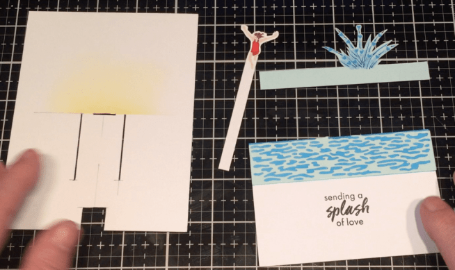
I did make a mock-up to figure out this mechanism and then created these pieces for the actual card. The piece on the left is 4.25″ x 5.5″ with a 1/2″ square notch at the center of the bottom, and a 1/2″ slot right in the middle of the card. The girl jumper die-cut is just under 1″ wide so I added two long slots 1/2″ from the vertical center line and 1.75″ from the horizontal center line down. Those will be the ‘tracks’ that the long tab on the bottom of the splash piece will travel in.
I stamped our jumper with SSS Barely Beige ink and colored her with my Micron pens and alcohol markers – I wanted more color that the simple silhouette stamp would provide. I did a partial die-cut on her and extended the card stock underneath her to make a long tab.
The “splash” is freehanded and cut from HA Arctic card stock with a long 1/2″ tab along the bottom. I colored the splash with Pigma pens, alcohol markers and a tiny heart stamp. The front of the card piece is 4.25″ x 2.75″ (half the size of the card) I inked the top inch of that piece with HA Summer Sky ink, die-cut the water die (from the HA April 2019 Venice kit) from more of the Arctic card stock, glued that to the inked section and stamped the sentiment on the bottom with Onyx Black ink.
The assembly is the same as any other “double slider card” – wrap your 1/2″ wide plastic ‘conveyor belt’ around the bottom notch and through the center slot and glue the ends together with some very strong double-sided adhesive. Remember to keep it just loose enough to slide easily. The tab on the splash piece is folded (1/2″ either side of the center of the splash) to go through the side slots, wrapped around the back and glued to the back of the plastic ‘conveyor belt’. The tab on the girl is glued on top of a 1/2″ pull-tab and both are attached to the front of the conveyor belt so she is above the center of the card when the wave is at the bottom, and she is below the center line when the wave is at the top.
Once the action is complete and working properly, you can add the top piece with foam tape and then add the whole panel to a card base with more foam tape. My 10C1K video has a little more detail on the assembly if you’d like to see more. I’m thrilled with this double-action card and I think it illustrates this sentiment perfectly!

That’s my 10 cards from the My Monthly Hero July Kit. I’m sorry this took a little bit of time to get to you – I didn’t receive my kit until July 12th and we had relatives staying with us over the last weekend. The craft room becomes the guest room when we have visitors! I am very pleased with all of these cards and I did manage to use every single stamp in this stamp set! WOO-HOO!! This is one of those MMH kits that sold out incredibly fast. I think everyone loves getting layering stamps in these kits – and I love the five ink cubes! If you DO go shopping at Hero Arts, please use my link: http://bit.ly/2sBmuMCHeroArts It helps support this website and my channel on YouTube, and is, of course, sincerely appreciated!


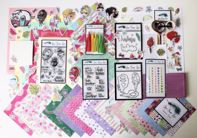
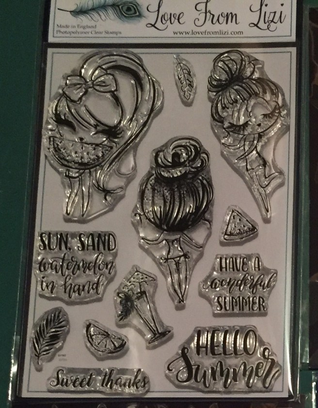
 the two add on stamp sets – “Summer Loving” (on the left) and “Summer Girl” (on the right) which gives me another two of the ‘eyelash girls’ and that terrific camper stamp! Since Lizi provided us with some extra copic-friendly card stock this month, I decided to go ahead and stamp all of the image stamps on a half-sheet of that card stock using

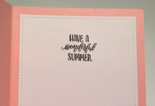 squares included in the kit, and embellished with three blue enamel dots. They match the bow and skirt on the girl perfectly! (both paper pieced) I did continue the sentiments on the inside of the card stamping the “Have a wonderful Summer” on the inside writing surface. I think all three of these sentiments work very nicely together! I like how the Pink and Raspberry Pink card stocks and the green ink blending on the white card panel echo a watermelon! And if that slice of watermelon is any indicator, then that watermelon must be bigger than her head! LOL!

 Did you notice the asterisk at the end of the sentiment? Oh yes… there is more to come! Seems like there’s always a condition when someone says they love you more than something (or someone) else! “Unless it’s mint chocolate chip” is printed on the inside of this card just the same as the sentiment on the front. Now THAT makes me laugh! A nice valentine or ‘love you’ card that doesn’t necessarily have anything to do with summer!
 mirror washi tape on either side and then thin strips of the Raspberry Pink card stock to the outside of the washi tape. The smallest Bubble peel offs fit on those strips perfectly, and I added a super thin strip of both to anchor my girl mounted with foam squares. A few sequins for more sparkle on this shimmer pattern paper and I also stamped the “sea you soon” sentiment on the inside – gives us a little purpose for this card! And it’s a nice pun!

 (from the
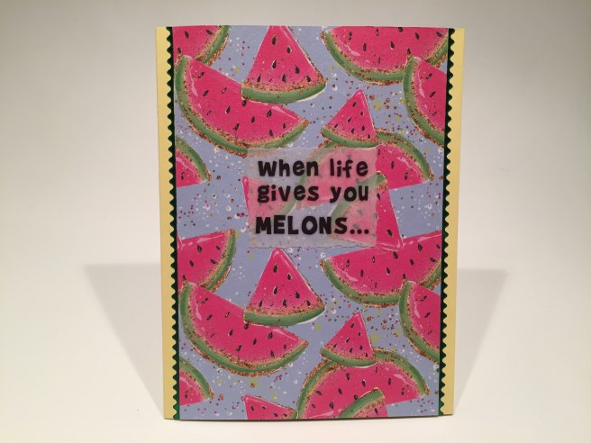
 The big kick comes on the inside with the completion of this sentiment – “you just might be dyslexic!” That makes me giggle every time I say it! I added the small watermelon wedge and the lemon from the stamp set(s) around the inside sentiment to kind of drive home the whole melon = lemon gag. A simple card with a terrifically funny sentiment. Sometimes I just can’t help myself!
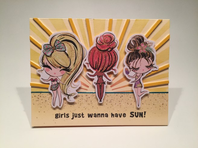
 inks and my
  I cut a slot for the hinge in the card panel above the camper roof and added a pull tab so it would flip the front of the camper open. I also cut out the window on the front of the camper to give a hint of what’s inside. I printed the sentiment on my last Mint card panel using the


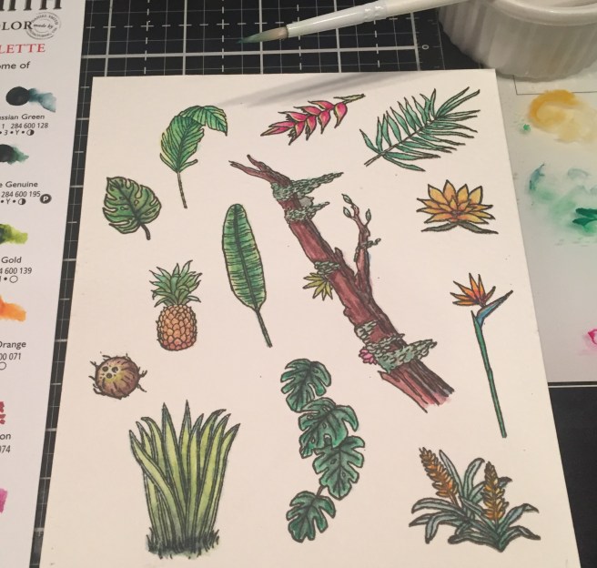
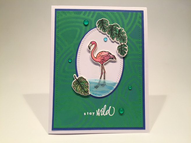
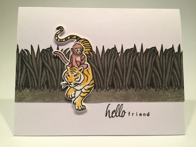
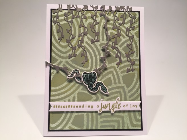
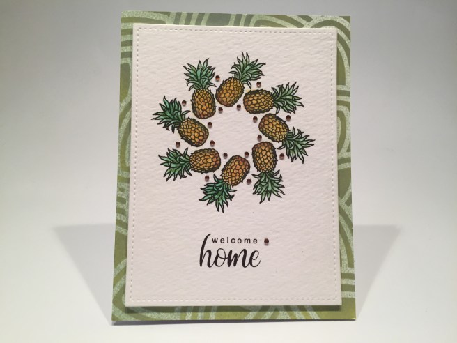
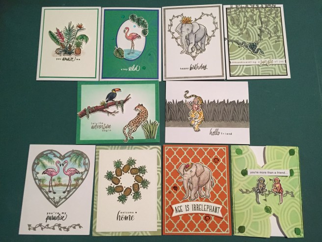
 Flowers and leafy images along with realistic animal images make up our 6″ x 8″ clear stamp set paired with seven different sentiments. Ous dies include twenty coordinating frame cuts along with two Jungle Vine Fancy Dies! We are treated this month to a Daniel Smith Watercolor Dot card “Jungle Palette” created especially for this kit. I guess we’re going to be watercoloring this month! This kit is rounded out with a 6″ x 6″ leaf pattern stencil and a brand new black dye ink cube that is darker than Hero Arts Intense Black ink – they are calling this INTENSE-ified Black Ink. I always love getting ink cubes in our MMH kits – this looks like a great kit to color and play with!


 Of course I justified this sentiment by adding a second sentiment on the inside. Using my


 I fashioned that sentiment to fit my
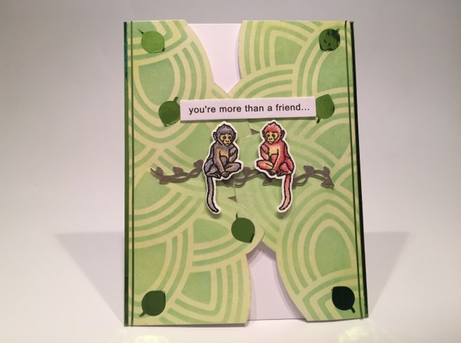


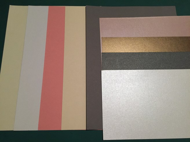
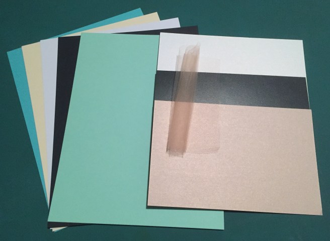
 This month, I decided to cut the card stock in half and use half of each sheet for card bases and trim the other half down to Acard-sized panels. I augmented the card bases from the kit with five white card bases from my stash, and I kind of like the option of having extra colored card panels to play with!
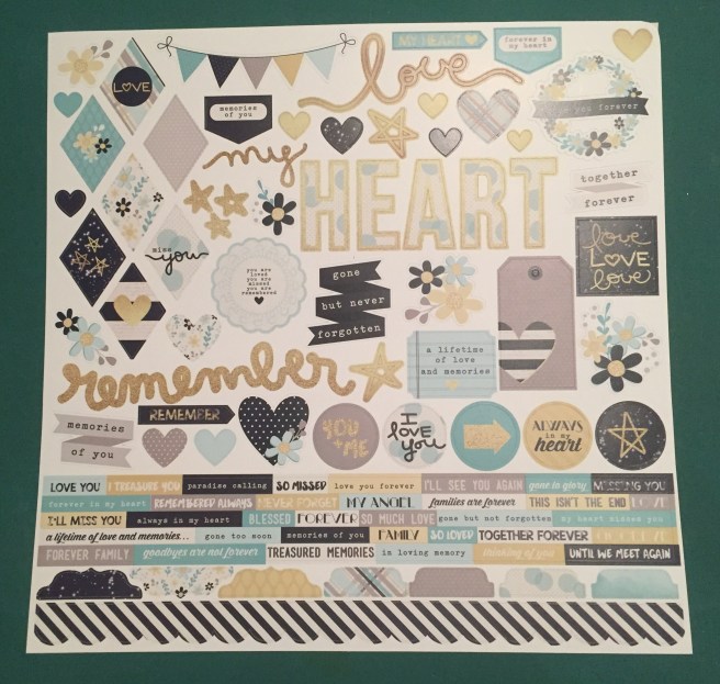
 panels on one side. Along with the two 12″ x 12″ cut-apart sheets also included in this kit, we have an embarrassment of cut-apart riches this month! I think it must have been that teal ombre, the wreath, and the dandelion panel that made me want to play with these. I went right ahead, and, disregarding the patterns on the back of these, cut both sheets down to eight panels. I wasn’t quite in the mood for a sympathy card right off the bat, so I decided to turn one of these panels into a masculine valentine.


 I did go ahead and add a sentiment on the inside of this card. One of the small sentiment strips from the sticker sheet went perfectly with this sentiment and is a great prelude to a personal note. More pretty!
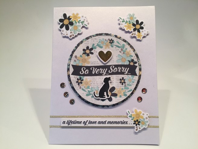


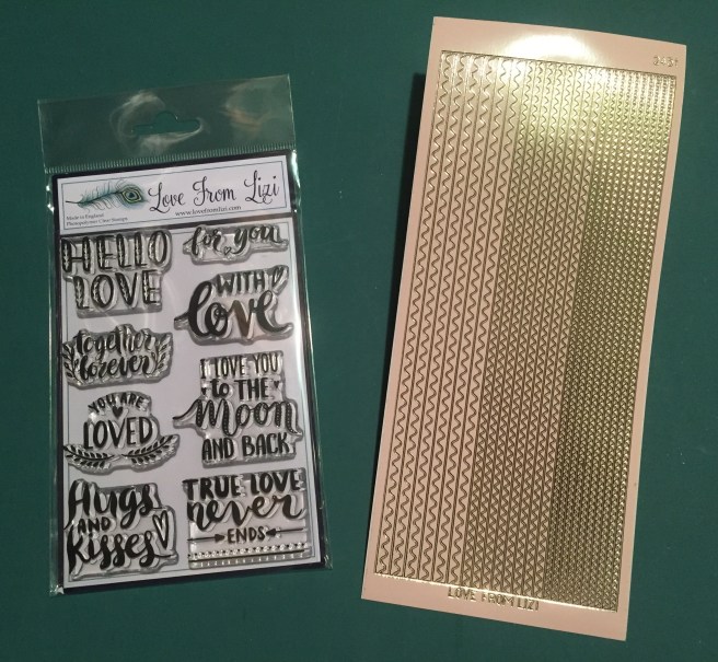
 I actually did a little stamp surgery on the “Forever in our Hearts” stamp from the


 On a Teal card base I grabbed my home-made ‘water ripples’ stencil and stenciled the bottom half of the card base using Salty Ocean Distress Oxide ink. I stamped the sentiment with the same ink and clear embossed that as well. I die-cut the two swans and three water lilies from our White specialty card stock and cut the hearts from a scrap of white glitter card stock. I took some green alcohol markers to the leaves of the lilies and glued everything flat to the card front except for the second swan who is mounted with some foam tape. I added two Teal mirror Sway peel offs (add-on peel off bundle) to the top and bottom edges of this card for a final pop of shape and shine.
  Of course, I cannot leave you without any puns this month, so on the inside of this card we get “You’re the swan that I want” (you are the swan I want – ooh, ooh, ohh, honey!) This is printed on a die-cut white writing surface using the
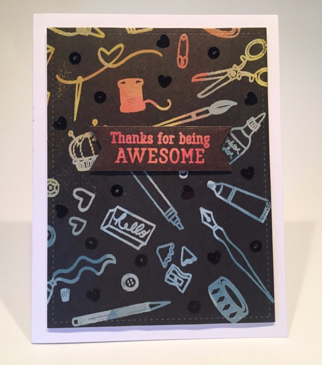
 Kit. Hero Arts is calling this “A Crafty Life is a Happy Life” kit in celebration of their 45th anniversary! This month we get a 6″ x 8″ clear stamp set featuring all sorts of craft supplies from stamping and painting to knitting and stitching along with 11 ‘crafty’ sentiments. We also get 20 matching frame cut dies and 2 Fancy Dies. I like the wide variety of crafty tools included with this stamp and die set! We also get a .5 oz. pot of Purple Sparkle Embossing Powder, a Clear Embossing and Watermark Ink Cube, a roll of Lavender Washi Tape, and five mini clothespins. I swear I have never actually purchased any mini clothespins, but over the past few years, I have acquired quite a large stash of these clothespins… obviously these mini clothespins are a popular addition to card kits and subscription boxes… Maybe I can find an interesting use for these…! If you’d like to follow along with my video, click here:
  I was also completely thrilled to receive an enamel pin marking the 45th anniversary of Hero Arts! Very nice pin in black and gold. Quite a lovely surprise!
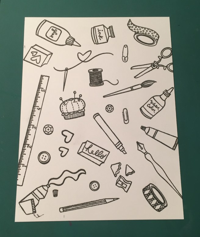

 I did stamp the sentiment on a piece of our Lavender Washi Tape using
  I did decide that I would use the “Handmade with LOVE” stamp on the back of all my cards this month. I do have a personalized stamp and a CardCutups label that I use on the backs of my cards, but I figured this was a good use for this stamp this month!

 I did add what could be the beginning of a long, soul-searching missive on the inside of this card by adding the “hi there” stamp! I’ve always liked cards with “cards” or “letters” or “envelopes” on them, and I really enjoy this “stationery” card. And, if calligraphy wasn’t enough to champion, then the simple act of writing a letter (or sending a card!) certainly is! LOL!
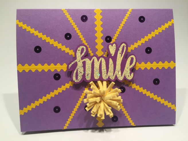
 Now, all “O”s wouldn’t work because then it’s just “OOOOO!” so I thought adding a few “X”s around would make the “O = hug” idea work!! But, not one to let the kisses go unnoticed, I did add “(and kisses)” on the inside as well! This is the
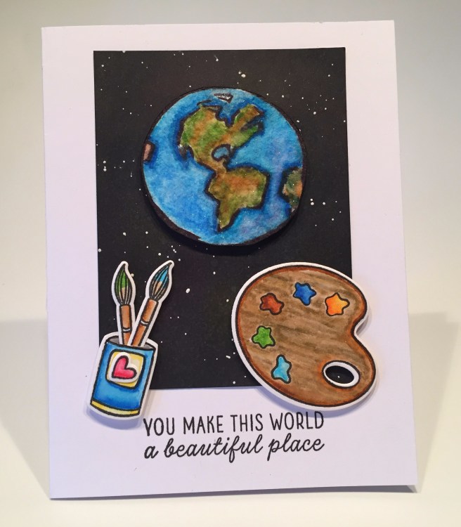


 This kit is stuffed with such a huge assortment of stamps, papers, stickers, dies, ribbons, embellishments and ephemera that it kind of feels like a free-for-all! Almost any card imaginable can be assembled using the supplies in this kit! As usual, I did make my ten A2 card bases using the five sheets of colorful card stock included in this kit. Let’s play! If you’d like to follow along with the video, please click here:
 Naturally, I have a little more to say here and added this (kind of snarky) sentiment on the inside. I printed that using the American Typewriter and
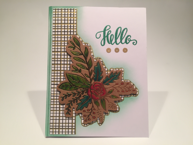
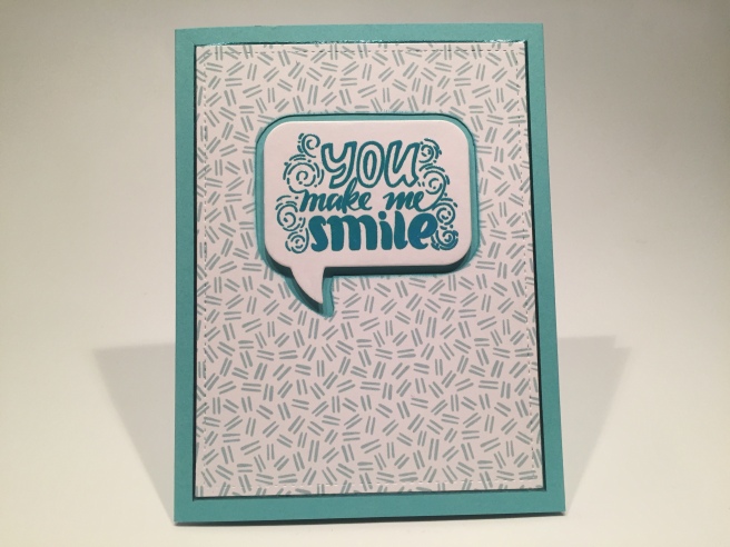
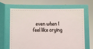 I did want to expand on this sentiment a little bit, so, on the inside writing surface (cut with a LFSRD) I added “even when I feel like crying” (
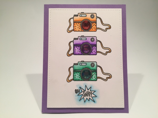
 I also seemed to remember a Love From Lizi sentiment stamp that would go along with this card beautifully! The “Happiness looks gorgeous on you!” stamp is from the LFL June ’18
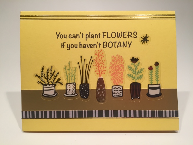
 I though this was a great idea for a Spring card, and knew I had this “Happy Spring” stamp from my days as a Paper Pumpkin subscriber – this stamp is from the April 2016 Paper Pumpkin kit. I embossed that stamp on some of my yellow card stock using the
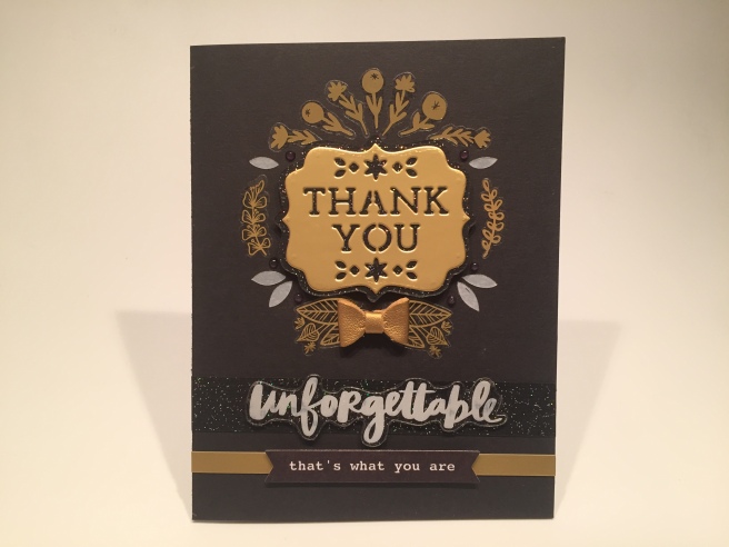
 arrangement of the gold foil flowers by using my non-stick craft mat and the die itself. I could move the stickers around and not worry that they would permanently fix themselves to the craft mat. I made a couple of slight adjustments transferring this design to my card front, but this exercise gave me a really good template to follow! I attached the die-cut to the card base with foam tape and arranged the foil stickers around it.
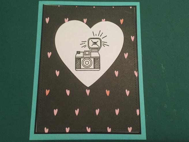
 Knowing that the Nuvo Drops in our kit don’t show their color on black, I reached for my
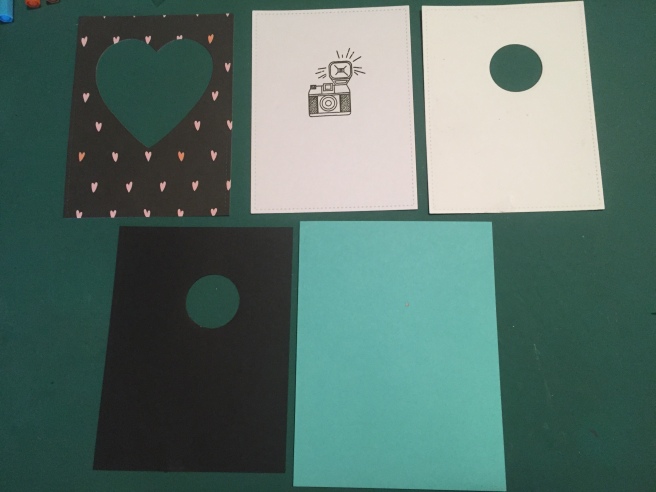
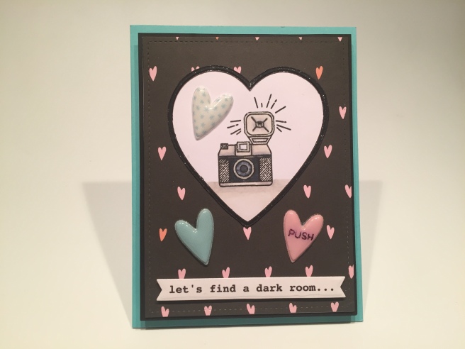
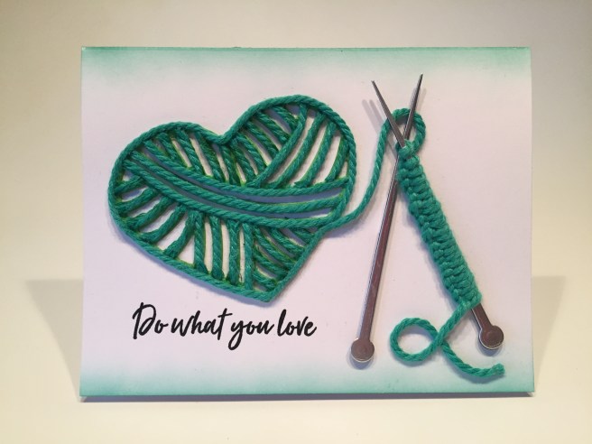
 I glued the puffy hearts in place, and used foam tape to add the sentiment banner. Naturally there is more to this sentiment continued on the inside of this card. Pretty good camera sentiment I think! Great valentine for any shutterbug or photography enthusiast! Let’s see this card in action!
 The z-fold is on the left of the front piece and on the right of the back piece. But we won’t glue them together till the end. I stamped the “PULL HERE” with Onyx Black ink (MFT interactive labels stamps) on both sides of the front piece, and then I covered the three panels and the sides of the two stamps with that fun black pattern paper. I stamped the camera on a piece of Bristol smooth card stock using VersaFine Onyx Black ink and embossed that with LFL Golden Crown embossing powder,
  and reached for my Stabilo markers again to color this. I added the “enjoy this moment” gold foil sticker from our kit underneath the camera, fussy cut the top edge of the camera and then cut straight down the two sides about 3″ making a large square below the camera.
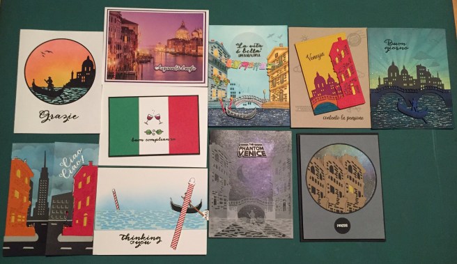
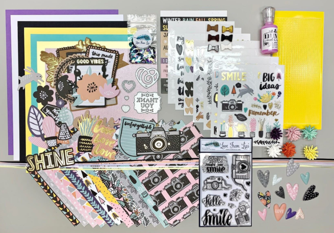
 In addition to the fancy dies, we get a 4″ x 6″ stamp set featuring a number of Italian sentiments, some English sentiments (a few translations!) and an assortment of scene-building images – clouds, birds, a sun, some waves, a cancelled postmark, etc. We also get a collection of the new Hero Hues Premium Cardstock in Sand, Mustard, Pumpkin, Cherry, Plum, Adriatic, and Arctic colors – we get two 8.5″ x 5.5″ sheets of each color and two similar sheets of vellum. I’ve been itching to check out this card stock ever since Hero Arts released it, and I have to say it is extremely high quality and the colors are bright and vibrant! To round out our kit this month we get a Tombow Mono Drawing Pen in black, and two rolls of 1/2″ foam tape (2.2 yards) in two different thicknesses. Perfect additions for layering your die-cuts!
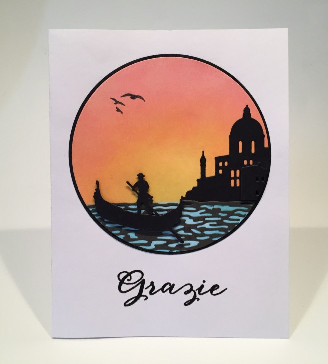

 Now, I have been tempted many times, but I’ve never used the backing card images from our stamp and die set on one of my cards, but the photograph of Venice this month was SO beautiful that I couldn’t resist! Those domes on our ‘building’ die, are modeled after the church seen in this picture – the
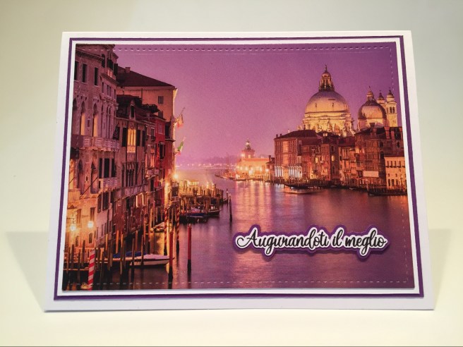
 Since we did a translation on my first card, I figured I would continue that concept here and turned to my

 I even managed to get a couple of those bow-tie pasta (farfalle) stamps on this card front as well! Yes, this printed sentiment is Italian for another one of our stamp set sentiments, so I simply stamped the ‘translation’ on the inside of the card! I think this makes a very effective retirement card – you don’t have to move to Venice for your retirement, but you can certainly travel there – or anywhere else! I really like this colorful ‘travel poster’!
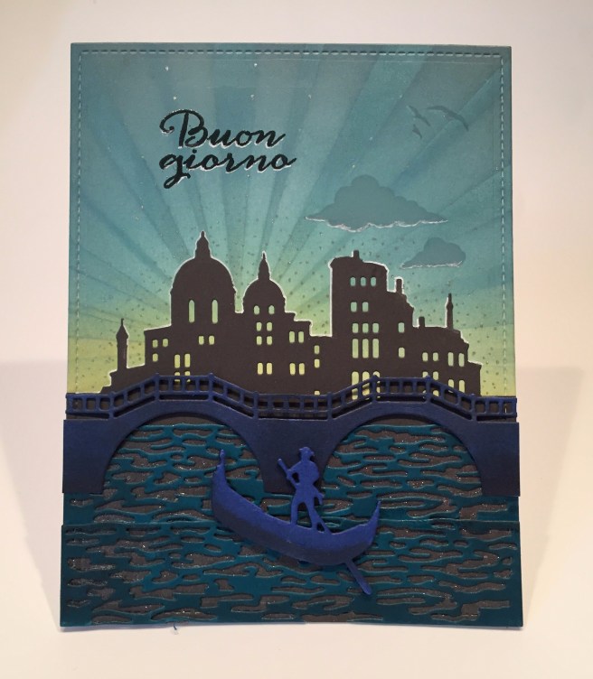
 A final sprinkling of dots using my
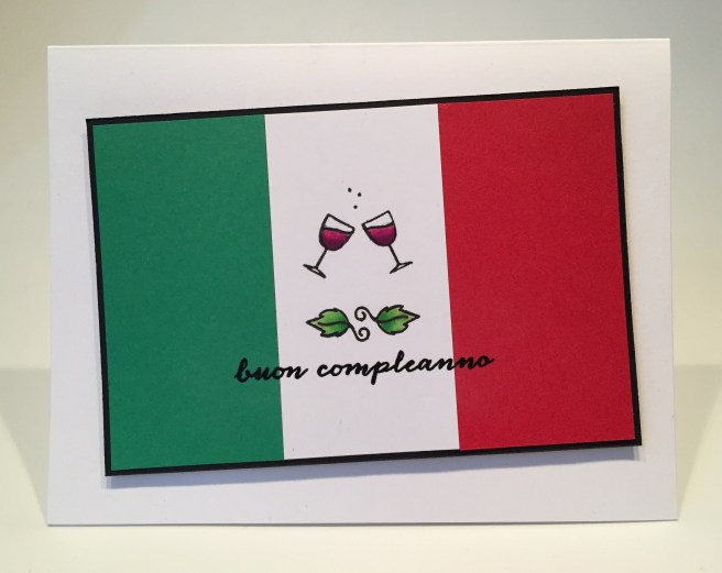
 The red wine echoes the red part of the flag, and the green leaves echo the green! Of course, I did add the “Happy Birthday” stamp on the inside (just in case!) and here we have a Birthday card that is right on theme without having to use any dies! A perfect card for an Italian or an Italophile!


 I think I am most pleased with this very simple yet surprisingly effective sentiment printed with the Arabella font on the inside of the card. I stamped the little sketched heart below my printed sentiment for a bit of a loving touch. I can think of many opportunities to use a card like this! I think this is SO SWEET!!