
Hello Folks! Scott here today with 10 cards created from the new My Monthly Hero Classic and Premium Kit for March 2023. This is our first regular month with the Classic/Premium kit having introduced the new options last month. This feels a little more balanced with most of the goodies contained in the Classic kit and just a few special items added for the Premium kit. We’re off to the farmer’s market this month with lots of fruits and vegetables paired with lots of puns!
CLASSIC KIT INCLUDES:
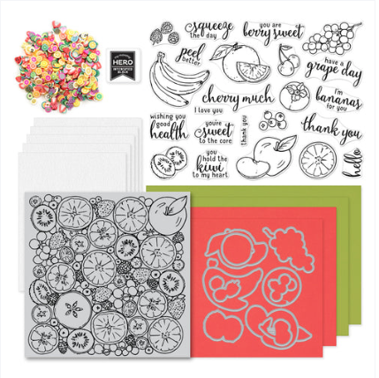
• Clear Stamp Set, 6″ x 8″
• 10 Coordinating Dies
• Fruit Cling Stamp, 6″ x 6″
• Intens-ified Black Ink Cube
• Clay Fruit Embellishments
• 2 Sheets each of Kiwi and Coral Cardstock, 5.5″ x 8.5″
• 5 Sheets of Watercolor Paper, 5.5″ x 8.5″
PREMIUM KIT INCLUDES (Premium elements in bold):
• Clear Stamp Set, 6″ x 8″
• 10 Coordinating Dies
• Fruit & Veggie Window Die, 3.7″ x 4.5″
• Fruit Cling Stamp, 6″ x 6″
• Intens-ified Black Ink Cube
• 2 Liquid Watercolor Neon Brights in Orange & Green
• 5 Mini Brushes
• Clay Fruit Embellishments
• 2 Sheets each of Kiwi and Coral Cardstock, 5.5″ x 8.5″
• 5 Sheets of Watercolor Paper, 5.5″ x 8.5″

That’s a nice batch of complimentary supplies to go with the Classic kit. The Fruit & Veggie Window die is adorable, and I always love when I can add more watercolors to my stash!
Once again, I figured I’d do five cards using only the Classic Kit and five more using anything and everything. There’s a lot of puns to get to here as well!

This is one of my favorite puns in this stamp set! And I really like that the image stamps are more realistic than cartoony! I figured I’d break out the ol’ Spectrum Noir Alcohol markers and practice coloring some fruit as realistically as I could manage! I stamped the Orange on Alcohol marker card stock with Intensified Black ink and colored it with my alcohol markers… I do love using markers to add texture and this orange was just begging for some stippling! I stamped the sentiment on a scrap of card stock and trimmed it to 2″ x 3/4″ and added a thin Kiwi mat behind. I die-cut the orange with the matching die and turned my attention to the background.
The Fruit Cling stamp in our kit features lots of sliced-in-half citrus (quite unique!) and is terrifically detailed as well. I grabbed the Butterfly Garden Pallet Reactive ink pad (from last month’s kit!) and used that to stamp the fruit cling stamp on some of the watercolor card stock, and added a little Clear embossing powder for a tiny bit of shine. I trimmed that to 5.5″ x 2 1/8″ and added another thin mat of the Kiwi card stock behind that as well. I glued the background to a White Card base, and added the Orange and sentiment with foam tape. I’m loving these stamps, and I have another 4.5″ x 3.25″ panel of this colorful cling stamp to use on another card! Squeeze the Day!!
All the puns in our stamp set are oriented to specific fruits… I thought I’d let the sentiments dictate where to go next.

I haven’t had the opportunity to do a lot of alcohol marker coloring lately, and I really enjoyed coloring all these stamps this month! I was so thrilled with this apple, that I didn’t want anything competing with it on this card. So I simply die-cut a piece of the watercolor card stock with a Lawn Fawn Stitched Rectangle die (4″ x 2.75″), stamped the sentiment on that with Intensified Black ink and embossed it with Clear embossing powder. I mounted that to a White card base with foam tape and added the die-cut apple with more foam tape… there may be no fancy colorful background here, but there’s plenty of dimension! You know how much I like my white space… I am loving this card!
And we continue our parade of fruits…

I took great care to make sure that I left a little spot of highlight on each grape in this bunch. I have often complained that my Spectrum Noir markers don’t have as fine a brush nib as Copics do…but with a little extra care, you can get into some very small areas! This background is die-cut from some Hero Hues Lavender and Amethyst card stock using an old LDRS Fancy Rectangles and Layers die. I figured I couldn’t put round grapes on a square (or rectangular) background! The two die-cuts are glued together, and I stamped the sentiment using Hero Hues Purple Galaxy Reactive ink, embossed that with Clear embossing powder, and glued it down to a White card base. I die-cut the Grapes and foam taped them on the front and added a few grape cluster clay embellishments. These are cute (but fairly tame) puns!
I’m sure I’m spending an inordinate amount of time coloring these fruits, but I am completely enjoying myself!

This one’s for all the Moms out there!! Hmmm… bananas are certainly one of the easier fruits to color! I do like the “peel better” pun quite a lot and it made me think of a prescription… so I searched around on the internet for a usable image and found these AMAZING “Dr. Mom” prescription sheets. (phar-ma.com) I printed out a sheet of prescriptions, trimmed one to size, and distressed the edges with some scissors. I cut some Hero Hues Canary card stock to match the size of the prescription, glued them together and down to a White card base. I stamped the sentiment with the Intensified Black ink, and mounted the die-cut bananas with foam tape. Truly a fun ‘get well’ card!
I do have more fruit to color, but I’m feeling like I may have short-changed the big cling stamp. I picked out a 6″ x 6″ piece of watercolor card stock from my stash and stamped the cling stamp using Intensified Black ink. Now I can’t use Alcohol markers on watercolor card, and there’s some tiny details here, so I grabbed my TomBow dual brush markers.

Interesting perspective on that citrus… the pith is most always white, but you can still see a bit of the peel on the edges. The TomBow markers proved to be a great choice for getting that much detail colored in on this stamp. Lots of fruit!
When I color an image that’s 6″ and don’t want to lose any of it, I automatically gravitate to a slimline card!

This mini-slimline card is 3″ x 6″ and used exactly half of my colored cling stamp! I cut the colored panel right down the center, and then fussy-cut the edges with a little border. I cut a 6″ x 6″ White card base, scored it at 3″ and traced the edges of the cling stamp on the front of the card base and cut the front to match the edges.

I glued the watercolor piece to the front of the card base, and added a panel of light grey card stock on the inside where I stamped the “thank you” sentiment with the Intensified Black ink. I just couldn’t commit to adding a sentiment on top of the watercoloring, so I relegated it to the inside of the card! This would be a great card to accompany a Harry & David gift box full of fruit!!
That was a fast five cards using the Classic kit… now I can include the extras from the Premium Kit… window die time!

Here’s our vegetables!! On a 4.25″ x 5.5″ panel of the watercolor card stock, I used the Orange and Green Neon Brights Liquid Watercolor along with the HA Dandelion Liquid Watercolor to paint the background. The Neon Brights settle down a lot when diluted with water and blended with the Dandelion watercolor beautifully.
I die-cut the window die on a piece of 4.25″ x 5.5″ alcohol marker card stock and colored it with my Spectrum Noir Alcohol markers. Slow and steady really works for these small images! I glued the watercolor background to a White card base, stamped the sentiment using Intensified Black ink (embossed with Clear embossing powder) and added the window panel with foam tape. I realized there was no other black on this card so I added a couple of black peel-off stickers to the top and bottom of the card front. That pulls everything together and adds a little more shine as well!
I do enjoy paper-piecing an interesting die-cut, and, since I didn’t do one last month, I thought a shaker card was called for using this Fruit and Veggie Window die.

I die-cut the window die in a piece of plain Ivory card stock and die-cut all the fruits and veggies from scraps of colored card stock, trimmed them out and glued them in place on the Ivory die cut. I added touches of Alcohol marker for some shading, and used a White gel pen for the turnip and radish… I got a big kick out of die-cutting the watermelon seeds from shiny black card stock. I also ink blended some Lemon Drop Reactive ink around the edges of the window panel, and lastly, glued a piece of acetate behind the window opening.
I printed this sentiment on another 4.25″ x 5.5″ panel of Ivory card stock using my Silhouette Software and Arial and Dream State fonts. Nice match to the sentiment stamps! I stamped the orange slice and the tomato(?) tomatillo(?) around the sentiment with more Lemon Drop Ink. I added a double layer of foam tape to the back of the window panel, added a bunch of the clay embellishments behind the window, and glued that to the sentiment panel.

This card was inspired by this random sign someone posted on a light pole at Riverside park… I couldn’t find any on-line reference to “affluent” or “affluent turtle” but this notice tickled me dearly… I realize that an Eat Good / Poop Good greeting card may be a bit too on the nose, (pun intended!) so I tried to make the sentiment more encouraging and less of a demand.
I printed this encouragement on the inside of the White card base using the same fonts as on the front. A little more subtle in it’s digestive directive, but I believe it still gets the point across! Makes me giggle.
Finally, I glued the shaker window assembly to the front of the card base. All the little clay embellishment pieces make great shaker bits and are truly quite adorable. And I love the graphic nature that the paper piecing brings to the die cut. Love it!

I still haven’t used the kiwi stamp, cherry stamp or the two berry stamps… and there are a few more puns to get to…

Does anyone remember this keyhole window die from the MMH January ’22 kit? I originally grabbed this kit because I remembered there was a die for a key that I thought would work well with this kiwi pun, but then I saw the keyhole cover plate die and , lo and behold, not only did the kiwi stamp fit perfectly, but the sentiment did too!!
I cut a 4.25″ x 5.5″ panel of the Kiwi card stock and die-cut the window die from some Auburn pearlescent card stock. I stacked those layers together and positioned the sentiment in the keyhole and stamped it on the Kiwi card stock using Intensified Black ink and some clear embossing powder. I stamped, colored and die-cut the kiwi as usual and added that with touches of foam tape. For me, the challenge of a stamp set like this is in choosing a nice variety of backgrounds… I think the fruit cling stamp can become a little overwhelming when used as a background, and I wasn’t over-the-top in love with the Orange and Green liquid watercolors… All the more reason to scrounge through past kits for some help!
Speaking of past kits… I actually remembered this pattern paper from a card kit I got back in 2017…! I remembered right where it was stored too! A little obsessive filing of past kits certainly paid off for me this time!

This was the only piece of that terrific cherry pattern paper I had left. Just the perfect amount! I stamped, colored and die-cut the cherries and added some Clear Lacquer pen on top for a great touch of juicy shine. The pattern paper is 5.5″ x 2.5″ matted on a thin black mat and a thicker Red Pearlescent mat and glued to the center of a White card base. The sentiment is stamped on a scrap of white card stock, fussy cut around and attached to the card front – along with the cherries – using foam tape. Can you say “cherry much”! I think this one’s kind of perfect!
The berry stamps are the smallest images in this stamp set… they don’t seem large enough to feature all on their own…

Here we have a new background from this kit that actually features itself! I stamped the blueberries and raspberries in a pattern on some alcohol marker card stock and colored all with my Alcohol markers – adding light shadows and taking care to leave highlights on all the fruit. I die-cut the colored panel to 3.25″ x 4.5″ using a LFSRdie, added a thin black mat and a thicker “mauve-ish” pearlescent mat and glued those to a White card base.
The sentiment is stamped and embossed on heavy-weight vellum. I actually made two – one with Purple Galaxy Reactive ink (didn’t seem right) and one with Berry Smoothie Reactive ink (right name, but still didn’t seem right)… BUT, when laid on top of each other, the two colors came together in a much more complimentary way. I glued the two vellum sentiments together using a Zyron sticker maker (no visible glue lines) and glued those to the card front. Here’s a fairly simple pun made all the more effective with a background full of colored berries. I like this color palette a lot!
Before you know it, we’ve reached the end of my 10 Cards 1 Kit post featuring the My Monthly Hero March 2023 Kit! Quite a batch of colorful cards this month… and lots of fruity puns!

It feels like I made a really good dent in this kit! I did use every image stamp and most of the sentiments (“I’m bananas for you” and “hello” didn’t make the cut), I used the Fruit Cling stamp two different ways as well as the Premium window die. I used plenty of the Kiwi card stock but none of the Coral, and I only have one and a half sheets of the watercolor card stock left. I didn’t use much of the Neon Brights liquid watercolors but they will join my other Hero Arts Liquid Watercolors in my stash. All in all, a great kit with lots of new items I’m pleased to add to my arsenal!
This kit (both Classic and Premium) is still available at Hero Arts! If you like what you see here, or I’ve managed to plant some seeds in your crafty brain, please use my links to grab one of these kits for yourself. It is always immensely appreciated and helps support this page while costing you nothing extra! Thank You! Thank You!
My Monthly Hero March 2023 Classic Kit: http://shrsl.com/3zd6z
My Monthly Hero March 2023 Premium Kit: http://shrsl.com/3zd75
Hero Arts MMH March 2023 Collection: http://shrsl.com/3zd76
HAPPY SPRING! Thank you so very much for joining me here today! Your attention and encouragement keeps me inspired and humble… I hope you enjoyed these cards as much as I did creating them… It seems I was quite starved for some coloring this month! Please let me know what your favorite card(s) is and remember to Like me, List me, Pin me, Post me, Friend me, Follow me, and Share me with all your crafty friends! Don’t run with scissors (or vegetable peelers!) and, as always, I send you and yours Love and Light and Happy Crafting!
DISCLOSURE: This site contains some affiliate links to products. I may receive a commission for purchases made through these links (at no cost to you). Thank you!

Hi Scott! Your cards are absolutely awesome!! Super great coloring job, I’m inspired to get out my markers. 😊 it’s so hard for me to choose my favorites this month; I’m thinking the orange, the banana, and the kiwi cards. So resourceful in using supplies from past months; the keyhole card turned out perfect! And the prescription sheet is so cool! Very original. Well done!!
LikeLiked by 1 person