
Hello Folks! Scott here with another 10 Cards 1 Kit post featuring the My Monthly Hero February 2022 Kit. This kit is inspired by the art of the Surrealist masters and the magical imagery of dreams. We have stamps reminiscent of the surrealist artists Dali and Magritte with lots of dream-y sentiments and assorted bits and pieces.
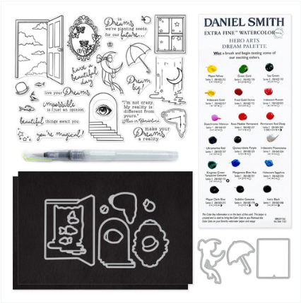
The 6″ x 8″ clear stamp set has windows and doors and stairs to nowhere with an umbrella, a mirror and a melting clock (Dali). Nine sentiments and assorted small images round out this imaginative stamp set. Of course we also get 15 coordinating frame cuts for all the stamp images, and this month we are treated to a New Daniel Smith Dot Palette card – the Dream Palette with a bunch of pearlescent colors. Perfect for coloring on the included 2 sheets of Black Watercolor paper (5.5″ x 8.5″), and a Water Flow brush! Dreamy!
Though I am pretty familiar with some of the Surrealist Masters – my Alma Mater has an original 30′ x 50′ Joan Miro mosaic decorating the front of the art museum – and I once did a children’s show exploring the art of Magritte – I was a little intimidated at the prospect of making 10 cards with this kit. I figured the DS watercolors were a good place to start.
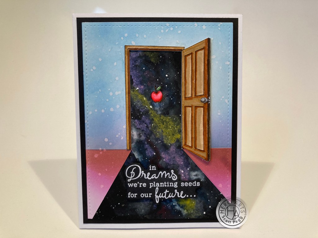
I took a half sheet of the Black Watercolor paper and painted some spacey cosmos using the DS Dream Dot card. I did use some Permanent White Gouache from my stash to get some brighter highlights and spatter in some stars. The pearlescent watercolors on the Dot card worked quite well on the black watercolor paper!
I stamped the door on a 110# White card stock A2 panel in the middle of the upper portion and colored it with my Zig Clean Color Real Brush Markers. I thought I would just put the night sky in the open doorway (in place of the stamped clouds) but decided that the cosmos should come through the door and towards us. I fussy-cut the door out and continued the cut from the door opening to the bottom corners of the panel.
I took a matching A2 card panel and masked off the bottom ‘floor’ portion and ink blended that with HA Berry Smoothie Reactive ink and a little Vintage Photo Distress oxide ink at the seam, reversed the mask and ink blended the sky with Broken China Distress Oxide ink with a little more Berry Smoothie at the seam. I spattered the background with some water for a little reactive texture, and I took the cut-away (negative) portion of the door and used that to cut the opening in the background leaving a little extra around the doorway to glue the fussy-cut door onto.
I die-cut the ink blended background with a Lawn Fawn Stitched Rectangle Die and glued that to the water colored galaxy panel and trimmed all the edges to match. I added a plain Black mat behind the assembled backgrounds and glued all to a White A2 card base. Then it was a simple matter of gluing the fussy-cut door in place. I did add some thin foam tape to the right edge of the door for a little touch of dimension.
I stamped the sentiment on a scrap of Black card stock with HA Embossing and Watermark ink and embossed that with fine White Embossing powder. When it was cool, I fussy-cut the sentiment and added it to the card front with some foam tape. Something was missing, so I stamped, colored and fussy-cut the apple from the stamp set and added that with some foam tape in the middle of the doorway. That’s what we needed here… a little something to focus on… and the apple helps reinforce the “seeds” aspect of the sentiment. This feels pretty surrealist to me!
I noticed that the melting sky stamp was the same width as the umbrella, so I decided to pair them up with this card.
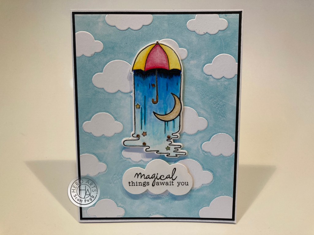
On some Bristol Smooth card stock, I stamped the umbrella and melting sky together using HA Intense Black ink and colored them with my Zig Real Brush markers. The moon is painted with the DS Iridescent Gold. I did some partial die-cutting on both the ‘sky’ (not cutting the top edge) and the umbrella (not cutting the bottom) to make the two images a single piece.
I grabbed an old Darice Cloud embossing folder and added Broken China ink to the background side of the folder using a brayer and ran that through my die cutting machine for our background. I was very pleased a how using a brayer really helped me get a fairly even layer of ink on that embossing folder! I cut that panel down to 4″ x 5.25″, added a thin black mat and glued those to a White A2 card base. I added the umbrella piece with some foam tape.
I st amped the sentiment on a scrap of white card stock and, using a MFT Mini Cloud Edges stencil, sketched a cloud outline around the sentiment, fussy-cut that out and mounted that to the card front with more foam tape. If you notice, this sentiment is not in the stamp set. I cut apart the “beautiful things await you” and the “you’re magical” sentiments to come up with “magical things await you” which seems a little bit more appropriate for this card! Fun!
I was enjoying the Black watercolor paper in our kit and thought I’d try one more bit of spacey cosmos for this next card.
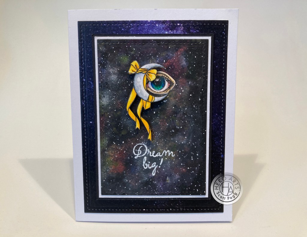
I painted another cosmos on the Black Watercolor paper using the DS dot card and a little Permanent White Gouache. This is a little more subtle that the galaxy on the first card. I die-cut that cosmos with a LFSRdie, added a thin white mat and a thin black mat and foam-taped those to a background made from the Altenew Galaxy Washi Tape and die-cut with another LFSRdie. The four layers are glued to a White A2 card base.
I stamped the ribboned moon and the eye on some Bristol Smooth card stock and colored them with my Zig markers. I fussy-cut the moon and die-cut the eye, gluing the eye flat to the card front and adding the moon with foam tape. (there’s some tiny slivers of foam tape behind those trailing ribbons!) I stamped and embossed the sentiment directly on the watercolor background… the iridescent paints do not provide the best surface for embossing – probably a little too slick – but I was able to get a decent embossing after several tries. I wasn’t too sure about the “surrealist” thoughts behind the ribbon-wrapped crescent moon, but I thought adding the eye pulled them both into the same surrealist realm. I love the eye and the moon together!
The staircase stamp caught my eye, and I could only think about M.C. Escher and his never-ending staircases. Now, Escher was probably considered more of an existentialist than a surrealist, but I thought this was perfectly appropriate!
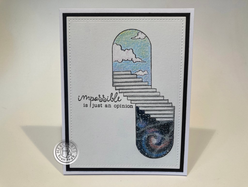
I stamped the staircase(s) on some Stonehenge card stock (very easy to match up the bottom of the steps), then masked around the top opening and stamped the clouds from the door stamp inside the opening. I colored this with my Prismacolor colored pencils and stamped the sentiment with Intense black ink. I die-cut that panel with a LFSRdie, added a thin black mat and glued them down to a White A2 card base. I thought this was the perfect marriage of image and sentiment! I did use a White gel pen for some stars in the galaxy, and this card feels very M.C. Escher-like! I did consider stamping the sentiment upside down as well so the card could be read from any direction..!
As long as we’re talking about artists, I started thinking about one of Magritte’s most famous paintings “The Treachery of Images” which features a painting of a pipe and the words “ceci n’est pas un pipe” or “this is not a pipe”.

We didn’t have a pipe stamp in our set, but we did have this bowler hat which Magritte used in some of his paintings, so I figured a chapeau would have to suffice! I stamped the hat on Bristol Smooth card stock and colored it with Zig markers and fussy-cut it out. I printed this sentiment on a scrap of Ivory card stock using my Silhouette software and the Arabella font, die-cut that with another LFSRdie, inked the edges with Vintage Photo Distress Oxide ink, and die-cut a frame from a scrap of Brown card stock. I looked through my patterned paper for some appropriate background paper and finally found this “art-y” background in my image files. I printed that on more of the Ivory card stock, trimmed it to 3.75″ x 5.5″, ink blended the top and bottom edges and glued that to a White card base. I added the frame and sentiment pieces with foam tape and mounted the hat with foam tape as well.
SO… if this is not a hat… what is it? I got a big kick out of this overly elaborate (I was channeling Steven Colbert) definition of a greeting card! I thought this was a fun way to justify this silly art rip-off. Makes me giggle!
I turned my attention to the window stamp for this next card. This is one of the more truly versatile stamps in this kit.
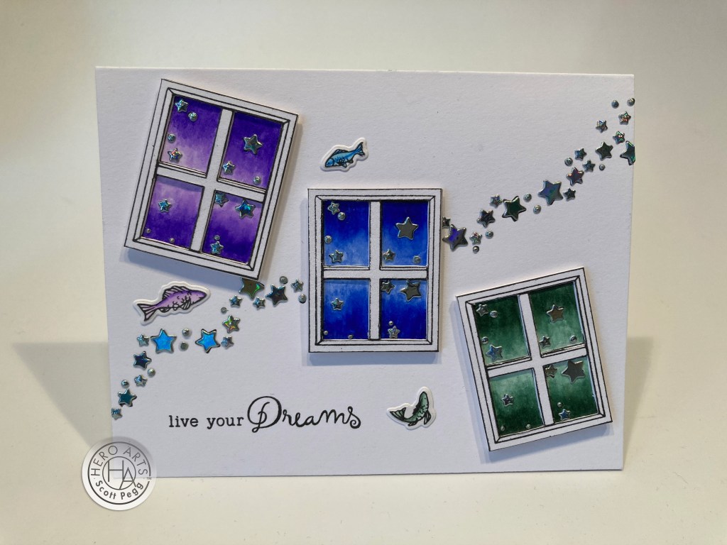
I spent way too much time on this card… this is actually the third background I created for these three windows… a galaxy background didn’t work, nor did an ink-smooshed background…! Finally I just stamped a big sweep of stars across the card front. I stamped the windows on Bristol Smooth card stock and colored them with my Zig markers and fussy-cut them out. I started trying to color the stars in the windows but some of them are so small I wasn’t having much luck with coloring them… so I reached for a Lawn Fawn Starry Skies die which just happens to have stars (and dots) perfectly sized for the stars in this kit. I die-cut a bunch of stars from some silver holographic card stock and glued those over the stamped stars on the background and in the windows.
Now the stars were thicker than the window frames so I stamped six more windows, fussy-cut them and their panes out, glued two together and glued a pair on top of each of the painted stamps. That helps the stars recede a bit and gives our windows some real dimension! I colored the fish to match the windows, die-cut them with the matching dies and glued them to the card front. I stamped the sentiment with Intense Black ink and mounted the windows with foam tape. I really like the white on this card… it really makes those windows pop and the holographic stars are extra sparkly!
I was at a bit of a loss over what to do with the butterfly covered oval frame (mirror?) in our stamp set. There’s the Alice in Wonderland sentiment but I don’t really equate Alice with surrealism (and I do happen to have a dynamite Alice in Wonderland stamp set that has this same quote!). After careful consideration, I realized I could fussy-cut a number of those butterflies away from the stamping and possibly make this a ‘real’ mirror!
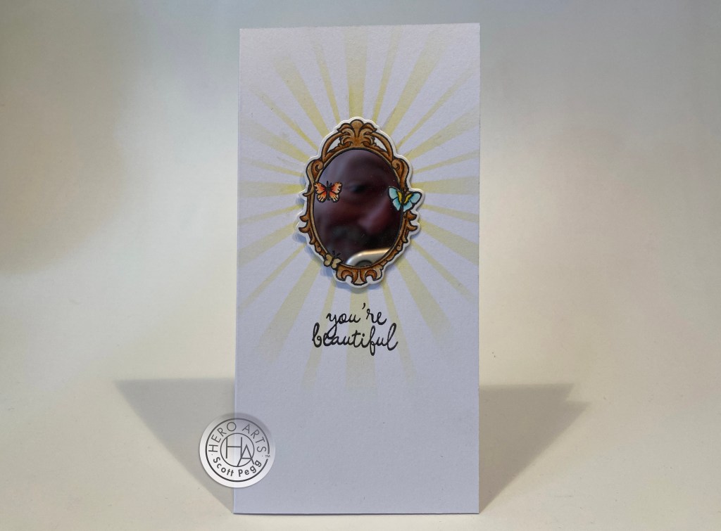
A Mini Slimline size seemed appropriate for this card! I stamped the frame on Bristol Smooth card stock and colored the fame with my Zig markers. I die-cut the whole mirror with the coordinating die and fussy cut the opening deleting five butterflies and leaving the two that were touching the frame. I stamped, colored and fussy-cut the single butterfly and glued it to the frame to round out the few butterflies that were left. I used some flexible plastic mirror in the opening which actually gives a terrific reflection – you can see me (and a touch of my phone) in the mirror!
This is a 3″ x 6″ Mini Slimline card – a 6′ x 6″ white card base scored at 3″. I took my homemade sunburst stencil and ink blended a little HA Lemon Drop Reactive ink in the middle and added a touch of shiny highlights with the DS iridescent gold watercolor paint. This sentiment is stamped using the cut away portions of the sentiments I used to make the umbrella card – perfect for a card where you can actually see yourself!! I like this plastic mirror stuff… great reflection without the distortion some mirrored card stocks have. And I DO think you are ALL beautiful!!
I haven’t used the door stamp with the clouds yet, so I thought the “have a beautiful day” sentiment would work well.

On a piece of plain grey card stock, I ink blended the clouds using the MFT Mini Cloud Edges stencil and Hickory Smoke Distress oxide ink. I cut that pane to 4″ x 5.25″, added a thin orange mat and glued those to a white card base. I stamped and embossed the sentiment with White embossing powder. I stamped the door using Intense Black ink on some Bristol Smooth card stock and colored it with my Zig markers. I fussy-cut the door (no white borders please!) and added it to the card front with foam tape. Looks like it’s going to be a beautiful day out there!!
I had an idea for that melting sky stamp and thought it would be another fun image to color with my colored pencils.
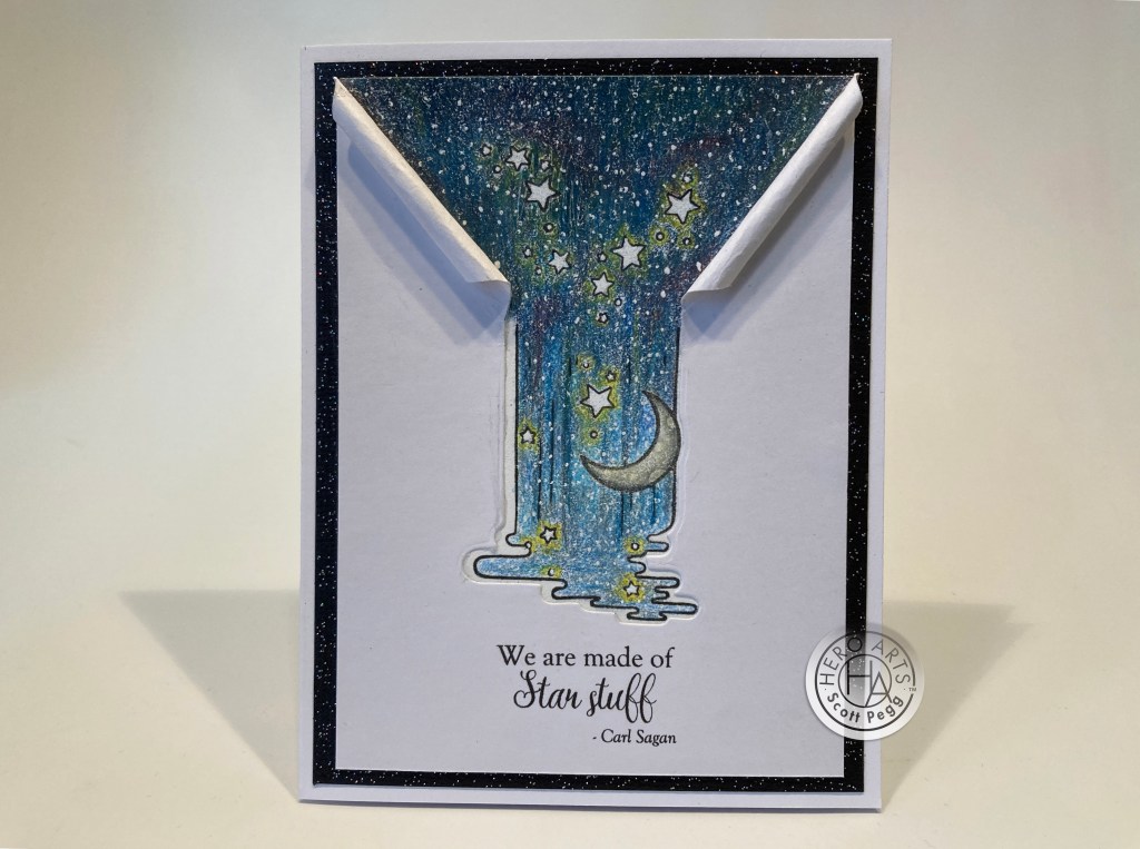
I stamped the melting sky in the center of an A2 panel of Stonehenge White card stock and sketched a couple of lines from the end of that stamp to the top corners of the panel. I stamped more stars in the triangle (and more by the moon) and colored all with my Prismacolor colored pencils. I LOVE how well colored pencils work with the Stonehenge card stock. When all was colored, I cut that panel to 3.75″ x 5″. I cut another panel of plain white card stock to the same dimensions, laid it over the colored panel and lined up the matching die with the colored image in the back. I partially die-cut the plain white panel (not cutting the top) and extended the two sides of the die-cut straight up to the top of the panel.
I created this sentiment (gotta love Carl Sagan!) using my Silhouette software, the Goudy Old Style Font and the Arabella font. I had to print that sentiment before I roll the edges! I glued the colored panel to a Black Glitter mat and then down to a White card base. I rolled the edges of the front panel to match the angle of the coloring and glued that on top of the colored panel. I did glue the rolled edges down as well.
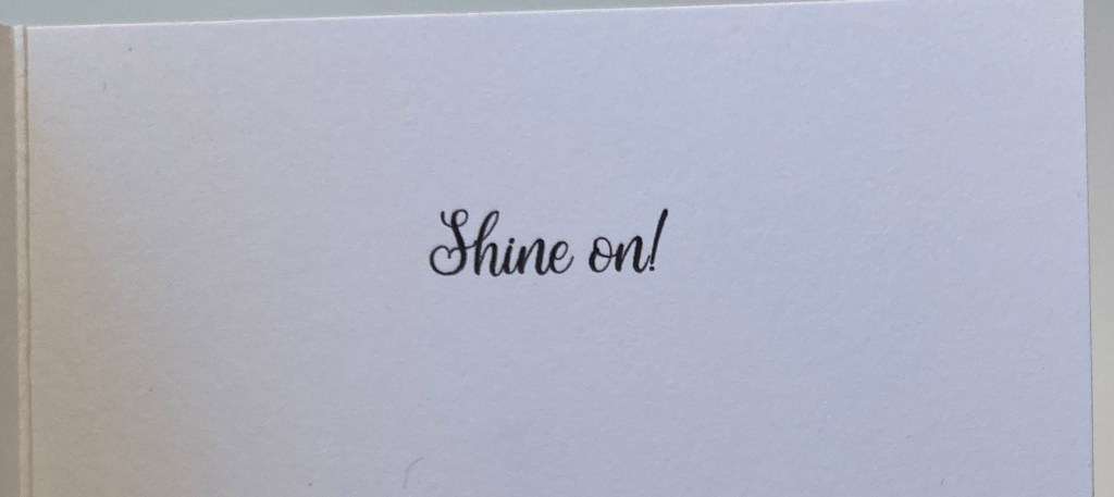
I did add some sparkle to the colored sky with a Sakura Stardust Gelly Roll pen. Now here’s some melting sky for you! Love the dimension the rolled paper gives this card, and I did add an extra sentiment on the inside to make this a true encouragement card. SHINE ON!!
You may notice that I haven’t used the melting clock stamp yet – that is patterned directly after Dali’s “The Persistence of Memory”, so… I chose to throw caution to the wind and try my hand at a full-on surrealist painting…!
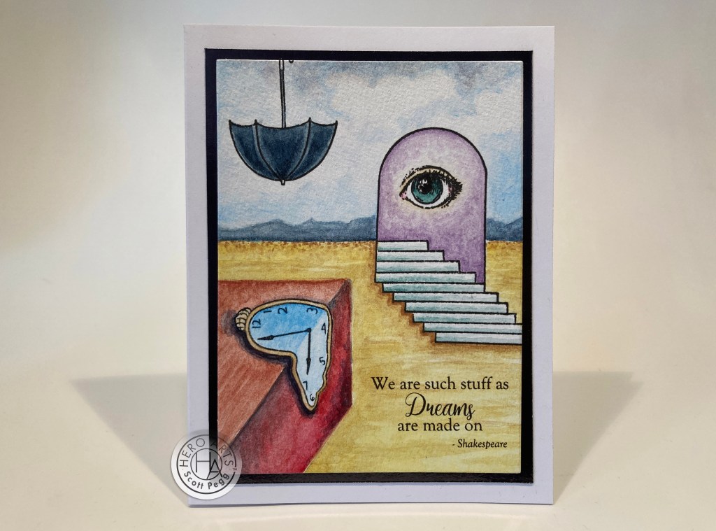
I stamped everything using Intense Black ink on some watercolor paper. I sketched in a horizon line (matching the top step) and added the box for the clock to lay on. You may notice I also added 3 more steps to the bottom of the staircase. All of this is water colored with the DS dot card included in this kit. I have to admit I was a little intimidated when I started water coloring the first layer over all these large spaces – but I just took my time and added layer upon layer till I achieved the desired effect. I am loving this! I added the perfect Shakespearean quote on the front using my piggy-back printing method and the same two fonts. Those are really good matches to the fonts in the stamp set!
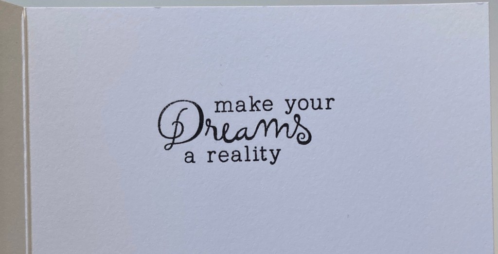
Nothing makes you hyper-focus quite as much as printing something on a panel you have spent hours coloring!! I thought this quote from The Tempest matched up beautifully with this sentiment from the stamp set which I stamped on the inside of the card. I trimmed the watercolored panel to 3.5″ x 4.75″, added a shiny black mat and glued those down to a White Card base. I think Dali would be proud!! I know I am!
And that wraps up my 10 Cards created using the My Monthly Hero February 2022 Kit. I was a little flummoxed with this kit at first, but after digging in and working with everything, I came to appreciate the quirky nature displayed here.
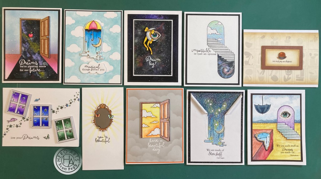
I tried to stay true to the surrealist nature of this kit, and I think everything but the mirror sticks close to the theme. I guess all of these cards are basically kind of encouragement cards… I did manage to use every stamp in the stamp set with the exception of the Alice in Wonderland quote. WOO-HOO! It seems I spent most of my time with the water color dot card, Zig markers and colored pencils – certainly a colorful bunch of cards! There are a number of versatile stamps in this set – the window, umbrella, hat, eye, apple, etc. that can be used on a variety of different layouts. Truly a unique batch of cards from a very imaginative kit!
This Kit is still available at Hero Arts – including a bunch of featured products curated to go match this kit. If I have managed to capture your imagination or inspired you with some new ideas and you’d like to grab a kit for yourself, please use my links when you go shopping at Hero Arts. It is always appreciated and truly helps support this page! Thank you!
My Monthly Hero February 2022: http://shrsl.com/3eas2
Hero Arts February 2022 Featured Products: http://shrsl.com/3eayn
Thank you so much for sharing your time with me here… It is always a pleasure to be able to share some ideas and a few smiles with you. If you aren’t a follower of this page please consider adding your email to the follow link at the top of this page, and remember to Like me, List me, Pin me, Post me, Share me with all your crafty friends, don’t run with scissors… and I send you and yours all my best wishes for beautiful dreams, pleasant awakenings and Happy Crafting!
DISCLOSURE: This site contains some affiliate links to products. I may receive a commission for purchases made through these links (at no cost to you). As an Amazon Associate I earn from qualifying purchases. Thank you!

Hard to pick a favorite, but amazed at all of your artistic designs. I think Colbert would love your homage to his, “MEANWHILE” segments.
You are truly an amazing and creative soul!
LikeLike
Thanks so much Victoria! That means a lot to me!
Cheers and Chuckles to you and yours!
Scott
LikeLike
These cards are over the top!! Best stamp set ever and you made the best use of them! Miss you doing Lizi cards! jt
Sent from my iPad
>
LikeLike
Thanks so very very much Jeanne! (miss you too!) Always a treat to hear from you!
XXOO!
Scott
LikeLike
Such cool cards Scott! Wishing you well, Gael
LikeLike
Thanks Gael! Always appreciated!
Cheers and Chuckles to you and yours!
Scott
LikeLike
Your blog is so entertaining every month; I love your narrations. I love to look at your cards, and read through the thought processes behind creating your cards, what inspired your designs, how you resolved those little creative road blocks we run into when making cards. So awesome, keep creating!!
LikeLike
Thank you so much Laurie… that means a lot to me! Sometimes I wonder if anyone is even looking…! All my best! Scott
LikeLike