Simon Says Stamp August ’17 “Together” card kit

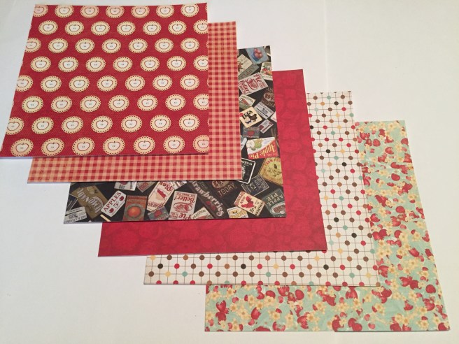
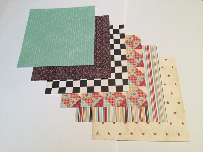
Hello Folks! Scott here with my ten cards from the Simon Says Stamp August ’17 “Together” Card Kit. This kit featured 16 single-sided designer papers and one sheet of Studio Puff stickers from the Pinkfresh Studio “Live More” collection. The pattern papers are very thick, sturdy cardstock, but I wasn’t bowled over by the patterns – lots of white and pink… fairly muted colors, and the stickers didn’t do much for me either. This Card Kit is still available at Simon Says Stamps – I think that says a lot as to the popularity of this particular kit…! We did get a full size Distress Oxide ink pad in Cracked Pistachio, a WOW! Cloud 9 glitter embossing powder, and 5 sheets of SSS cardstock.IMG_3620

The stamp set this month is the You + Me clear stamp set – very sentiment heavy. Interesting corner stripe stamp and the border stamps are nice… but the last thing I need is more LOVE and THANKS sentiments…! I think this text heavy stamp set is the main reason this kit has not sold out… But I am determined to create some cards that stretch the boundaries of this kit and possibly help those who did purchase this kit think outside the box a little bit.

IMG_3649

For my first card, I started playing around with the border stamps, and used the plus stamp to stamp out a heart shape on a piece of the pattern paper. I recently received my new Tim Holtz Stamp Platform and that was invaluable in helping me create this stamped and fussy-cut heart. The YOU + ME = AWESOME is the best sentiment stamp in this set, and everything has been stamped with the Cracked Pistachio Distress Oxide ink on the Mint card base. I did clear embossing on the sentiment and the top and bottom stamps for a little shine, and added little strips of the + pattern paper for a little extra color… one of my old red heart brads matched up nicely and echoes the heart cut-out and the red pluses on the pattern paper. I used my VersaMarker Pen to add the Cloud 9 glitter embossing powder around the heart. This is the first time I have used ‘glitter’ embossing powder and I found it didn’t stick to the VersaMark ink very well… even after heat setting, a lot of the glitter would brush away fairly easily. I don’t know if this is indicative of other glitter embossing powders, or just my inexperience of using it, but I had to ink and emboss a couple times to get this effect. Nice sparkle, but I think I’d just as soon use real glitter! I do like this finished card and I especially like how the plus stamp on the grid paper kind of looks like cross-stitching!

IMG_3650

The “There is beauty in Simplicity” sticker caught my eye… I was tempted to just stick that in the middle of the Orange Peel card base and call it done, but I couldn’t help but add a little bit of decoration. The orange stripe down the side was cut from one of the pattern papers, and I stamped the dashed line border stamp right next to that with the Orange Slush Hybrid ink that we got in the SSS April ’17 card kit. Perfect match, and the hybrid quality of the ink allowed me to do a little clear embossing on top of that stamp. I rounded the outside edges of the card base with my WRMK Corner Chomper, added three sequins from the Paper Pumpkin ‘Season of Gratitude’ October 2016 kit for a touch of sparkle, and I don’t think I can get any more ‘simple’ than that. 3 sequins, 2 stickers, 1 stamp and a strip of pattern paper.

IMG_3652

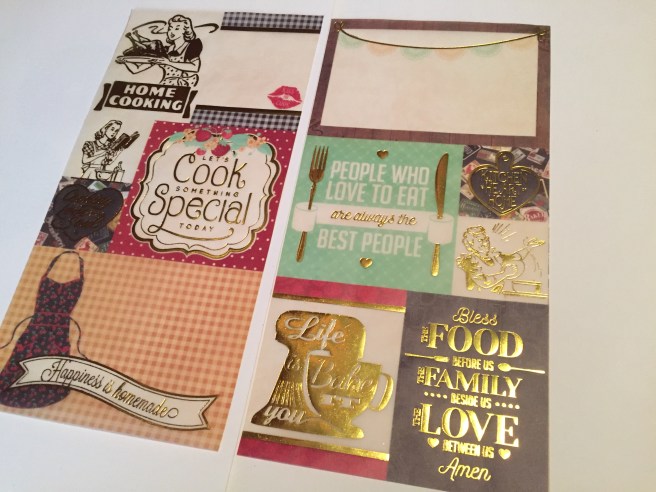
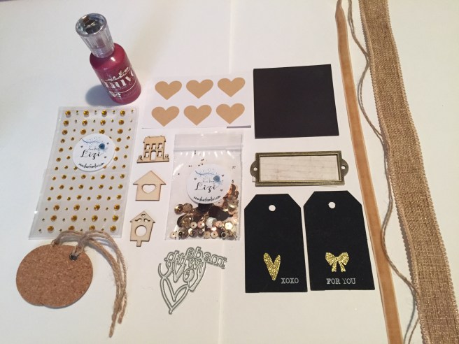
The TH Stamp Platform to the rescue again…! I stamped the “LOVE you endlessly” sentiment using the SSS Barely Beige ink pad (received in the SSS June kit) on the light brown grid paper over and over again to cover the whole card face, then stamped the same sentiment using Walnut Stain Distress Oxide ink on a bit of the leftover white grid paper, and trimmed that down to a little flag. I fussy-cut the edge of the pink diamond pattern paper to tuck under the edge of the brown grid paper and mounted this all to the Banana card base. I used an Ellen Hutson Stitching lines die to cut the edge of the card base – I like that it repeats the flag end of the sentiment and the cut edge of the diamond pattern paper. I added some golden gemstones from the Love From Lizi July ’17 card kit under the sentiment – I just used a piece of tape to pick the gemstones up off the acetate sheet they came on, and transferred them directly to the card – made them nice and straight and evenly spaced without a lot of fussing. I also used a border peel off sticker in Chocolate Brown from the Love From Lizi August card kit to define the left edge of the card. These Border Peel Off stickers have become my favorite sticker with so many uses – they come in three widths and are an easy way to add a touch of shine and a lovely accent wherever you use them.

IMG_3653

Once again, the TH Stamp Platform helped me accurately place the corner stripe stamp in the center of the Mint card base to form a center square as my focal point. I’m loving this new stamp platform! The corner stripe is stamped in Worn Lipstick Oxide ink (from the SSS June card kit), the sentiments are stamped in Broken China Oxide ink and the arrow border is stamped in the Cracked Pistachio Oxide ink – these colors work great together and I really enjoyed having the sentiment go around the corners and edges of the stripe stamp. A simple square of pattern paper (this is the one sheet of pattern paper in this kit that I REALLY like) to fill in the center square, and one of the puffy stickers on top of that – a little sappy, but it goes well with the sentiment. Three Moonshine Confetti sequins (from the SSS July kit) add a spot of bling, and I am really pleased with this card.

IMG_3654

I was getting tired of not having any images in this kit to work with, so I raided my stash, and found this photo – I actually made a Birthday Card that is very similar to this card a couple of years ago. The Polaroid frame I created on my Silhouette and cut four of them in plain white cardstock and glued them together to make a nice thick chunky frame. A strip of the blue-green stripe pattern paper across the front of the Slate card base, and I stamped the sentiment in Mint Macaron ink from Stampin’ Up (discontinued) which matched the blue-green stripe much better than the Cracked Pistachio ink. I did print the picture on photo paper so it does have that photo gloss to it, and mounted the whole ‘Polaroid’ up on foam tape. A lovely, touching, simple card. WITH AN IMAGE!

IMG_3655

The ‘Don’t Quit’ puffy sticker caught my eye, and I added “Your Daydreams” in Arial Black font printed on white cardstock to complete that sentiment. The pattern paper had a grey and white ‘marble’ pattern in the cut-out corners – once I got rid of the marble design, I liked this pattern paper much better..! That also allows the Slate card base to help us zero in on the focal point. The little triangular puffy stickers matched perfectly and added some nice texture, and I used a new Extra Fine Point Metallic Silver Sharpie to add a touch of shine to the cut-out corners. I really like the tips on these water-based markers – Extra Fine Point indeed! “Don’t Quit Your Daydreams” is a fun and unique sentiment!

IMG_3656

Here we go with the TH Stamp Platform and that corner stripe stamp again…! AND the Worn Lipstick, Cracked Pistachio, and Broken China Oxide inks (I think those three colors work great together). By masking the corner of the stamp at a 45 degree angle, I was able to get a very good ‘striped square’ for a shaker window frame. I stamped the stripes and sentiment on white cardstock – the corner stripe stamp was only 5″ long (before the corner) so I had to stamp the stripes on both ends of the card and hide the seam behind the shaker. Thank You TH Stamp Platform!! My favorite pattern paper returns in the back of the shaker window, and for a couple of thin strips to help transition from the white cardstock to the Ivory card base. The sequin mix is from the Paper Pumpkin June ’16 kit, and I added one of the tiny puffy stickers in the middle of the shaker window. I like this card a lot – It’s good to be reminded of the impact a shaker windows adds even when it’s a very small part of the card!

IMG_3658

This card actually embraces the pattern papers in this kit. I found this great cat and dog silhouette on-line and created a ‘hand-cut die’ for cutting them out of two pattern papers. (more pink..!!!) Those shapes were traced with my Pigma Micron 05 archival ink pen, and mounted on the light brown grid paper with two different thicknesses of foam tape. The XOXO pattern paper matched the Orange Peel card base perfectly, the sentiment is stamped in Walnut Stain Oxide ink, and there’s a couple of the Chocolate peel off stickers to highlight the center panel. I enjoy this card a great deal – I actually wish I had these cat and dog shapes as a real die! I’ve about exhausted the stamps and pattern papers in this kit (at least the ones I like!), and by now, I am really aching to COLOR SOMETHING!!

IMG_3659

HOORAY FOR COLOR!!  I found this cute image on-line (similar to the picture of the boys on the Polaroid card) and had to use it. I traced it directly to the Ivory card base with my Pigma Micron 05 pen, and colored it with my Spectrum Noir alcohol markers. (For a detailed – yet sped up – coloring process check out the video for this card kit) The sentiment and the arrow border are stamped in the Cracked Pistachio Oxide ink, and here we have a very bright, colorful, single-layer card. I think this is a terrific Thank You card! And NOW.. I have used EVERY sentiment stamp in this kit!

IMG_3661

I was a little dismayed at the YOU + ME = AWESOME stamp in this kit because the AWESOME was so close to the YOU + ME = that, try as I might, I could not get a good stamp of just the YOU + ME =. I tried masking the stamp, I tried masking the paper, nothing would give me a good stamp. (You + Me = a lot of things… not just AWESOME!)  I wish SSS had taken that into consideration when making this stamp and had given us a little more room between the two lines! Nonetheless, I printed the sentiment myself (in Arial Black font) on the Banana cardstock, framed that with some of the Cloud 9 embossing glitter (and my VersaMarker pen) and mounted that on foam tape to a piece of the pattern paper. I added more Cloud 9 embossing glitter to the top and bottom of the pattern paper with scor-tape – I think the scor-tape holds this glitter embossing powder much better than the VersaMark ink does – even after heat setting. I mounted this all on my own black card base which I had coated with a spray of Sheer Shimmer Spritz. I wanted this card front to be very simple, yet still hint at the treasures inside:

IMG_3662

YOU + ME = MAGIC  !!!!  (even better than awesome!)  This is a Twist and Pop card that has been out there in the card-making world for some time. I mastered the pattern for this card a while ago, but haven’t had an occasion to use it yet… until NOW! I colored and cut the word MAGIC on my Silhouette using the Brady Bunch Remastered font (I am getting a LOT of use out of that font!) and used the Shimmer Spritz to add some sparkle, I found this great fireworks image on-line to use for the top background, and added the Banana card stock to provide writing space at the bottom. I used my Sakura Stardust glitter gel pen to outline all the edges, and some of the SSS Moonshine sequins to add some real bling. This card makes me very happy!! When I do one of these Twist and Pop cards again, I will use lighter weight cardstock for the mechanics… !!

On a final note for this post, It has been announced that I am now a Design Team member for the the Love From Lizi shop! HOORAY!! I am very excited for my first Design Team assignment! As such, I have had to embrace new avenues of social media for this assignment, so you can now find me on Instagram @cardcutups and on FaceBook @cardcutups as well as here and on YouTube. I hope you will join and follow me on these other platforms as well. As always, thank you so much for your attention and support, and please send me any questions or comments you may have – I will try my best to answer everyone. HAPPY CRAFTING!

“All Tim Holtz Card” with new Tim Holtz Stamp Platform

I got my new Tim Holtz Stamp Platform!! Thinking I may make an ‘All Tim Holtz’ card to break in my new tool!!!

IMG_3556

I recently got this Sizzix / Tim Holtz Alterations stamp and die set “Compass Blueprint” that caught my eye on line. This was right around $19 for the set – which seems to me a very good price considering you get 3 nice rubber stamps and 5 dies. Brand name dies are so expensive, you’ll often pay $20 just for 5 dies with no extras. I haven’t used this set yet, so It seems a good one to use with my ‘All Tim Holtz’ card…!!

IMG_3627

I rarely buy 12’X12″ paper packs – no real need for that big of patterned paper when making cards. However, I can’t resist a deal, and I have always admired Tim Holtz’s paper packs. When I found this Crowded Attic Paper Stash by Tim Holtz Idea-ology on-line for $9.29 I jumped at the deal. Regular price for a 12X12 TH paper pad runs at least $15. A heck of a bargain! I like the Tim Holtz pads because they offer the initial full page designs reduced to quarter-page size (6X6) and then even smaller at 2″. That makes what might be too large of a pattern for a card, more in line with the scale of an A2 card. I think I will use this Paper stash for my “All Tim Holtz’ card to christen my new Tim Holtz Stamp Platform.

IMG_3630

We received a new Tim Holtz Distress Oxide ink pad in Worn Lipstick with the Simon Says Stamp June 2017 ‘Blissful’ Card Kit. I was so impressed with this ink that I did purchase the other 11 pads from this first release of Oxide Inks. I LOVE THESE INK PADS. So versatile, very blend-able, works great for stamping, reacts with water… the list goes on and on with this new line of Distress Inks. Of course, the minute I got that whole set, Ranger released the second set of 12 Oxide Ink pad colors… sigh… So… let’s add the Walnut Stain Distress Oxide ink pad to do my stamping, and my ‘All Tim Holtz’ card is starting to take shape! A simple Kraft card base will work well. I like the Recollections (Michael’s) Kraft card stock – very inexpensive, and I like the nice medium tone with this card stock – not too light, not too dark. I tend to shop the sales at Michael’s where you can get the 50 sheet card stock packs for $2.50. Now that’s a bargain at a nickle a sheet!

IMG_3552

The Crowded Attic Paper Stash by Tim Holtz Idea-ology has a great map of the Pacific Ocean… Of course it’s way too big in the 12″ X 12″ sheet but it’s perfect for an A2 card in the 6″ x 6″ size. There are also a number of 6″ X 6″ distress colors on the back sides of the reduced patterns. I really like the dark red, brown, sage green and beige colors on this other sheet from the pack, so I’ll use those colors for the different parts of the compass. I do want to conserve as much of that map pattern paper as possible so I divide that piece into four 6″ X 1.5″ pieces. I can get four cards out of that one piece of patter paper that way.!

IMG_3555

Okay… lets wrap this up! I seem to have lost or inadvertently deleted my stamping pics so let’s just go right to the finished card! I did all the the stamping in the Walnut Stain Distress Oxide ink… basically just stamping the whole compass stamp on each of the papers. I did use the Tim Holtz Stamp Platform to stamp the kraft card base and then added the map pattern paper in place to stamp it again… that prevented me from having that thin blank line between the papers where the stamp cannot reach if you stamp both papers together. I then used all of the die cuts for the compass pieces and the banner, and I layered everything up with foam tape. I spattered the whole card with some plain white watercolors, added some mini brads on the sides of the banner and the center of the compass, and for a final touch, traced the shadow lines on the ‘needle’ with my Sakura Gelly Roll Stardust Gel Pen. Along with the brads, that Stardust pen adds a nice touch of glimmer to an otherwise very ‘distressed’ card – I like this card a lot – the papers all go together very well, matching up with the hints of red, green and beige on the map pattern paper. Next time, I will die-cut all the pieces but probably skip the foam tape between the 2 ‘needle’ pieces. 

IMG_3644

LFL August 2017 Card Kit Add…

I posted  this on the Love From Lizi group over at FB but thought I should add a post about this here. I mentioned that I had not made a shaker card with the LFL August Card Kit, but someone asked me about my fridge magnet and did I ‘seal’ the magnet to protect it from kitchen grime? No, I hadn’t, but that got me thinking and I made this adjustment:

IMG_3614

I cut a simple frame from some gold glimmer specialty paper along with a piece of acetate and foam mounted that to the existing magnet with a bunch of the ‘Cookies and Cream’ sequins from the kit. I even went in and covered the sides of the foam strips with some gold glitter paper (from the LFL July kit) to kind of ‘seal’ in the whole magnet. Just a little extra effort here and we have a shaker magnet for your fridge!

IMG_3615

As you can see, the magnet still sticks to the card base with no problem. It even shakes without falling off the card..!! Plenty of sequins but not so many that you can’t make out the sentiment. I don’t know why, but this did not occur to me until the question about sealing the magnet came up. And now I can say that I DID make a shaker card with the Love From Lizi August 2017 Card Kit. Hope you enjoy this little extra tidbit!!

10 Cards 1 Kit / Love From Lizi August 2017

Hello folks!, Scott here with another Love From Lizi Card Kit for August of 2017. Check out my previous blog for the un-boxing of this ‘foodie’ card kit. Lizi always includes a bunch of supplies in her kits and this month was no exception! My goal is to use as many pieces and parts from the kit in my 10 cards as possible… often that proves to be a challenge as there are so many goodies. OTA5QzhFQURFODMzMjNGMzYzMzM6YjVlNDg2Y2VjNjdkN2Y2NmZjNzYzNWQxMDJlNWU4M2U6Ojo6OjA=

Lizi always includes 5 pieces of A4 cardstock in her kits, so I trim a half an inch from the long ends and split the cardstocks in half to make 5 1/2″ X 4 1/8″ card bases – just shy of a regular A2 card. From my stash, I added some assorted pieces of white cardstock, black cardstock, dark red cardstock, and I discovered that my Staples 110# Ivory cardstock was almost a perfect match to the off-white cardstock from the kit, so all of the vellum pieces from the kit got mounted on that ivory cardstock. I keep that ivory cardstock in my stash mostly for mock-ups, experiments, and as my inexpensive trial and error cardstock… This stuff is so cost-effective that I don’t mind making mistakes with it!

I admit I had some qualms about the sentiments in this kit… they didn’t particularly seem like card sentiments, more like scrapbook sentiments and cooking craft sentiments, but I have no problem bringing in my own sayings and sentiments to make cards that are more useful to me…!

IMG_3566

My first card features the “Home Cooking” vellum from the kit. Mounted on the Staples Ivory cardstock with Stick It adhesive sheets covering the entire back of the image – that way, you can’t see your adhesive through the vellum. I outlined the mounted vellum with the chocolate peel-offs from the kit, mounted that on the gold glimmer specialty paper from the kit, and mounted those on a black cardstock mat and foam taped the entire assemblage to the apple pie pattern paper included in the kit. I did add small touches of the burlap and velvet ribbon from the kit (they match perfectly) to the top and bottom and mounted it all on the dark red card base. Fairly clean and simple, but “Home Cooking” doesn’t mean much to me as a sentiment, so I added a little more inside –

IMG_3606

Now there’s a reason to send this card to somebody!! LOL! This sentiment I printed with my Silhouette Software in the Marketing Script font on that Ivory cardstock, stamped a couple of hearts from the stamp set in Fired Brick Oxide Ink and die-cut the cardstock with my Lawn Fawn Stitched Rectangle dies. Just a simple addition inside the card and what might be considered an unwieldy sentiment on the front, takes on new meaning…!

IMG_3569

For card number two, I took the large 6″ wide vellum piece with the apron and banner and cut the images off the gingham background. I thought the color of the gingham on the vellum was not nearly as bright and lively as the gingham pattern paper, so I mounted the vellum apron and banner to some ivory cardstock and popped that up with some foam tape on the gingham pattern paper. I added some twine from the kit to stand in for the apron strings, and cut thin strips of the cherry pattern paper to trim the top and bottom. The “made with love” die cut is from the kit – I die-cut 4 black pieces and one from the gold glimmer specialty paper and glued them all together to make a nice chunky die-cut. I thought that would be enough, but when I went to add the die-cut to the card, it seemed a little naked to me, so I glued the die-cut to one of the cork tags from the kit (twine removed) but that still wasn’t enough. I die cut a circle from the glitter specialty paper in the kit and mounted the cork tag to that, but I still wasn’t satisfied, so I broke out one of the wood veneer die-cuts from the kit, colored it red with an alcohol marker, added a little Wink of Stella to it, and attached that to the whole assemblage. Finally, a big, chunky sentiment that fills the space very nicely. I can see using this card with a gift of pound cake or banana bread, but other than that, I don’t see much traction to be had with these sentiments.

IMG_3574

Now I’m going full tilt with my own sentiments…! There were plenty of vellum pieces without sentiments, so I focused my attention on them. I really like this retro image of a young lady at the counter with a cook book and egg beater, so I mounted that vellum piece to some ivory cardstock, mounted that to some gingham pattern paper and added that to a square of the black and white tile pattern paper. That whole piece is foam taped up on a rectangle of the red glimmer specialty paper, which is outlined with the chocolate peel-offs. The sentiment is printed with my Silhouette software on the ivory cardstock in Lucida Calligraphy font and I used the peel-offs around that piece before foam taping it to the red glimmer paper. I complete the sentiment inside…

IMG_3607

“I’d bake you a cake today … if I knew how to work an oven! Happy Birthday!” The inside sentiment is printed on the ivory cardstock, cut with a stitched rectangle die and mounted to some of my own dark red cardstock, which was also die cut with the stitched rectangle dies. An excellent and totally appropriate birthday card! I did add some small sequins from the ‘cookies and cream’ sequin mix in the kit to the front of the card and added a couple small dots of the Nuvo Crystal Drops in Autumn Red which, of course, were included with this kit. I really like this card and can always use another birthday card in my stash..!!

IMG_3564

Here’s another one of the vellum pieces that I liked, but found very difficult to read… the “WHAT” is very hard to make out, and I found the order of the text slightly confusing… Not one to be deterred, I went online and searched out a similar stand mixer image and added my own text to it:

IMG_3576

Printed on the ivory cardstock with my laser printer (at work), the “Live a Little” is in the Script MT Bold font, and the “Lick the bowl” is Goudy Heavyface BT font. Of course I was able to foil the image with gold deco-foil and a laminator – I have to admit I really enjoy the results I get with the deco-foil! I outlined the image with the chocolate peel-offs, mounted that with foam tape to the mint utensil pattern paper (outlined with the peel-offs too!), wrapped some more of that burlap and velvet ribbon around the mint paper and glued it all down to that great food advertisement pattern paper. Everything is attached to one of the mint card bases and a few sequins from the kit finishes this card off nicely. No sentiment inside, but this would make a great birthday card for any age and would be appropriate for a variety of occasions. AND it’s easy to read!

IMG_3578

There was a magnet included with this kit, and, what with the ‘foodie’ theme, I’m sure Lizi was thinking of a refrigerator magnet. Here’s my fridge magnet card – I figured the “Kiss the Cook” stamp went well with the lips stamp in the kit and that made sense to me for something to go on your fridge… so I stamped the lips in the Fired Brick Oxide ink and embossed it with my Ranger Clear embossing powder, stamped the Kiss the Cook sentiment with my Simon Says Stamp Intense Black ink and embossed that as well.  All on the ivory cardstock. I added the red and gold vellum strips I cut off of the stand mixer piece and added a couple strips of the peel-offs on the sides.

IMG_3611

I used a black card base, with a frame cut from the bronze glimmer specialty paper (cut with Lawn Fawn stitched rectangle dies) to frame a piece of the polka-dot pattern paper with a strip of the striped pattern paper down the middle. I stamped the banner from the stamp set in Walnut Stain Oxide Ink on the ivory cardstock and stamped the “Made with Love” sentiment stamp with the Fired Brick Oxide ink and added a little clear embossing to that too. If you look close, you can see a bit of the outline of a ‘holding’ magnet under the striped pattern paper which holds the magnet to the card while allowing for easy removal. This did use both of the sentiment stamps included with the stamp set on this card. I suppose, this would be an appropriate card to accompany a gift of food or something homemade. Nothing inside the card but some of my ivory cardstock to provide writing space.

IMG_3579

“Sorry… sometimes I bake mistakes” is a great little pun to use for an apology card. I went with the older lady vellum piece from the kit, and mounted that to some ivory cardstock and printed the sentiment on the same piece. I created the sentiment on my Silhouette software in Marker Felt font and outlined both pieces with the chocolate peel-offs. I mounted the ivory piece to a mat of the gold glimmer specialty paper and added some peel-offs to the top and bottom of that. I stamped the mint card base with the silverware stamp in Cracked Pistachio Oxide Ink making a little pattern on the top and bottom. I colored the silverware handles with a TN1 Spectrum Noir alcohol marker just to add a little definition to the silverware. I glued one of the craft heart stickers to a piece of the glitter specialty paper and fussy cut that around the heart shape. A bunch of Wink of Stella on top of the heart, and a few sequins paired with the small golden rhinestones finishes up this card with a touch of sparkle. A pun-y apology card!

I’m starting to run low on usable vellum pieces in the kit so I jumped to the cherries and leaf stamp for my next card. There are so many ‘cherry’ puns you can use (since cherry rhymes with so many words!) that I had to reign my baser impulses in…!

IMG_3583

“I love you cherry much” is printed on white cardstock in the Noteworthy font. I LOVE using the Silhouette software to design my sentiments. The basic software is free and very intuitive, so I suggest some vast experimenting out there! I stamped the cherries and leaves using a couple of small leaf masks in SSS Intense Black ink on white cardstock and colored the cherries and stems with my Spectrum Noir alcohol markers. I did use the Chameleon marker included in the kit to color the leaves. I fussy cut the image out, and mounted it to the white cardstock with foam tape and then mounted that whole piece to a black cardstock mat. I stamped the border stamp from the kit in SSS Intense Black Ink on another piece of white cardstock and colored the balls with my alcohol markers and added a touch of highlight to them with a white gel pen. A couple of small pieces of the striped pattern paper adorn the top and bottom, the focal piece is foam taped to the white and striped layer, and the whole thing goes on one of the dark red card bases. As a last embellishment, I added Glossy Accents to the cherries for an added touch of dimension and some great shine. I think the border stamp and the cherry stamp goes very well together, and I really like the simple pun on this card.

I have this classic saying in postcard form on my desk:Keep-calm-and-carry-on-scan

“Keep Calm and Carry On” was a motivational poster produced by the British government in 1939 in preparation for World War II. The poster was intended to raise the morale of the British public, threatened with widely predicted mass air attacks on major cities. Of course this has been adapted to many uses over the years… I actually found one that said “Stay Alive and Avoid Zombies”! So I felt justified in adapting this to my own uses, and, inspired by the lips stamp in the kit, came up with my own Keep Calm card.

IMG_3584

I printed the sentiment on white cardstock in the Din Alternate font using my Silhouette software (I know, I know!) and stamped the lips in Fired Brick Oxide Ink and embossed them with some Ranger clear embossing powder (mmmmmm! –  makes the lips look nice and juicy!). I mounted that on a piece of my own dark red cardstock with the edges glittered up with my Wink of Stella pen. I mounted that piece on one of the light yellow card bases and added golden rhinestones from the kit at the four corners. I thought I was being totally original with this, but, naturally, a quick search on the internet and “Keep Calm and Kiss Me” has obviously been around for a while. After completing this card, I also found a Keep Calm font at dafont.com! Oh, well, I guess I’m not as forward-thinking as I might have wished..!! LOL!! But I still like this card very much!

I wanted to try and use all the stamps in the stamp set this month, so I was looking forward to using the triangle pattern stamps to make my own ‘quilt’ using various pattern papers from the kit.

IMG_3588

I concede that the stamping on pattern paper may seem like overkill, but I like how it looks on the red and the star pattern paper, and I even like the striped triangle stamp on the striped pattern paper. I stamped all with the Walnut Stain Oxide Ink and fussy cut all 32 triangles out. I actually assembled the quilt on a simple piece of typing  paper before mounting it to the light yellow card base. I was thinking of this as a “Welcome to your new home” card and liked the abbreviation of “Welcome Home” as my sentiment. I printed that in Signpainter font on the ivory cardstock and cut it out with my Silhouette Portrait machine. I added one of the wood veneer die-cuts from the kit colored with my Delicata Gold ink pad and a little knot of twine from the kit to finish it off. I was worried that this wouldn’t work out – that the pattern paper would be way too busy – but am ultimately very pleased with the result. I can see my using these triangle stamps to create assorted ‘quilts’ for my card backgrounds!

And now, for card number ten, I realize it’s not the season but I couldn’t resist:

IMG_3590

I loved the cherry pattern paper so much – it felt very Christmas-y to me, so I stamped the cherries and a couple of leaves with SSS Intense Black Ink on white cardstock, colored them with my Zigg Clean Color Real Brush Markers and fussy cut them out with a little white border. I had the Santa hat in my image file from a previous Christmas Card as well as the curvy Merry Christmas sentiment. A little fiddling around in Photoshop changed Merry to Cherry and the Santa Hat fit the cherries perfectly without even having to re-size them!  The Cherries and the sentiment are foam taped up on the pattern paper for a little dimension, with a couple of thin strips of the gold glimmer specialty paper down the sides and everything mounted to the black card base. I added a little sparkle to the fur on the hats and the sentiment with my Wink of Stella pen and Voila! a very Cherry Christmas card! This makes me giggle a lot!

There was one vellum piece in the kit that I absolutely adored, but couldn’t figure out how to use on a card, so I decided to do a little bonus project this month. All the cooking, baking, food, and related sentiments in this kit kept making me think of a recipe book…

IMG_3602

“Let’s Cook Something Special Today” was my favorite vellum piece from this kit – I just couldn’t set it aside and not do anything with it, so I created a nice “Favorite Recipes” gift book! This was the only vellum piece to feature the strawberries and yellow flowers which matched one of the patter papers perfectly, so I mounted the vellum on my ivory cardstock, did a border punch with hearts and scallops on the strawberry pattern paper and added that to the top and bottom of the vellum with some chocolate peel-offs between the two. I used the ‘book plate’ embellishment from the kit but couldn’t print my sentiment on the included tag because it was super glossy, so I printed “Favorite Recipes” on the star pattern paper in the Lucida Handwriting font.

I based the size of this recipe book around a half-sheet of cardstock – 8.5″ X 5.5″ – and I felt like 12 sheets (recipes) should cover most anyone’s favorites – so I only used 6 sheets of black cardstock for all the pages.

IMG_3609

I cut slits in the 12 black cardstock pieces to fit a 4″ x 6″ index card for the recipes, and created a cover out of black chipboard that was a little larger all the way around. (8 3/4″ x 5 3/4″) I cut 7/8″ off one end of the chipboard to serve as the ‘spine’ (scoring the cardstock pages at 3/4″ for their fold) aEP-14-01-main-278x214and then created a ‘hinge’ out of the red stripes on a USPS tyvek priority mail envelope. I simply cut the strips off the envelope and, using scor-tape, attached the chipboard pieces back together with a small gap to facilitate the fold.

IMG_3610I punched small holes on the ‘spine’ and pages, added gold grommets to the holes on the covers and bound the book together with  some twine from my stash (the twine in the kit was a little too thin for binding purposes). I added a little washi tape to the front cover for a little decorative touch and my “Favorite Recipes Gift Book” is complete. Now, I could fill this up with my favorite recipes – in which case I would add my name to the upper right hand corner of the cover. OR, I could give this to friends to fill with their favorite recipes in which case I would add their names to the cover.

I believe that this kit lent itself to projects like this or even to scrapbook pages more so than to cards, but I still had a great time creating with this kit. I actually used ALMOST every stamp from the stamp set (the small heart stamp did not get used) and I also used a little bit of everything in the kit (except the chalkboard tags!). I have lots of supplies left over to augment my stash and I am looking forward to the September Kit! Let me know if you have any questions or comments and, as always, Happy Crafting!

UnBoxing! Love From Lizi August 2017 Card Kit

IMG_3527
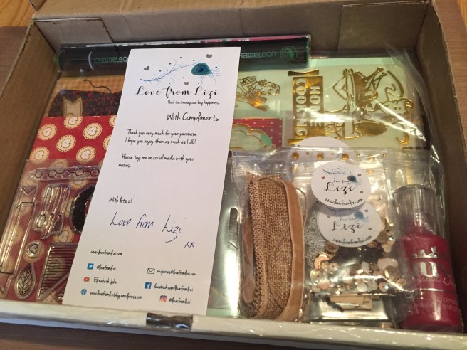
Hello folks! Scott here with my first ever unboxing post for the Love From Lizi August 2017 card kit. We get so much product in these card kits that I thought I would show off the supplies before I started making cards!

IMG_3533

Lizi always includes 5 sheets of very nice A4 card stock in her kits. This month we get mint, black, off-white, pale yellow, and a deep red. We also receive 4 half-sheets of specialty paper including a lovely chocolate brown glitter card stock and 3 sheets of glimmer card stock in gold, a kind of bronze, and that deep red. A great assortment of high quality card stock!

IMG_3536

The British crafters I follow seem to love printed vellum sheets, and Lizi does not disappoint with 2 sheets of printed and gold-embossed vellum. A dozen pieces (you have to cut them apart) of various sizes with an assortment of sentiments on many of them: “Home Cooking” “Happiness is homemade” “Life is what you bake it” etc. I think you could easily make 10 cards just using the vellum pieces!

IMG_3539

I really like the pattern paper included with this kit. We get a dozen, 6″X6″ single-sided pattern pages, featuring that great deep red, mint and light yellow from the card stock sheets. I am a big fan of red so I really like these pattern papers and that black sheet featuring vintage advertisements for food is stunning in and of itself!

IMG_3542

Love the little cherries on the black background and the quilt piece pattern paper uses all of the colors in this kit. The mint stripe on the upper left is actually utensils (spatulas, rolling pins, spoons, whisks, etc.) that make the tone-on-tone stripes.

IMG_3538

Of course, we get an exclusive stamp set with our kit as well. Two sentiments: “Made With Love” and “Kiss the Cook” in a nice font, a large double cherry, utensils, a banner, a great lip stamp, a couple of hearts, a leaf and those four triangles that seem to echo the quilt pattern paper. I’m sure some quilters out there could stamp out some unique patterns with these!

IMG_3544

Lizi has been featuring a Chameleon alcohol marker in her kits for 3 months now, and this month it is a GR3 Grass Green color. I hope she continues this perk for a long time!    I am also becoming a big fan of Lizi’s peel-off strips in multiple widths (this month in chocolate brown) for being so easy to use and the fact that they add a great ’embossing’ touch without having to break out the heat gun!

IMG_3545

This is where the Love From Lizi Kits kind of blow me away – so many embellishments! Beginning at the bottom left and going clock-wise we get; two round cork tags with twine attached, over 100 translucent gold rhinestone in 4 sizes, a Nuvo Crystal Drops in ‘Autumn Red’, six craft heart stickers, a 3″ square sheet magnet (refrigerator magnets, anyone?), a metal tag frame embellishment with removable tag, 3/8″ velvet ribbon, thin natural twine, 1″ burlap ribbon with a delicate scalloped edge and sparkles (more than 3′ of each), 2 chalk board tags with gold glitter and white sentiments, a wafer die that says “made with love” accented with a heart, 3 wood veneer cut-outs, and a “Cookies and Cream” sequin mix.

OTA5QzhFQURFODMzMjNGMzYzMzM6YjVlNDg2Y2VjNjdkN2Y2NmZjNzYzNWQxMDJlNWU4M2U6Ojo6OjA=

That, my friends, is a lot of product in one card kit! I’m looking forward to delving into these supplies as I work on my 10 Card 1 Kit video for this subscription. Remember, this kit is still available at Love From Lizi but these kits usually sell out quickly! If you do purchase one this month, tell Lizi that Scott sent ya!! Thanks for your support!

Printing Sentiments for Cards

A lot of people have been asking about how how I print unique sentiments on my cards, so I thought a little tutorial would be a good post and hopefully answer some questions.

IMG_3489“I’m hot for you” is printed on a vellum overlay, and “You Bet GIRAFFE I Love You!” is printed on the actual card base. Let’s do both of these prints. OK, granted, you can always print something on a full sheet of paper or cardstock and cut or trim or die-cut or whatever you like with the print, but I started doing this “piggy-back printing” when I was trying to conserve supplies. After all, If you print just a line or two of text on some cardstock, and then cut that out, you can’t send that paper back through your printer.

This slideshow requires JavaScript.

First, you need to know how your paper feeds into your printer, and which side of the paper gets printed. I have an inexpensive Canon Pixma MX922 inkjet printer/scanner/copier. (I like this printer a lot – gives me really pretty good color for the price!) Open your paper trey and mark your top piece of paper with an arrow pointing into the printer. Now print something. When your paper comes out of the printer, leave it in the catch tray and find your arrow. My prints come out with the arrow on the bottom. That means that, in the paper tray, the bottom of the paper is what gets the print.

This slideshow requires JavaScript.

Choose your favorite software. I LOVE my Silhouette design software but you can use anything you are comfortable with. (the basic version of the Silhouette design software is free and, if you are interested, I would suggest getting it and experimenting. I think it is pretty easy and intuitive design software created with crafters in mind…!) Whatever program you use, just be sure to place your sentiment design on the page so there is room to add your vellum (or other media) over the print. I know I want to print on the right side of a 6″ long piece of vellum, so I place my sentiment to the right side of the paper before printing, and then print the design on a plain piece of copy paper.

This slideshow requires JavaScript.

Now, you want to add your vellum piece (or whatever media you want to print this on) over the top of your original print. Vellum is easy to line up since you can see right through it. You can use your t-square or grid paper to help you line it up anyway you desire. Tape your positioned vellum down to the paper along the leading edge (the edge that will enter the printer first) with washi tape or painters tape (I always press fresh tape along my arm to take away a bit of the sticky). Be sure not to tape over your sentiment, or the tape will get the print, and not the vellum!

This slideshow requires JavaScript.

Return your original print (with the vellum taped to it) to the paper tray of your printer. Remember which orientation works for your printer. For my printer, I put the image back face down in the paper tray with the top of the paper leading into the printer. Print the same page again. * Don’t change anything on the original computer file or it won’t print in the same place a second time!* As the print comes out of your printer, you will see your sentiment printed on the vellum.IMG_3503

Just remove the washi tape and Voila! your sentiment has been printed on a small piece of vellum. Now let’s try to print on something not quite so easy to see through… Like 120# Simon Says Stamp Cardstock.

This slideshow requires JavaScript.

Back to the Silhouette software. You can create an outline of your whole card with this software, and line up a sentiment anywhere you want. Here, the 2 black rectangles are the front and back of my card base (fold line in the center) and the red rectangle is the size of my giraffe focal piece. (With the Silhouette design software, the black lines will print, but the red lines will not.) Now you can design your sentiment to scale and in the right place for printing to your card base. (Play with the free Silhouette software for a while if you can – I think you will really like how easy it is to use) When you’re happy with your design, print it out on plain paper.

This slideshow requires JavaScript.

Now, using the card outline you printed, line up your card base right along those lines,  and tape down the leading edge. I have a light-pad and use it frequently to be able to see through the paper for accurate alignment. (a sunny window or even a blank computer screen will shine enough light through your paper as well…) Again, use your t-square, or grid paper or just the printed lines to properly line-up your card base. Replace the printed sheet with the card base taped on it into your paper tray. Remember your paper orientation (print face-down, top of paper toward the printer for my Canon).

This slideshow requires JavaScript.

If you are using guidelines (the black rectangles) you will need to remove them on your computer before you print the page a second time, or you will end up printing black lines on your cardstock! (the red lines will not print with this software) Remember NOT TO MOVE or adjust your sentiment from when you first printed it. After you are sure all is clear and ready, print that page again, and your sentiment will be printed directly on your card base!

This slideshow requires JavaScript.

Just remove the washi tape and you have a completed sentiment on your card base ready for whatever your crafty heart desires..! This is the exact same process I used with my Love From Lizi July Card Kit as well, though I used my laser printer at work so I could foil my sentiments with gold…!

I hope this answers some questions, and I hope you will give this a try and realize that you will never have to ‘make do’ with a semi-appropriate sentiment (or missing!) stamp again!! Please let me know about your successes (and failures) and as always, please feel free to ask any questions!

Also, if you have ANY inclination, go ahead and download the Silhouette software and spend some time experimenting with it. Even if you never get a Silhouette cutting machine, the software has numerous uses…!

Simon Says Stamp July 2017 “Summer Hello” Card Kit

• OK… here we go..! After much hesitation and resistance, I have finally broken down and started my CardCutUps blog. I recently finished a 10 Cards 1 Kit video for the Simon Says Stamp July 2017 Summer Hello Card Kit and thought I would take that opportunity to get a blog rolling…  Needless to say, this site is in flux and evolving as I learn…!

IMG_3475
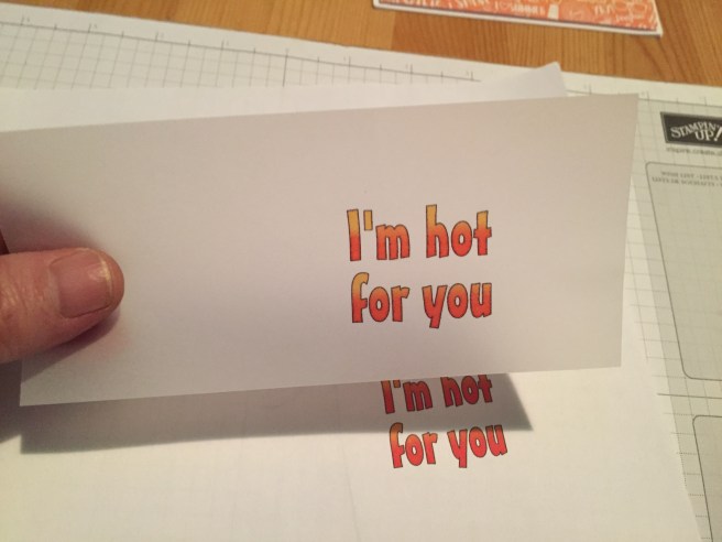
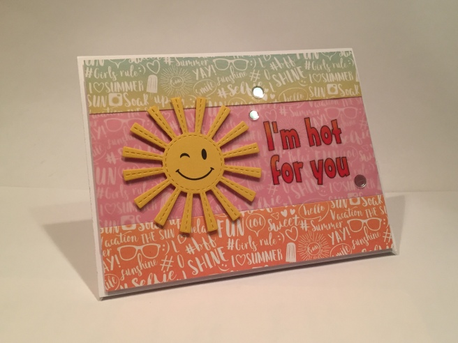
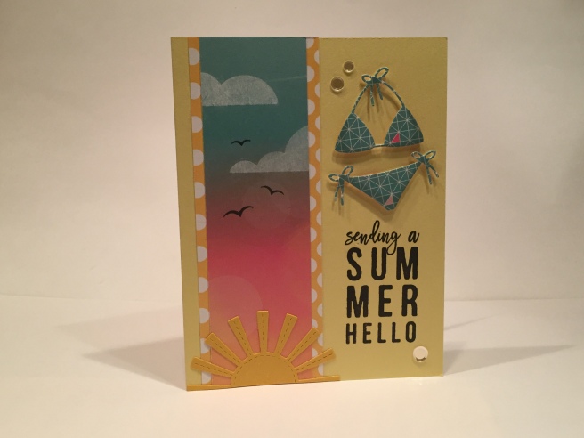
• Here is my first card from the kit using just a strip of that beautiful sunset pattern paper. I matted that on a piece of the yellow and white polka-dot pattern paper, stamped the sentiment directly on the Sunshine card base and die cut a bikini from one of the pattern papers as well. I did use my lightest grey Spectrum Noir marker to add a touch of shading to the die cut.  I stamped the clouds using Avery Elle Pure White pigment ink – (note – this ink looks like it is not stamping well, but the white brightens as the ink dries – I made the mistake of triple-stamping one of the clouds and I thought it would NEVER dry!!) Of course I added those great birds from the stamp set as well… This was such a beautiful piece of pattern paper that I was trying to conserve it as much as possible, so the strip is only 1.75 inches wide. I added half of a stitched sun die at the bottom of the pattern paper to break up the vertical stripe a bit. Add a few Moonshine Confetti pieces for a little sparkle, and my first card is complete. The bikini die included in the kit is cute but, ultimately,  seems rather limited to me.

IMG_3472
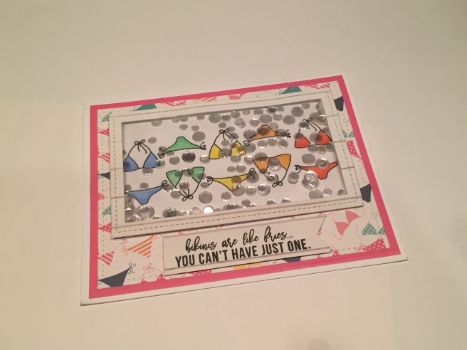
• Obviously, this kit was encouraging recipients to make shaker cards… what with the inclusion of an acetate sheet and double sided foam strips.. This is the only shaker card I made with this kit. I originally wanted to fill the window with all sorts of bikini die cuts but I couldn’t fit more than a few of them in because the die is actually fairly large. I opted to use one of the bikini stamps and, in order to get as many in a row as possible, I stamped them in SSS Intense Black Ink up-side-down and right-side-up and colored them all with my Spectracolor colored pencils. The frame and pattern paper are cut with Lawn Fawn Stitched Rectangle Dies and matted on the solid pink pattern paper and attached to a white card base. Plenty of Moonshine Confetti sequins and the “bikinis are like fries…’ sentiment. I thought the script part of this sentiment was pretty difficult to read though…  very small indeed.

IMG_3469
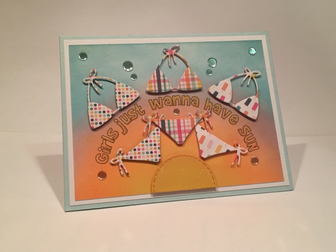
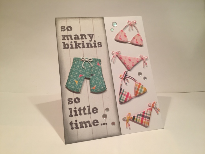
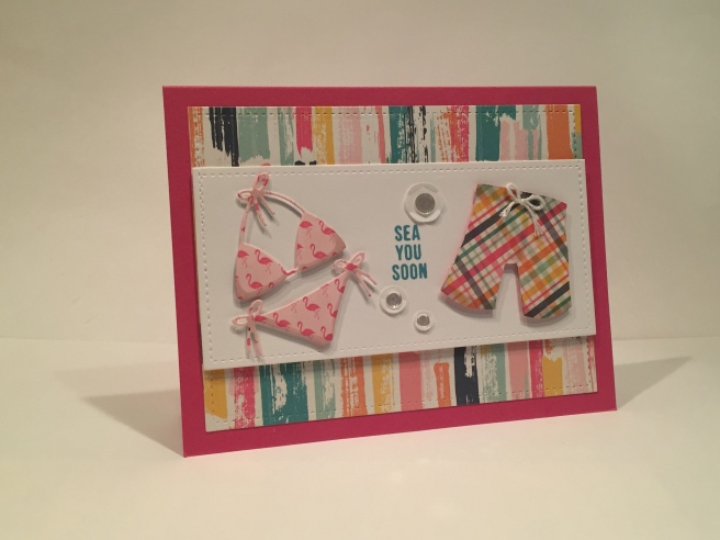
• I created a Board Shorts cut-out to go along with the bikini die cut. (again both shaded with a light grey alcohol marker) I thought all these bikinis looked lonely and I just wasn’t sold on the notion of a uni-sex beach..! The addition of a little white twine bow to the waistband of the shorts really sells the cut-out and coordinates nicely with the die-cut ties. The white card stock is from my stash, die cut with the LF stitched rectangle dies and mounted on pattern paper and the Doll Pink card base. I have to admit I am a little pinked-out from the last couple of months of card kits, but I do really like this cardstock color! I used some chunky white sequins from my stash and topped them off with the Moonshine Confetti sequins and stamped the title stamp in Distress Oxide Broken China.  Now there’s some company to look forward to on the beach!

IMG_3470
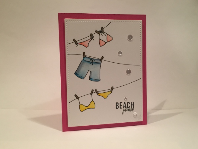
• Since I created the Board Short cut-out I figured I should create a Board Short “stamp”. I stamped both of the bikini stamps on Bristol Smooth cardstock in Intense Black Ink and I traced my Board Short “stamp” and the clotheslines with a Sakura Pigma 05 Micron Pen. I love these archival, waterproof, pigment pens because they come in a variety of very small nib widths. It’s very easy to match up the line width of stamps to the nib widths of the pens, so they are great for making corrections to stamped images. Here, the drawn lines match the stamped lines perfectly. I just used a Stitched Hillside die to give me a gentle curve on the clotheslines and cut down some craft cardstock into thin little ‘clothespins’. I colored the suits with my Zigg Clean Color Real Brush Markers and stamped the “Beach please” sentiment in intense black ink. Again, the cardstock is cut with a LF Stitched Rectangle die and mounted to the Doll Pink cardstock with foam tape. Add a few Moonshine Confetti sequins for a little sparkle. I love the movement that the curved clotheslines gives the whole image. I think it really has the feeling of a clothesline  flapping in the breeze… I like the simplicity of this card.

• Now, what to do with the “Water you up to?” sentiment. Obviously, I have to use the wavy water stamp from the kit, but the sentiment felt a little incomplete to me. So I ended up using the sentiment on the inside of the card and making a little pun on the front.

IMG_3485
IMG_3467

“Aquaholic?” (Arial Narrow font) makes me laugh, goes well with the stamp, and is a perfect lead-in to “water you up to”.  I stamped on the solid aqua pattern paper with the wavy water stamp in every blue or blue-green ink I had in stock and fussy-cut the top edge to tuck the stitched sun die behind. Matted that (bottom panel with foam tape) on the yellow and white polka-dot pattern paper and the Sunshine card base. A few dots of Ranger Enamel Accents in Lemon Twist (and some Wink of Stella on the sun) add a final touch and a little sparkle.

IMG_3465

• Back to that gorgeous pattern paper…! I used the rest of that paper here on my “Time to Relax” card and cut it to size with a stitched rectangle die. I stamped the clouds with VersaMark ink and white embossed them… The birds and sentiment stamped in SSS Intense Black ink and a sun created from a stitched circle die to go behind a bit of craft cardstock cut with a stitched curves die. I added the “watch more SUNSETS than NETFLIX” sentiment with my computer and tried to match the RELAX sentiment as much as possible – I used ‘Monterry BT’ for the cursive and ‘Arial Narrow’ for the block type. I did flip the pattern paper upside down so the ‘rays’ were going in the right direction from the sun in the lower left corner, and the added sentiment seems like good advice as well as giving me a bit of a chuckle…!

At this point, I realize that I have used EVERY STAMP in the stamp set… I don’t think I have ever used every stamp in a kit.. so now I can let the imagination truly run wild!!

IMG_3477

• “GIRLS JUST WANNA HAVE SUN” is the perfect sentiment to go along with a group of the bikini die-cuts! I created the ink blended background with Distress Oxide inks in Fossilized Amber, Spiced Marmalade, Worn Lipstick and Broken China on a piece of Bristol Smooth cardstock, matted that on some white cardstock from my stash and attached those to the Audrey Blue card base. I created the sentiment on my computer and printed it up on the inked (and dried) cardstock. Three bikinis and a half sun die-cut from pattern paper and mounted with foam tape. Of course the moonshine confetti sequins add a nice sparkle to the finished card.

IMG_3481

• There were two sheets of pattern paper in the kit that were the same pattern in two different colors – a sunset gradient and a pink. I wanted to use them together and see if I could get the pattern to be continuous across both colors of pattern paper. I don’t know if anyone will ever notice, but lining up the patterns made me happy! I added some vellum from my stash over the pink pattern paper and printed my “I’m hot for you” sentiment with my computer on the vellum. (Mister Earl BT is the font) Of course the whole sentiment depended on having a sun as the focal point – again cut from some yellow cardstock from my stash – and printed with a happy face wink that I had in my image files to add some character. Everything mounted on a white card base, three sequins from the kit and a fun summer card with no bikinis!

IMG_3483

• I wanted to use my Board Shorts cut-out again, so I created this sentiment (in Sketch Block font) on a strip of the nice white-washed board pattern paper edged with a little Pumice Stone distress ink. The white twine bow really finishes off the shorts nicely. The bikinis and Board Shorts are again lightly shaded with my alcohol markers and mounted with foam tape to a white card base. Can you tell I really like those Moonshine Confetti sequins? Great sparkle while still letting the card itself shine through.

• Finally we arrive at card number ten… I do not have a big stash of stamps in my possession – one of the reasons I started doing subscription kits was to affordably grow my stamp stock. When I first started playing with this kit, I looked to see if I had any stamp images (the April bunny? the May critters?) that the bikini die or stamps would fit – I thought a penguin or a bunny wearing a bikini would be very funny..! None of the bikini pieces from the kit would fit any stamps I had, so I went to the web to look for an appropriate animal to put a bikini on… I found a great pig image and after some scaling and stretching, managed to size the image so the bikini die cut would fit:

IMG_3478

I traced the image onto bristol smooth cardstock with my pigma micron pens and colored it with my Spectrum Noir markers. I outlined the bikini die with the same pen and just trimmed off the die-cut ties and added twine ties to the bikini bottoms for a little extra dimension. The sentiment is printed in ‘Marker Felt’ font in plain black and all is mounted on the Audrey Blue card base. I did add Glossy Accent dots instead of the Moonshine Confetti to provide the finishing touch. This card makes me laugh a lot. I hope it gives you a couple chuckles as well!

AND HERE”S MY FIRST BLOG GIVE-AWAY!! For anyone who subscribes to my blog with this first post, I will email a .png file of my Board Shorts images used with these cards. Both images included- the larger cut-out shape and the smaller traceable “stamp” image which match the sizes of the die-cut and the stamps in this set.
I encourage comments about this post, (constructive criticism encouraged – I’m a total novice here!!!) Let me know what you like and what you don’t, and any ideas you may have about future posts. And if you’d like to e-mail me, just go to the CONTACT page.

I look forward to hearing from you!!!

COMMENTS:


← Back

Thank you for your response. ✨