Hello Folks! Scott here with another mid-month treat for you… New add-on dies, and press & foil sentiments to go along with your Simple Stories Steamboat Willie Duo die set released last year.
This is the second add-on set from Spellbinders that compliments the original Steamboat Willie dies released last year – We did get a September 2025 release of the Classic Mouse Christmas Embellishments and Classic Mouse Holiday Wreath, so this is a welcome addition to the Simple Stories line directing us towards Valentine’s Day! I was thrilled by the addition of two new arms for our characters that create a “hand heart” when put together. There are also lots of accessories including a box of candy, a rose, a balloon, a heart lock (open and closed) with a key, an envelope and a sucker(?), as well as a nice new boater hat for Mickey!
I was delighted that Santa gave me a new Spellbinders BetterPress Paperpress system this year because part of the New Year changes at Spellbinders include combining the Glimmer Hot Foil plates and the BetterPress plates into one universal plate that will work with either system. The Classic Mouse Happy Sentiments is a Press + Foil plate! It will work with both the BetterPress and the Glimmer Hot Foil tools!
I couldn’t wait to try out my new BetterPress tool, so I reached for the Happy Sentiments plate to begin with! I think my first run with that new tool worked very well, though I could have probably put a little more ink on the plate to start with. I was a little paranoid about inking up the BetterPress plate a second time, but I love the whole Paperpress texture!
Of course I had to run that new Press + Foil plate through the Glimmer Hot Foil system as well and I was completely impressed with how well that plate worked with BOTH tools! That was part of the reason I was hesitant to get the new BetterPress system… I’d have to invest in more BetterPress plates. I hope all manufacturers combine these plates!
The new arms for Mickey and Minnie in this Classic Mouse Love die set was the most exciting thing to me (there were no extra arms in the Christmas release) so that’s where I started. (Trust me, I do love all the new accessories too!)
I dug into my paper scraps to create Mickey and Minnie – though I did use Pitch Black card stock from Hero Arts for all the black. I gave Mickey the new Boater (die-cut from plain Ivory card stock), and used Minnie’s hat from the original set decorated with a couple of hearts from the new set. I did use a paper punch for the polka-dots on Minnie’s dress, and I gave Mickey the rose and Minnie an (abbreviated) sucker. I thought the candy box was a bit large to put in either of the empty hands – it almost covers their whole body! I just wanted the “hand heart” to be the focus.
I did happen to find this old Mickey Mouse cartoon sketch on line with no copyright restrictions, so I downloaded and printed it out to use as a background for this card. I like the sketchy quality of it and it’s light enough to provide an interesting background without really pulling any focus from the main mice!
You can download a copy of this comic for yourself here:
I die-cut that background to 5″ x 3.75″ with a Lawn Fawn Stitched rectangle die and added a thin Black Mat and a thin Pearlescent Pink mat before gluing those to a 5″ x 7″ card base. With the new arms, I thought Mickey and Minnie felt a little crowded on an A2 card, and I didn’t want the sentiment to cover any part of the characters. So I glued everything to the card base a bit off to the left and added some Love From Lizi Red Mirror peel-offs (in two widths) to the right side of the card front. I die-cut two more sentiment blanks and glued them to the foiled sentiment and added that to lower right of the card front with some judiciously placed foam squares. There’s some shine on Mickey’s rose and boater bow, and on Minnie’s hat as well as the heart-shaped sucker. I love those new arms that make a perfect “hand heart” together!
There is also the Classic Mouse Love Sentiments in this new release, but I decided to go for the Classic Mouse Happy Sentiments instead because they felt a little more universal… I haven’t used a BetterPress sentiment yet!
Both Minnie and Mickey are done up in Pitch Black card stock and a pack of Gray Ombre card stock from Core’dinations that has been in my stash for quite a while. These are assembled straight from the original die set. I die-cut the heart with the largest HA Infinity Nesting Frame Heart die from some pearlescent Pink card stock and glued that to the front of an A2 White Glimmer card base. I glued the characters to the heart and added the “sucker” from the new die set cut from the same Grays as the characters. I layered up the BetterPress sentiment with two die-cut blanks and glued that in place. You see there’s not a lot of room on an A2 card for a sentiment when you feature both characters. I love the retro feeling on this valentine, and really like the perfectly tuned Mickey Mouse sentiment.
While playing around with these dies, Joel walked into the craft room and saw one of my Mickey heads floating around on my desk, and I had just die-cut the Heart Balloon from the new set when he suggested that Mickey’s head should be the balloon… AHA!
That works perfectly with this sentiment, and makes me giggle so much! Since this card was only featuring Mickey, I decided to do a Mini-Slimline card – a 6″ x 6″ square scored at 3″ and folded in half for a 3″ x 6″ card. I masked off 1/8″ around the perimeter of the card front with some masking paper and used a Pebbles Chalk palette to add the blended yellow background. With the masking removed, we have a nice white frame around the card.
I assembled Mickey as usual – again I love the fact that these dies allow for a touch of black outline as you layer their pieces to imitate the drawn lines of both characters! I die-cut the balloon string from a scrap of pearlescent pink card stock, and I die-cut the bottom bit of the Heart Balloon (including the “knot”) from more Pitch Black card stock and glued that to the bottom of Mickey’s head for its own balloon knot. I did trim off the left loop of the bow on the string and reconfigured it to go behind the “balloon”. I still wanted to see a bit of the knot, but I didn’t want to obscure too much of the face.
I glued Mickey’s body flat to the card base and added the “balloon” with foam tape for more of a floating sensation. Of course the balloon string fits right into Mickey’s hand and both ends of the string are glued down flat. I die-cut two more blanks of this foiled sentiment, glued them together and then right down to the card front. I LOVE THIS CARD! Not only is it a great visual pun, but, since Mickey is a cartoon, it’s totally plausible for him to be walking around with a balloon head! And the headless torso just makes me laugh!
There are a lot more accessories in this die set than just the ones I used… the locks and key are great for a “key to my heart” card (notice the “latch” on the clasp of the open lock), and I do love the dimensionality of the box of candy, and, well, you know what the balloon inspired!
Speaking of Joel… when I got the original Steamboat Willie Duo dies, he was almost as excited as I was, and he wanted to put his own spin on the Classic Mickey Mouse. Here’s a special bonus featuring Joel’s exacting, engineering mind…
We decided on 3″ squares to create this Warhol-esque Micky Mouse picture. Joel picked all the colors and assembled all the Mickey’s on his own. He was meticulous in his efforts to pose all of the Mickeys exactly the same, and carefully distributed all the colors in the backgrounds, shoes, shorts, buttons and tongues. He also created an elaborate template to make sure he got the Mickeys in the exact same spot on all the colored squares. We attached all the squares together and glued them to a 12″ square black mat. That fits perfectly in an Album frame – we chose White – and now this hangs on the wall underneath our “Sorcerer’s Apprentice Sketch’s” Limited Edition Pin Set in our dining room. High Art Indeed!!
That will wrap us up for another mid-month tangent! If you’d like to grab some of these Classic Mouse die sets from Spellbinders. please use my links listed below – I do make a small commission from whatever you purchase (at no cost to you!) and that really helps keep this page alive with some card-making inspirations coming your way.
Thank you so much for sharing some time with me today… I hope you enjoyed this little mid-month diversion as I keep exploring the Classic Mouse Duo die set.! If you enjoyed this, please click the Like Star at the bottom of the post, and if you wish to be notified when a new post comes out, just click the Follow Me at the top of the page. And don’t hesitate to send me a note if you have any comments or questions. Please take a moment to Like Me, List Me, Pin Me, Post Me, basically, share this post with all your crafty friends – especially any Disney Fans! And remember… Don’t run with scissors! As always, I send You and Yours Love and Light, Happy Valentine’s Day, and Happy Crafting!!
DISCLOSURE: This site contains some affiliate links to products. I may receive a commission for purchases made through these links (at no cost to you). As an Amazon Associate I earn from qualifying purchases. Thank you!
Hello Folks! HAPPY NEW YEAR!! And a big WELCOME BACK to the new Hero Arts My Monthly Hero kits! Hero Arts has retired their assorted monthly subscription kits and I am pleased as punch to get back to the My Monthly Hero! I’ll have more information about the subscription changes towards the end of this post but let’s dig right into this month!
My Monthly Hero Includes: • Mini Notecard Die Set • Post Box Die Set • Special Delivery Stamp & Cut • 10 Sheets of Cardstock- 1 of each color, 5.5″ x 8.5″ (Chiffon, Bellini, Coral, Carrot, Beeswax, Tuscan, Peridot, Rainforest, Fawn, Truffle)
My Monthly SUPER Hero Includes everything in the regular MMH above, plus: • Front Page Stamp & Cut • Postage Frame Die Set
Much like the last year (or so) of the original My Monthly Hero, we are now offered two levels – The My Monthly Hero kit and the My Monthly Super Hero Kit (love the re-naming!). SO MUCH STUFF! Especially with the Super Hero kit! At $45 for the main kit and $75 for the Super kit, this feels like Hero Arts is giving us even better overall value this year! YAY!
Though the old MMH kits tended to be stamp forward, this kit seems a little more die forward – we get a lot more dies this month than we get stamps… so how should I start? I decided to take each set alone and in order to see where that takes me. I got this wild idea to see if I could use all of the die cuts from the Mini Notecard Die set on one card!
SUCCESS!!! We have gotten small envelope dies in our MMH kits before – the MMH January 2020 kit in particular – but I’m always in the mood to be a little meta and put a mini card on the front of a normal card!
I die-cut the two envelopes from Hero Hues Peony card stock and die-cut everything else in the set from 80# Neenah Classic Crest Solar White card stock. I used Ohuhu Alcohol markers to color all the white die cuts. I decorated the top envelope with the bow, the 2 stamps (3 die cuts each), the postage cancellation swoop (detailed with a Black Pigma Micron pen) and the second heart. The sentiment is from the Love From Lizi “Fairy Garden” card kit from March of 2019 stamped in VersaFine Onyx Black ink and embossed with Clear embossing powder.The back of the envelope has the snail “wax seal” (I used the two circle dies to make the ring around the snail). The “open” sentiment is stamped in HA Taffy Reactive ink using the MFT Interactive Labels stamps. I use a Zots Removable glue dot to close the envelope.
You open the envelope and pull out the card cut from some plain White card stock to 4+5/8″ x 1+7/8″ then scored and folded at 2+3/8″ to make a top-folding card that matches the size of the note card die (which is a side-fold). The sentiment (yuck! yuck!) is from the MMH February 2022 kit stamped with VersaFine Onyx Black ink and embossed with Clear embossing powder. The stars (from the same kit) are stamped with Taffy Reactive ink and embossed with Clear embossing powder as well. I finished up the front of the mini note by ink blending more Taffy ink around the edges.
I couldn’t resist doubling-down on the mini-mayhem and made a Twist-and-Pop-up for the inside of the card. The mechanism and the sentiment are both done on simple printer paper to conserve on thickness.
First I cut a 4.25″ square of paper (that’s the full height I wanted to fit this mini card) and folded it diagonally in both directions and then folded it in half in the other direction – this folds in on itself to make a triangle – the point of the triangle will be in the center of the fold in the card base.
So we have to cut it down to the width of the card – 1+7/8″ in this case, so let’s cut it to 1+3/4″ to leave a little border on the sides. This means we have to cut 7/8″ to the right and the left of the center line (the point). Once cut, this is our basic mechanism. Now is the perfect time to decorate the mechanism however you like. I stamped the text on the background using the text cling stamp from the MMH March 2023 kit with Taffy Reactive ink. Then I ink blended the whole mechanism with the same ink.
Now we have to refine the pop-up to fit our sentiment (or whatever you want to twist and pop)! First, the pop-up has to be shorter than the height of the mechanism. My sentiment is trimmed down to 3+1/4″x1″ – that’s all the longer the pop-up part needs to be. So fold the mechanism in half and trim off 5/8″ from either side (both sides of the pop-up) – the leftover tab should be 3″ wide in total. Since my pop-up piece is only 1″ wide, we’ll trim the width of the pop-up to 1″ as well (that’s only a HALF INCH on the folded side). REMEMBER this trimming of the width has to stop at the edges of the vertical portion of the pop-up. This is our final mechanism.
I stamped the sentiment (from the MMH December 2021 kit) on a piece of copy paper that’s 3+1/4″x1″ and ink blended Taffy ink over the background. Fold the sentiment strip in half to the back and then fold 3/4″ of each end back towards the center fold – accordion style. The left end of the sentiment attaches to the bottom half of the left pop-up, and the right end of the sentiment attaches to the top half of the right pop-up. Sometimes it’s easier to attach the sentiment strip to the mechanism before gluing it to the card base.
Once the pop-up is working smoothly, you can attach the whole mechanism to your card base and decorate as you like. I colored the rest of the flowers with Ohuhu Alcohol markers, assembled them together, and attached them to the sentiment strip – being careful that they hide appropriately when the card folds up.
Alas, I still had two of the smaller circle die-cuts left… the original die-cut, and the piece left over when I die-cut the ring from the larger circle for the “wax seal” on the front of the card. I glued those dots to the top and bottom panels of the pop-up mechanism and added die-cut exclamation points (cut from an old “marker Micro” alpha die and colored with alcohol markers) to the center of the circles. THERE!! Now I have used every single die in the Mini Notecard Die set on ONE card!! Well… technically I didn’t use the actual notecard die because it was a side-fold card, but for all intents and purposes, this card used all the dies in that set!
To finish up the front of the card, I cut a panel of Tim Holtz pattern paper to 3.75″ x 5″ with a Lawn Fawn Stitched Rectangle die, and added a thin Pearlescent Pink and a plain Black mat behind that, and glued those to a white card base. I added thin black mats behind the two envelopes and glued those to the card front. I also added a touch of glitter around the heart with some Stickles glitter glue. It’s not often that I spend this much time on my first card in a kit, but I had a blast playing with this mini notecard set and love my final, surprising result!
Moving right along… I set aside the Mini Notecard Die Set, and reached for the Post Box Die set for my next card.
Some might think I’m a little bit too literal, but I love this mailbox! I die-cut the box and lid and the front highlights of the paper hooks from some Tim Holtz Onyx Metallic card stock, the backgrounds of the HELLO and the mail slot and the corner filigree as well as the full paper hooks are die cut from MemoryBox Glossy Black card stock. I used Tim Holtz Champagne Metallic card stock to die-cut the golden highlights and the box is glued together. SO CUTE!
The bird and snail and rubber band are die-cut from scrap White card stock and colored with Ohuhu Alcohol markers. The newspaper is die-cut from some Ivory card stock with Antique Linen Distress Oxide ink blended around the edges. I die-cut the snail shell from the background paper and did a little ink blending with the Antique Linen ink on all the animal parts before gluing them together. The background is pattern paper from an old Tim Holtz paper pad embossed with an even older Darice Brick embossing folder. I did ink up the “mortar” lines on the embossing folder with Walnut Stain Distress Oxide ink to darken up the “mortar” lines. I trimmed the bricks to 4″ x 5.25″, added a thin Black mat and glued those down to a White card base.
Of course I couldn’t leave well enough alone and had to add this cute sentiment on the inside of the card. Using my Silhouette software and the Nanum Pen Script font, I printed this sentiment on the inside of the card base (before adding anything to the front) using my “piggy-back printing” method. Makes me smile…!
I put the paper in the hooks and attached the whole mailbox to the card front with thin foam tape and perched the snail and the bird on top of the mailbox with foam tape as well. I love how realistic this die cut mailbox is!
Of course you could be fanciful and decorate this mailbox with all the flower die cuts in this set, but I’m not the type to stuff a bouquet into a mailbox! And we do have a “bouquet wrapping” die in this set… I’m so literal, I know!!
A sweetly casual valentine! I die-cut all the flowers and foliage from more Solar White card stock and colored them with Ohuhu Alcohol markers. I attached a piece of newspaper (the want ads are appropriately tiny) to a scrap of card stock and die-cut the wrapping from that. A little shading with Alcohol markers gives the wrap a little dimension. The flowers and greenery are assembled and arranged in the wrap, and I used a small piece of thin twine to wrap around the gather.
The background is a panel of White card stock stenciled with Taffy Reactive ink and a SSS Falling Hearts stencil. I cut that panel to 3.75″ x 5″ with a LFSRdie and added a Pearlescent Pink and Plain Black mat before gluing all down to a White card base. I die-cut the envelope die in this set (same size as the Mini Notecard dies) from a scrap of white card stock and lightly blended more Taffy ink around its edges. I glued the envelope flat to the card front and added the bouquet with foam tape.
The sentiment is from the Lawn Fawn Big Scripty Words stamp and die set (one of their earlier sets I still find quite useful)! I stamped that with VersaFine Onyx Black ink on White card stock and embossed it with Clear Embossing powder. I die-cut the sentiment and two blanks (this was also one of the earlier die-cut sentiments available in those days) then stacked and glued them together and then down to the card front. Finally, I added a red glitter heart to the envelope for a touch of sparkle. Valentine’s Day is just around the corner!
So those two cards used 95% of the Post Box Die Set… Let move along to the Special Delivery Stamp and Cut set. Finally I get to color some stamps!
I couldn’t resist using some masking to create this little vignette! And I really wanted to have a window in the box so you can see the letters shake around inside! I stamped this scene on some Bristol Smooth card stock using Versafine Onyx Black ink and some simple masking at the base of the pole. I colored everything with my Zig Clean Color Real Brush markers. After so many die cuts, I was totally immersed in painting this vignette. I did use a Gold Gel pen for the trim around the window and the envelope slot, and then I fussy cut away the window opening.
I stamped and embossed “POST” on a piece of heat resistant acetate using Versa Mark ink and HA Gold Embossing powder. I trimmed that to size and attached it to the back of the window opening. Using a MFT Mini Cloud Edges stencil and some Pebbles Chalk pastels, I blended in the clouds as well as the hillside using a Lawn Fawn Simple Hillside stencil. I die-cut the panel with a full-size 4.25″x 5.5″ Lawn Fawn Stitched rectangle die. I stamped and embossed the sentiment as usual on White card stock, die-cut it and two blanks with the matching die and glued them together.
I stamped the two envelopes and package twice on some scrap White card stock and colored them all with Prismacolor colored pencils and fussy-cut them out. I used some 1/8″ thick foam strips to outline the the back of window opening – allowing more room at the top (mail slot you know) and decided I could only get 4 envelopes to actually shake around effectively in there. I added the envelopes and covered the back of the window with a scrap of the TH Onyx Metallic card stock.
I added 1/8″ foam tape along the edges of the whole panel and attached it to an A2 White card base, and then glued the stacked sentiment into place. Absolutely adorable!! I really like that the shaker window is “embedded” in the card front and not an extra level on top!
We can’t ignore that great snail stamp (every set has had a snail so far!) and, of course, the postage stamp stamp…
The whole “snail mail” thing is delightful and makes me giggle. I stamped the postage stamp and the snail with VersaFine Onyx black ink on a scrap of Neenah Solar White card stock and colored it with my Ohuhu Alcohol markers then added the “25¢” stamp, and die-cut it (and two blanks) with the matching die. The sentiment is stamped and embossed as usual, then die-cut (along with two blanks), then both sets of die cuts are stacked up and glued together.
I was looking for a background for this card when I came across this old Stamping’ Cut die in the Chic Die set. I die-cut that from the same TH background paper that I used for the bricks. I made an A2 card base from Hero Hues Antique Ivory card stock, glued the background in place and added the stamped (and stacked) pieces. A little bit adorable!
SIDE NOTE: Hero Arts is discontinuing their Hero Hues card stock line (EXCEPT for their Pitch Black card stock) and are shifting to the Spellbinders ColorWheel card stocks. The Spellbinders ColorWheel card stocks are what we’ve been getting in the monthly card kits for the last year or so. So I figured I should try and use my Hero Hues card stock and start stashing my ColorWheel card stock. What do you think?
There is one more sentiment in this stamp set that caught my eye – it may have been the matching die that did it!
YAY! I stamped the YAY! stamp in a simple pattern on a panel of White card stock using Hero Hues Purple Galaxy, Blue Hawaii, Green Apple, Lemon Drop, Creamsicle, and Fruit Punch Reactive inks. I also stamped the small YAY! dot in the same colors (no Lemon Drop (too light)) and die-cut them with their matching die. I stamped and embossed the big YAY! as usual, and die-cut it out along with 6 blanks in Purple, Blue, Green, Yellow, Orange and Red. Those are all stacked and glued to the back of the stamped YAY!
I die-cut the background to 3.25″ x 4.5″ with a LFSRdie and added thin mats of Black, Yellow, Red and Blue behind and then glued them all to a White card base. I glued the big YAY! in the center and added the YAY! dots with thin foam tape. I was going to add a qualifying sentiment to the inside of this card but decided to leave that option open for any occasion that might deserve a hearty YAY! Or a lot of them!!
That really covers most all of the My Monthly Hero kit… Let’s look at the extras in the SUPER Hero Kit!
The Front Page Stamp and Cut set is quite unique and gives you lots of flexibility for celebrating any Breaking News in your circle of family and friends. I dug out an old Meade Acade´mie Sketch pad which had some nicely aged papers and stamped everything with VersaFine Onyx Black ink and Fruit Punch Reactive ink. I glued the stamped panel to another layer of the sketch paper for some added thickness, and die-cut the pair with the matching die.
I created a Gray A2 card base and used the Hero Arts Newspaper Bold Print cling stamp to stamp the background using HA Granite ink. That’s the perfect background stamp to use with this stamp set! I attached the “paper” to the card front with thin foam tape and I added a 4″ x 5.25″ panel of the same sketch paper to the inside of the card to carry the newspaper theme all the way through! It would be easy to create some personalized sentiments to use with this stamp!
This set also includes dies for all of the sentiments… even the “Breaking News” on the main newspaper stamp…
I started with some of my plain old Staples Ivory card stock and stamped the top of the “paper” stamp with Versafine Onyx Black ink and embossed that with Clear embossing powder. I die-cut the “Breaking News” sentiment along with one blank and glued them together. I also glued the black strip to another layer of the Ivory card stock and fussy cut that dividing line out. I stamped the other sentiments with Purple Galaxy Reactive ink and embossed those with Clear embossing power before die-cutting them along with one set of blanks and gluing them together. The “seal” is stamped with VersaMark ink and embossed with HA Gold embossing powder, then die-cut and layered with a second blank.
The background is the same Newspaper Bold Print cling stamp stamped in Granite ink on Ivory card stock and die-cut to 3.75″ x 5″ with a HA Infinity Rectangle die, and ink blended with a little Vintage Photo Distress oxide ink around the edges and splattered with the HA Brown Acrylic Speckle from last month’s card kit. The background is matted with a thin Black mat and a thin Purple Metallic mat before gluing down to an A2 White card base. I arranged all the die cuts on the card front and glued them down flat. There’s a lot more versatility with this stamp set when you can use the sentiments individually! The possibilities are almost endless!
Feels like that’s about all there is to the Front Page Stamp and Cut set… What does the Postage Frame Die Set give us!?
It’s a Postal Pup!!! How Cute! I used Hero Hues Sand and Chestnut card stock for the dog, and Hero Hues Periwinkle and Mist for the postal accessories. I did ink blend Vintage Photo Distress oxide ink along the bottom edges of the dog before assembling him, and I die-cut his nose and eye from Glossy Black card stock. The letters and newspaper are die-cut from more of the Ivory card stock and then supplemented with some extra letters left over from the Special Delivery shaker card before arranging them in the postal bag on both sides of the dog!
I die cut the Postage Frame from some White card stock and masked off the edges with 1/4″ strips of masking paper and then ink blended on some Antique Linen Distress oxide ink for a soft background. I stamped the “postage” details on the background with more Granite ink using a stamp set so old I have no idea where it came from…! I stamped and embossed the sentiment as usual right on the background and added a Black mat behind the postage frame before gluing that down to a White card base. The postal pup and his load is attached to the card front with foam tape. That little doggie displays such great dimension that he (or she!) practically leaps right off the card! Special Delivery indeed!
There are two sizes of stamp dies in this set and each of the two sizes has a background die and a matching frame die! Since I am assembling this cards during the week of Christmas, I couldn’t resist making a Holiday card!
I dug around in some old Holiday Pattern paper and found these sweet treats in both red and green colors and perfectly sized for the larger stamp die! I die-cut 4 sweets from the red pattern paper and five sweets from the Green pattern paper and glued those to 9 frame dies cut from plain White card stock. I took a piece of matching polka-dot pattern paper and glued that to a 4.25″ x 5.5″ panel of White card stock. I added the negative die cut from the Postage Stamp Frame die around the edges and glued the 9 stamps in place.
I stamped both sentiments (from the MMH October 2021 Kit) on White card stock with Green Apple Reactive ink and embossed both with Clear embossing powder. I die-cut the Happy Holidays sentiment with a LF Many Everyday Messages die and the “card” sentiment to 2.25″ x 1.75″ and rounded the corners with a Corner Chomper. I took a white Mini Notecard envelope (from the first set) and created a slot in the lower part of the back to hide our gift card. I decided where I wanted the envelope to go on the front of the card and cut a matching slot through the background.
I glued the envelope in place on the front of the card matching up the slots and then assembled the envelope. I attached the gift card to the back of the sentiment card with a piece of tape and slid those through the slot of the envelope. Then I added double layers of card stock to the back side of the card front to give us a channel for the gift card to slide into. Then I could attach the whole background to an A2 White card base being careful not to put any glue in the gift card channel. I have always loved being able to hide a gift card inside a card… and the Abundance sentiment is perfect to go along with a gift card!
And there we have all 10 cards created with the NEW My Monthly Super Hero kit for January of 2026! Happy New Year indeed! We have a nice variety of cards in many different styles and a few surprises as well!
I do hope Hero Arts gets back to featuring a few more stamp sets in their card kit, and can come up with some more exciting extras to keep us jonesing for more! I did use the vast majority of everything offered in this kit and had quite a good time discovering the myriad of uses this set inspires! And I even got to do some much needed coloring this month!
Here are details about the new My Monthly Hero subscription plans – there are 2 SUBSCRIPTION OPTIONS: My Monthly Hero – $45 • My Monthly Super Hero – $75 • HOW IT WORKS: Monthly Reveal: Each kit is revealed on the 1st of the month, with sneak peeks starting a few days before. • Subscription Window: Sign up between the 1st–27th of each month. • Easy Billing: After the first kit, subscriptions are billed automatically on the 3rd of each month. • Flexible & Hassle-Free: Subscribe, switch plans, or cancel anytime. • SUBSCRIBER PERKS: My Monthly Super Hero Subscribers: 15% off purchases • Free shipping coupon every month. My Monthly Hero Subscribers: 10% off purchases.
If you are excited about My Monthly Hero coming back and want to grab a subscription for yourself, please use my links below – I do get a small commission from anything you buy at HA (at no cost to you!) and that helps keep the wheels turning and the inspiration coming! As always it is supremely appreciated!
Happy New Year! Happy My Monthly Hero return! Thank you so much for sharing some time with me here today! I hope I was able to inspire you and maybe show you something new! Let me know which cards are your favorites If you enjoyed this post please click the “Like” star at the bottom of this page, and if you wish to be notified of new blog posts click the Follow Me button at the top of this page. Please, take a few moments to Like Me, List Me, Pin me, Post Me, Basically, just share this post with everybody you can, and remember… Don’t run with scissors!! As always, I send you and yours Love and Light, and Happy Crafting!
Hello Folks! Happy Holidays! Scott here with 10 new cards from the Hero Studio Card Kit of the Month for December of 2025. “Soup There It Is” is what they have titled the December Hero Studio release and the Card kit features all sorts of ingredients and equipment for making a pot (or a bowl) of your own nourishing soup. Soup On!
December 2025 Card Kit of the Month includes: • You’re Souper 6″ x 8″ Clear Stamp Set • You’re Souper Coordinating Dies • Big Squishy Hugs Die Set • Brown Acrylic Speckle, .5 oz. • 10 Sheets of Cardstock- 1 of each color, 5.5″ x 8.5″ (Poppy, Pomegranate, Carrot, Terra Cotta, Cinnamon, Beeswax, Saffron, Tuscan, Truffle, Alabaster)
Looks like we get to do some coloring this month!! I am a big fan of soup…! When we make soup, we always make a great big pot so there are plenty of leftovers. You’ll almost always find a tub of frozen soup in the freezer at this house!
Of course I reach for the You’re Souper Stamp set to get things rolling… and to get some coloring in! I also grabbed an old Bo Bunny Family Recipes Collection paper pad that I had in my stash… I thought that might come in handy!
I decided to do some stamping and masking instead of relying on the coordinating dies to start with. I only need a mask for the green pepper and top right side of the pot. First I stamped the pepper with VersaFine Onyx Black ink and then cut a mask to place over it. The carrot, onion and pot were then stamped and a mask placed over the right side of the pot. Then the pepper mill is stamped in the background. Everything is stamped on Bristol Smooth card stock and colored with my Zig Clean Color Real Brush markers.
I must give a big shout out to these Zig Clean Color Real Brush Markers. I got this set of 36 pens exactly 10 years ago, and all of the pens are still going strong – not one has dried out, and I feel like I use them pretty regularly. When paired with Strathmore Bristol Smooth card stock the blending and watercolor possibilities seem almost effortless! And they LAST!
As a final touch on this vignette, I stamped the steam rising from the pot using SSS Barely Beige ink. I die-cut the panel to 3+1/8″ x 4″ with a Lawn Fawn Stitched Rectangle die and added a thin black mat behind. The background is from the Bo Bunny pattern paper cut to 4″ x 5.5″ and glued to the center of an A2 White card base. I added some Love From Lizi Pin Stripe Peel-Offs in Brown Mirror on the two sides of the pattern paper for a touch of shine.
I glued the matted vignette to the center of the pattern paper, and stamped the sentiment on a scrap of Bristol card stock with Hero Hues Root Beer Reactive ink and embossed that with some clear embossing powder. I die-cut the sentiment (and two blanks) with the matching die, stacked and glued the three layers together, and added them to the card front. The shine on the sentiment matches the peel-offs and the tile background feels extra homey… and a perfectly good pun!
In that Family Recipes paper pad I had some extra backgrounds that I had used on an old Re-Gift-Able Recipe Book I created quite a long time ago, and that red polka-dot with heart trim reminded me of a placemat…
I stamped the bowl and spoon with VersaFine Onyx Black ink on some plain Ivory card stock and stamped the detail of the bowl with Spiced Marmalade Distress Oxide ink and the contents of the bowl with Antique Linen Distress Oxide ink. Then I stamped the “noodles” in the soup with more Antique Linen ink and embossed that with Clear embossing powder. I colored the rest of the bowl and spoon with my Zig markers and die-cut them both with their matching dies. (I did make a paper template for the bowl die to help me line it up correctly).
I did some slicing and dicing to that old red pattern paper and shrunk it down to about 3″ x 1.75″ – perfect size for a placemat! I added a black mat behind the placemat to highlight the heart trim. The background is white card stock die-cut with an Altenew Cross Stitch Canvas Die and trimmed to 3.75″ x 5″ with a LFSRdie and ink blended with Antique Linen Distress Oxide ink around the edges. I matted that with black card stock and then I spattered some Brown Acrylic Speckle on that for an added touch of distress… that Acrylic Speckle is great for dark card stocks… you can see how well the little dots show up on the black mat. I glued the background to a White card base.
I stamped the sentiment on a scrap of White card stock with VersaFine Onyx Black ink and embossed that with clear embossing powder. I die-cut the sentiment (and two blanks) with the matching die and stacked and glued them together. The placemat is glued down to the background, the bowl is attached to the placemat with foam tape, and the spoon is glued to a 3/4″ square of water color paper with torn edges and folded in half to be a napkin. I like the shine on the “noodles” in the soup, and the napkin is just the perfect touch – Looks like dinner to me!
The die-cut borders on the bowl and spoon didn’t bother me so much here because they were stamped on Ivory card stock (same as the placemat trim) which helped them blend in… but in general, I am not a fan of die-cut borders.
So I turn back to masking again! I stamped the pot lid on a panel of white card stock and cut a mask to fit on top. Then I stamped the pot (both with VersaFine Onyx Black ink). I stamped the pot detail with some Concord & 9th Sea Glass ink and colored the rest of the image with my Prismacolor Colored Pencils. I stamped and fussy-cut the big spoon from a scrap of White card stock and colored that the same. I cut a slit in the soup for the spoon to go in – just enough room!
Since I had the masks, I decided to cover the pot and lid with the masks and use an old Carta Bella Designer Diamond background stamp with Antique Linen Distress Oxide ink to stamp the background right over the masks. I stamped the background a second time using Vintage Photo Distress Oxide ink around the edges. While the masks were still on, I blended a little Antique Linen ink around the bottom and sides of the pot, with a light touch around the edges and all over the background, and I also stamped the steam coming out of the pot with SSS Barely Beige ink. Then I die-cut the panel to 3.75″ x 5″ with a LFSRdie and added a thin Black mat before gluing them down to an A2 White card base.
I slipped the spoon into the soup through the slit and attached the end of it to the card front with foam tape. That adds an interesting touch of dimension to an otherwise flat card. I stamped and embossed the sentiment as usual directly on the card front. Looks like a nice tomato bisque in that pot… I hope you have some grilled cheese on hand!
There is one sentiment in this set that says “feel better fast”. How do you speed up the recovery process?
More soup, of course! Using my MISTI, I stamped the bowls and spoons on a panel of Neenah Classic Crest Solar White 80# card stock with VersaFine Onyx Black ink. I colored the bowls and spoons with my Ohuhu Alcohol markers and used a variety of Distress oxide ink pads with a brush and water for the soups. I stamped the “noodles” in the bottom center bowl with Antique Linen Distress oxide ink and embossed that with clear embossing powder. Short of covering the entire contents of the bowls with Glossy Accents, I think adding some shine to the “noodles” does the trick and adds the right amount of shine to your soup.
I stamped and embossed the sentiment as usual, and die-cut the panel to 3.25″ x 4″ with a LFSRdie and added a thin black mat behind. The background is some old Scrapbooking Made Simple Dottie Primaries card stock die-cut to 3.75″ x 5″ with a LFSRdie with a thin Black mat glued behind. Those are glued to a White card base and the colored panel (and mat) are glued on the background. Pea soup, tomato soup, miso soup, chicken vegetable… what ever your pleasure!
I still wanted to do a pot of soup with a lid that flips up… an interactive card that kind of blows the lid off the pot…!
First off… I love this dark Blue pot! I think it came from William Sonoma!!! I stamped the pot in the center of an A2 panel of Neenah Classic Crest 80# Solar White card stock with VersaFine ink and colored it with my Ohuhu Alcohol markers B350, B380, and B440. I stamped the lid on a scrap of Neenah card stock and colored it the same. I fussy cut the lid with a half-inch wide tab coming off of the top edge (you only need an inch of length at most).
I stamped the soup (and the detail noodles) using Antique Linen Distress Oxide ink – heavier on the edges and lighter in the center. I stamped the noodle sentiment with VersaMark ink and embossed it with Love From Lizi Ivory Pearl Embossing Powder. That’s a great “noodle” color (and shine) but to get a little more contrast, I added a touch of shadow to the left and bottom sides of the letters with a Brown Pigma Micron pen. That’s fairly easy to do with embossed letters… the embossing will help guide your pen…!
Again… since I already had the masks, I masked off the pot and stamped the background using the Concord & 9th Sunshine Turnabout Stamp set (and, yes, I use the C&9th turnabout jig as well). That is one of my favorite and most used turnabout stamps in my stash! I stamped that with Fossilized Amber, Peeled Paint, Candy Apple, and Spiced Marmalade Distress Oxide inks. Love it!
I trimmed the panel to 3.75″ x 5″ and glued a thin Black mat behind. Using a T-square and the pot lid I marked where the tab on the lid fell, and cut a slit in the base for the tab to pass through. Now the secret to making this a pull-tab card is to NOT score the tab at the edge of the pot lid, but to score it about a quarter of an inch above the lid. Now slide the lid tab through the slot and affix a “spacer” (wider than the tab but just under a quarter inch) to the tab in order to hold the lid in place. Then, when you fold the tab over, and attach a pull-tab (1/2″ wide/double thick), the lid will flip up when the pull tab is pulled. If you find that description confusing, I will demonstrate this on my video that accompanies this blog.
I did stamp another lid using SSS Barely Beige ink (wiping off the knob) and fussy-cut that to go on the inside of the lid (of course the Alcohol markers bleed through) to give us a clean interior. A couple of card stock channels on either side help keep the pull-tab in place, and I use a 1/2″ punch to expose the pull tab (stamped with the MFT Interactive Labels stamp) at the bottom of the card. I glued the whole mechanism to a White card base – being careful not to glue down the pull-tab, and here we have a fun interactive card ready to delight the recipient… no matter how sick they are!
Enough with the soup! Let’s turn our attention to the Big Squishy Hugs Die Set! I did ascertain that the two sets of sleeve dies (one pair with a cuff the other pair with stripes) do not match. It appears we have two different sleeve options!
I die-cut the two hand dies from plain Ivory card stock and colored the hands with my go-to R18, R19, and R20 Ohuhu markers. I die-cut the two Striped sleeves from some plain Gray card stock and the stripes from some darker Gray. I glued the stripes to the sleeve and suddenly had what appeared to be prison garb… so I grabbed an R180 Ohuhu marker and colored over the Gray. That’s better! I masked off the arms and ink Blended Hero Hues Lemon Drop, Creamsicle, Grape Slush, Thistle, Splash and Blue Hawaii Reactive inks for the background (half on one die cut, half on the other).
I glued the sleeves to the arms trying to keep away from the bottom of the right arm and the top of the left arm to avoid buckling where the arms overlap. No matter how hard I tried I still had a bit of conflict where the arms touched. I don’t think the overlap is bad… you just need to be aware of it. I glued the two die cuts (only the left and right edges of the arms) to an A2 White card base. I slid the heart (die-cut from the Poppy card stock) behind the arms and glued it in place. Then I glued the hands down and tried to ignore the tiny buckle where the arms overlap.
I stamped and embossed the sentiments as usual on a scrap of White card stock, die-cut them (and 2 blanks each) with their matching dies, and stacked and glued them together, and then down to the card front. A really unique die that creates a delightfully whimsical card for conveying “big squishy hugs” to anyone and everyone you’d like!
Let’s see if we can make those arms work without any sleeves… maybe try to illustrate the action of a hug..?!
Again, I die-cut the two arm dies from some plain Ivory card stock and colored the hands as usual. I also die-cut the two arm dies from some pattern paper in my stash (Sizzix Geometrics Paper pad) and die-cut two cuffs from the backside of that pattern paper. I trimmed away the hands from the pattern paper at the same point on both arms. I cut a piece of White card stock to 4.75″ x 5.5″ and scored the long sides at 1/4″ and folded those both to the inside of the card.
I glued the Ivory die cut to the back-side of the flaps on the card base and trimmed away the rest of the flap on either side. Then I glued the pattern paper die cuts on top of the Ivory die cuts (and the flaps) leaving the hands exposed. The arms interweave together quite nicely! I added the contrasting cuffs to both arms. We don’t need no stinkin’ sleeve dies!
I stamped and embossed the sentiment on the front as usual and added the ellipsis at the end with a Pigma Micron pen. The heart is die-cut from some plain Red card stock and the sentiment stamped with VersaMark ink and embossed with white embossing powder. I glued the heart to the inside of the card – I suppose you could glue the heart to one of the arms and let it appear in the hug, but this seemed to be one of the easiest ways to get these die-cuts to be a unique opening for this card. The cuffs sometimes interfere with each other, but over all, a pretty smooth operation.
Of course you can just cut away the arms from the rest of the two dies and put them wherever you want!
It’s Sweater Weather!!! I die-cut the two arms (only the two arms) from some Plain Ivory card stock and colored the hands as usual (Ohuhu R18, R19, R20). I took a 3.75″ x 5″ panel of White card stock and embossed this knitting pattern on the whole panel – this is an old Love From Lizi embossing folder from her October 2018 Card Kit. I added some ink blending around the edges and over the front of the embossing using Antique Linen Distress Oxide ink. I glued that to a thin Black mat and glued those down to an A2 White card base.
I die-cut the cuffed sleeves from the same card stock and embossed them with the knitting pattern too. I added plain white cuffs over the embossed cuffs and ink blended more Antique Linen along the bottom edges. I glued the sleeves on top of the Ivory arms. I stamped and embossed the sentiment as usual and die-cut it (along with two blanks) with the matching die and stacked and glued the sentiment together.
I used an old Sizzix Heart, Cross Stitch emboss and cut folder to cut out this heart from Poppy card stock. I thought the texture would be nice along with the sweater texture. I attached that to the center of the card front using thick foam tape. I decided where to place the arms, and trimmed off the excess before gluing them to the left and right edges of the card front and then to the top of the heart. No need to fuss with overlaps or buckling… and an extra pair of arms is always useful!
When I was die-cutting the stripes for the other sleeves, I noticed that the negative die-cut was pretty interesting…
It’s Rugby Season!! I took an A2 panel of the Cinnamon Card stock from the kit and die cut the two sleeve stripes dies right into that panel – I did tape the two stripes dies together and carefully spaced them around in a circle and die-cut the pair five times for a total of 10 arms. I die-cut 10 hands from Ivory card stock and colored them as usual with my Ohuhu markers. I slipped the die cut hands into the last stripe of the arms, pulled them snuggly into place and marked the bottom of the stripe on the hand. I removed the hand, trimmed it down to just inside the pencil line and glued them back in place with a touch of glue behind the stripe. Looks like a “Go Team” huddle to me! and the striped “shirts” are very Rugby!
I die-cut the Cinnamon layer with a 3.75″ x 5″ LFSRdie (carefully keeping tabs on the orphaned corner pieces) and glued that down to a 3.75″ x 5″ piece of Terra Cotta card stock – remembering to add the corners of the stripes to complete the image. I die cut the sentiment from some plain White and Black card stock using an old Alpha die set from the Love From Lizi Oh, Baby special edition kit. I glued the letters together for a bit of a black shadow and glued them down to the card front. I did add the “you got this” sentiment on the inside of the card. I really like this… a totally terrific masculine card for any sports enthusiast on your list! Or any sports playing female on your list too! Go Team!!!
Over the last year or so, Waffle Flower came out with stamps, dies and stencils in their Postage Collage collection. I slowly gathered the essentials of that release thinking that it would be a perfect way to showcase smaller images…
This is exactly what I had in mind! I die-cut the Postage Collage Die from some 110# Neenah Classic Crest Solar White card stock and then arranged the stamps. Since I already had a green pepper mask, I went ahead and added that in front of the pepper grinder. I stamped all the food items with VersaFine Onyx Black ink, and stamped the solid soup stamp with Antique Linen and Vintage Photo Distress Oxide inks. I created this pun-y sentiment using my Silhouette Software and the Take Charge font. I printed that right in place using my piggy-back printing method and my NEW! Epson EcoTank printer.
I took the Postage Collage Blocks Stencil and ink blended all the “stamp” backgrounds with Hero Hues Splash, Key Lime Fizz, Thistle, and Lemon Drop Reactive inks and then Antique Linen and Vintage Photo Distress Oxide inks. I used my Ohuhu Alcohol markers to color everything – with the help of some White Gel pen for the onion and garlic. Once everything was colored, I stamped the “noodles” in the soup with Vintage Photo Distress Oxide ink and embossed that with some Clear Embossing powder. I also have the Postage Collage Stamp Set so for a final touch, I stamped the “FOREVER” and the stamp prices as well as the “Hugs Inside” markings.
I added a thin Black mat behind the sheet of stamps and glued those down to an A2 White card base. And who doesn’t need another Birthday card in their stash! I’m thrilled to finally get to see how this Waffle Flower Postage Collage collection can work with a group of smaller stamps. And this is perfectly in line with the whole Hero Studio theme this month. I really like how this turned out!
And before you know it, that’s all ten cards for this month! This is a handsome batch of cards with lots of COLOR!
I did manage to use every stamp in the You’re Super stamp set except for the “deep breath, friend” sentiment. Somehow that just seemed a little too personal for a greeting card. I also opted for some simple masking this month instead of relying on the coordinating dies to create my vignettes – but I always love (and use!) the sentiment dies! I did use every die in the Big Squishy Hugs die set, but didn’t use much of the Brown Acrylic Speckle – it just didn’t feel very appropriate for most of these cards. But we did end up with a wide variety of cards colored in a number of different mediums with some good puns (one extra!) and even some interactivity. Admittedly, I had a great time playing with this kit!
As usual, if you’d like to get this kit (or anything else in this month’s Studio release) for yourself, you will need to Subscribe to the Hero Studio Card Kit of the Month by December 27th. If you do go shopping at Hero Arts, please use my links listed below… I make a small commission from whatever you buy (at no cost to you) and that helps support this page and keeps a little bit of fun inspiration coming your way! It is so very truly appreciated!
Once again we have reached the end of another year. I can’t believe how fast the time flies! Thank you so very, very much for sharing your time with me here… I hope you have enjoyed yourself and maybe even learned something new this year. Remember, YOU are the reason I keep posting! If you liked this post please click the “Like” star at the bottom of this page, and if you wish to be notified of new blog posts click the Follow Me button at the top of this page. Please, take a few moments to Like Me, List Me, Pin me, Post Me, Basically, just share this post with everybody you can, and remember… Don’t run with scissors!! As always, I send you and yours Love and Light, Happy Holidays and Happy Crafting!
DISCLOSURE: This site contains some affiliate links to products. I may receive a commission for purchases made through these links (at no cost to you). As an Amazon Associate I earn from qualifying purchases. Thank you!
Hello Folks! Scott here again with 10 new cards inspired by the Hero Studio Card Kit of the Month for November 2025. One More Chapter is the title of this month’s release and that might as well be One More Book once you see how many books are featured in this kit.
Card Kit of the Month Includes: • To Be Read Pile 4×6 Clear Stamp Set • To Be Read Pile Coordinating Dies • Happy Place Die Set • Professional Bookworm 3×4 Stamp & Cut • Gold Hero Wax, 1 oz. • 10 Sheets of Cardstock- 1 of each color, 5.5″ x 8.5″ (Bellini, Coral, Carrot, Terra Cotta, Beeswax, Saffron, Tuscan, Peridot, Seaside, Waterfall)
I think that’s a lot of books! There’s 8 books in that “pile”! The Coordinating dies are a fairly clever die set with the covers of the books rendered as 8 individual dies. Lots of spine decorations, but not much to color this month… The Happy Place die set is fairly unique and should be fun to assemble, but the Professional Bookworm stamp and cut set makes very little sense to me… many of the sentiments are about the sender not the receiver – “If you need me I’ll be reading”, “Books are my happy place”, “Shhh… I’m reading” etc… those kinds of sentiments seem odd to me…!
So I naturally started with the To Be Read Pile stamps and dies. I like the dimension the separate cover dies provide!
I started this card by die-cutting the book pile from some plain ivory card stock. I do keep plain old ordinary (Staples grade, generally) Ivory and Grey card stocks in my stash – they come in very useful! Then I die-cut the 8 book covers from the Spellbinders card stock included in the kit – Terra Cotta, Beeswax, Saffron, and Tuscan. I stamped and embossed the book bindings using VersaMark ink with HA Gold and Silver embossing powder, LFL Golden Crown embossing powder, and HA White embossing powder. Then it’s a simple matter of gluing the book covers on top of the full pile – but BEWARE! All of the cover dies line up edge-to-edge EXCEPT for the 4th book down from the top. The left side of the 4th book cover has to layer ON TOP of the fifth book cover die. So I suppose it’s better to glue those book covers on going from the bottom to the top…
I die-cut a piece of the Terra Cotta card stock and a piece of Tim Holtz pattern paper with two Spellbinders Essential Arches dies and glued them together before gluing them to the front of an A2 card base. I added some foam tape behind the assembled pile to attach it to the card front. That’s a lovely Thank You card for your favorite bibliophile!
I mentioned my disappointment that there weren’t really any images to color… so I made do with coloring the pile itself!
I die-cut the pile of books from some Bristol Smooth card stock and used my TomBow watercolor markers along with some water and a brush to color all of the book covers. That satisfied my coloring mojo a little, and I swear it took no more time than die-cutting and assembling all the book covers. Do note that I removed the top book from the pile… yup… there’s only 7 books here! Once the water coloring was dry, I stamped and embossed the spines using VersaFine Onyx Black ink with Clear embossing powder for all the words, and VersaMark ink with Gold embossing powder for the top and bottom books. I did use some craft tape on the back of this die-cut to hold all the cut lines together.
I die-cut a panel of White card stock to 3.25″ x just under 4″ using a Lawn Fawn Stitched Rectangle die (3.25″ x 4.5″) and doing some partial die-cutting to bring that die cut down to size. I added a thin black mat behind and glued those to a White card base. I used thick (1/8″) foam tape on the back of the book pile and placed that in the center of the card front. A couple of strips of alphabet washi tape completes the literary theme and compliments the water colors nicely. The embossed spines add plenty of sparkle to this highly complimentary card!
That’s the covers done with colored card stock and simple water colors… let’s die-cut AND color with alcohol markers!
I do like this pile! Note that I did cut the top TWO books off. I die-cut the pile die from Ivory card stock again (trimming away the top two books) and die-cut the remaining 6 book covers from some alcohol friendly White card stock.
Here’s a pic of the Ohuhu alcohol markers I used for the book die-cuts in this pile.
I figured it was about time to play with the Gold Hero Wax, so I used a paintbrush to color the edges of the die-cut book pages with the wax. I glued the colored covers in place (book 2 overlaps book 3 here!) and this pile looked so nice I decided we didn’t need any spine stamping but we could sure use some more of that gold wax!
I was surprised that we got this pot of Gold Hero Wax in this kit but didn’t get any kind of stencils to use with the wax. I dug through my stash and found this nice Rococo wallpaper stencil (I believe it’s an old Michael’s stencil (very thin!)). I took a 4″ x 5.25″ panel of the Seaside card stock and spread the Gold Hero wax on through the stencil. Really nice shine to that wax!! When the stenciling was dry I added a thin Black mat and glued those to a White A2 card base.
I was perusing my stash for alternate sentiments to use with this kit when I came across the MMH March 2021 card kit. That kit has some great book oriented sentiments – including the one I used on this card. I thought the “you are the author of your own story” was appropriate for a stash of untitled books…! I stamped that on a scrap of Seaside card stock with VersaFine Onyx Black ink and embossed it with Clear embossing powder and trimmed it down to size. I added foam tape behind the book pile and the sentiment and added them to the card front. I really do like this card a lot.
That’s book piles of 8, 7 and 6… maybe there’s something we can do with the 2 book-cover dies that are only the book spines…
I took the card stocks from the kit and started die-cutting the 2 spines from them – from the left – Terra Cotta, Saffron, Tuscan, Seaside, Terra Cotta again. I stamped the spines with Black Soot, Walnut Stain and Blueprint Sketch Distress Oxide inks. It’s easy to make a shorter book by just trimming down the die-cuts with the dies! Then I sketched in some “page-turning” titles using colored Pigma Micron pens. Not too shabby if I say so myself!
I stamped the sentiment (again from the MMH 3/21 kit) on a scrap of Beeswax card stock using VersaFine Onyx Black ink and embossed that with Clear embossing powder and trimmed it down to size with a Lawn Fawn Everyday Sentiment Banners die. I die-cut a panel of my Staples Ivory card stock to 3.25″ x 4.5″ with a LFSRdie and ink blended some Vintage Photo Distress Oxide ink around the edges. I also used that ink to add a little shading to the edges of our books. A thin Black mat completes the background on a White card base, and I trimmed the sentiment to be our “bookshelf” and mounted everything to the card from with foam tape. You may disagree with my idea of a “page-turner” but you could personalize this card to anyone’s particular tastes! Harlequin Romances, perhaps?
I’m running out of ideas on how to use the To Be Read Pile of stamps and dies… I thought the stamps might give me something a little more graphic…
I started this card by stamping the four spine stamps on a panel of White card stock using VersaMark Onyx Black ink and embossed them all with Clear Embossing powder. That was very flat and colorless, so I started thinking about how to add some color to this stamping… water colors… alcohol markers? I even thought of covering the stampings with colored vellum. Finally I realized I could die-cut masking with the spine dies and blend ink over the stampings to add color. I used HA Reactive inks in Taffy and Fruit Punch on top, Key Lime Fizz and Green Apple on the right, Splash and Blue Hawaii for the bottom, and Thistle and Grape Slush on the left.
I die-cut the colored panel to 4″ x 2.75″ with a LFSRdie and added a thin Black mat behind. I cut a piece of the Bellini card stock from the kit to 4.5″ x 3.5″ and glued that to a White card base. I stamped this sentiment (from the MMH 3/21 kit again) with VersaFine Onyx Black ink and embossed it with Clear embossing powder. A bit more of a graphic card here but the sentiment works and the ink-blended books provide an interesting frame – with a little “hello” in the corner!
It feels like I’ve done just about everything possible with the To Be Read Pile stamps and dies… moving along…!
For the Happy Place die set, I used my Staples Ivory card stock to cut out the hand and forehead and hair (the book pages too) and colored those with my Ohuhu alcohol markers (R18, R19, R20 for the skin tones) I reached for some textured card stock for the book – Core’dinations Cardstock Brights – and die-cut the embellishments from the same and used a darker red alcohol marker to color them before gluing them in place on the covers and the spine. I die-cut the clothes from some random dot pattern paper in my stash (plain white for the cuffs) and gave them a little dimension by ink-blending Black Soot Distress Oxide ink on their edges. I die-cut the flowers and their centers from more Beeswax card stock (coloring the centers with a Brown alcohol marker) and arranged all nine of them on the cover of the book. The leaf (die-cut from Ivory and colored with HA Key Lime Fizz and Green Apple Reactive inks) is inset on the back cover.
The background is made from a Danielle Steele “book” (The Affair) that was printed in the NYTimes many years ago as a special fold and cut booklet – of course I put that in my pattern paper stash! I cut that to 3.75″ x 5″ and added a thin Black mat before gluing down to an A2 White card base. I glued the assemblage together and mounted it to the card front with foam tape. I decided to go with this sentiment from the Professional Bookworm stamp and die set… I stamped that sentiment on a scrap of White card stock with VersaFine Onyx Black ink and embossed it with Clear embossing powder and trimmed it down with a Lawn Fawn Everyday Sentiment Banners die.
In order to make this a little more useful as a greeting card, I decided to add this secondary sentiment on the inside. I created this sentiment using my Silhouette Software and the Mutaka Mahee Extra Bold font printed on the inside flap of the card base. I think this is a pretty good reason for being a touch late…!
While I was looking for a background for that last card, I did do a dry-embossing of the book pile die on some watercolor card stock thinking it might work as a background behind our engrossed reader – unfortunately, the assembled reader almost covered the entire embossing… so it was not useful as a background, but it did give me an idea for this next card…
I dry-embossed the Book Pile die on more watercolor card stock but this time I inked the die with some Walnut Stain Distress Oxide ink before embossing. Then I took a brush and some water and started spreading that ink out from the lines. I did add more ink to help fill in the covers, and I also used some Vintage Photo Oxide ink as well. I really like this watercolor look all in sepia tones… and inking the die really shows the outline here! I die-cut the watercolor panel to 3.75″ x 5″ with a LFSRdie and added a thin Black mat.
This sentiment is once again from the MMH 3/21 kit – stamped with VersaFine Onyx Black ink but NO embossing – I thought any shine would take away from the watercolor feeling of this congratulatory card. This is similar to the stamp set with the whole compliment on one spine. “Literally” would be a useful (pun-y) word to have in this stamp set!
There is another sentiment in the MMH 3/21 kit that works perfectly with the Happy Place die set…
I don’t think you could find a more appropriate sentiment for this die set than this one! I die-cut and assembled this reader like the first one I did, but I used HA Liquid Watercolor in Cocoa for the skin tones and Vintage Photo Distress Oxide ink for the shading on her clothing. The book is die-cut from the Seaside card stock and the embellishments are cut from the Waterfall card stock. The flowers were cut from Ivory card stock and colored with alcohol markers and glued to the covers – small one to the left.
The leaves on the Spellbinders Leafy 3D Embossing Folder look very similar to the leaves on the flowers, so I embossed a panel of Green textured Core-dinations card stock adding HA Green Apple ink to the embossing folder for a darker shade in the background. I trimmed that down to 4″ x 5.25″ and added a thin Black mat before gluing them down to a White card base. The sentiment is stamped on a scrap of White card stock with VersaFine Onyx Black ink and embossed with Clear embossing Powder. I die-cut that sentiment with another Lawn Fawn Everyday Sentiment Banners die and did a little ink-blending on the edges with Key Lime Fizz Reactive ink. Our reader and the sentiment are mounted to the front of the card with foam tape.The Leafy background is so immersive… it kind of makes me feel like I’m on the same chapter!
As usual, I start looking for ways to use this die-set that doesn’t necessarily entail assembling the whole reader…
That usually leads me to something a little more graphic. And another perfectly appropriate sentiment from the MMH 3/21 kit! I die-cut the five books from the textured Core’dinations card stock. For the Blue, Green, Red, and Purple books, I used a negative die-cut from the embellishment outline to color the outlines with a Gold Gel pen. I took a scrap of White card stock and spread some of the Gold Hero Wax on it for the embellishments on the Yellow book. I also spread the Gold Wax on the exposed pages. I decided to inset the frames on the covers so I die-cut the frames from the center of the book covers and inset the Gold Wax frame with the yellow centers.
I stamped the sentiment (last one from the old kit, I promise) on the cover of the Yellow book with VersaMark ink and embossed that with Gold embossing powder. Unfortunately, I couldn’t get a good embossing on the textured card stock so I pulled that inset panel off, die-cut another from the smooth side of the card stock, replaced that inside the frame and embossed the sentiment again. Much nicer! I decided to do the leaf in the same embossing powder, so I melted some Gold embossing powder on a scrap of card stock and die-cut the leaf from that. I inset the leaf on the back cover of the book – a nice match to the sentiment.
I glued the plain books in an interesting modified chevron to a White A2 card base trimming off their edges on either side, and then mounted the Yellow book with thick foam tape behind the spine and thin foam tape at the edges. Some Enamel dots from the Hero Studio Card Kit of the Month from September of this year adds a little celebratory sparkle to this card – a perfect birthday card to go along with a book for your favorite reader!
I was starting to keel a little guilty about not using much of the Professional Bookworm stamp and die set, so…
I don’t think I’ve ever combined a stamped sentiment with a printed sentiment, but I think this works quite well and is certainly a topical reminder to put down your screens every once in a while…! I die-cut, colored and assembled our reader the same as our first one, and used some pattern papers from a Sizzix Geometrics Paper pad. I used HA Splash reactive ink for shading on the clothing (looks like pajamas here!) and used the Gold Wax for the cover embellishments. I decided to cut the inner panels of the book covers from the same pattern paper I used for the background. That gives this card a fun, almost see-through feel…
I printed this sentiment on a scrap of White card stock using my Silhouette Software and the BM Hanna Pro OTF font. Then I stamped the Shhh… (which I trimmed away from the accompanying “I’m reading” sentiment) with VersaFine Onyx black ink and did some partial die-cutting to cut out the Shhh… and continued the die cut in a simple box around the printed sentiment. The background is die-cut at 3.75″ x 5″ with a thin Black mat added and glued to an A2 White card base. Our reader is glued to the card front along the bottom edge and I used some foam tape behind the book and head for a little dimension. Finally I added this “compound” sentiment along the bottom with some foam tape. I do believe we could all use a little Digital Detox these days!!! What better way than with a book!
That wraps up my 10 Cards from 1 Kit post using the Hero Studio Card Kit of the Month for November 2025. This is actually quite a colorful collection of cards this month… and though I didn’t use every single stamp this month, I did use all the die sets! And, despite my reservations at the beginning, I did get to do some coloring this month!
I recognize that having the My Monthly Hero March 2021 kit in my stash was a big help in creating ten usable greeting cards! I actually used all six sentiments from that old kit! Thank you, stash! Though all these cards are book-oriented, I think I did manage to get a good variety of looks this month. I really like the short stack of colored books on the Gold HA Wax background, and the sepia-toned watercolor card really stands out, as well as the graphic Novel Birthday card. Both of the die sets are very unique, and I know where I’ll turn when I need a greeting card for a real book lover! Let me know which cards are your favorites!
As usual, if you’d like to get this kit for yourself, you will need to Subscribe to the Hero Studio Card Kit of the Month by November 27th. If you do go shopping at Hero Arts, please use my links listed below… I make a small commission from whatever you buy (at no cost to you) and that helps support this page and keeps a little inspiration coming your way!
Thank you so very much for sharing some time with me here… Your participation means so much to me! If you enjoyed this post please click the “Like” star at the bottom of this page, and if you wish to be notified of new blog posts click the Follow Me button at the top of this page. Please, take a few moments to Like Me, List Me, Pin me, Post Me, Share this post with all your crafty friends, and remember… Don’t run with scissors!! As always, I send you and yours Love and Light and Happy Crafting!
DISCLOSURE: This site contains some affiliate links to products. I may receive a commission for purchases made through these links (at no cost to you). As an Amazon Associate I earn from qualifying purchases. Thank you!
Hello Folks! Scott here with my ten cards inspired by the October 2025 Hero Studio Card Kit of the Month – “Merry Era”. Disco balls or, mirror balls if you like, are the main icon in this kit, with touches of holiday theming…
Card Kit of the Month Includes: • Deck the Halls with Disco Balls 6×8 Stamp Set • Deck the Halls with Disco Balls Coordinating Dies • Have a Ball Die Set • Gold Embossing Powder .5 oz • 10 Sheets of Cardstock- 1 of each color, 5.5″ x 8.5″ (Poppy, Dahlia, Tutu, Blush, Alabaster, Beeswax, Tuscan, Fern, Seaside, Waterfall) • Two Sheets of Gold Matte Paper, 5.5″ x 8.5″
I have to admit I’m not all that current on the slang use of “era” to define particular moments (generally fleeting) in a person’s life… I always thought “era” was used to refer to an epochal period of time, as in the Paleozoic Era, but I suppose in this age of constant navel-gazing, we have adopted “era” to mean any length of time marked by any sort of change in one’s personal life. Hmm. I admit I do like the “Deck the Halls With Disco Balls” sentiment, and as someone who was actually alive and participating in the Disco Era, I do love the assorted “Disco Balls” in this kit.
I reached for the stamp set and the layering disco ball stamps to begin with – one outline and three filler stamps…
I used Altenew Dark Night ink for the Mirror ball outline, then Misty Morning, Cloudy Sky, and Nimbus for the filler tiles. These inks came in a set from Altenew with matching grays from light to dark. This set of inks does lean into more of a Teal Gray which I thought would work well for a mirror ball. To add a bit of reflection to the ball, I used a VersaMark pen to color in some tiles, and embossed them with Clear embossing powder. That turned the shiny tiles more Green! I stamped the ornament cap with HA Granite ink and die-cut that and the ball with their matching dies. I trimmed away the white border on the ornament cap where it overlapped the ball, punched a tiny hole in the opening, and glued that to the top edge – ready for a hanging cord!
The background is a panel of Seaside Card stock from the kit stamped using layers of HA Contour ink with a very old graduated circles rubber background stamp. I die-cut that panel to 3.25″ x 4.5″ with a Lawn Fawn Stitched Rectangle die and sprayed some Sheer Shimmer Sparkle to bring that background to life. When the sparkle was dry, I added a thin Gold mat behind. I die-cut a panel of White card stock to 3.75″ x 5″ with a LFSRdie and added a thin mat of Fern card stock (from the kit) behind, and glued that to a White A2 card base.
I stamped the sentiment on a scrap of White card stock with VersMark ink and embossed that with HA Gold embossing powder (from the kit). I die-cut that with the matching die and added it to the card front with foam tape. I added a piece of Gold thread through the ornament cap, glued that behind the Gold mat, and attached the mirror ball to the card front with foam tape. I glued that to the card front and added a few Gold sequins for some extra sparkle. That is quite the versatile mirror ball stamp set… you can let your crafty spirit explore any combination of colors!
Of course, I’m just looking for some sparkle on my mirror ball, so I gathered all the sparkly metallic inks in my stash…
And I guess I have to surrender to the HO HO HO at least once! The Gold HO outline is stamped with Hero Hues Rose Gold Pigment ink, and filled in with Golden Glitz, Celestial Copper, and a touch of Bronze Burst Delicata inks from Tsukineko. I stamped the H and the bow in the same colors. Very interesting shine for a subtle sparkle! The Silver HO outline is stamped with HA Granite ink and filled in with Delicata Silvery Shimmer ink, and Concord & 9th Dove ink and HA Contour ink. Again the H and bow are stamped in the same colors. For the center HO I stamped the outline with Dove ink and filled it in with Concord & 9th Peacock, Oceanside, and Aqua Sky inks. The bow outline is stamped with the Peacock ink and filled in with the other two inks and the H. uses all three. There’s no glitter in these inks so I used a Spectrum Noir Sparkle pen to add some glitter to the stampings. The silver set is the least glittery of the three…
The background is a piece of pattern paper from my stash die-cut to 3.75″ x 5″ with a LFSRdie and I sanded the edges for a bit of distressing. I glued that to a thin white mat and a thin teal mat hoping to match with the center HO. Close! I glued the stacked background to a White card base.
I added the three HOs to the card front with foam tape. Because of the slant on the H’s, it was a little tricky to line these HOs up…! I used my gridded mat to line them up and transferred them to the card front with low-tack tape. Some Red/Gold crystals adds extra sparkle and more Red! I did add a panel (3.75″ x 5″) to the inside of the card with the Have a Ball sentiment and Santa hat using VersaFine Onyx Black ink and Concord & 9th Poppy ink for the red. The curve of the hat fits the curve of the sentiment quite nicely. I do think you need all three HOs for this combo to make sense…!
Most mirror balls are silver (plain mirror) for maximum reflectivity. Though I suppose any color of mirror tiles would work since they are actually reflecting what ever color of light is projected on them… I’m just shooting for classic silver!
I think this comes pretty close! I wanted to stamp on metallic card stock so I reached for my StazOn Jet Black Solvent ink to stamp the mirror ball outline on some Silver Matte card stock in my stash. Then I stamped the same on some Silver Mirror card stock and proceeded to fussy-cut all the mirror tiles. I die-cut the matte ball and glued the mirror tiles on top – alternating the mirror tiles with the matte background. That feels like a real era-defining mirror ball!
The background is Dark Blue Pearlescent card stock from my stash die-cut to 4″ x 2.75″ with a LFSRdie and the sentiment is stamped with VersaMark ink and embossed with HA Silver embossing powder. On a scrap of the same card stock I stamped, embossed and die-cut the three sparkles with the same Silver embossing powder. I added a piece of silver thread to the back of the mirror ball, added the ball over the sentiment with foam tape, and wrapped the silver thread over the top of the Blue background and glued it behind. I added a thin mat of White card stock and a thin mat of Silver Matte card stock behind the blue and attached the sparkles with foam tape.
The Green striped pattern paper is from my stash and die-cut to 5″ x 3.75″ with a LFSRdie and the same White and Silver mats are glued behind. Those are glued to an A2 White card base and the matted Blue panel is glued on top. This may be my favorite mini Mirror Ball!
Once I broke out that StazOn Jet Black Solvent ink I knew my metallic card stocks were going to get a bit of a work-out!
This is about a simple as you can get with these mini mirror balls! I stamped these on some Red and Green Tim Holtz Metallic Jewels card stock and some Mirrored Holographic card stock from my stash… StazOn ink dries perfectly and no filler tiles needed! I die-cut the balls with the matching die and added silver thread to hang them from.
Back to my pattern paper stash for this Green Striped paper with White Glitter snowflakes down one side. I die-cut that to 3.75″ x 5″ with a LFSRdie and stamped the sentiment with VersaMark ink and embossed it with HA White embossing powder. I decided on an arrangement of the mirror balls, attached them all with thin foam tape, and taped their strings over the top of the pattern paper. Then I added a thin Black mat and a thin Silver mat before gluing all down to a White card base. Some small silver snowflake sequins add more sparkle, and this is a terrifically shiny Christmas card! And I do think this sentiment is kind of a hoot! Especially for anyone who actually participated in the Disco Era.
Okay… I can’t bring myself to use the “said no one ever” sentiment but I will brave the Merry Era sentiment…!
“In My” seems a little odd on a card front… why am I sending you a card about me being in my “merry era”…? Similar to sending someone a card that says “I’m having a Merry Christmas”!? But I guess I understand that’s kind of the vernacular now… but I digress…!!! I wanted to use the pine branches and holly stamps in the set and I haven’t used the sunburst stamp yet either. And, of course I’m going for as much sparkle as possible! I grabbed this great White Holographic Glitter card stock from my stash and did a quick experiment on a scrap to see if I could emboss on its shiny surface. It worked! I do like using a white(ish) background when I use die-cut stampings. I think it helps the white borders on the die cuts appear less obvious.
I stamped the pine branches with Hero Hues Byzantine Green Reactive Glitz ink (touches of sparkle there!) the holly leaves with the C&9th Oceanside ink and the berries with C&9th Poppy ink. I die-cut everything with their matching dies. I stamped the sentiment on a scrap of white card stock with VersaMark ink, embossed it with LFL Emerald City embossing powder, and die-cut it along with three blanks and glued them all together. I stamped the sunburst on the White Glitter card stock die-cut to 3.75″ x 5″ and embossed it with HA Gold embossing powder. I stamped another mirror ball on Gold Metallic card stock with StazOn ink and die-cut that out as well.
I added a thin mat of Fern card stock (from the kit) behind the White Glitter background and glued those to a White card base. I attached the mirror ball with foam tape and the pine branches with glue and a bit of foam tape on the ends of the short branches. I glued the holly and berries in place and glued the sentiment on top. I found a pack of Enamel stickers from the MMH Premium Kit of April 2023 and the small red stickers fit on the berries perfectly! Just a little more shine for this sparkly declarative Christmas greeting.
Short of the “said no one ever” sentiment, I have used all the stamps in the kit. Time to look at the Have a Ball die set!
This Disco Ball die is 4.25″ in diameter! When I get a die this large my first thoughts often turn to shaped cards! Who could resist a fun Disco Ball card! I grabbed some Gold Metallic card stock and some Gold Glitter card stock from my stash and die-cut the big ball from both. I die-cut two scraps of White card stock with a 4.25″ HA Circle Infinity die (if you have the HA dies the next to the largest die fits perfectly), and I glued the outline die cut to the white base. Then I could paper piece in the tiles – Metallic tiles on the Glitter outline and Glitter Tiles on the Metallic outline. Two for one!
I folded a piece of White card stock in half and die-cut the 4.25″ circle leaving an eighth of an inch (or so) of the die over the folded edge to give me a round folding card base. I glued the assembled mirror ball on top. I die-cut the bow from the Tim Holtz Red Metallic Jewels card stock, and the underside of the loops from some dark red card stock in my stash. I glued the bow pieces together and glued that to the top of the ball. The sentiment is stamped on the Dark Red card stock with versaMark ink and embossed with the Gold embossing powder. I die-cut the sentiment and two blanks with the matching die and glued them together before gluing them to the face of the mirror ball. I trimmed about a quarter of an inch off the bottom of the back of the card (parallel to the fold line) so the card will stand for display! No embellishments needed!
And here’s that two-for-one option – –
This is the Gold Metallic outline with the Gold Glitter tiles. It’s interesting how the Metallic outlines look thinner than the glitter outlines – some kind of optical illusion I suppose! The ball is glued to a die-cut card base just the same and the bow is die-cut from the Tim Holtz Green Metallic Jewels and the loop shadow is cut from Hero Hues Palm card stock. I glued the bow together and down to the mirror ball. The sentiment is stamped on the same Palm card stock and embossed with Gold embossing powder and then die-cut along with two blanks. Those are glued together and then glued down to the card front. These shaped cards are glorious and I’m sure anyone would be thrilled to receive one!
But you know me… I gotta have my Silver Mirror Ball…!
I grabbed some Matte Silver Metallic card stock and some Silver Mirror card stock from my stash and die-cut the big ball from both, glued the outlines to two white 4.25″ circles and paper-pieced the tiles into the openings – Matte tiles into the Mirror outline and Mirror tiles into the Matte outline. For this card I did add the die-cut ‘tag loop’ to the top of the mirror ball. I tied a green striped bow from some wired ribbon and slipped some Silver cord into the knot so I could tie the bow to the top of the Mirror Ball and have some cord left over for hanging!
I stamped the sentiment on the Matte Silver card stock with VersMark ink and embossed that with the LFL Emerald City embossing powder. I die-cut the sentiment and one blank with the matching die and glued those together for a little more rigidity. I also stamped a “to:” and “from:” on the backside of the mirror ball (which is white) using stamps from the Hero Studio CKM from October 2024. I attached the mirror ball to a plain White A2 card base using Zots removable clear adhesive dots. The recipient can then remove the whole mirror ball and use it as a tag or an ornament… or a tag AND an ornament! I love that a the ribbon is sparkly and a little see-through – doesn’t feel like too much here!
And another two-for-one… I was interested in trying to imitate the mirror ball reflections on the background…
To give me more background area, I cut the assembled mirror ball in half. I looked for a stencil that had an irregular pattern of dots and picked the Concord & 9th Confetti Dots Turnabout stencil for these random reflections – since the stencil is created to be stamped four times in rotation, doing it only once makes for a very random distribution. I pounced VersaMark ink through the stencil and embossed the dots with LFL Silver Glitz embossing Powder – very sparkly! I die-cut the background to 3.75″ x 5″ with a LFSRdie and added a thin Silver Metallic mat behind and glued them to a White card base.
I stamped the Pine boughs with the Byzantine Green ink on plain Green card stock and added some veining details with a Brown Pigma Micron pen before die-cutting them with their matching dies. I stamped the sentiment with VersMark ink on the same Green card stock, embossed that with HA Silver embossing powder, and die-cut it and two blanks with the coordinating die. I glued those together and weighted them down to dry. I added the mirror ball with thin foam tape, the pine boughs glued at their ends and foam taped at their tips, and glued the sentiment to the mirror ball with some thin foam tape on the right side. I think the sparkly dots are very reminiscent of a mirror ball’s reflections twirling around!
OKAY! Enough with the Holiday Balls! LET’S GO TO THE DISCO!
Ahhhhhhhhhh! That feels amazing!!! A disco-licious all-purpose encouragement card!
I actually created the background I’m using here, when I was making this card using the Hero Studio CKM from March of this year. I used the Thin Stripes Stencil in that kit to make the Deco Foiled background on this “YAY” card, and I immediately took the leftover foil and laminated it to a panel of Black Toner card stock. So I had an extra panel of that foil with thin Black stripes instead of the thin foiled stripes. This is the DecoFoil Rainbow Shattered Glass transfer sheet. This panel has been sitting on my desk since March… time to use it!
I die-cut the foiled panel to 3.75″ x 5″ and added a thin White mat and a thin Black mat and glued them to an A2 White card base. I created this sentiment using my Silhouette Software and the Phosphate font and I printed it on some glossy photo paper. I die-cut the printed sentiment with a 1.5″ Infinity Circle die along with three blanks, and glued them all together. I attached the (other) half Disco Ball with thin foam tape (a little closer to the top to leave room for the sentiment) and die-cut the ‘sparkles’ from the same White Holographic Glitter card stock used on card five, and attached those to the Disco Ball with thin foam tape. The sentiment is glued down comfortably in the lower left corner. I can practically feel the base pounding and hear the diva’s wailing with this card. Keep On Dancn’ INDEED!
And thanks to some two-for-one assemblages, that’s my ten cards for this month. You do have to hand it to Hero Arts – their card kits are definitely unique and continually offer something that I’ve never seen before. I had a great time trying to emulate an actual mirror ball, and it’s nice to be able to feature some metallic card stocks for a change!
This is a shiny and extra sparkly set of cards this month! I used all but the “said no one ever” stamps and most of the coordinating dies, I used all of the Have A Ball die set and a good amount of the papers and lots of the Gold embossing powder. Though I don’t think I’m going to be making a Disco Christmas theme for my actual holiday cards anytime soon, I do like the small stamped Disco Balls and the large Disco Ball die, and that big ribbon die is terrific… there are lots of uses for the items in this kit throughout the year for many non-holiday greetings. Let me know which cards are your favorite!
As usual, if you’d like to get this kit for yourself, you will need to Subscribe to the Hero Studio Card Kit of the Month by October 27th. If you do go shopping at Hero Arts, please use my links listed below… I make a small commission from whatever you buy (at no cost to you) and that helps support this page and keeps a little inspiration coming your way!
Thank you so very much for sharing your time with me here today… Your attention means so much to me! If you enjoyed this post please click the “Like” star at the bottom of this post, and if you wish to be notified of new blog posts click the Follow Me button at the top of this page. Please, take a few moments to Like Me, List Me, Pin me, Post Me, Share this post with all your crafty friends, and remember… Don’t run with scissors!! As always, I send you and yours Love and Light and Happy Crafting!
Hello Folks! I have something new for you today! I was watching Tim Holtz on a Saturday morning a while ago and fell in love with a new Spellbinders die set – the Classic Mouse Steamboat Willie Duo – both Minnie and Mickey!! Though I don’t think of myself as a devoted die-cut card maker, I decided I had to have this set… I actually have some prized porcelain sculptures of Mickey and Minnie from Steamboat Willie!
This is the Spellbinders bundle I had to have for myself:
It was pretty big news when the Steamboat Willie version of Mickey Mouse (and Minnie!) became Public Domain in January of 2024… at least it was big news to us Disney junkies!! Of course I couldn’t wait to put these guys together…
FREAKING ADORABLE!! I love how the top layers of the die cuts still allow for the black outline. The heads, bodies and arms are all separate so you can pose them in a variety of ways. These were cut from HA Pitch Black card stock and a pack of Gray Ombre card stock from Core’dinations (been in my stash for a while)! LOVE THESE DIE CUTS!!!
Spellbinders reached out to me (because I bought these original dies?) and asked if I’d like to check out the Classic Mouse Holiday release… newly available on September 10th!
Well, of course I said YES! The embellishments add a little bit of holiday delight and who could resist these charming cartoony wreaths? Naturally, Spellbinders asked me to post my playtime results on my socials… No Problem!!
I was intrigued by the possibility of doing a “Classic” Christmas card and keeping everything in the “Classic Mouse” black & white color range…
I couldn’t be happier with how this came out! I did have to separate Mickey’s arms to get his left arm wrapped around the wreath, but it looks totally plausible! I also trimmed back the points of both their hats and moved the pompoms to make this arrangement a little narrower so it would fit on an A2 card. I die-cut the Happy Holidays! sentiment on the bottom half and the berry holes on the top half of the wreath and filled them in with Pearl dots… and added a few more in other sizes for good measure. The background is a Gina K Designs Snowflakes embossing folder (perfect – and White!) On the inside I would say “Hope your Holidays are Classic!”. I DO think the end result is worth it, but these assembled die cut images are certainly time-consuming to assemble… if I was sending out more than 5 or 10 Christmas cards I would probably avoid this one!
The wreath is kind of in the background with Mickey and Minnie, and I did want to explore the various wreath options… Before making cards, I die-cut all the wreath pieces in a variety of combinations and colors…
I do love the Christmas lights cut from colored metallic card stock! But I wasn’t completely happy with how the the bow pieces layer together… all the examples of this bow I saw on-line used extremely close color combos… but I was looking for a little more contrast…! While the inside of the bow loops should be in shadow, the same doesn’t hold true for the knot and the front tails… (bottom left bow) so I adapted my layered bow (center) to have the main bow cut from both the shadow color and the highlight color, and then trimmed away the highlight color, and trimmed the back highlight tails to show a little shadow where they overlap the back tails. The knot is the only piece die-cut from the highlight color. A little touch of a Brown Pigma Micron pen helps define the knot and where the tails are behind the bows. I like this!
I die-cut this wreath with the berry holes from some medium Green card stock in my stash, and backed the berry holes with Red card stock. I added another wreath (no holes) to the back to give a little rigidity, and did some light ink blending on the edges (inside and out) with Forest Moss Distress Oxide ink. Also, I added drops of Sparkle Lacquer in each red berry hole.
The light bases and the light strings were die-cut from some slightly darker Green card stock and I doubled up the strings for more depth and strength. I glued the metallic Bulb pieces on to the bases and attached them to the strings (two of the lights cover up the seams between the two strings and I glued those to the wreath. I placed the bow on the bottom of the wreath with thin foam tape.
The background is some old pattern paper from my stash die-cut with a 3.75″ x 5″ Lawn Fawn Stitched Rectangle die with a thin Black mat glued behind. I stamped the sentiment (from the My Monthly Hero November 2020 Kit) with VersaFine Onyx Black ink and embossed it with Clear embossing powder and glued the background to a White card base. Lastly, I affixed the wreath to the card front with thin foam tape. I really like that the “shadows” on the bow are behind the highlights (not glued on top of), and due to the thinner nature of this Red card stock, my die-cutting machine completely removed (with a little help from me) the embossed wrinkles where the bow is knotted. Lovely holiday wreath with bright shiny lights!
I decided to go all Gold for this wreath… I die-cut the wreath with the Merry Christmas insert and the berry holes insert, glued some Gold metallic card stock behind the openings (there is a die for this) and added another plain wreath on the back. The bow is layered just like the first bow using Gold Metallic card stock for the back (shadow) and Champagne Gold Metallic card stock for the highlights – nothing fancy on the tails… i just trimmed away the back tails from the front highlight piece, and did I die-cut the knot from the highlight color.
The back of the ornaments (with the cap) is die-cut from Gray card stock and the balls cut from more Gold Metallic card stock, glued together, and then I added some Silver Gel pen to the caps. The background pattern paper is cut to 3.25″ x 4.5″ with a LFSRdie with a thin Gold Glitter mat glued behind. Both are glued to an A2 White card base, and the wreath and accessories are attached with thin foam tape. Green and Gold are terrific compliments and this card really shines!
This Classic Mouse Holiday Wreath die set is certainly versatile, and is quite fetching even when done simply! The wreath is die-cut with the Happy Holidays and berry holes inserts and backed with some Holographic White card stock and another plain wreath glued to the back as well as some Forest Pine ink blended on the edges. I found some little red gems that fit in the berry holes perfectly, so I added them and then tied a double bow with some 1/8″ satin ribbon and glued that to the wreath.
I found this perfectly sized pattern paper for my background and cut it to 3.5″ x 3.5″ and added a thin Holographic White mat behind and glued those to a 4.25″ x 4.25″ card base. All that’s left is adding the wreath with thin foam tape. For a fairly simple set of dies, the versatility these wreaths is so vast, that it feels like I’m just scratching the surface – not to mention using the wreaths with the Classic Mouse characters…! Plenty of sparkle and shine on this card too!
Now you didn’t think I would leave you without doing a Mickey and Minnie in color…!
I didn’t think these dies could get any cuter, but you have to love these guys done up in the requisite reds and yellows!
And it just keeps getting even more adorable!! I used the Frame and Sentiment dies to cut the Hello There! and Oh Boy! circle frames from a medium Gray card stock, and backed those letters with some Black Tie Glitter card stock. I arranged Mickey and Minnie inside the circles and trimmed off their legs (ouch!) and tails (no, I am NOT a farmer’s wife!). I die cut the three hearts (2 large and 1 small) from the same Gray and Red card stocks and glued them together.
I took a panel of White card stock die-cut to 5″ x 3.75″ with a LFSRdie and ran it through the Spellbinders Heart Swag embossing folder (5.5″ x 8.5″!). I colored the raised embossing with a small brayer and Picked Raspberry Distress Oxide ink and blended more of that ink around the edges. I glued the background to a thin Black mat and then down to a White card base. I glued the character circles together in the center and glued them directly to the card front. Lastly I added the three hearts for a little cartoony detail. This is a great Friendship card or even a Valentine’s Day card for all your friends who may be Disney (or just Mickey) Fans!
That will wrap us up for this little mid-month tangent post! If you’d like to grab some of these Classic Mouse die sets from Spellbinders. please use the links listed below – I make a small commission from whatever you purchase (at no cost to you!) and that really helps this page and keeps some card-making inspiration coming your way.
Thank you so much for sharing your time with me… I hope you enjoyed this little mid-month diversion and a trip to Disneyland! If you enjoyed this post click the Like Star at the bottom of the post, and if you wish to be notified when a new post comes out just click the Follow Me at the top of the page. Please take a moment to Like Me, List Me, Pin Me, Post Me, Share this with all your crafty Disney Fans… remember… Don’t run with scissors… and, as always, I send You and Yours Love and Light and Happy Crafting!!
DISCLOSURE: This site contains some affiliate links to products. I may receive a commission for purchases made through these links (at no cost to you). As an Amazon Associate I earn from qualifying purchases. Thank you!
Hello Folks! Scott here with my new 10 Cards 1 Kit post featuring the Hero Studio Card Kit of the Month for September 2025. Fall in the Forest is the theme this month and the Card Kit features a quintuplet of cute squirrels. SQUIRREL!!
Card Kit of the Month Includes: • Fall is my Favorite 6×8 Stamp Set • Fall is my Favorite Coordinating Dies • Treehouse Die Set • Sunset Enamel Dots • Brown Twine, 1 yard • 10 Sheets of Cardstock- 1 of each color, 5.5″ x 8.5″ (Truffle, Merlot, Cinnamon, Terra Cotta, Carrot, Coral, Bellini, Beeswax, Saffron, Tuscan)
This kit is perfectly appropriate for all your Fall or Autumnal needs… Not a lot of sentiments this month but that just gives me more room to come up with a few classic chestnuts (pun intended) and maybe some new sentiments as well!
Now, it may be the simple juxtaposition of the sleeping squirrel and the big pumpkin on the stamp set that made me think of this, but my first thought was putting that squirrel on top of the pumpkin…
Very Cozy! On a panel of 80# Neenah Solar White card stock, I stamped the squirrel with VersaFine Onyx Black ink and stamped the same on a piece of masking paper. I fussy-cut the bottom of the squirrel masking and placed that over the stamped squirrel and then stamped the large pumpkin with the same ink. I also stamped the same pumpkin on more masking paper, fussy-cut the bottom edge, laid the mask over the pumpkin, and stamped the pile of leaves at the bottom. That gives us a perfectly stacked little vignette.
I decided that this would be a great kit to practice coloring with my Ohuhu Alcohol Markers. All of the colored images this month (except for the small individual leaves) were colored with this batch of markers. Quite the autumnal palette!
I did do some partial die-cutting to cut this little vignette out. I die-cut the top half of the squirrel and the bottom half of the leaves just to where they meet the pumpkin, and then I fussy-cut the sides of the pumpkin to join the two partial die cuts.
Looks like there was a die especially made for this combination! AND you don’t have to worry about extraneous white borders on your die cuts! I do love that! I didn’t think any of the kit sentiments were particularly appropriate for this little scene so I dug through my old MMH kits and found these two sentiments in the MMH Sept. 2023 (Happy Autumn) and the MMH Sept. 2020 (Let’s get cozy) kits. Even though these are from two different MMH kits, they work quite well together! I stamped both on White card stock with VersaFine Onyx Black ink, embossed them with Clear embossing powder, and die-cut both with a Lawn Fawn Everyday Sentiment Banners die.
Fortunately, I had stamped our vignette right in the center of a 4.25″ x 5.5″ White panel, and with the partial die-cutting and fussy-cutting, I had a perfectly shaped hole in the center of an A2 panel. I trimmed that panel to 3.75″ x 5″ with a Lawn Fawn Stitched Rectangle die (keeping the die cut opening in the center) and embossed it with a Taylored Expressions Burlap embossing folder (that kinda killed the stitching). I inked the top raised side of the embossing folder with Antique Linen Distress Oxide ink which gives us some color to the inside of the depressions, and I ink blended a little more of the same ink around the edges. That texture feels cozy too! I added a thin Black mat behind the embossed panel (filling in the center opening as well) and glued that to an A2 White card base. I added the sentiments and vignette to the card front with thin foam tape. When viewed at an angle you get a perfectly shaped black shadow right under the die cut vignette. Not quite an eclipse card but kind of! Love that sleeping squirrel stamp!
Let’s see what I can do with the sentiments in this stamp set. “You Got This” seemed like a good place to start.
That sentiment and the “standing” squirrel inspired an interactive card with the squirrel juggling the pumpkin! I stamped the squirrel and the second largest pumpkin on Neenah Solar White card stock, colored them with my Ohuhu Alcohol markers (I think my pumpkin coloring is better on this one) and die-cut them with their matching dies.
I’m pretty sure everyone is over my constant reliance on the Lawn Fawn Stitched Rectangle Dies… so I bought a new ModaScrap Framed Rectangles die set (on sale!). Only four dies in this set but I do love the casual feel and the funky cut-out border on these dies! I die-cut a panel of 100# (need some strength here) Neenah Solar White card stock to (just under) 3.25″ x 4.5″ with the second largest die in the set. I decided on an arrangement for the squirrel and pumpkin, and stamped the sentiment in place and embossed it with Clear embossing powder.
I marked where the center of the pumpkin would fall on the die-cut panel and used a HA Infinity Circle die to cut a hole through the panel. I took a double layer of foam tape and fashioned a circle from that (smaller than the hole) and stuck that on the center back of the pumpkin. I die-cut another circle (larger than the hole) from a scrap of white card stock, then put the pumpkin foam tape through the die cut hole and glued the larger die-cut circle to the back of the doubled foam tape – allowing the pumpkin to spin around without coming off. Once the pumpkin was in place I glued the squirrel directly to the front panel.
I added a SINGLE layer of foam tape around the die-cut panel (inside of the border cuts) and attached that to an 3.25″ x 4.5″ panel of Terra Cotta card stock (from the kit) and then glued that down to a White card base. This is a fun card to play with! Not only will the pumpkin spin around just by shaking the card, but (with the help of the pumpkin stem) it is greatly satisfying just to manually spin the pumpkin round and round! Big pumpkin for such a little squirrel!
Autumn themed Stamp Sets usually have some kind of a “thankful” sentiment included – this kit is no different!
I stamped the stump, squirrel and heart on 80# Neenah Solar White card stock with VersaFine Onyx Black ink and colored them all with my Ohuhu Alcohol markers and die-cut them with their matching dies. I die-cut a 2.75″ x 4″ panel of more Neenah card stock (with a LFSRdie!) and ink blended HA Splash Reactive ink on the top half and Antique Linen Distress Oxide ink on the bottom half. I decided on my arrangement and stamped and embossed the sentiment as usual. I added a thin White mat and a thin Black mat behind the inked panel and glued those down to a White card base. I glued the stump flat to the card front and added the squirrel and heart with thin pieces of foam tape. This would even work for a Valentines Day card… maybe “I’m squirrel-y for you!” Cute!
We’re slowly making our way through all the squirrels in this set… and I’m trying to use all the accessories as well.
This card displays a certain nutty logic…! I stamped the group of nuts (VersaFine ink) on a panel of Neenah card stock three times – cutting a mask for the center group (left and right ends) so I could add to the grouping on both sides. That seemed to be enough nuts to nestle this squirrel into comfortably. I stamped the squirrel and three single nuts on more Neenah card stock and colored everything with my Ohuhu Alcohol markers.
I die-cut the squirrel with its matching die, and fussy-cut the three nuts. I die-cut the panel to 3.5″ x 2.25″ with a LFSRdie and ink blended a bit of Antique Linen Distress Oxide ink on the edges. I did some selective fussy-cutting on the back side (and hands) of the squirrel to get rid of the white borders where the die cut stamps intersect. I glued the squirrel and nuts flat to the panel with two spots of thin foam tape behind his tail and his favorite nut!
I dug out some fall themed pattern papers from my stash and picked this fun polka-dot for my background. I trimmed that paper to 5″ x 3.75″, added a thin black mat, and glued them to an A2 White card base. I created this sentiment using my Silhouette Software and the Nanum Pen Font. I printed that on a scrap of White card stock and trimmed it to size with a Lawn Fawn Everyday Sentiment Banners die. I added 2 layers of Pitch Black card stock behind the sentiment and the assembled panel and glued them both to the card front. I did consider a couple different sentiments for this card… there’s plenty of racy puns that would work! But I like this personalized approach!
I was more than a little intrigued by the book stamp in this set… Squirrel bibliophiles? Okay… There is what appears to be a sitting squirrel…
Maybe bibliophiles are good advice columnists!? This card tickles me…! I stamped the squirrel, book, and large mushroom on more Neenah card stock, colored them with my Ohuhu Alcohol markers and die cut them with their matching dies. I played around with an arrangement and cut a scrap of white card stock to 2 5/8″ x 2.75″ and stamped and colored the smaller mushroom before ink blending Splash and Antique Linen on the top and bottom. I added a thin Black mat behind the inked panel. I die-cut this blue pattern paper from my stash to 3.75″ x 5″ with a LFSRdie, added a thin Black mat and glued that to a White card base.
I created these “notes” using my Silhouette Software and the Nanum Pen font again. That is a great font for this stamp set! I printed the notes on a scrap of legal pad, and punched the spiral-bound edge with an old American Crafts punch and carefully tore the edges around the other three sides. Chewed?!? I glued the squirrel to the mushroom using a little fussy-cutting (on his butt and the right side of the mushroom) to hide the die cut white borders – I like that his leg is in front of the mushroom but his tail is behind.
I glued the book in the squirrels hand (not bothering with the white borders) and glued the assemblage flat on the inked panel. Now the smaller mushroom becomes a toad stool foot stool! I glued the completed panel to the card front and added the sentiment using a tape runner. I do think this advice is pretty sound… especially coming from a squirrel… I really like the fourth one – go out on a limb…!
I guess the five squirrels in this kit each deserved their own card…! Let’s turn our attention to the Tree House Die Set…
And here we have an honest to goodness pun! I couldn’t resist die-cutting this tree from Wood Abachi Solid card stock (from the MMH Sept. 2019 kit) Great texture for a tree trunk with no effort! I die-cut the “carvings” into the tree trunk and blended a little Antique linen on the edges and a touch down the center of the tree. I wanted a bunch of leaves for the top of this tree, but wasn’t looking forward to having to color every leaf, so I die-cut the “maple” leaf die from Beeswax, Saffron, and Tuscan card stocks from the kit. I did ink blend some Antique Linen Distress Oxide ink on all the card stock pieces before die-cutting the leaves – just for a little variation.
I added some veining to the otherwise plain leaves with a Pink Pigma Micron pen – that gives us a nice touch of added color and detail without having to color all 18 leaves! I ink blended HA Splash reactive ink on the sides of an A2 White card base and glued the tree trunk on top. I arranged the leaves and glued everything flat to the card front. I did try to hide the stems of all the leaves as they were attached (because of no branches, you know!).
I printed this sentiment (same as the rest) on a scrap of White card stock, trimmed it to size with a Lawn Fawn die and swiped over it with a little Antique Linen ink. I highlighted the heart “carving” using a disposable Micro Applicator and the Antique Linen ink. I also went over the die cut lettering with a .03 Pigma Micron pen to darken it up as much as possible. Another Valentine from this Fall kit… with a pun!
So this is a “Treehouse” die set and there is an oval die for the squirrels home inside the tree. Okay… I swear if any creature opened up a hole this large in a tree it would surely kill the tree!
Ding-dong! I die-cut the tree from Neenah card stock along with the house hole, stamped the standing squirrel and colored both with my Ohuhu Alcohol markers. I did fussy-cut the squirrel. On another panel of Neenah card stock I placed the tree in position and outlined where the house hole fell. I removed the tree and stamped the two squirrels inside the house and colored all with my Ohuhu markers. I ink blended Splash Reactive ink on the sides of the panel before trimming it to 4″ x 5.25″ and adding a thin Black mat behind.
I glued the inked panel and mat to a White card base and stamped the sentiment using HA Unicorn White ink and embossed that with White embossing powder. I added two layers of Pitch Black card stock behind the tree for some homey depth, and arranged our visiting squirrel on the branch. Since he was fussy-cut it was easy to split his arms and legs so it looks like he’s holding on to the tree. For a final touch, I die-cut some Translucent Leaf Notes (from the MMH September 2018 kit) with one of the leaf dies in this kit and added them to the card front for some extra color and shine. Maybe that house hole is so large because it’s just a dead tree stump… the lack of branches might support that theory!
I knew I was going to have to buckle down and color me some leaves before I was done with this card kit…!
I did switch to my Zig Clean Color Real Brush Markers to color the leaves – I do prefer the Zig markers for coloring such small pieces. On a panel of Bristol Smooth card stock I stamped the smallest pumpkin along with a mask using VersaFine Onyx Black ink. I fussy-cut the left side of the mask, placed that over the small pumpkin and stamped the larger pumpkin next to it. I stamped the leaves randomly across the rest of the panel, and stamped a few extra leaves on some scrap Bristol Smooth card stock. I colored everything with my Zig markers.
I die-cut the panel to 3.5″ x 2.25″ with a LFSRdie and used my Pebbles Chalk palette around the leaves to tone down the white a little bit. I had this breezy background paper in my stash – the dotted swirls are actually gold with a little touch of shine. I die-cut the pattern paper with a 5″ x 3.75″ LFSRdie, added a thin Black mat and glued those to a White card base. I stamped the sentiment on a scrap of matching card stock and embossed it with Clear embossing powder, cut it to size, and added a thin Black mat behind as well.
I fussy-cut the extra leaves (I almost always color the edges of my fussy-cuts with a Black Memento marker) and added a thin Black mat to the colored panel. I glued the sentiment and colored panel directly to the card front, and added two of the individual leaves breaking through the boundaries of the panel with thin foam tape. For the final touch I added a number of the Sunset Enamel Dots for more texture and shine… I have always felt very comfortable in fall colors…!
I was determined to figure out another way to use that Treehouse die… since the only branches on this die end in abrupt cut-offs (actually at the edges of an A2 card) this presented a bit of a challenge, but I really like this idea…
I die-cut the tree from more Neenah Solar White card stock, and cut it right down the center so I could move the flat, cut edges to the sides with the branches in the middle. On the die, the top branch is short and stubby, so I die-cut another of the longer branch, flipped it upside down and melded that with the short branch to make it longer. I colored both trees with Ohuhu markers. I die-cut a piece of HA Arctic card stock to 3.75″ x 5″ with a LFSRdie, and ink blended HA Splash Reactive ink down the center. I taped the two trees in place on that panel, and cut off the overlaps along the top edge (including the now longer branch).
Since the leaf was the main focal point, I wanted one that was a little larger than the leaves in the kit. I found this leaf from the MMH September 2018 kit, stamped it on Bristol Smooth card stock with VersaFine Onyx Black ink, colored it with my Zig markers and fussy-cut it out. I printed the sentiment on the inked background panel (just like the rest of my sentiments) and added a thin Black mat and glued those to a White card base. I glued the trees flat to the card front and added the leaf with thin foam tape. I really like this encouragement card – splitting the tree in two and moving them to the sides almost makes this a three-panel card front… the blues and browns work well together, and the leaf is just the right size with enough detail to really pop. Love it!
The MMH September 2023 Kit (I used the “Happy Autumn” sentiment from this kit on card one) also has some larger decorative sentiments perfectly themed to the changing season…
I stamped this sentiment on a piece of pattern paper from my stash, and embossed it with Clear embossing powder. I colored the little leaves and mushroom with Alcohol markers and added a little drop shadow behind the sentiment. I do believe this sleeping squirrel is my favorite in this set. I stamped, colored and fussy-cut him just like the other squirrels.
I die-cut the stamped panel with a HA Oval Infinity die, and die-cut the next larger Oval from Black and glued them together. I wrapped the brown twine around and around the bottom of the squirrel to create a little messy nest for comfort. I used a thick piece of foam tape for the top of the squirrel, and glue for the nest, and placed the squirrel right on top of the sentiment.
The background is a piece of watercolor paper perforated with a Honey Bee Stamps Spring Leaves Pierced Cover Plate and trimmed it to 4″ x 5.25″. I ink blended Antique Linen ink over the whole background, added a thin Black mat and glued those to a White card base. I glued the oval down to the card front and added a few Sunset Enamel Dots for some extra shine. Looks like a perfectly cozy nest for napping.
And there you have all ten of my cards inspired by the Hero Studio CCM for September 2025. I have to admit these squirrels are pretty cute and I do love the overall palette created with this batch of cards! Now, I’m usually pretty slavish over trying to use every stamp in a stamp set but I relaxed a bit this month… I didn’t use the rake, the coffee cup, or the leaf banner stamps. I thought I was doing good just figuring out how to use the book in this set!
For a Fall themed Kit, we have a pretty diverse group of cards here… there are a few outright Autumn cards but we also have some possible Valentines and encouragement cards and friendship cards, a pun, and even a moving interactive card! Let me know which card(s) are your favorites!
As usual, if you’d like to get this kit for yourself, you need to Subscribe to the Hero Studio Card Kit of the Month by September 27th. If you do go shopping at Hero Arts, please use my links listed below… I make a small commission from whatever you buy (at no cost to you) and that helps support this page and keeps a little inspiration coming your way!
Thank you so very much for sharing your time with me today… Your attention means the world to me! If you enjoyed this post please click the “Like” star at the bottom of this post, and if you wish to be notified of new blog posts click the Follow Me button at the top of this page. Please, take a few moments to Like Me, List Me, Pin me, Post Me, Share this post with all your crafty friends, and remember… Don’t run with scissors!! As always, I send you and yours Love and Light and Happy Crafting!
DISCLOSURE: This site contains some affiliate links to products. I may receive a commission for purchases made through these links (at no cost to you). As an Amazon Associate I earn from qualifying purchases. Thank you!
Hello Folks! Scott here with my new 10 Cards from 1 Kit post featuring the Gina K. Designs Christmas in July Card Kit from her July 2025 release. August is certainly not too early to start thinking about your Christmas cards for this year!
Christms in July Card Kit includes:
Let Your Light Shine 6 X 8 Stamp Set
Let Your Light Shine Die Set
Let Your Light Shine Stencil
O Christmas Tree Stamp Set
O Christmas Tree Die Set
Layered Mistletoe Stencil
Layered Mistletoe Die Set
FREE GIFT!! 2 oz Starlight Sparkle Gel
As usual, a big batch of goodies in the kit and I’ve always loved Gina K Glitz Glitter Gels – perfect for the holidays!
Naturally I started out with the string of Christmas lights, but, without even thinking about it, I stamped the string in VersaFine Onyx Black ink. Well that doesn’t look right… OHHH… yesss… let’s stamp that string in GREEN!
On an A2 White card base I stamped the string of lights on the bottom right and top left corners (just flipping the card around on my MISTI) using Concord & 9th Clover ink. I was careful to leave room for the light bulbs around the edges and between the strings. Using the stencil, I colored the bulbs with C&9th Poppy, Buttercup, Oceanside, and Eggplant inks. There are two strings of lights here, so I did have to stencil twice. Then, I used the stencil to spread the Starlight Sparkle Gel over the light bulbs – letting one string dry before stenciling the Sparkle Gel over the other string. Though it doesn’t show up in the photo, that gel is super sparkly!
I stamped the sentiment with VersaMark ink and embossed it with HA Red embossing powder. I die-cut it out with the matching die and cut two more blanks at the same time. I glued those three layers together for some dimension, and glued that right to the card front. I cannot say how tickled I was when those light strings come together! Down and out, absolutely adorable! Though it is a tad fiddly, those little light bulbs are extremely cheery!
Of course I wasn’t going to let my Black stamped strings go to waste…
These light bulbs are stenciled with Gina K. Designs Gold Glitz glitter gel – even more reflective than the Starlight Sparkle Gel! Again, I did have to wait for one string to dry before stenciling the second string. The sentiment is stamped with VersaFine Onyx Black ink and embossed with Clear embossing powder, die-cut along with two blanks and glued together and then down to the card front. I like that this sentiment isn’t necessarily a Christmas greeting – though it could be used for the holidays, it doesn’t have to be! Those little light strings are freakin’ adorable!
Beyond the lovely, big sentiments and the light string, there’s also an assortment of sparkling star stamps in this set…
I actually began this card by stamping all the stars onto Pitch Black card stock with VersaMark ink and embossing them with HA Yellow Prisma embossing powder (from the MMH December 2020 kit). There’s some great sparkle in that embossing powder that doesn’t really read in the pic. I stamped the sentiment directly on the card front with HA Unicorn White pigment ink and embossed that with White embossing powder. I added some shine around the stars and the sentiment with my Pebbles Chalk palette, added more stars with a White gel pen, and trimmed that panel to 3.25″ x 4.5″. Everything seemed a little flat, and the Pebbles chalk “glow” did dim down the yellow embossing powder a bit…
SO… I stamped all the stars again on Pitch Black card stock using VersaMark ink and embossed them with the same embossing powder and then die-cut them all with their matching dies. Note that the bottom right cluster of four stars has two dies – one stamp – but two dies. Now when I placed the die-cut stars over the stamped stars it gave me a nice black outline around the stars before you get the “glow” around them – perfect little touch of focus!
I cut a panel of TH Yellow Metallic card stock to 3.75″ x 5″ and glued the stamped panel on top. Then I added a thin mat of Black Tie Glitter card stock (4′ x 5.25″) and glued them all down to an A2 White card base. And here we have another “not necessarily a holiday card” from this Christmas kit. I do like that this kit has a couple of non-holiday sentiments!
Okay… I guess it’s time to embrace the Christmas of it all, and let’s try die-cutting that string of lights too!
I do believe Gina suggested die-cutting the string before stenciling the light bulbs, so that’s what I did. I stamped the string of lights twice using C&9th Evergreen ink and die-cut them out with the matching die. Then I stenciled the light bulbs with C&9th Poppy, Buttercup, and Oceanside inks. Instead of using the Sparkle Gel again, I chose to “color” in all the bulbs with a GellyRoll Stardust Sparkle gel pen – a little more obvious on top of the colors, but a good amount of shine!
I stamped the sentiment on White card stock with VersaMark ink and embossed that with Love From Lizi Emerald City embossing powder. I have to admit that is one of my favorite embossing powders of all time – so beautifully smooth and it has an almost neon sheen! I die-cut the sentiment (and two blanks) with the matching die and glued them together for a little dimension.
I was digging around in my stash for some Christmas-y pattern paper when I thought of ribbon! I have some nice ribbons in my stash that don’t get used very often, so I took a piece of this striped 1.5″ ribbon and covered the back with Scor-tape and burnished that down to the ribbon. I removed the tape liner and adhered the ribbon to the center of the card front. I trimmed the edges and ran a little bead of liquid glue along the cut edges to prevent fraying. I glued the sentiment on top of the ribbon, trimmed off the ends of the light strings (at the third loop) and added both of the light strings to the card front with thin foam tape. Merry Christmas indeed!
Let’s take a look at the Layered Mistletoe stencil. I decided to keep to the C&9th palette of inks that I’ve already started.
The Mistletoe is stenciled with Clover and Evergreen inks for the leaves, Poppy and Cranberry inks for the berries and Aqua Sky and Oceanside for the bow. That makes for a fun, rather stylized image – I die-cut the stencil with the matching die and set that aside. I stamped the sentiment (this one is from the O Christmas Tree stamp set) with VersaFine Onyx Black ink and embossed it with Clear embossing powder, and die-cut it (and two blanks) with the matching die, and glued all three pieces together.
For the background, I grabbed an old Stampendous Flourishes metal stencil and spread the Starlight Sparkle Gel through the stencil directly onto an A2 White card base. Though I could have sworn the stencil was clean (it LOOKED clean!) the Sparkle Gel activated some leftover inks on the stencil (on the edges??) and tinted the gel just a little bit. Actually that works quite beautifully – and it doesn’t interfere with the Sparkle Gel at all!
I die-cut another mistletoe and sentiment layer from Pitch Black card stock, and glued those to the inked mistletoe and sentiment – offsetting those a little for a bit of dark shadow definition. I did cut off the “AND” from the sentiment before adding the shadow. I glued those both to the card front and let the Starlight Sparkle Gel add all the celebratory shine!
I am aware that Mistletoe actually sports white berries, and is generally hung upside-down to encourage a holiday kiss.
OKAY! WOW! On a panel of plain Black card stock I used HA Unicorn White ink to stencil layers one and three of the Layered Mistletoe Stencil – that covers all the leaves, berries and bow. I did flip the bow around before stenciling to make it “hang” in the right direction – and I didn’t stencil through the extended ends of the ribbons so there was no overlap to worry about. I let the White ink dry throughly before adding the colors. I did use HA Key Lime Fizz and Green Apple Reactive inks for the leaves (letting each layer dry before adding the next) and decided to stick with Unicorn White ink for the berries and bow. The layers of the Unicorn White ink blended together beautifully and created some lovely dimension to the berries and bow.
I trimmed the stamped panel to 3.75″ x 5″ with a Lawn Fawn Stitched Rectangle die, added a thin White mat and a thin black mat, and glued them to a White card base. I stamped the sentiment (again, from the O Christmas Tree set) on a scrap of Black card stock with Unicorn White ink and embossed it with White embossing powder and die-cut it out with the matching die. I glued that (no extra layers!) directly to the card front. I did add a tiny touch of highlights on the berries with a White gel pen, and I am completely thrilled with this Mistletoe! It is actually quite striking, and at least we’ve got it hanging in the right direction! Love it!!
Time to dive into the O Christmas Tree stamp set and die set… This stamp set probably spoke to me the least in this whole kit… I don’t know if it was the extreme tree and branch varieties or the simple graphics that gave me pause…
On a panel of White card stock I stamped this tree (probably my favorite of the three) in the center with C&9th Clover ink, scooted the card stock over 3/4″ to the right and stamped the tree again (2nd Gen Stamping). Then I returned the card stock to its original position and stamped the center tree again with Clover ink, scooted the card stock 3/4″ to the left and stamped the tree again. This gives me a dark center tree and two lighter trees all with the same ink pad! I did exactly the same with the tree branches stamp using C&9th Eggplant ink. (I had a design teacher in school who liked to repeat that there is no true black in nature, and I think this Eggplant ink is a greta “natural” alternative to black.
Once the trees were dry, I stamped the baubles, the star and the sentiment(s) with VersaMark ink and embossed them all with Ranger Gold embossing powder. I die-cut that panel to 3.25″ x 4.5″ with a LFSRdie, added a thin mat of TH Green Metallic card stock behind, and glued them both to an A2 White card base. Very graphic, and very Holiday!
I believe Gina made a card with all three of the trees and I wanted to see what I could do using all three trees as well…
How about just using the tree dies? I die-cut the three trees using the Altenew Green Meadows Cardstock set (Minty Green, Just Green and Hunter Green) and stamped their corresponding bauble stamps with VersaMark ink and embossed the Minty Green tree with Ranger Silver embossing powder, the Just Green tree with LFL Emerald City embossing powder, and the Hunter Green tree with Ranger Gold embossing powder. I stamped three of the stars and embossed them to match the trees. I fussy cut the stars out leaving a super-thin white border and glued the Silver and Green stars to the tops of their trees.
I found this perfectly lovely soft Silver Textured card stock in my stash and die-cut it to 3.75″ x 5″ with a LFSRdie. I took a piece of 4″ x 5.25″ card stock and embossed the edges with Scor-tape and the Emerald City embossing powder. I glued the two pieces together and down to a White card base. I stamped the sentiment with VersaMark ink and embossed it with Emerald City embossing powder, die-cut it out (and 1 blank) with the matching die and glued them together. I added another die-cut tree to the backs of all the trees just for a little rigidity, and glued them to the card front. I added the Gold star and the sentiment with thin pieces of foam tape. For a final touch, I added a sprinkling of Gold enamel dots around the background. I think the die-cut trees harken to a retro graphic approach and feel kind of pop-art-y..!
Aside from the tiny baubles meant to decorate the trees, this stamp set also features some larger bauble stamps as well.
Those bauble stamps make for a delightful holiday background. I stamped the three circles and three snowflakes on a panel of White card stock with VersaMark ink and embossed them all with Ranger Gold embossing powder. Then I ink blended some HA Splash Reactive ink on the embossed panel fading it out towards the bottom. I added little dots connecting the baubles with a Gold gel pen and tried to keep the whole background a little loose and carefree. I die-cut the panel with to 3.25″ x 4.5″ with a LFSRdie, and added a thin mat of TH Silver Metallic card stock and glued those to a White card base.
I stamped both sentiments with VersaMark ink and embossed them both with Ranger Silver embossing powder and die-cut them out (along with 2 blanks each) with their matching dies, stacked and glued them together. I added the big sentiment to the card front with thin foam tape, and the sub-sentiment directly to the card front. The string of lights is the left-over lights from card number 4 (Merry Christmas) “invisibly” joined together and mounted to the card front with thin foam tape. This card brings BOTH stamp sets together for a very shiny Holiday card!
Out of all the tiny bauble stamps for the trees in the O Christmas Tree set, I really like the star baubles the best…
With the addition of the highly graphic “branches”, those star baubles become quite contemporary and rather industrial! I stamped the “branches” on a panel of White card stock using the C&9th Eggplant ink. They are 3/4″ apart from each other, and the center tree is 1/4″ higher than the side trees. I stamped the Star Baubles on top of the tree skeletons with VersaMark ink and embossed them with Ranger Gold embossing powder. You can line up that bauble stamp so none of the stars actually touches the “branches” – I really love that!
I stamped the sentiments with VersaMark ink and embossed them with Ranger Gold embossing powder. I trimmed the panel to 3.25″ x 4.5″ with a LFSRdie and added a thin TH Gold Metallic card stock mat behind, and glued those to an A2 White card base. I love how modern and industrial this card is – like something you might see at Rockefeller Center when it’s all done up for the Holidays! Plenty of shine here too!
There you have it! All 10 of my cards using the Gina K. Designs Christmas in July Card Kit! I’m a little surprised at how much fun I had playing with all the different parts of this kit!
The String of Lights tickles my fancy every time I look at them… I love the fact that some of the sentiments have nothing to do with the holidays… I really LOVE the upside-down mistletoe on the black with appropriately white berries and I actually love how versatile the O Christmas Tree stamp set turned out to be…! I used bunches of embossing powder this month… I believe every card has SOME embossing… and a number of cards have Glitz or Sparkle gel! There’s lots of shine and sparkles this month – perfect for the Holidays (or ANY occasion). Let me know which card(s) are your favorites!
This kit has already sold out at Gina K. Designs which is so often the case with her Card Kits. Though you don’t have to subscribe to receive the Gina K. Designs Card Kits you do need to order early whenever they come out! Looks like the August Release party is scheduled for Tuesday, August 26th…! Don’t forget to tune in! NOTE: Due to rising tariffs, the Gina K. Designs Card Kit will increase in price by $10 this release… That is still an incredible bargain… but if you want to combat rising prices in the craft industry (and everywhere else!) don’t forget send a letter or call your representative or congressman and make your feelings known! We can combat rising prices collectively!
Thank you so very much for sharing your time with me here today. Your attention and encouragement mean so very much to me! Let me know if you have any questions or any comments! If you enjoyed this post please click the “Like” star at the bottom of this page, and if you would like to be notified of new posts click the Follow Me button at the top of this page. I would kindly appreciate it if you would take a few moments to Like Me, List Me, Pin me, Post Me, Share me with all your crafty friends, and remember… don’t run with scissors!! As always, I send You and Yours Love and Light and Happy Crafting!
Hello Folks! Scott here with my 10 Cards From 1 Kit post featuring the new Hero Studio Card Kit of the Month for August of 2025. “Ichabod’s Study” is what they have titled this Studio release. Victorian Halloween appears to be the theme!
Card Kit of the Month Includes: • Abraham and Katrina 6×8 Stamp Set • Abraham and Katrina Coordinating Dies • Stamping Guide for stamp set • Victorian Frame Die Set • Pear Blosson Press-One Light 2 Pack • 10 Sheets of Cardstock- 1 of each color, 5.5″ x 8.5″ (Cinnamon, Terra Cotta, Carrot, Coral, Bellini, Tuscan, Mint, Waterfall, Blue Spruce, Raven) • Holographic Rainbow Film, 1 sheet – 5.5″ x 8.5″ • Acetate, 1 sheet – 5.5″ x 8.5″
The Holographic film, acetate and light are included to provide some spooky interactive two-way mirror effects with the Victorian Frame dies and our characters. This is how this effect was explained to me: “The Pear Blossom light, Holographic Rainbow Film, and Acetate sheet are designed to work together to created a framed mirror that lights up to reveal a portrait. To do this, remove the backing paper from the Rainbow Film and adhere it to the acetate sheet. Then adhere that over the top of your stamped portrait. When you place the light behind the image it will illuminate to reveal the portrait in the mirror. So cool!” I proceeded to attach the Rainbow Film to the Acetate to have them standing by.
Here’s a pic of the acetate Stamping Guide included in the kit to help you line up the multi-layered Character stamps:
And there is a coloring guide available to assist with your color choices.
Very interesting… and quite a unique card kit this month – though I do find it a little hard to wrap my mind around the idea of Halloween in August! I started playing with this kit by practicing my stamping of Alexander and Katrina – experimenting with colors and practicing layering up the portraits. I REALLY put the stamping guides to good use… they were extremely helpful in getting the layers to line up just right and give us some lovely dimensional portraits.
I stamped Alexander’s outline with VersaFine Onyx Black ink and for his face and hair I used HA Espresso Core ink, Antique Linen Distress Oxide ink and Concord & 9th Ballet Slipper ink. His clothing is stamped in HA Dusty Blue, Splash, and Blue Hawaii inks. I die-cut him out with his matching die, trimmed a little of the white border away, and colored what was left of the border with a Black alcohol marker.
I die-cut the Victorian Frame with some Urban Basicilla Black card stock (I believe this was from the MMH Kit for September 2019) and the detail die from Wood Abachi Solid card stock (from the same kit) and glued them together, positioned Alexander behind the frame, and finished the frame with Pitch Black card stock die-cut with the Frame Background die. I did rub a little white chalk pastel in the corners where the background meets the frame for a touch of distressing. I die-cut the Mask from the same Black card stock and glued it in place – I like using the die-cut instead of the stamp for a mask – makes it feel like it was added-on to the portrait just for the holiday!
I pulled a bunch of Halloween themed pattern paper from my stash (from the Love From Lizi October 2017 Card Kit) and grabbed this 2 1/8″ scrap of cobweb paper, and glued that (a little above center) to the front of an A2 White card base. I trimmed that out top and bottom with some LFL Black Glitter peel-offs. I stamped the cobwebs on the edges and the sentiment with VersaFine Onyx black ink and I embossed them all with Clear embossing Powder. I added the portrait of Alexander with thin foam tape and added two Black sequin spiders for some spooky bling. I have to admit that with the help of the Stamping Guide, these characters come out beautifully shaded and pretty realistic for stamped images!
I had to dive right in and make an “Appearing Portrait” card using the Rainbow film and Pear Blossom light. I am no stranger to light-up cards, and I welcomed the ease and convenience these pre-packaged lights give us.
I’m actually quite pleased with how this came out – I did fiddle and fuss with this quite a bit and might have come up with a couple of useful tips if you want to try this yourself. (I have a fairly detailed step-by-step in my companion video at: https://youtu.be/3i43oKykL7k) Ultimately, I was not overly fond of the Pear Blossom light – I think the LED is too close to the battery, so when you turn on the light, you tend to get a shadow where the battery is. Also, it does help to move the image as far away from the light as possible – I used 5 layers of Pitch Black card stock behind the frame (just the frame) to help get Katrina as far from the light source as possible. But I do LOVE the satisfying “click” of the switch when you press on it. Even the proximity of the switch is so close to everything that it takes some finagling to get the switch outside of the frame. I did find that using 40# vellum behind Katrina helps diffuse the light coming from the tiny LED.
Katrina’s outline is stamped with HA Espresso ink, her hair is stamped with HA Thistle ink, her face is stamped with Antique Linen Distress Oxide (stamping off to lighten the ink) and C&9th Ballet Slipper ink, and her dress was stamped in Peacock and Midnight C&9th inks.
I did fussy-cut Katrina out… The Frame is die-cut from Gold Metallic card stock and the detail is a Textured Gold paper. The background is Pitch Black card stock die-cut with a Lawn Fawn Stitched Rectangle die, distressed with touches of Unicorn White ink and attached to a White card base with foam tape (to make room for the light). The sentiment and the “push” (from the MFT Interactive Labels stamp set) are stamped on Pitch Black with HA Unicorn White pigment ink and embossed with White embossing powder. I trimmed the label to size and die-cut the sentiment (and four blanks) with the matching die, glued them all together and glued that under the mirror. The spider webs came from the LFL 10/17 card kit and they are stretched and glued around the edges of the background and the frame. Very interesting effect through that rainbow mirror – I don’t think I’ve seen anything like this before!
Katrina fit inside her frame so nicely that it really pointed out how much Alexander was almost bursting out of his!
Embrace the burst! Beware! He’s coming right out the portrait! Alexander’s outline is stamped with HA Espresso Ink, His hair with HA Sand ink, and his face with Sand ink again, and finally C&9th Ballet Slipper ink. His clothes are stamped in HA Dusty Blue, Summer Sky, and Stone Wash core inks. The stamping came out really well on this one! I also colored out his eyes with a White gel pen. I fussy-cut Alexander out leaving a little bit of a white border which I colored with a Black alcohol marker. The frame is cut from the same card stocks as the first card, with four layers of frame (including the background) to build up the dimension. Alexander is glued behind the frame at the bottom with his left shoulder and head extending beyond the edges of the frame with the assistance of some thicker foam tape.
The background is Carrot card stock (from the Kit) die-cut to 3.25″ x 4.5″ with a LFSRdie and covered with this interesting random weave of black webbing (again from that LFL Kit). I glued that to a Black mat and down to a White card base. I stamped the sentiment on a scrap of Pitch Black Card stock with HA Unicorn White pigment ink and embossed that with White embossing powder. I die-cut the “BEWARE!” using an old Marker Micro Alphabet die from more scraps of pattern paper and glued that above the sentiment. I die-cut the sentiments with a 2.5″ x 1.25″ LFSRdie and die-cut three blanks so I could glue them all together before gluing that to the card front. This card makes me giggle, and I appreciate being able to show off the cool layered stamping (even if he has no eyes!)
I saw one of the designers put a die-cut jack-o-lantern over Alexander’s head, and I thought why not on Katrina’s head?
Since Katrina has more of a neck than Alexander, I decided to mask off her head and stamp this image as one layer. Katrina is stamped the same as card #2 (with no head!) and the pumpkin is stamped with HA Creamsicle, Tangerine, Espresso, and Forever Green inks. I did give the pumpkin a coquettish tilt on her neck and stamped the carving with VersaFine Onyx black ink. I colored in the background with a couple of Beige alcohol markers and put her in a frame die-cut from Auburn Pearlescent card stock and Champagne Metallic (detail) card stock. I added two layers of Black card stock behind to add some thickness to the frame.
I love this pattern paper and had a 3″ wide piece waiting for me. I glued that to a White card base and added Black Stripe peel-offs down the sides. I stamped the sentiment on a scrap of White card stock with VersaFine Onyx Black ink and embossed that with Clear embossing powder. I die-cut the sentiment along with three blanks using the matching die and glued them all together before gluing them to the card front. I glued the portrait in place and there’s something about the tilt of the jack-o-lantern that seems particularly ominous!
That’s four cards with framed Alexander and Katrina portraits. Let’s break them out of their confines!
At last they meet!! I stamped the kids together on a panel of Neenah Solar White card stock with VersaMark ink and stamped all their layers using HA Soft Granite ink and SSS Barely Beige ink. I did not stamp the full face stamp for either of them effectively leaving their skin white… and the tones that show up in their clothing was just residue from previous stamping that the new inks reactivated. I did give their eyes extra dark circles for a more ghostly effect. Now it was a simple matter of creating an aura around them using a variety of Grey alcohol markers. I did try to leave a thin halo of White right around their edges, and extended the outline of their clothing along the bottom into nothingness.
I die-cut that panel to 4.5″ x 3.25″ with a LFSRdie, added a thin black mat behind and glued that to a Golden Glitter Off-White card base. I stamped the sentiment with VersaFine ink and embossed it with Clear embossing powder. I did add some Wink of Stella sparkles to the background around our ghosts and for a final touch, stamped and embossed the bat the same as the sentiment, die-cut him out and fussy-cut most of his white border away before gluing him to the card front. I love this card! I love that Katrina is looking at Alexander and that they compliment the victorian elements in each other so very well! GHOSTLY!
I have another Pear Blossom light and wondered if you could stamp directly on the back of the two-way mirror material.
Yes you can! I stamped the cobweb on the back of the Rainbow Film piece with VersaFine Onyx Black ink – pigment ink will dry on that film okay! I stamped the spider (from the MMH September 2019 Kit) with the same ink and colored the hourglass on his abdomen with a red alcohol marker. I die-cut the “BOO!” from black card stock using the same Marker Micro Alpha die and glued that on the back of the film too. The frame is assembled just like Card #2 – I did do a little distressing on this frame with some Black pigment ink.
I die-cut this striped pattern paper to 3.25″ x 4.5″ and added a thin Black mat behind (3.5″ x 4.75″). I decided where I wanted the frame and traced the opening to the pattern paper. I cut out the opening through the pattern paper and the mat as well. Then I could position the Pear Blossom light directly on the card front. I glued the stamped film to the back of the frame along with a piece of 40# vellum and added 4 layers of black die cut frames behind the gold frame to give the image some distance from the light source. I added foam tape behind the frame opening (avoiding the mechanicals) and around all edges of the background, then positioned the assemblage on the card front.
The “button” and sentiment are stamped with Unicorn White ink and embossed with White embossing powder and die-cut into shape. I did add two blank die cuts behind the sentiment for some dimension. I glued those in place on the card front and decided to add some moths! I die-cut the three sizes of moths from that 40# vellum, colored them very lightly with alcohol markers, bent their wings up and glued them to the card front. This one really lights up the whole frame!
I had a bunch of 1.75″ x 1.25″ Black and White cut outs building up on my desk – they were from the centers of the frames – I had so many because I was layering up the frames for depth and distance. Those scraps inspired this card.
Black and White works perfectly for Halloween! I stamped the cobwebs on the black pieces with Unicorn White ink and embossed them with White embossing powder, the bats and the sentiment (I did cut the sentiment stamp in half) are stamped with VersaFine Onyx Black ink and embossed those with Clear embossing powder. The masks are stamped with HA Creamsicle, Green Apple and Thistle Reactive ink and embossed with clear embossing powder. I did take time to cut some eye holes in the butterfly / moth stamp – instant mask!
The pumpkin is stamped with HA Creamsicle, Tangerine, Espresso and Moss inks. I taped the rectangles together on their backs and glued them to a Glossy Black mat (3.75″ x 5.5″) and then down to a White card base. This graphic was quite fun to assemble and I like the Black and White checks with a few splashes of appropriately Halloween-y colors!
I got that layered pumpkin stamp right on with that last card and it made me think of a good Halloween pun!
HA! I stamped the big pumpkin with HA Creamsicle, Tangerine and Spicy Mustard for the details – I didn’t want too much contrast interfering with the pumpkin face which I stamped with VersaFine Onyx Black ink. I fussy-cut the pumpkin out and colored the edged with a black marker. I used the smallest Oval Infinity Frame Cuts die from HA to die-cut a piece of black card stock for the eye-patch and glued a thin piece of Black twine along the top half of that oval. I let that dry and then cut the top of the oval off where the string was attached – a perfect eye patch sized just right for our pumpkin. I glued the patch over his right eye and glued the string in place around the back. Then I die-cut a Black mask using the large pumpkin die and glued that to the back.
I had this ‘batty” pattern paper in my Silhouette Software library, and added the sentiment using the SignPainter-HouseScript font and printed that on some glossy Photo paper for some shine. I die-cut the background with a 3″ x 4.25″ LFSRdie and added a thin mat of Carrot card stock (from the kit) and a thin mat of Glossy Black card stock and glued them all down to an A2 White card base. I did add the simple “Happy Halloween” sentiment on the inside of the card. I do get a big kick out of this pun!
Of course I’m not going to let having only two Pear Blossom lights stop me from doing one more light-up card…
I couldn’t resist lighting up a Jack-O-Lantern! I stamped the large pumpkins on the Tuscan card stock from the kit using HA Creamsicle, Espresso, and Green Apple inks, and die-cut with the matching die. The smaller pumpkins are stamped on White card stock using HA Creamsicle, Tangerine, Espresso, and Green Apple inks and I fussy-cut them out – I thought the White border was just too big for these little pumpkins. I stamped the face on one of the pumpkins with VersaFine Onyx Black ink and when that was dry, cut out the black parts. I also stamped the “PUSH” on one of the small pumpkins with the same ink and embossed that with Clear embossing powder.
I stamped a panel of Blue Spruce card stock from the kit with the HA Acanthus Bold Prints cling stamp using HA Blue Raspberry ink – it’s very subtle but adds a lot of leafy texture. I die-cut the background with a 4″ x 5.25″ LFSRdie and added a thin black mat behind that. I decided on a stacked arrangement for the pumpkins and glued them all together. I die-cut a hillside for the group from more of the Blue Spruce card stock with a HA Circle Nesting die. I taped the hill and pumpkins to the card front and marked where the top pumpkin would be – I fussy-cut the pumpkin opening through the background and mat, and transferred that opening (along with corner registration marks) on the front of an A2 White card base.
You can see those marks on the pic below. I’ve been using Chibitronics – LED Circuit Lights for a long time now and I love the flexibility they give me – you can put the “switch” anywhere in relation to the LED and you can get colored LED lights too! The “switch” is just a folded-over piece of paper to encompass the battery. I glued the flap of paper to the bottom (where I wanted the “switch”) and ran two strips (“+” and “-“) of copper tape to where the LED would be. One strip goes to the bottom of the battery and the other strip goes up and over the paper flap so when the battery is in place, it sits on the bottom strip, and you can press the top flap down to the top of the battery to complete the circuit and light up the tiny LED.
Finally, I stuck the (yellow!) LED light to the ends of the circuit and burnished it down – I used thick foam tape to make a little compartment around the battery to keep it from moving around – you want to make sure your foam tape is a little bit taller than your battery so your circuit doesn’t make a connection until you press on it. Here you see the light working perfectly well and in the exact position I wanted.
Before assembling everything, I glued some yellow Glassine paper (or Kite paper if you like) behind the openings of the Jack-o-lantern. I die-cut the bottom of our “hill” with the matching LFSRdie and glued that on top of the background before gluing our pile of pumpkins in place. I added a barrier of thick foam tape around the pumpkin (to avoid light leaks) and the same foam tape around the perimeter of the card front. I did attach the paper flap to the foam tape around the battery, and attached the completed card front to the card base. Everything works brilliantly! I added some shading below the pumpkins and on top of the hill with some Chalk Pastels and stamped the sentiment on more of the Blue Spruce card stock with Unicorn White ink and embossed that with White embossing powder, die-cut it with the matching die, added three more blank die cuts for dimension, and glued that to the card front.
Definitely a little “Hocus Pocus” going on here with this interactive light-up card. I am continuously surprised by how easy and how much fun those Chibitronic LEDs are. If you are unfamiliar with this light-up option, you can get an easy Intro Kit at this link: https://amzn.to/3J3vch6. and my batch of multi-colored lights is at this Chibitronics link. We don’t often get light-up options in our Card Kits, but when we do, I love having these little lights on hand!
I have seen a few Alexanders and Katrinas stamped in green tones on-line… zombies! More interactive fun to be had!
And a spooky fun double entendre! The Katrina stamps reminded me of a Cameo, so I thought I’d go with an oval frame for this card. I used the 2.5″ x 3.375″ HA Oval Wood Infinity die cut three times from White card stock, glued together and colored with my Ohuhu alcohol markers. Normal Katrina is stamped with HA Espresso, and Sand (hair and face), and C&9th Ballet Slipper. Once again her dress is stamped with HA Thistle and Grape Slush Reactive inks.
Zombie Katrina is stamped with HA Pine ink for the outline, Green Apple for hair and face detail, and Key Lime Fizz for the full face. Her dress is stamped in HA Moss and Forever Green inks. I did white-out her eyes with a White gel pen and I added a little more ghoulish shading on her face with a light grey alcohol marker and also colored the background behind both Katrinas with alcohol markers.
I die-cut this blood-splattered pattern paper to 5″ x 3.75″ with a LFSRdie and prepared a Glossy Black mat cut to 5.25″ x 4″. I decided on the placement of the frame and fussy-cut an opening through the pattern paper. I glued a piece of acetate to the back of the frame and glued that to the opening on the pattern paper. I lined up the zombie Katrina (still on a panel of 4.5″ x 3.5″ card stock) in the frame opening and glued her to the Black mat. I glued the mat to a White A2 card base and punched out a thumb notch on the right side with a half-inch hole punch (right through the card base as well), and added the same notch to the pattern paper.
Now I needed to cut the moving Katrina out and, unfortunately, the HA Oval Nesting dies are not the same shape as as the Nesting Frames (they are much wider) but I did find that the Gina K Designs Oval Small Set has a 2″ x 3″ oval that fits the frame very nicely, and even embellishes the edge with some double-stitching. That’s the die I used to cut the moving “normal” Katrina out. I folded a 1″ piece of card stock in half and glued that together to make a 1/2″ pull-tab (colored the same as her background). I lined up Katrina behind the frame, and the pull-tab with the notch, and glued the tab to the portrait. When that was secure, I used thin foam tape to create channels on the Black mat for the pull-tab portrait to move along, and added stops to define the left and right ends of the travel. Then I just had to add the pattern paper with the frame on top – making sure everything was lined up correctly and being careful not to add any glue in any of the “travel’ channels. That mechanism works terrifically!
I created the this sentiment with my Silhouette Software and the SignPainter-HouseScript font and printed it on a scrap of glossy photo paper and die-cut it with a Spellbinders Nestabilities Deckled Rectangles LG die and cut two more blanks and glued them together and added a thin beige mat behind. I trimmed the pull tab to length and rounded the corners with my corner-chopper and stamped the arrow (from the same MFT stamp set) at the end of the tab. I added the “mmmmmmm” to the tab using black card stock and the Marker Micro die (again) and was thrilled to give zombie Katrina something to say! I glued the sentiment in place on the card front and added one Black heart peel-off for the final touch. I love the pull-tab changing Katrina, and the double entendre sentiment, and everything about this card!
Happy Halloween indeed!! That wraps up all ten cards I created with the Hero Studio Card Kit of the Month for August of 2025. All the cards are definitely showing up for the Halloween theme this month… I don’t generally give out Halloween cards but this batch might just reorient my thinking!
A good assortment of cards this month with FOUR (count ’em 4!) interactive cards, three of which light up, we’ve got a good pun this month, and even a double entendre…! I actually used every single stamp in this Kit, all of the Victorian Frame dies, and most of the coordinating dies, both of the Pear Blossom lights and some of the card stocks. I even have some of the two-way mirror left to play with! I really like the Katrina stamps, and the large pumpkin / Jack-O-Lantern stamps, and the Victorian Frame dies should prove very useful! Let me know which cards are your favorites!
As usual, if you’d like to get this kit for yourself, you need to Subscribe to the Hero Studio Card Kit of the Month by August 27th. If you do go shopping at Hero Arts, please use my links listed below… I make a small commission from whatever you buy (at no cost to you) and that helps support this page and keeps a little inspiration coming your way!
Thank you for sharing your time with me today… If you enjoyed this post please click the “Like” star at the bottom of this post, and if you wish to be notified of new blog posts click the Follow Me button at the top of this page. Please, take a few moments to Like Me, List Me, Pin me, Post Me, Share this post with all your crafty friends, and remember… Don’t run with scissors!! As always, I send you and yours Love and Light and Happy Crafting!
DISCLOSURE: This site contains some affiliate links to products. I may receive a commission for purchases made through these links (at no cost to you). As an Amazon Associate I earn from qualifying purchases. Thank you!
Hello Folks!! Scott here with another 10 Cards 1 Kit post featuring the Gina K Designs “Relax and Have Fun” Card kit released in June of 2025! This unique kit includes two 6″ x 8″ stamp sets, along with dies and stencils and a great big free gift in the guise of ANOTHER 6″ x 8″ stamp set and dies! So much to play with this month!
The Next Gen Stamp and Die Set is designed to expand upon the sentiments included in the Flora Fix Card Kit with additional familial designations, and we get some classic Gina K silhouettes with the Great Outdoors Stamp Set, and the Spice of Life Set is an adorably huge freebie – useful all over the house!
Often, when I am confronted with a new stamp set, I’ll get the juices rolling by stamping and coloring all the images in the set. Especially when there’s a larger number of smaller icons to work with.
I stamped all the images from the Next Gen Stamp set using VersaFine Onyx Black ink on Bristol Smooth card stock and colored everything with my Zig Clean Color Real Brush Markers. I guess the phone didn’t need coloring..!?
Then I’ll usually take the matching dies and die-cut everything out. This makes it easy for me to fiddle around with combinations and layouts, and get the old noggin’ focusing on the new stamps!
The stack of books with a cup of tea (coffee?) on top seemed appropriately feminine to me, so that’s where I started.
I found a nice piece of pattern paper from an old Sizzix 6″ x 12″ Geometrics Paper Pad (lovely combination of pinks and corals) and die-cut that to 2.75″ x 4″ with a Lawn Fawn Stitched Rectangle die, added a thin Black mat and another thin Pink mat and glued those to an A2 White card base. I stamped the sentiments on a scrap of White card stock with VersaMark Onyx Black ink and embossed them with Clear embossing powder, and then die-cut them all with their matching dies. I do love sentiment dies! I glued the sentiments directly to the card front and added the die cut stacked books and tea with foam tape.
Okay… I don’t have a daughter, but if I did!!!
The phone stamp gave me a little bit of a pause… there are five little sentiments and three speech bubbles to create a text exchange on the phone, but the sentiments are rather generic and there doesn’t seem to be much chance to have an actual conversation just using the stamps… and, of course, my mind goes a little overboard with a challenge like this.
We have two speech bubbles (long and short) for our side of the conversation, but only one speech bubble (long) for the replies… hmmmmm. Happy Birthday seemed a safe place to start. I stamped the speech bubbles in Hero Arts Dusty Blue Core ink (for my bubbles) and HA Contour ink for the speech bubble replies. There are no “thank you” or “that means a lot to me” replies in the stamps so I just used smileys for the replies. It was easy enough to color the smiley faces on the grey speech bubbles with a Yellow Zig Marker, but that wouldn’t work on the blue speech bubbles – and besides, I wanted the ‘heart eyes’ to be in red. So I stamped another heart smiley on a scrap of white card stock using Concord and 9th Poppy ink. Then I colored in the mouth and outline with an 03 Black Pigma Micron pen. Finally, I cut it out using a standard hole punch – close enough – and glued it over the original black stamped smiley.
(I didn’t realize till much later, that the smileys DON’T need a speech bubble… DOH!)
The phone still seemed a little barren so I got the idea to add hearts floating up from the heart smiley – I think most phones have this feature now… floating balloons or hearts or fireworks on top of your texts. I used some Love From Lizi Red Glitter Heart peel-offs for the rising hearts – they come in three sizes, so that worked quite well to indicate the animation of floating hearts!
I felt like the phone wasn’t quite enough for me… so I decided to add a little pun-y sentiment to this card… Are you taking about the recipient of the card or are you talking about your phone..?!? I die-cut another piece of pattern paper (from the same Sizzix paper pad) to 3.75″ x 4.5″ with a HA Rounded Rectangle Nesting die. I created the sentiment with my Silhouette software and the Typewriter Hand font, and printed it directly on the pattern paper. I added a thin Black mat behind that and glued them both to the card front. I die-cut another phone from some Silver Metallic card stock and offset it behind the phone for a little touch of shiny metal and some added thickness. I rounded the corners of the card base with my Crop-A-Dile Corner Chomper, and glued the phone in place. A pun-y, funny Birthday card for your favorite smartphone addict!
For some reason I thought these three images went well together… and provided another little challenge for me.
First off – – I LOVED coloring the rainbow on the camera – the original white Polaroid Camera did have a rainbow under the lens… adding a little angle to the sides of the rainbow helps sell the 3-D. I also enjoyed coloring the Journal like a composition notebook, and after fiddling with the stamped (black) polaroid pics decide to up the ante with those.
I stamped the polaroid pics stamp on a scrap of black card stock with HA Unicorn White ink and embossed that with White embossing powder, and die-cut it with the matching die. I decided I need some pictures in there so I searched the internet for a couple of images, shrank them down to size (using my Silhouette software) and printed them on some glossy paper. I fussy-cut the inside of the polaroid pics stamp (leaving a thin black line between the pics) and glued the printed pics into the openings. (No, I don’t know who that lady is, but it would be easy to include the recipient’s pic there as well!)
I cut a panel of White card stock to 3.25″ x 4.5″ with a Simon Says Stamp Modern Postage Stamp Rectangle die and stamped the sentiment using VersaMark Onyx Black ink and embossed that with Clear embossing powder. I added a thin Grey mat behind that, and a panel of Black card stock (die-cut to 3.75″ x 5″ with a LFSRdie) behind that and glued everything down to a White card base. Finally, I added the images with thin foam tape. This is a great friendship card and if you put your the recipient’s pic on the polaroid it’s completely personalized!!
Now there’s that Stanley to-go mug and a Starbucks to-go cup… I seem to remember a coffee themed kit in my stash…
I remembered right…! The My Monthly Hero August 2018 Card Kit is all about coffee!! I used the sentiments and paper from that kit for this card. I cut the Coffee & Tea Dyed Decorative Paper to 1.25″ x 5.5″ using my Tim Holtz Deckle Edge trimmer and glued that to a 1.5″ x 5.5″ strip of Black card stock. I decided on my arrangement and stamped the sentiments directly on the decorative paper (sentiment dies were rare back then!) and of course I embossed them with Clear embossing powder as well.
I ink blended Frayed Burlap Distress Oxide ink on the top and bottom of an A2 White card base and glued the strip down to the card front just above the center line. I added the to-go cups with thin foam tape and used some tiny copper gems for a touch of extra sparkle. A little anthropomorphizing of the cups makes for a sweet card usable for all your coffee friends and tea addicts!
I did like the little scooter stamp in the Next Gen Stamp Set, but I had a problem pairing it up with anything else…
Perfect for another pun! I started this card by sketching a little black ground line across a panel of White card stock with a Pigma Micron pen… I did sketch that in with a pencil and when I went over it with the pen, I tried to draw it all in one stroke. I die-cut that panel to 2.75″ x 4″ with a LFSRdie. I created this sentiment using my Silhouette Software and the Times new Roman and Raustilla fonts, and printed that directly on the die-cut panel. Then I added a thin Black mat behind.
I found this polka-dot pattern paper in my stash and die-cut that to 3.75″ x 5″ and added a thin Black mat behind that and glued those to a White A2 card base. I added the printed white panel on top of the polka-dots and mounted the scooter with thin foam tape. I added a little indication of movement behind the back wheel of the scooter with the Pigma Micron pen. Love this little scooter! One of my friends once called me Scooter… ONCE!
Suddenly I realized that I’ve done five cards already and have only used one of the stamp sets… best be moving along!
Anybody in your circle play golf?! I have many avid golfers in my family! (and one of them is actually retired!) I took a panel of White card stock and ink blended some HA Splash Reactive ink on the top half and then stamped all the landscape stamps using Altenew Misty Morning, Cloudy Sky, Nimbus, and Dark Night inks. I got a lot more layers by overlapping the stamps and letting the combined colors be visible – even flipping the small hill stamp upside-down below the golfer. I stamped the golfer, the tree the bird and the flagstick with VersaFine onyx Black ink (and some Dark Night ink) and then I die-cut the inked panel to 3.75″ x 5″.
I stamped and embossed the sentiment as usual, added a thin Black mat behind the inked panel, and glued all to a White card base. We did have a lively discussion about which direction the golfer was actually facing… (does a silhouette stamp automatically indicate that you are behind the figure?) and I finally made the case that we have a left-handed golfer here at the end of his stroke. Works for me!! For a final touch, I figured we needed a ball flying through the air towards the hole, and after dismissing most little round dots (die-cut or stamped), I ended up using my Pigma micron Pen to add the golf ball. That seems perfectly in scale! And I LOVE those tree silhouette stamps!!
We have golfing, fishing and biking in the Great Outdoors Stamp Set and we have both men and women doing all three!
I thought I would concentrate on the women for this card! I started out with a bunch of 1.25″ strips of White card stock. The long strip is 5″ and the short strips are all 2.25″ long. I ink blended HA Splash reactive inks on the four strips (top or bottom or all-over) for some variation. For the biking strip I stamped the small hill stamp with Concord and 9th Wheat ink, and stamped the riverside (fishing) with Concord and 9th Dove ink and I used Concord and 9th Evergreen ink for the small hill under the golfer. I stamped all the figures and images with VersaFine Onyx Black ink. When everything was dry I added thin Black mats behind each strip.
I decided on my arrangement and stamped the sentiment on the card front with VersaFine Onyx Black ink and embossed that with Clear embossing powder. All of the strips were then glued directly to the card front. I thought about adding the Happy Birthday stamp but decided that there were more occasions that his card could be used for, than just a birthday – so I’m keeping the options open!
And we have another set of Layering Stencils in the kit this month – a big graphic grouping of Hibiscus blossoms!
On a panel of White card stock I ink blended the stencils with HA Lemon Drop, Fruit Punch and Green Apple Reactive inks. I tried to keep away from the outer edges of the second stencil (the centers) for a little more of a blended feel as opposed to the strongly graphic layering of colors. I added a little water to a smoosh of Lemon Drop ink and spattered that across the background.
I die-cut the flower panel to 3.75″ x 5″ with a LFSRdie, added thin black and yellow mats behind and glued all to a White card base. I had to dig around for this sentiment in my stash – I knew I had a “Be Amazing” stamp and die but it was too large and would cover up a lot of the hibiscus… I finally found this sentiment from an old Paper Pumpkin kit. Works perfectly for this bright, colorful happy card!
Finally we get to the FREE GIFT stamps and dies – the Spice of Life set… beyond labeling your garden, there are some great pun-y sentiments in this set too!
I figured a great pun like this needed more than a single sprig of thyme so I stamped the thyme stamp repeatedly in a circle on a panel of Bristol Smooth card stock. I did fussy-cut a mask of the right side of the stamp, and masked off the “thyme” label as well… I believe there are eight stampings giving us a total of sixteen branches. I colored all the herbs with my Zig markers. That gave me a little circle just over 2.25″ in diameter… Hmm… I decided to cut the circle in half to stretch it out! For some reason, I created the division on an angle and thought that was interesting enough to keep playing with that angle. I stamped the sentiment on a scrap of Bristol Smooth card stock using HA Green Apple Reactive ink and embossed that with Clear embossing powder.
I assembled the sentiment strip and the two halves of the herbs using craft tape to hold everything together and then I die-cut the whole thing with a 2.75″ x 4″ LFSRdie. While everything was still taped together, I added a thin black mat behind but only gluing it to the two herbal halves of the assembly – then I could remove the sentiment strip to add a thin black mat behind that as well. I die-cut a panel of Green card stock with a 3.75″ x 5″ LFSRdie and embossed that with a Spellbinders 3D “Leafy” embossing folder. I added a thin Black mat behind the Green panel and glued those to a White card base. I glued the matted herbs directly to the card front and added the sentiment strip using foam tape. A great Birthday card for your favorite gardener, or herbal enthusiast or anyone who appreciates a good pun!
Now this may seem a little esoteric, but I couldn’t get this idea out of my mind so I decided to follow up on it!
Where…? Why to Scarborough Fair of course!! I stamped the herbs on a panel of White card stock using VersaMark Onyx Black ink (I stamped the rosemary with C&9 Evergreen ink (masking off the label) and then stamped the label (masking off the herbs) in Black. A 1.25″ Scalloped Square Layering die (from Tonic Studios) fit all the stampings nicely, so I die-cut the 4 herbs and added thin Black mats behind them all.
I found this foiled green polka-dot pattern paper in my stash (from a Love From Lizi May ’18 card kit!) and die-cut a panel to 3.75″ x 5″ with a LFSRdie and added a thin Green/Gold mat (from the same kit) behind that and glued them down to a White card base. I used my Silhouette Software and the Winnie Font to print this sentiment on a scrap of White card stock, and I die-cut that with a Lawn Fawn Everyday Sentiment Banners Lawn Cuts. The herb blocks and the sentiment are all mounted with foam tape. I wasn’t sure everyone would get this reference, but I figured that between the Simon and Garfunkel fans and the The Graduate movie fans, then that should cover a lot of bases right there! Beside the fact that it tickles me!
And there we have all ten cards using the Relax and Have Fun Card Kit from Gina K Designs! There is so much more that can be done with this kit and the plethora of supplies contained within! I kind of feel like I barely scratched the surface! I usually try to use everything in a Card Kit on my ten cards but there’s so much stuff in this kit!
I didn’t get to the game controller or headset from the Next Gen kit… missed a couple of guys in the Outdoors… and I didn’t use the lovely frame stamp in the Spice Kit… but we certainly have an eclectic groups of card this month! There’s a number of Birthday cards (always useful) and friendship/love cards, a retirement card, and even an all-purpose card! And, boy! Those hibiscus really pop!
This post went live the day after Gina released the New Card Kit for July… which I believe means this kit is no longer offered as a kit but the stamp sets are available individually! DOH!!
I had a great time with this kit and I believe all the stamp sets this month are great stash builders and will get plenty of use over the years! It’s always a good thing to have a wide variety of options – especially sentiment options!
Thank you so very much for spending your time with me here today! Let me know if you have any questions or any comments you’d like to make! If you enjoyed this post please click the “Like” star at the bottom of this page, and if you would like to be notified of new posts click the Follow Me button at the top of this page. I would kindly appreciate it if you would take a few moments to Like Me, List Me, Pin me, Post Me, Share me with all your crafty friends, and remember… Don’t run with scissors!! As always, I send You and Yours Love and Light and Happy Crafting!
DISCLOSURE: This site contains some affiliate links to products. I may receive a commission for purchases made through these links (at no cost to you). As an Amazon Associate I earn from qualifying purchases. Thank you!

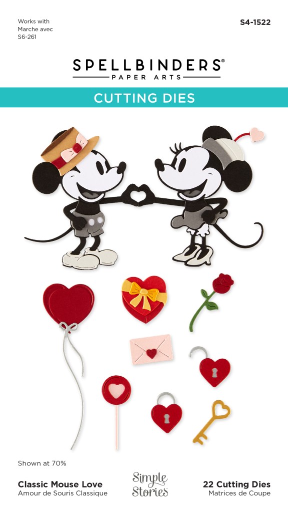
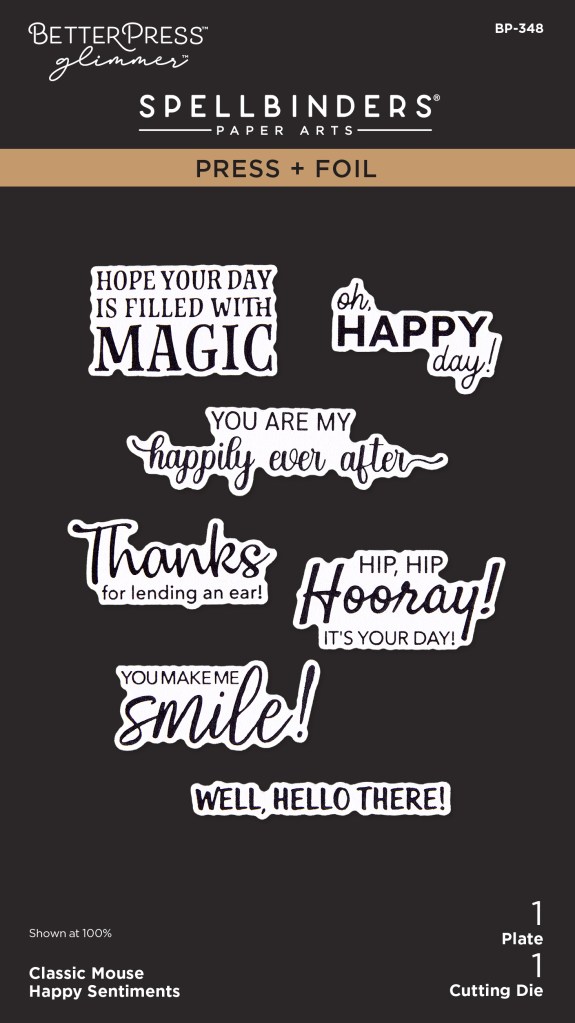
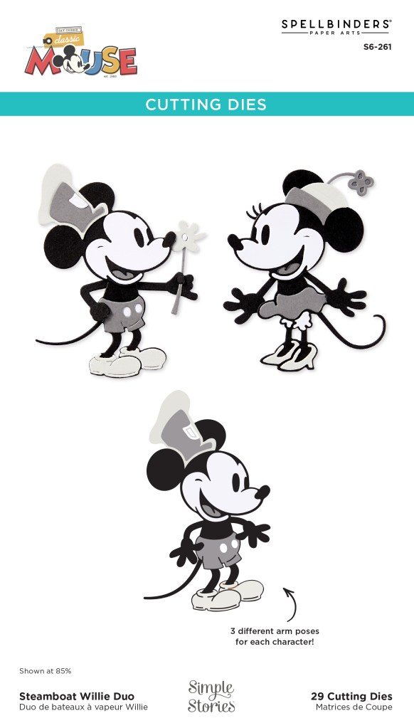

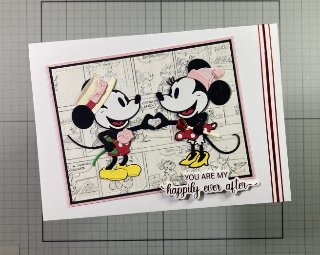
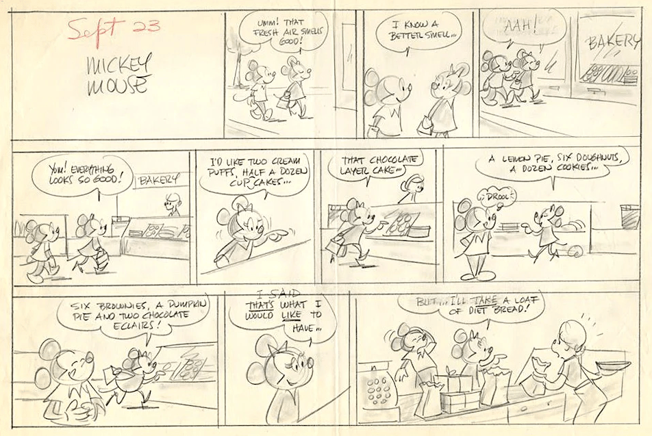

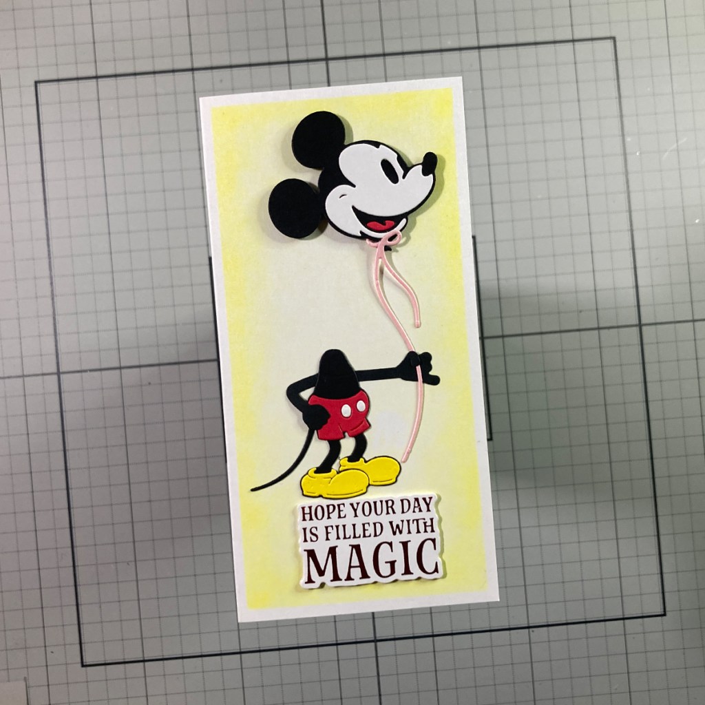
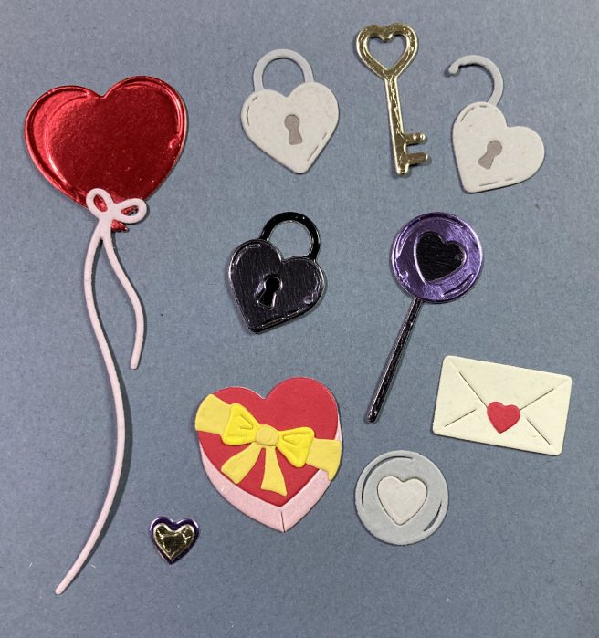
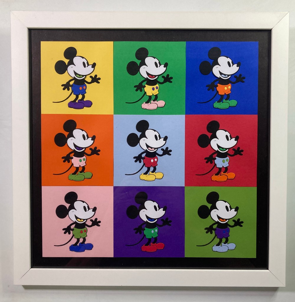
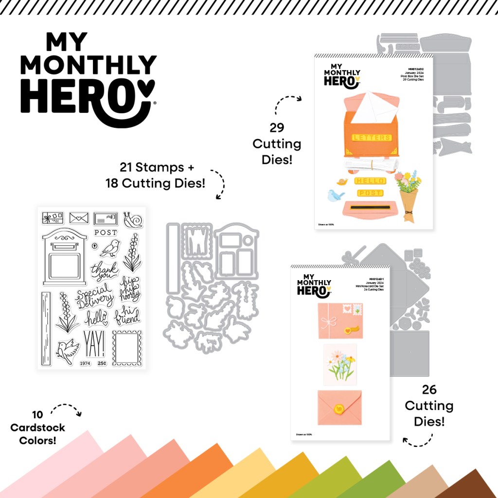
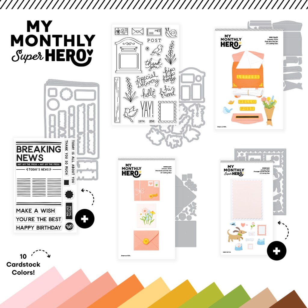
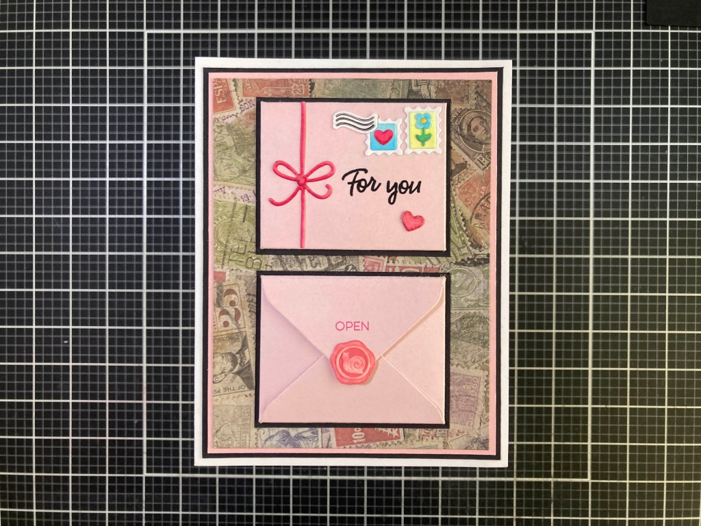
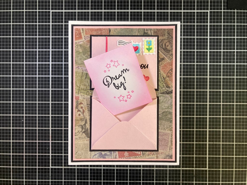


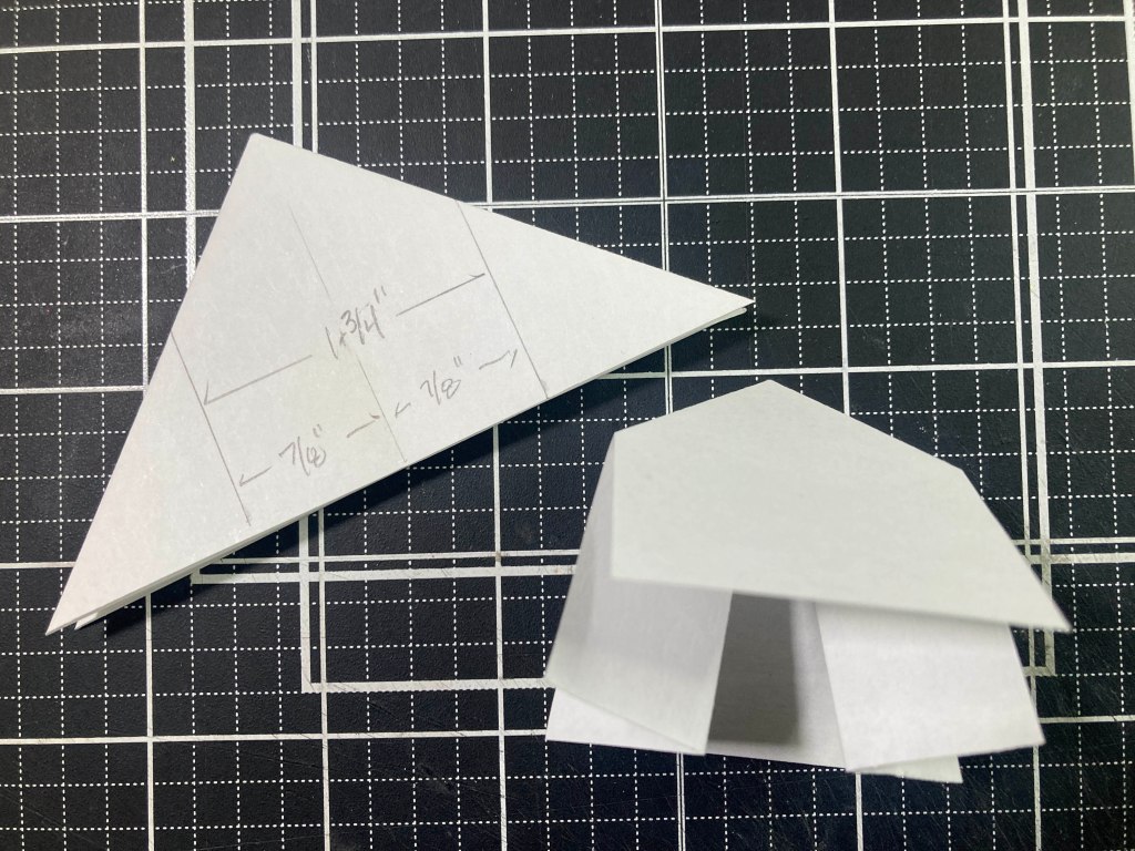
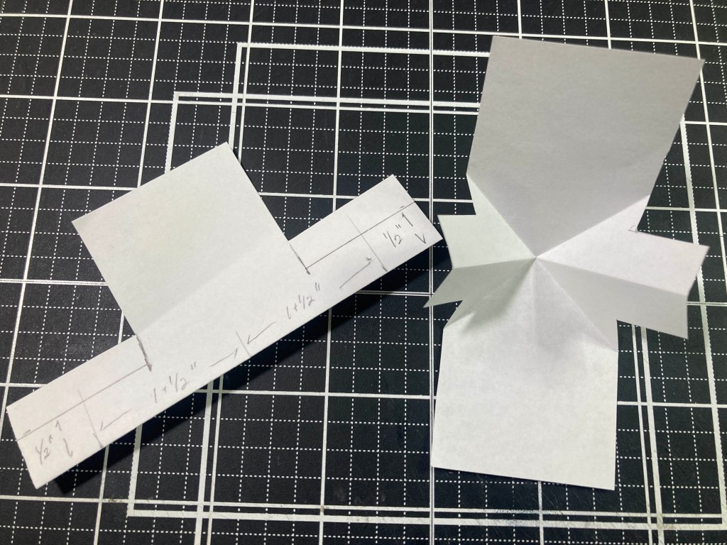
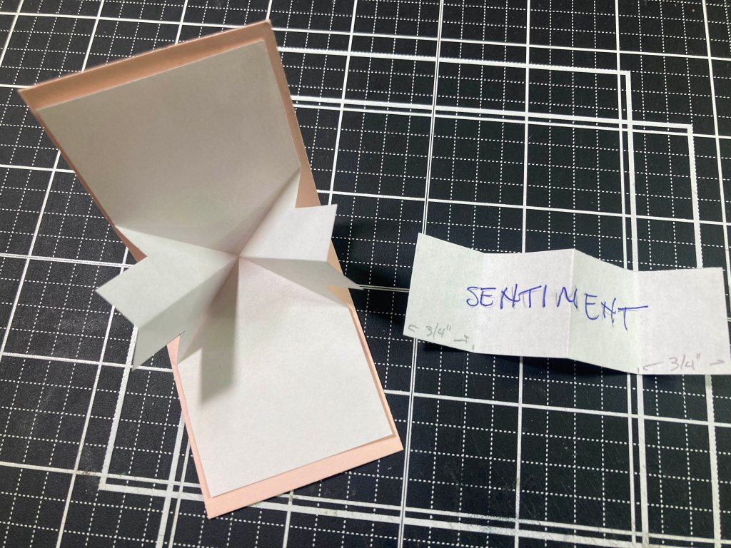
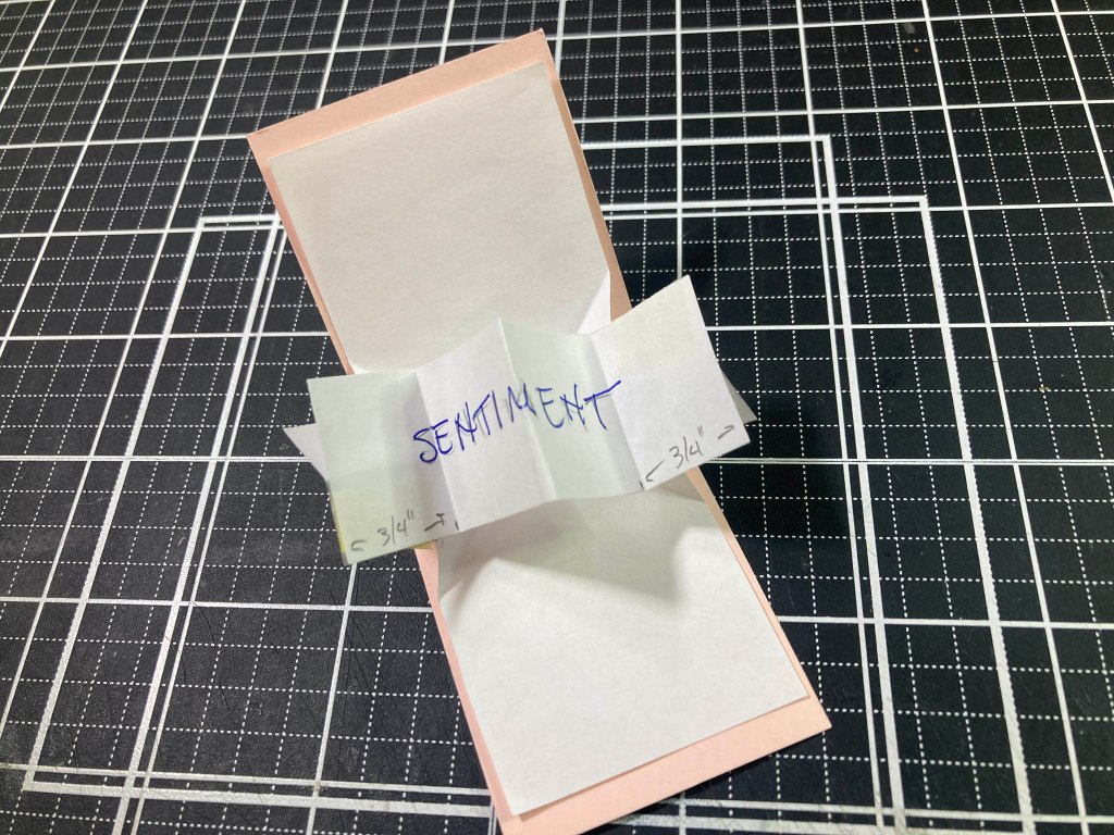

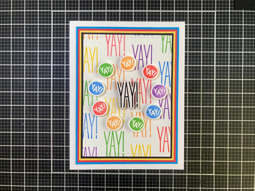
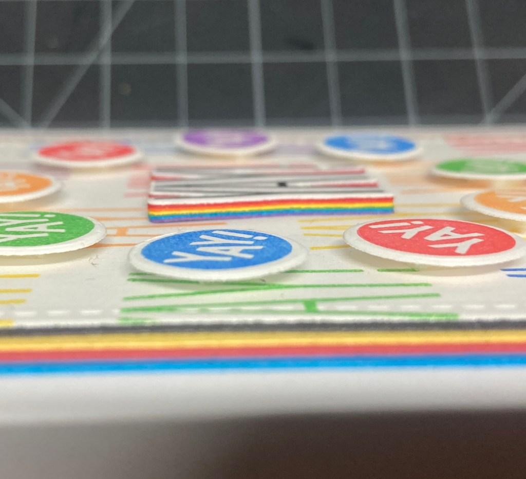

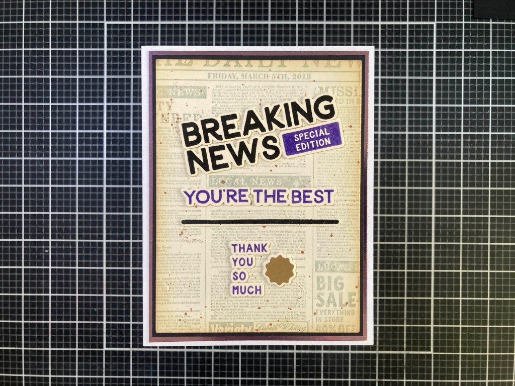
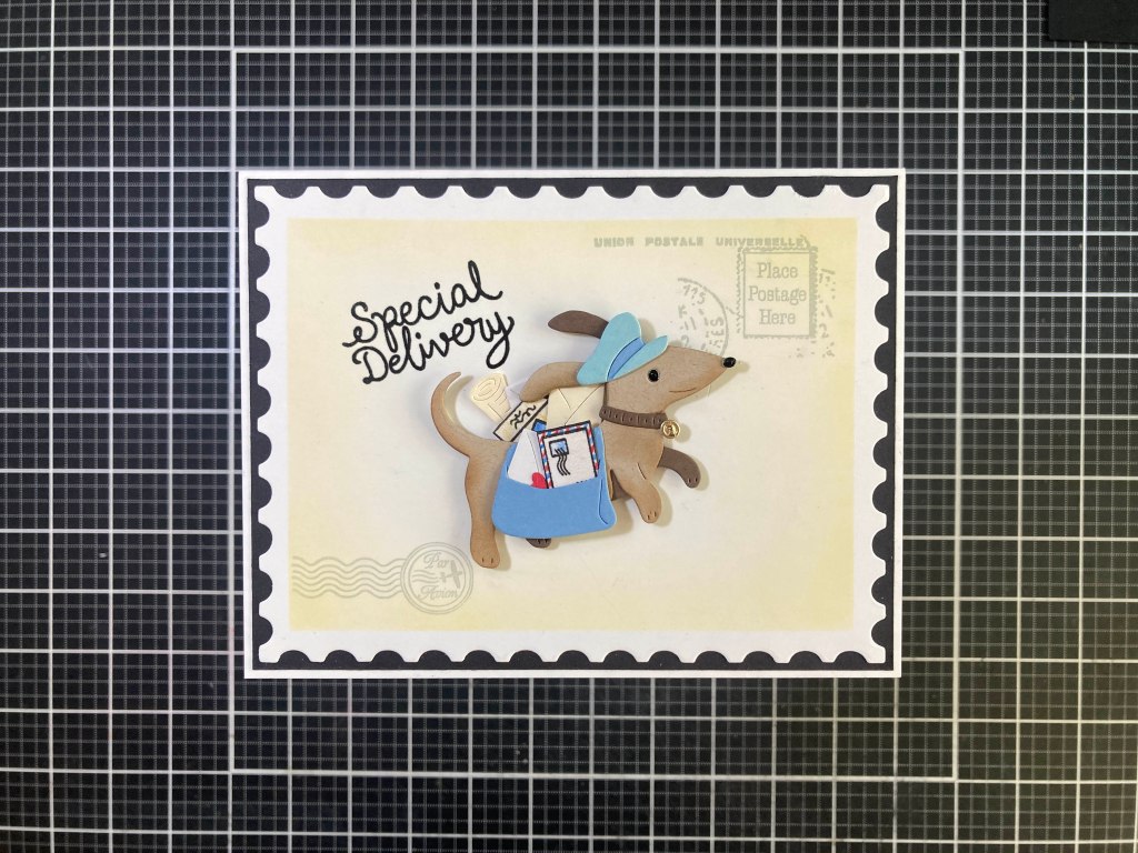
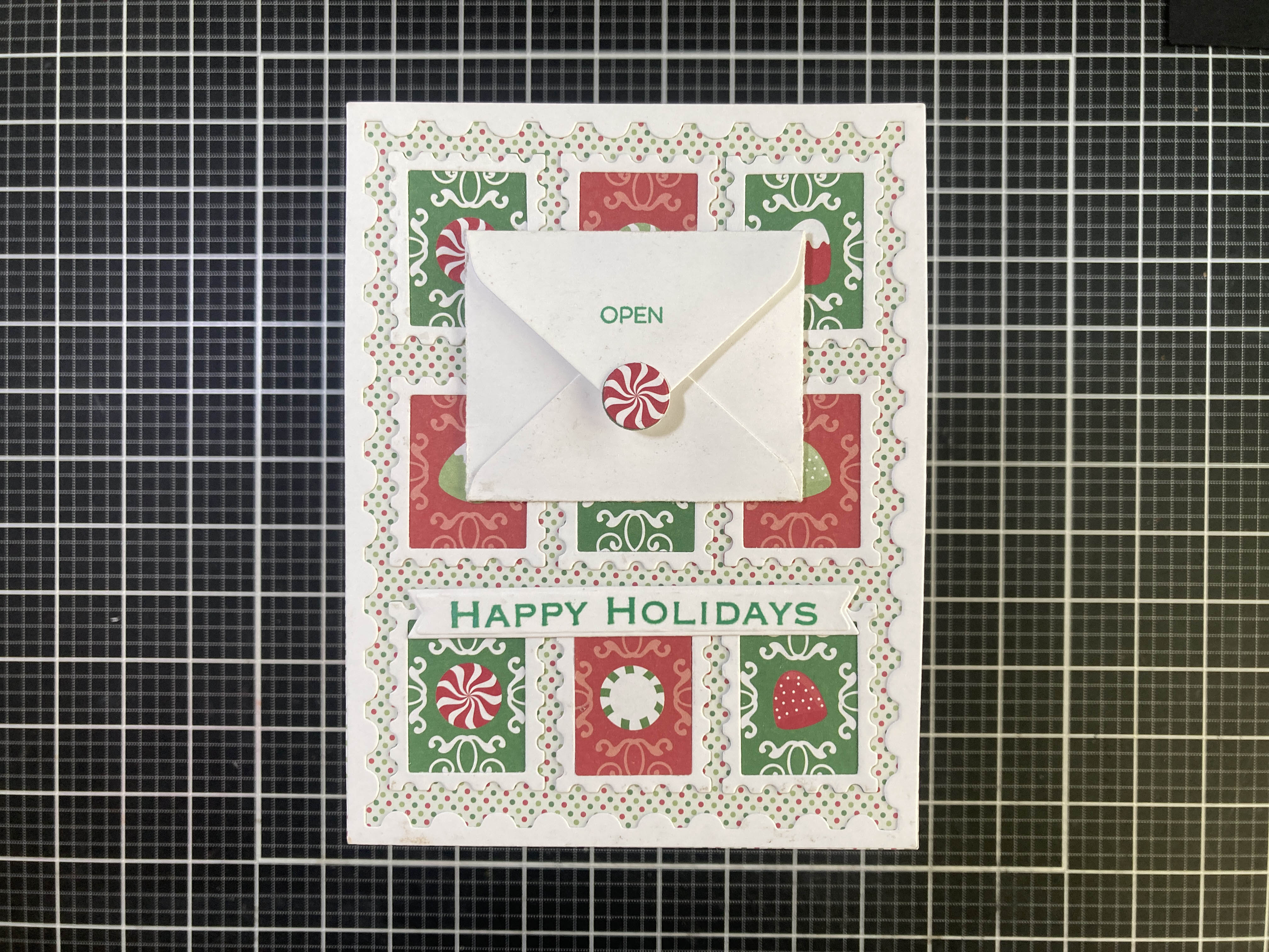
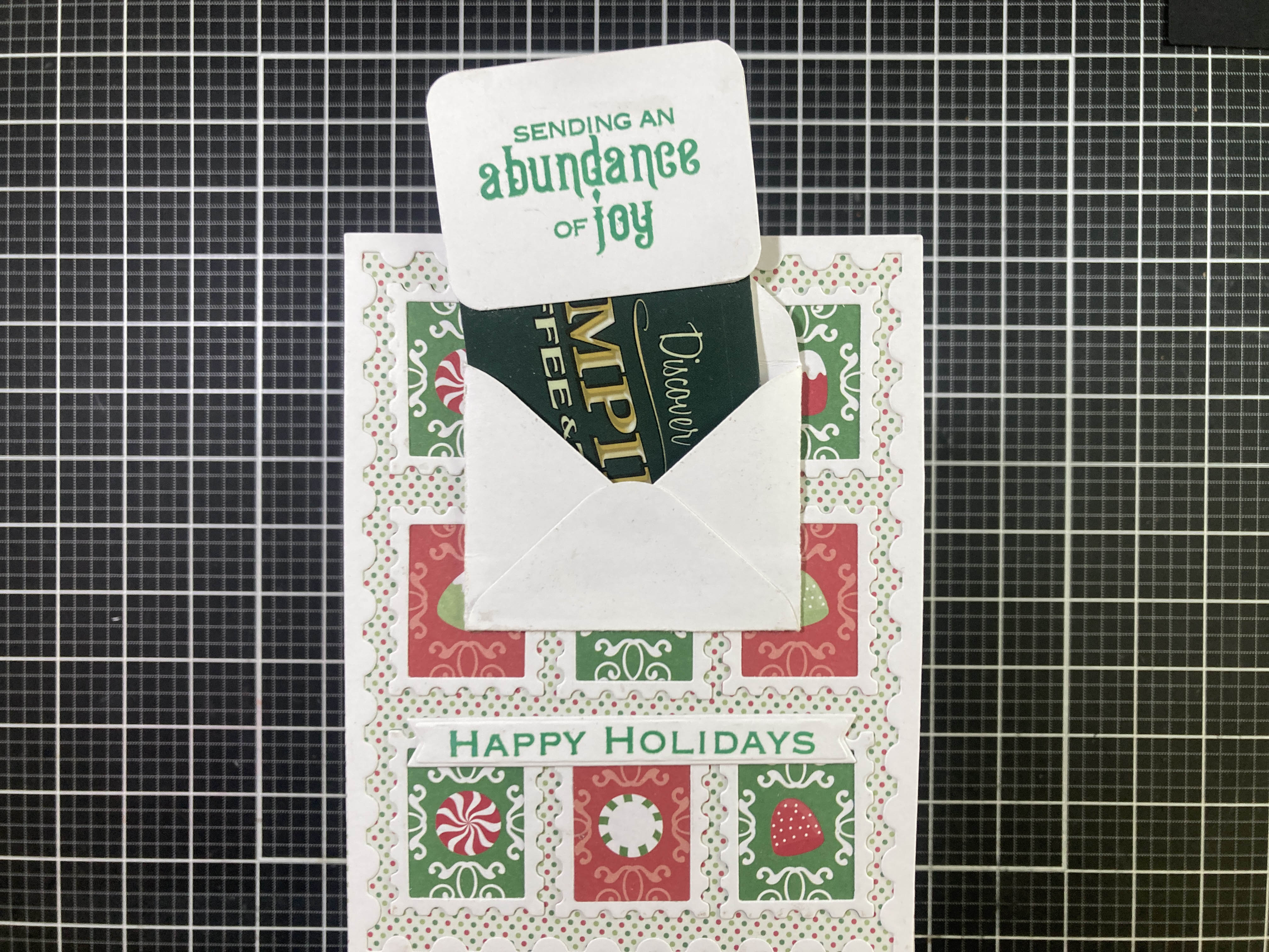
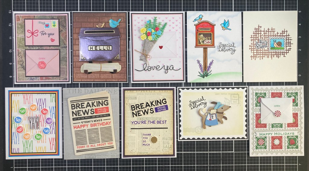


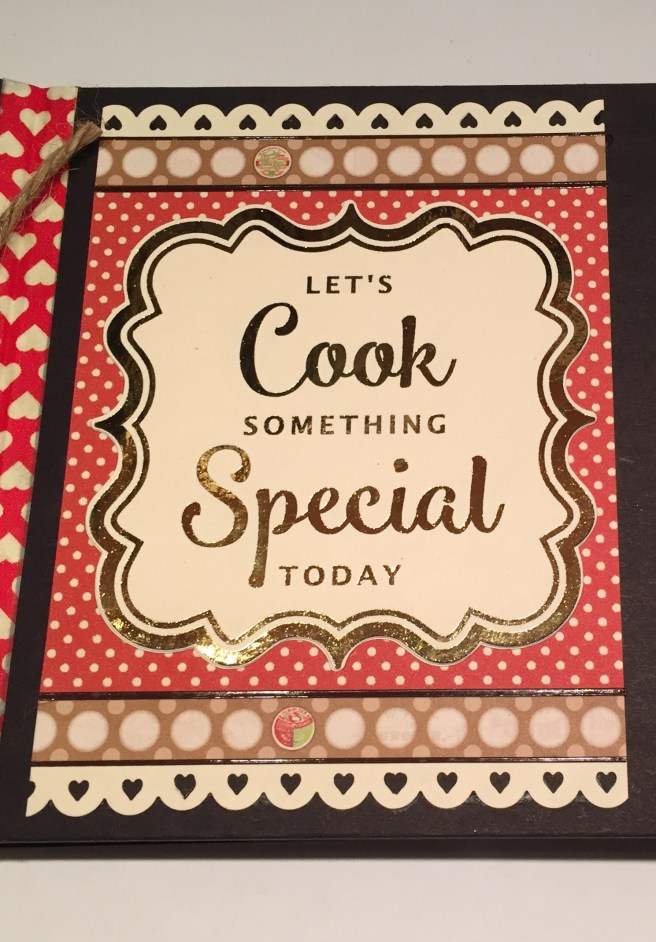


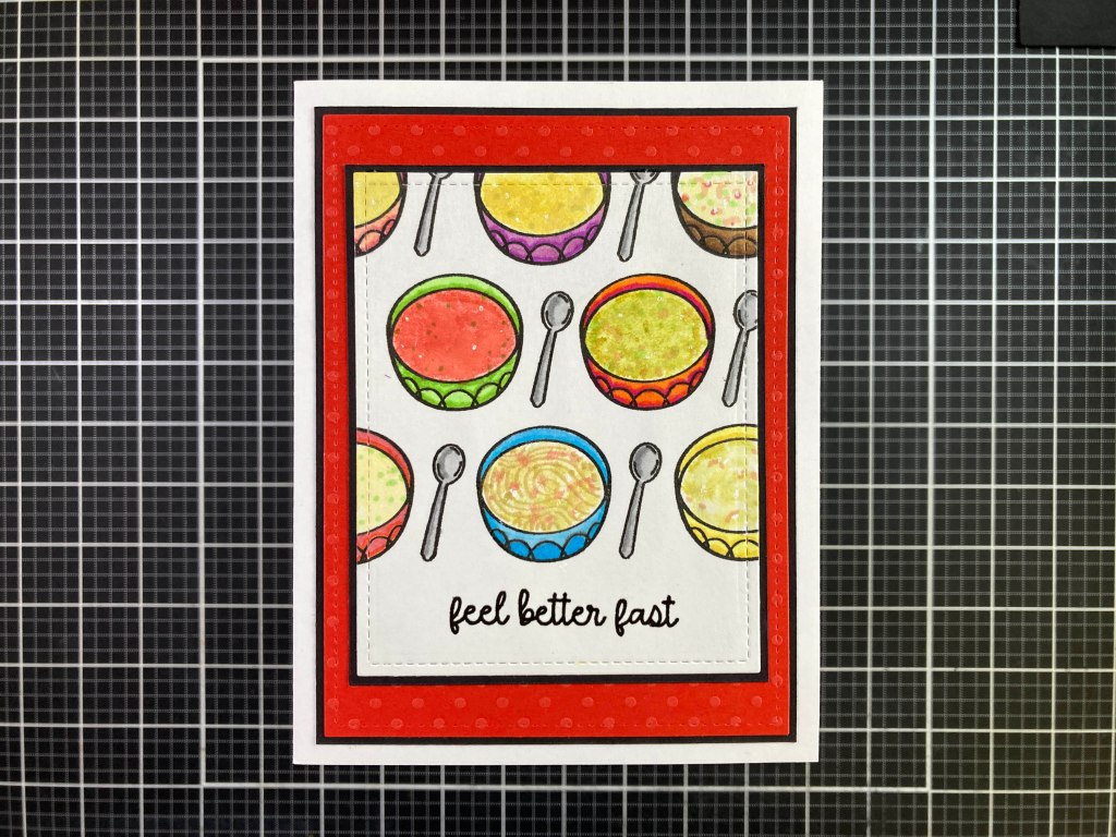


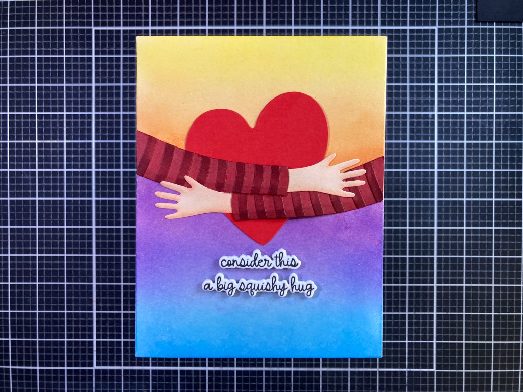


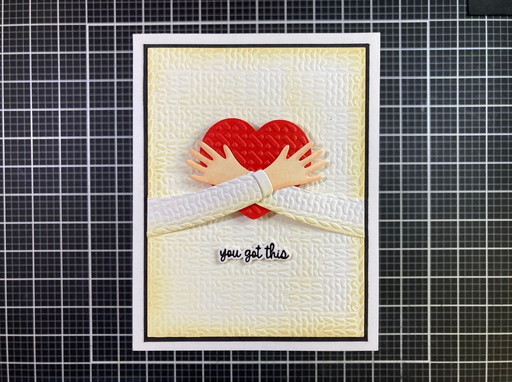


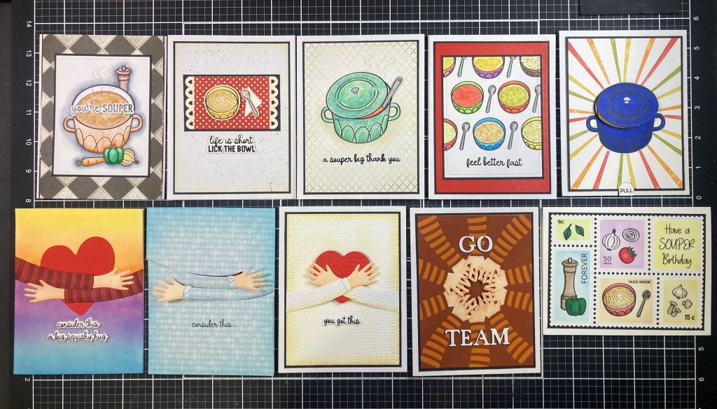
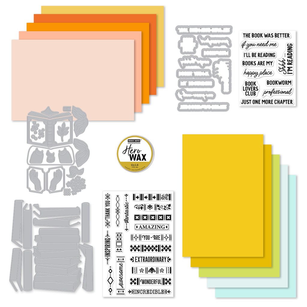
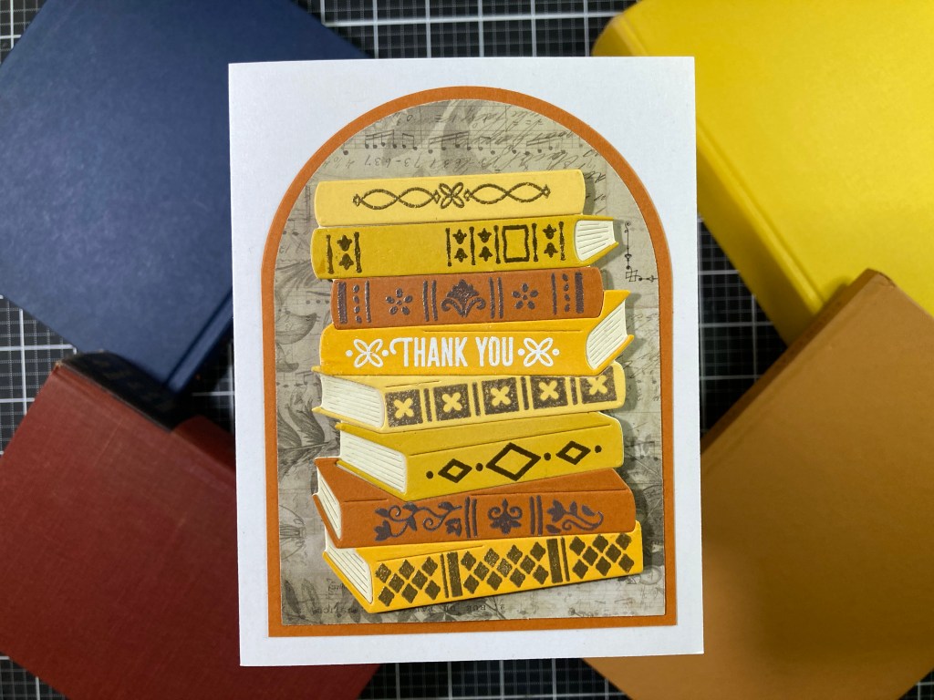
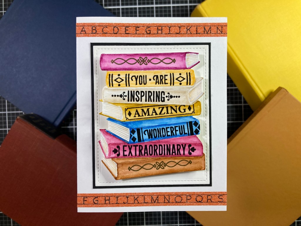

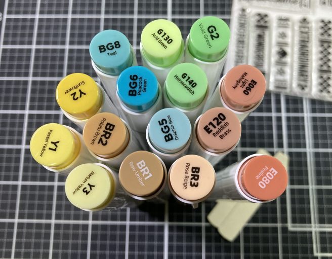


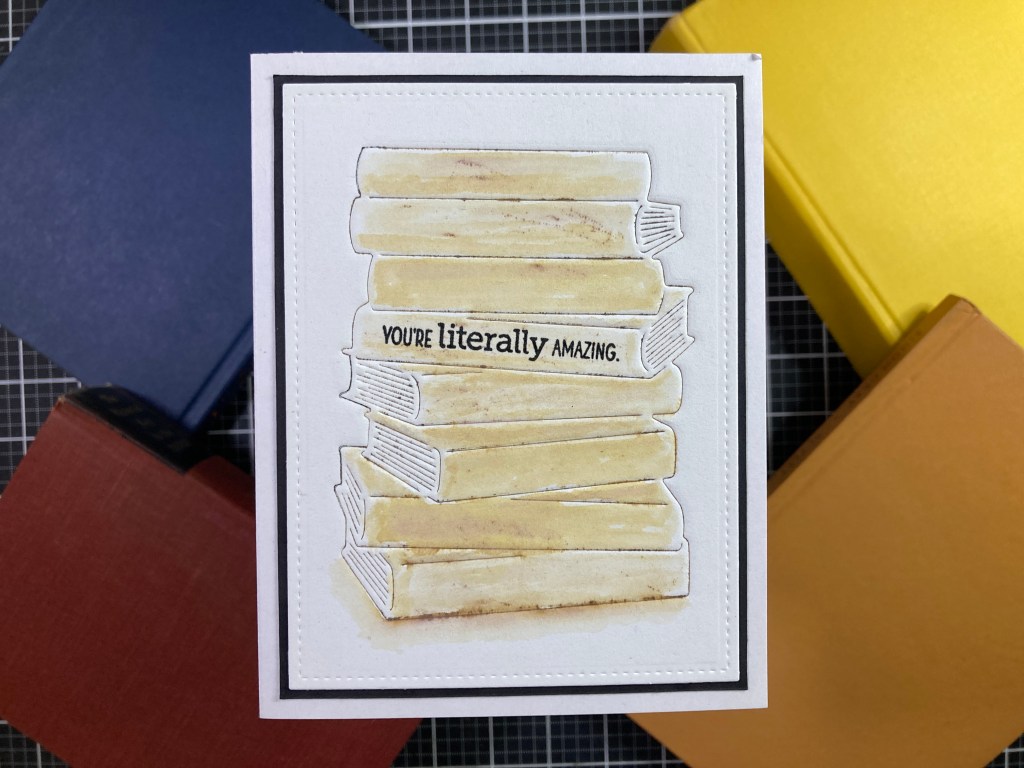


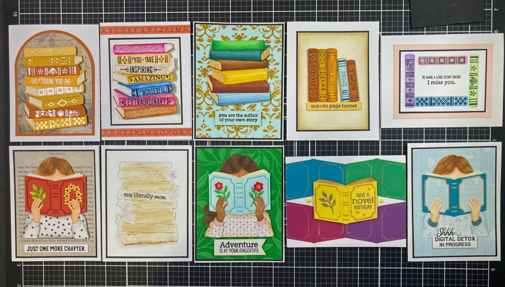

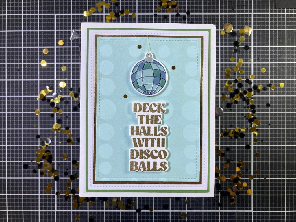
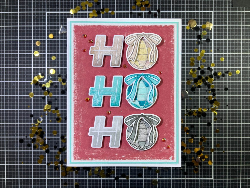
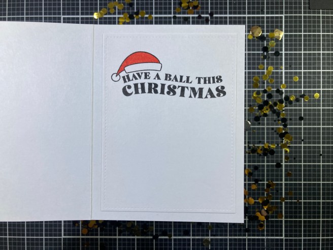
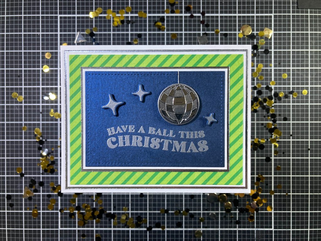

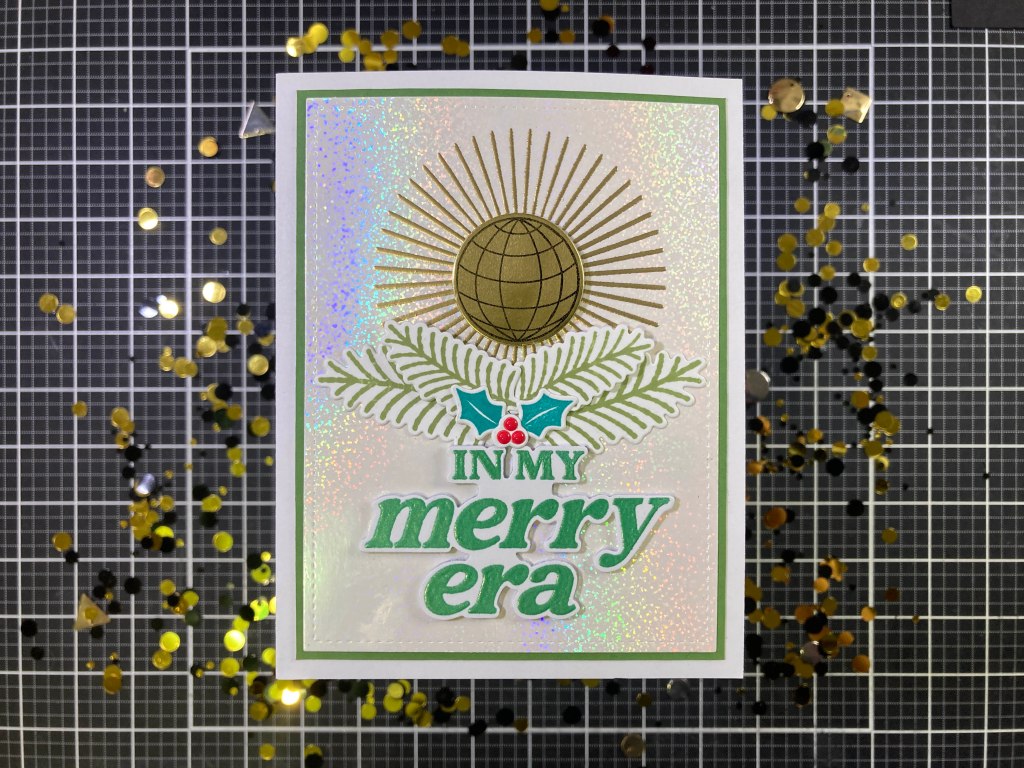

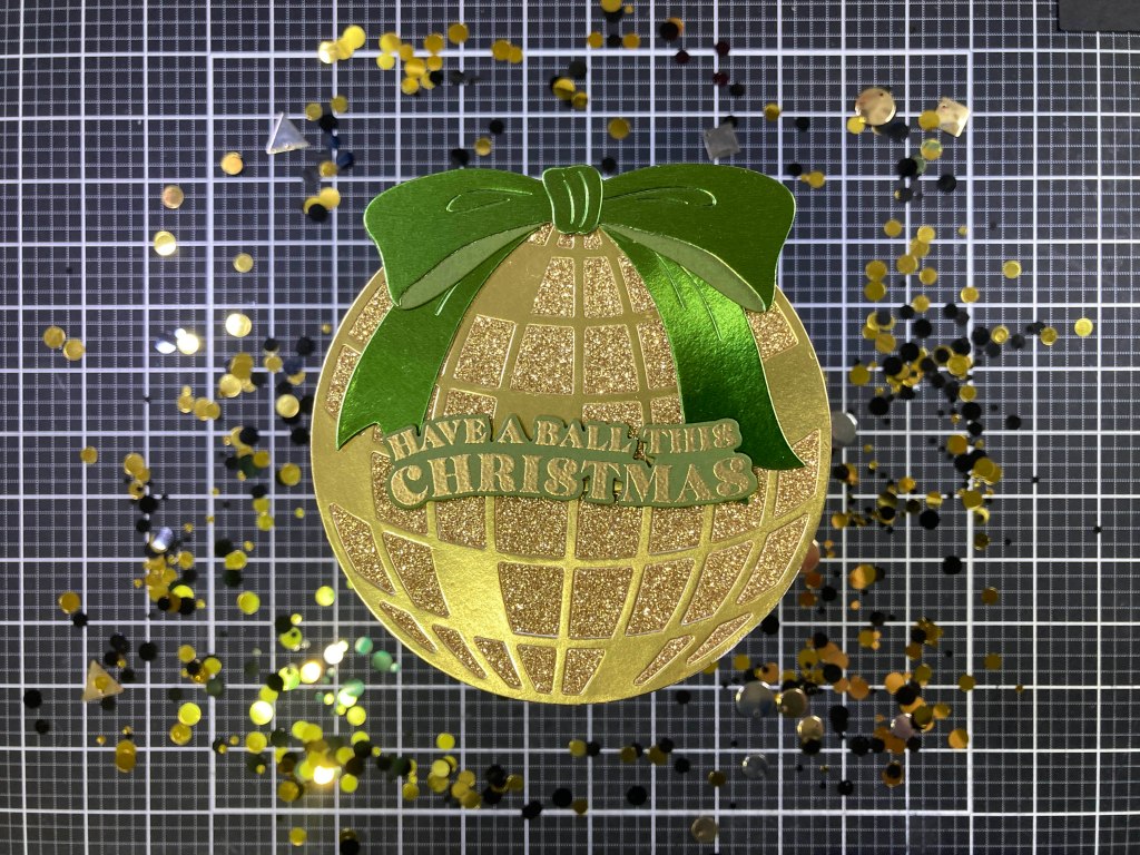


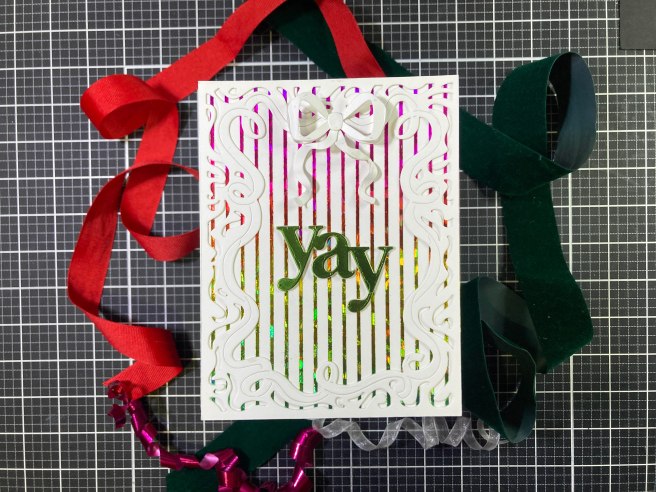

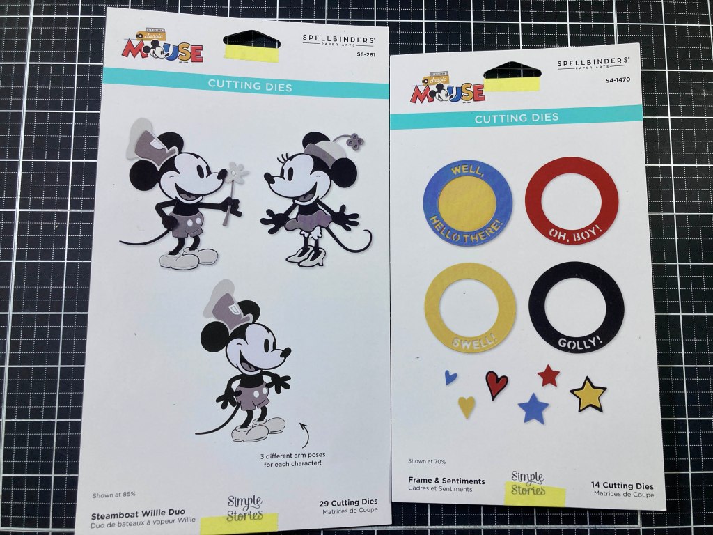


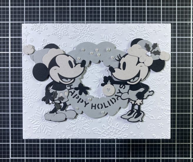


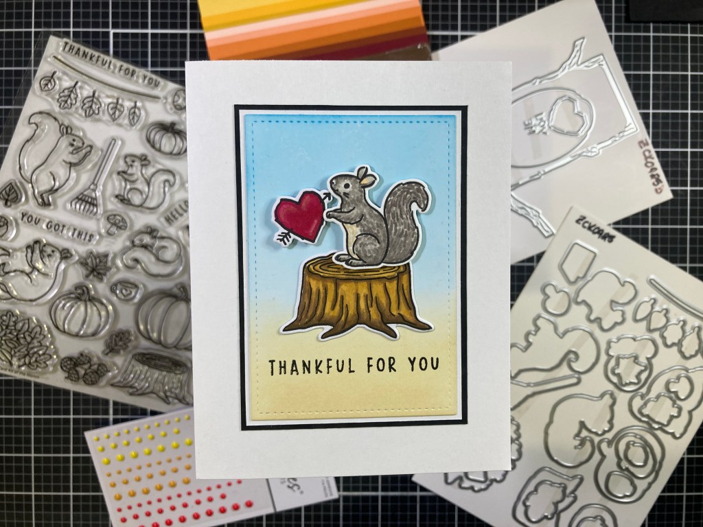
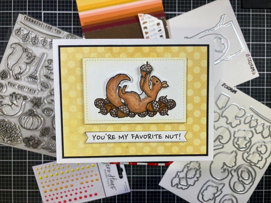
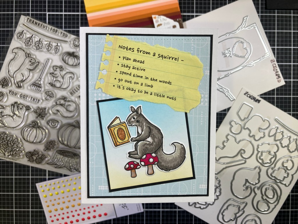
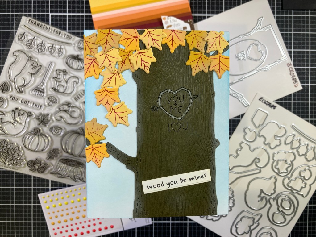


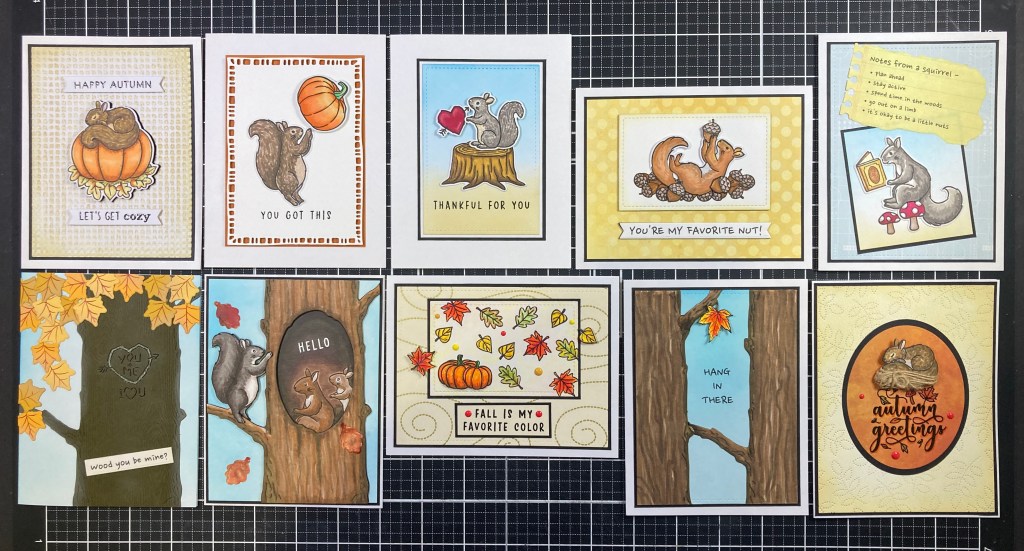


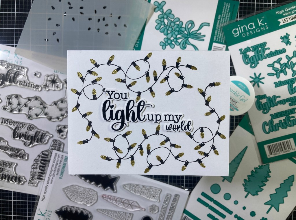
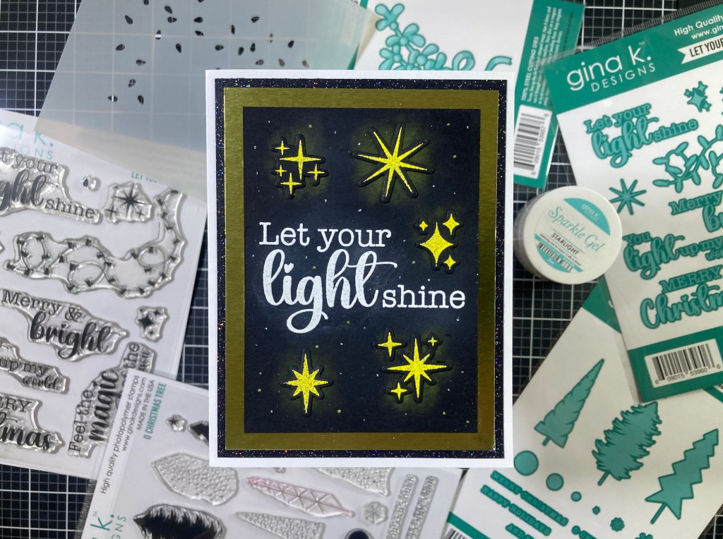
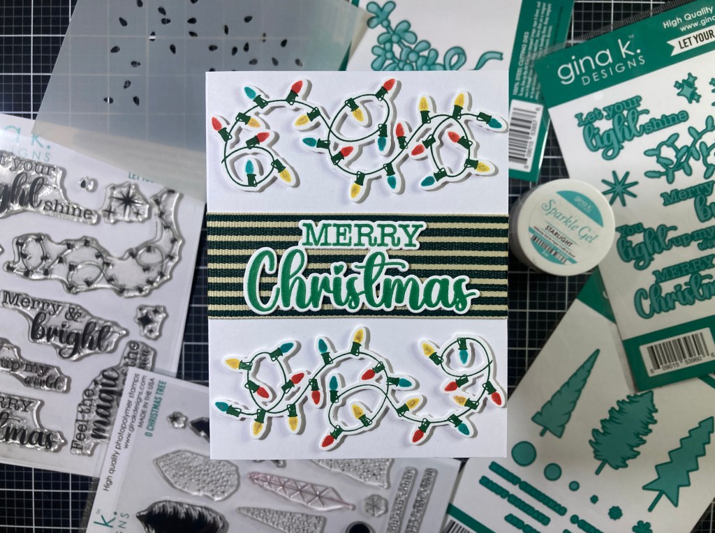


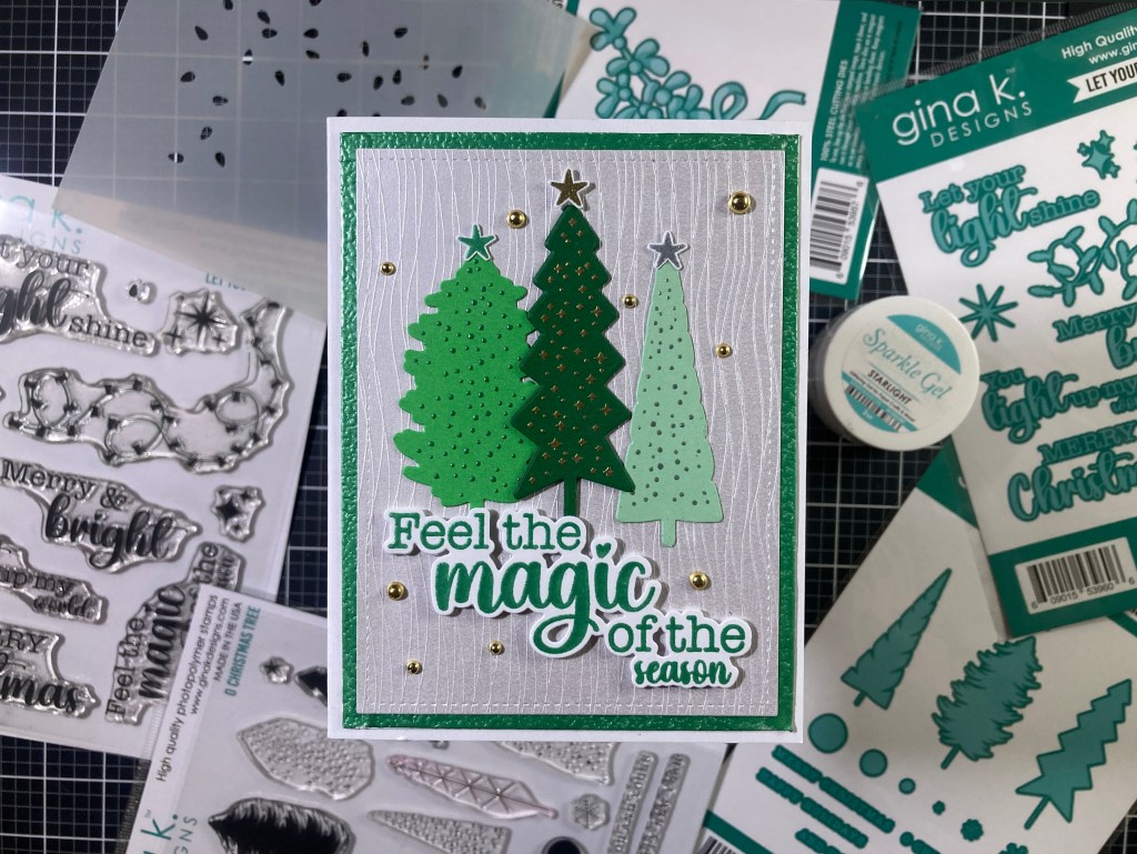
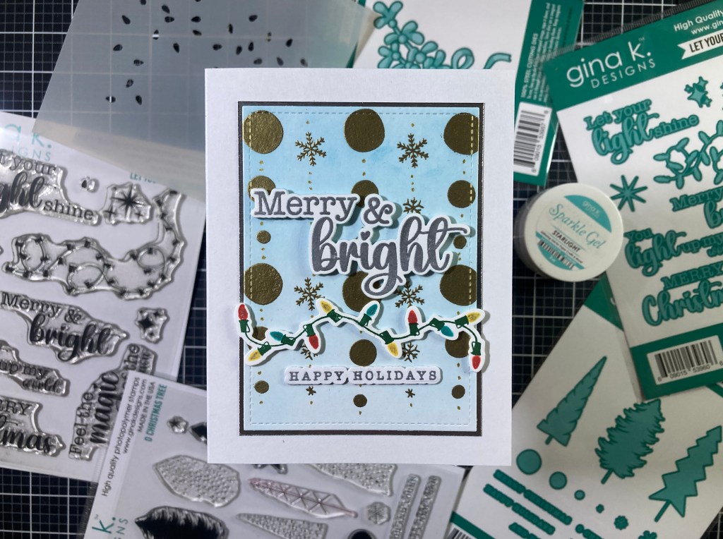
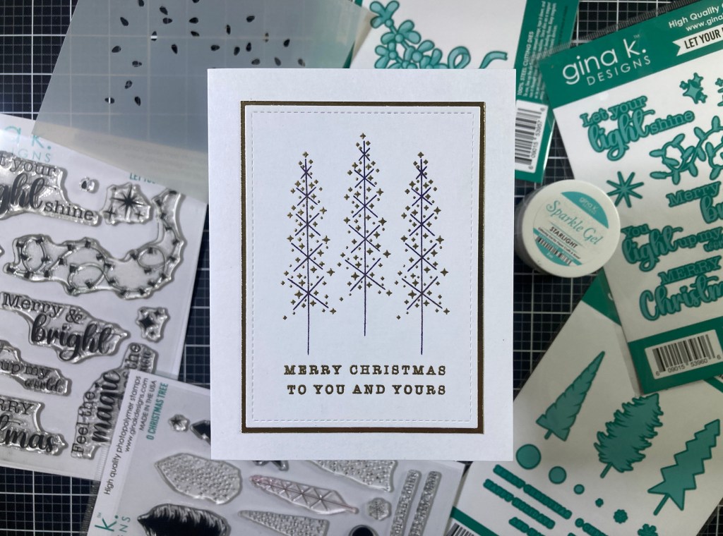
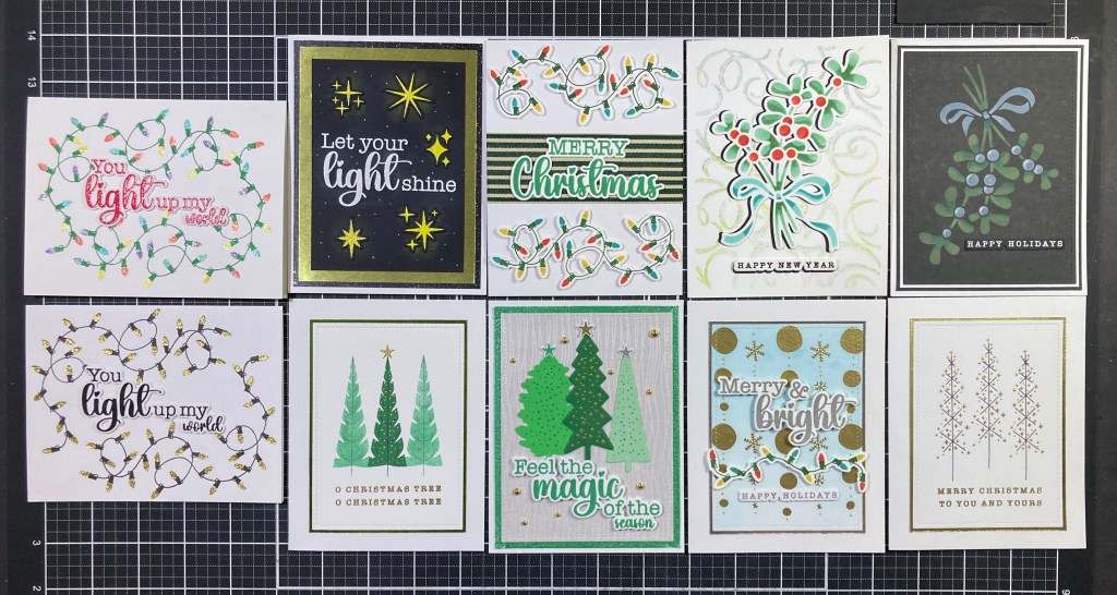
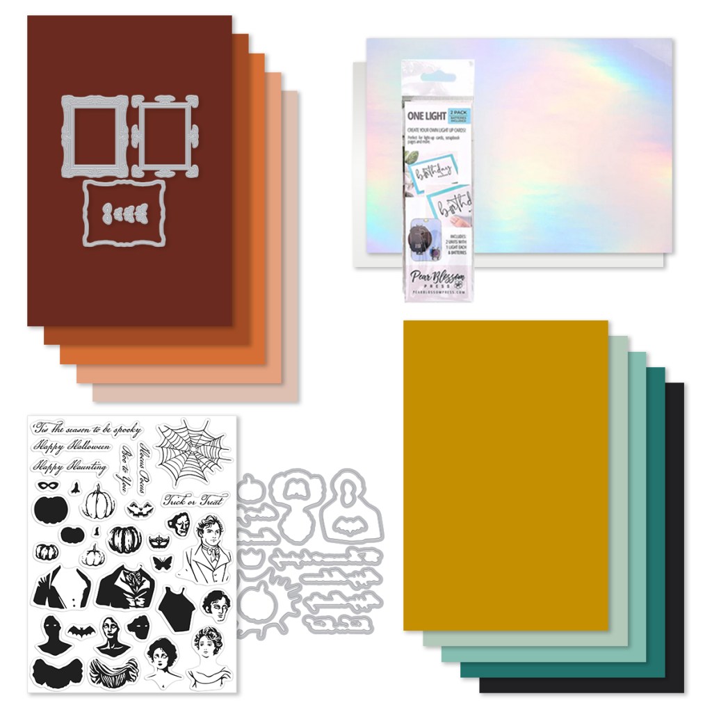


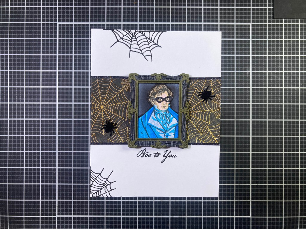

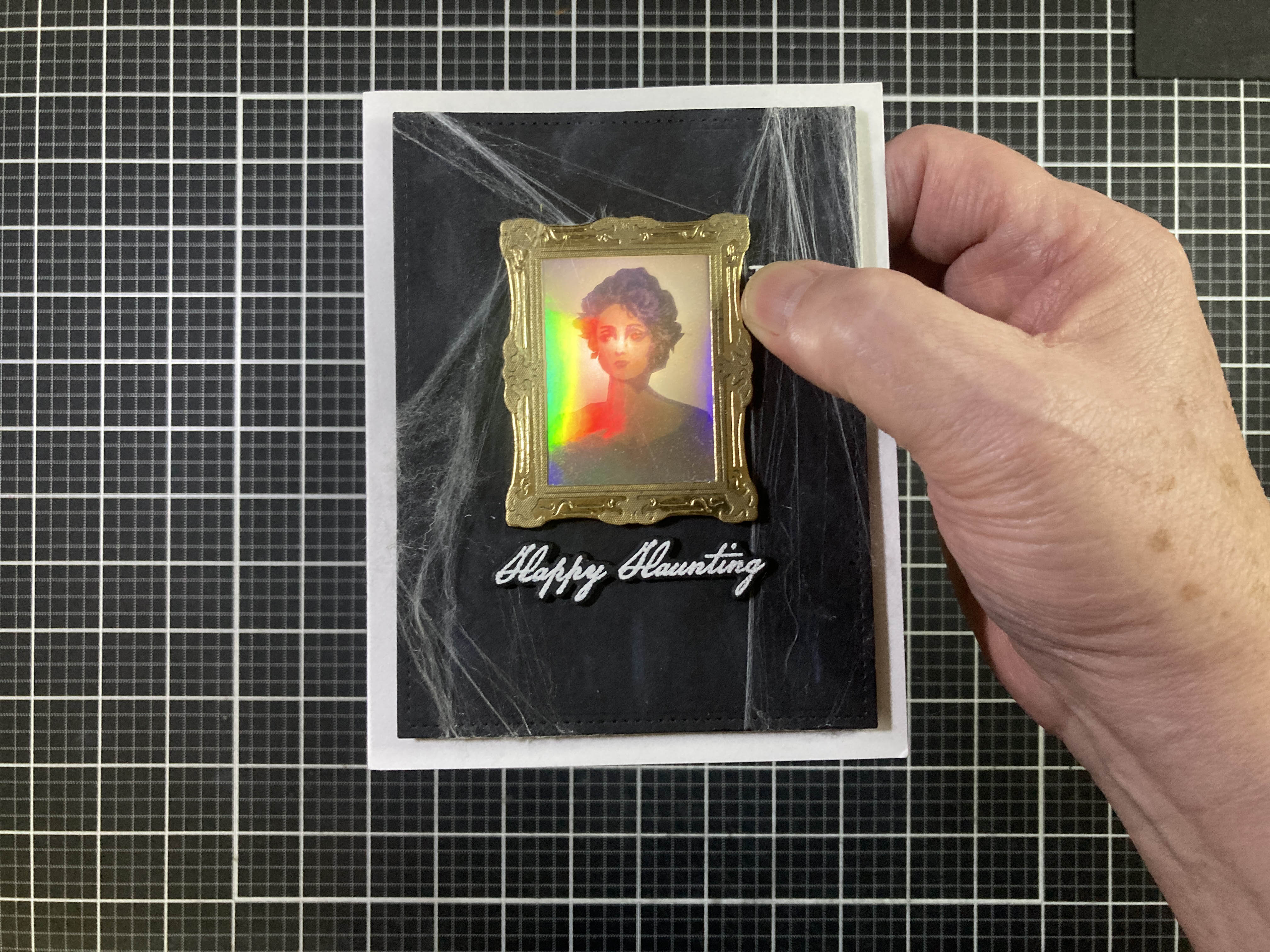


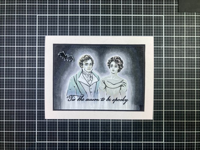
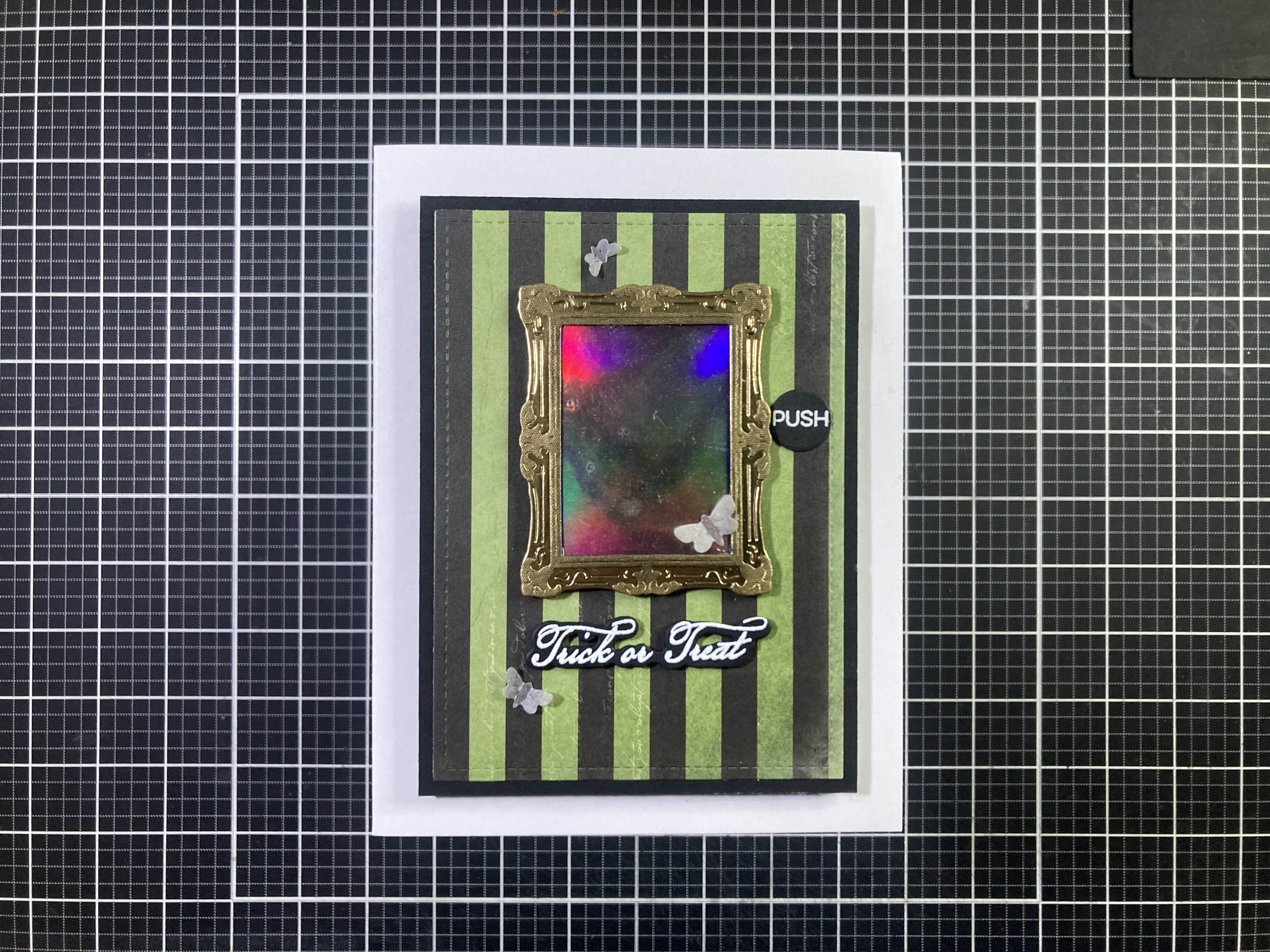

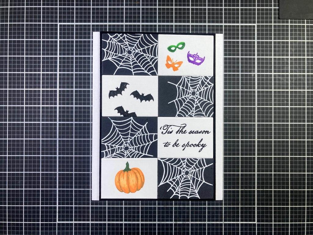


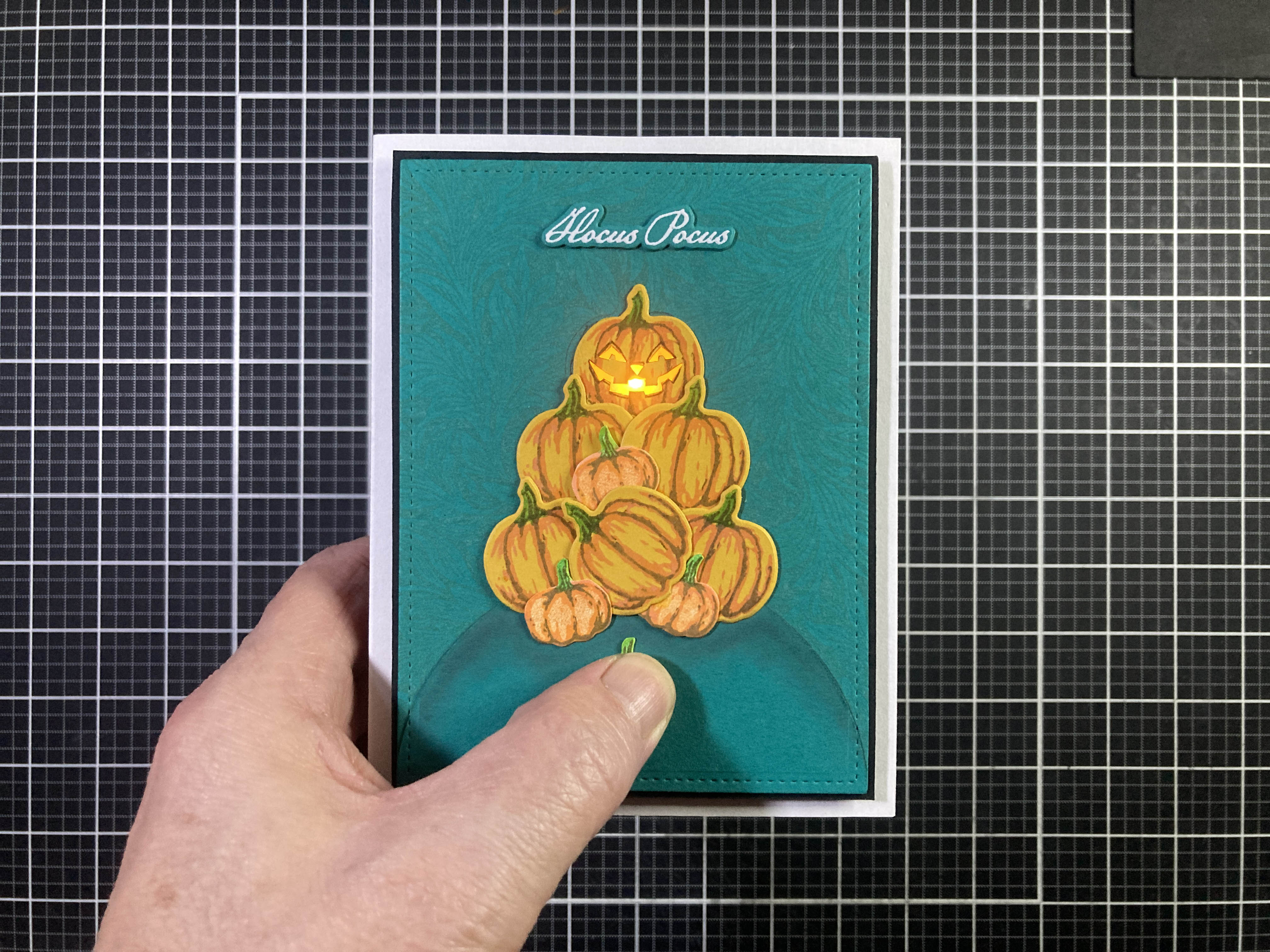


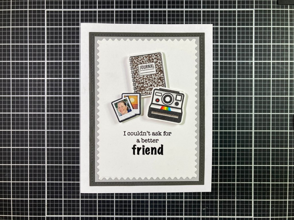

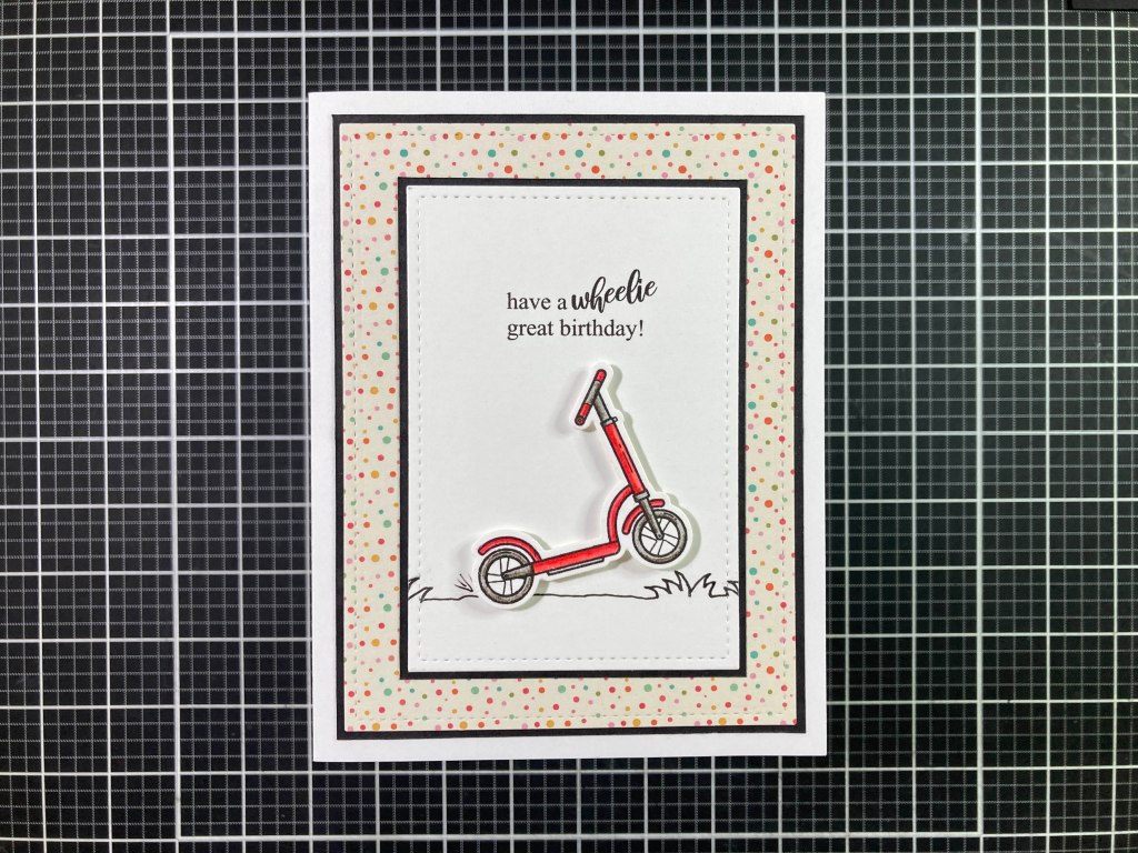


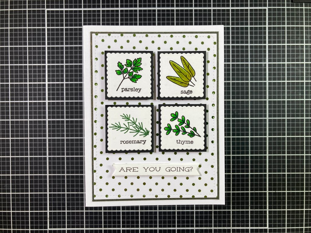


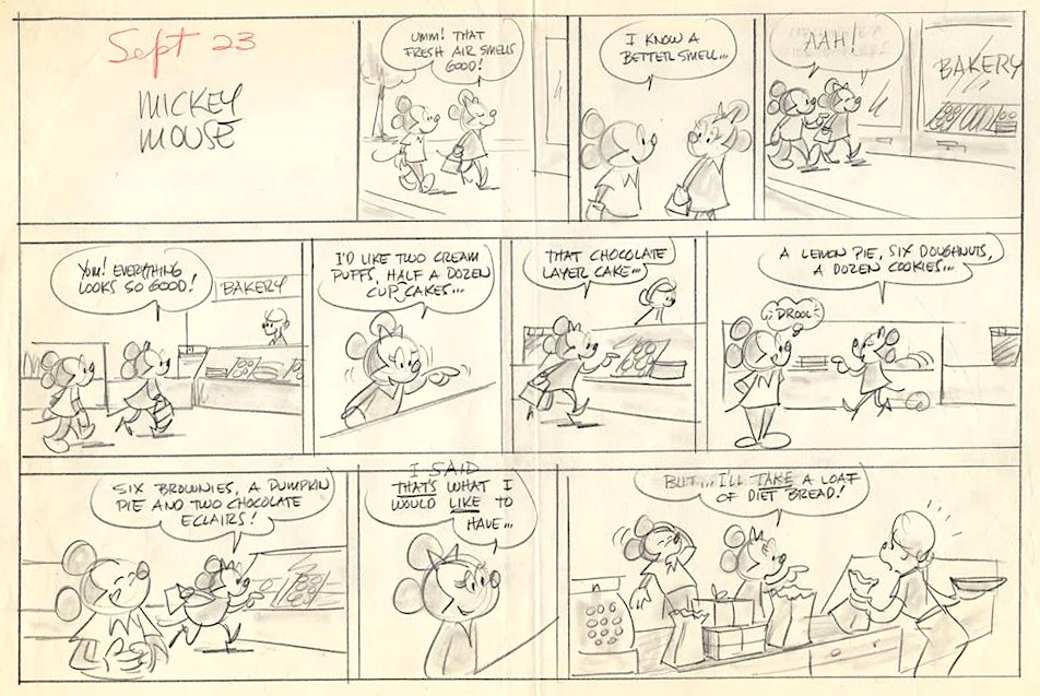