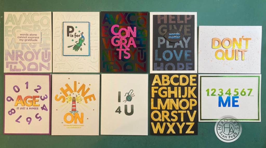
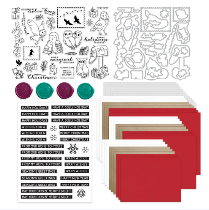
Hello Folks! Scott here with my 10 cards featuring the My Monthly Hero April 2024 Premium (and Classic) Kits. We are exploring Folk Art this month with an amazing color-layering stencil and matching cover plate die!

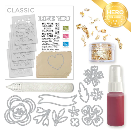
CLASSIC KIT INCLUDES: • 3 Color Layering Floral Butterfly Stencils, 5.25″ x 6.5″
• Coordinating Cover Plate Die
• 16 Coordinating Frame Cuts
• Clear Stamp Message Set, 4″ x 6″
• 3 Reactive Ink Cubes (Blue Hawaii, Splash, Taffy)
PREMIUM KIT INCLUDES Everything in the Classic Kit AND:
• Birds & Flowers Clear Stamp Set, 4″ x 6″
• 13 Coordinating Frame Cuts
• 16 Washi Stickers

I find it interesting that the Cover Plate die cuts all the butterfly’s wings but NOT the bodies (for adding dimension) but we also get frame dies that will completely cut out the butterflies – and some of the florals as well! Only sentiment stamps in the Classic Kit… looks like that stencil is the only “image” we get in the Classic Kit – and of course the dies!

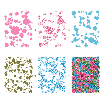
Now I did do a little Folk Art research, and there are naturally many different styles of Folk Art – about as many as there are Folks! You’ve got Scandinavian Folk Art, Mexican Folk Art, Polish Folk Art, American Folk Art… I thought I would try to duplicate some of the more recognizable styles this month. To start with, I figured I would go in the direction the kit is sending me and use the included inks to color our Folk Art Floral Butterflies. This is from the HA website showing us to use the Taffy ink for stencil 1, Splash for Stencil 2, Blue Hawaii for Stencil 3… the stencils are numbered and have registration marks at the corners for help in lining them up.
I tend to have a lighter hand when it comes to color layering stencils… and I do like some soft color in the background…

I thought some Hero Hues Ivory card stock would work nicely with these colors and avoid a plain white background. I ink blended through the stencils with the included inks but kept things a little bit softer overall. The stencils line up beautifully , and this Folk Art pattern certainly gives us full-card coverage! Literally right to the edges of an A2 card!
I trimmed the colored panel to size with the largest HA Rounded Rectangle Infinity die. Actually fits beautifully, and feels a bit retro as well. I glued the panel to an A2 White card base that had the corners rounded with a 1/4″ corner chomper. I stamped the sentiment directly on the card front using the Blue Hawaii Ink and embossed that with some clear embossing powder. These colors seem classic Americana to me… though American Folk Art tends to be more landscape oriented, this feels kind of Pennsylvania-Dutch Folk Art to me!
Gotta try that Cover Plate die too! I recommend die-cutting BEFORE stenciling – it makes lining everything up easier!

The die certainly gives us some nice definition… almost like an outline stamp! I die-cut the cover plate die on some plain White card stock, and ink blended the stencils with Lemon Drop, Green Apple, and Creamsicle Reactive inks. I glued the colored panel to a Kraft card base and added tiny spots of foam tape behind the butterfly wings and some of the greenery/flowers to help them hold their dimension.
I stamped the sentiment on a scrap of Ivory card stock using Root Beer Reactive ink and embossed that with Clear embossing powder. I trimmed the sentiment to size and added a Kraft mat behind. I attached the matted sentiment to the card front with some foam tape. This doesn’t quite fit any specifically localized Folk Art, but it sure is spring-y!
And then there’s the frame cuts…! I did see a good amount of Mexican Folk Art that looks like paper cut-outs…

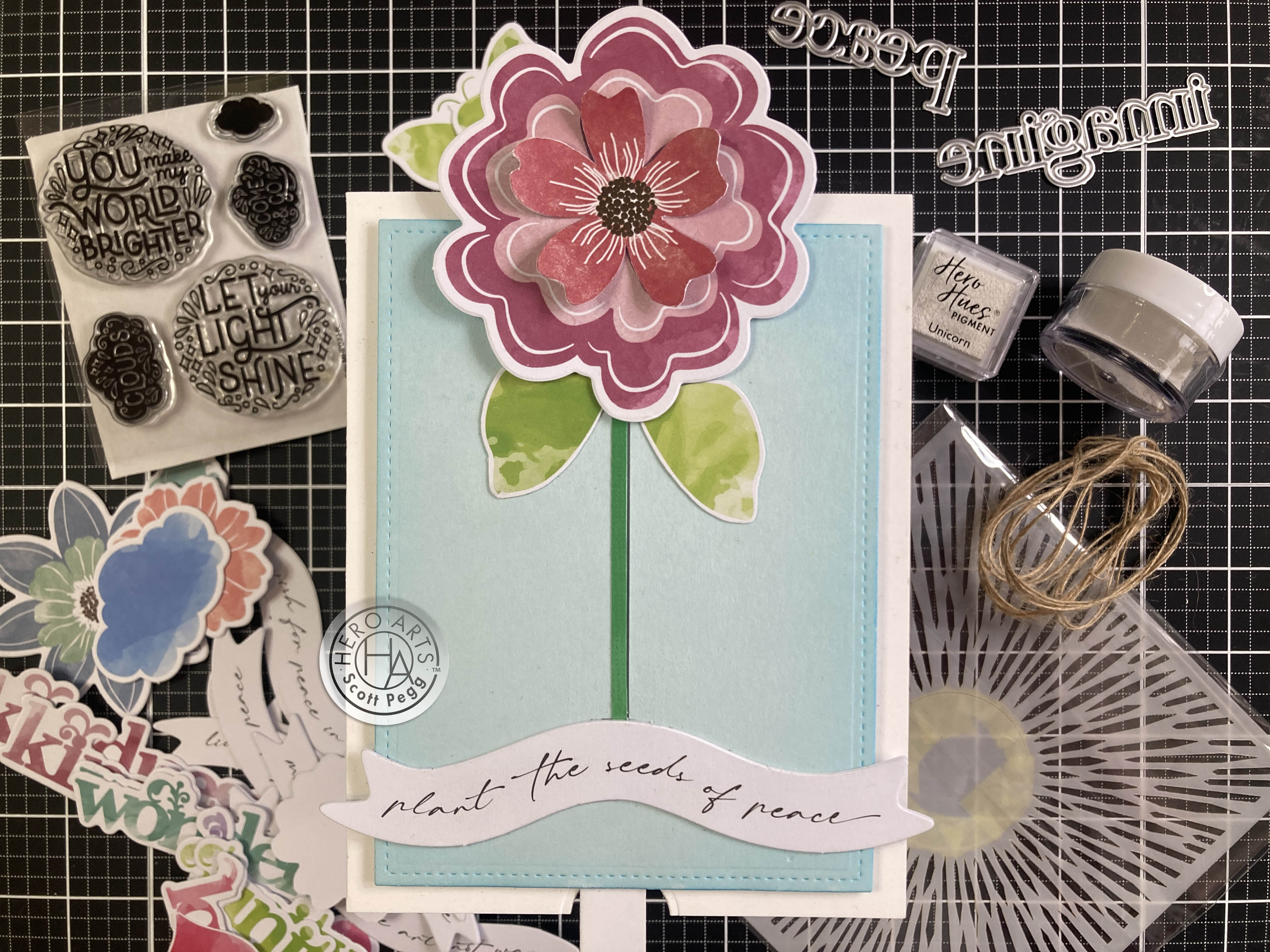
So this is my tribute to Mexican Folk Art! I die-cut everything from some textured lightweight card stock and layered everything together – I dug out some hole punches to add centers and extra details to the flowers. I really like the green leaf bits in the tiny red butterflies…! I stamped the cobbled together sentiment on a scrap of Pitch Black card stock with VersaMark ink and embossed that with Neon Lime embossing powder. Amazingly close match!! I glued all to a Pitch black card front and then to a White A2 card base. I die-cut the sentiment with a Lawn Fawn Everyday Sentiment Banners die and attached that to the card front with foam tape. I like this a lot!
I recently purchased some Acrylic markers from Altenew and thought I’d give them a try with this layering stencil…

Now that’s some colorful Folk Art! I was pleasantly surprised how well those acrylic markers worked with the stencils! I used a good HA Pitch Black card base and I was careful not to over-flood the stencils with too much paint. But the markers layered on top of each other (and the black card stock) very nicely! Even the White dots are the acrylic markers!
I did decide to do some outlining with a Black Pigma Micron pen on the butterflies and layered flowers for a little more definition. I stamped the sentiment on a scrap of Pitch Black card stock and embossed that with White embossing powder. I trimmed that to size and added a scrap of multi-hued green card stock for a mat. Those are attached to the card front with foam tape. This one is my tribute to Polish Folk Art which is usually very colorful and often on black!
When I think of nature-patterned Folk Art my mind easily goes to the blue and white classic “Delft” type patterns…

Kind of classic Scandinavian Folk Art! The big secret to this was selectively inking and white embossing parts of the #3 stencil to create an ink-resist to the blue colors going on top. All the butterfly details and assorted flower centers are embossed first. Then I ink blended Splash ink through stencil 1, Blue Hawaii ink through stencil 2, and C&9th Midnight ink for stencil 3. I do think the super dark blue helps sell the “Scandinavian” feel! I was a little impatient with this card so I wasn’t able to keep the background a pristine white, but I think it works well as a tribute to Scandinavian Folk Art!
I trimmed the panel with a Rounded Rectangle infinity die and glued that to a corner-chomped White card base. I stamped the sentiment on White card stock with VersaMark ink and embossed that with SSS Steel Navy embossing powder. (I do love that color and how nicely it finishes!) I die cut the sentiment with another Rounded Rectangle die and attached it to the card front with foam tape. Anyone have some pickled herring??
That’s five cards using the Classic Kit! I truly enjoyed trying to emulate assorted styles of folk art! But, now I get to use the Premium Kit ingredients and we actually have some stamps we can color here!

I stamped the bird and greenery using Intense Black ink on Bristol Smooth card stock and a square infinity die to help lay them out. I heat set the ink and colored all with my Zig Clean Color Real Brush markers. There are some tiny spaces on these stamps..! I die cut the panel with a Tonic Studios Scallop Square die and the mat from Periwinkle card stock using the next larger die. I glued those together and down to an A2 White card base.
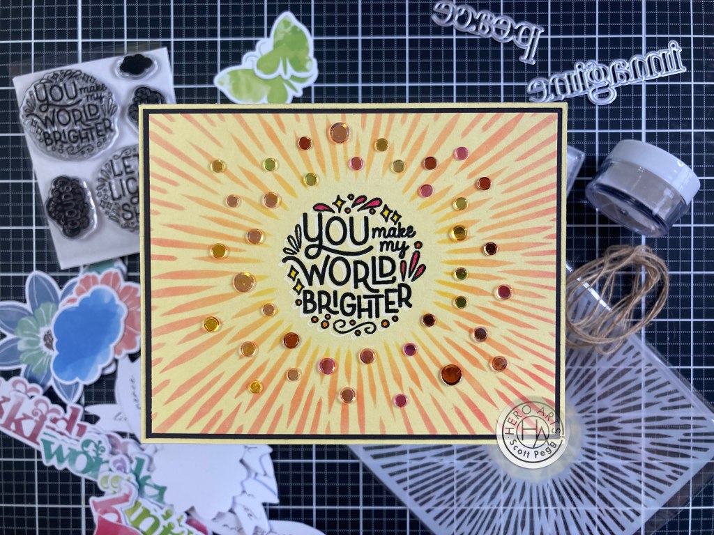
I stamped the sentiment on a scrap of White card stock using VersaFine Onyx Black ink and embossed that with Clear Embossing powder. I love the sentiment dies in the premium kit, so I die-cut the sentiment and two blanks to glue together and glued the sentiment to the card front. I did add a little dusting of yellow pastel chalk around the bird to give him a little background. I was just happy to have something to color!
I saw a lot of patterned Folk Art that wasn’t on black or white backgrounds but on lots of different colors…

I thought my alcohol markers would stand up to some Arctic card stock! I stamped the sentiment in the center of an A2 panel and arranged the florals around that. I stamped everything with Gina K. Designs Amalgam ink – works so well with my new Ohuhu alcohol markers! I was surprised the yellow didn’t turn green, and considering how small some of these areas are… I am very pleased with the marker’s finely pointed brush tips!
I die-cut the panel with a Lawn Fawn Stitched Rectangle die and added a mat of Black Tie glitter card stock. I glued those to a White card base, and added some small crystal gems to help carry the sparkle to the stamping. This feels very free-form and casual – just like the sentiment! But I do appreciate the bit of sparkle as well!
We get a nice little pack of Washi Stickers in the Premium Kit… I was about to peel and stick them to some card stock…

When I realized that if I did that, I’d have to fussy cut them out! I checked to make sure that foam tape would stick to the liner paper on back of the stickers, and when it did, I decided to use the stickers as is… I didn’t’t even peel off the liner! I ink blended Thistle Reactive ink around the edges of an A2 panel of White card stock and stamped the sentiment in the same before embossing it with Clear embossing powder. Then I added some splatters of Purple Galaxy Reactive ink and glued the panel to a White card base.
I added the stickers to the card front with foam tape taking care to support all the edges to resist curling. I really do like these Washi Stickers. You’re never going to get this kind of detailed coloring on these images with the stencil or the stamps themselves! And you can always tell the recipient that they can peel the butterflies and flowers off the front of the card and use them as stickers!! That’s downright Interactive!!
I can’t ignore the fact that we get 9 Frame dies for the 9 butterflies that are revealed on the color layering stencils…

This is fun! I inked up the stencils (concentrating on the butterflies) with Fruit Punch, Thistle, and Purple Galaxy Reactive inks, and then die-cut all the butterflies with their matching dies. I fiddled around with different background colors for a while and settled on this white panel embossed with a Tailored Expressions Burlap embossing folder. I thought the white provided a good pop for the butterflies, and the embossing pulled it more into the background. I distressed the edges of the background with the blade of my scissors and glued it down to an A2 Purple card base.
I stamped the sentiment on a scrap of white card stock using VersaFine Onyx Black ink and embossed it with Clear embossing powder. I die-cut it (along with two blanks) with the matching die and glued all three layers together. I folded the wings of the butterflies up and glued their bodies and antennae to the card front, and lastly, glued the sentiment in place. I’m amazed that all nine of these butterflies are actually different… either coloring or size, they’re all unique!
While I was tinkering around with possible patterns I could create using the stamps in the Premium Kit, I started playing around with the birds and came up with a fun combo that was easy to create with minimal masking!

I masked off the tail feathers on the second bird stamp and stamped two of them tail to tail. Then it was easy to mask off the two pointy tails and stamp the flower behind. Very interesting! I stamped all with Gina K. Amalgam ink and colored everything with my TomBow Watercolor markers – again the fine point on those markers helps get into all the tiny spaces on these stamps. I die-cut the whole image by partially die-cutting the birds and fussy cutting around the center flower. I die-cut four more (blank) birds and glued them behind the stamped birds trimming away the tail feathers as needed.
I took a White card base and stenciled the background with an old Mini Swirly Garden stencil using Taffy ink and blending out towards the edges. I stamped the sentiment with Intense Black ink and decided to add the two floral sprigs in the center to fill out the colored birds. I glued the layered birds to the card front and O think I’ll call this one Scott’s Modern NYC Folk Art!
And that wraps up all 10 of my cards for April! I did manage to use every image stamp in the kit, and most of the sentiments, along with a great deal of the frame cuts. I used some of the washi stickers, and of course the stencils and cover plate die… I’m sure there are a million more options available with this unique kit.

A colorful batch of spring-y cards! Love to see the stencils in different color combos, and the die-cut card really pops!
I must apologize for my late post this month… April has been an extremely busy month for me, and combined with the fact that this kit, in all its permutations, sold out very quickly! That’s right… The Classic and Premium Kits and even the Premium Elements have long been sold out. There must be more butterfly madness out there than I thought! If you have followed me for any time, you know I’m not that particularly fond of butterflies, but here we have 7 out of 10 cards featuring butterflies…! Who knew!?
I must express my thanks for sharing your time with me here… I am always encouraged and humbled by your support! Let me know if you have any favorites here, and please remember to click the ‘like’ button at the bottom of this post, (that helps A LOT!) and share me on your Facebook and Pinterest pages! Don’t run with scissors…! and, once again, I am sending you and yours Love and Light and Happy Crafting!
DISCLOSURE: This site contains some affiliate links to products. I may receive a commission for purchases made through these links (at no cost to you). Thank you!