
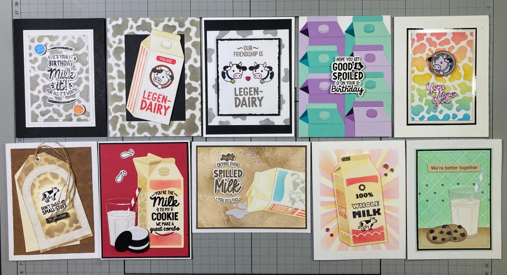
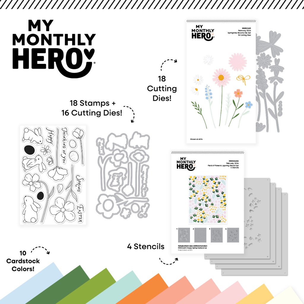
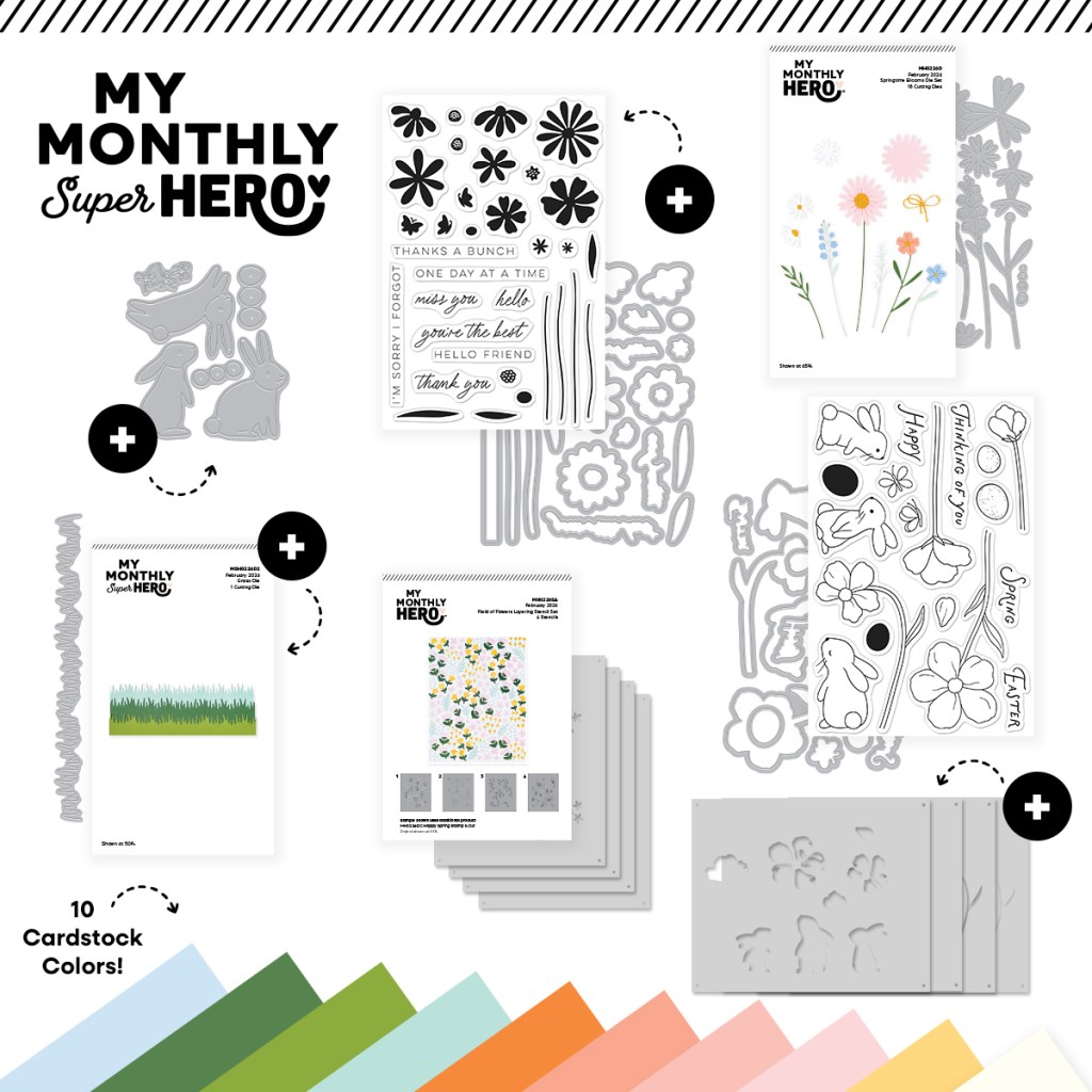
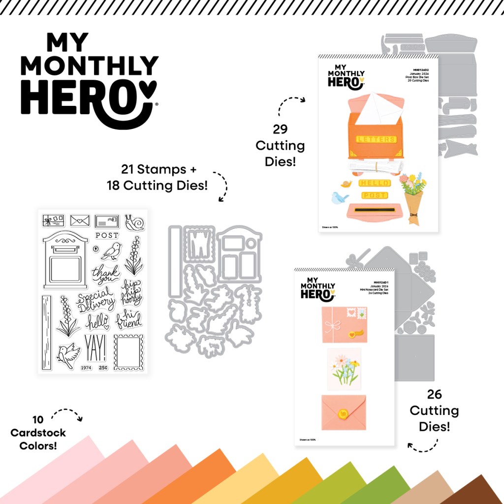
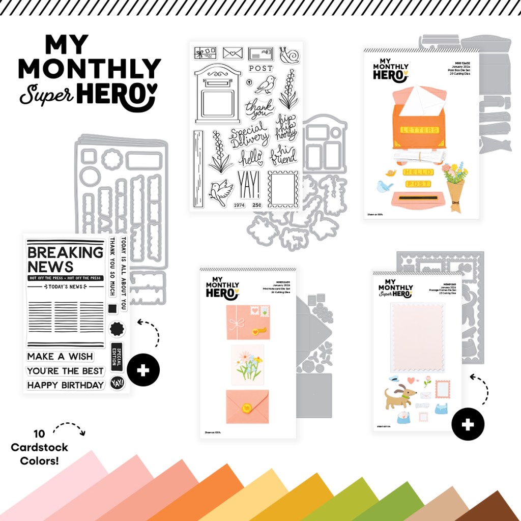
Hello Folks! Scott here once again with the NEW My Monthly Hero and My Monthly Super Hero for March of 2026! This is month number three for the return of the My Monthly Hero / Super Hero kits from Hero Arts and the theme this month is quite unique: “Milk It”
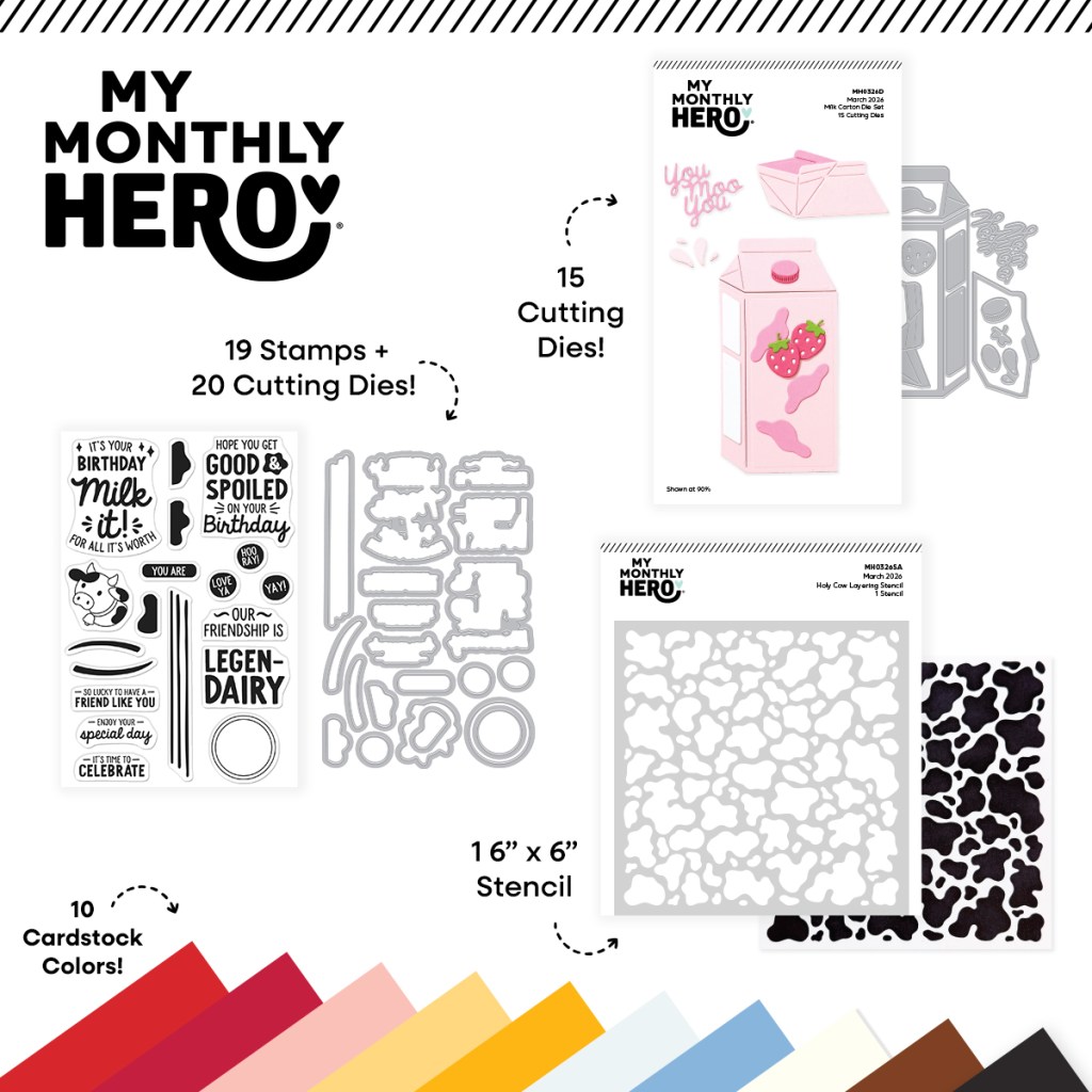
| My Monthly Hero Includes: • You Are Legen-Dairy Stamp & Cut • Holy Cow Stencil • Milk Carton Die Set • 10 Sheets of Cardstock – 1 of each color, 5.5″ x 8.5″ (Poppy, Pomegranate, Bellini, Beeswax, Saffron, Windy, Celestial, Alabaster, Truffle, Raven) |
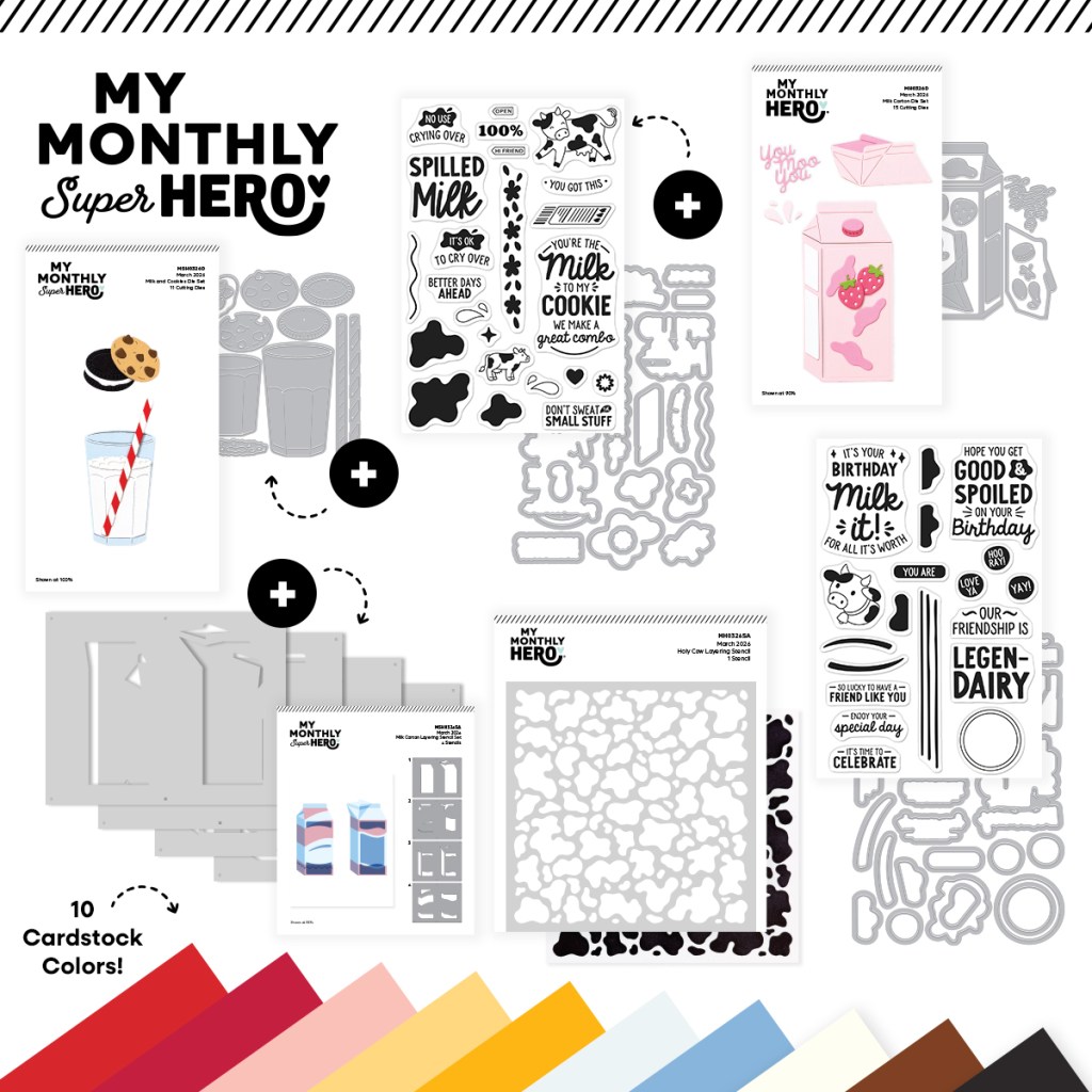
| My Monthly SUPER Hero Includes everything in the regular MMH above, PLUS: • Spilled Milk Stamp & Cut • Milk & Cookies Die Set • Milk Carton Layering Stencil Set |
There’s a number of large sentiments here, and a very unique milk carton die (and stencils). I don’t believe I have anything quite like this kit in my stash! For those who only subscribe to the MMH kit I will continue to make five cards from that set along with five other cards using the whole Super Hero kit.
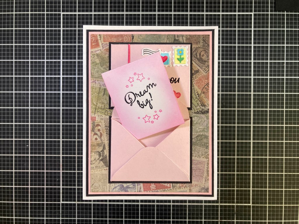
Since the Legen-Dairy stamps seemed rather sentiment heavy, that’s where I began!
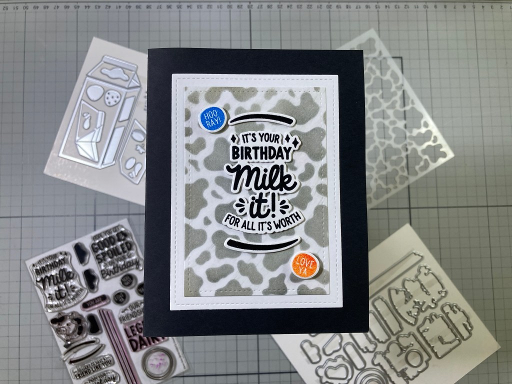
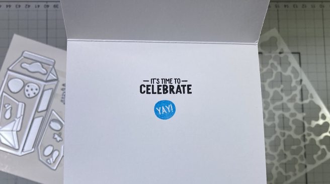
On a panel of White card stock I stenciled the Holy Cow stencil with Hero Hues Licorice Reactive ink. That was a touch too perfect for me, so I wiped over the stenciling with a dry cloth and softened the edges of the spots a bit… it actually looks a little more “hairy”! I stamped the sentiment and the two swooshes on White card stock with VersaFine Onyx Black ink and embossed them both with Clear Embossing powder and die-cut them out with their matching dies. I stamped the HOO-RAY and LOVE YA dots on White with VersaMark ink and embossed them with Blue and Goldenrod Embossing powder (from the MMH March ’22 kit) and die-cut them both out.
I trimmed the cow-spot panel to 2.75″ x 4″ with a Lawn Fawn Stitched Rectangle die and glued that to a White mat cut to 3.25″ x 4.5″ with another LFSRdie. I glued both of those to an A2 Black card base. I die-cut two more blanks of the sentiment and swooshes, then stacked and glued them to the stamped and embossed pieces. I glued the sentiment and swooshes to the card front and added the colorful dots with foam tape.
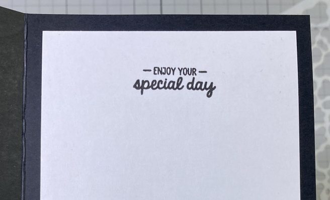
Since this was a Black card base I did add a writing panel on the inside trimmed to 3.75″ x 5″. The sentiment is stamped with VersaFine Onyx Black ink and the panel was glued to the inside. This card was my easy intro to this new kit… and a great B’day card for any of your lactose-tolerant friends!
There’s not a lot of image stamps in this kit so I knew I had to start using that Milk Carton die sooner rather than later!
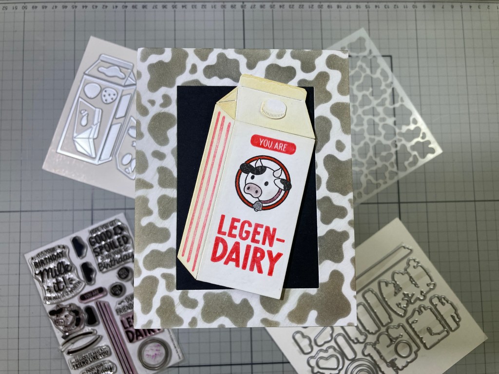
I die-cut the Milk Carton dies from some plain White card stock and did a little ink-blending (with the help of some masking strips) on the top and side using Antique Linen Distress Oxide ink. Then I attached the top and bottom pieces together with tape on their backs. I stamped the cow on the front of the carton masking off the cow’s body between the bell and the ear. Then I stamped the cow on some masking paper and fussy-cut the mask out. I placed the mask over the cow and stamped the ring around the cow. That’s about as close to a “logo” as I can get with the stamps in this kit. I stamped the stripes on the side and the sentiments using Hero Hues Fruit Punch Reactive ink and embossed the sentiments with Clear Embossing powder.
I die-cut the cap and did a little more ink-blending to it before glueing that to the milk carton. This cow frame is actually the leftover stenciling from card #1… I did place the frame back under the stencil and added a touch of Frayed Burlap Distress Oxide ink over the Licorice ink for a little bit of a warmer feel. I backed the open frame with a plain piece of Black card stock and glued those to a White A2 card base. I colored the ring around the cow with a Red Pigma Micron pen, her collar with a Brown Pigma Micron Pen, and the Bell with a Silver Gel pen. I added a touch of color to the snout and horns with a pale Ohuhu Alcohol marker.
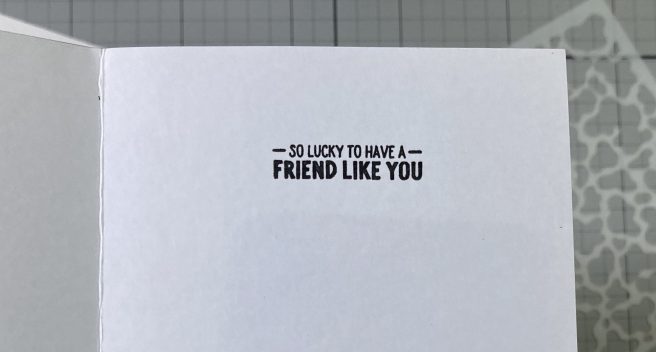
Using foam tape, I attached the Milk Carton to the card front at a jaunty angle and stamped this sentiment on the inside of the card for a little extra touch! I did get a lot of satisfaction fiddling around with the cow stamp and the ring stamp to get them to work together.
Since the cow head is the only image stamp in this set I decided to do some reverse stamping to get a second cow!
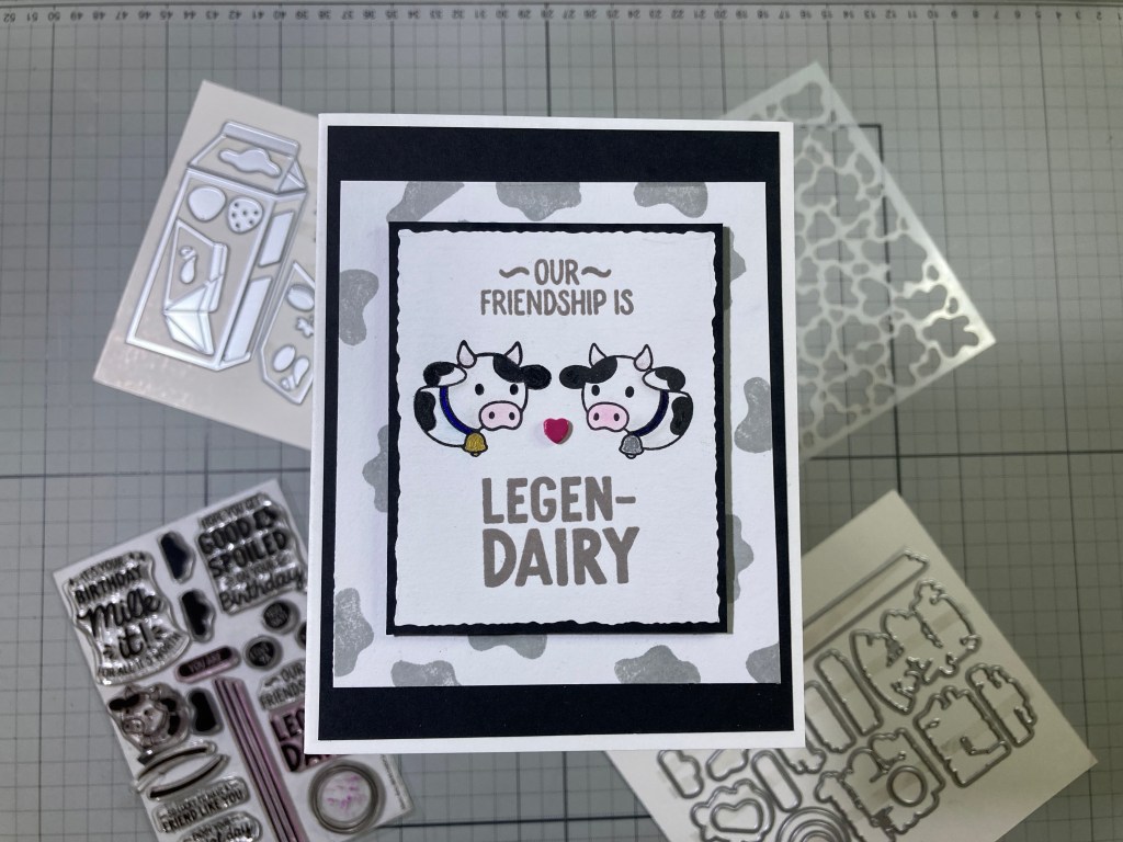
It has been a while since I did any reverse stamping…! I used to do reverse stamping using a silicone mat… but with the advent of so many sticky mats made from stamp material, I got to thinking and wondered if I could reverse stamp using my sticky mat – it’s already loaded into my MISTI! Well, it worked very well just using VersaFine Onyx Black ink. Simply make a tape hinge for your cardstock and stamp directly on your sticky mat, then fold your card stock over on its hinge and press into the stamping on your mat. Worked quite well for me and the ink washes off your sticky mat if you go after it right away!
Click here to see my original Reverse Stamping video. (ignore the silicone mat and just try it on your sticky mat)
I stamped the left-facing cow on the right and colored their collars with Pigma Micron pens in Blue and Purple, and their bells with Gold and Silver gel pens. I did use my Pebbles Chalk Palette to add a little color to their snouts and horns and a touch of shading on their bodies. I arranged the sentiments above and below the pair, then stamped them with Hickory Smoke Distress Oxide ink and embossed them with Clear Embossing powder. I didn’t have a die on hand that really fit this arrangement, so I trimmed the stamped panel to 2.75″ x 3+3/8″ using my Tim Holtz Deckle Paper trimmer.
I lightly traced the outline of the deckled panel onto the center a piece of White card stock cut to 3.75″ x 4+3/8″ (1″ larger that the deckled panel), and then I stamped the cow spots on the edges of the “frame” using Hero Arts Granite ink. I knew I was going to add a mat to the stamped panel so I could easily stamp the spots right up to the traced outline and the mat would cover any stamp edges.
I glued a 4″ x 5.25″ piece of Black card stock to the front of a White card base and glued the spotted “frame” on top. I did add a thin Black mat to the back of the stamped (and deckled) panel and added that to the card front with foam tape. A Red Enamel Heart glued between the cows adds a pop of color and a little touch of dimension.
That takes care of BOTH versions of the Legen-Dairy sentiment in this set… let’s get back to the milk carton dies and try something a little bit more graphic.
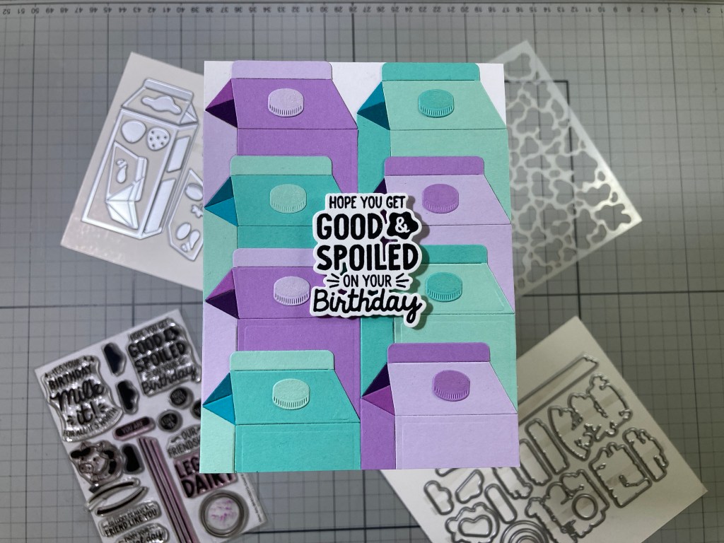
I’m not totally sold on this sentiment, but I figured it deserved a shot… and I thought that the more milk cartons, the more some might become spoiled..?? HA! This card started as 4 cartons then became 6 cartons and then settled in at 8 cartons. Paper piecing can be fun with the right set of dies! These cartons are all die-cut from Altenew Shades of Purple and Sea Shore Gradient Cardstock sets – 4 shades of each color. And I didn’t waste card stock either – each carton is only long enough to hide behind the carton in front of it.
I taped all the cartons together on their backs and glued them to a top-folding A2 White card base (I did have to trim off a sliver of the card base from one of the long sides to fit the width of the cartons). I stamped and embossed the sentiment as usual, and then die-cut it along with 2 blanks. I stacked and glued all the die cuts together and mounted them to the card front with foam tape. For a little birthday sparkle, I added some Spectrum Noir Sparkle pen to the tops of all the caps – it doesn’t register in the pic but it’s very apparent in person!
In my never-ending quest to use every stamp in a stamp set, I added this sentiment on the inside of this card – stamped with VersaFine Onyx Black ink and Hero Hues Splash Reactive ink. Goes well with the Good & Spoiled sentiment!
Looking back at these last four cards, it appears I may have become the victim of the stereotypical white cow with black spots syndrome… I did grow up in Kansas and even went to school with Dairy Farmers – I guess that stuck in my head…
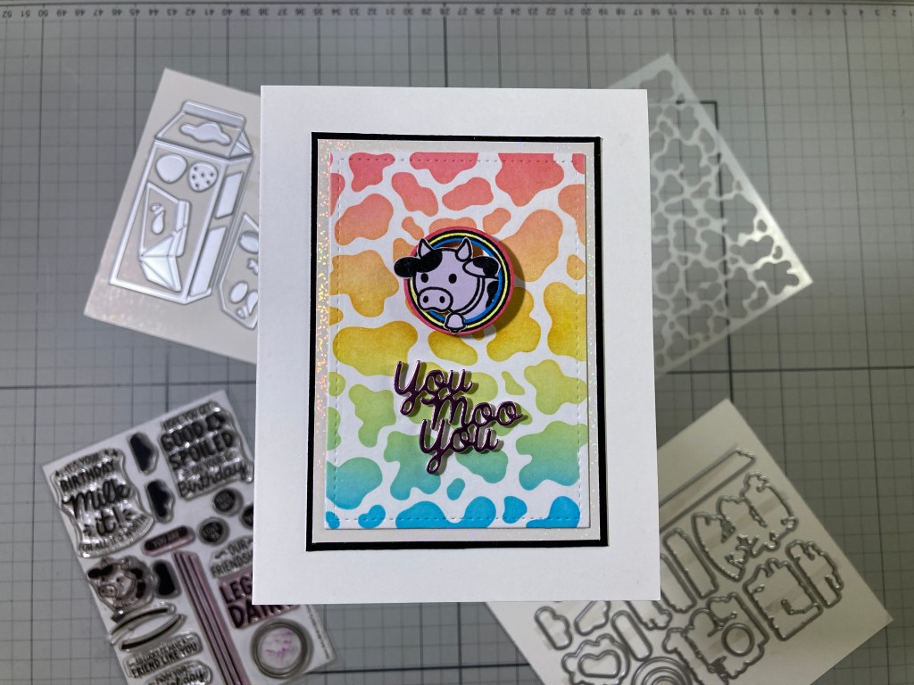
Here’s some color! And we even have another sentiment that was with the Milk Carton Die set – and it’s a good pun!!! The Holy Cow stencil is ink blended with Hero Hues Splash, Lemon Drop, and Fruit Punch inks – fairly easy to get a good rainbow going with these three inks! I die-cut the stenciling to 2.75″ x 4″ and glued that to a 3″ x 4.25″ mat of White Mylar Glitter card stock. Finally, a thin mat of glossy Black card stock is glued behind, and the matted background is glued to a White card base.
I die-cut the sentiment from some Tim Holtz Metallic Jewels card stock and I cut three more blanks from White card stock. I glued all the die cuts together before gluing the whole stack to the card front. I stamped the cow on some Altenew Soft Lilac card stock (in the Shades of Purple Gradient card stock set) using Versafine Onyx Black ink and I embossed that with Clear embossing powder. I fussy-cut the cow so I wouldn’t have a big die-cut border. I stamped and embossed the ring on White card stock exactly the same and die-cut it with the two circle dies in the set. I colored the rings (including the borders left by the die-cut) with Red, Blue and Yellow Ohuhu Alcohol markers. I glued the cow into the ring with some of him peeking over the edges.
And here’s the surprise… The Cow Spins! These new little Charm Spinners have been making the rounds lately, and I couldn’t wait to give them a try! They are SO SMALL (about 0.5cm around and less than 1/8″ tall) and SO EASY to SPIN!
I measured where the center of the ring should be (behind the cow) and glued the spinner to that spot. I glued the bottom of the spinner to the center of the card front and let everything dry before trying to spin it. I got that spinner almost dead center (you can see the rings barely waver when it’s spinning) and it seems to spin for the longest time! (It did take me about 6 takes to get this video clip where the cow head stops in the right place!!) I LOVE IT!
That covers the My Monthly Hero set! I actually used every single stamp in the You are Legen-Dairy Stamp set and I am more than ready to move along to the Super Hero kit! I decided to start small…! Or so I thought!
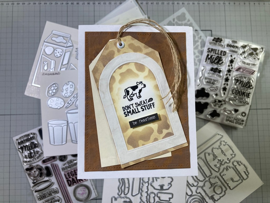
I wanted to pair the small cow and the Small Stuff sentiment together… at first I thought it would just be that tiny vignette in the center of the card… but I got a little carried away. I had this tag (2.5″ x 4.5″) sitting on my desk and decided to stamp the vignette (VersaFine Onyx Black ink and Clear Embossing powder) on the tag. Then I figured I should add some of the Holy Cow stencil on the tag – ink blended with Frayed Burlap and Antique Linen Distress Oxide inks. Then I thought it needed a frame and instead of something square, I went with this arched frame die-cut with Spellbinders Essential Arches dies.
The frame is cut from some old White Sizzix Texture Roll – 185# card stock that can be washed and scrunched and distressed and looks like leather… how appropriate! I have more of the Sizzix Texture Roll in Tan, so I washed and scrunched a panel, did a bit of light stenciling with Walnut Stain Distress Oxide ink and die-cut that to 3.75″ x 5″ and glued it to a White card base. Great faux-leather effect…! I thought the single tag seemed lonely, so I cut another tag from some plain Ivory Card Stock and tied the two tags together with some twine (a cow tail?). I glued those to the card front and finally added the “be fearless” sentiment (from the Tim Holtz Small Talk sticker pad) with foam tape. I think that’s enough! Much more fun than a simple vignette!
The big cross-over between the plain hero and super-hero kits is the Milk Carton Layering stencils. They fit the Milk Carton Die Set perfectly. But, I figured we didn’t have to stencil on the die-cuts, so I just stenciled both cartons on some Ivory card stock.
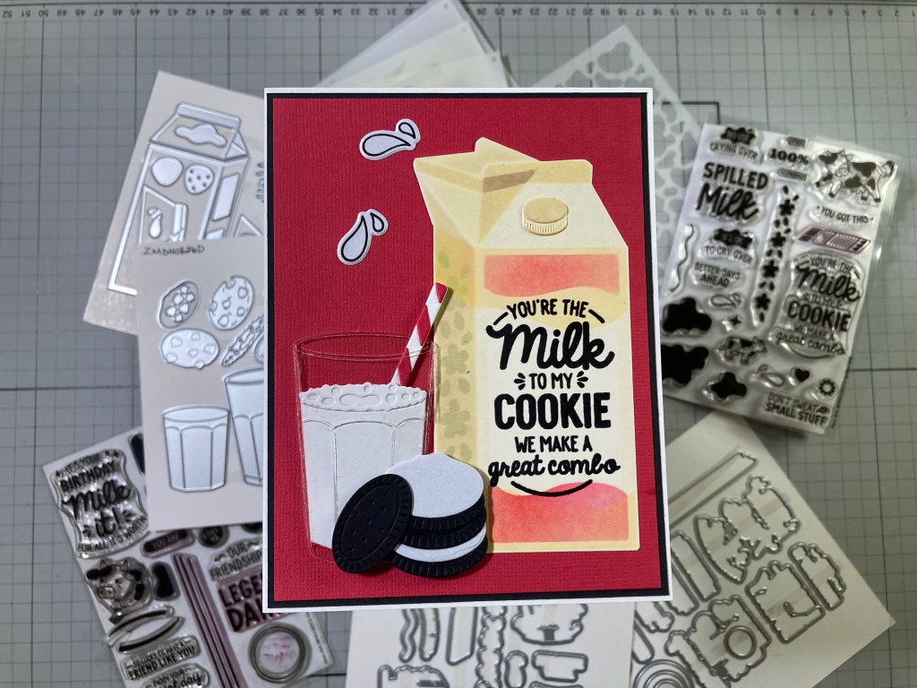
I stenciled this carton using Antique Linen, Frayed Burlap and Walnut Stain Distress Oxide inks and HA Fruit Punch Reactive ink (I didn’t add any ink to the full front stencil). It’s an easy task to fussy-cut both of the stenciled cartons out – just use a ruler or your trimmer for perfectly straight cuts. I added the ink-blended cap to the top of the carton (redundant, huh?) and stamped and embossed the sentiment as usual on the front of the carton. I also stamped the “flowers”? or “milk splashes”? along the side of the carton with HA Soft Granite ink. I believe that’s where they belong.
When I realized that the two Glasses dies in the Milk & Cookies Die Set were slightly different sizes, I realized the smaller glass is supposed to be the milk – the larger glass (which has a bottom) is also a tiny bit wider. I’m sure these were meant to glue the milk (and the bubble layer) on top of the big glass leaving the bottom and sides showing – indicating that the “milk” is inside the glass. I wanted to actually put the milk IN the glass, so I die-cut the class from a piece of acetate and glued the White milk (and bubbles) BEHIND the acetate. In an attempt to camouflage the glue, I placed the die-cuts face down (milk and bubbles on top) and ran a thin bead of glue down the side edges – let that dry thoroughly, and the milk held on to the acetate quite nicely. The straw (cut from White and Red card stocks) helps hold everything together as well! Note that the straw does come out of the glass at the rim!
The cookies are die cut from Pitch Black card stock and some White pearlescent card stock and glued together. The background is some Textured Red card stock cut to 4″ x 5.25″ with a thin Black mat and glued to an A2 White card base. I glued the carton down flat, and added the milk glass and the cookies with thin foam tape. For an embellishment, I stamped the two milk drops on more of the Pearlescent White card stock using StazOn Jet Black ink, die-cut them out and glued them to the card front. I really like the “glass” glass, but I do wish there were outline dies for the two cartons.
I wasn’t completely sold by the “Spilled Milk” sentiments, but decided I needed to try and give them a chance as well!
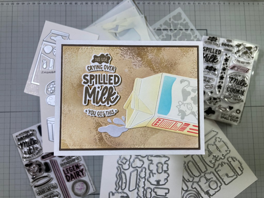
I die-cut a carton from White card stock and used the stencils for some selective shading using Antique Linen and Frayed Burlap Distress Oxide inks and HA Splash Reactive ink. I did stencil the back piece of the open carton before gluing it in place. I stamped the side of the carton with Fruit Punch Reactive ink and stamped the large cow on the front with HA Granite ink.
I stamped the sentiments with Walnut Stain Distress Oxide ink and embossed them with Clear Embossing powder. I die-cut the sentiments along with 2 blanks and glued them all together. The background is an experiment in ink resist using Gesso – I sponged some White Gesso onto a panel of White card stock, let that dry and then ink blended Distress Oxide inks on top – the Gesso takes the ink differently than the plain paper and gives us another interesting “leather” texture. The inked panel is cut to 5″ x 3.75″ with a LFSRdie, a thin Dark Brown mat is added and both are glued down to a White card base.
I trimmed the bottom half of the carton away and glued that flat to the card front. I die-cut “splashes” from more of the Pearlescent White card stock and glued them under the spout. I glued the stacked sentiments in place, and, with the carton on its side with milk spilling out, I think this works decently well as an encouragement card.
That covers the three main sentiments in the Super kit… now I can work on some sentiments of my own!
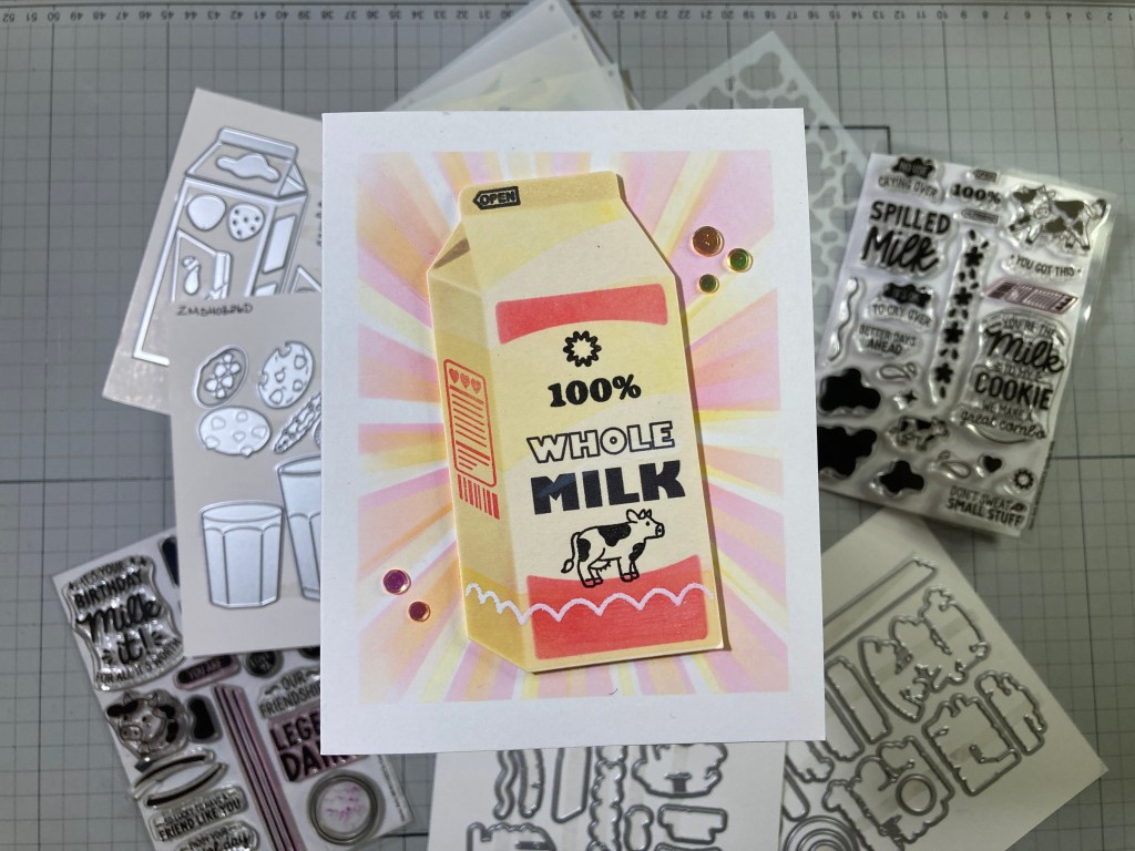
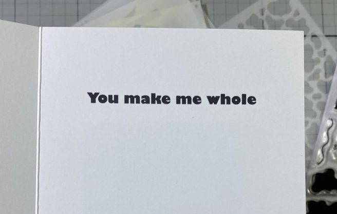
The 100% stamp in the Spilled Milk Stamp set inspired this card. This is the closed carton I stenciled and fussy cut the same as card seven. I created the “Whole Milk” part of the sentiment using my Silhouette Software and the Gill Sans Ultra Bold font and I printed that directly on the stenciled carton. The cow, “100%”, the starburst and “open” were stamped with VersaFine Onyx Black ink and the side panel was stamped with Fruit Punch Reactive ink. I also re-stenciled the scallops towards the bottom with VersaMark Embossing ink and embossed those with White Embossing powder.
The background is ink blended directly on a White card base with a PinkFresh Studio Slimline Layered Starburst stencil in Antique Linen Distress Oxide Ink, Fruit Punch Reactive ink and Lemon Drop Reactive ink. Since the slimline stencil is only 3+3/8″ wide, I masked off 3/8″ on the top and bottom of the card front before stenciling. I attached the milk carton to the card front at a jaunty angle with foam tape.
Of course the payoff comes when you open the card. I printed this sentiment on the inside of the card using my Silhouette Software and the Gill Sans Ultra Bold font. I did print this before doing any stenciling or assembly on the card. For a final touch and a dash of sparkle I added some confetti sequins to the card front. Almost a valentine!
I haven’t used the chocolate chip cookie dies yet, and there was one more die-cut glass idea I wanted to try…
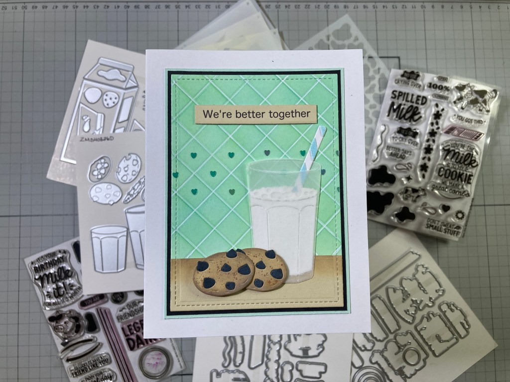
For a “frosted” glass try cutting the big glass from some thick Vellum! I die-cut the big glass from 40# Bazzill Vellum and assembled the milk/bubbles and glass the same as the acetate glass. I did take a moment to cut away a bit of the bubbles where the straw goes into the milk – even more realistic! I tell you, the vellum may work better than the acetate for this die-cut glass. The straw (White and Light Blue card stock) again helps hold everything together!
The cookies (2 pieces-top and bottom) are die-cut from some GKD Sandy Beach card stock and ink blended with Frayed Burlap and Antique Linen Distress Oxide inks and then spattered with HA Brown Acrylic Speckle before gluing together. The chips are die cut from Pitch Black card stock and glued in place. A little Antique Linen Distress Oxide ink lightly blended over the chips pulls them away from straight Black.
The background is a panel of White card stock cut to 3.25″ x 4.5″ with a LFSRdie. The tile pattern was scored into the card stock with my Scor-Buddy and the whole panel was ink-blended with Key Lime Fizz and Splash Reactive inks. I do like that blend! The “table” is more Sandy Beach card stock cut to size with the same LFSRdie and ink blended along the top edge. Once the Background inking was good and dry I did go back over the “grout lines” with a White Gel pen – that really makes the tiles pop! I glued the “table” to the tiles and added a thin Black mat and a thin Spellbinders Mint mat and glued those to a White card base.
I printed the sentiment on a scrap of Sandy Beach card stock using my Silhouette Software and the Hiragino Maru Gothic Pro W4 font. I die-cut that to size with a Lawn Fawn Everyday Sentiment Banners die and cut a second one to glue behind for some added thickness. I glued the glass flat to the card front and the cookies with a touch of foam tape. I played around with some enamel heart embellishments but decided to add these tiny heart glitter pieces to make a pattern in the tile. This is old Martha Stewart Wintermint Heart glitter! I don’t use it often but it comes in handy sometimes! Just the right amount of sparkle and just the right color. I’m loving this card!
That makes 10 cards inspired by the My Monthly Hero and Super Hero kits for March of 2026! This is a terrifically unique kit this month and should prove to be quite a versatile addition as a milky part of my stash!
Definitely unique, milky and a little pun-y! These cards all feel thematically concise this month! I almost used all of the stamps in the kit, and I did use all of the specialty dies (except the strawberry – I had a bad experience with strawberry milk once, and I just couldn’t bring myself to even consider it)! It was good to do some reverse stamping, and I need to remember to play with that Sizzix Texture Roll more, and I will certainly be on the lookout for more things I can set to spin! This kit may have taxed my brain a little bit, but I ultimately had a great time coming up with these cards!
If you have all sorts of fun ideas about what you could do with a milk carton, and you’d like to grab one of these kits for yourself, please use my links below – I do get a small commission from anything you buy at HA (at no cost to you!) and that helps keep the wheels turning and the new ideas coming! It is, as always, supremely appreciated!
My Monthly Hero Subscriptions: https://www.kqzyfj.com/click-101337132-16957481?url=https%3A%2F%2Fheroarts.com%2Fpages%2Fsubscribe
Hero Arts: https://www.jdoqocy.com/click-101337132-16957493
Thank you so very much for sharing your time with me here today! I hope I was able to provide you a little inspiration and maybe a chuckle or two! Remember, YOU are the reason I keep posting! Let me know which cards are your favorites! If you enjoyed this post please click the “Like” star at the bottom of this page, and if you wish to be notified of new blog posts click the Follow Me button at the top of this page. Please, take a few moments to Like Me, List Me, Pin me, Post Me, basically, just share this post everywhere and with everyone you can, and remember… Don’t run with scissors!! As always, I send you and yours Love and Light, and Happy Crafting!
DISCLOSURE: This site contains some affiliate links to products. I may receive a commission for purchases made through these links (at no cost to you). As an Amazon Associate I earn from qualifying purchases. Thank you!


