
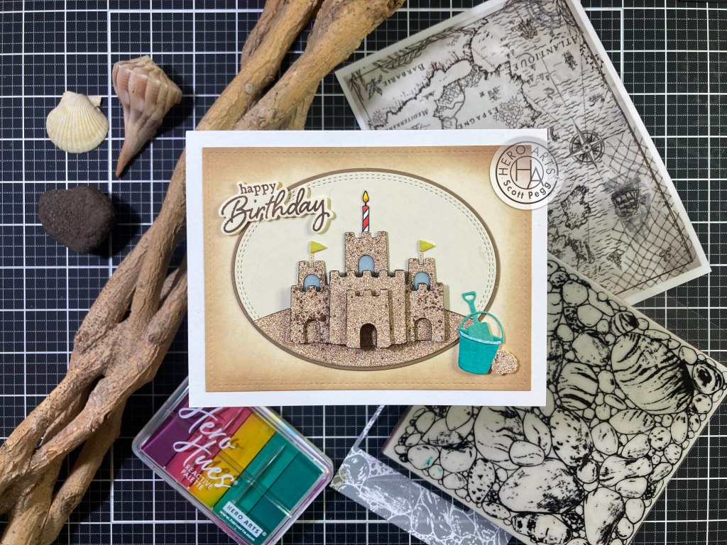
Hello Folks! Scott here with my 10 Cards From 1 Kit post featuring the new Hero Studio Card Kit of the Month for August of 2025. “Ichabod’s Study” is what they have titled this Studio release. Victorian Halloween appears to be the theme!
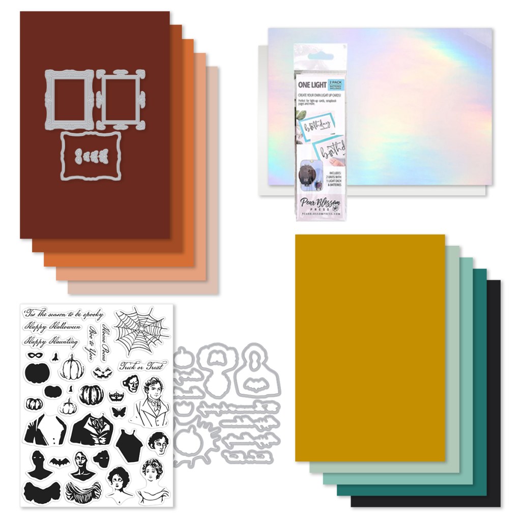
| Card Kit of the Month Includes: • Abraham and Katrina 6×8 Stamp Set • Abraham and Katrina Coordinating Dies • Stamping Guide for stamp set • Victorian Frame Die Set • Pear Blosson Press-One Light 2 Pack • 10 Sheets of Cardstock- 1 of each color, 5.5″ x 8.5″ (Cinnamon, Terra Cotta, Carrot, Coral, Bellini, Tuscan, Mint, Waterfall, Blue Spruce, Raven) • Holographic Rainbow Film, 1 sheet – 5.5″ x 8.5″ • Acetate, 1 sheet – 5.5″ x 8.5″ |
The Holographic film, acetate and light are included to provide some spooky interactive two-way mirror effects with the Victorian Frame dies and our characters. This is how this effect was explained to me: “The Pear Blossom light, Holographic Rainbow Film, and Acetate sheet are designed to work together to created a framed mirror that lights up to reveal a portrait. To do this, remove the backing paper from the Rainbow Film and adhere it to the acetate sheet. Then adhere that over the top of your stamped portrait. When you place the light behind the image it will illuminate to reveal the portrait in the mirror. So cool!” I proceeded to attach the Rainbow Film to the Acetate to have them standing by.
Here’s a pic of the acetate Stamping Guide included in the kit to help you line up the multi-layered Character stamps:

And there is a coloring guide available to assist with your color choices.

You can download the guide right here:
Very interesting… and quite a unique card kit this month – though I do find it a little hard to wrap my mind around the idea of Halloween in August! I started playing with this kit by practicing my stamping of Alexander and Katrina – experimenting with colors and practicing layering up the portraits. I REALLY put the stamping guides to good use… they were extremely helpful in getting the layers to line up just right and give us some lovely dimensional portraits.
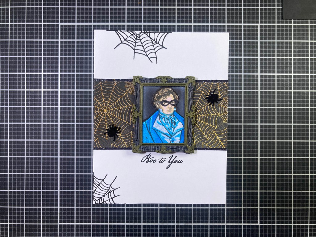
I stamped Alexander’s outline with VersaFine Onyx Black ink and for his face and hair I used HA Espresso Core ink, Antique Linen Distress Oxide ink and Concord & 9th Ballet Slipper ink. His clothing is stamped in HA Dusty Blue, Splash, and Blue Hawaii inks. I die-cut him out with his matching die, trimmed a little of the white border away, and colored what was left of the border with a Black alcohol marker.
I die-cut the Victorian Frame with some Urban Basicilla Black card stock (I believe this was from the MMH Kit for September 2019) and the detail die from Wood Abachi Solid card stock (from the same kit) and glued them together, positioned Alexander behind the frame, and finished the frame with Pitch Black card stock die-cut with the Frame Background die. I did rub a little white chalk pastel in the corners where the background meets the frame for a touch of distressing. I die-cut the Mask from the same Black card stock and glued it in place – I like using the die-cut instead of the stamp for a mask – makes it feel like it was added-on to the portrait just for the holiday!
I pulled a bunch of Halloween themed pattern paper from my stash (from the Love From Lizi October 2017 Card Kit) and grabbed this 2 1/8″ scrap of cobweb paper, and glued that (a little above center) to the front of an A2 White card base. I trimmed that out top and bottom with some LFL Black Glitter peel-offs. I stamped the cobwebs on the edges and the sentiment with VersaFine Onyx black ink and I embossed them all with Clear embossing Powder. I added the portrait of Alexander with thin foam tape and added two Black sequin spiders for some spooky bling. I have to admit that with the help of the Stamping Guide, these characters come out beautifully shaded and pretty realistic for stamped images!
I had to dive right in and make an “Appearing Portrait” card using the Rainbow film and Pear Blossom light. I am no stranger to light-up cards, and I welcomed the ease and convenience these pre-packaged lights give us.

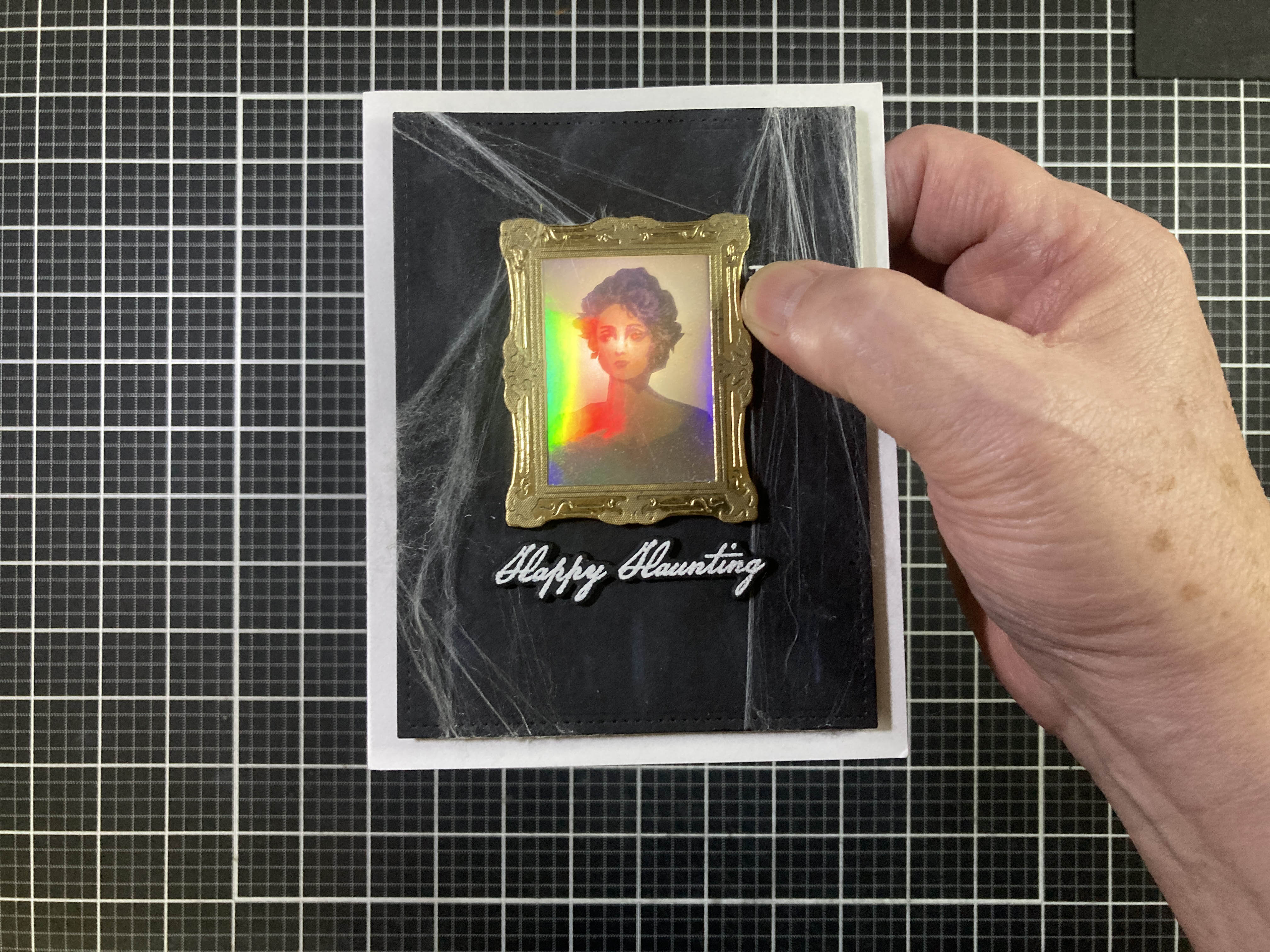
I’m actually quite pleased with how this came out – I did fiddle and fuss with this quite a bit and might have come up with a couple of useful tips if you want to try this yourself. (I have a fairly detailed step-by-step in my companion video at: https://youtu.be/3i43oKykL7k) Ultimately, I was not overly fond of the Pear Blossom light – I think the LED is too close to the battery, so when you turn on the light, you tend to get a shadow where the battery is. Also, it does help to move the image as far away from the light as possible – I used 5 layers of Pitch Black card stock behind the frame (just the frame) to help get Katrina as far from the light source as possible. But I do LOVE the satisfying “click” of the switch when you press on it. Even the proximity of the switch is so close to everything that it takes some finagling to get the switch outside of the frame. I did find that using 40# vellum behind Katrina helps diffuse the light coming from the tiny LED.
Katrina’s outline is stamped with HA Espresso ink, her hair is stamped with HA Thistle ink, her face is stamped with Antique Linen Distress Oxide (stamping off to lighten the ink) and C&9th Ballet Slipper ink, and her dress was stamped in Peacock and Midnight C&9th inks.
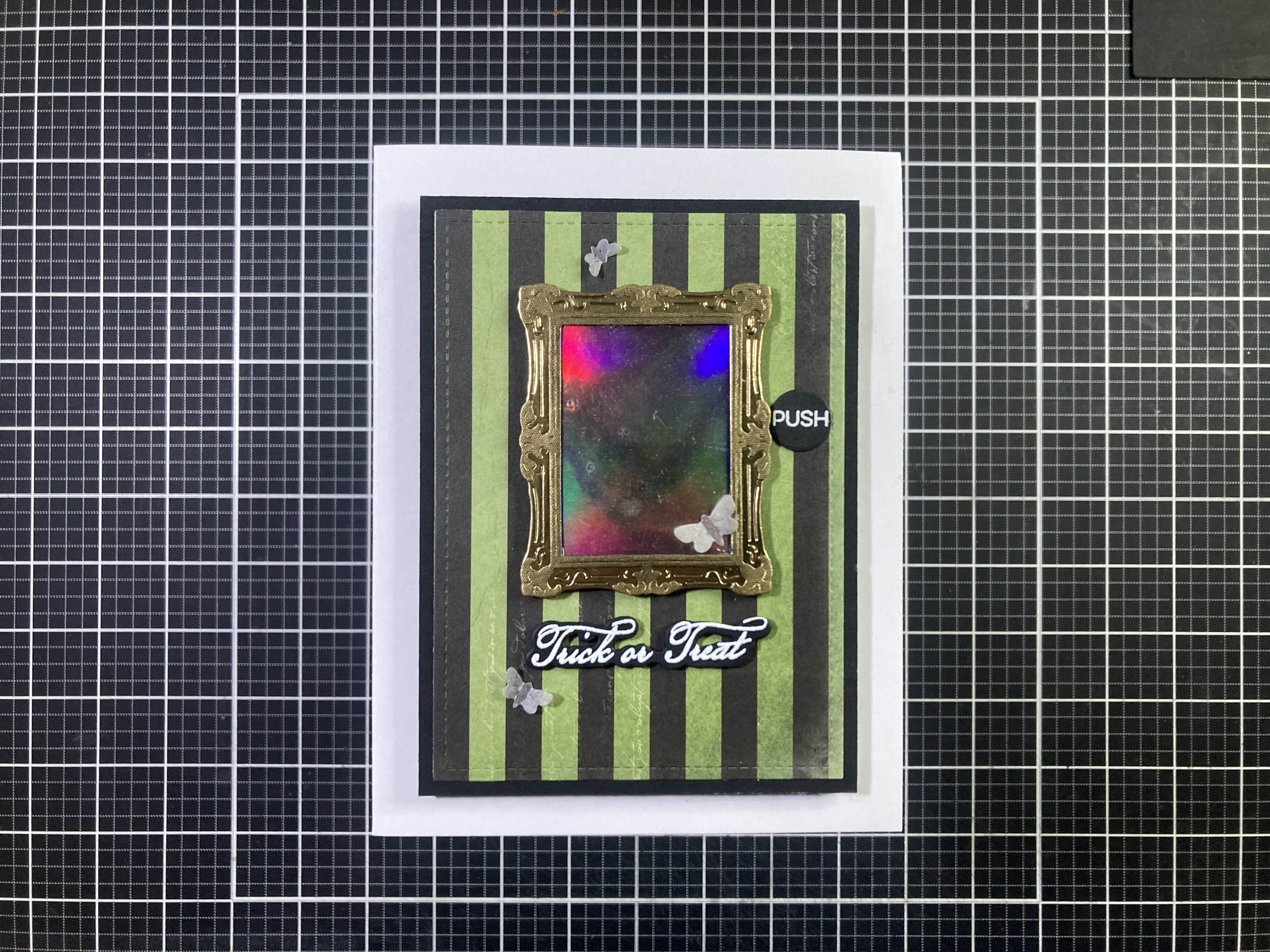
I did fussy-cut Katrina out… The Frame is die-cut from Gold Metallic card stock and the detail is a Textured Gold paper. The background is Pitch Black card stock die-cut with a Lawn Fawn Stitched Rectangle die, distressed with touches of Unicorn White ink and attached to a White card base with foam tape (to make room for the light). The sentiment and the “push” (from the MFT Interactive Labels stamp set) are stamped on Pitch Black with HA Unicorn White pigment ink and embossed with White embossing powder. I trimmed the label to size and die-cut the sentiment (and four blanks) with the matching die, glued them all together and glued that under the mirror. The spider webs came from the LFL 10/17 card kit and they are stretched and glued around the edges of the background and the frame. Very interesting effect through that rainbow mirror – I don’t think I’ve seen anything like this before!
Katrina fit inside her frame so nicely that it really pointed out how much Alexander was almost bursting out of his!

Embrace the burst! Beware! He’s coming right out the portrait! Alexander’s outline is stamped with HA Espresso Ink, His hair with HA Sand ink, and his face with Sand ink again, and finally C&9th Ballet Slipper ink. His clothes are stamped in HA Dusty Blue, Summer Sky, and Stone Wash core inks. The stamping came out really well on this one! I also colored out his eyes with a White gel pen. I fussy-cut Alexander out leaving a little bit of a white border which I colored with a Black alcohol marker. The frame is cut from the same card stocks as the first card, with four layers of frame (including the background) to build up the dimension. Alexander is glued behind the frame at the bottom with his left shoulder and head extending beyond the edges of the frame with the assistance of some thicker foam tape.
The background is Carrot card stock (from the Kit) die-cut to 3.25″ x 4.5″ with a LFSRdie and covered with this interesting random weave of black webbing (again from that LFL Kit). I glued that to a Black mat and down to a White card base. I stamped the sentiment on a scrap of Pitch Black Card stock with HA Unicorn White pigment ink and embossed that with White embossing powder. I die-cut the “BEWARE!” using an old Marker Micro Alphabet die from more scraps of pattern paper and glued that above the sentiment. I die-cut the sentiments with a 2.5″ x 1.25″ LFSRdie and die-cut three blanks so I could glue them all together before gluing that to the card front. This card makes me giggle, and I appreciate being able to show off the cool layered stamping (even if he has no eyes!)
I saw one of the designers put a die-cut jack-o-lantern over Alexander’s head, and I thought why not on Katrina’s head?

Since Katrina has more of a neck than Alexander, I decided to mask off her head and stamp this image as one layer. Katrina is stamped the same as card #2 (with no head!) and the pumpkin is stamped with HA Creamsicle, Tangerine, Espresso, and Forever Green inks. I did give the pumpkin a coquettish tilt on her neck and stamped the carving with VersaFine Onyx black ink. I colored in the background with a couple of Beige alcohol markers and put her in a frame die-cut from Auburn Pearlescent card stock and Champagne Metallic (detail) card stock. I added two layers of Black card stock behind to add some thickness to the frame.
I love this pattern paper and had a 3″ wide piece waiting for me. I glued that to a White card base and added Black Stripe peel-offs down the sides. I stamped the sentiment on a scrap of White card stock with VersaFine Onyx Black ink and embossed that with Clear embossing powder. I die-cut the sentiment along with three blanks using the matching die and glued them all together before gluing them to the card front. I glued the portrait in place and there’s something about the tilt of the jack-o-lantern that seems particularly ominous!
That’s four cards with framed Alexander and Katrina portraits. Let’s break them out of their confines!
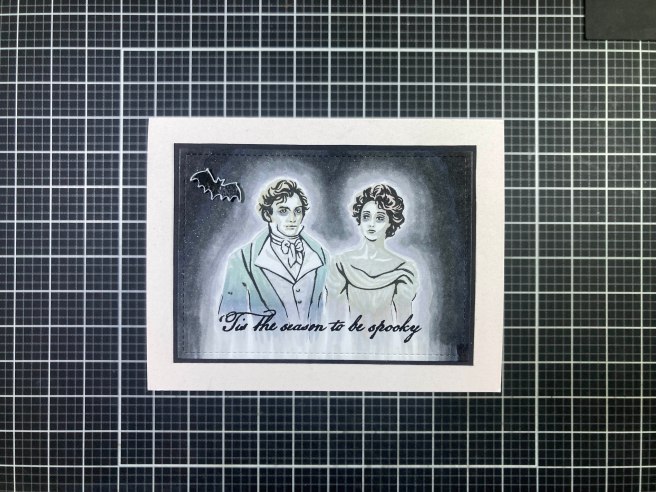
At last they meet!! I stamped the kids together on a panel of Neenah Solar White card stock with VersaMark ink and stamped all their layers using HA Soft Granite ink and SSS Barely Beige ink. I did not stamp the full face stamp for either of them effectively leaving their skin white… and the tones that show up in their clothing was just residue from previous stamping that the new inks reactivated. I did give their eyes extra dark circles for a more ghostly effect. Now it was a simple matter of creating an aura around them using a variety of Grey alcohol markers. I did try to leave a thin halo of White right around their edges, and extended the outline of their clothing along the bottom into nothingness.
I die-cut that panel to 4.5″ x 3.25″ with a LFSRdie, added a thin black mat behind and glued that to a Golden Glitter Off-White card base. I stamped the sentiment with VersaFine ink and embossed it with Clear embossing powder. I did add some Wink of Stella sparkles to the background around our ghosts and for a final touch, stamped and embossed the bat the same as the sentiment, die-cut him out and fussy-cut most of his white border away before gluing him to the card front. I love this card! I love that Katrina is looking at Alexander and that they compliment the victorian elements in each other so very well! GHOSTLY!
I have another Pear Blossom light and wondered if you could stamp directly on the back of the two-way mirror material.

Yes you can! I stamped the cobweb on the back of the Rainbow Film piece with VersaFine Onyx Black ink – pigment ink will dry on that film okay! I stamped the spider (from the MMH September 2019 Kit) with the same ink and colored the hourglass on his abdomen with a red alcohol marker. I die-cut the “BOO!” from black card stock using the same Marker Micro Alpha die and glued that on the back of the film too. The frame is assembled just like Card #2 – I did do a little distressing on this frame with some Black pigment ink.
I die-cut this striped pattern paper to 3.25″ x 4.5″ and added a thin Black mat behind (3.5″ x 4.75″). I decided where I wanted the frame and traced the opening to the pattern paper. I cut out the opening through the pattern paper and the mat as well. Then I could position the Pear Blossom light directly on the card front. I glued the stamped film to the back of the frame along with a piece of 40# vellum and added 4 layers of black die cut frames behind the gold frame to give the image some distance from the light source. I added foam tape behind the frame opening (avoiding the mechanicals) and around all edges of the background, then positioned the assemblage on the card front.
The “button” and sentiment are stamped with Unicorn White ink and embossed with White embossing powder and die-cut into shape. I did add two blank die cuts behind the sentiment for some dimension. I glued those in place on the card front and decided to add some moths! I die-cut the three sizes of moths from that 40# vellum, colored them very lightly with alcohol markers, bent their wings up and glued them to the card front. This one really lights up the whole frame!
I had a bunch of 1.75″ x 1.25″ Black and White cut outs building up on my desk – they were from the centers of the frames – I had so many because I was layering up the frames for depth and distance. Those scraps inspired this card.
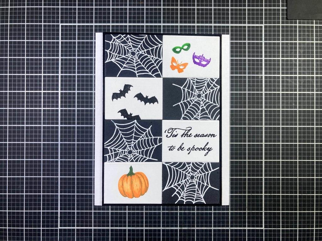
Black and White works perfectly for Halloween! I stamped the cobwebs on the black pieces with Unicorn White ink and embossed them with White embossing powder, the bats and the sentiment (I did cut the sentiment stamp in half) are stamped with VersaFine Onyx Black ink and embossed those with Clear embossing powder. The masks are stamped with HA Creamsicle, Green Apple and Thistle Reactive ink and embossed with clear embossing powder. I did take time to cut some eye holes in the butterfly / moth stamp – instant mask!
The pumpkin is stamped with HA Creamsicle, Tangerine, Espresso and Moss inks. I taped the rectangles together on their backs and glued them to a Glossy Black mat (3.75″ x 5.5″) and then down to a White card base. This graphic was quite fun to assemble and I like the Black and White checks with a few splashes of appropriately Halloween-y colors!
I got that layered pumpkin stamp right on with that last card and it made me think of a good Halloween pun!

HA! I stamped the big pumpkin with HA Creamsicle, Tangerine and Spicy Mustard for the details – I didn’t want too much contrast interfering with the pumpkin face which I stamped with VersaFine Onyx Black ink. I fussy-cut the pumpkin out and colored the edged with a black marker. I used the smallest Oval Infinity Frame Cuts die from HA to die-cut a piece of black card stock for the eye-patch and glued a thin piece of Black twine along the top half of that oval. I let that dry and then cut the top of the oval off where the string was attached – a perfect eye patch sized just right for our pumpkin. I glued the patch over his right eye and glued the string in place around the back. Then I die-cut a Black mask using the large pumpkin die and glued that to the back.
I had this ‘batty” pattern paper in my Silhouette Software library, and added the sentiment using the SignPainter-HouseScript font and printed that on some glossy Photo paper for some shine. I die-cut the background with a 3″ x 4.25″ LFSRdie and added a thin mat of Carrot card stock (from the kit) and a thin mat of Glossy Black card stock and glued them all down to an A2 White card base. I did add the simple “Happy Halloween” sentiment on the inside of the card. I do get a big kick out of this pun!
Of course I’m not going to let having only two Pear Blossom lights stop me from doing one more light-up card…

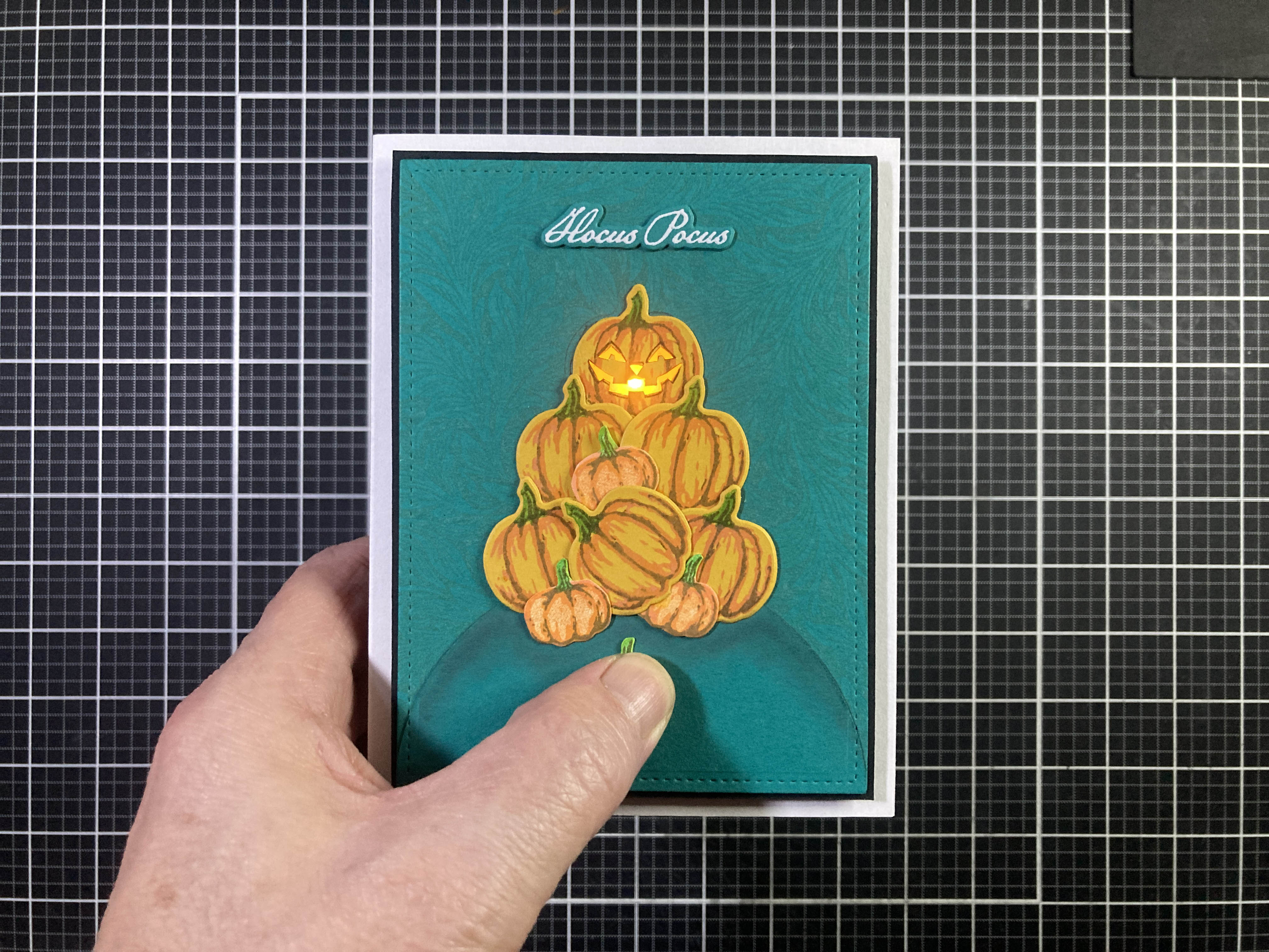
I couldn’t resist lighting up a Jack-O-Lantern! I stamped the large pumpkins on the Tuscan card stock from the kit using HA Creamsicle, Espresso, and Green Apple inks, and die-cut with the matching die. The smaller pumpkins are stamped on White card stock using HA Creamsicle, Tangerine, Espresso, and Green Apple inks and I fussy-cut them out – I thought the White border was just too big for these little pumpkins. I stamped the face on one of the pumpkins with VersaFine Onyx Black ink and when that was dry, cut out the black parts. I also stamped the “PUSH” on one of the small pumpkins with the same ink and embossed that with Clear embossing powder.
I stamped a panel of Blue Spruce card stock from the kit with the HA Acanthus Bold Prints cling stamp using HA Blue Raspberry ink – it’s very subtle but adds a lot of leafy texture. I die-cut the background with a 4″ x 5.25″ LFSRdie and added a thin black mat behind that. I decided on a stacked arrangement for the pumpkins and glued them all together. I die-cut a hillside for the group from more of the Blue Spruce card stock with a HA Circle Nesting die. I taped the hill and pumpkins to the card front and marked where the top pumpkin would be – I fussy-cut the pumpkin opening through the background and mat, and transferred that opening (along with corner registration marks) on the front of an A2 White card base.
You can see those marks on the pic below. I’ve been using Chibitronics – LED Circuit Lights for a long time now and I love the flexibility they give me – you can put the “switch” anywhere in relation to the LED and you can get colored LED lights too! The “switch” is just a folded-over piece of paper to encompass the battery. I glued the flap of paper to the bottom (where I wanted the “switch”) and ran two strips (“+” and “-“) of copper tape to where the LED would be. One strip goes to the bottom of the battery and the other strip goes up and over the paper flap so when the battery is in place, it sits on the bottom strip, and you can press the top flap down to the top of the battery to complete the circuit and light up the tiny LED.

Finally, I stuck the (yellow!) LED light to the ends of the circuit and burnished it down – I used thick foam tape to make a little compartment around the battery to keep it from moving around – you want to make sure your foam tape is a little bit taller than your battery so your circuit doesn’t make a connection until you press on it. Here you see the light working perfectly well and in the exact position I wanted.

Before assembling everything, I glued some yellow Glassine paper (or Kite paper if you like) behind the openings of the Jack-o-lantern. I die-cut the bottom of our “hill” with the matching LFSRdie and glued that on top of the background before gluing our pile of pumpkins in place. I added a barrier of thick foam tape around the pumpkin (to avoid light leaks) and the same foam tape around the perimeter of the card front. I did attach the paper flap to the foam tape around the battery, and attached the completed card front to the card base. Everything works brilliantly! I added some shading below the pumpkins and on top of the hill with some Chalk Pastels and stamped the sentiment on more of the Blue Spruce card stock with Unicorn White ink and embossed that with White embossing powder, die-cut it with the matching die, added three more blank die cuts for dimension, and glued that to the card front.
Definitely a little “Hocus Pocus” going on here with this interactive light-up card. I am continuously surprised by how easy and how much fun those Chibitronic LEDs are. If you are unfamiliar with this light-up option, you can get an easy Intro Kit at this link: https://amzn.to/3J3vch6. and my batch of multi-colored lights is at this Chibitronics link. We don’t often get light-up options in our Card Kits, but when we do, I love having these little lights on hand!
I have seen a few Alexanders and Katrinas stamped in green tones on-line… zombies! More interactive fun to be had!


And a spooky fun double entendre! The Katrina stamps reminded me of a Cameo, so I thought I’d go with an oval frame for this card. I used the 2.5″ x 3.375″ HA Oval Wood Infinity die cut three times from White card stock, glued together and colored with my Ohuhu alcohol markers. Normal Katrina is stamped with HA Espresso, and Sand (hair and face), and C&9th Ballet Slipper. Once again her dress is stamped with HA Thistle and Grape Slush Reactive inks.
Zombie Katrina is stamped with HA Pine ink for the outline, Green Apple for hair and face detail, and Key Lime Fizz for the full face. Her dress is stamped in HA Moss and Forever Green inks. I did white-out her eyes with a White gel pen and I added a little more ghoulish shading on her face with a light grey alcohol marker and also colored the background behind both Katrinas with alcohol markers.
I die-cut this blood-splattered pattern paper to 5″ x 3.75″ with a LFSRdie and prepared a Glossy Black mat cut to 5.25″ x 4″. I decided on the placement of the frame and fussy-cut an opening through the pattern paper. I glued a piece of acetate to the back of the frame and glued that to the opening on the pattern paper. I lined up the zombie Katrina (still on a panel of 4.5″ x 3.5″ card stock) in the frame opening and glued her to the Black mat. I glued the mat to a White A2 card base and punched out a thumb notch on the right side with a half-inch hole punch (right through the card base as well), and added the same notch to the pattern paper.
Now I needed to cut the moving Katrina out and, unfortunately, the HA Oval Nesting dies are not the same shape as as the Nesting Frames (they are much wider) but I did find that the Gina K Designs Oval Small Set has a 2″ x 3″ oval that fits the frame very nicely, and even embellishes the edge with some double-stitching. That’s the die I used to cut the moving “normal” Katrina out. I folded a 1″ piece of card stock in half and glued that together to make a 1/2″ pull-tab (colored the same as her background). I lined up Katrina behind the frame, and the pull-tab with the notch, and glued the tab to the portrait. When that was secure, I used thin foam tape to create channels on the Black mat for the pull-tab portrait to move along, and added stops to define the left and right ends of the travel. Then I just had to add the pattern paper with the frame on top – making sure everything was lined up correctly and being careful not to add any glue in any of the “travel’ channels. That mechanism works terrifically!
I created the this sentiment with my Silhouette Software and the SignPainter-HouseScript font and printed it on a scrap of glossy photo paper and die-cut it with a Spellbinders Nestabilities Deckled Rectangles LG die and cut two more blanks and glued them together and added a thin beige mat behind. I trimmed the pull tab to length and rounded the corners with my corner-chopper and stamped the arrow (from the same MFT stamp set) at the end of the tab. I added the “mmmmmmm” to the tab using black card stock and the Marker Micro die (again) and was thrilled to give zombie Katrina something to say! I glued the sentiment in place on the card front and added one Black heart peel-off for the final touch. I love the pull-tab changing Katrina, and the double entendre sentiment, and everything about this card!
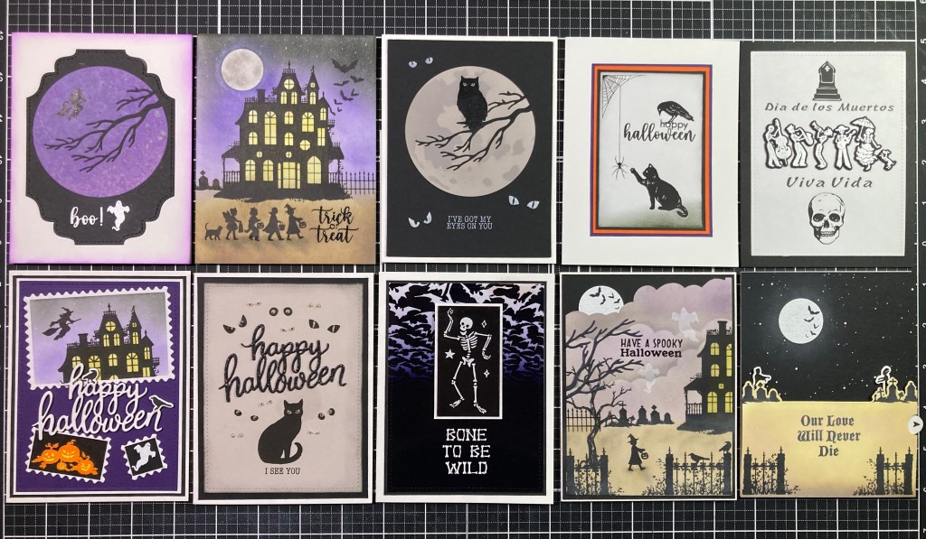
Happy Halloween indeed!! That wraps up all ten cards I created with the Hero Studio Card Kit of the Month for August of 2025. All the cards are definitely showing up for the Halloween theme this month… I don’t generally give out Halloween cards but this batch might just reorient my thinking!

A good assortment of cards this month with FOUR (count ’em 4!) interactive cards, three of which light up, we’ve got a good pun this month, and even a double entendre…! I actually used every single stamp in this Kit, all of the Victorian Frame dies, and most of the coordinating dies, both of the Pear Blossom lights and some of the card stocks. I even have some of the two-way mirror left to play with! I really like the Katrina stamps, and the large pumpkin / Jack-O-Lantern stamps, and the Victorian Frame dies should prove very useful! Let me know which cards are your favorites!
As usual, if you’d like to get this kit for yourself, you need to Subscribe to the Hero Studio Card Kit of the Month by August 27th. If you do go shopping at Hero Arts, please use my links listed below… I make a small commission from whatever you buy (at no cost to you) and that helps support this page and keeps a little inspiration coming your way!
Hero Studio Card Kit of the Month Subscription: https://www.kqzyfj.com/click-101337132-16959232?url=https%3A%2F%2Fheroarts.com%2Fproducts%2Fhero-studio-card-kit
Hero Studio Monthly Subscriptions: https://www.tkqlhce.com/click-101337132-16959232
Hero Arts: https://www.jdoqocy.com/click-101337132-16957493
Thank you for sharing your time with me today… If you enjoyed this post please click the “Like” star at the bottom of this post, and if you wish to be notified of new blog posts click the Follow Me button at the top of this page. Please, take a few moments to Like Me, List Me, Pin me, Post Me, Share this post with all your crafty friends, and remember… Don’t run with scissors!! As always, I send you and yours Love and Light and Happy Crafting!
DISCLOSURE: This site contains some affiliate links to products. I may receive a commission for purchases made through these links (at no cost to you). As an Amazon Associate I earn from qualifying purchases. Thank you!


