10 Cards 1 Kit • Hero Studio • Card Kit of the Month • April 2025

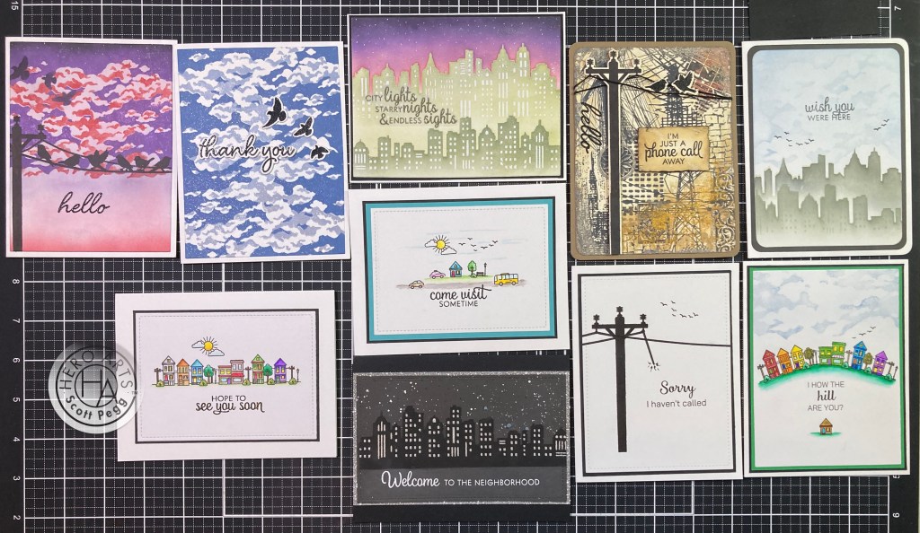
Hello folks! Scott here with my 10 Cards 1 Kit post featuring the Hero Studio Card Kit of the Month for April 2025. This month is “Tranquil Terrarium” month – this kit is perfect for nature lovers and those seeking a peaceful, botanical touch for their crafts… and you can build your own serene terrarium with the detailed stamps and dies in the Card Kit.

April 2025 Card Kit contains:

Terrarium Clear Stamp Set, 6″ x 8″

16 Terrarium Coordinating Dies

20 Terrarium Fancy Dies

Clear Hero Enamel Dots

3 Clear Card Panels, 4.25″ x 5.5″

9 Sheets of Cardstock, 5.5″ x 8.5″ Anchor, Fog, Truffle, Fawn, Alabaster, Fern, Rainforest, Peridot, Poppy

This unique kit looks like fun! Whether you want to do shaker cards or just create some plant-forward vignettes, this Card Kit certainly gives us a lot of opportunity for coloring!

I was looking forward to coloring theses stamps so I began by stamping all the stamps (with VersaMark Onyx Black ink) on some Bristol Smooth Card Stock to color with my Zig Clean Color Real Brush Markers, and stamped another batch on some Stonehenge White card stock for coloring with my colored pencils.

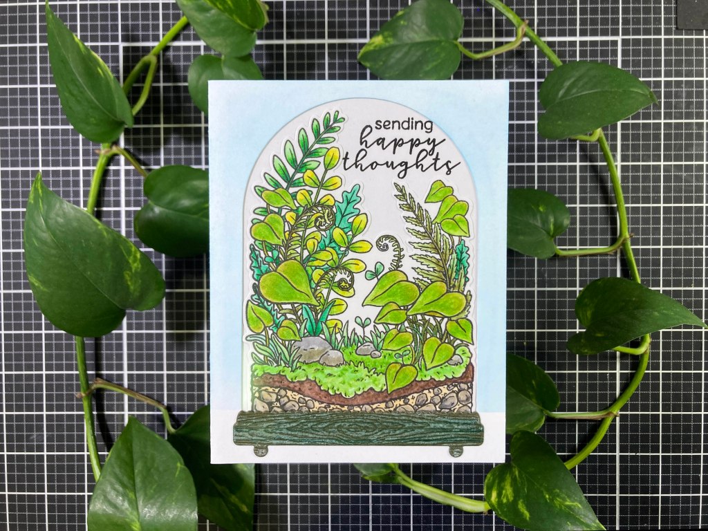
Of course, I began with the big terrarium stamp – LOTS of details on this stamp, but if you take it plant by plant, it’s fairly easy to differentiate all the flora from each other! On the front of an A2 White card base, I die-cut the domed opening and lightly blended HA Splash Reactive ink around the sides and top. I die-cut the colored stamp and glued it in place on an A2 panel of White card stock. I stamped the sentiment with VersaFine ink and embossed it with Clear Embossing powder. Then I glued one of the clear acetate panels on top and glued those to the back of the die cut card base centering the stamp in the arched opening. (I did trim the panel to fit.)

I die-cut the terrarium base from a scrap of wood-grained Dark Green card stock (from the MMH September 2019 Kit) and highlighted the texture with a little white crayon before gluing it to the base. That’s a bit of a tight fit to get everything to fit on an A2 card… I toyed with adding some of the other smaller images to the terrarium, but I don’t much care for the white borders the coordinating dies leave (and trying to hide them – or worse, cut them away) and I thought a lot of the individual images were a little out of scale for a terrarium of this size. Still… an absolutely adorable (and verdant!) little terrarium!

I wanted to use the other images in the stamp set, so I did go ahead and color all the smaller images with my Zig Markers and dutifully die-cut them out. Of course everyone’s going to put the frog on the tree stump, but I was more interested in the crack of the stump and what might be growing out of that!

I decided to use the terrarium stamp for some background, so I stamped that on a panel of White card stock with some Hero Arts Fog Reactive ink, and did some soft blending on the bottom of the panel with the same ink. When I glue a couple of die cut images together, I like to trim away the white border only where the images overlap – I trimmed the border away from the plant only where it sits on top of the stump, and I trimmed away the border on the rocks where they are in front of the mushrooms – that gives me a seamless coupling without having to fussy-cut the whole image. I cut a small slit in the trunk to “plant” the Pothos and glued the shrooms to the back of the rocks.

I die-cut the stamped panel with a 3.25″ x 4.5″ Lawn Fawn Stitched Rectangle die and added a thin Green mat behind that and glued them to a White card base. I stamped the sentiment with HA Apple Green Reactive ink and embossed that with Clear Embossing powder. I arranged the images on top and glued them directly to the card front. I fussy-cut the single Pothos leaf and added that to the plant with some foam tape for some added dimension, and colored in the mushroom dots with a Sparkle Gel pen. The single leaf actually adds a great amount of depth, and I love the plant growing out of the trunk.

That leaves me with the large moss-covered rocks, the frog and the small mushrooms… Frogs sit on rocks!!

I glued the frog to the rocks (I just cut away the small seedlings on top of the rocks) and trimming the white border on the frog where he overlaps with the rock – almost looks like both pieces were die-cut as one! I die-cut a scrap of White card stock with a 2.75″ x 4″ LFSRdie, and ink blended some clouds across the top with a MFT Mini Cloud Edges stencil and Splash Reactive ink. I stamped the sentiment with VersaFine ink and embossed it with Clear embossing powder. Then I added a thin black mat and a thicker Green mat before gluing both to a White card base. I added the frog and rocks using foam tape, and added a couple of Clear Hero Enamel Dots to the leaf… one drop is precariously perched on the tip of the leaf ready to roll off… I do love that frog!! I wish there were a few more critters in this kit!

Lets turn to my Prismacolor colored pencils, and the images stamped on the Stonehenge White card stock…

A little less intense coloring than the Zig Markers afford, but every bit as verdant… I think I actually have more greens in my colored pencils than I do in my Zig Markers! I also used Gamsol and a blending stump (tortillion) to help blend the colored pencils… I forget how well Gamsol works! I die-cut the colored terrarium and added some light blue to the white spaces to help it blend into the background. The background Dome is actually the one I cut from our first card – it already had the Splash Reactive ink blend around the edges. I stamped the sentiment with VersaFine Onyx Black ink on a scrap of White card stock ink-blended with more Splash ink, and die-cut it with the matching die.

I die-cut the terrarium base from some Black woodgrain card stock (again from the MMH September 2019 kit) and trimmed off the top (scalloped) layer – that’s a little simpler, and it takes up less room as well! I glued the colored stamp to the Dome background, and the base to the bottom and glued them all to the front of a White card base. I added the sentiment with foam tape (that is kind of a wacky sentiment!) and (instead of acetate) I added three graduated sized Clear Dots to the top edge of the dome – a suggestion of glass (or moisture) without using up the acetate sheets. I like this coloring so much, I didn’t even think about adding any of the smaller images… looks like a pretty busy terrarium as is!

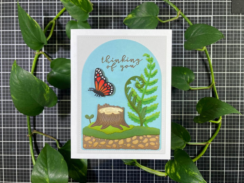
I couldn’t avoid putting that frog on the tree stump, but I was much happier using some fussy-cut masking to stamp this vignette instead of having to resort to the matching dies.

First I stamped the frog on a panel of Stonehenge White card stock, and stamped the same on a piece of masking paper and fussy-cut it out. I covered the frog with the masking and stamped the tree stump (along with another on more masking paper). I fuss-cut the stump mask and placed it over the stamped tree stump. Then it was a simple matter of stamping the Pothos plant and the mushrooms – remove the two masks and VIOLA! A sweet little vignette! I colored everything with Prismacolor colored pencils and used Gamsol for blending – lots of shades of green here!

I dug around in my stash for this sentiment (HA Many Everyday Messages stamp set) and stamped that in VersaFine ink and embossed it with Clear Embossing powder. I die-cut the panel with a SSS Modern Postage Stamp Rectangle and glued it to a 4.75″ x 3.5″ Peridot mask (from the kit) and then down to a White card base. The vignette seemed a little stark against the pure White card stock so I reached for my Pebbles Chalk Palette and blended a soft green haze around the scene – that anchors everything quite nicely! That frog really looks like he’s missing someone!

That covers all the image stamps from our stamp set (a couple more sentiments to use yet) but time to dive into the Terrarium Fancy Dies. Personally, I’d rather color than die-cut – I do get a little anxious about coloring or shading die-cuts… I just don’t think I’m very good at that… but I went ahead and die-cut all the Fancy dies and glued the layering pieces together.

As far a die-cuts go, I’m always at odds over whether to cut them from White card stock and color the shapes, or color white card stock first and then die-cut the shapes or die-cut from colored card stock and add shading. Since we have so much colored card stock in this kit I decided on the latter technique. And, yes, the lighter stones on the darker soil are paper pieced on top!

On the large fern I actually started with my Ohuhu Alcohol markers… not as perfect of a blend as I might have wanted, but serviceable. For the rest of the greenery and the stump I ink blended Green Apple and Vintage Photo Distress Oxide ink on them with blending brushes or foam. I do like that the rocks (because they are glued on top) catch the ink blending perfectly! Lastly, I die-cut the Dome from some Hero Hues Mist card stock

I liked that the large fern seemed very happy on the right side of the Dome background so I arranged everything around that and stamped the sentiment using Vintage Photo Distress Oxide ink and embossed that with Clear Embossing powder. For the butterfly, I took a small paintbrush (very small!) and some White Gouache and painted in the dots on the edges. Oh, baby!! That certainly brought that butterfly to life! I also blended in some Orange Chalk pastels close to the body and just wiped the excess off of the black – that’s a nice subtle blend! I glued everything together and down to the Dome die cut and added a couple pieces of scrap card stock behind the top of the stump to keep it level. I mounted the butterfly with foam tape and decided to add a kind of mat behind the Dome – I die-cut a piece of the Fog card stock from the kit with a 3.75″ x 5″ LFSRdie and glued that to a White card base and then glued the Dome with assembled die cuts on top. Love that butterfly and the clean and simple graphic nature of the die cuts. Not necessarily a terrarium…!

After fussing with painting in the white dots on the butterfly I figured there had to be a better way, so I die-cut the butterfly background from Fog card stock (in the kit), layered that with the Black detail die-cut and marked where the dots were. Then it was pretty simple to color in the rest of the wings and the body with my Alcohol markers and just leave the edge white. I think that worked extremely well and it was pretty simple to boot!

This stamps and dies in this kit are obviously intended for Portrait oriented cards… I’ve got to mix it up a little and try to expand the horizons of this kit with a Landscape oriented card

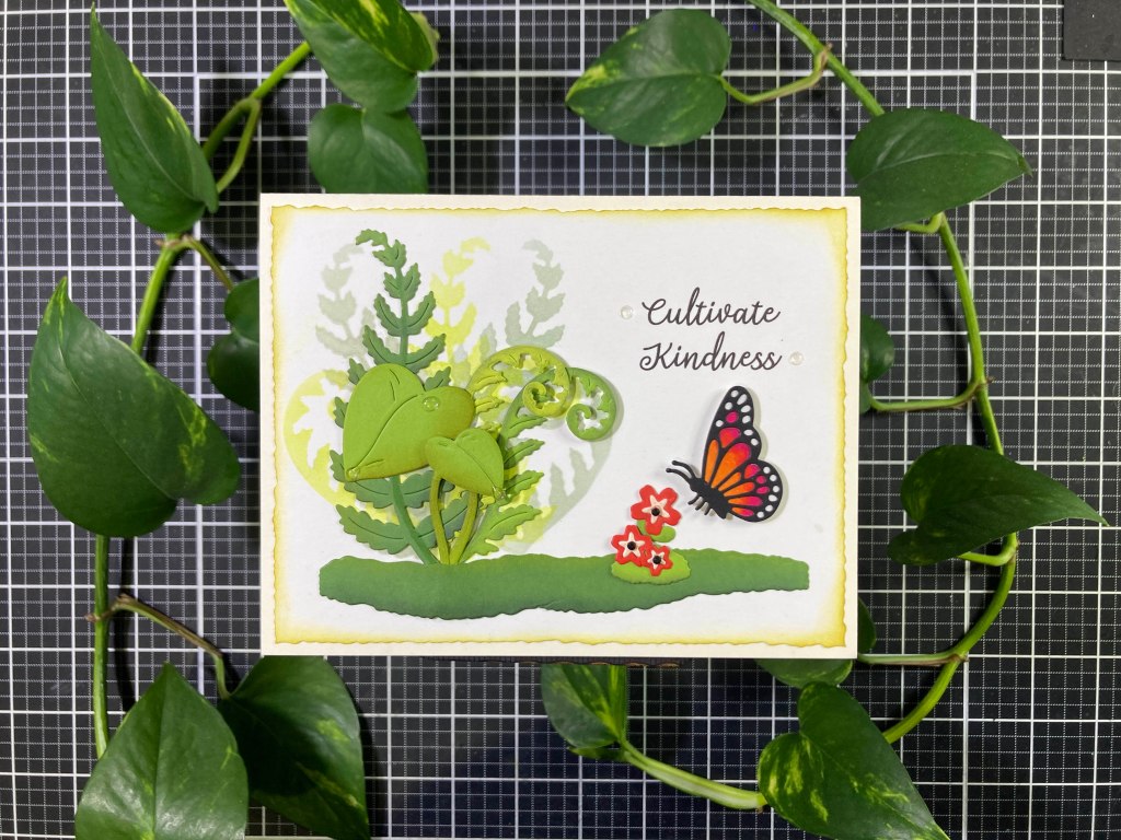
I did some partial die-cutting to extend our ground cover to 4.5″ long – perfect to anchor our landscape arrangement. I also realized that the die-cut negatives from the Fancy Dies would make great stencils! On an A2 panel of White card stock, I stenciled in the two ferns a few times on the left with HA Fog and Key Lime Fizz Reactive inks – in a nice little grouping that will fill in behind our die cuts perfectly! I ink blended Vintage Photo on all the greenery die cuts for a little touch of shading. I decided on an arrangement and turned to my printer for this sentiment. I used my Silhouette software and the Dream State Font to print this sentiment on the panel.

I trimmed the panel to 4″ x 5.25″ with my (NEW!) Tim Holtz Deckle Guillotine paper cutter (I do love a deckle edge) and lightly ink blended some Forest Moss Distress Oxide ink around the edges. I glued the printed and stenciled panel to a White A2 card base, and started gluing down the die cuts – the small Pothos leaf and the ends of the Fiddlefern dies are mounted with foam tape – as well as the butterfly! A few Clear Dots to highlight the sentiment and I used the HA Spring Enamel Dots (from the MMH April ’22 Kit) on the big leaves – there are actual drop shaped and oval dots in that pack. Finally I colored some tiny gems black (with an alcohol marker) to use as flower centers. And a lovely sentiment!

Beyond the butterfly dies, I think my favorite dies are the Mushroom dies – I love that they come in two pieces!

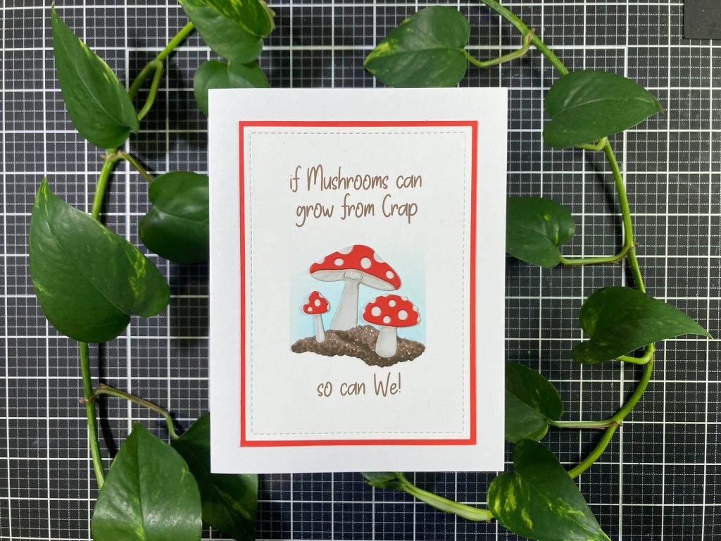
This is a unique encouragement card! And a good reminder for all of us! I die-cut the largest mossy groundcover die from the Truffle card stock in the kit (how appropriate!) and colored it with my Ohuhu Alcohol markers. I do find that coloring die-cuts with alcohol markers usually works better for me when I stipple in assorted colors – less of a blending and more of a texturing with colors. I also did some light blending on the underside of the mushrooms with my Pebbles Chalk Palette. The die cut groundcover measures right at 2″ across, so I masked out a 2″ square in the center of an A2 card panel and ink blended some Splash Reactive ink inside that square to ground our image.

I used my Silhouette Software and the Take Charge Font to print this sentiment (in Brown) around the Splash square. Then I die-cut the panel with a 3.25″ x 4.5″ LFSRdie and added a thin mat of the Poppy card stock – I want that to match the mushrooms! I glued that to an A2 White card base and glued the die cuts in place. I did add scraps of card stock behind the tops of the front two mushrooms to keep them level. You know, some mushrooms are actually cultivated on dung and most all mushrooms grow from some form of rotting organic decay… Crap is a nice way of saying that! And if mushrooms can flourish in that kind of an environment, then I think we can too! (And since this is a printed sentiment, you could also easily swap out the “We” for “You”.)

I still have the die cut rocks and some leaves along with the die cut mushrooms from the stamp set..

I went ahead and fussy-cut the white border from the mushrooms – a little tedious, but worth it! I arranged those with two rocks, the medium groundcover and two leaves into this pleasing arrangement. I masked off a 2.25″ x 3.5″ area in the center of an A2 White card panel and ink blended Green Apple, Lemon Drop and Splash Reactive inks for a nice ombre background. I die-cut that panel with a 2.75″ x 4″ LFSRdie and added a thin black mat behind before gluing that to the front of an A2 White card base.

I did the blending on the die-cuts with my Pebbles Chalk Palette – I love the shading on the leaves! That may be my favorite way to add some simple shading to die cuts! I stamped the sentiment (last one in the stamp set!) with VersaFine Onyx Black ink and embossed that with Clear Embossing powder. I glued the die cuts and mushrooms in place and used a touch of foam tape behind the smaller leaf in front. I love that the leaves seem to be protecting the mushrooms – or at least shading them… that gives some great context for a Thank You card!

At this point, I have used every stamp in the Stamp set and every Fancy die in the kit… except for the heart..!

Now I’m feeling back to form with this terrific little pun! I still had the frog stamped on some Stonehenge White card stock so I colored him up with my colored pencils and fussy-cut him out (getting rid of the leaf but keeping the stem). The frog fits perfectly on top of the die cut rock. I was going to stamp and die-cut the heart but realized the die cut alone makes for a perfect heart, so I die-cut the heart from the Poppy card stock in the kit. I glued the frog to the rock and the heart to the stem.

I die-cut a scrap of white card stock with a 1.5″ x 2″ apex.) Spellbinders Deckle Rectangles die and ink blended Forest Moss Distress Oxide ink around the edges. I used my Silhouette software and the Footlights MT Light font to print this sentiment on a White card panel and die-cut that with a 2.75″ x 4″ LFSRdie. I added a thin Dark Green mat behind that before gluing both to the front of an A2 White card base. I added the deckle rectangle with foam tape and glued the images in place – with a scrap of card stock behind the frog and a touch of foam tape behind the heart. A couple of Clear Dots highlight the sentiment and a clear Heart Dot (from the Spring Enamel Dots) right in the middle of the heart. I do love that frog stamp, and this is a terrific lovingly pun-y sentiment!

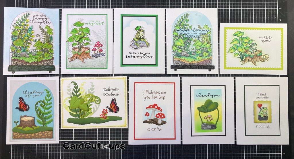
And that covers my 10 cards for the month I really had a good time working with this kit… I think the terrarium concept is fun and unique, and the stamps and dies are detailed and quite adorable. I really like that the frog stamp is more realistic than cartoony – he actually looks a little grumpy! I’m always trying to create cards that go a little beyond what the design team shows us and that hopefully gives you some new ideas about using these supplies. I did manage to use all the stamps and Fancy dies on these 10 cards! Let me know which ones are your favorites!

My only reservation about this kit is that the Stamps and Fancy Dies are very similar – tree stump stamp… tree stump die cut… mushroom stamp… mushroom die cut… pothos stamps… pothos die cuts… you get the idea… not to mention that you need to use the Dome and Base Fancy Dies to make a stamped terrarium… And I did wish for more critters than just a frog and a butterfly. Those are minor quibbles with what I found to be a delightful kit. Maybe HA is just trying to appeal to both stampers and die-cutters this month!

You can pick up this April ’25 Card Kit of the Month by subscribing to the Hero Studio Card Kit of the Month through April 27th. If there are any leftovers after then, they will become available beginning the 20th of May.

I guess that wraps things up this month! If you enjoyed this post and these cards  please click on the “Like” star at the bottom of this post (and the “Follow Me” link at the top of this page)! Remember to Like Me, List Me, Pin Me, Post Me, Share me with all your crafty friends…! Remember… don’t run with scissors…! And as always, I send you and yours love and Light and Happy Crafting!!!

10 Cards 1 Kit • Hero Studio Card Kit of the Month • October 2024

Hello Folks! Scott here with our next batch of cards created with the new Hero Studio Card Kit of the Month for October 2024. This month we’re celebrating the holidays with a Christmas themed kit – It’s never too early to start working on our Holiday Cards!

• Clear Stamp Set, 6″ x 8″
• 16 Coordinating Dies
• Hole Punch Die
• Tree Window Die
• Holiday Treats Words Cling Stamp, 6″ x 6″
• Washi Sticker Pack, 22 pieces
• Embossing & Watermark Ink Cube
• 5 Sheets Each of Kraft, White & Red Cardstock, 5.5″ x 8.5″
• Gold Embossing Powder, 0.5 oz
• White Embossing Powder, 0.5 oz
• Peppermint Clay Embellishments

Truly a great batch of goodies this month, but what stands out to me is the stamp set featuring a lot of images that we can actually color! Since the launch of the Hero Studio line in June , all of our Card Kits have mainly featured silhouette stamps. Finally we have a chance to do some coloring! I stamped out three sets of our 12 images using VersaFine Onyx Black ink, and colored everything using three different mediums…!

I stamped this on 80# Neenah Classic Crest Solar White card stock and reached for my Ohuhu Alcohol markers for coloring. The Neenah card stock is my preferred paper for alcohol markers. This is a shot of the markers I used to color this first set of images.

I am getting more used to these alcohol markers, and they certainly make quick work of coloring these images, but for the first time I’m realizing that most of these images – except for the tree – are fairly small… I could have spent more time on the tree background, but I kind of liked the subtle texture of the markers overlapping. I did use a white gel pen to color in the snowflakes image and a Gold uni-ball Signo gel pen for the garland on the tree.

For the next round I stamped everything on Bristol Smooth card stock so I could use my Zig Clean Color Real Brush markers. Bristol Smooth card stock is my absolutely required paper for coloring with Zig watercolor markers (or any brand of watercolor markers)!

The Zig markers take a little more time, but I’m very used to them and they give me great control. I’m especially pleased with the ornament on the top right! This time I used a Silver uni-ball Signo gel pen for the garland on the tree AND the stars on the background.

I stamped this set on Stonehenge White card stock and used my old Prismacolor colored pencils for the coloring. The Stonehenge White is a lovely cotton paper that works especially well with colored pencils.

The little bits of texture on that card stock really grabs hold of the colored pencils and adds some perfect texture – especially to the cookies! I really like the big tree here, and I didn’t color the background figuring I’d use the Tree Window Die on this version. I did go back to the Gold gel pen for the garland on the tree. Though these are all pretty small images, a sharp point on a colored pencil gives you great results!

I found this whole coloring process very therapeutic, and now I have more than enough images to create my 10 cards with. Since I colored them first, I die-cut all the images from the alcohol marker coloring (on top) first. Of course I reached for the big tree to start with!

Now the info card in the kit has a number of different arrangements you can create with these tiled images… but there must be hundreds of combinations available. My regimented, symmetrical, graphic nature led me to this arrangement featuring the big tree right in the center. All the images die-cut beautifully with their matching dies.

I stamped the sentiment using the Embossing and Watermark ink and the Gold Embossing powder on a panel of Dark Blue Pearlescent card stock die-cut to 3.75″ x 5″ with a Lawn Fawn Stitched Rectangle die. That card stock is a really close match to the background of the tree. I glued that to an A2 White card base and added the die cut images with thin foam tape. A couple of Gold Metallic dots adds a little bling and matches the garland on the tree. Straight to the point!

Now I’m kind of obsessing over using up all twelve images from this first round of coloring…!

I die-cut a panel of the Red card stock included in the kit to 3.75″ x 5″ with a LFSRdie, added a thin black mat behind that, and glued both to a White card base. I stamped the sentiment using the Embossing and Watermark ink and White Embossing powder. I do like the big, classic font for these sentiments!

I attached the images to the card front with thin foam tape – thinking that this is a kind of a tree-shaped arrangement..! I added the Peppermint Clay embellishments at the corners, and stamped the extra sentiment on the inside of the card. Again… no beating around the bush here..!

Of course I am working my way through all the sentiments in the stamp set as well as all the images… I guess there’s only one thing to do here…!

A nice little vignette giving perfect context to this sentiment! I used the largest open-frame die-cut in the kit, and with some partial die-cutting abbreviated that die to only 3″ long using some Hero Hues Arctic card stock. I stamped the sentiment on that panel with VersaFine Onyx Black ink and embossed it with Clear embossing powder. I added a thin dark blue mat behind the stamped panel and glued both to a White A2 card base.

I added the die cut colored tree plaque with thin foam tape and grabbed the small Snowflake Sequins (from the My Monthly Hero November 2022 kit) to add a spray of silver snowflakes across the front of this card. Mmmmm, Chilly!

For some unconscious reason, while I was coloring these 12 images, I added grey backgrounds behind the cookie stamps… I did add a bit of a halo around the presents, but, other than the tree and the cookies, didn’t color any other backgrounds. After I die cut the cookies, all of a sudden, those backgrounds started looking like cookie sheets!

To begin with, I added thin Black mats behind all the cookie die cuts. I figured out my arrangement, and, using a Hero Arts Rectangle Infinity die, I cut a panel of White card stock to 3.5″ x 4.75″. I printed the second half of the sentiment at the bottom of that panel using my Silhouette software and the Dream State font. Then I stamped the large part of the sentiment (masking off the “to be jolly”) with Onyx Black ink and embossed that with Clear embossing powder. Lastly, I fussy-cut some 1/4″ notches into the four corners and glued that panel to a 3.75″ x 5″ Black mat, and glued both of those to a White card base.

I glued the two left “cookie sheets” directly to the card front and mounted the gingerbread man with some thin foam tape. I did stamp the “Happy Holidays” sentiment on the inside of the card and added four Peppermint Clay embellishments to the four corners. I couldn’t resist adulterating this sentiment stamp for this yummy cookie card! I promise I’ll use that sentiment in its entirety before we’re done!

Now I’ve used all twelve images in our stamp set! That was quick! Let me see what our Washi Sticker Pack inspires..!

There’s that sentiment in all its glory! I did like the Gingerbread House sheet of Washi Stickers – it seems to have the most similar items represented – more cookies and treats! I cut that sheet to 4″ x 5.25″ and added it to the front of an A2 Kraft card base (from the kit). I ink blended some Vintage Photo Distress Oxide ink around the edges, helping to blend the Washi Sticker into the card stock. I stuck the Gingerbread Man Washi Sticker to a scrap of White card stock and fussy cut him out. I added him to the card front with foam tape. I thought we need a little more color on this card, so I fussy cut a couple of the Ivy leaves and Berries from their Washi Sticker, and added them to the top right corner.

I stamped the sentiment on a scrap of Ivory card stock with Onyx Black ink, embossed that with Clear Embossing powder, die-cut it out with the matching die, and ink blended a little on the edges. I added that to the card front with foam tape. I die-cut some Ivory card stock with a LFSRdie and ink blended Vintage Photo around the edges. I stamped the “fa las” with Onyx Black ink and couldn’t resist finishing the phrase with a few more “las” – just masked off the “fa” for the second line. That feels complete!

Let’s move on to the Zig marker colored images now… and I haven’t used the Holiday Treats Words Cling Stamp yet! And I think we are due for a little pun!

About the only way you can use the stamps in this set without their “frames” is to fussy-cut them out. That’s what I did to the Zig-colored cookie images. I also colored their cut edges with a black marker. I stamped the Cling stamp on a piece of the Kraft card stock with Unicorn White ink, let that dry, then shifted the card stock half a millimeter down and to the left, and stamped again with Vintage Photo Distress Oxide ink. That adds a lot of interest and dimension to the background stamp. It’s subtle, but it definitely reads! Once dry, I die-cut the background to 3.75″ x 5″ with a LFSRdie and ink blended Vintage Photo around the edges before gluing that to a thin Dark Brown mat and down to a White card base. I printed this pun-y sentiment on a piece of the Kraft card stock using my Silhouette software and the Helvetica Neue font. I die-cut that with a random stitched square die from my stash (1 and 3/8″) and blended more Vintage Photo ink on the edges before matting that on a thin White mat.

The gingerbread house with trees is glued flat to the card front and everything else is mounted with foam tape. I did add the “Happy Holidays” sentiment on the inside of the card using the Vintage Photo ink and a little clear enamel dot. The whole card feels like Gingerbread!

The Cling “Treats Words” stamp is pretty specific for a background. As long as you’re featuring treats, it works perfectly. I do imagine it could work in a few other instances… I like making a habit of creating holiday Thank You cards too!

While I was fussy-cutting the cookies out, I went ahead and cut out the gifts as well (and colored their edges black). I stamped the Cling stamp on a panel of White card stock using Fruit Punch and Green Apple Reactive inks for a holiday stripe effect and splattered both inks (watered down) on top for a little more texture and softening. When that dried, I die-cut it to 3.75″ x 5″ with a LFSRdie and added a thin Red mat and a thin Black mat before gluing it all down to a White card base.

We have seven open-frame dies in this kit to cut out the 12 images – the Snowy Tree die and the Candy Cane die actually fit together for a nice matted pair. I believe the Candy Cane die is cut from Black and the Snowy Tree die is cut from White and glued together before being glued to the card front. I stamped the sentiment (from the MMH January 2020 kit) on a scrap of White card stock with Fruit Punch ink and embossed it with clear embossing powder. I trimmed that to size with a Banner die and matted that to a thin Black mat. I mounted the gifts and the sentiment with foam tape. Somehow the coloring on the background stamp takes the focus away from the specific words… at least a little bit! Seems we always get something rather special over the holidays that usually deserves a nice Thank you card!

That Tree stamp in our set seems to be my favorite… big enough to actually have some fun coloring it!

We’re still die-cutting the Zig marker colored images. To make the large frame around our tree die cut, I took a scrap of White card stock and covered it with some old Altenew Galaxy Washi Tape and trimmed it down to 2.25″ x 4.25″ and added a thin black mat behind. I stamped the sentiment on Pitch Black card stock using the Embossing and Watermark ink and embossed that with the White embossing powder before die-cutting it out with the matching die. I glued the matted panel flat to the card front, and added the Tree and sentiment using foam tape. This tree has a good amount of shine from the Silver Gel pen on the garland and the stars, and I really like the die cut sentiment on the White card.

I believe that covers all the large sentiments in our stamp set, but I haven’t used the Tree Window die yet…

This is my colored pencil version of the tree. I die cut it with the full open frame die to begin with, then used the Tree Window die to cut out the background. If done properly, that would leave a thin edge of card stock around the edge of the cut out – unfortunately, I didn’t get a perfect die cut, so I just trimmed away the thin edges of the die cut leaving me with just the tree and the snowbanks. I took the Window die and a panel of White card stock and die-cut the Window in the upper center of the panel. I trimmed the panel to 3.75″ x 5″ with a LFSRdie and glued the colored tree on top. Since the edges of my die cut tree weren’t the prettiest, I took some peel-off stickers from my stash to make a frame around the opening – thin Green Glitter peel-offs first and then a thick matte Gold around that. That cleaned up the edges nicely!

I stamped the sentiment at the bottom of the panel with the Embossing ink and embossed it with the Gold embossing powder – matches the Gold peel-off frame quite well! I took another panel of White card stock die-cut to 3.75″ x 5″ with a LFSRdie and covered that with more Altenew Galaxy Washi tape. I covered the back of the tree panel with foam tape and mounted that to the galaxy background. It would be quite easy to add some acetate behind the tree and turn this into a shaker card, but I was very pleased with the dimension alone. I glued the window panel to a White card base and called it done… the Gold tree garland, the Gold peel-off frame and embossed sentiment all match extremely well and give this card a certain royal luster perfect for the holidays!

I admit this was one of my first “out-of-the-box” ideas for this kit… and my coloring of the purple ornament clinched it!

This card makes me smile! I did try laying this out on a regular A2 sized card, but decided to go with a 4Bar card size – commonly used for Invitations and Thank You cards – it is 3.5″ wide by 4 and 7/8″ tall. I added a black mat behind the die cut ornament, and printed this sentiment using my Silhouette software and the Times New Roman font. Though I was going for an extremely minimal card here, I thought just the ornament and sentiment were a little lonely on this card front, so I decided to add some die-cut stitching on the sides. I trimmed the printed panel to 3.5″ x 4 and 7/8″ and used one of the Ellen Hutson Stitching Lines dies on the two long sides. Just the right touch! I glued the panel to a White card base and added the matted ornament with foam tape. You know how much I like using song lyrics for my sentiments, and I think this diminutive card with a slightly pun-y sentiment is absolutely adorable!

It seemed Hero Arts was making something of a deal about the included Hole Punch Die – probably one of the smallest dies I have ever seen! I gather that this implies that you can add a hole to any of these images and instantly turn them into a tag – the included “to:” and “from:” sentiments further add to this notion. Okay… I can do tags…!

Of course I hadn’t used the Tree Window Die all alone yet… a simple and very effective use of that die – millions of possible combinations! But the Hole Punch Die seemed terrifically small for this standard 3″ x 5.5″ tag. I took two white tags and die-cut the tree into one and stamped the sentiments using Blue Hawaii Reactive ink and embossed those with Clear embossing powder.

I did a simple alcohol marker gradient on the second tag followed by some stars spattered with Dr. Ph. Martins bleed-proof white watercolor, and then glued the two tags together. I made the hole reinforcement with a scrap of white card stock colored with the darkest alcohol marker and punched out with a 1/2″ hole punch and a regular hole punch for the inside. I glued that on top of the hole and added a little Blue and White bakers twine for attaching. This simple use of the window die would work as beautifully on a card as on a tag!

Thus I felt obliged to actually make a tag using the included Hole Punch Die. I happened to have an extra Black and White mat (in reverse) from card number seven so I die-cut the colored pencil wreath, used the Hole Punch die on the black and white mat, and glued the wreath on top.

That only left me to stamp the sentiments on the back with Onyx Black ink, and add some Red and White bakers twine through the hole. Perfect little gift tag. And, YES, a lot of our stamped images would make great gift tags!

With the tags, I have now used every single stamp in this stamp set! WOO-HOO! I do have a good amount of colored images left over and ready to go, but I do feel like I have had my coloring mojo satisfied at least for a little while!

This is a lively and colorful batch of cards! I did use a bit of everything in this kit including the Cling stamp, a few of the Washi Stickers, embossing powders, embellishments and card stocks. I did feel a little constrained by the nature of these stamps – the framing on all the images is almost impossible to mask out, so you’re kind of left with just a variety of rectangles to create your designs with. Unless you want to start fussy-cutting everything!

Thank heavens for that truly versatile Tree Window Die! Though of course, that is still a rectangular shape..! Perhaps I was blinded to the versatility of this kit by my simple need to color! (and my rigidly symmetrical, graphic design bent!) Still… I enjoyed creating these cards (and tags!) very much!

This kit is still available at Hero Arts! If you’re looking for some holiday inspiration this year, now is the time to grab a kit for yourself before they all sell out! If you do go shopping at Hero Arts, please use my links listed below! Doing so helps support this page and all of CardCut-ups at no cost to you! THANKS!!!

Hero Studio Card Kit of the Month October 2024: https://heroarts.com/products/ck1024-october-card-kit-of-the-month?sca_ref=6639489.ubrhdU2VDFY73qx

Hero Arts: https://heroarts.com?sca_ref=6639489.ubrhdU2VDFY73qx

Thank you so very much for sharing some of your time with me today. It is appreciated more than you realize! Your encouragement and support really helps keep me motivated!! If you enjoyed this post, please click the LIKE Star at the bottom of this post, let me know which cards are your favorites, send me a comment or a question, and consider sharing this with all your friends on your Pinterest, FaceBook and Instagram pages. Remember… don’t run with scissors…! and, as always, I send you and yours Love and Light and Happy Crafting!

DISCLOSURE: This site contains some affiliate links to products. I may receive a commission for purchases made through these links (at no cost to you). Thank you!

10 Cards 1 Kit • Hero Studio • Card Kit of the Month • September 2024

Hello Folks! Scott here with my 10 cards inspired by the Hero Studio Card Kit of the Month for September 2024. It’s Halloween time with all sorts of unique items all ready for creating greeting cards for the coming spook-tacular! It’s been a few years since we got a Halloween themed kit from Hero Arts!

• Haunted Scenic Clear Stamp Set, 6” x 8”
• Animal Eyes Clear Stamp Set, 3″ x 4″ 
• 20 Coordinating Dies
• Moon Window Die
• White Pumpkins Decorative Tape, 1 inch x 10 yards
• Black Crows Decorative Tape, 1 inch x 10 yards
• 2 Sheets Halloween Hero Transfers (Rub-ons), 6″ x 8″
• Glow-in-the-Dark Lacquer Pen
• Unicorn Pigment Ink Cube
• 10 Sheets Black Watercolor Paper, 5.5″ x 8.5″

Lots of fun images this month! I thought I’d start out fairly simple and see what that Moon Window Die was all about.

Before I dove in to this new kit (silhouette stamps often work best with a good background) I did a couple of experiments with some Distress Oxide spray. I got a nice spotty coloring using Wilted Violet and Iced Spruce Distress Oxide spray on plain White card stock sprinkled with drops of water for more ‘craters’. That should work for a Moon! I die cut the Moon Window Die from the colored card stock and glued the Moon itself on a panel of the Black watercolor card stock cut out with a LDRS Fancy Rectangle die.

I stamped the witch on the moon with VersaFine Onyx Black ink and stamped the ghost and sentiment with Unicorn White pigment ink and embossed those with White embossing powder. I took a White A2 card base and did a little ink blending on the edges with Wilted Violet Distress Oxide ink. I glued the assemblage to the card front and we’ve got an simple evocative Halloween card. I like the black witch and the black branch…!

Time to tackle all those silhouette stamps. The “Haunted” House is a gloriously detailed stamp with tons of windows…

I stamped the house with VersaFine Onyx Black ink on a panel of White card stock a few times so it was nice and black and set it aside to dry. Since the black ink is so very black I thought I could ink blend over the top without altering the black too much. So… I stamped the house on a piece of masking paper and cut around the windows keeping both the negative and positive masks for inking. I put the negative mask (showing the windows) over the dried stamping and, using a blending foam, pounced Lemon Drop Reactive ink over all the windows. I removed that mask and added a simple circle mask for the moon, and then, when the Lemon Drop ink was dry, placed the positive mask over the windows and inked the background sky with Purple Galaxy and Licorice Black Reactive ink. Again, I used a blending foam for a little more control and the ability to pounce instead of rub.

Once the sky was dry I ink blended the ground with Frayed Burlap Distress Oxide ink. I stamped the fence on the right of the house and the gravestones on the left defining our horizon, then the bats in the sky and the trick-or-treaters in front with VersaFine Onyx Black ink. I stamped the sentiment with the same ink and embossed that with clear embossing powder. I added some shadows to the moon and the trick-or-treaters using my Pebbles Chalk Palette. For a final touch, I added some stars in the sky using a White gel pen. I glued the panel to the front of an A2 card base and called it done! These stamps are delightfully detailed, and I love this one-layer card – no die-cutting necessary! I think the shadows from the kids really sells this scene.

Lets go back to the Moon Window Die and actually use it as a window die…

I die-cut the Moon Window Die on a 4″ x 5.25″ piece of the Black watercolor paper, and cut a matching panel from some Grey card stock. I have an old Tim Holtz Moon Mask Stencil and centered the largest stencil behind the die cut moon and ink blended through that stencil with Concord & 9th Dove ink. That stencil is one of the easiest ways to make a quick effective moon – in 3 different sizes!

I lined up the layers to see where I should stamp the owl, and used VersaFine Onyx Black ink to stamp the owl on the moon – I also embossed the owl with Clear embossing powder. I stamped the eyes and the sentiment on the black panel using Unicorn White ink. I did try thinning out the Glow-in-the-Dark Lacquer pen to paint on the eyes, but anything less than full strength doesn’t give you hardly any glow. Lesson learned! I glued the two panels together and down to a White card base. I did stamp the “Happy Halloween” sentiment on the inside of the card with Onyx Black ink. Finally I took my Dr. Ph. Martins Bleed Proof White opaque watercolor and gave our owl a bright white highlight right in the center of its eyes. The owl looks like it’s perfectly perched on the branch and I love the random eyes in the darkness.

I took the Hero Transfer sheets out and lo, and behold, there are two different sets of rub-ons! One Black and one White! And both have completely different images!

The black rub-ons caught my eye – specifically the cat with its paw out – so I created a little vignette with the rub-ons and a stamped sentiment. On a 2.5″ x 3.75″ panel of White card stock I put the cobweb in the top left corner and used a Pigma Micron 02 pen to draw a line coming down from the web – I did use a t-square to make sure it was nice and straight and square to the panel. I added the spider at the end of the line and that showed me where to put the cat transfer. I stamped the sentiment with Onyx Black ink and added the crow perched on the sentiment.

I ink blended the edges of the white panel with Hickory Smoke Distress Oxide ink adding a little more under the cat to suggest a little grounding. I added a thin Black mat, a thin Orange mat and a thin Purple mat to the inked panel and glued all to an A2 White card base. Great little halloween vignette here… the cat is going after the spider, but the crow is standing by to go after the cat! Kind of a Hunter vs. Hunted card!

One of my favorite stamps in this set has to be the Skeleton Band – obviously a riff on the Dia de los Muertos holiday.

I couldn’t resist goin all in for this Mexican heritage greeting card. I stamped the musicians on a piece of Black card stock using Unicorn White ink and embossed them with White embossing powder. Beautifully detailed stamps again! For an added bonus, the matching die cuts all the musicians out individually! I die-cut two more blanks from Black card stock and glued them all together so I wouldn’t have to fuss with foam tape. Using a Lawn Fawn Stitched Rectangle die, I trimmed a panel of White card stock to 3.75″ x 5″ and, using my Silhouette Software, printed the sentiment using the Baoli TC font. I added the Skull and Gravestone rub-ons to the printed panel, and glued our musicians in place.

I glued that panel to a Black A2 card base, and I also printed the translation of “Viva Vida” on a panel of White card stock for the writing surface in the inside. I went back and forth a couple times over using “Viva la Vida” or just “Viva Vida” for this card. The first is a little more conversational, and the second is more declarative. I decided to forego the “la” mostly because of a small Mexican bodega in my Neighborhood that is called Viva Vida – Long Live Life! I considered decorating the skull rub-on with gems but decided to stick with the very appropriate black and white color scheme. Gotta love those stamps!

Maybe it’s because of the impending holidays, but I’ve been seeing a lot of “stamp” cards around lately… so…

I do have the SSS Modern Postage Stamp Rectangles die, so I die-cut the three smaller rectangles from some 80# Neenah Classic Crest White card stock. These dies don’t cut a frame, just the whole “stamp”, so I masked off a “frame” on the larger rectangle and stamped the upper portion of the house on that with the Onyx Black ink. I used my pre-cut masks to color in the windows and the sky just the same as card number two, and added the witch stamped in Onyx Black in the sky. For a final touch I added some stars with a White gel pen.

The pumpkins are stamped on some Yellow card stock using Creamsicle Reactive ink and embossed with Clear embossing powder. That makes it easy to color the background using a Black TomBow watercolor marker – wipes right off the embossing! I cut that to size (1 and 5/8″ by 15/16″) to fit on the medium Postage die cut. I cut a piece of card stock to a 3/4″ square, stamped the ghost on that with Unicorn White ink and embossed that with White embossing powder. I glued the ghost to the center of the small Postage die cut.

I was digging through some old MMH kits looking for some more sentiment options when I came across this die-cut sentiment from the MMH September 2019 Kit. I die-cut that twice from White card stock and twice from Black card stock and glued them all together for a chunky sentiment. I stamped the crows on a scrap of White card stock with Onyx Black ink and then die-cut them with their matching die. I added them both perched on the sentiment. The Dark Purple background is cut to 3.75″ x 5″ with a LFSRdie and matted to a thin White and Black mat and glued to a White card base. I arranged the “stamps” and the sentiment and glued them down to the front of the card.

I realize why there are so many “stamp” images and dies out there… a greeting card is generally mailed, therefore images of stamps are always appropriate! This is a great collage of images and the half-house is almost as good as the whole house! And I love those pumpkins with their “candle-lit” features!

After my glow-in-the-dark lacquer fail on card number three, I decided to create some lacquer “dots” to dry on a craft mat. I do this a lot with enamel dots – it helps avoid mess-ups directly on your card front – just pop the “dots” off of your craft mat and glue them directly to your card front.

I planned this whole card around that MMH Sept. ’19 die-cut sentiment cut once from Black Tie glitter paper and once from plain Black card stock and glued together. I die-cut a panel of plain Grey card stock to 3.75″ x 5″ with a LFSRdie, and stamped the cat (from the Animal Eyes stamp set) and all the eyes (and the sentiment) using Onyx Black ink. I added a little ink blending on the edges of that with Hickory Smoke Distress Oxide ink. I grabbed my dried glow-in-the-dark dots and cut some of them in half with a craft knife. Using a black alcohol marker, I added pupils to the glow-in-the-dark dots – for the cat-eyes on the upper right, I just cut slivers off the sides of a dot. Here we have some real glow-in-the-dark action! A quick charge under a bright light and the eyes glow nicely without having to be in the complete dark! You can even get the eyes looking in different directions depending on where you put the pupils. I love the scowl on the cat and even the eyes without the stamps work well especially when glowing!

There was one image on the White Transfer sheet (rub-ons) that caught my eye…

I cut out the skeleton along with the stars that were right next to him and rubbed them on to a scrap of Glossy Black card stock. It took a little extra rubbing to get the skeleton to adhere to this glossy card stock – the white print kept trying to separate from the clear adhesive layer. I was finally able to get everything to adhere to the glossy card stock and trimmed that to 1.5″ x 2+5/8″ and added a thin White mat behind. What to do for a background? I knew I would have to print this sentiment, so I figured I could match the Glossy Black card stock by printing on glossy photo paper.

I had this background of bats in my image files and used my Silhouette software to lay out the bats and sentiment using the Bones font. I printed that on a piece of photo paper and once it was dry, I trimmed that to 3.75″ x 5″ with a LFSRdie. I added a thin plain Black mat behind the background and glued them to an A2 White card base. I added the skeleton panel to the card front with foam tape. I did also stamp “Happy Halloween” on the inside with Onyx Black ink. There are lots of Halloween puns out there, but I don’t think I’ve ever used this pun! All the better when you can relate it to a song! Recorded by Steppenwolf in 1968, Born To Be Wild was famously featured in the 1969 movie Easy Rider. Perfect!

When I was trolling through my stash for sentiments, I came across this one from the MMH September 2020 kit. I thought trick-or-treating alone was a pretty scary prospect… especially in this neighborhood.

I stamped and colored this card just like card number two but used Grey card stock instead of White. I stamped the tree, gravestones, and house first using Onyx Black ink. When dry, I used my pre-cut mask to add Lemon Drop ink in the windows, and then used a My Favorite Things Mini Cloud Stencil and Hickory Smoke Distress Oxide ink (and some touches of Purple Galaxy Reactive ink) to add the clouds in the sky. I used Antique Linen Distress Oxide ink for the ground and blended in touches of Frayed Burlap ink for a little variety. When that was dry, I stamped the gate (with the crows) and the fence and our trick-or-treater. I did blend in a touch of SeaSalt Reactive ink at the base of the gate and house and gravestones to suggest a bit of a misty atmosphere, and added a bit of a shadow to our trick-or-treater with my Pebbles Chalk palette. I die-cut the inked and stamped panel with a 4″ x 5.25″ HA Rectangle Infinity die.

I stamped the moon on a scrap of Black card stock using Unicorn White ink and embossed that with some clear embossing powder. I fussy-cut the moon and was considering sliding it between the inked clouds when I realized you wouldn’t have clouds in front of AND behind the moon. I decided to fussy cut the top row of clouds and put the moon behind that. I cut more black card stock to 4+1/8″x5+3/8″ to fill in the night sky and provide a mat around the whole panel. I glued the black mat to a White card base and glued the card front on top being sure to add the Moon behind the clouds.

I stamped and embossed the sentiment as usual, and stamped the ghosts using Unicorn White ink. I didn’t emboss or over-stamp the ghosts leaving the ink to stay transparent… like ghosts! That tree stamp felt a little skimpy all by itself there so I grabbed the die-cut branches from card number one, colored them Black with an alcohol marker and glued them to the card front – effectively expanding the tree and helping to highlight the sentiment as well. SPOOKY!

Already at card number 10 and I haven’t used the Frankenstein Monster or Bride stamps… they do suggest movement…

It’s been a while since I’ve made a pull-tab magic slider card! I actually have a how-to for this mechanism on my 10C1K video over on YouTube (link at the bottom of this post). I also have instructions for two different magic slider cards on my 10C1K MMH video for July 2019 if you’d like to check those out as well.

I stamped the gravestones on the right and left sides of an A2 panel of White card stock about 2+3/8″ up from the bottom edge. I used the matching die to do some partial die-cutting on those (don’t cut the bottom edge) and connected the die cuts to each other in a straight line with my craft knife. I colored that panel with Antique Linen and Frayed Burlap Distress Oxide inks and then stamped the gate. The left gate is the full stamp. for the right gate I masked off and stamped the end pillar on the right, then shifted the left side of the stamp to complete the shortened gate. I printed the sentiment directly on the panel using my Silhouette software and the Blackmoor LET font.

I took an A2 panel of black card stock and stamped the moon in Unicorn White ink and embossed that with White embossing powder. Then I spattered in the stars with my Dr. Ph. Martin opaque White watercolor. Our monsters are stamped on White card stock with Onyx Black ink and die-cut with their matching dies. I stamped the arrow (MFT Interactive labels stamp set) and the sentiment (from the MMH September 2019 kit) on the pull-tab and assembled the whole card together. (see video!)

I think this interactive card was a great way to showcase those monster stamps and a perfectly spooky love sentiment. Happy Halloween indeed!

That wraps up all ten of my cards using the Hero Studio Card Kit of the Month for September 2024. Now, I’m not a huge fan of Halloween, and I rarely send out Halloween Cards, but I had a really great time creating these cards! I used all but the “happy fall” sentiment in the main stamp set, and all the eyes and a couple of the animals in the Animal Eyes stamp set. I used some of the White AND Black rub-ons, we’ve got two Moon Window die cards, three cards with that great Haunted House stamp, two bona fide scene cards. I didn’t get to the Decorative Tapes (nothing screams “graphic” in this batch of cards) but those will go right into my Washi tape collection. Looks like a fun Halloween this year!

This kit is still available at Hero Arts! If you’ve gotten bit by the Halloween bug and want to grab this kit for yourself, please use my links below. It really helps support CardCutups here on my website and on my YouTube channel as well – at no cost to you! Thank’s for all your continued support!

Hero Arts: https://heroarts.com?sca_ref=6639489.ubrhdU2VDFY73qx

Hero Studio Card Kit of the Month September 2024: https://heroarts.com/products/ck0924-september-card-kit-of-the-month?sca_ref=6639489.ubrhdU2VDFY73qx

If you enjoyed this post, please click the LIKE Star at the bottom of this post, send me a comment or a question, and consider sharing this with all your friends on your Pinterest, FaceBook and Instagram pages. Thank you so much for spending some of your time with me today… your encouragement and support keeps me motivated! Let me know which cards are your favorites… don’t run with scissors… and I send you and yours Love and Light and Happy Crafting!

DISCLOSURE: This site contains some affiliate links to products. I may receive a commission for purchases made through these links (at no cost to you). Thank you!

10 Cards 1 Kit • Hero Studio • June Card Kit of the Month

Hello Folks! Welcome to the launch of the NEW Hero Studio and their inaugural Card Kit of the Month for June, 2024. I am thrilled to be able to continue along with Hero Arts and am excited to take a look at the new Card Kit! Here’s a quick look at all the goodies we have in store for us this month.

• Urban Sky HeroScape Clear Stamp Set, 6″ x 8″ 
• Neighborhood Message Clear Stamp Set, 4″ x 6″
• 10 Coordinating Dies
• City Stencil, 6″ x 6″ with 3 Fallout City Skylines
• 5 Ink Cubes (Peony, Pitch Black, Dusty Blue, Stonewash, Amethyst)
• 2 Sheets Each of Silver Foil, Silver Glitter, Silver Cube & Pitch Black Cardstock, 5.5″ x 8.5″
• 2 Sheets City Textures Hero Transfers (Rub-Ons)

Quite an assortment of supplies in this month’s kit! A plethora of urban design elements from city landscapes, to skies filled with clouds and birds. And this from Hero Arts: “The lines, shapes, and colors of buildings and power cables will add the beauty of modern design to your projects.” Okay..! Hmm… Interesting… all the cables in NYC are buried underground so we don’t even have telephone poles around here… But I do like the “birds on a wire” motif!

I gather the Stonewash and Dusty Blue inks were intended for the cloud stamps… but wouldn’t Amethyst and Peony work as well?

On a panel of Neenah Solar White card stock I stamped the cloud stamps with the Amethyst and Peony inks and added a little ink blending in the same inks over the rest of the panel. I did add a touch of Pitch Black ink blended at the top edge to give this a little more of a dusk-y feel.

I stamped the telephone pole, wires, and birds using the Pitch Black ink – that is extremely BLACK ink… I love it! Easily covered over the background stamping. I’m not sure why, but I chose to add the power cables to the bottom of the insulators on the poles… I think I just liked that aesthetic better than the cables coming from the top of the insulators. Of course that’s wrong, but what do I know… we don’t have telephone poles in NYC!!

I stamped the sentiment using VersaFine Onyx Black ink and embossed it with some clear embossing powder for a little texture and shine, and I added a few stars at the top with a white gel pen and a glitter gel pen. Just a touch of sparkle. I trimmed the panel to 4″ x 5.25″ and glued it to an A2 White card base. I liked that I could curve the line of birds to match the curve of the cable, and I like the straightforward simplicity here – all on a one-layer card!

I guess this is a fairly unique set of cloud stamps. A good amount of space at the top of the stamp, and barely 3.5″ long… Maybe I could use these stamps to fill the whole card up with clouds!

I really like this one. On an A2 panel of White card stock I stamped the 2 cloud stamps moving the clouds right up to the top edge of the panel (with Stone Wash and Dusty Blue inks). Then I rotated the panel and did the same on the bottom edge (now top) edge. I did try to pay attention to any overlaps in the center, but was able to avoid anything unseemly. Though the bottom clouds are technically upside-down, it’s kind of hard to tell – just a bunch of clouds!

I stamped the sentiment and birds on 110# card stock with VersaFine Onyx Black ink, embossed them all with Clear embossing powder and die-cut them out with the matching dies. Gotta LOVE those sentiment dies! I die-cut two blanks for the sentiment and one blank for the birds and glued them all together. I trimmed the cloud panel to 4″ x 5.25″ and added some Sheer Shimmer Spritz for some overall sparkle. I glued the panel to an A2 White card base and the sentiment and birds to the card front. ALMOST a one-layer card! Feels very Johnathan Livingston Seagull to me!

My eyes wandered over to the City Stencil and I wondered how I could make the windows appear on the inked-in silhouettes of the buildings… I guess you could use embossing powder, or gel or paste… but can you use the knock-out parts of the stencil to help ink-blend a sky around the building outlines…? So many questions…!

On an A2 panel of White card stock, I secured the knock-out part of the largest skyline down to the panel and blended in the sky above with Peony, Amethyst and Pitch Black inks. I had decided to use White Embossing powder for the windows, so I don’t worry about getting ink in the window parts of the stencil. Once the sky is inked in, I add the open stencil to the window stencil and pounced VersaMark ink through the windows, and embossed them with White embossing powder. Then I remove the knock-out window stencil, and ink blend the buildings using HA Contour ink (that’s the lightest Grey ink I own).

I repeat the same for the lower buildings without having to blend in the sky – darker ink will cover over any extra Contour ink down below. I used C&9th Dove ink for the front buildings after embossing the windows in White. I trimmed that panel down top 4″ x 5.25″ and added a thin black mat before gluing them down to an A2 White card base. I stamped the sentiment on some 40# vellum using VersaFine ink and embossed that with Clear embossing powder.

I fussy-cut the sentiment and glued it to the front of the card with small dots of liquid glue. I added some stars in the sky with a White gel pan and stamped the sentiment on the inside using the Pitch Black ink. I like being able to use the knock-out stencil to blend in a sky, and the White embossing powder worked really well through the window stencils. Another one-layer card!

Trying to figure out how to use those stencils hurt my brain a little, so I turned to the Neighborhood Message stamp set!

I arranged and stamped all the individual images using VersaFine ink on Bristol Smooth card stock and colored them all with my Zig Clean Color Real Brush markers. A pleasant little scene highlighted with some silver gel pen on the tires and bumpers of the vehicles. A simple suggestion of a road and lawn pulls the whole scene together. Those are some TINY images to color… makes me a little wary of the big stamp with 6 buildings !

I die-cut the water colored panel with a Lawn Fawn Stitched Rectangle die (4.5″ x 3.25″) added a blue mat (4.75″ x 3.5″) and a thin black mat (4 7/8″ x 3 5/8″) and glued those to a White card base. Lastly, I stamped the sentiment with Pitch Black ink. This uses all seven of the small individual stamps in this set and I love the bucolic scene this suggests!

That was a nice break, but I started thinking about using the stencils for an actual Black silhouette of a city skyline.

On a panel of Grey card stock I stenciled in the medium skyline using the Pitch Black ink – I reversed the stencil for a different look. When that was dry, I pounced VersaMark ink through the windows and embossed them with White embossing powder. After heat-setting I replaced the stencil and spattered some stars in the sky using some Doc Martin Bleed Proof White opaque watercolor.

I stamped the sentiment using Unicorn White ink and embossed that with White embossing powder. I used another LFSRdie and did some partial die-cutting to adjust the shape of the panel to 5.25″ x 3.25″. I was having a hard time figuring out how to use the metallic paper in this kit and figured that the Silver Glitter card stock might add a nice sparkle to this night-time card. I cut the glitter card stock to 5.5″ x 3.5″, glued it to the back of the die-cut panel and then down to an A2 Pitch Black card base (plenty of uses for THAT card stock!). I like this a lot – pretty simple to accomplish and I really like the black/white palette.

And then there’s the rub-on sheets – LOTS of Urban motifs there but I am a little thrown by the ships’ mast and rigging?? Regardless, the rub-ons will provide us with a perfect background for a multi-media card!

I cut out a card-sized panel of the rub-on sheet from the bottom right – that puts the ships’ mast on the mid-left of the card where I planned to put the telephone pole. I rubbed that onto an A2 panel of Ivory card stock. I used some texture paste through one of the stencils on the bottom right (you can see some window shapes down there, and when it was dry, I used some watered-down Distress Oxide Frayed Burlap ink to give the paste a little color, and added a little of that over the whole background for a little color variation – the rub-ons took the watercolor ink just fine!

I wanted a little more variation on the stencil, so I added some Gold Treasure Metallic Gilding Polish on the bottom right as well… adds some great shine to the grunge! When everything was dry, I die-cut the panel with a HA Rounded Rectangle Infinity die, and lightly sanded the edges for a little more distress. I stamped the pole on more Ivory card stock and extended the stamp to make the pole longer – it’s actually 5 1/8″ long (you can see the tiniest little jog on the pole where I added length). I die-cut the pole doing partial die-cutting to adjust for the added length.

I added some black bakers twine to the pole for the cables (keeping them hanging from the bottom no matter how wrong it is!) I attached the telephone pole to the card front with foam tape arranging the cables front and back. I glued the ends of the twine around the back edges of the panel and glued the panel down to a Kraft card base with the corners rounded. I stamped the birds on more Ivory card stock with VersaFine ink and embossed them with clear embossing powder before die-cutting them out. I picked two of the birds to add to the wire and foam taped them to the card front with spots of glue where they sit on the twine.

Finally I stamped the sentiment on more Ivory card stock and embossed it with clear embossing powder, then die-cut it with an old Spellbinders Deckle Edge die. I distressed that with more of the Frayed Burlap Distress Oxide ink and some Pitch Black ink and added it to the card front with more foam tape. Finally I added the “hello” stamp to the left side with VersaFine Onyx Black ink embossed with Clear embossing powder. Classic example of a multi-media card! I love the three-dimensional quality of the birds and telephone cables and the rub-ons worked perfectly!

I was thinking of ways to make those window stencils work, and thought an old ink-resist technique might work.

I wanted to use the clouds with the stencils this time, but I wanted the clouds to feel softer, so I stamped the first cloud stamp a few times using a blending brush to add Dusty Blue ink to the stamp. Nice and suggestive instead of hard stamped edges. I pounced VersaMark embossing ink through the two window stencils (lighter on the back buildings and more on the front buildings) and let that dry completely – the VersaMark ink should grab color differently than just the paper. I stenciled the buildings using Contour ink and Dove ink – sure enough the embossing ink grabbed more of the color and gave a really nice suggestion of the windows… all very soft.

I trimmed the panel with a Rounded Rectangle die and the mat with the next larger die, and glued those to a White card base. I stamped the sentiment with VersaFine ink and embossed it with clear embossing powder, and stamped the birds from the Neighborhood set with Pitch Black ink. Kind of a grey day in the city here, but I like the softer nature of everything – especially the light suggestion of clouds.

I guess it’s time I bit the bullet and tackled that Neighborhood stamp with six buildings…

Stamped on Bristol Smooth card stock with VersaFine Onyx Black ink and colored lovingly with my Zig markers. I do like the white house at the end of the block! Sentiment stamped and embossed. Panel cut with a LFSRdie and matted with black before gluing to an A2 card base. This stamp is terrific if you take the time to do some detailed coloring!

A couple puns occurred to me as I was working on these cards and I thought I’d see if I can make them work…

Another simple black and white card but I love the irony here… the lines are down so I haven’t called, but I thought snail mail might be a better way to communicate… makes me giggle. Very straight forward here – Pitch Black ink on Neenah White card stock, Printed sentiment using my Silhouette Software and the Smoothie Shoppe and the Bai Tamjuree fonts. Die cut with LFSRdie and some sparks drawn in with a Pigma Micro pen. Yes, my telephone lines are still hanging below but I figured once I went there, I should just keep going! Great card for checking in with a friend!

I combined a few techniques for this last card and also modified the stamp just enough to give me a pun!

Makes me laugh! I did the cloud stamp on a panel of Bristol Smooth card stock using a blending brush to add ink and then I stamped the street stamp in a curve to create our “hill”. A simple rainbow palette for the houses colored with my Zig markers. I printed the sentiment using the same fonts and added the single house below. The panel is trimmed to 3.75″ x 5″ and matted on Green and Black card stock and down to a White card base. That street stamp is 3.75″ long so curving it like this helps it fit on a portrait oriented card just fine! Again… I really like the soft clouds!

And that concludes my ten cards made with the first ever Hero Studio Card Kit of the Month! I am pleased to see this first round of subscription options with the new Hero Studio and am thrilled with this wide assortment of cards!

I am sorry this is coming to you so late in the month… I received my kit a little later than usual and I also spent a week in Kansas celebrating my Mother’s 90th Birthday! She is doing well and we had a whole week of celebrations!

This kit is still available at Hero Arts! If I’ve given you any inspiration on how many ways you can use this kit, you can still grab one for yourself! Please use my links below when you go shopping at Hero Arts – it doesn’t cost you anything extra and it really helps support this page and my YouTube channel. Thank you!

Hero Studio Card Kit of the Month June ’24: http://shrsl.com/4lcln

As always I am thrilled that you choose to spend a little time with me here, and I hope you enjoyed what I was able to come up with this month! Remember to click the “like” button at the top of this page, let me know what your favorite cards are, and be sure to share this on your FaceBook, Pinterest, and Instagram pages. Please, don’t run with scissors, and I send you and yours Love and Light and Happy Crafting!!

DISCLOSURE: This site contains some affiliate links to products. I may receive a commission for purchases made through these links (at no cost to you). Thank you!

10 Cards 1 Kit • My Monthly Hero • March 2024

Hello folks! Scott here with another installment of my 10 Cards 1 Kit posts featuring the My Monthly Hero March Classic and Premium kits! Looks like we’re headed to the Far East this month with a wide variety of supplies to guide us!

CLASSIC KIT INCLUDES:

• Clear Stamp Set, 6” x 8”
• 17 Coordinating Dies
• Cover Plate Window Die
• 2 Rub-On Transfer Sheets w/ stick
• 3 Ink Cubes (Cherry, Periwinkle & Deep Ocean)

PREMIUM KIT INCLUDES: Everything in the Classic Kit AND:
• Clear Stamp Set, 4″ x 6″ 
• 10 Coordinating Dies
• Translucent Pinks Hero Hues Enamel Dots

When I did my video unboxing I did remark about the Chinese aspects of this kit… I do believe the rub-ons are Chinese lettering… and aren’t those cherry blossoms?? Or is this all Japanese? The Hero Arts description of this kit doesn’t mention that at all… I hope I haven’t offended anyone – truly not my intention! We do get a new mountain layering stamp set and the cover plate die is very interesting (Hero Arts calls it “a stunning patterned gate window die”). And to top it all off, there are sentiment dies for both of the stamp sets! As usual, I’ll begin with my first five cards made using the Classic Kit.

As Hero Arts says… let’s “experience the breathtaking beauty of misty mountains and tranquil waters”. Sounds nice!

I took an A2 card base of Hero Hues Ivory card stock and stamped the solid mountain stamp with Periwinkle ink, and the detail stamp with Deep ocean. Then I stamped the ‘waters’ with Periwinkle ink and blended a little Altenew Dark Night ink on the bottom. The sun and reflection are stamped with the Cherry ink, the boat and sentiment are stamped with the Dark Night ink. I wasn’t particularly thrilled with the sentiment selection in this kit… so I combined two stamps to get this “enjoy the peace” sentiment…

I did use the sentiment dies to do some partial die-cutting to get this ‘new’ sentiment to look like it was meant to die-cut! I like that! (truth be told, I was afraid of screwing up the combined sentiments if I stamped them directly on the card front)! The birds are from the MMH June ’23 kit and are stamped second generation Periwinkle ink – nice and soft. (I thought the crane and dragonfly were a little large for this scene, but the birds work perfectly). Basically a one-layer card! I do think the Ivory card base adds a nice touch of antiquity.

When I saw the “stunning patterned gate window die” my first thought was, “Can I use it with my hot foil machine?”

The answer is a resounding “Yes!” I took a simple piece of 4.25″ x 5.5″ red textured paper (core’dinations I believe) and some Gold foil. I laid the die face up on my Spellbinder’s Glimmer Press and let it heat for a long while… I added the foil (pretty side facing the die), the red card stock, one thick piece of card stock as a shim, then the Glimmer plates and pressed the button. When the light stopped blinking, I ran the sandwich through my Spellbinder Platinum 6 die cutting machine. Voila! There was a little over-foiling on the background (mostly erased with a Tombow Mono Sand eraser) and with the addition of the shim, the gate die-cut perfectly – leaving traces of gold on the cut-outs as well. Big success!!!

I die-cut a gold metallic frame with two HA Circle Infinity dies of proper size. (Here’s one for you – the Cover Plate Window die is not a perfect circle! Close… but it’s a tad taller than it is wide… interesting!) I stamped the sentiment on some HA Pitch Black card stock with Embossing and Watermark ink and embossed it with Gold embossing powder before die-cutting it with the matching die. I die-cut two more sentiment “blanks” and glued them all together. I trimmed the foiled panel to 4″ x 5.25″, added a piece of thick vellum behind the window, and glued it to a Pitch Black A2 Card base (nice black frame for all that red). I glued the gold frame around the window, and the chunky sentiment in the center. I completely surprised myself using the Hot Foil with this window die… Good to know that it works! Truly a “Stunning Patterned Gate” !!

I did a little research on Chinese landscape paintings, and noticed how “misty” a lot of the mountain art was… hmmm…

I have a new set of Altenew Tranquility ink cubes (on sale!) in my stash, so I thought I would use those for another landscape card – and, of course, I had to fiddle around with the stamp placement – I think I achieved a nice sense of depth here! On a White A2 card stock, and with some simple masking, I stamped the left side of the mountain stamps on the right (Misty Morning, and Cloudy Sky inks) and the right side of the mountain stamps on the lower left (Cloudy Sky, and Nimbus inks) and two stampings of the water using Cloudy Sky along with some Periwinkle ink. I stamped the little Gateway with Periwinkle ink and the boat with Misty Morning ink.

Once all was dry, I took a small blending brush and the Hero Hues Unicorn White and added “mist” between and around the bases of the mountains – fairly effective but not as stark as the reference art I saw…! I stamped the sun reflection stamp in the sky using a few passes of HA Contour ink – that stamp reads very atmospheric when used in the sky! Finally, I stamped the sentiment and two impressions of the bamboo plant stamp with the Dark Night ink. I did emboss the sentiment with Clear embossing powder for good measure.

I trimmed the stamped panel to 4″ x 5.25″ and glued it to a 4.25″ x 5.5″ piece of Dark Blue textured card stock and then down to an A2 White card base. I think the rearranging of the mountains is very interesting and the addition of the Unicorn White ink adds an ethereal quality. Just trying to bring a little more depth into an otherwise fairly flat scene.

You probably know that I do make an effort to use all the stamps in our stamp sets in my ten cards… lemme see…

I did do a dry-emboss of the cover plate die on another A2 card panel of Ivory card stock – subtle but definitely see-able! On a 3″ circle of White card stock, I ink-blended and stamped our little pond scene with the Periwinkle and Deep Ocean inks (second generation stamping for the dragonfly) making a little duck family swimming among the reeds. I trimmed the embossed panel to 4 1/8″ x 5 3/8″ and glued it to an A2 card base of Hero Hues Periwinkle card stock. I die-cut the circular White frame using the same two Infinity Circle dies as I used on the second card. I glued the inked circle to the center, and glued the frame to the top of that. I like this constructed sentiment, and the scene is certainly peaceful! This is the only card this month that ignores the Far East theme..!

I have to return to that Cover Plate die again… how can we really highlight the texture on that die…? Hmmmm…

Use that die on some metallic card stock! Tim Holtz Metallic card stock trimmed to 4.25″ x 5.5″ and die-cut with the CoverPlate die. I did add the Chinese lettering rub-ons to the non-embossed areas of the background – boy, they really stick to that metallic card stock – but they also add a ton of interest. I added the Red textured card stock behind the window and glued the background to an A2 White card base. The frame is die-cut from some Metallic Black card stock, and the crane is stamped and embossed with Gold on a scrap of Pitch Black card stock and die-cut with its matching die (plus two more “blanks”) all glued together for a touch of dimension.

I fiddled and fussed with which sentiment to use for this card and finally went searching on the internet…

I did find this “Double Happiness” symbol on-line which is a very common sentiment for newlyweds. I was messing around with the size and the colors of the symbol when I realized that I could emboss the symbol using a Versa-Marker Pen! That even adds a little touch of “hand-made” to the Double Happiness! And you can use a black watercolor marker to get the background as black as possible, because the embossing resists the watercolor! I think this is perfect for this card!

I die-cut two more circle blanks from Pitch Black card stock and glued those to the embossed Double Happiness piece and then down to the center of the window opening. The Black frame and Crane are glued to the card front as well. I did complete the wedding wishes on the inside of the card stamping this sentiment (from the SSS June ’17 card kit) using Intense Black ink. Gold, Black and Red… Classical!

And there we go! Now I’ve used every image stamp in the Classic stamp set, just not all the sentiments…!

But wait… that’s five cards right there! Now we get to add in all the extras from the Premium Kit!

Love the cherry blossom branch stamp but it is a little small… Masking paper to the rescue! On a panel of Neenah Solar White card stock I stamped the blossoms on the lower left masking off the leaves at the top of the stamp. Then I masked off the stamped blooms below the leaves to stamp the branch extension. If you cut your mask carefully, you can use both sides of your mask for this arrangement. Looks like one big branch of blossoms!

Now I get to play with my Ohuhu Markers again! Here’s a shot of the markers I used on the cherry blossom branch. I think I did use one darker Green and a Darker Brown here, but had edited those out while coloring later blossoms… I did use the markers to “spatter” the background around the blossoms, and I stamped and embossed the sentiment using VersaFine ink and Clear embossing powder. I did use a White gel pen to add dots to the stamen ends – that adds a lot!!

I trimmed the stamped panel to 5″ x 3.75″, added a thin black mat behind it, and glued both to a Hero Hues Peony card base. A few Pink enamel dots highlight the sentiment. I do like this greeting as an option for a plain thank you card… and I really like the cherry blossom stamp!

Now I have to see what combining the cherry blossoms with the Cover Plate “Gate” die will get us!

Boy! If you want to emphasize some subtle embossing textures, just go for the metallic card stock! Just like the Gold, this hi-gloss Black card stock brings every line of that die to life!! And why not pair that with some metallic Red for the window! Black and Red “lacquer” just screams Far East to me!! I stamped and colored the cherry blossoms branch and the single blossom just like the last card and die-cut them both with their matching dies.

I did color the white border around the die-cut bloom stamps with a Black marker to help it disappear and draw attention to the blossoms. I glued the single blossom at the top of the branch stamp (makes it a little bigger again!) and mounted those to the card front with thin black foam tape. The holographic sentiment is made with hot foil and the Simon Hurley Must-Have Sentiments hot foil plate and die – I made a bunch of those sentiments on the same high-gloss black card stock when I first got that set and I thought this colorful (and metallic!) “Hello” worked here perfectly! I added that to the card front with more foam tape. I just might like this card even more than the Gold card! OOOOOH! Shiny!

When I found the Double Happiness symbol, I found a bunch of Confucius sayings (naturally) and one caught my eye…

I was also interested in trying to use one of the big round rub-ons – is that symbol referencing a clock… or a zodiac? Not sure, but I thought it would be interesting standing in for the sun. I did use the mountain die to cut some masking paper, and I masked off the sky and ink blended some Thistle Reactive ink to fill in the mountains. Then I stamped the detail stamp with Grape Slush Reactive ink.

Once the ink was dry, I masked off the mountains, and added the circular rub-on in the center – taking care to rub carefully where the mask meets the card. I carefully peeled away the backing paper, and ink-blended a light touch of Cherry ink over the sun, and Periwinkle ink for the sky. The water is stamped with Periwinkle ink, and the bamboo and dragonfly stamped with Altenew Misty Morning ink. I did try adding mist where the water meets the mountains using Unicorn White ink and a touch of the Misty Morning ink – the grey adds a little depth to the white… almost gives it some texture… nice sense of mist!

I printed this sentiment on the front panel and on the inside of an A2 card base using my Silhouette software and the Papyrus Font. I trimmed the front panel to 3.75″ x 5″, added a 1/4″ Green-Grey mat and an 1/8″ black mat and glued those to the card base. For a final touch, I added one of the square symbols from the rub-on sheet over the sentiment. That rub-on “sun” is very interesting and I think this makes for an interesting encouragement card!

I do like the “garden of happiness” sentiment in the Premium stamp set… and I haven’t done a colorful background yet…

On a panel of Canson Mix Media card stock, I ink-smooshed Worn Lipstick, Abandoned Coral, Twisted Citron, and Peeled Paint Distress Oxide inks, drying completely between layers and adding some spatter at the end. I am really enjoying ink-smooshed backgrounds lately… you never know what you’re actually going to get, but if you’re patient and dry your ink between layers, it almost always rewards you with an interesting background! I did decide to add some light stampings of the blossoms to the background as well – we are going for a “garden” here! – so I used HA Soft Granite Ink for those.

I colored and die cut all the blossoms the same as my others and arranged them on the card front – there’s two of the single blossoms on the top right. Once I was happy with the arrangement, I stamped the sentiment with VersaFine Onyx Black ink and embossed it with Clear Embossing powder. I trimmed the panel to 4″ x 5.25″, added a thin Green mat and glued those to a White card base. The blossoms are all attached with foam tape, and a smattering of Pink Enamel dots adds a little more shine! This makes me yearn for Spring!

I got a little hung-up with the phrase “stunning patterned gate window die” and maybe even obsessed over the word “gate”… so I just had to make that Cover Plate die into a gate!

So… you open the gate and… get a chuckle!

I used the largest Circle die from my previous window frames to cut a circle in the middle of a 4.25′ x 3.75″ piece of Red metallic card stock. I centered the Cover Plate die on the circle and embossed all the lines in the card stock – again, this looks amazing on the metallic card stock!! I used the same Circle die to cut two circles from some thin self adhesive wood sheets from Silhouette and die-cut the “patterned gate” from those circles. But beware! The Patterned Gate is NOT symmetrical! The Left side and Right side DO NOT MATCH! So I did die-cut the inside gate backwards – not from the top of the wood sheet but from the back – the adhesive side! Then they match up with no problem! I die-cut another Circle from some thick Vellum and glued that between the two wooden gates. I did remember to add a bit of a hinge to the left side of the gate before gluing it all together.

I printed the sentiments using my Silhouette Software and the Papyrus Font on a Hero Hues Ivory card base. I glued the red panel to the card front fitting the door into the opening and gluing the hinge behind the red. I added the next size larger Circle die to cut a frame from more of the wood sheets and glued that around the gate opening. A couple of wood strips trimmed to 1/8″ are glued to the top and bottom of the red panel. I did take three of the rectangular die-cuts from the gate and glued them together and then to the right side of the gate for a “handle”. This is a fun interactive card! A touch of dry humor, some organic wood structure and bright red lacquer…! This makes me giggle!

That’s my ten cards featuring the My Monthly Hero March 2024 kits! Appears I was certainly enamored with the Cover Plate die this month! We do have three mountain cards, a few cherry blossom cards, and an interactive card to boot!

I did manage to use every image stamp in our two stamp sets, and a number of the sentiments. I used all of the inks, a number of the dies, and a decent amount of rub-ons! Really nice variety of cards this month, but look at how that black card really captures your attention! Coloring the die-cut outlines really makes those cherry blossoms pop! I really enjoyed playing with this kit and all of the supplies, and, though we have dabbled in cherry blossoms and oriental images before with My Monthly Hero, I really love the big graphic nature of this whole kit.

Both of these Kits are still available at Hero Arts! If you see something here that catches your eye, or inspires a bunch of new ideas to bubble up in your brain, then grab a kit for yourself while they’re still available! When you go shopping at Hero Arts please use my links below! They actually help support the work I do here and my appreciation is truly heartfelt! Let me know which cards are your favorite this month!

My Monthly Hero March 2024 Classic Kit http://shrsl.com/4gi47

My Monthly Hero March 2024 Premium Kit http://shrsl.com/4gi4a

My Monthly Hero March 2024 Premium Elements http://shrsl.com/4gi4d

My Monthly Hero March 2024 full release http://shrsl.com/4gi4j

Thank you so much for sharing some time with me here. I hope you enjoyed my selections as much as I enjoyed creating them! If you’re not a follower, please click the “follow” button at the top of this page, Like this post and be sure to share this on your Pinterest and Facebook pages. Every click helps! Your continuing support is a huge encouragement! Here’s to the coming spring (slowly but surely), and I send you and yours Love and Light and, as always, Happy Crafting!

DISCLOSURE: This site contains some affiliate links to products. I may receive a commission for purchases made through these links (at no cost to you). As an Amazon Associate I earn from qualifying purchases. Thank you!

10 Cards 1 Kit • My Monthly Hero • January 2024

Hello Folks! Happy New Year! Scott here with another 10 cards 1 Kit post featuring the new My Monthly Hero January 2024 Classic and Premium Kits. Valentine’s Day is right around the corner and we have lots of spring-y floral options with these kits!

CLASSIC KIT INCLUDES:
• 5 Color Layering Floral Background Stencils, 5.25″ x 6.5″
• Coordinating Heart Window Frame Cut
• Love You Fancy Dies
• Love Messages Clear Stamp Set, 4″ x 6″
• 6 Sheets of Camel Watercolor Paper, 5″ x 7″
• 3 Core Ink Cubes (Moss, Azalea, Summer Sky)

PREMIUM KIT INCLUDES (Premium elements in bold):
• Everything in the Classic Kit        AND:
• 10 Floral Fancy Dies
• Gold Leaf Flakes
• Sparkle Clear Lacquer Pen
• Pink Gold Metallic Spray, 1 oz.

The Color Layering Floral Background stencils and the coordinating Heart Window Frame cut is a unique combo that gives us the option of getting two cards out of one background!

The coloring guide for the stencils is on the Hero Arts website – Azalea ink for stencils 1 and 2 (lighter and darker); Summer Sky ink for layer 3; Moss ink for layer 4, and back to Summer Sky ink (darker) for layer 5. Almost complete coverage for a beautiful floral background!

As usual, I will make my first five cards using just the supplies included in the Classic Kit.

I basically followed along with my first stenciling on some Canson Multi Media card stock. I did use both the Summer Sky and the Moss ink with the fifth stencil, trying to keep the Summer Sky ink blending on the flower parts and the Moss ink blending on the leafy parts. I believe I had a lighter hand on this whole stencil than what was represented on the website and the backer card. Quite lovely!

I did want to cut out the Heart Window fancy die from this panel, but wasn’t too sure exactly where it should line up… I took a panel of 40# vellum and die-cut the Heart Window from the middle of the vellum. Now I could line up the vellum window on the inked card panel and figure out exactly where to place the Heart Window fancy die. I felt total confidence cutting out the Heart window from the inked panel, and it appears I got it in the right place!

I had been watching a Jennifer McGuire live video (https://www.youtube.com/watch?v=6AmQiIAQu2U) where she was making “Swivel cards” with Gregory from Concord & 9th, so I thought I would try her swivel technique for my first card.

I die-cut the Heart Window from the front of an A2 card base and ink blended a light layer of the Azalea ink around the edges. I cut a scrap of White card stock to 1″ x 3.5″ and scored it at .75″, 1.75″, 2.5″, and 3.5″. This will be our swivel mechanism moving our heart from the front of the card to the inside. I stamped the sentiment on the front with VersaFine Onyx Black ink and embossed that with Clear embossing powder.

I glued the 1″ tab at the end of our mechanism to the back of the inside of the card at the widest point of the Heart Frame die cut. Then, folding the mechanism in half, applied glue to the back of the card front where it matched up with the mechanism, and, folding the card flat, attached the mechanism to the front of the card base making a little pop-up box when the card is unfolded. That’s where we’ll attach our Heart!

I temporarily attached the heart to the mechanism to decide where my inside sentiment should go. I stamped and embossed the Happy Valentine’s Day the same as the sentiment on the front of the card. All that’s left is to close up the card and glue the Heart in place on the mechanism. I was a little concerned that the variegated edge of the die cut would get caught up on the card front, but the mechanism works really well! This is kind of a pop-up card… I think “swivel” is a good way to describe this fancy surprise of a card!

Now I have the rest of that stenciled panel to use on a second card! Two for one is always a bonus!

I began this card by ink blending Azalea ink on the two ends of a White card panel going darker at the edge and lighter towards the center. I let the ink blending dry, then taped over the blending with some clear packing tape. Then I lined up the Love You Fancy dies and cut them out right through the packing tape – that gives us beautiful shiny die-cut letters without having to use any Clear lacquer or Glossy Accents! I die-cut two more blanks of the Love You Fancy dies from White card stock and glued them together for a thicker sentiment.

I trimmed a tiny bit from the edges of the inked panel to make it 4 1/8″ x 5 3/8″ and glued that to a Hero Hues Azalea card base – giving us a thin Azalea frame around the edges. I thought the Azalea card stock was a bit too bright behind the Love You sentiment, so I toned that down with the vellum cut-out of the Heart I had left from cutting the vellum guide with the first card. I ran the vellum heart through my Xyron Sticker Maker to coat the back with adhesive and pieced it in to the die-cut opening on the front of the card. That toned down the Azalea card stock nicely! I finished by glueing the stacked Love You Fancy dies on the front. I love all the Azalea colors on this card and the easy shine on the sentiment!

I am not sure what possessed me to do this next card, but at the time I thought it was a very cool idea!

Yes! I actually traced all the stencils using some colored Pigma Micron Pens (permanent ink!). Unfortunately, I don’t have a Green pen, so I made due with a light brown… Very interesting effect… almost looks hand-drawn… in fact, it almost looks like one of those line-art drawings where you don’t lift the pen from the paper. Ultimately, I did think that it was a little too stark, so I lightly blended the inks over the pen lines (using the stencils) for a hint of color. That helped!

I realized that you can make a capital “I” from the “L” in the Love die so decided to make the declarative “I Love You” my sentiment. I die cut that from some Metallic Pink card stock, and once from some plain white card stock and glued those together for strength. I thought this background plus the Heart Window Frame cut would make a good easel card.

I did a partial die-cut of the heart on the background and scored the sides of the panel where I stopped the die cut (2 1/8″ up from the bottom). I took a top folding A2 card base and scored the front panel at 2 1/8″ and glued the die-cut panel (all but the Heart cut out) to the card base. The Heart popping out of this background is actually a surprise… you can’t tell it’s there till you open the card! I stamped the “xoxo” sentiment on a scrap of white card stock with VersaFine Onyx Black ink and embossed that with Clear embossing powder.

I trimmed the sentiment to size and added three layers of White card stock for thickness, and glued that to the inside of the card to provide a holder for the easel front. The metallic sentiment is all the shine we need here! Love this!

The bold, all-capital sentiments in the clear stamp set are pretty large, and I noticed that many of them are about the same size as well… hmmmmmmm…

Quite the interesting ladder cut for a gate-fold card! I stamped the sentiments in the center of a 4.25″ x 11″ panel using Distress Oxide inks in Tattered Rose, Worn Lipstick, Fired Brick, and Candied Apple (from top to bottom) and embossed all with Clear embossing powder. I scored the left and right sides of the panel at 2.75″ (5.5″ total!) and sketched out my ladder cuts around the sentiments using a T-square ruler. I cut those lines carefully with a metal ruler and craft knife and erased all my pencil guidelines. I added some Heart Washi tape (from my stash) down the two sides of the card front and turned my attention to the inside of the card.

Since I only have half of a card base attached to the two sides of my gate-fold front, I cut another panel of white card stock to 4.25″ x 5 3/8″ wide (to allow for the side folds). Using my vellum guide from the first card, I ink blended the heart using the Azalea ink and stamped the sentiment and flowers with the Candied Apple Distress Oxide ink. I did add some Clear embossing powder to the sentiment, and glued some small Heart sequins to the front and inside sentiments.

I glued the two front panels to the completed inside panel – that does give me a seam in the center of the back of the card, but it’s almost unnoticeable. Gate-fold cards are nothing new, but I think this is a fun and unique design.

We also have that incredibly soft, torn edge Camel Watercolor paper in the Classic Kit that really caught my eye.

I decided to try stenciling on the watercolor paper… it took the ink nicely, but is fairly fragile… soft blending brushes are the best! This background is created with the Kit inks in the order recommended. I measured out the background to be 4.25″ x 5.5″ and tore the edges using a metal ruler. That really highlights the hand-made quality of this watercolor paper and gives this card an extra vintage feel. I die-cut the Love You Fancy dies from the watercolor paper, glued another die-cut of Kraft card stock to the back for strength, and blended a little Azalea ink on their bottoms. Then I gave both a light dusting of Sheer Shimmer Mist for a little sparkle.

I stamped the “Sending” and “lots of” (both partial stamps) on the watercolor paper using Azalea ink and die-cut those with a Lawn Fawn Everyday Sentiment Banners die. I did add a layer of Kraft card stock to the back of both for strength – that watercolor paper is so soft and seems like it could just fall apart – though it really isn’t that delicate. I stenciled the big flower one more time on the watercolor paper, fussy-cut it out and glued another layer of Kraft card stock to the back.

I glued everything to an Ivory A2 card base using a little foam tape on the flower to pop it above the sentiment. I’m not sure the watercolor paper was included in this kit for this purpose, but I really love the Vintage vibe that paper provides.

That’s five cards using the Classic Kit items… with three fancy fold / interactive cards, and I even used almost all the stamps in the stamp set as well! But now I get to add on the Premium supplies too!

This card makes me Happy! First, I sprayed the Pink Gold Metallic spray on a 8.5″ x 5.5″ panel of Canson Multi Media card stock and let that dry. I die cut all of the Floral Fancy dies from some White card stock and colored all the pieces with my (Happy Birthday!) new Ohuhu Alcohol Markers. I paper-pieced all the die-cut pieces together using some thin Micropore Surgical tape, added drops of the Sparkle Clear Lacquer pen to the center dots of the two big flowers, and added some highlights with a White Gel pen. I stamped the sentiment on the banner die-cut with the help of my MISTI using VersaFine Onyx Black ink and embossed that with Clear embossing powder, then ink blended a little Antique Linen Distress Oxide ink onto the banner.

I die-cut the Pink Gold background with a Simon Says Stamp Modern Postage Stamp Rectangle die, and picked a larger Hero Arts Nesting Rectangle die to be a guide for the Gold Leaf frame. I love using a Zig 2 Way glue marker when working with foil flakes. I dries tacky so it becomes the perfect medium for foiling. I taped the rectangle die to the front of an A2 Kraft card base, and used my 2 Way Glue pen (chisel tip) to trace a square of glue around the inside of that frame. I let that dry then added the gold flakes on top, burnished the gold into place, and then used a stiff paintbrush to clear away the excess foil.

I glued the background panel to the card front and added all the flowers and sentiment with foam tape and glue. Lots of color on this card, and, believe it or not… I actually used every die and all the extra supplies from the Premium Kit on this one card! I guess that wraps it up then! HA!

I do have more of the Pink Gold Metallic spray card stock left… let’s see how the Gold Leaf Flakes pairs up with that.

I used my Zig 2 Way glue pen on top of the Pink Gold sprayed card stock, making sure to leave the glue a little streaky. When dry, I added Gold Leaf flakes to the glue, burnished it down and brushed away the excess. I die cut that with the “Love” Fancy die, and cut two more ‘blanks’ from Pitch Black card stock to glue behind. I stamped the “you” sentiment (partial stamp) on more of the foiled Pink Gold card panel with VersaFine Onyx Black ink, embossed it with clear embossing powder, and fussy-cut it out.

I die-cut a Hero Arts Nesting Heart die from Hero Hues Peony card stock, and glued that to an A2 Pitch Black card base. The sentiment is glued on top and the “you” sentiment is glued in the middle. With the foiling, the two sentiments almost seem like one! I did add a writing surface on the inside using the same Peony card stock. Love the stark Black and Pink and Gold on this card… very simple yet very striking!

After that mostly Black card, I started wondering about the possibility of creating a background with the color layering stencils using only shades of Grey…

On a panel of light Grey card stock I ink blended the stencils using Hickory Smoke Distress Oxide ink for stencils 1 and 2, Concord & 9th Mushroom ink for Stencil 3, Concord & 9th Mushroom ink for stencil 4 (there is a slight green cast to that ink!), and Black Soot Distress Oxide ink for stencil 5. Very interesting, but not particularly inspiring… I wondered about cutting the Heart Window out of this, or stamping a sentiment right on top, when I remembered the heart stencil I did on the inside of Card number four – the gate-fold card. I let all these inks dry overnight.

The next day, I grabbed my vellum stencil of the heart and lightly ink blended Azalea ink on top of the inked background. Just the pop of color this card was begging for! I really like this! I stamped the sentiment on a scrap of the light Grey card stock using Onyx Black ink and embossed that with Clear embossing powder, and fussy-cut it out. I cut the ink blended panel to 4.25″ x 5.5″ and glued it to a White A2 card base. The sentiment is attached to the front with some foam tape and here we have another fun way to use those stencils and Heart Window Frame Cut. Other than the sentiment, this is actually a one-layer card! Might be a little “goth” but I like it a lot!

There’s still some mileage to get from those Floral Fancy dies… they are perfect for cutting from colored card stock!

I found some textured card stock in my stash to use for the flowers on this card. I die-cut one last panel from my Pink Gold spray card stock with a Lawn Fawn Stitched Rectangle die. I measured out a mat using the watercolor paper and tore the edges with a metal ruler. I glued the background to the mat and then to an A2 White card base. I die-cut the flowers and leaves three times and the small white flower six times. I colored the centers of the large flowers with an alcohol marker and paper-pieced them in place using Micropore tape.

I did a VERY light blend of Azalea ink on the White flowers, and their centers are die-cut from the middle of the large flower die. I attached the flowers with foam tape and glue to the top edge of the background. The sentiment is an old Lawn Fawn Scripty Borders die that I die-cut twice from matching Magenta card stock and glued together. The sentiment is glued to the card front and trimmed at the edges. I thought the Magenta card stock went well with the Pink Gold spray, and there is plenty of sparkle there so no embellishments needed!

I have avoided creating a shaker card since I thought everyone would be making them with this kit… but after looking at the Hero Arts Blog and other posts, I don’t see many shaker cards… reason enough…!

My Mom loves flower cards and I don’t think I’ve ever made her a shaker card…! The stencils are inked in Spiced Marmalade Distress Oxide ink for stencil 1, Carved Pumpkin Oxide for stencil 2, Lemon Drop Reactive ink for stencil 3, Moss ink for Stencil 4, and Fossilized Amber Distress Oxide for stencil 5. Mom loves yellows and oranges..! I trimmed the panel to 4.25″ x 5.5″, die-cut the Heart Window from the center and glued that to the front of an A2 White card base. I stamped this sentiment (from a years-old Paper Pumpkin stamp set!) on acetate with VersaFine Onyx Black ink and embossed it (carefully!) with clear embossing powder. The flowers on this stamp match the background perfectly!

I glued the acetate behind the opening, and added a double layer of foam tape around the heart and edges of the panel. I filled the shaker with a lot of crystal sequins and a bunch of tiny golden flowers die-cut with a couple of Dress My Craft mini flower dies. I lined up the foam tape panel with the card base and glued them together! Flowers aren’t just for Valentine’s Day! I think my Mom will like this a lot!

Of course you can use any color combination you can think of with the Color Layering Floral Background Stencils. That makes this kit truly versatile. And there we have it!! That wraps up my ten cards for this MMH January 2024 Kit!

What a fun variety of cards this month… a swivel card, easel card, gate-fold card, shaker card… Lots of valentines… and even a Mother’s Day card! Though I mostly stuck to the colors included in our kit (especially on the first five cards) I do think there’s a good variety of looks and styles and even some fun techniques! Which ones are your favorites??

At first I wasn’t very inspired by this kit, but after putting it to some good use, I discovered that there were actually lots of options for card making – the stencils and Heart frame cut alone are a terrific pair of tools for interesting backgrounds and a wide variety of card styles. And I’m always game for more flower and leaf dies! Also… if foil flakes intimidate you, I recommend the Zig 2 Way Glue Pens – they make it so easy! I had much more fun with this kit than I thought I would!

Both the Classic and Premium Kits are still available at Hero Arts – as well as the Premium Elements and the whole January Release! If you like what I’ve shown you today and want to try some of these cards for yourself, please use my links below when you go shopping at Hero Arts. Doing so helps support me and this page so I can continue to bring you my takes on the new My Monthly Hero Kits as they come available. Your support is always supremely appreciated!

My Monthly Hero January 2024 Classic Kit: http://shrsl.com/4dxzk

My Monthly Hero January 2024 Premium Kit: http://shrsl.com/4dxzm

My Monthly Hero January 2024 Premium Elements: http://shrsl.com/4dxzp

My Monthly Hero January 2024 Release: http://shrsl.com/4dxzr

Thank you so much for sharing some of your precious time with me here today! I am always thrilled to hear from you! Remember to Like me, List me, Pin me, Post me, Share me will all your crafty friends… don’t run with scissors… and as always I wish you and yours Love and Light and Happy Crafting!

DISCLOSURE: This site contains some affiliate links to products. I may receive a commission for purchases made through these links (at no cost to you). As an Amazon Associate I earn from qualifying purchases. Thank you!