
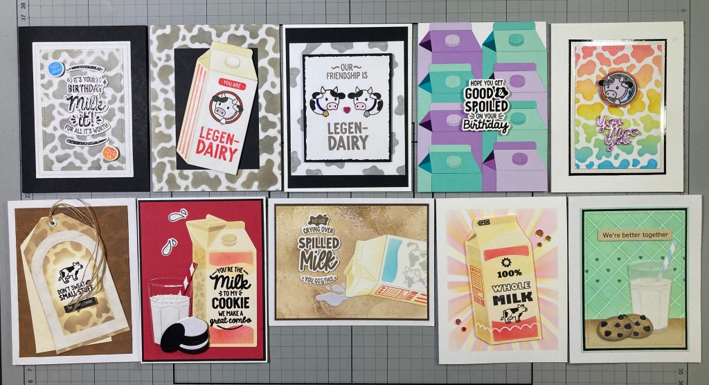
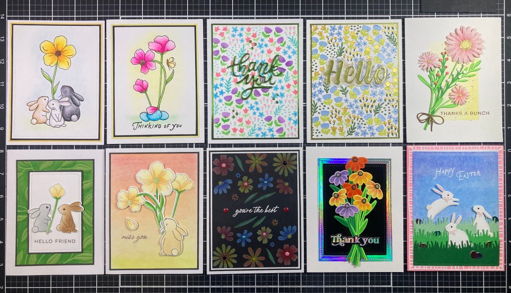
Hello Folks! Happy Spring!! Scott here with a new set of 10 cards featuring the My Monthly Hero & Super Hero kits for April 2026. The theme for this kit is “Plant Lady Society” – just look at the number of plants and flowers in this kit!
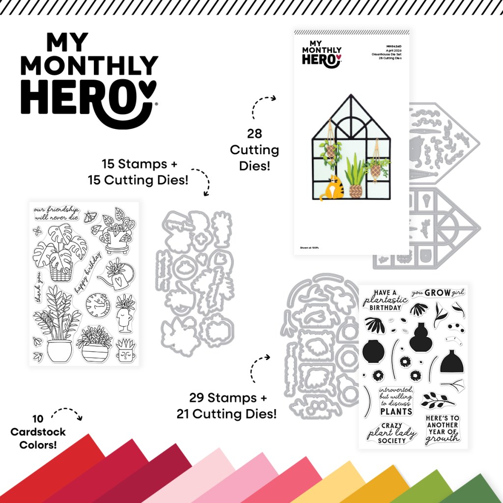
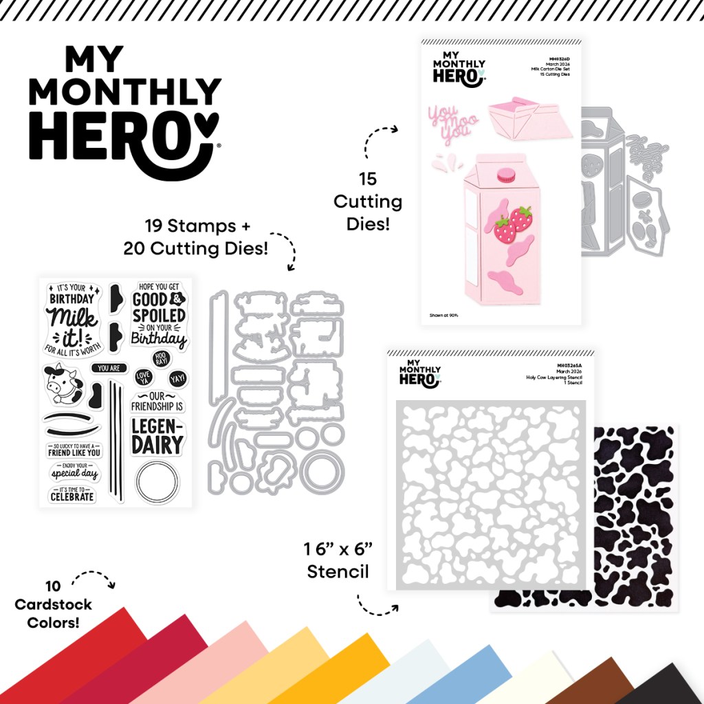
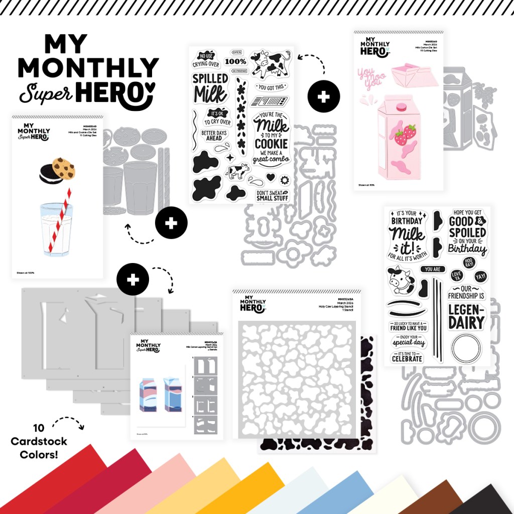
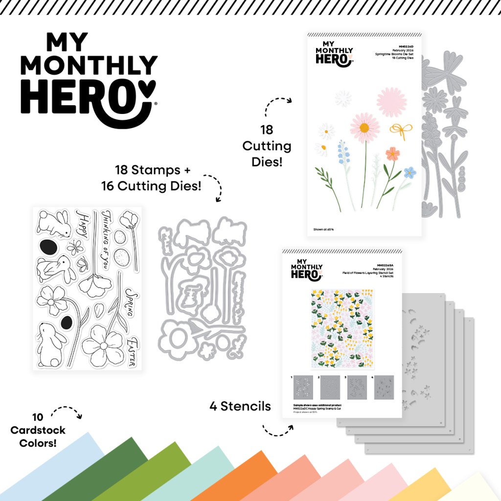
| My Monthly Hero Includes: • House Plants Stamp & Cut • You Grow Girl Stamp & Cut • Greenhouse Die Set • 10 Sheets of Cardstock – 1 of each color, 5.5″ x 8.5″ (Poppy, Pomegranate, Cranberry, Blush, Tutu, Dahlia, Beeswax, Tuscan, Rainforest, Fern) |
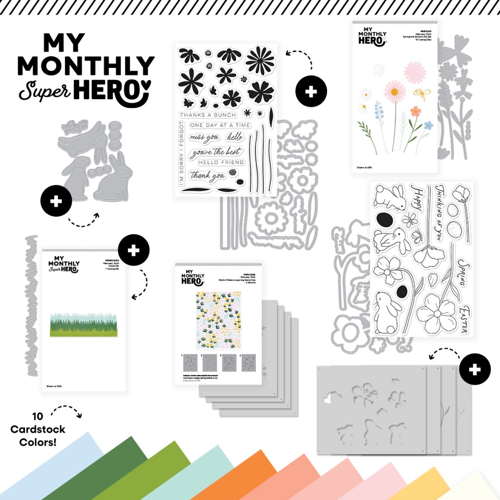
| My Monthly SUPER Hero Includes everything in the regular MMH above, PLUS: • Hello Beautiful Stamp & Cut • Fresh Flowers Die Set • Watering Can Die Set |
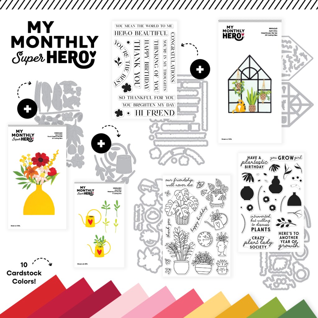
LOTS of cutting dies in these kits! More than 100 dies! PHEW! This appears to be the first of the New MMH/SH kits that doesn’t have any explicit cross-over between kits. The Hello Beautiful Stamps are all sentiments, so they can be used with both kits, but there are eight sentiments in the MMH kit alone, so the extra sentiments aren’t necessary. As usual, I’ll make the first five cards using just the MMH kit and then the last five cards will use everything all together!
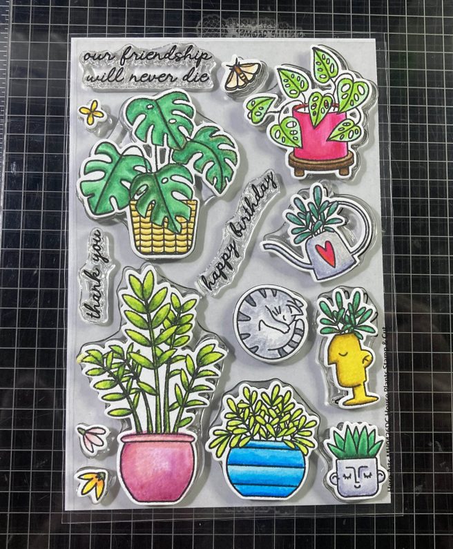
At least we do have some good stamps for coloring! I don’t often do this, but I thought I would stamp all the images from the House Plants Stamp set with VersaFine Onyx Black ink on some Canson Mixed Media Card stock. I reached for my TomBow Water-Based Dual Tip markers to color everything. The Mixed Media card stock takes the watercolors very well, and it’s easy to blend the markers with each other or with light touches of water and a paintbrush.
To kick off my card making, I decided to use the matching dies to cut everything out. It’s always fun to lay out my colored and die-cut images directly on the stamp set. Haven’t done this in a long while !
Though we had a huge snowstorm just a month ago, and temperatures still seem reluctant to rise, I am all set for some Spring card making! And just look at all the colored and die-cut images I have available! I do often take my clues from the sentiments in a set, so here we go…!
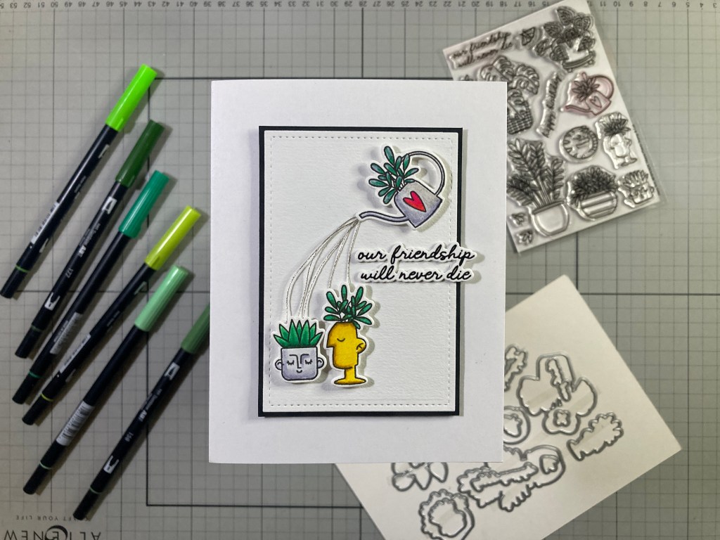
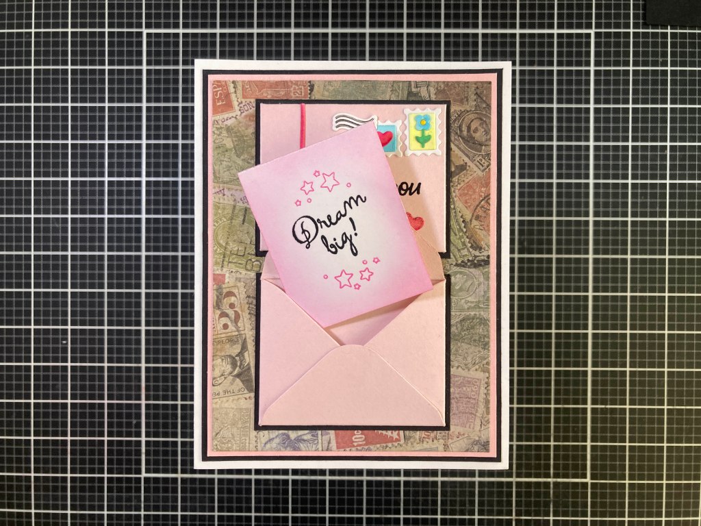
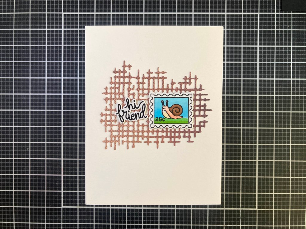
I stamped the sentiment on a scrap of the Canson Mixed Media card stock with VersaFIne Onyx Black ink and embossed it with Clear embossing powder. I die-cut it out along with two blanks and glued them all together. I die-cut a piece of the Mixed Media card stock to 2.75″ x 4″ with a Lawn Fawn Stitched Rectangle Die, and decided on my layout so I could add DMC Silver Metallic thread through the background. Using a needle, I got the 5 pieces of thread through a hole in the background (where the watering can spout will be) and I glued those down to the back of the card stock. Then I added a thin Black mat behind, and attached them both to an A2 White card base with foam tape.
I arranged the silver thread on the card front and added the two potted plants with foam tape. I attached the watering can with more foam tape and glued the spout to the top of the threads. I glued the sentiment in place letting it hang off the side a little bit. I thought these head vases conveyed the friendship theme perfectly!
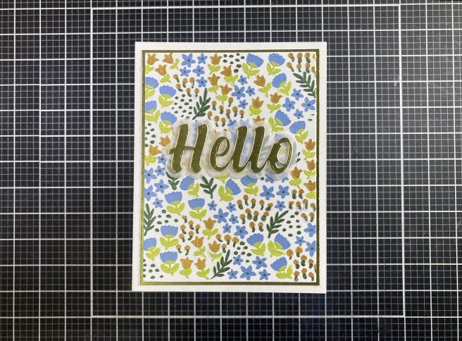
I have mentioned before that I don’t particularly care for the white borders that most dies leave around an image. On the first card I just kept the background white – that helps camouflage the white borders… but there are more ways to hide those borders than just keeping your backgrounds white!
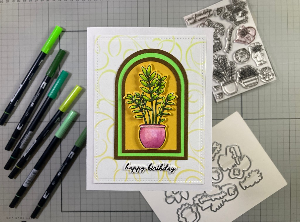
You can color those borders to match whatever background you want! This works very well as far as I’m concerned! I used the Spellbinders Essential Arches dies to make the plant arch. I like that there are 16 dies in this set so there’s a big assortment of sizes. I cut the Acid Green arch to 2.5″ wide and the Yellow Ochre arch to 2″ wide. I die-cut the frames from Auburn Pearlescent card stock using the next size smaller dies (2.25″ & 1.75″) and glued those frames on top of the colored card stocks.
I die-cut another piece of Mixed Media card stock to 3.75″ x 5″ and used my old metal Stampendous Flourishes stencil to ink blend Fossilized Amber and Twisted Citron Distress Oxide inks onto that piece. I stamped the sentiment on a scrap of Mixed Media card stock with VersaFine Onyx Black ink and embossed it with Clear embossing Powder. I die-cut that with the matching die along with one blank and glued the two together. I colored the white borders of the die-cut with an Ohuhu Alcohol marker to match the Yellow Ochre background.
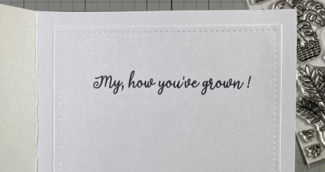
The stenciled panel is glued to a White card base, the two Arches and the stacked sentiment are glued down flat, and the potted plant is attached with foam tape. I did add this “explainer” to the inside of the card using my Silhouette Software and the Dream State font. I printed that on a scrap of plain white card stock die-cut to 3.75″ x 5″ with a LFSRDie. That makes me giggle and justifies a birthday card with a potted plant. I guess “let’s get potted!” would work too!!
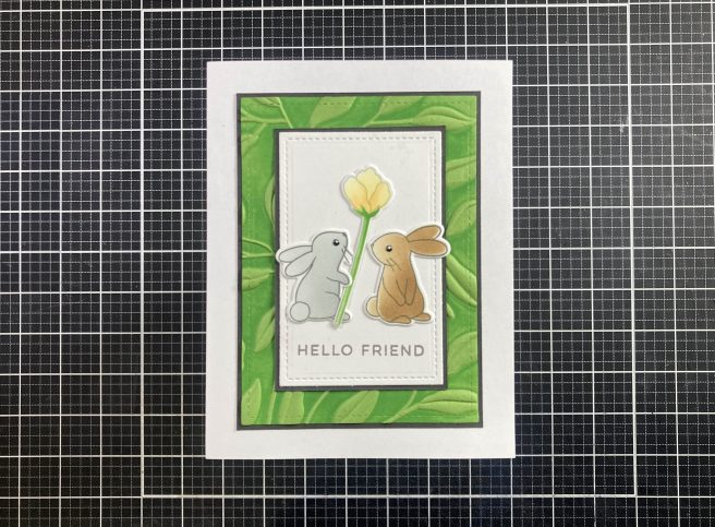
There is a decent Birthday pun in the You Grow Girl Stamp set… so lets use that with another House plant!
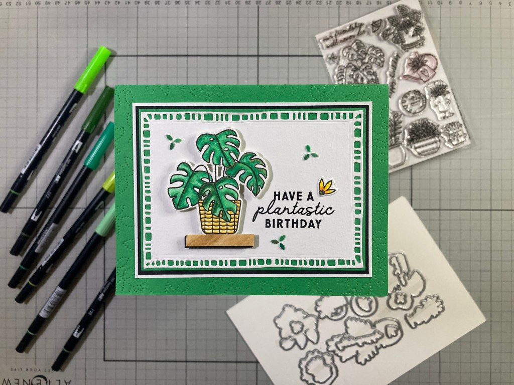
That’s a good pun for any Birthday gardener! On a Green A2 card base, I used the HoneyBee Spring Leaves A2 Pierced Cover Plate die on the front. I die-cut another panel of the Mixed Media card stock to 3.25″ x 4.5″ with a Moda Scrap Framed Rectangle die and added thin Green, Black and White mats behind that before glueing all to the card front. I stamped and embossed the sentiment as usual directly on the card front. I made a little “shelf” for my plant with a piece of woodgrain pattern paper with a small black “shadow” glued behind. I glued the plant to the shelf and mounted them to the card front with foam tape. For embellishments, I added the single bloom stamp in the corner of the sentiment, and added these Dragon Scale Sequins (from the MMH August ’19 kit) for some fun sparkle! I like that the Pierced cover plate die adds the same pattern to the back of the card front so you can see the whole thing when the card is opened!
The images in the You Grow Girl stamp set are all basically silhouette stamps – perfect to use for backgrounds!
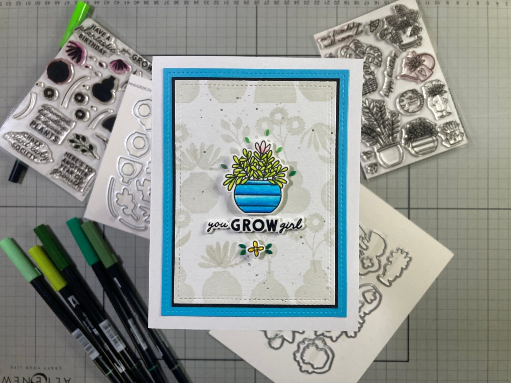
I stamped the background on Mixed Media card stock using Simon Says Stamp Barely Beige ink and all the pots and plants in the You Grow Girl stamp set. (I really like the cone flowers stamped upside-down on the round pot!) to finish the background, I spattered Black Soot Distress Oxide ink lightly on the stamping. I die-cut that panel to 3.25″ x 4.5″ with a LFSRdie and added a thin (1/16″) black mat and a thicker Blue mat using the 3.75″ x 5″ LFSRdie. I glued those together and then down to an A2 White card base.
I stamped, embossed and die-cut the sentiment as usual, die-cut three blanks and glued them all together. I trimmed the top leaf off of the potted plant and added my little pink bloom in it’s place. I mounted the potted plant with foam tape and glued the stacked sentiment below. I wanted to add the other small bloom from the House Plants Stamp set and decided to add it to the card with a small craft spinner – yes! the little bloom spins!! More Dragon Scale sequins add some fun sparkle and those spinners are small enough for this tiny little flower! Interactive fun!
That brings us to the Greenhouse Die Set. The die cuts the greenhouse to 3 & 7/8″ x 5 & 1/8″. Big enough for a shaped card!
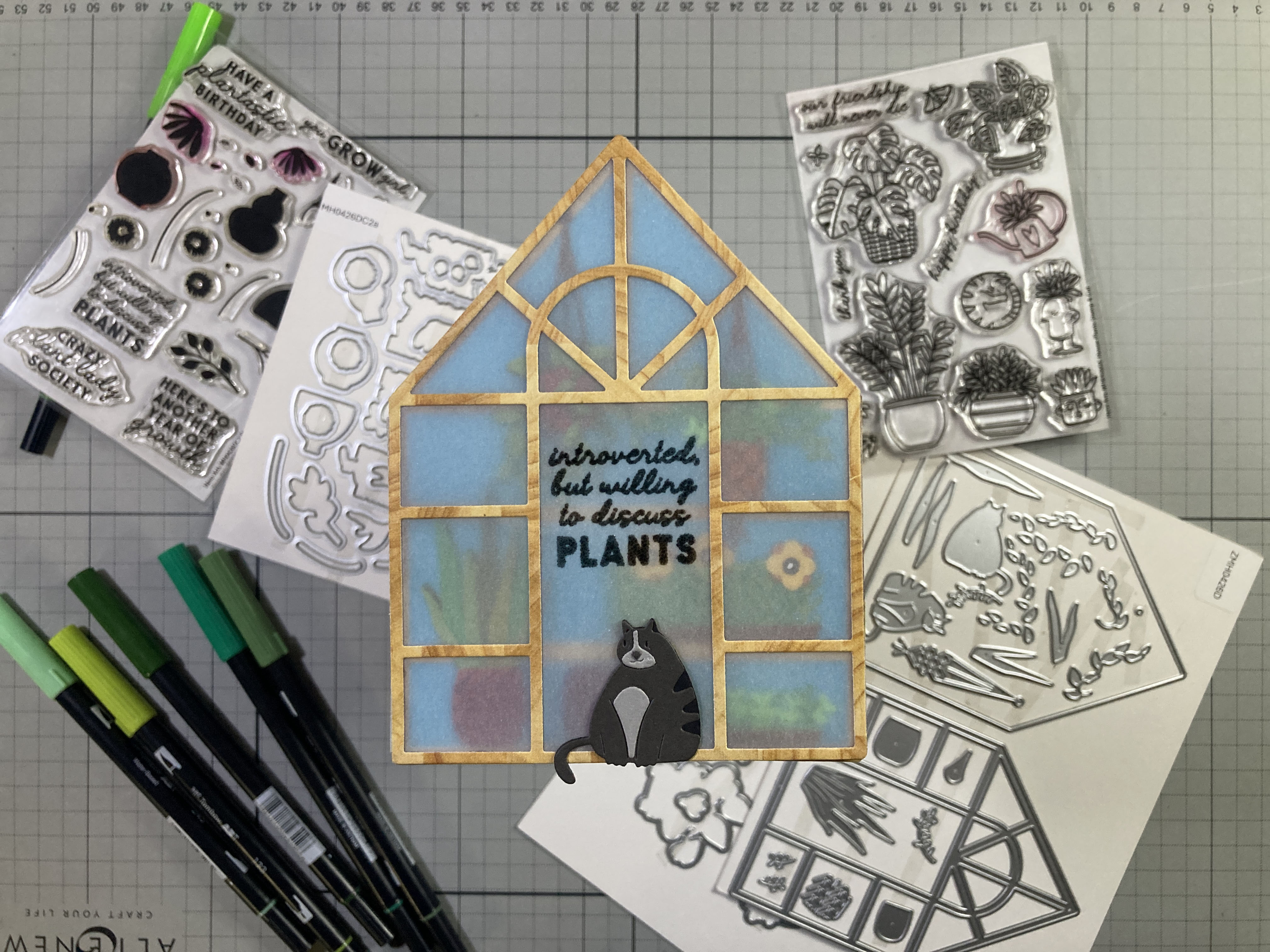
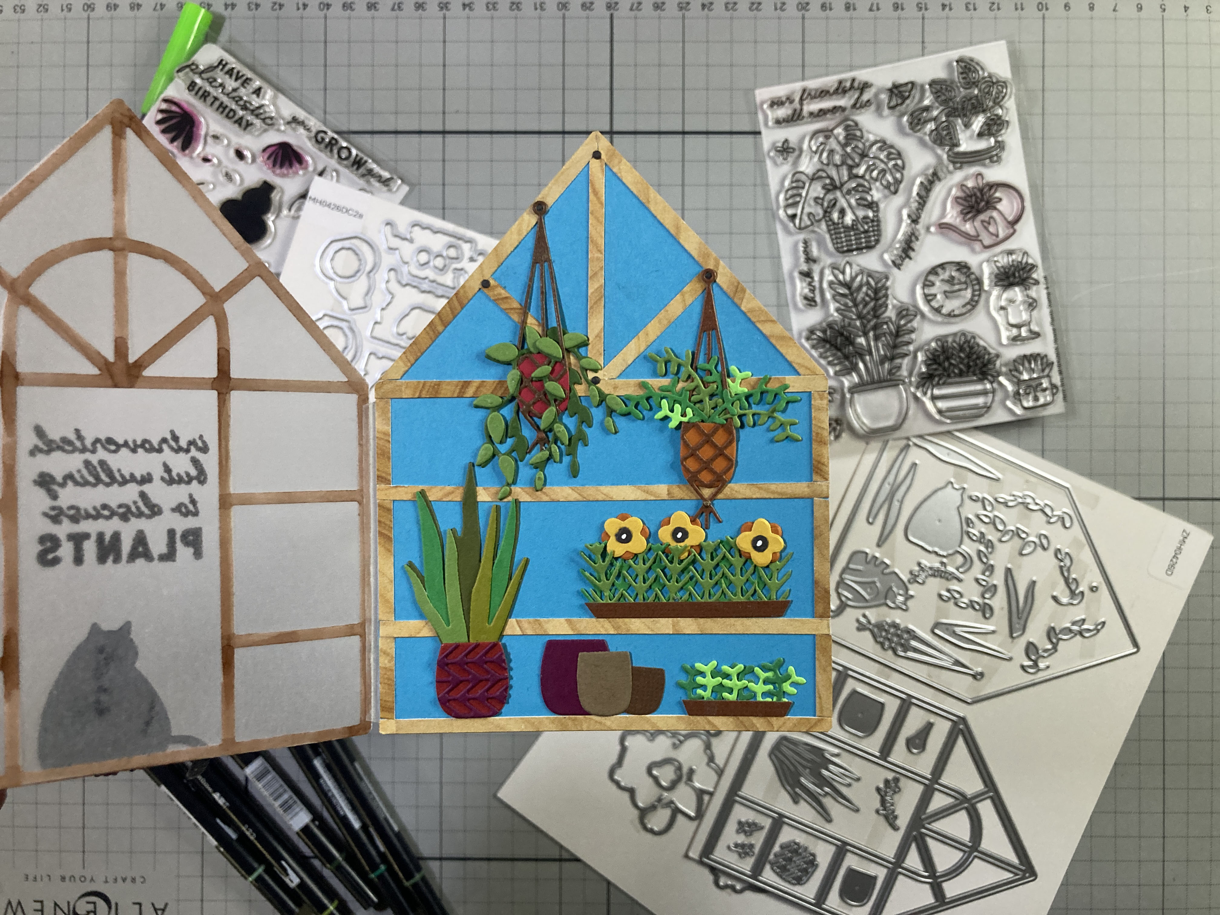
Thinking it would be fun to “walk into” the green house, I die-cut a piece of wood-block pattern paper with the detailed Greenhouse die and glued that to a piece of thick vellum die-cut with the Greenhouse outline die. I die-cut another detail die from the same vellum, colored it with an alcohol marker, and glued it on the back of the vellum (the inside) to cover up the glue from the front piece. I die-cut the Blue background with the outline die and then added the structure and shelves with 1/8″ strips of the same wood-block pattern paper. I tried to match the inside structure to the detail die structure (minus the arch).
I die-cut all the decorative dies from my card stock scraps. All the detail dies layer together to make a cat, a large-leaf potted plant with a decorated pot, and two types of hanging plants in macrame hangers. That wasn’t quite enough for me so I used the pot-pattern die to make a bunch of new greenery that I glued into a simple “tray” cut from brown card stock. The flowers are die-cut from Yellow and Orange card stock scraps with the small flower die in the House Plants set and their centers are die-cut from the triple-bud die in the You Grow Girl set. I die-cut some extra pots and another small “tray” of seedlings using the small round-leaf dies used in the hanging plant on the right.
I wanted something to “hang” the plants on, so I die-cut six small Dark Grey dots with the tiny dot die and glued them to the intersections of the inside beams, and modified one for the cat’s nose. I placed the hanging plants on their “nails” and glued all the other plants in place. I stamped and embossed the sentiment on the front as usual and added the cat at the door using some dry adhesive. I didn’t worry about covering up the back of the cat because there’s a door there!
I cut a 1/4″ wide piece of vellum to 2.75″ long and scored two fold lines (very close together) down the center. I creased the vellum on both score lines and glued that to the front and back panels as my hinge. The double crease allows for some thickness inside the card without warping the front. For a final touch, I cut a scrap of White card stock with the Greenhouse outline die, trimmed 1/8″ from all the edges, and glued that to the back of the card for a writing surface. Admittedly, there’s a lot of small fiddly dies here, and that’s generally not my go-to method for card making. But there is definitely a certain allure in holding a tiny potted plant in a macrame hanger in the palm of your hand!
That’s a pretty thorough examination of the plain Hero Kit – now we can add in the Super Hero supplies and go all out. Of course, there was that cat stamp from the House Plant set that was taxing my brain – this is the only image in this whole kit that is viewed from above – the perspective just doesn’t work with the plants… I think this may help:
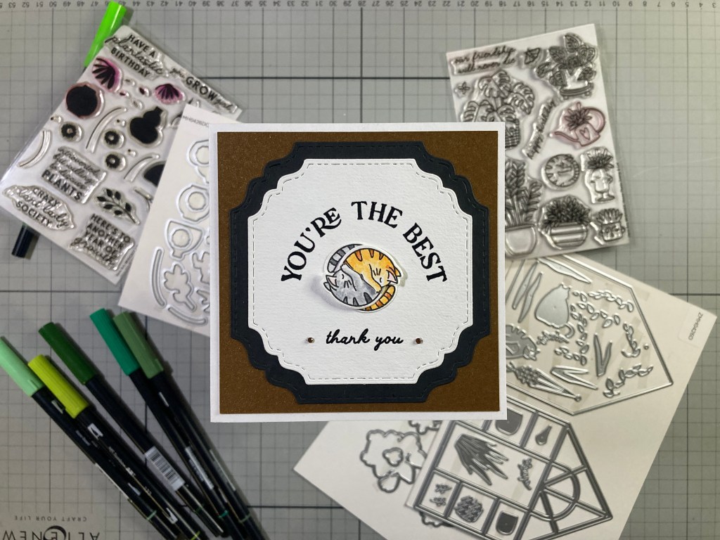
Skip the plants entirely and go for the cuddles!! I stamped, colored and die-cut another cat (orange tabby) the same as the first cat. Then I cut both cats from between their tails and ears, to their face and along the bottom of their front paws to their pits. That allows the two cats to be intertwined together in a cuddly embrace! That works well with this sentiment from the Hello Beautiful Stamp and Cut set along with the thank you sentiment from the House Plant set. I thought this whole idea would work best on a square card!
I die-cut more Mixed Media card stock with an old LDRS Fancy Squares and Little Things die and cut a black frame from the larger die in the set and glued them together. I stamped and embossed both sentiments as usual directly on the card front. I did give a little bit more of a curve to the large sentiment. I cut a panel of Auburn Pearlescent card stock to 4″ x 4″ and glued that to a 4.25″ square card base. I glued the stamped panel to the card front and added the intertwined cats with a spot of foam tape on the top of their heads, and their tails glued flat to the card front. A couple of tiny Copper jewels highlights the sentiment and gives us some sparkle. I really like using that cat stamp like this!
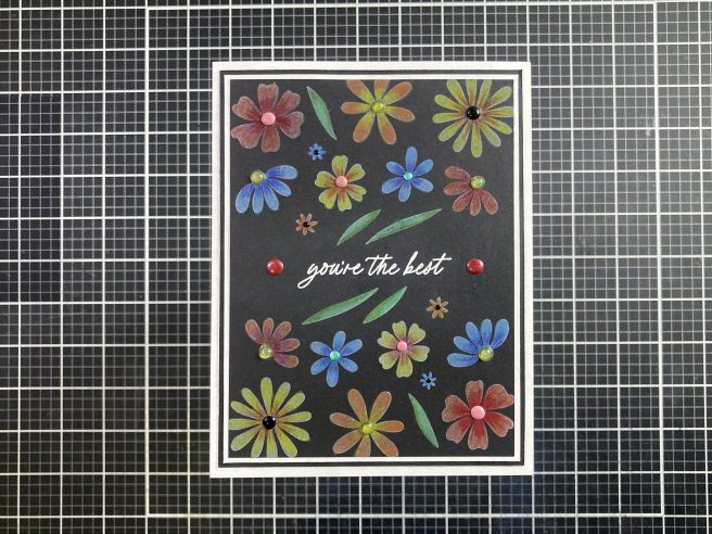
I figured I’d spend a little more time with the silhouette stamps in the You Go Girl stamp and cut set…
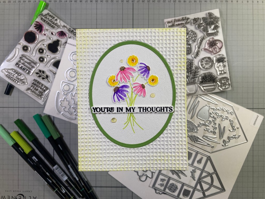
I decided to shoot for a little more of a watercolor effect for these stamps so I colored the stamps with my TomBow markers and gave them a light spritz of water before stamping them on more Mixed Media card stock. The flowers took a few stampings to get to their final color and then I die-cut all the blooms with their matching dies.
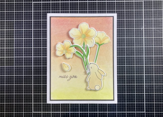
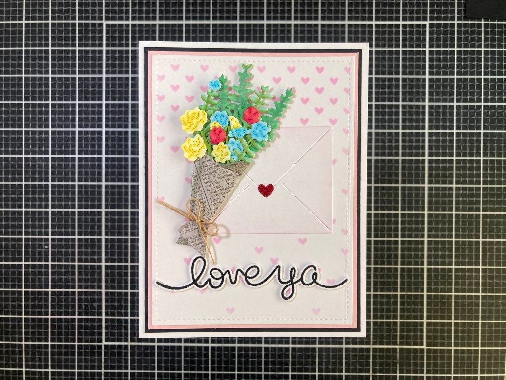
I die-cut an oval from a 4.25″ x 5.5″ panel of Mixed Media card stock with a HA Oval Nested Frame die-cut and arranged my bouquet before stamping the stems with Twisted Citron Distress Oxide ink. The stem stamps are not as long as I needed, so I extended their length by hiding the seams behind the sentiment. I die-cut the oval frame from Green card stock using the original Oval die and the next smaller die and glued that to the stamped oval. I glued all the flowers in place at the end of their stems, and stamped, embossed, die-cut and stacked the sentiment (+2 blanks) as usual.
I took the leftover panel of Mixed Media card stock (with the oval cut out) and embossed that with a Taylored Expressions Burlap embossing folder and ink blended a little Twisted Citron ink around the edges. I glued that to an A2 White card base and pieced the stamped oval back into the opening. I glued the sentiment in place (covering the stem seams) and added some HA Clear Enamel Dots for some highlights. Using watercolor markers to color your stamps is a fun way to hint at watercoloring without completely abandoning the fact that these are stamps.
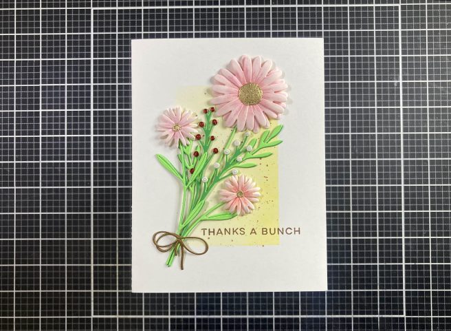
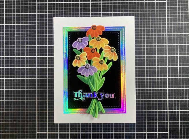
That covers a couple of the sentiments from the Hello Beautiful Stamp and Cut set – time for the Fresh Flowers Die set!
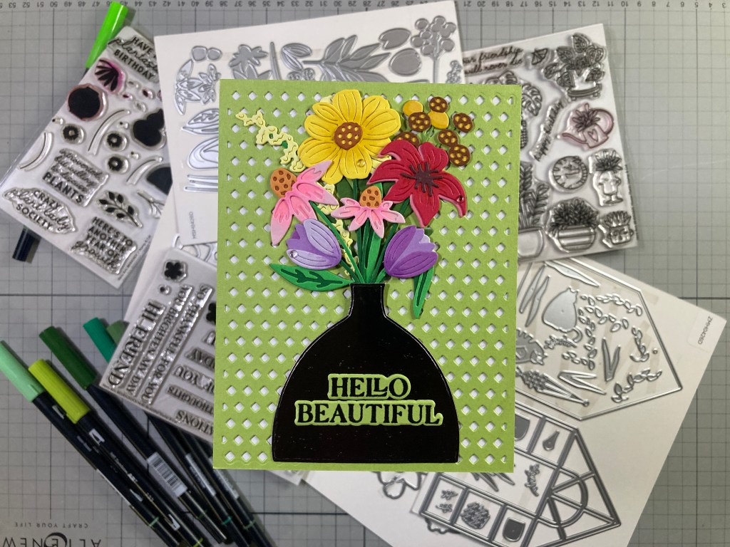
I do believe this card uses every single die in this set! Again, I reached for my card stock scraps to die-cut all the layers of flowers, stems, and leaves, and assembled all the blooms using light touches of Alcohol Markers for some subtle shading. I do think I am getting better at matching my Ohuhu Alcohol markers to my colored card stocks! After a good amount of wrangling, I came up with a pleasing arrangement and gathered the stems in a bunch to go into our vase which I die-cut from a piece of Tim Holtz Metallic Jewels kraft-core card stock.
I took a 4.25″ x 5.5″ panel of Hero Hues Kiwi card stock and die-cut that with a Waffle Flower Tiny Diamonds Die and glued it down to a White card base. I stamped, embossed and die-cut the sentiment on a scrap of Kiwi card stock along with two blanks and stacked them together. I glued the flower stems behind the vase and glued the vase and blooms flat to the card front. The thickness of the card stocks gives us plenty of dimension in the arrangement without having to use any foam tape. The sentiment is glued on top of the vase and I added more HA Clear enamel dots to some of the flower petals since they are so “fresh”. This is a great die set with lots of variety if you like die-cutting flowers! There are many types of flowers and leaves, and the stem dies are long enough that you can fill up a big 5″ x 7″ card or even a tall Slim-line card quite easily!
I do like that a number of the sentiment dies in the Hello Beautiful stamp set are single dies but will cut out the individual words on some of the larger sentiments! That’s very handy!
And that gives us the Watering Can Die Set in the Super Hero kit – looks like the same watering can as the stamp in the House Plants Stamp and Die set only larger.
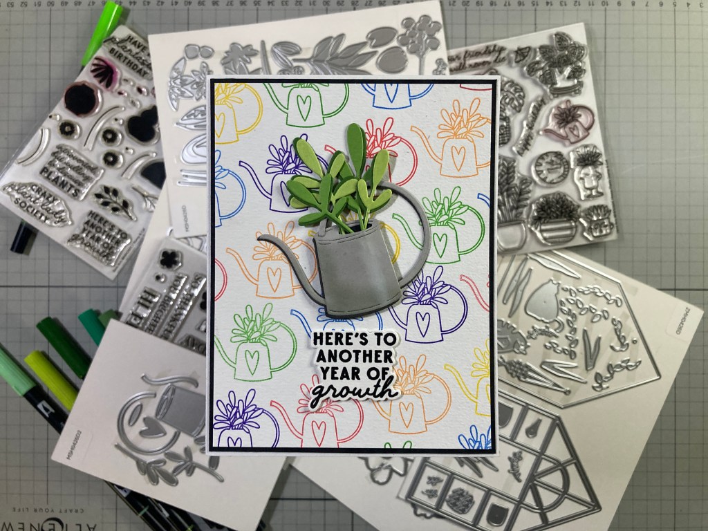
On a 4.25″ x 5.5″ panel of Mixed Media card stock (and with the help of my MISTI) I stamped the Watering Can from the House Plants Stamp set in a simple pattern using HA Fruit Punch, Creamsicle, Lemon Drop, Green Apple, Blue Hawaii, and Purple Galaxy Reactive inks. I trimmed that panel to 4″ x 5.25″ and added a thin black mat before gluing them down to a White card base. Makes a perfect background for this die-cut Watering Can!
I die-cut the Watering Can from Light Grey card stock and glued the pieces together before doing some ink blending on the can with Hickory Smoke Distress Oxide ink and some HA Unicorn White pigment ink. Since the can was cut from thin card stock, it was quite flimsy, so I die-cut another whole can from Dark Grey card stock and glued it behind the grey can with a little offset on the bottom and left sides. That adds strength to the die cut and a little more dimension as well. The opening at the top of the can was left open for the plants. The plants are cut from three shades of Green with the darkest shade glued to the backs (with a little offset) of all the leaves. I glued all the plants in the can opening and added a patch of Black card stock behind the opening.
The sentiment is stamped on more Mixed Media card stock with VersaFine Onyx Black ink and embossed with Clear embossing powder and die-cut with the matching die. I die-cut one more blank sentiment and glued the two together. I attached the can to the card front with foam tape down the center and the handle and spout glued flat. There is a touch of foam tape behind the far right and far left leaves as well. I glued the sentiment directly under the can and added the happy birthday sentiment from the House Plants Stamp set on the inside. More Plantastic Birthday Cards!
Of course there is another Birthday sentiment in the Hello Beautiful Stamp set. A nice BIG sentiment!
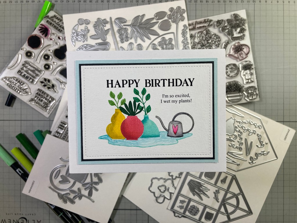
I decided to return to the You Grow Girl Stamp set since I hadn’t spent any serious time with these silhouette pot stamps, and I actually haven’t used any masks for a flat one-layer card this month. I used Cincord & 9th inks for the pots – first I stamped the round pot with Poppy and Cranberry inks and cut a mask to cover that pot. Then I stamped the large pot with Buttercup and Stardust inks and the right pot with Oceanside and Peacock inks. I masked off the plants on the watering can stamp and stamped the can with C&9 Mushroom ink. I did have to complete the top of the can and handle and used a simple circle template for assistance.
I masked off the tops of the pots and stamped the plants in them with C&9th Parsley, Clover and Evergreen inks. Again, that Cone Flower stamp works perfectly well stamped upside down in the red pot! I reached for the “Ice Rink” stamp from the MMH October 2018 kit, masked off the potted plants and watering can and stamped that with Oceanside ink – there’s a puddle!! I colored the can and the puddle with my Tombow markers and a wet paint brush.
I decided where the sentiments would go and die-cut the colored panel to 4.5″ x 3.25″ with a LFSRdie. I created the sub-sentiment using my Silhouette Software and the Times New Roman font. I printed that directly on the panel using my piggy-back printing method. I stamped and embossed the HB sentiment as usual directly to the card front. I added a thin Black mat and a thicker Hero Hues Arctic mat behind the stamped panel and glued everything down to an A2 White card base. Finally, I added some highlights to the puddle with a White Gel pen. This has got to be one of my favorite plant puns… and with the addition of the watering can in this set, I just couldn’t resist!
And before you know it, that’s all ten of my cards created with the My Monthly Hero and Super Hero kits for April 2026.
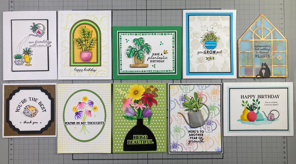
Look at that! We’ve got Four Birthday cards this month! I guess that’s not too surprising seeing as how there are three different Happy Birthday sentiment stamps in this set! I am pleased that we had a decent amount of coloring to do this month, but I have to admit I do find it a bit tedious fiddling around with layering dies to create (rather smallish) flowers, and then you have to arrange them in a pleasant bouquet! I do try my best, but I am NOT a florist! HA!! I really enjoyed figuring out a logical use for the cat stamp, and I truly love opening the “door” and “walking” into my green house! The Hello Beautiful Stamp and Cut has a bunch of terrific sentiments, and the three die sets are good fun and offer lots of possibilities, but, I am always up for more coloring!!
If you are tired of this endless winter and are longing for spring, you might like to grab one of these kits for yourself. And for a change, just buying the My Monthly Hero kit this month isn’t compromised by needing something in the Super Hero kit. If you do go shopping at Hero Arts – for these Kits or anything else – please use my links listed below – I do get a small commission from anything you buy at HA (at no cost to you!) and that helps keep the plants sprouting and the crafty inspiration coming! It is, as always, genuinely appreciated!
My Monthly Hero Subscriptions: https://www.kqzyfj.com/click-10133713…
Hero Arts: https://www.jdoqocy.com/click-1013371…
Thank you for sharing some of your time with me here today! I hope I inspired you and shared a smile or two with you! You are the reason I do this post! Let me know which cards are your favorites! If you enjoyed this release please click the “Like” star at the bottom of this page, and if you wish to be notified of new blog posts just click the Follow Me button at the top of this page. If you would take a few moments to Like Me, List Me, Pin me, Post Me… share this post everywhere you can and with everyone you can, and remember… Don’t run with scissors!! As always, I send you and yours Love and Light, and Happy Crafting!
DISCLOSURE: This site contains some affiliate links to products. I may receive a commission for purchases made through these links (at no cost to you). As an Amazon Associate I earn from qualifying purchases. Thank you!


