10 Cards 1 Kit • Hero Studio Card Kit of the Month • July 2024

Hello Folks! Scott here with my 10 cards created with the New Hero Studio Card Kit of the Month for July 2024! Sorry I am so late this month… there was a bit of a mix-up at headquarters and my kit didn’t arrive till the 15th. This is month number two of the New Hero Studio line up of products and subscriptions for a variety of tastes and budgets! The Card Kit of the Month is themed around a Victorian seaside holiday with a whole assortment of stamps, dies, inks and more to transport you to the seashore of times gone by. Here’s the contents of our kit:

• Victorian Seaside Clear Stamp Set, 6″ x 8″
• 22 Coordinating Dies
• Sand Castle Fancy Dies
• Rock Cling Stamp, 6″ x 6″
• Victorian Seaside Reactive Palette Ink Pad (Berry Smoothie, Taffy, Lemon Drop, Pool Party and Blue Raspberry)
• 2 Sheets Map Hero Transfers (Rub-ons), 6″ x 8″
• 2 Sheets Each of Blue, Purple, Green Vellum, 5.5″ x 8.5″
• 2 Sheets Each of White Lava Holographic, White Rainbow Holographic Cardstock, 5.5″ x 8.5″

Another huge batch of supplies to inspire and excite us! The stamp set is silhouette based with figures and landmarks as well as the sea and a cloudy sky and six sentiments. I always love the Hero Arts Palette Ink Pads, and Hero Arts Cling Stamps are just about the best in the world! Looks like we’re headed to the beach this month!

I did a little research on Victorian swimming before I started playing with this kit… it turns out that co-ed swimming on beaches was actually against the law – legal segregation of bathing areas in Britain ended in 1901 – the end of the Victorian era. Women would use a Bathing Machine (basically a cabana on wheels) that would be horse-drawn out into the water and discharge the women straight into the surf – already changed into whatever bathing outfit they had and readily covered up by the water. All that bother in a vain attempt to appear “respectable”. We’ve come a long way, baby!

I found it interesting that this kit combined silhouette stamps (usually stamped in black) with clouds and seashore (usually stamped in colors). I thought I’d avoid the black (and the figures) to start out with.

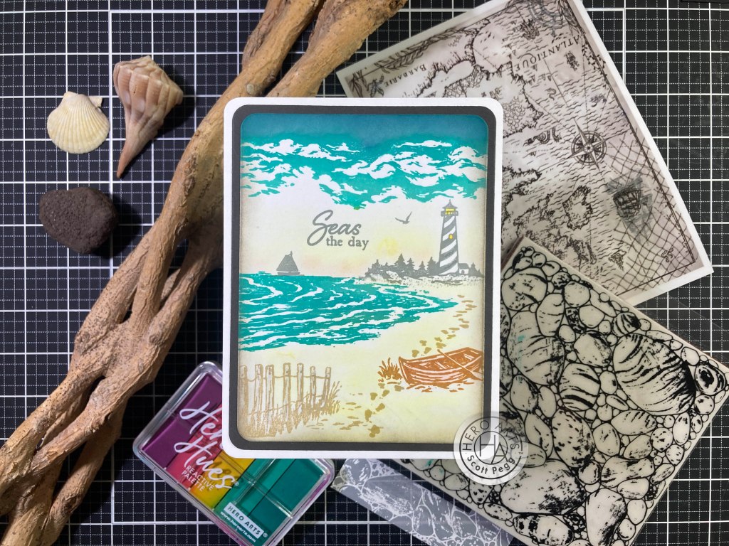
On a piece of Neenah Classic Crest Solar White card stock, I stamped the clouds and the water using Pool Party and Blue Raspberry inks in the Palette ink pad. I stamped the fence part of the foreground stamp and the footprints using Hero Hues Sand ink, and the boat using Hero Hues Caramel ink. The lighthouse, boat, bird (just one!) and sentiment are stamped with Concord and 9th Dove ink. If I had my druthers, I would have done the fencing in Caramel and the boat in Sand… but this will work!

I wanted a little more height to the clouds (making them lower in the sky) so I ink blended Blue Raspberry above the stamp and tried to blend out the stamp line. To add a little more color to the background, I reached for my Pebbles Chalk Palette and softly blended some sand and sky – I also added light touches of grey to the fence and brown to the boat (so they weren’t pure white). I added some lights to the lighthouse with the Lemon Drop ink and a Micro Applicator.

I die-cut the panel with a HA Rounded Rectangle Infinity die and cut a mat from Dark Grey card stock using the next larger die. I ink blended Pumice Stone Distress ink around the edges of the stamped panel and glued that down to the grey mat. Both of those are glued to an A2 White card base with 1/4″ rounded corners. The scale of these stamps is a little specific… the lighthouse seems to work best in this position, and of course the fence and boat are meant to be in the foreground, but the sailboat can be far away (real boat) or close-up (toy boat). And “Seas the day” is a great pun!

I do try to use every stamp in a stamp set – including the sentiments – and wanted to see how Black silhouettes would work with the more colorful natural elements.

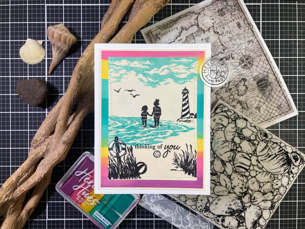
On a piece of Ivory card stock, I stamped the water and sky with the same inks trying for a little bit of a lighter hand by using blending brushes to soften the inks before stamping. I stamped all the images using Pitch Black ink. (I do like the coverage of that ink!) The foreground is the right side of the foreground stamp split left and right – I added some stems to the bottom of the right side of the stamp – under the life preserver (otherwise flat) using a Pigma Micron pen. I like the kids standing in the water..!

I did have the problem of the water showing through the top of the life preserver… I grabbed my PH Martin’s Bleed Proof White watercolor and filled in the preserver – I also added some white to the stripes on the lighthouse to balance out the white on the life preserver. Works well! I die-cut the inked panel with a Lawn Fawn Stitched Rectangle die (3.25″x 4.5″). I swiped the Palette ink pad on a scrap of White card stock (keeping the blues in the middle) and die-cut that with another LFSRdie (3.75″x 5″). I glued those together and added a thin Ivory mat before gluing all down to a White card base. Keeping the silhouettes in black is pretty stark, but it still works nicely for this buddy card.

If you want to give your stamps a little more detail, you can color on your stamps directly with watercolor markers and with the help of a stamping platform get a good (repeated) impression . And I’m always interested in trying to stretch a stamp set that’s apparently made for portrait cards into a landscape card.

Using TomBow watercolor markers, I stamped the couple on White card stock – using a stamp platform lets you repeat stamp until you get the desired amount of ink on the page. I thought these guys came out well, so I die-cut them with their matching die – surprise – the die cuts them out individually! So I glued them together a little bit closer to each other – ah, romance!

On a piece of White card stock I stamped the water twice – feathering out the edges where they would overlap – and that gave us a surf that covers the whole landscape card front! I stamped the fence using Sand Stone ink, and the boat, life preserver (with a little Sand Stone at the bottom) and the row of cabanas using Sand ink. Using my TomBow markers diluted with a little water, I painted in the fence, the boat (lightly), the life preserver, and the cabanas. I used the foreground stamp and some Micro Applicators to add in more sandy footprints between the foreground stamps. I also used my Pebbles chalk palette again to add color to the beach and the sky – nice and soft.

I stamped the birds (only four!) and the sailboat with Dove ink and stamped the sentiment using Sand Stone ink. I die-cut the panel with a Rounded rectangle die and glued it to a Kraft card base. I used a Spectrum Noir Sparkle pen to add some shimmer to the water and mounted our couple using foam tape. I love the boat behind the fence, and the colorful details of our romantic couple… and, YES, with a little care, these stamps will work in a landscape orientation!

On the back of our Studio kit card, it shows using the water stamp upside-down in the opposite direction… let’s try that!

I stamped the upside-down water on the right side of an Ivory card stock panel using the blue inks again, and thought it might benefit with a more defined horizon line. I masked off a horizon at the top of the stamp and ink blended Pool Party across the front of the card panel. I didn’t try to cover the bottom edge of the surf but did try to get to the farthest left edge of the stamp. Since we have a horizon, we should have some sun too! I reversed the masking and used Lemon Drop ink to blend in a little sunshine, and a small sun using masking with a hole punched out. That works!

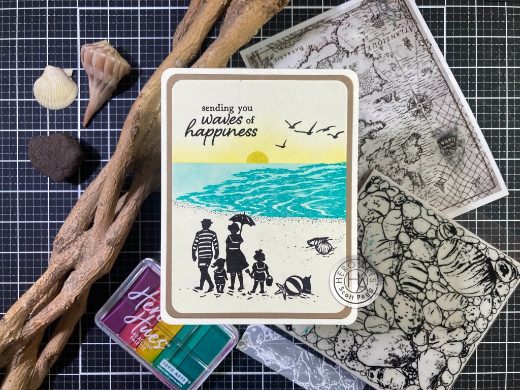
I stamped the couple using Pitch Black ink, and stamped the kids next to them. The littlest kid fits right between them! I stamped the seashells, beach ball and (toy) sailboat and birds (all five!!) with Pitch Black ink, and used a Pigma Micron pen to add more divots and texture around the stampings and the shore. That helps fill out the “sandy” area. I stamped the sentiment with VersaFine Onyx Black ink and embossed that with Clear embossing powder. I die-cut the panel and the Kraft mat with HA Rounded Rectangle dies and glued them all down to an Ivory card base with 1/4″ rounded corners. I love the family grouping here, and I think that water stamp works just fine in this orientation! I avoided layered stamping so no touch-ups were needed, and I guess I was simply eager for a definitive horizon line!

Though I probably use “thank you” cards more than any other, I couldn’t think of a specific scene that would work for that, so I thought some vignettes might convey the sentiment a little easier.

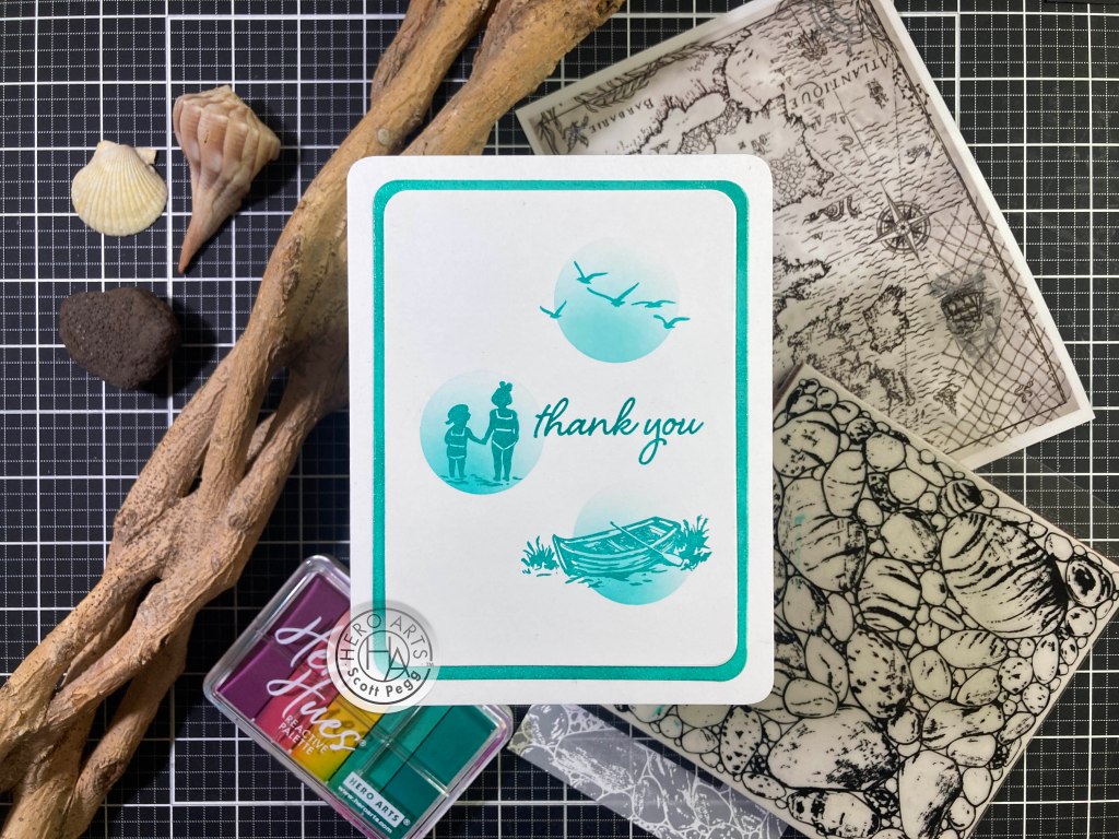
How about some little monochromatic vignettes? I cut a piece of masking to 4.25″ x 5.5″ and die-cut some 1.25″ holes through the masking using HA Circle Infinity dies. I placed the masking on a Neenah Solar White A2 card panel and ink blended Pool Party through the holes – darker on the bottom left and fading out towards the top right. I stamped the three images inside the circles using the Blue Raspberry ink. I think the kids holding hands implies a connection (see the “thinking of you” card) and the boat implies assistance, while the birds represent freedom or completion – all the things you think about when you are proffering your thanks to someone!! (I’m trying here!).

I swiped some Blue Raspberry ink around the edges of another panel of White card stock and added some random spots of clear embossing powder for a bit of a watery shine. I die-cut both panels with HA Rounded Rectangles dies and glued them to a White card base with 1/4″ rounded corners. I think the rounded rectangles feels a little more vintage, and this clean and simple monochrome arrangement works very well as a thank you card

That’s five sentiments… we only have the Happy Birthday sentiment left… I’ve used all the images stamps so let’s use the Sand Castle Fancy dies for our Birthday card! And of course we have to break out the HA Sand Embossing powder!!

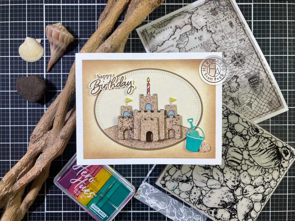
I have a good amount of that Sand Embossing powder on hand, so I decided to cover a panel of card stock with some Scor-Tape (I used a 6″x6″ sheet), covered the sticky side with embossing powder, and heat set it. That gave me a whole panel of “sandy” card stock to use!

I die-cut the Sand castle four times from this sheet for some three dimensional layering!. The back layer is the full Castle with the upper “doorways” cut-out and backed with the Blue Vellum. For the next layer, I cut off the three towers and the three “doorways”. For the third layer I cut off the side pieces and the center door, and then cut out the front rampart (and door) from the fourth piece. I colored all the edges of the die cuts with a dark Brown Alcohol marker and used thin foam tape to stack them all together. I can’t imagine a better way to use this die!

I die cut the flags from more of the sand embossed paper and die cut the pennants from some Lemon Drop ink swiped on some watercolor card stock and glued to the “sand” posts and then behind the side towers. I grabbed my Gina K. Designs Oval stitched dies (both small and large) and die-cut Ivory card stock with the small die and some Kraft Card stock with the large die. I find it incredibly hard to line up oval die-cuts, but these dies make it easy because you line up the smaller oval with the stitched lines on the larger oval. I die-cut a little sand hill with a stitched hillside die and the small Oval die, colored the top edge with Brown and glued that to the Ivory background.

I die-cut the bucket from a swatch of Blue Raspberry on watercolor paper, and the shovel from a Pool Party swatch on the same watercolor paper. I die-cut another panel of Ivory card stock with a LFSRdie (5″x 3.75″) and ink blended Walnut Stain Distress Oxide ink around the edges before gluing that to an A2 White card base. I stamped the sentiment on a scrap of Ivory card stock with the same ink, embossed that with Clear embossing powder and die-cut it with the matching die. I also die-cut the sea shell from the sand paper too.

I decided we needed a birthday candle to drive home this sentiment so I turned to the MMH May 2024 Kit and stamped the striped candle on a scrap of white card stock. I colored that with my TomBow markers, fussy cut it out (including a “wick” to keep the flame attached) and glued that to the back of the center sand castle tower. The ovals (with the hill) are glued to the card front, then the castle (with flags and candle) is glued to the oval. I used a White gel pen on the rim of the bucket and glued the shovel inside before adding those (and the shell) with foam tape. Finally the sentiment is added with more foam tape. I really love that die and the sand embossing powder, and I love this beach-y B’day card!

I’ve used all the stamps in our stamp set (including all the sentiments) and all of the Fancy dies, so now it’s all on me!

I was really itching to make that lighthouse red and white, and after coloring the couple stamp, I realized that I could do the same with the lighthouse stamp! I stamped the lighthouse in the center of a panel of Neenah White card stock using my TomBow Markers and my MISTI Stamp Platform. This stamp was easier to color than the couple was… and I am very pleased with the overall effect! I created this sentiment using my Silhouette software and the Dream State font, and printed it directly on the stamped panel. I die-cut the panel with a LDRS Fancy Rectangles die, and die-cut some of the Lava Holographic card stock with the matching larger die and glued them together. The Lava card stock gives us a nice sense of watery reflections!

I took a card base of Ivory card stock and stamped the Rock Cling stamp on the front using Frayed Burlap Distress Oxide ink. A lighthouse is supposed to protect you from the rocky coastline! I glued the matted layers to the stamped card front and finally added some Lemon drop ink in the lighthouse window and beacon. You know how much I love white space, and vignettes, so this card thrills me to no end!

The Rock Cling stamp is good for a background, (though those rocks are pretty large…!) but can it hold up on its own?

A fancy cut-edge detail takes this cling stamp one step further! I used some Ranger Mixed Media card stock in Ivory for this card. I stamped the cling stamp on a 6″x 6″ panel using Antique Linen Distress Oxide ink and then lightly double stamped it with Frayed Burlap Distress Oxide ink. Then, using a damp paintbrush, I pushed some of the stamped ink around to give some color variation to the rocks. I mainly went over the stamped lines and detail but I didn’t scrub so hard as to erase the stamping. Now we need some shadows. I used Pumice Stone Distress ink with a paintbrush and colored in all the shadows and spaces between the rocks – I kept the shadows to the lower left hoping to add some extra dimension to this stamp.

I traced a line following the rocks that were whole (not behind other rocks) from top to bottom and fussy cut the stamped panel in two. I die-cut the other three sides with an A2 sized LFSRdie. I took an Ivory Mixed Media card base and traced the cut line of the rocks on the front panel and fussy cut the edge of the card base. Then I just glued the stamped panel to the card front matching all the edges. I printed the sentiment using my Silhouette software and the Arial Black font. I printed that on a scrap of matching Ivory card stock and die cut it with the smallest LFSRdie. There are a number of fun rock sentiments out there that would work quite well with this unique cling stamp!

I was having a hard time figuring out how to use the Map Hero Transfer sheets with this kit… so I grabbed a bunch of my “experiments” I did with this kit and created a pseudo multi-media card using the rub-ons.

Another vignette card and a good pun! The Map transfer sheet actually works pretty well in this arrangement. I tried to use the part of the rub-on that has as few place names as possible. I went ahead and used the top left part of the rub-on sheet on an A2 panel of White card stock and set it aside. I also realized you can actually stamp and emboss on the Vellum sheets in the kit – When I was playing around with the Rock Cling stamp, I stamped it on some of the Purple vellum using Unicorn White ink and embossed that with White embossing powder. The embossing stayed on the Vellum quite nicely! I wasn’t sure what to do with it so I just set it aside. Not quite the makings of a multi-media card!

I stamped the boat on a scrap of White card stock using HA Caramel ink and die-cut it out using the matching die. Using a HA Square infinity die, I cut another piece of the Lava Holographic card stock to 2.25″ square and matted that on a 2+3/8″ square of the Blue Vellum. I die-cut the rock embossing vellum to 3″ square and glued the three layers together. I trimmed the map panel to 3.5″x 4.75″ and matted that on a thin Ochre card stock and down to a White card base. I decided to add the square layers toward the top of the card front instead of the middle, and all we need is a sentiment.

I printed this greeting using my Silhouette software and the Times New Roman and Dream State fonts. I trimmed that down to a simple banner and mounted both it and the boat to the card front with thin foam tape. Again, that Lava card stock gives a great impression of water, and the vellum is a little shiny too, and I like how the embossed rocks and map rub-on play off of each other. I also like that you can see the “here be monsters” parts of the map. Tide down indeed!!

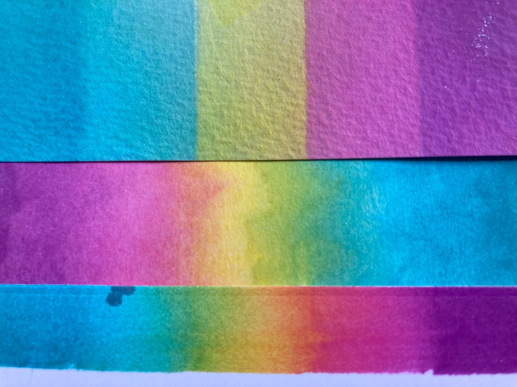
I had experimented with the Palette Reactive ink pad when I started playing with this kit – I swiped it on some watercolor card stock (top) but it absorbed so quickly into that that it was hard to get a blend. I also swiped it on some Multi-Media card stock (middle) and it moved a little bit easier though still not very much. Finally I grabbed some Bristol Smooth card stock (bottom) and swiped the Palette ink on that – wiggling it back and forth a little bit – on THAT card stock the inks blended with no help at all!

Literally NO water was used on this background.

Now that’s kind of amazing! I trimmed the inked panel to 3.75″x 2.5″ and stamped the water on the left using Unicorn White ink embossed with White embossing powder. I stamped the foot prints using C&9 Dove ink. I also used the Dove ink to stamp the cabanas on my swatched watercolor paper. Instead of going rainbow, I followed the Lemon Drop line of the swatch. I die-cut the cabanas using their matching die.

I printed this fun sentiment on a scrap of White card stock using my Silhouette Software and the Stencil font. I trimmed that to size using a LFSRdie. I cut another piece of the Lava Holographic card stock to 4+1/8″ x 2+7/8″ and glued the colored panel on top. I was looking through my scraps for some dark grey card stock and found this die-cut stamp piece already cut out. Perfect for the last layer. I glued everything to a White card base and added the cabanas and the sentiment with foam tape. I just love that background… Might have to take some other Palette Ink pads to that Bristol Smooth card stock..! I Love the whitecaps of the water on the blues… perfectly beach-y! This card makes me laugh!

That wraps up my 10 Cards inspired by the Hero Studio Card Kit of the Month for July 2024! I did manage to use every stamp in our stamp set, all of the fancy dies, some of the rub-on transfers and a good amount of the specialty papers.

This is a fun variety of summer at the beach cards! I think the Victorian Seaside stamp set is quite versatile, and that Sand Castle die and cling stamp are great stash builders! I enjoyed coming up with so many ways to use these supplies. This kit is still available at Hero Arts – if something here has caught your eye or your imagination, you should grab a kit for yourself before they are all sold out! If you do go shopping at Hero Arts, please use my links listed below. It helps support this page at no cost to you, and is always supremely appreciated!

Hero Arts: https://heroarts.com?sca_ref=6639489.ubrhdU2VDFY73qx

Hero Studio Card Kit of the Month July ’24: https://heroarts.com/products/ck0724-july-card-kit-of-the-month?sca_ref=6639489.ubrhdU2VDFY73qx

Thank you so much for spending some time with me today! Your attention and time are always appreciated. I hope you enjoyed yourself as much as I did! Let me know which cards are your favorite, and if you would take a moment to click the “like” star at the bottom of this post, send me a comment, share these cards on your FaceBook and Pinterest pages, and post this for all your crafty friends and neighbors! I send you and yours Love and Light and Happy Crafting!

DISCLOSURE: This site contains some affiliate links to products. I may receive a commission for purchases made through these links (at no cost to you). Thank you!

10 Cards 1 Kit • Hero Studio • June Card Kit of the Month

Hello Folks! Welcome to the launch of the NEW Hero Studio and their inaugural Card Kit of the Month for June, 2024. I am thrilled to be able to continue along with Hero Arts and am excited to take a look at the new Card Kit! Here’s a quick look at all the goodies we have in store for us this month.

• Urban Sky HeroScape Clear Stamp Set, 6″ x 8″ 
• Neighborhood Message Clear Stamp Set, 4″ x 6″
• 10 Coordinating Dies
• City Stencil, 6″ x 6″ with 3 Fallout City Skylines
• 5 Ink Cubes (Peony, Pitch Black, Dusty Blue, Stonewash, Amethyst)
• 2 Sheets Each of Silver Foil, Silver Glitter, Silver Cube & Pitch Black Cardstock, 5.5″ x 8.5″
• 2 Sheets City Textures Hero Transfers (Rub-Ons)

Quite an assortment of supplies in this month’s kit! A plethora of urban design elements from city landscapes, to skies filled with clouds and birds. And this from Hero Arts: “The lines, shapes, and colors of buildings and power cables will add the beauty of modern design to your projects.” Okay..! Hmm… Interesting… all the cables in NYC are buried underground so we don’t even have telephone poles around here… But I do like the “birds on a wire” motif!

I gather the Stonewash and Dusty Blue inks were intended for the cloud stamps… but wouldn’t Amethyst and Peony work as well?

On a panel of Neenah Solar White card stock I stamped the cloud stamps with the Amethyst and Peony inks and added a little ink blending in the same inks over the rest of the panel. I did add a touch of Pitch Black ink blended at the top edge to give this a little more of a dusk-y feel.

I stamped the telephone pole, wires, and birds using the Pitch Black ink – that is extremely BLACK ink… I love it! Easily covered over the background stamping. I’m not sure why, but I chose to add the power cables to the bottom of the insulators on the poles… I think I just liked that aesthetic better than the cables coming from the top of the insulators. Of course that’s wrong, but what do I know… we don’t have telephone poles in NYC!!

I stamped the sentiment using VersaFine Onyx Black ink and embossed it with some clear embossing powder for a little texture and shine, and I added a few stars at the top with a white gel pen and a glitter gel pen. Just a touch of sparkle. I trimmed the panel to 4″ x 5.25″ and glued it to an A2 White card base. I liked that I could curve the line of birds to match the curve of the cable, and I like the straightforward simplicity here – all on a one-layer card!

I guess this is a fairly unique set of cloud stamps. A good amount of space at the top of the stamp, and barely 3.5″ long… Maybe I could use these stamps to fill the whole card up with clouds!

I really like this one. On an A2 panel of White card stock I stamped the 2 cloud stamps moving the clouds right up to the top edge of the panel (with Stone Wash and Dusty Blue inks). Then I rotated the panel and did the same on the bottom edge (now top) edge. I did try to pay attention to any overlaps in the center, but was able to avoid anything unseemly. Though the bottom clouds are technically upside-down, it’s kind of hard to tell – just a bunch of clouds!

I stamped the sentiment and birds on 110# card stock with VersaFine Onyx Black ink, embossed them all with Clear embossing powder and die-cut them out with the matching dies. Gotta LOVE those sentiment dies! I die-cut two blanks for the sentiment and one blank for the birds and glued them all together. I trimmed the cloud panel to 4″ x 5.25″ and added some Sheer Shimmer Spritz for some overall sparkle. I glued the panel to an A2 White card base and the sentiment and birds to the card front. ALMOST a one-layer card! Feels very Johnathan Livingston Seagull to me!

My eyes wandered over to the City Stencil and I wondered how I could make the windows appear on the inked-in silhouettes of the buildings… I guess you could use embossing powder, or gel or paste… but can you use the knock-out parts of the stencil to help ink-blend a sky around the building outlines…? So many questions…!

On an A2 panel of White card stock, I secured the knock-out part of the largest skyline down to the panel and blended in the sky above with Peony, Amethyst and Pitch Black inks. I had decided to use White Embossing powder for the windows, so I don’t worry about getting ink in the window parts of the stencil. Once the sky is inked in, I add the open stencil to the window stencil and pounced VersaMark ink through the windows, and embossed them with White embossing powder. Then I remove the knock-out window stencil, and ink blend the buildings using HA Contour ink (that’s the lightest Grey ink I own).

I repeat the same for the lower buildings without having to blend in the sky – darker ink will cover over any extra Contour ink down below. I used C&9th Dove ink for the front buildings after embossing the windows in White. I trimmed that panel down top 4″ x 5.25″ and added a thin black mat before gluing them down to an A2 White card base. I stamped the sentiment on some 40# vellum using VersaFine ink and embossed that with Clear embossing powder.

I fussy-cut the sentiment and glued it to the front of the card with small dots of liquid glue. I added some stars in the sky with a White gel pan and stamped the sentiment on the inside using the Pitch Black ink. I like being able to use the knock-out stencil to blend in a sky, and the White embossing powder worked really well through the window stencils. Another one-layer card!

Trying to figure out how to use those stencils hurt my brain a little, so I turned to the Neighborhood Message stamp set!

I arranged and stamped all the individual images using VersaFine ink on Bristol Smooth card stock and colored them all with my Zig Clean Color Real Brush markers. A pleasant little scene highlighted with some silver gel pen on the tires and bumpers of the vehicles. A simple suggestion of a road and lawn pulls the whole scene together. Those are some TINY images to color… makes me a little wary of the big stamp with 6 buildings !

I die-cut the water colored panel with a Lawn Fawn Stitched Rectangle die (4.5″ x 3.25″) added a blue mat (4.75″ x 3.5″) and a thin black mat (4 7/8″ x 3 5/8″) and glued those to a White card base. Lastly, I stamped the sentiment with Pitch Black ink. This uses all seven of the small individual stamps in this set and I love the bucolic scene this suggests!

That was a nice break, but I started thinking about using the stencils for an actual Black silhouette of a city skyline.

On a panel of Grey card stock I stenciled in the medium skyline using the Pitch Black ink – I reversed the stencil for a different look. When that was dry, I pounced VersaMark ink through the windows and embossed them with White embossing powder. After heat-setting I replaced the stencil and spattered some stars in the sky using some Doc Martin Bleed Proof White opaque watercolor.

I stamped the sentiment using Unicorn White ink and embossed that with White embossing powder. I used another LFSRdie and did some partial die-cutting to adjust the shape of the panel to 5.25″ x 3.25″. I was having a hard time figuring out how to use the metallic paper in this kit and figured that the Silver Glitter card stock might add a nice sparkle to this night-time card. I cut the glitter card stock to 5.5″ x 3.5″, glued it to the back of the die-cut panel and then down to an A2 Pitch Black card base (plenty of uses for THAT card stock!). I like this a lot – pretty simple to accomplish and I really like the black/white palette.

And then there’s the rub-on sheets – LOTS of Urban motifs there but I am a little thrown by the ships’ mast and rigging?? Regardless, the rub-ons will provide us with a perfect background for a multi-media card!

I cut out a card-sized panel of the rub-on sheet from the bottom right – that puts the ships’ mast on the mid-left of the card where I planned to put the telephone pole. I rubbed that onto an A2 panel of Ivory card stock. I used some texture paste through one of the stencils on the bottom right (you can see some window shapes down there, and when it was dry, I used some watered-down Distress Oxide Frayed Burlap ink to give the paste a little color, and added a little of that over the whole background for a little color variation – the rub-ons took the watercolor ink just fine!

I wanted a little more variation on the stencil, so I added some Gold Treasure Metallic Gilding Polish on the bottom right as well… adds some great shine to the grunge! When everything was dry, I die-cut the panel with a HA Rounded Rectangle Infinity die, and lightly sanded the edges for a little more distress. I stamped the pole on more Ivory card stock and extended the stamp to make the pole longer – it’s actually 5 1/8″ long (you can see the tiniest little jog on the pole where I added length). I die-cut the pole doing partial die-cutting to adjust for the added length.

I added some black bakers twine to the pole for the cables (keeping them hanging from the bottom no matter how wrong it is!) I attached the telephone pole to the card front with foam tape arranging the cables front and back. I glued the ends of the twine around the back edges of the panel and glued the panel down to a Kraft card base with the corners rounded. I stamped the birds on more Ivory card stock with VersaFine ink and embossed them with clear embossing powder before die-cutting them out. I picked two of the birds to add to the wire and foam taped them to the card front with spots of glue where they sit on the twine.

Finally I stamped the sentiment on more Ivory card stock and embossed it with clear embossing powder, then die-cut it with an old Spellbinders Deckle Edge die. I distressed that with more of the Frayed Burlap Distress Oxide ink and some Pitch Black ink and added it to the card front with more foam tape. Finally I added the “hello” stamp to the left side with VersaFine Onyx Black ink embossed with Clear embossing powder. Classic example of a multi-media card! I love the three-dimensional quality of the birds and telephone cables and the rub-ons worked perfectly!

I was thinking of ways to make those window stencils work, and thought an old ink-resist technique might work.

I wanted to use the clouds with the stencils this time, but I wanted the clouds to feel softer, so I stamped the first cloud stamp a few times using a blending brush to add Dusty Blue ink to the stamp. Nice and suggestive instead of hard stamped edges. I pounced VersaMark embossing ink through the two window stencils (lighter on the back buildings and more on the front buildings) and let that dry completely – the VersaMark ink should grab color differently than just the paper. I stenciled the buildings using Contour ink and Dove ink – sure enough the embossing ink grabbed more of the color and gave a really nice suggestion of the windows… all very soft.

I trimmed the panel with a Rounded Rectangle die and the mat with the next larger die, and glued those to a White card base. I stamped the sentiment with VersaFine ink and embossed it with clear embossing powder, and stamped the birds from the Neighborhood set with Pitch Black ink. Kind of a grey day in the city here, but I like the softer nature of everything – especially the light suggestion of clouds.

I guess it’s time I bit the bullet and tackled that Neighborhood stamp with six buildings…

Stamped on Bristol Smooth card stock with VersaFine Onyx Black ink and colored lovingly with my Zig markers. I do like the white house at the end of the block! Sentiment stamped and embossed. Panel cut with a LFSRdie and matted with black before gluing to an A2 card base. This stamp is terrific if you take the time to do some detailed coloring!

A couple puns occurred to me as I was working on these cards and I thought I’d see if I can make them work…

Another simple black and white card but I love the irony here… the lines are down so I haven’t called, but I thought snail mail might be a better way to communicate… makes me giggle. Very straight forward here – Pitch Black ink on Neenah White card stock, Printed sentiment using my Silhouette Software and the Smoothie Shoppe and the Bai Tamjuree fonts. Die cut with LFSRdie and some sparks drawn in with a Pigma Micro pen. Yes, my telephone lines are still hanging below but I figured once I went there, I should just keep going! Great card for checking in with a friend!

I combined a few techniques for this last card and also modified the stamp just enough to give me a pun!

Makes me laugh! I did the cloud stamp on a panel of Bristol Smooth card stock using a blending brush to add ink and then I stamped the street stamp in a curve to create our “hill”. A simple rainbow palette for the houses colored with my Zig markers. I printed the sentiment using the same fonts and added the single house below. The panel is trimmed to 3.75″ x 5″ and matted on Green and Black card stock and down to a White card base. That street stamp is 3.75″ long so curving it like this helps it fit on a portrait oriented card just fine! Again… I really like the soft clouds!

And that concludes my ten cards made with the first ever Hero Studio Card Kit of the Month! I am pleased to see this first round of subscription options with the new Hero Studio and am thrilled with this wide assortment of cards!

I am sorry this is coming to you so late in the month… I received my kit a little later than usual and I also spent a week in Kansas celebrating my Mother’s 90th Birthday! She is doing well and we had a whole week of celebrations!

This kit is still available at Hero Arts! If I’ve given you any inspiration on how many ways you can use this kit, you can still grab one for yourself! Please use my links below when you go shopping at Hero Arts – it doesn’t cost you anything extra and it really helps support this page and my YouTube channel. Thank you!

Hero Studio Card Kit of the Month June ’24: http://shrsl.com/4lcln

As always I am thrilled that you choose to spend a little time with me here, and I hope you enjoyed what I was able to come up with this month! Remember to click the “like” button at the top of this page, let me know what your favorite cards are, and be sure to share this on your FaceBook, Pinterest, and Instagram pages. Please, don’t run with scissors, and I send you and yours Love and Light and Happy Crafting!!

DISCLOSURE: This site contains some affiliate links to products. I may receive a commission for purchases made through these links (at no cost to you). Thank you!

10 Cards 1 Kit • My Monthly Hero • April 2024

Hello Folks! Scott here with my 10 cards featuring the My Monthly Hero April 2024 Premium (and Classic) Kits. We are exploring Folk Art this month with an amazing color-layering stencil and matching cover plate die!

CLASSIC KIT INCLUDES: • 3 Color Layering Floral Butterfly Stencils, 5.25″ x 6.5″
• Coordinating Cover Plate Die
• 16 Coordinating Frame Cuts
• Clear Stamp Message Set, 4″ x 6″
• 3 Reactive Ink Cubes (Blue Hawaii, Splash, Taffy)

PREMIUM KIT INCLUDES Everything in the Classic Kit AND:
• Birds & Flowers Clear Stamp Set, 4″ x 6″
• 13 Coordinating Frame Cuts
• 16 Washi Stickers

I find it interesting that the Cover Plate die cuts all the butterfly’s wings but NOT the bodies (for adding dimension) but we also get frame dies that will completely cut out the butterflies – and some of the florals as well! Only sentiment stamps in the Classic Kit… looks like that stencil is the only “image” we get in the Classic Kit – and of course the dies!

Now I did do a little Folk Art research, and there are naturally many different styles of Folk Art – about as many as there are Folks! You’ve got Scandinavian Folk Art, Mexican Folk Art, Polish Folk Art, American Folk Art… I thought I would try to duplicate some of the more recognizable styles this month. To start with, I figured I would go in the direction the kit is sending me and use the included inks to color our Folk Art Floral Butterflies. This is from the HA website showing us to use the Taffy ink for stencil 1, Splash for Stencil 2, Blue Hawaii for Stencil 3… the stencils are numbered and have registration marks at the corners for help in lining them up.

I tend to have a lighter hand when it comes to color layering stencils… and I do like some soft color in the background…

I thought some Hero Hues Ivory card stock would work nicely with these colors and avoid a plain white background. I ink blended through the stencils with the included inks but kept things a little bit softer overall. The stencils line up beautifully , and this Folk Art pattern certainly gives us full-card coverage! Literally right to the edges of an A2 card!

I trimmed the colored panel to size with the largest HA Rounded Rectangle Infinity die. Actually fits beautifully, and feels a bit retro as well. I glued the panel to an A2 White card base that had the corners rounded with a 1/4″ corner chomper. I stamped the sentiment directly on the card front using the Blue Hawaii Ink and embossed that with some clear embossing powder. These colors seem classic Americana to me… though American Folk Art tends to be more landscape oriented, this feels kind of Pennsylvania-Dutch Folk Art to me!

Gotta try that Cover Plate die too! I recommend die-cutting BEFORE stenciling – it makes lining everything up easier!

The die certainly gives us some nice definition… almost like an outline stamp! I die-cut the cover plate die on some plain White card stock, and ink blended the stencils with Lemon Drop, Green Apple, and Creamsicle Reactive inks. I glued the colored panel to a Kraft card base and added tiny spots of foam tape behind the butterfly wings and some of the greenery/flowers to help them hold their dimension.

I stamped the sentiment on a scrap of Ivory card stock using Root Beer Reactive ink and embossed that with Clear embossing powder. I trimmed the sentiment to size and added a Kraft mat behind. I attached the matted sentiment to the card front with some foam tape. This doesn’t quite fit any specifically localized Folk Art, but it sure is spring-y!

And then there’s the frame cuts…! I did see a good amount of Mexican Folk Art that looks like paper cut-outs…

So this is my tribute to Mexican Folk Art! I die-cut everything from some textured lightweight card stock and layered everything together – I dug out some hole punches to add centers and extra details to the flowers. I really like the green leaf bits in the tiny red butterflies…! I stamped the cobbled together sentiment on a scrap of Pitch Black card stock with VersaMark ink and embossed that with Neon Lime embossing powder. Amazingly close match!! I glued all to a Pitch black card front and then to a White A2 card base. I die-cut the sentiment with a Lawn Fawn Everyday Sentiment Banners die and attached that to the card front with foam tape. I like this a lot!

I recently purchased some Acrylic markers from Altenew and thought I’d give them a try with this layering stencil…

Now that’s some colorful Folk Art! I was pleasantly surprised how well those acrylic markers worked with the stencils! I used a good HA Pitch Black card base and I was careful not to over-flood the stencils with too much paint. But the markers layered on top of each other (and the black card stock) very nicely! Even the White dots are the acrylic markers!

I did decide to do some outlining with a Black Pigma Micron pen on the butterflies and layered flowers for a little more definition. I stamped the sentiment on a scrap of Pitch Black card stock and embossed that with White embossing powder. I trimmed that to size and added a scrap of multi-hued green card stock for a mat. Those are attached to the card front with foam tape. This one is my tribute to Polish Folk Art which is usually very colorful and often on black!

When I think of nature-patterned Folk Art my mind easily goes to the blue and white classic “Delft” type patterns…

Kind of classic Scandinavian Folk Art! The big secret to this was selectively inking and white embossing parts of the #3 stencil to create an ink-resist to the blue colors going on top. All the butterfly details and assorted flower centers are embossed first. Then I ink blended Splash ink through stencil 1, Blue Hawaii ink through stencil 2, and C&9th Midnight ink for stencil 3. I do think the super dark blue helps sell the “Scandinavian” feel! I was a little impatient with this card so I wasn’t able to keep the background a pristine white, but I think it works well as a tribute to Scandinavian Folk Art!

I trimmed the panel with a Rounded Rectangle infinity die and glued that to a corner-chomped White card base. I stamped the sentiment on White card stock with VersaMark ink and embossed that with SSS Steel Navy embossing powder. (I do love that color and how nicely it finishes!) I die cut the sentiment with another Rounded Rectangle die and attached it to the card front with foam tape. Anyone have some pickled herring??

That’s five cards using the Classic Kit! I truly enjoyed trying to emulate assorted styles of folk art! But, now I get to use the Premium Kit ingredients and we actually have some stamps we can color here!

I stamped the bird and greenery using Intense Black ink on Bristol Smooth card stock and a square infinity die to help lay them out. I heat set the ink and colored all with my Zig Clean Color Real Brush markers. There are some tiny spaces on these stamps..! I die cut the panel with a Tonic Studios Scallop Square die and the mat from Periwinkle card stock using the next larger die. I glued those together and down to an A2 White card base.

I stamped the sentiment on a scrap of White card stock using VersaFine Onyx Black ink and embossed that with Clear Embossing powder. I love the sentiment dies in the premium kit, so I die-cut the sentiment and two blanks to glue together and glued the sentiment to the card front. I did add a little dusting of yellow pastel chalk around the bird to give him a little background. I was just happy to have something to color!

I saw a lot of patterned Folk Art that wasn’t on black or white backgrounds but on lots of different colors…

I thought my alcohol markers would stand up to some Arctic card stock! I stamped the sentiment in the center of an A2 panel and arranged the florals around that. I stamped everything with Gina K. Designs Amalgam ink – works so well with my new Ohuhu alcohol markers! I was surprised the yellow didn’t turn green, and considering how small some of these areas are… I am very pleased with the marker’s finely pointed brush tips!

I die-cut the panel with a Lawn Fawn Stitched Rectangle die and added a mat of Black Tie glitter card stock. I glued those to a White card base, and added some small crystal gems to help carry the sparkle to the stamping. This feels very free-form and casual – just like the sentiment! But I do appreciate the bit of sparkle as well!

We get a nice little pack of Washi Stickers in the Premium Kit… I was about to peel and stick them to some card stock…

When I realized that if I did that, I’d have to fussy cut them out! I checked to make sure that foam tape would stick to the liner paper on back of the stickers, and when it did, I decided to use the stickers as is… I didn’t’t even peel off the liner! I ink blended Thistle Reactive ink around the edges of an A2 panel of White card stock and stamped the sentiment in the same before embossing it with Clear embossing powder. Then I added some splatters of Purple Galaxy Reactive ink and glued the panel to a White card base.

I added the stickers to the card front with foam tape taking care to support all the edges to resist curling. I really do like these Washi Stickers. You’re never going to get this kind of detailed coloring on these images with the stencil or the stamps themselves! And you can always tell the recipient that they can peel the butterflies and flowers off the front of the card and use them as stickers!! That’s downright Interactive!!

I can’t ignore the fact that we get 9 Frame dies for the 9 butterflies that are revealed on the color layering stencils…

This is fun! I inked up the stencils (concentrating on the butterflies) with Fruit Punch, Thistle, and Purple Galaxy Reactive inks, and then die-cut all the butterflies with their matching dies. I fiddled around with different background colors for a while and settled on this white panel embossed with a Tailored Expressions Burlap embossing folder. I thought the white provided a good pop for the butterflies, and the embossing pulled it more into the background. I distressed the edges of the background with the blade of my scissors and glued it down to an A2 Purple card base.

I stamped the sentiment on a scrap of white card stock using VersaFine Onyx Black ink and embossed it with Clear embossing powder. I die-cut it (along with two blanks) with the matching die and glued all three layers together. I folded the wings of the butterflies up and glued their bodies and antennae to the card front, and lastly, glued the sentiment in place. I’m amazed that all nine of these butterflies are actually different… either coloring or size, they’re all unique!

While I was tinkering around with possible patterns I could create using the stamps in the Premium Kit, I started playing around with the birds and came up with a fun combo that was easy to create with minimal masking!

I masked off the tail feathers on the second bird stamp and stamped two of them tail to tail. Then it was easy to mask off the two pointy tails and stamp the flower behind. Very interesting! I stamped all with Gina K. Amalgam ink and colored everything with my TomBow Watercolor markers – again the fine point on those markers helps get into all the tiny spaces on these stamps. I die-cut the whole image by partially die-cutting the birds and fussy cutting around the center flower. I die-cut four more (blank) birds and glued them behind the stamped birds trimming away the tail feathers as needed.

I took a White card base and stenciled the background with an old Mini Swirly Garden stencil using Taffy ink and blending out towards the edges. I stamped the sentiment with Intense Black ink and decided to add the two floral sprigs in the center to fill out the colored birds. I glued the layered birds to the card front and O think I’ll call this one Scott’s Modern NYC Folk Art!

And that wraps up all 10 of my cards for April! I did manage to use every image stamp in the kit, and most of the sentiments, along with a great deal of the frame cuts. I used some of the washi stickers, and of course the stencils and cover plate die… I’m sure there are a million more options available with this unique kit.

A colorful batch of spring-y cards! Love to see the stencils in different color combos, and the die-cut card really pops!

I must apologize for my late post this month… April has been an extremely busy month for me, and combined with the fact that this kit, in all its permutations, sold out very quickly! That’s right… The Classic and Premium Kits and even the Premium Elements have long been sold out. There must be more butterfly madness out there than I thought! If you have followed me for any time, you know I’m not that particularly fond of butterflies, but here we have 7 out of 10 cards featuring butterflies…! Who knew!?

I must express my thanks for sharing your time with me here… I am always encouraged and humbled by your support! Let me know if you have any favorites here, and please remember to click the ‘like’ button at the bottom of this post, (that helps A LOT!) and share me on your Facebook and Pinterest pages! Don’t run with scissors…! and, once again, I am sending you and yours Love and Light and Happy Crafting!

DISCLOSURE: This site contains some affiliate links to products. I may receive a commission for purchases made through these links (at no cost to you). Thank you!