
Hello Folks! Scott here with my ten cards featuring the Love From Lizi February 2019 Card Kit. This is an Art Deco themed kit featuring peacocks, peacock feathers and all the lovely blues and greens associated with them. If you’d like to see my 10C1K video now, just click this link: https://www.youtube.com/watch?v=94ngoBC18fg
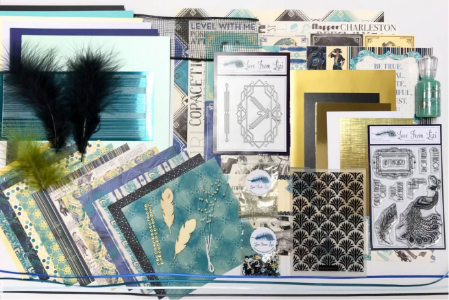
This kit sold out extremely quickly this month and I can see why…! From the intricately detailed stamps and dies to the lovely pattern papers, cut-aparts, stickers and unique embellishments, this month promises some unique design possibilities for everyone!
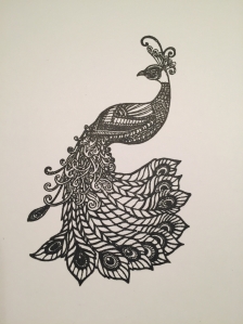
I did cut and fold all the included card stock into A2 card bases, and, as is often the case, I began playing with this kit by stamping that gorgeous peacock stamp with VersaFine Onyx Black ink on some Bristol smooth card stock. I was reaching for my Zig Clean Color Real Brush markers when I realized I should try out some new watercolor mediums I received for my birthday (in December) and Christmas.
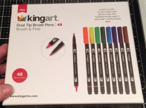
My sister-in-law got me this Kingart set of 48 dual tip brush pens for Christmas this year. These are just like Tombow Art Markers – a felted brush tip on one end and a fine tip on the other. I used these to color this first peacock. These markers did provide some movement on the Bristol smooth card stock but 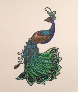 not quite as much movement as I have become accustomed to with the Zig markers. The inks are vibrant and there is a nice variety of colors and shades, and the markers certainly seem nice and juicy! The fine tip is not quite as fine as I would like but, overall, I was very impressed with these markers! Pretty as a peacock!
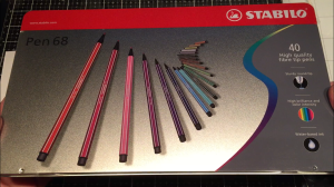
For my birthday, I was thrilled to get this Stabilo set of 40 fineliner pens from my oldest and dearest of friends. I used to have a small set of these markers but I passed them along to my mom when she started getting into adult coloring books. These pens are water-based but only have a 1mm felt tip – very sturdy nibs and fairly fine.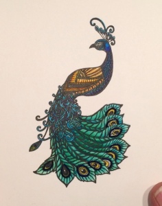 Just as I remembered, these Stabilo pens are super vibrant and colored up my second peacock very nicely. I was VERY impressed with how well they moved on the Bristol card stock and there’s a great variety of colors! I think I think I got little too much color at the top center of the tail feathers where those 10 feathers get very thin… even the 1mm nib on these markers had a hard time giving me a truly fine line… Quite lovely!
Now I can reach for my Zig brush markers! I have only ever had the 32 set of these markers so I have the fewest color choices with these markers but I have the most experience using them!
Of course, these 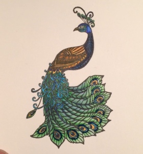 markers move very easily on Bristol smooth card stock, and while I may not have quite the same color selection as the other two sets, you can easily combine colors to get most any color you want! This peacock is a little lighter overall than the other two, but the colors are every bit as vibrant and the shading a little more subtle… this isn’t the best picture of this peacock, but you’ll see how nicely this works on a card. BTW… I did outline the ‘eye’ of the tail feathers on all three of these peacocks with a dark blue glaze pen to add some color and shine to what amounts to be a simple black portion of the stamp. Now to figure out how to use these on my cards! I guess I am going to have to fussy cut these… ! Yikes!
After working so much with this peacock stamp (I’m in NO hurry to start fussy cutting!) I began to wonder how this super detailed stamp would work with some heat embossing.
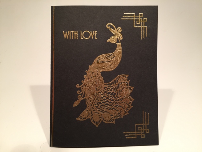
Here we go! Nice and simple – very straightforward – and quite stunning! If you take some care, and get a good impression without smashing your stamp into the paper, you can capture a lot of detail with most any ‘ultra fine’ embossing powder. I did try the Love From Lizi Emerald City and Golden Crown embossing powders but I thought my plain gold powder had a bit more ‘presence’ on this black card base. The peacock, the corner embellishment and the sentiment were stamped directly on the black card with VersaMark ink and heat embossed with Ranger Super Fine Gold embossing powder. A simple strip of Lizi’s Gold Mirror peel off (from the May 2018 LFL kit) down the left side completes our easy introduction to this kit. With those stamped corners, this almost looks Oriental! Nice and shiny and very art deco!!
There is one cut-apart that really caught my eye – you can probably guess which one!
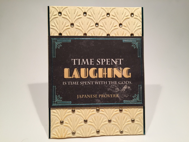 Love this sentiment! I don’t think I have ever heard this proverb before! Since the ‘framing’ on this piece was in teal, I chose to add some of the Teal Mirror peel offs to the outside frame and added little extra touches among the corner flourishes. I also added some Glossy Accents to the ‘LAUGHING’ text for some added dimension and shine. Instead of using pattern paper with this, I decided to use the embossing folder to dry emboss the front of one of the Cream card bases. I did (very lightly) sponge some Spiced Marmalade Distress Oxide ink over the embossing to highlight the pattern a little bit and, since embossing will warp most any card stock. I glued an additional panel of white card stock behind the embossed cover. I ran a couple more peel offs down the edges of the embossing and added the cut apart panel to the card front with foam tape. This card needed a little more something-something, so I reached for the small Champagne Gold gems and used them at the tip of each embossed ‘leaf’ spray. That’s the trick! The gems really highlight the embossed pattern and add some terrific bling!
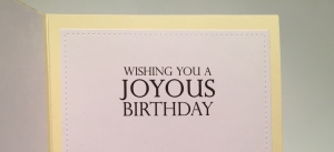 I did consider how I could use this card, so I turned to my Silhouette Software to add a “Wishing you a Joyous Birthday” sentiment on the inside writing surface. This is using the Perpetua Titling MT Light font which I thought came very close to matching the smaller block text on the cut apart. That works! Now we have a very sharp Birthday card for anyone who enjoys laughing – or anyone who enjoys making others laugh! LOL!!
I did think one of the ladies on the 3″x 4″ panel cut apart sheet seemed very proud of herself and perfect to pair up with the ATTAGIRL! stamp.
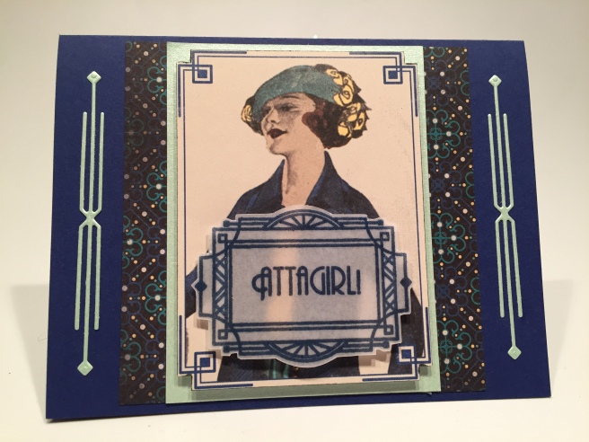
I fussy cut that lady panel following along the lines of the printed deco frame for a little extra interest, and foam taped that to a 3″x 4″piece of the Mint Green specialty paper from the kit. On the Navy card base, I glued down a 4″x 4″ piece of the dark graphic pattern paper and glued the matted piece directly to the pattern paper. Now, how about the dies in this kit…! I had the perfect space to add a couple of the straight flourish die-cuts.
I did take some StickIt double-sided adhesive and applied some to a piece of the Mint glimmer card stock in preparation for die-cutting these intricate dies. I also used a piece of wax paper between the die and the card stock to help remove the piece when it’s cut (didn’t help much..!) but with some care and patience these incredibly skinny die cuts came free of the die very nicely. Thank heavens for that StickIt on the backs!
I embossed the frame and “ATTAGIRL!” sentiment stamp using Simon Says Stamp Steel Navy Embossing Powder (I don’t have any LFL Warm Navy) on a double piece of vellum – two vellum pieces glued together using the Xyron Sticker Maker. I fussy cut the vellum frame and was able to add two foam strips right behind the busy vertical bars on the left and right sides, and, since the doubled vellum is stiff enough to hold it’s own, I was able to add some extra depth with the framed sentiment foam taped to the card front. I think this lady and this sentiment were meant for each other!!
 I actually have the same font used for the sentiments in this stamp set in my own font files so I did create a “Congratulation” sentiment on the inside writing surface to finish out the ‘AttaGirl’ on the front. I used my Silhouette Software and the Andes font for all my extra printings this month. I was so thrilled when I recognized this font! That doesn’t happen very often but I LOVE it when it does!
I was SO pleased to have an “ATTABOY” sentiment in our stamp set so now, at last, we get some equal time!! LOL! There aren’t any images of particularly proud men anywhere in this card kit so I decided to just go with the art deco theme! Those LFL Gold Mirror peel-offs were still on my desk too, so I just couldn’t resist!
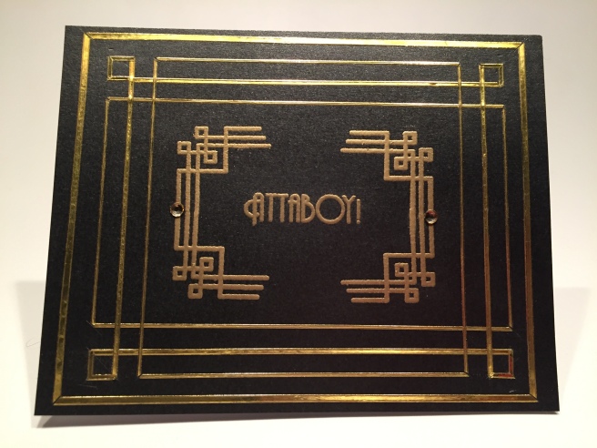
Inspired by the corner stamps in the kit, I grabbed the Black Glimmer specialty card stock and taped it down to my TH media mat. I skipped the outer frame to begin with (1/4″ left and right and 1/8″ top and bottom and laid down three rectangles of peel offs in thin, medium, and thin again every 1/4″ with the peel offs running off the edges of the card. It was fairly easy to miter the corners on the two thin rectangles. To make the corner squares on the medium peel off rectangle that’s between the thin frames, I added shorter pieces of medium peel offs to make the outside edges of the corner squares and mitered the three corners on those squares as well.
I stamped and embossed (VersaMark ink and Ranger Gold embossing powder) the corner stamp four times matching up their edges to make this open stamped frame in the middle of the peel off frames. “ATTABOY” fit in that stamped frame perfectly! After everything was embossed and cooled, I added the thick peel off frame around the outside and attached the black glimmer card front to a white card base. A couple of the kit gems to camouflage the fact that the outside strip of the matched stamps didn’t quite meet up, and we’ve got a truly masculine Art Deco congrats card! Nothing on the inside of this one… I was just basking in the joyful reality of an actual GUY sentiment! I LOVE THIS!
That’s three of the five sentiments in this stamp set – let’s go back to the ladies and the “GIRLS NIGHT OUT!” stamp for the next card.
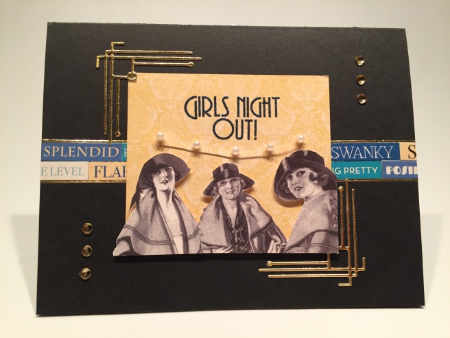
It’s sticker time! I fussy cut these ladies from the long strip of “Femme Fatals” on the sticker sheet and removed their stickiness so I could add some foam tape on their back. I arranged four of the small sentiment stickers on the right and left sides of the center line of the black card base and used more gold peel offs on their top and bottom edges. (I know, I know, I just can’t help myself!!) I die cut two of the corner dies from the gold textured specialty card stock and trimmed a piece of the yellow damask pattern paper to 3″ wide by 2 and 5/8″ tall. I stamped and embossed the sentiment using VersaMark ink and that same SSS Steel Navy powder. Then I glued the little squares on the inside corner of the die cuts to the corners of the pattern paper before spray-gluing everything directly to the card base. I foam taped the ladies coming off the edges of the pattern paper, added three crystals to the top right and bottom left, and added a small swag of the pearl spray underneath the sentiment. Feels like a little pearl necklace! Hmmmm… SWANKY!!
This sentiment sounds like an invitation to me, and I was kind of itching for at least a little pun somewhere in this kit, 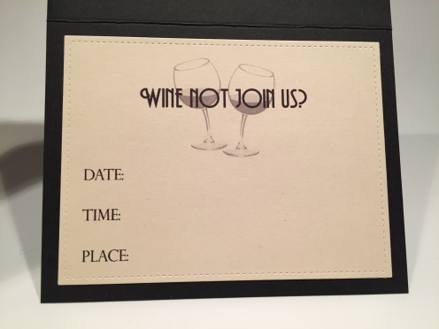 so I turned to my Silhouette Software to create the inside of this card. On a piece of Staples ivory card stock from my stash, die cut with a Lawn Fawn Stitched Rectangle Die, I paired up these wine glasses from my image stash with the fun “WHINE NOT JOIN US?” sentiment using the Andes font and the Perpetua font for the party details. There’s a bit of a pun for us this month! I’m finding (mixed company) puns a little hard to come by this month! You know I seem to be a little obsessed with actually finding a purpose for my cards, and this makes a pretty classy invitation that’s not too complicated to make more than a few!
I have yet to tackle the feather stamp from this kit and if anything, it seems even more detailed than the peacock stamp. If such a thing is even possible!! While I was doing some peacock research prior to receiving my kit, I came across an Aesop Fable – The Jay and the Peacock and that inspired this card!
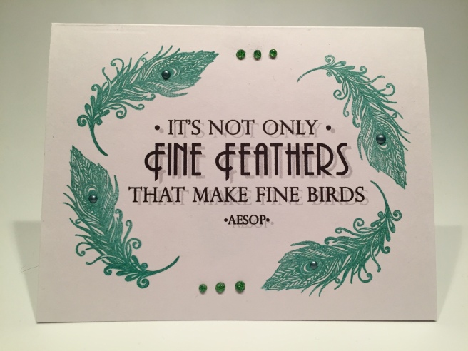
Now, I’ve been using my homemade wreath builder template fairly frequently lately, and I thought I could use the template and the feather stamp to create more of an oval shape on the front of this card. The feather stamp is large enough to cover the short ends of a card with just a couple of impressions. I designed this sentiment using my Silhouette software and the Andes and Perpetua fonts and printed that right in the center of a white card base. I turned to my wreath builder template and stamped the feathers using Stampin’Up Emerald Envy ink.
I laid my card base in portrait orientation in the template and positioned and stamped the feather in the top left corner. I turned the card counterclockwise 90 degrees to stamp the second feather. Then I turned the card another 90 degrees CCW with the opposite side at the top of the template for the third stamp and 90 degrees more for the fourth impression. That turned the feather stamp into a lovely oval shaped frame for this fun sentiment! A few of the Nuvo Glitter drops from the kit on the top and bottom and some Wedgewood Blue Nuvo Crystal drops (from the LFL Nov.’18 kit) added to the ‘eye’ of the feathers. That’s all the sparkle this card needs! I can’t think of a more interesting way to convey the message that “you’re perfect just the way you are”! This is a very nice ‘one-layer wonder’ card that features that lovingly detailed feather stamp!
Working with that feather stamp made me think of the special birthday present that LFL subscribers received in our Sept.’18 LFL Super Card Kit – the LFL peacock feather die! I haven’t had a chance to use that die yet, so I thought this kit was the perfect opportunity to try it out. AND I have that add-on Atta Girl A4 satin card pack – perfect!
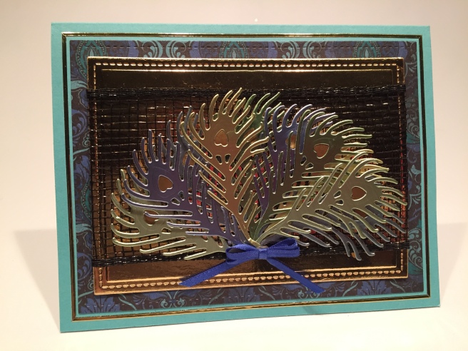
I die-cut the peacock feather twice from each of the 5 sheets of blue and green satin card stock, and filled in the ‘eye hearts’ with the brushed gold vinyl included with the kit. I was determined to tame that Black Deco Mesh ribbon we received, so I die cut the gold mirror specialty card stock piece with a LFSRD and, using a good amount of scor-tape on the back and the edges, wrapped the deco mesh around the gold die cut. Great texture and some really nice shine from that mesh as well! I glued the gold panel to the damask pattern paper die-cut with another LFSRD, and mounted both directly to the Aqua card base before outlining that with more gold peel-offs. (so arrest me already!! LOL!)
I arranged the ten die cuts in a fan (hopefully reminiscent of a peacock’s tail) and attached to the card front with a combination of foam tape and Multi Medium Matte glue. A little double bow using the Royal Blue ribbon from the kit adds a touch of dimension to the base of our fan and all that’s left is a sentiment for the inside. Again, using my Silhouette software and the Andes font, I printed this sentiment on a scrap of white card stock die cut with a LFSRD and mounted to the inside of our card. This is actually printed a very dark blue color with a bit of a drop shadow! I think this sentiment goes perfectly with the shiny colored feathers on the front of the card and all these encouragements go right along with the AttaGirl! theme of this card kit.
Ok… I have made you wait long enough… now let’s use those colored peacocks! I did take the time to fussy cut all three peacocks leaving a small white border around two of them.
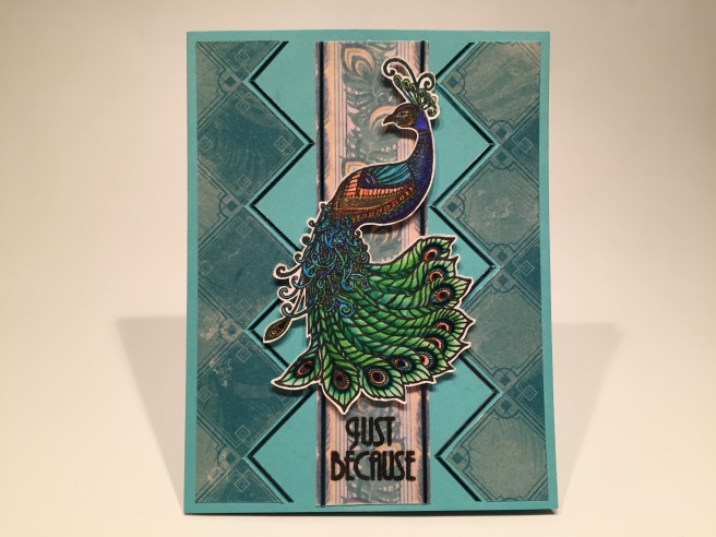
On the Aqua card base I attached two strips of the blue squares pattern paper that I fussy cut along the edges of the squares, and outlined the inner saw-tooth edges with the medium Teal peel offs. I cut a strip of the peacock feather stripes pattern paper and in order to mute it just a little so it didn’t compete with the peacock, covered it with a piece of vellum – again using my Xyron sticker maker to glue the vellum to the pattern paper. I stamped the sentiment in Onyx Black ink (matches the stamped peacock) and added some clear embossing powder to it for a little shine. I glued that strip down to the center of the card front and added more peel offs to the sides. This is the peacock colored with my new kingart dual tip markers and fussy cut using my x-acto craft knife. I mounted that to the card front using 1/16″ thick foam squares and, never one to leave well enough alone, I did add a little extra sentiment on the writing surface inside the card. “Just Because … I Love You” turns this into a very-non-traditional yet quite beautiful valentine!
I did cut the Zig clean color real brush peacock out without a white border simply so I could use one of the feathers included in our embellishment bag!
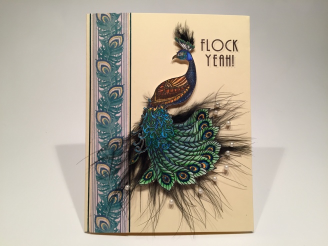
First, I printed this sentiment directly on the Cream card base using my Silhouette software and the Andes font. I used another strip of the peacock feather pattern paper down the left side and edged that with more of the Teal peel offs. I cut some of the pearl sprays into single pearl sprigs and glued those to the tips of all the tail feathers. I then trimmed off a tip of one of the black feathers and glued that behind the peacocks tail and added a tiny tuft of feather to the crest on his head. Foam tape attached the peacock to the card front, and we have a bona fide pun with this card!! HOORAY!!! LOL! I love this card and how much texture the feather and pearls bring to the table! And here you thought that peacock couldn’t get any fancier! This one is definitely the flamboyant one!
I still have a few items in the kit that I haven’t used yet, but I have an idea…!!
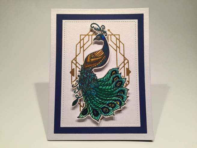
I die cut that intricate frame die from the brushed gold vinyl sheet quite early in my process and took great care to lay that right in the center of the pearlescent white specialty card stock. The dies cut that vinyl very nicely and if you lick your fingers (keep them just a little bit wet) it will help you handle the vinyl without it constantly trying to stick itself to you. That piece floated around on my desk for quite a while as I considered what exactly I should put inside that frame. I kept thinking it needed a sentiment in the center until I cut out this peacock (colored with the Stabilo pens) and held it in front of that deco frame. EUREKA!!
I only have a Navy card base left and I wanted to see that color on the card front but wanted something a little more striking than just a thin trim or an outline. That white glimmer specialty card stock is 4.25″ x 5.5″ – exactly the size of our card. That gave me the idea to do a kind of ‘reverse frame’ to highlight that great Navy card base! I taped two of my LFSRDies together and centered them on the white glimmer card stock and sent that through my die cutting machine. I simply glued the ‘leftover’ outer frame and the inner rectangle to the card base and TADA! That Navy card stock features quite prominently on our card front. I did reach for my thicker 1/8″ foam squares to attach the peacock to the card front with a little extra dimension, and I am totally in love with this gorgeous card!
I’m generally not one to leave a card without a sentiment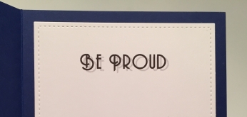 so I turned to my computer one last time to do the “Be Proud” sentiment on the inside writing surface. Another lovely encouragement card to wrap us up this month! I think these last three cards really demonstrate that coloring and cutting that peacock stamp was worth every moment devoted to them!
So that’s my ten cards featuring the Love From Lizi February ’19 Card Kit. For some reason, this kit really inspired my anal retentive, ultra detailed, nerdy perfectionism that took up a little more time at my craft desk than usual, but, in the end, produced some truly stunning results and some downright gorgeous cards!
Naturally, I have gobs and gobs of extras left over from my kit, I only used 5 of the 12 pattern papers, I didn’t use any of the sequins, glitter or the wood veneer feathers, but I did manage to use all of the stamps and all of the dies – and that brushed gold vinyl as well! I used a little bit of everything else but not a lot of any one thing – unless you’re counting that peacock stamp! LOL!!! Lizi continues to spark my imagination with her kits and the unique themes and embellishments she includes that practically beg you to think outside the box! As mentioned at the beginning, this kit sold out super quickly but there are still some add-ons available at Lizi’s shop. If you do go shopping at Love From Lizi or want to get in on the fun and subscribe, please use my link: http://bit.ly/LFLlink.
I am truly blessed and so grateful that you choose to spend your time with me here – I am constantly amazed at the generosity of spirit and heartfelt encouragement that all of you share with me! Let me know which card(s) you liked the best, if you have any questions don’t hesitate to ask, and remember to Like Me, List Me, Pin Me, Post Me, share me with all your friends, don’t run with peacocks, and HAPPY CRAFTING!!

Wow! All the cards are amazing. Best use of feather… definitely for that peacock card. The card with the feather dies is stunning. and the gold Atta Boy is so rich looking. Your peacocks are spectacular.
I love your creativity. Thanks for the inspiration.
LikeLike
Thanks Drue! Always appreciate hearing from you! Spread the Cheer!
LikeLike
Oh my gosh!! You’ve made some really beautiful cards with this kit. I’ll probably CASE every single one of them. The feather card is my favorite, though. I’ve been spring cleaning big time and crafting has been on the back burner…until now. My kit should be here today and you have inspired me. Thank you so much! 🤓
LikeLike
Thank YOU, Jeanne! Always great to hear from you! This kit brought out the nerdy-perfectionist in me! Your encouragement and support inspires me!
LikeLike
Great Art Deck cards! You will be Art Decoed out by the time you do Hero Arts too this month. Lots of work, but great “ATTABOY” card. My favorite is the stunning “flock” card…coloring is fantastic, and love how you used the feathers behind. Appreciate you sharing your creativity.
LikeLike
Thanks Sarah! Truly appreciated! Seems like the same theme with the MMH Feb. kit…! At least I’m prepared! Thanks for all the support and encouragement!
LikeLike